


Hands-on with SolarTab, a giant solar panel for your gear

Charging with solar energy is an appealing concept for many, but there are still plenty of obstacles.
For some people, a battery backup is a part of everyday life. Our phones are growing more capable every day. But when you’ve got a hour commute home and want to watch a movie or play games the whole ride home at the end of the day, the last thing you want to see is a low-battery warning. Every once in a while you might wonder if it’d be possible to run these phones entirely on self-generated power. Hand-crank generators and solar panels connected to massive battery packs don’t sound like the most practical thing on the planet, but if it’s a reliable solution it’d be cool to think about your phone as living “off the grid.”
Solartab is the latest in a line of products from companies that want to give you the ability to charge your phone with the sun whenever you want. To help you deal with the size of the solar panel, the company has disguised it to look like a tablet.
Take a solar panel, add a 13,000mAh battery and a pair of USB ports for charging whatever you want, and for the most part you’ve got Solartab. What makes this panel special is its design, not its functionality. Solartab comes with a folding case attached that both makes the panel look like a tablet, and gives you some flexibility in positioning the solar panel when charging. When folded up in its case and stuffed into your bag, Solartab is mostly indistinguishable from any other 10-inch tablet.
A total capacity of 13,000mAh is enough to charge any phone several times over, and with a pair of 2A ports you can charge just about anything you’d need to get you through a day. When you drain the battery, you can charge it through the microUSB port or by using the big solar panel on the front. Solartab has included an optimal charging LED on the side of the casing to let you know when it’s receiving the perfect amount of sunlight, so you know how to charge your battery quickly. In our tests this battery gets around 10 percent charged every hour Solartab is in this optimal position. While it’s unlikely you’ll frequently be able to fully charge Solartab from dead in a single day, it’s also not impossible.

As portable batteries go, Solartab is massive and a little inconvenient to carry around. As a solar panel capable of keeping you charged, Solartab is fantastic. It charges much faster than your average small-ish solar panel, and the case design makes it easy to position and re-position for the best possible charge. If you’re looking for a way to go solar with your gear, this isn’t a bad place to start.
See SolarTab at Amazon

Best smartphone cameras: Galaxy S7 vs. iPhone 6s vs. Nexus 6P vs. Lumia 950
Samsung vs. iPhone, Nexus vs. Lumia. It’s time to find out who makes the best smartphone camera.
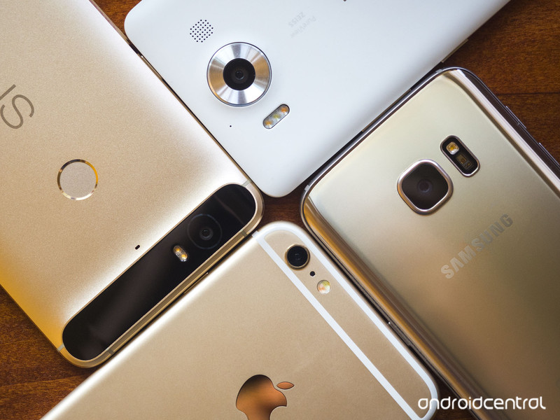
Recently a new smartphone waltzed onto the scene, throwing a gauntlet to the ground: we have the best smartphone camera, Samsung said. There are already some excellent smartphone cameras out there — we learned that from our previous smartphone camera showdown, and with the new entrants into the field the time has come to do a proper comparison between them all. So let’s do this: it’s Apple iPhone 6s Plus versus Huawei Nexus 6P versus Microsoft Lumia 950 versus Samsung Galaxy S7 (otherwise known as the challenger and the new kid on the block).
Why these phones?
We went with four phones for this cross-platform showdown to keep things simple, picking what we know to be among the greatest and latest cameras. So there’s the iPhone 6s Plus, which has the same sensor and lens set up as the smaller iPhone 6s, but adds in optical image stabilization for improved shake reduction and better nighttime shots.

On the Android side there are so many phones to chose from that we went with the big brother of the barely winner from the last time around: the Huawei Nexus 6P. It has the same sensor and lens system as the smaller LG Nexus 5X, but the Nexus 6P has a more powerful processor and picks up electronic image stabilization in the process.
The Samsung Galaxy S6 was one of the strongest contenders the last time we did this, so it was only natural to include its successor: the Galaxy S7. It sports a wider aperture and a sensor that’s larger yet packs fewer pixels for a claimed dramatic improvement to nighttime performance. Both the 5.1-inch Galaxy S7 and the 5.5-inch Galaxy S7 edge have identical cameras, so we went with the slightly more pocketable S7 standard.
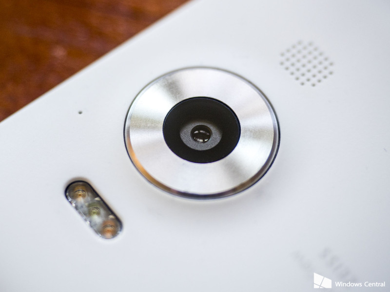
Lastly, there’s the Microsoft Lumia 950. The flagship Lumia phones have always had incredible cameras, and the Lumia 950 promised to pick up that torch and keep running with it. It packs a 20MP sensor behind an ƒ/1.9 lens with OIS. And unlike the other phones on here, there’s a dedicated camera button to make launching faster and easier. (OK, Samsung allows for a double-tap of the home button.) Like the Samsung sister phones, the Lumia 950 and its bigger 950 XL sibling have the exact same cameras.
The LG G4, another strong contender from last time around, was left out of this round. With the LG G5 coming soon, it didn’t seem fair to include last year’s model in this comparison. Fret not, we’ll come back to it all again when the G5 finally arrives.
How we shot
Over the course of a few days we took these four phones to various locations to try them out in a variety of settings. While a few feature advanced manual controls, we left each camera in full automatic mode with automatic HDR enabled. Keeping with the expectations of how you would use a smartphone camera, we shot every photo hand-held. The only alteration made to any photo before uploading was resizing as needed.

Technically, yes, both the Galaxy S7 and the Lumia 950 offer the option to shoot with manual controls and spit out RAW image files that are better for editing than the JPGs we know and love. But, the truth is most people who buy these phones aren’t going to bother with manual modes — they’re daunting and finicky and RAW files take some time to fully wrap your head around. There are apps available for the iPhone and Nexus 6P that add some of those controls, but again, that’s not a thing a “normal” person is going to be include to do.
And let’s be honest: If you’re the kind of person who cares about setting your white balance, fiddling with the ISO and tweaking the shutter speed, then you already know what phone you want when it comes to the camera. Fact is, you probably don’t want to do any of that on a phone at all — you want a real camera with real controls and a nice big sensor and lens to go with it.
You can shoot some really nice photos with a quality smartphone on auto. We’re not professional photographers, and we don’t expect you to be either. But if you want to get technical with your smartphone, there are phones that’ll let you do that.
Spec showdown
One final thing before we dive into the photos: let’s talk specs.
| Megapixels | 12MP | 12.3MP | 20MP | 12MP |
| Resolution | 4032×3024 | 4000×2992 | 4992×3744 | 4032×3024 |
| Aspect Ratio | 4:3 | 4:3 | 4:3 | 4:3 |
| Sensor Size | 1/3″ | 1/2.3″ | 1/2.4″ | 1/2.6″ |
| Pixel Size | 1.22μm | 1.55μm | 1.12μm | 1.4μm |
| Aperture | ƒ/2.2 | ƒ/2.0 | ƒ/1.9 | ƒ/1.7 |
| Focal Length | 29mm | 29mm | 26mm | 26mm |
But what do all those numbers mean?
Megapixels is shorthand for the total number of pixels on the camera sensor. The pixels are arranged in a grid, with “1 megapixel” meaning “1 million pixels.” So the Lumia 950’s 20MP camera has 20 million pixels on it. More megapixels equal a more detailed image. Smaller-resolution photos might look fine on your phone or computer, but once printed at poster size they might fall apart in quality. Thankfully, the minimum 12MP sensors we’re looking at here have enough detail that an 8×12-inch print would look fantastic, and even a full 24×36-inch poster would look pretty good.
Resolution is essentially a different way of looking at the pixel count. Megapixels are computed by multiplying the horizontal pixel count by the vertical pixel count, and those two numbers just so happen to be the resolution.
Aspect ratio is an abstraction of the resolution that will give you an idea of how “wide” an image is. Your smartphone, computer, and TV all likely have 16:9 displays, which is to say that for every 16 units on the long side, you’ll find nine on the short side. The 4:3 aspect ratio is a more “traditional” shape, narrower but taller, and what were used to from old film photography and pre-HD televisions. Most phones give you options for aspect ratios and total resolution.
Sensor size is a the physical size of the sensor. Having more megapixels doesn’t necessarily mean you have a larger sensor, it might just be more but smaller pixels packed into the same space. Sensor size is measured in fractions, to the larger the number (i.e. the smaller the denominator), the larger the sensor. Of our four phones, the Nexus 6P has the largest sensor while the iPhone 6s has the smallest, but they’re all fairly close to the same size — just 0.1 inches separate the two.
Pixel size is where sensor size and megapixels meet — it’s a measure of the actual size of the actual individual light-sensing pixels on the sensor plate. Because we’re talking about putting millions of pixels on a plate roughly the size of your pinky finger nail, we measure these in micrometers (μm). The larger the individual pixel, the more light it collect, and thus the better quality and brighter image it should able to produce. Still, we’re talking about impossibly small things here — the Galaxy S7 has the biggest pixels in our comparison at 1.4μm, and that’s still 1/50th the width of a human hair. In a word: tiny.
Aperture is the size of the opening through which light flows to the sensor. It, too, is expressed as a fraction (the ƒ is standing in place of the number 1). The larger the number, the wider that opening, and thus the more light that gets through. (Because of this fractions thing, it seems a bit backward. An aperture of ƒ/1.7 lets in more light than ƒ/1.9 — because fractions.) A consequence of the wider aperture is a narrower depth of field — the range in front of and behind your focused subject that will also be in focus.
Focal length is a holdover from the olden days of film cameras, measuring the distance from the lens to the film. In essence, it’s an indicator of how wide your photo will be, except that it’s an inverse — the longer the focal length, the narrower your field of view. Think of it as looking through a tube — the longer the tube, the less of what’s on the other end you’ll be able to see.
The Photos
Okay, let’s get to it. We’ve laid out the photos in a grid so you can easily compare them side-by-side. They are arranged in this order: iPhone 6s, Nexus 6P, Lumia 950, Galaxy S7.
Indoors
As you might be noticing, none of these is a particularly bad camera. In fact, we’ll say they’re all pretty great, so our analysis here is going to trend towards nit-picky preferences. Your opinion may differ, and that’s OK. When it comes to indoor photography, none of these phones come up short. The Galaxy S7 tended to produce photos that were a little more saturated than the rest, but when it came to balancing darks and lights it was hard to top the Lumia 950’s HDR “Rich Capture,” which was able to accurately and cleanly bring out detail and visibility in the windows photo. As things got darker the iPhone and Lumia struggled a bit, though, with the iPhone producing a photo darker than the rest and the Lumia ramping up the brightness too much to the point that it was blowing out light sources and washing blacks with gray.
Daylight
When it came to outdoor shots, things started to get interesting. The Nexus 6P occasionally struggled with brightness, sometimes producing photos that were overexposed, and other times offering conspicuously dim photos in acceptable lighting conditions. The iPhone 6s Plus, Lumia 950 and Galaxy S7 all were consistently great in direct sun and under cloud cover, though the GS7 tended to produce images that were more vibrant and a touch brighter. While the iPhone’s colors may have technically been more accurate, it’s hard to argue that the GS7’s results don’t look better.
Panoramas unfortunately leave the Lumia 950 out of the equation (as with the RAW and manual photography statements, we’re going with the default app on these phones, and the Lumia Camera app does not support panoramas). The GS7 and iPhone both offer sweep-style panoramas, while the stock Google Camera app on the Nexus requires the user to pause and let the phone take photos at specific points. Under favorable lighting conditions either method will produce fine results. But under less-great conditions (backlit, or dark as you’ll see below), the Nexus-style approach seems to yield sharper, brighter, and better balanced results.
As dusk began to set, the iPhone and Lumia photos reflected the yellowing of the light, while the Galaxy and Nexus compensated by tweaking things towards toward the blue side of the color spectrum. For portrait photography that may be ideal, unless you’re into the jaundiced look, but it’s not exactly an accurate reflection of the conditions in which the photo was taken.
Nighttime
When it started getting dark is when things started to go south for the iPhone. While it excels at well-lit photographs with accurate colors and sharp details, the small sensor and tight aperture mean that there’s simply not nearly as much light getting into your photos. And so the cameras with larger sensors and wider apertures tended to perform better.
The Nexus 6P occasionally struggled with blown-out bright spots in the darkness and noticeable oversaturation. When it came to preserving detail in the darkness, the Lumia 950 was king thanks to its large sensor, wide aperture, optical stabilization, and a significant bump in pixel count over the competition. The difference is very noticeable on close inspection of the vertical lines of the bridge railing where buckets of fine detailing comes through that’s lost in the muddled results of the other phones.
But the greatest darkness struggle came with the panorama (again, leaving out the Lumia). The iPhone, even with the benefit of OIS, produced an image that was hilariously dim, losing all sorts of detail into inky blackness. For all the true-to-life tendencies of the iPhone’s image processing, it falls far short here. The Nexus went to the other extreme — its dark panoramas were crisp and bright, too bright, actually. Where the iPhone lost detail to the shadows, the Nexus blew out the brights like it was nobody’s business. Somewhere in the middle you’ll find the Galaxy S7. None of these phones produced a panorama that was close to what the naked eye saw or the regular photographic capabilities of these cameras.
Challenging Lighting
This section originally was going to be titled “Food” (because we all apparently love to take and share pictures of our meals), but it ended up being a better test of how these cameras perform under challenging lighting conditions. In particular, that delectable Nueske ham sandwich on grilled sourdough with asparagus, grilled banana peppers, and a melted mix of gruyere and gouda, was illuminated by the red glow of the neon signs seen earlier in this overview and indirect sunlight coming in through the windows behind the photographer.
That sort of lighting is something our eyes are perfectly capable of adjusting to — we know that it’s red light and we see the asparagus and lettuce as green, the banana peppers as yellow, and the ham as pink. But a smartphone camera, even the vaunted LG G4 with its color spectrum sensor that’s supposed to be able to compensate for that, struggles in that light to portray what we see. The iPhone was perhaps the closest to reality, although the Lumia did a commendable job of preserving detail and sharpness at the edge of the sandwich — if it had been even remotely closer to the correct color temperature it could have been a really great photo.
The beer photo was taken after a fresh pour of Breckenridge’s Nitro Vanilla Porter in a dimly-lit bar, and the Galaxy S7 performed admirably here, with a capture bright and crisp enough that you can almost make out the individual miniature nitrogen bubbles. The other phones? Not so much.
Macro
The minimum focusing distances of each camera were surprisingly different. The Lumia 950 let us get closest, but only marginally more so than iPhone 6s Plus and Samsung Galaxy S7. The Nexus 6P was roundly disappointing in comparison, requiring nearly twice the minimum distance before it would focus cleanly.
When you crop in, however, the Galaxy S7 surprised with a comparatively sharp capture. The other phones claimed to have been focusing, but even after repeated attempts we weren’t able to get a straight-on macro shot that approached the GS7’s sharpness. Coming at the coin from an angle surely would have helped to produce more in-focus captures, but that’s not really pushing the cameras to the limit.
Selfies
When it comes to the front cameras on these phones, all but the Nexus 6P have 5MP units, while the 6P (and its 5X little brother) have 8MP front-facing cameras. Regardless of how many megapixels you’re working with there, we’re talking about a camera that has a smaller lens and a smaller sensor … and something you’ll generally be pointing at your face (as you do with a front-facing camera).
As with the rear cameras, in excellent lighting they all perform incredibly well. But throw in challenging lighting conditions and things start to fall apart. The iPhone was the only camera that was able to consistently and accurately focus on my mug every regardless of lighting, but its comparatively tiny sensor and aperture meant that photos in the dark were, well, quite dark — and it struggled to balance the bright light in the first set against the relative darkness of where I was standing. But my face was the closest to well-exposed than the others, even if that resulted in a horribly blown-out background.
Even when it good light the Galaxy S7 struggled with detailing on my face. Where the iPhone, Lumia, and Nexus all picked up copious skin detailing, something with the Samsung phone resulted in smoothed-out skin — and yes, the “beauty mode” that was enabled by default was turned off before these photos. That said, the front-facing HDR that both the Galaxy S7 and iPhone 6s Plus fired off resulted in the closest-to-balanced photos between my spot in the shade and the sunlit city behind me.
Upon heading into a darker environment, things got even more difficult for each of these cameras. The Lumia and Galaxy struggled to focus — despite poking the screen to tell it where to focus. The iPhone struggled in the dim light, but at least its facial recognition saw my face and accurately focused. But the award in this round goes without question to the Nexus 6P. Not only is its bigger 8MP photo more details, it also had zero trouble focusing and producing a crisp and relatively bright selfie as a result.
Video
For all this talk about photos, let’s take a few moments and talk about video. With the proliferation of bandwidth in recent years, video on a smartphone has become more practical than ever. There’s been a lot of focus on improving photography on smartphone cameras, but where do we stand with videography? There’s a lot more at play here — shutter speeds, variable brightness, stabilization, and audio, just to name a few.
A lot of what was discussed above in photography applies to the video capabilities of these phones as well. Interestingly, despite the fairly uniform fields of view each camera provided in photos, it’s all over the map with video. The iPhone 6s and Galaxy S7 have fairly similar fields of view, while the Nexus 6P’s videos are noticeably tighter cropped (due to the reservation of buffer pixels on the sides of the viewing frame for its electronic stabilizations). The Lumia 950’s video is the widest — where all the others crop in for video, the Lumia’s videos are actually wider than photos shot at the default 4:3 aspect ratio.

On the colors front the iPhone and Lumia tended towards warmer while the Galaxy S7 frequently produced video that was colder with more pronounced blue hues. As with photography, the iPhone 6s Plus struggled mightily in the darkness — it was fine in decent light, but as soon as the lighting grew dim it started offering video that was noticeably darker and muddier and less saturated. The Lumia 950’s videos in the dark actually tended
Stabilization also is a concern with photography (shaky video is bad video), and it’s quite evident from the “wobble” you get with the Nexus 6P since its stabilization is exclusively electronic. While it would be fine for static shots, as soon as you introduce any movement to the 6P’s camera — even the slight movement you inevitably get from just holding it while standing still — there’s noticeable wobble in the picture. And when there’s not a static point for the 6P to lock onto (the shot of the flowing waters of the Ohio River) you get to see all the shake that’s not being removed. Considering how great the Nexus 6P is with photography, the stabilization’s a serious disappointment here.
Audio quality varied noticeably between the phones as well. The indoor audio quality of the iPhone and Galaxy were the closest to the natural sound of the space, but once outside the iPhone’s audio clarity noticeably degraded as it picked up more sound from outside the focus area of the camera and struggled to handle wind noise.
The Lumia 950’s audio was, for all the emphasis on its quartet of microphones, remarkably flat and almost entirely absent bass. The Galaxy S7’s audio, on the other hand, was picked up a huge amount of ambient noise with a “warmer” audio profile, but also picked up a lot of ambient noise. Both it and the Lumia handled wind noise far better than the iPhone or Nexus.
Interface


As we would hope with any smartphone camera app, the interface offered by each phone is dominated by the viewfinder. As each camera has a 4:3 sensor (at least they’re set so by default), that leaves space for major camera controls that don’t overlap the image you’re trying to capture.
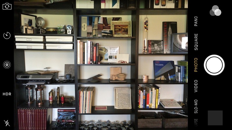
The iPhone camera app is one of the simpler offerings — nowhere will you find tools or settings buried under in-camera menus. Controls are on the short ends of the display — one side hosts small simple single- and two-touch toggles for features like the camera flash, HDR, and flipping between front and rear cameras, while the other end has large buttons to jump into the Photos app to view your captures, a big round shutter button, and to access filters (in photo modes).
Switching between modes is indicated by a strip of words along the edge of the viewfinder — they compress and fade away towards the sides of the phone as if to indicate a dial, and in fact swiping in either direction across the viewfinder will switch to the next mode with a blurred transition effect. This is simple, but it’s also a pain in the rear if you want to switch from, say, pano on on end to a time-lapse video on the other and have to swipe across the screen five times to change modes.

The Google Camera app on the Nexus 6P is even simpler. Primary controls are all on one side of the viewfinder: big buttons for the shutter, switching cameras, and jumping to Google Photos, plus one-touch cycle-buttons for the timer, HDR, and flash. Switching between photos and video is done with a simple swipe across the display, but it’s not at all immediately obvious that you need to swipe to change — the only indicator is a pair of dots at the bottom of the viewfinder. More advanced modes like panoramas as well as general settings are relegated to a menu button in the top left corner of the display.
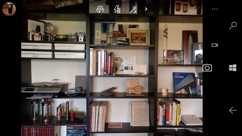
The Lumia camera app carries on the theme of simplicity — the jump-to-Photos button sits on one end with the shutter button on the other. Single-tap controls for switching cameras, the flash, and HDR/Rich Capture sit on top of the viewfinder, while accessing additional lens filters, the timer, and settings is accomplished through the three-dot menu button next to the shutter.
Where the Lumia camera steps above and beyond the others is the little > button next to the Rich Capture toggle. Tap that and you’re switched into manual mode with full control over white balance, focus, ISO, brightness, and even shutter speed. No other default camera app offers so quick and intuitive access to manual camera controls.
The Camera app on the Galaxy S7 takes after the camera app on the Galaxy S6, surfacing a huge number of options with a plethora of menus. It can be a little daunting at first, but it’s not terrible. Along one side you’ll find buttons to open the Photos app, start recording a video (this is the one default camera app here that doesn’t require a preliminary tap or swipe to get to video mode first), capture a photo, switch cameras, or change modes (more on that in a bit). Along the other end of the viewfinder are a settings gear icon, menu for changing the aspect ratio and image size, a flash toggle, timer menu, HDR toggle, and a menu with live previews of various filters. There’s also a > button, but unlike the Lumia where it unveils more controls, here it collapses this list of buttons.
The Mode button is where things really get interesting with the Galaxy S7, though. Tapping it opens as pop-over menu with 10 different camera modes. Some are useful, like pro (a manual mode with control over shutter speed, focus, ISO, white balance, and brightness), panorama, live broadcasts to YouTube, and hyperlapse. Others are of questionable value, like selective focus (refocusing after the fact by taking multiple photos at once), video collage, and food (which creates a fuzzy focused area circle you can drag around with everything outside that being slightly blurred).
But for all of the complication and silly features that Samsung’s added to their camera app (and do note that they’ve pared things back a bit in the GS7), they’ve carried over the most useful camera feature of the Galaxy S6 to the GS7: double clicking the home button at any time, even with the phone off, will launch the camera app, and it will do so ridiculously fast. It’s a shortcut that’s been somewhat emulated on the Nexus 6P with a double click of the power button, but that’s not been entirely reliable in our testing. And not nearly as fast as the GS7, and the placement of the 6P’s power key about halfway up the edge of the phone means it’s occasionally a stretch to reach.

The Lumia 950 is the only one of these phones with a truly dedicated camera button — a hallmark of Windows Mobile devices. Press and hold it for just a moment at any time and it’ll launch the camera, right? Just one problem: the default settings hobble this shortcut by relying too heavily on the proximity sensor to prevent accidental launches while in your bag or pocket. You can disable it, but it’s not something an average user would think to look for — I thought I had a dud camera button at first. That camera button is also a two-stage shutter button; press halfway to focus, all the way to capture. It works really well and I definitely preferred it to tapping the on-screen button to capture a photo.
And then there’s the iPhone. Where each of the other phones has a hardware shortcut to get to rapidly open your camera (and they’re not even the quickest — double clicking the volume down button on the LG G4 or V10 will launch the camera app and take a photo), the iPhone 6s Plus offers no such option.
There are two ways to quickly get to the camera on the iPhone. If your phone is on the lock screen, dragging up from the bottom right corner will open to the camera, but that requires a click on the power or home button (which in this case we’re hopefully doesn’t unlock automatically with your fingerprint) and then a quick swipe up the screen. If your phone is already unlocked, you can swipe up from the bottom of the screen to access the Control Center and then tap on the camera button in the bottom right corner of the screen.
We’d love to see Apple implement a similar camera launch hardware shortcut on the iPhone. It wouldn’t be a double click of the home button, as Apple’s designated that action to launch Wallet, though double clicking the power button is unassigned and could be of use here.
Read the reviews
There’s a lot more to each of these phones than just the camera. Want to know more? Check out our reviews!
Apple iPhone 6s Plus reviewHuawei Nexus 6P reviewMicrosoft Lumia 950 reviewSamsung Galaxy S7 review
The bottom line
So who makes the best smartphone camera? More than ever, that’s a toss-up — these are all four great cameras, with strengths and weakness in each.
A lot of it comes down to your personal photographic (or platform) preferences. If you want true-to-life colors, you’ll want an iPhone or Lumia 950. But if colors that pop are more your thing, then the Galaxy S7 will serve you well. If you’re taking a lot of photos or videos in the dark, then you shouldn’t bother with the iPhone, and you should avoid the electronically-stabilized Nexus 6P if you intend to shoot a lot of video. If you need the most detail and intuitive manual controls, the 20MP Lumia 950 is the phone for you. And if you want the fastest possible access to the camera, double clicking the Galaxy S7’s home button will serve you well.
For a long time Apple was king of the smartphone cameras hill thanks to their obsessive focus on camera quality over the megapixel race. Samsung’s dialing back to 12MP in the Galaxy S7 over the 16MP in the GS6 is all the indication we need that the megapixel wars are over — the focus is on quality and everybody is delivering excellent sensors and software to match. If there’s anything to take away from this match-up it’s that you would be well-served by any of these cameras — and they’re attached to some really great phones to boot.
If push came to shove and you needed us to offer a recommendation of the best smartphone camera — knowing full well that there’s always another phone on the horizon that threatens to take even better photos — we would tell you the Samsung Galaxy S7 has the best camera of the bunch, but only by a hair. But, like we said, it comes down to your personal preferences. So which phone do you think took the better photos?

You can now control your OneWheel from your Android phone

If you are a OneWheel owner, you’ll be happy to see that you can now take control of it right from your Android phone. Using Bluetooth 4.0 you can now change your rides, control the lighting and more. For those not familiar, OneWheel is a motorized single wheel board that rides like a combination of a skateboard, surfboard and snowboard. From the app, you can now take advantage of the following features:
- DIGITAL SHAPING: Change the way your Onewheel rides, the way a surfboard shaper customizes the ride for an individual rider. Fast and sporty? Try Extreme mode. Or for a great starting point, try Classic!
- MONITOR YOUR RIDING: Keep track of your battery status and other key riding parameters while you fly through the world.
- LED LIGHTING CONTROL: Control the LED lighting on your Onewheel.
- LEARN TO RIDE VIDEOS: Getting on your Onewheel for the first time or need a quick refresher? Check out the Learn to Ride videos from within the app.
You can download the OneWheel app from Google Play now.

Nest 3.0 review: The smartest thermostat just got smarter
We had Nest 3.0, the smart learning thermostat, installed at the tail-end of 2015, replacing the 2.0 model installed in the summer of 2014. Since then it’s been sensing and learning our heating habits. Good job, as the wintry cold spell has really stuck in.
Now, we know a thermostat probably sounds oh so boring – even a smart one like this – but one that learns your heating habits, that you can schedule from an easy-to-use app on your phone, and adjust over Wi-Fi from wherever you are in the world? C’mon, that’s cool. Or, more to the point, warm.
Updating from second-gen to third-gen Nest and having the time to live with the Learning Thermostat in conjunction with Nest Cam for three months has been ideal to update our experience with the system.
So what’s new? Nest 3.0 has a slightly larger screen and is more resolute than its 2.0 predecessor, but is also a whisker slimmer, while adding better sensing technology, 5Ghz Wi-Fi compatibility and hot water controls (as applicable) too. Following a March update the Nest app can also track your smartphone – and those of up to 10 family members too – for enhanced Auto-Away control.
With plenty of competition for smart heating systems – from the likes of Hive, Tado and Honeywell Evohome – how does Nest 3.0 stack up? Does it iron out all the cold moments of its predecessor to reign as king of the smart thermostats?
Nest Learning Thermostat 2016 review: Pro install
The £249 cover price of the Nest Learning Thermostat includes a professional install (take a look at Nest’s official site for details). That means your existing thermostat will be replaced and Nest will be installed – whether on the wall or, as we opted for, via a plug socket and mounted on the Nest Stand (which is sold separately for an extra £29). Note, Nest 3.0 needs a different stand to Nest 2.0 due to size differences, should you be thinking of upgrading.
Whatever you opt for, however, you’ll need open access to your boiler – so make sure it’s tidy and accessible for work, as a separate wall-mounted timer box (called Heat Link) will need to be installed.
Pocket-lint
Even if you’ve got a relatively old boiler – our combi has an analogue 24-hour wheel with on/off switches, it looks well retro – it shouldn’t be a problem. If you’ve got concerns about your boiler’s compatibility then take a look at Nest’s own installation page which will assist with compatibility. The Heat Link box is wired in to bypass existing timers, like a clever technological parasite, and accepts the mains power available from the boiler without the need to go digging holes or adding new electrical wiring into the walls.
For us the Nest 3.0 install was interesting because swapping out from Nest 2.0 meant the new Heat Link box could use the existing wired connections to the boiler. It was, therefore, a super-fast update taking only about 15-minutes to install. Our earlier Nest 2.0 install from scratch was a longer process of about an hour given the more considerable amount of work that had to be done, so you’ll need to allot that amount of time for a brand new install.
Our installer knew the product well due to hundreds of previous installations – and having a pro will be priceless for most. We certainly wouldn’t advise buying Nest and trying to install yourself unless you’re a professional. If you are then doing so will save you £50 on the full install price – the hardware is £199 (up from £179 for Nest 2.0) – and might be quicker as there’s no waitlist time to find a qualified fitter.
Nest 3.0 Thermostat review: Settling in
Once the install is done, download the Nest app on your smartphone – it’s iOS or Android only for now, with no Windows Phone compatibility – and the Learning Thermostat is clever enough to recognise a phone on the same Wi-Fi network for sync. Should it not, a manual registration is easy to figure out, but it goes without saying that Wi-Fi is an essential.
If the network goes down then so too does the ability to remote control via the app and, of course, to relay information to your boiler. No need to panic, though: a physical button on the Heat Link box can be pressed-and-held to override the heating and pop it on for a manual boost of heat.

Interestingly Nest 3.0 adds 5Ghz a/b/g/n Wi-Fi connectivity (in addition to 802.11b/g/n at 2.4GHz), but we’re not really sure why. Such a frequency is better for faster, short-range coverage, and given our Thermostat has a wall between it and the router, plus two more walls between that and the Heat Link box, it’s surely better to use the existing 2.4Ghz range? We don’t know how the product auto-switches between the two frequencies, but what we have noticed with Nest 3.0 is a lot more drop-outs and disconnections than we ever had with Nest 2.0 – but that could be put down to our awful Virgin Media router.
The Nest phone app is our preferred way of controlling heat, but using the thermostat itself doesn’t disappoint: its single circular face acts as a button, while the metal exterior rotates infinitely to cycle through settings and, importantly, the current desired temperature. The display turns orange to let you know when heating is taking place, and also provides a time estimate of how long it will take to reach the desired temperature, which Nest calls Time-to-Temp.
The Thermostat includes sensors to monitor temperature and humidity where it has been set-up – so that’s something to keep in mind. If, for example, it’s installed in a small room that retains heat better than other larger rooms in the house then it will assume its temperature reading represents that of the whole house. For Nest 3.0 there’s improved sensor range, which Nest calls “Farsight”, to catch motion at greater distances and with heightened accuracy compared to with Nest 2.0. It’s certainly a lot better, catching motion and displaying a nice analogue or digital clock face and the current temperature as a result.
As the thermostat operates as a feedback system it won’t keep on heating once the desired temperature has been reached to conserve energy. That’s far better than just lobbing the heating on for two hours at any given time. If the temperature drops half a degree below your optimum setting then Nest will ensure it kicks back in again. Choosing lower temperatures will generate a Leaf symbol to show that you’re conserving energy, the idea being your overall costs to the gas man decrease too.
Pocket-lint
Nest third-gen Learning Thermostat review: Zoning out
Unfortunately Nest has no way to individually control multiple zones or rooms in your home, because it’s not positioned at multiple radiator points like, say, Honeywell Evohome can be. However, Nest can be connected to multiple boilers if you have more than one in your home (read mansion), and the system can handle two separate homes at once. So if you already have a zoned heating system then you’ll need a Nest Learning Thermostat for each of those zones, all of which can be controllable from within the one app.
However, using multiple Nest Learning Thermostats raises an interesting point: you can monitor others that you’ve registered with. Whether you want to know, for example, that your elderly mother has got an ample temperature in the house, or your unoccupied holiday home (yeah, we wish) doesn’t have the pipes freezing over during winter, you can not only monitor the ambient temperature in real-time, but also make heating adjustments and schedules as necessary. All those Nest readings pool into the one application interface and can be controlled remotely.
As we’d touched upon Nest 3.0 can also handle hot water separately to central heating, if you’re running a tank operation anyway. Many smaller houses, ours included, run combo boilers these days, without the need for such separation. As such we’re unable to test this feature directly for review, merely mention its presence. It’s a positive step forward, though, and one of the gripes we had with the earlier install’s capabilities.
Pocket-lint
Nest Learning Thermostat 2016 review: Home & Away
When we had Nest originally installed we set a baseline temperature threshold to 15C, but during the summer months that meant the heating never kicked in. The Thermostat sensed when we were at home, however, so it was still learning, ready for when we began to introduce temperatures to it during the winter months of 2014 and beyond.
Then Nest 3.0 comes along and – boom – all that data is gone, because it’s like a hard reset. With the new install comes learning from scratch which, for a “smart” thermostat system, doesn’t really seem all that smart, does it?
Nest can learn pretty quickly though, responding to your input and, as mentioned, registering times when you’re at home (or not) using Farsight motion detection and, now, GPS location data from your smartphone.
This is all officially called Nest Sense and the smartphone integration makes it a lot more intelligent than before. Far too many times we’ve been sat in the office at home, only for the heating to switch off because it thinks you’re not at home. That no longer happens because, one, the GPS data lets the system know you’re at home and even if this position data remains static, the thermostat control itself is still looking for sound and motion data and learning your daily routine (if you have such a thing).
So even at times when the system has thought we’ve gone out due to inactivity, it pops on Nest Cam – a separate product which we have as part of the ecosystem – and our motion will feedback to the system and confirm we’re in, avoiding the Auto-Away feature. Finally, a feedback loop that’s fixed.
READ: Nest Cam review
Well, almost. Because Nest does still have to learn. And sometimes it can freak out and decide to pop the heating on when it seems unnecessary, or way ahead of your existing schedule by believeing it needs a couple of hours to reach ample temperature. It’s slowly figuring it out, but from day one Nest, in our experience, isn’t a perfect install – it needs some time.

The introduction of GPS input from registered users’ smartphone locations is a feature we’ve long been calling for – the fact it’s taken this long is somewhat baffling really. But now it can compete with the likes of Tado (which also tracks your movements based on phone GPS and will even switch the heating on to be at the exact temperature for when you arrive home from work) and Hive by British Gas (which knows when you’re en route home and will prompt an alert that you might want to switch the heating on).
Yep, Nest knows where you are – which is kind of creepy, but kind of cool – and we’ve not seen our phone battery take a hit as a result. We’ve not needed to add anyone else to the network, but it’s possible to link up to 10 separate accounts to the Family Accounts section, each of which has input to the learning – but can’t adjust core admin, such as Wi-Fi password, address, and so forth.
Nest 3.0 Thermostat review: Scheduling
Having to restart scheduling hasn’t been too bad for us in our setup. We’ve generally let Nest 3.0 do its thing, learn our routine, track when we’re in and out, and set its schedules accordingly. If you don’t want a constant baseline temperature of, say, 18C in the home then you can make adjustments to the weekly schedule with variable temperature thresholds (from 9-32C) at different times of day and the thermostat will kick-in accordingly.
Temperature settings can be set at 15-minute intervals – and for no less than one hour minimum, which is a shame, as there’s no 30-minute morning booster possibility – using an easy press-and-drag interface via the app. Or, if you prefer, it can be controlled on Nest itself which works fine, but is a bit more fiddly to programme given the single press and rotational controls. If your Monday to Friday day-to-day is one and the same then simply copy and paste your heating preferences from one day of the week into another with minimal fuss. It’s really easy to make schedules and equally easy to adjust them.

However, it’s not possible to instruct Nest that you will be “Away” within a schedule – this is only achievable via the “Home / Away” toggle within the app. Using this will assist with Nest’s learning, although we largely suspect that smartphone GPS data will be the thing to take over based on your actions over time.
The one thing we still think is missing is a top-up booster button within the app where the heating kicks in for, say, an extra 30-minutes or an hour – a setting that Honeywell Evohome offers. Although it might not be the most economical of ideas, we’d use such an option to dry out wet clothes on the radiator in the winter, but wouldn’t want such an infrequent adjustment to impact on Nest’s learning, whether we’re Home or Away. Which, at the moment, might cause difficulties in its understanding of why you suddenly want a 25C boost at an already warm time of day.
READ: Honeywell Evohome review
One thing that’s never quite clicked with us, not in our 18-months of Nest use anyway, is seasonality. Because it’s typically warmer in the summer months in the home, the heating is less likely to kick in and do its thing with any given daily/weekly schedule. We’re not fully convinced the system can cater for draft detection and such like, though, and the variance that may have on you wanting to make different temperature decisions at different times of year.
Nest third-gen Learning Thermostat review: Reports
A rather nifty feature is that Nest will email you reports so you know how your consumption is going – Family Account members receive this too, if signed up. Perhaps you used an extra nine hours of heating this week compared to last – it will let you know.
Within the app there are daily breakdowns under the Energy History tab too. This details when the central heating was active, for how long, the temperature setting, and whether that was as a result of manual adjustment or Nest’s own intervention to maintain temperature. Symbols at the end of each day – shown in a current month calendar arrangement – let you know whether your adjustments caused energy usage above your average, or that Auto-Away assisted in below average consumption. You’ll get the Leaf symbol for the day on the opposite side if consumption is low – great to keep an eye on to try and keep your bills lower. It’s almost like a bit of a game.
Verdict
When it comes to intelligent heating solutions the Nest Learning Thermostat is the best looking of the bunch that we’ve seen. Sorry Tado, Honeywell, Hive, et al – even though all of these allow you to control your heating from anywhere you are in the world (with a signal/Wi-Fi anyway) – but Nest 3.0 is elegant looking, easy to use, and we like how responsive the new Farsight sensitivity is in responding to motion.
The third-generation model also irons out the previous hot water issue by adding controls for those with an immersion tank, while Family Accounts and smartphone-based GPS data all impact on Home/Away automation for the best experience yet. It’s that last part that helps Nest 3.0 smooth out its predecessor’s issues (despite some erratic moments during the learning process) and integrate better with Nest Cam and other Works with Nest products. Sure there’s still no zone controls (well, they’re limited to one thermostat per boiler should you operate more than one; there aren’t individual radiator controller options like with Honeywell Evohome) but that’s about all that’s now missing.
When it comes to central heating control, and keeping one eye on economical spending, the Nest Learning Thermostat is a clever little package. Easy to install and manage, with the potential to save energy and therefore money, it’s a choice option for a modern thermostat. It’s already got better through updates – and having seen such improvements the idea of yet more improvements means it’ll only get more intelligent in the future.
What is Sky Q, how much does it cost and how can I get it?
At the end of 2015, Sky announced a new premium TV service called Sky Q.
Now it is available to buy, so let’s look at what the technology offers. There’s plenty to get your head around, that’s for sure.
The new service modernises Sky, offering a level of connectivity that hasn’t been available before through the company’s other systems, and a new family of devices to carry Sky’s TV service into the future.
Called Sky Q, it sits alongside Sky+ and Now TV as a new brand, and it’s available to sign up for and buy from Sky’s own online store. Therefore, here’s everything you need to know about Sky Q.
READ: Sky Q review: The future of multi-room television?
What is Sky Q?
Sky Q is a new brand from Sky and it is not just a service, but a complete family of devices. Its goal is to completely reinvent how Sky provides your television entertainment at home, incorporating a number of new elements, while still providing many of the features you expect from Sky.
There are a range of Sky Q hardware devices, starting with a high-end Sky Q Silver set-top-box that’s the brains behind the outfit and designed to sit in the living room, much like the existing Sky+HD box. There is also a second main set-top-box, called simply Sky Q, that has a smaller hard drive and lacks some features (such as ultra high definition support), but will likely be better for those on a budget.
There are also other devices and ways to connect, with a Sky Q Mini box to extend the Sky Q experience into other rooms along with a Sky Q Hub internet router, supporting Sky Q apps for mobile devices and a new Sky Q Touch remote.
The result is all-encompassing, letting you watch what you want, where you want and whenever you want. In many ways, Sky Q allows Sky to fend off many rival TV services, offering things like a more integrated EPG, multi-room solutions that connect to the Silver box yet work as if separate devices, as well as the ability to view and save recordings onto mobile devices to watch on the move.
Sky is proposing Sky Q as a “premium” TV service.
Sky
Sky Q: The hardware
Sky Q and Sky Q Silver box
The Sky Q Silver box replaces your traditional Sky+ or Sky+HD box under your TV. It offers a slim design, so is much more compact than previous Sky+ boxes. There are two boxes available, the Silver being the more advanced with 12 TV tuners, allowing recording of four channels while watching a fifth (the others are used for other features, including one reserved for 4K, it is thought). The Sky Q Silver STB allows viewing on two tablets, and supports two Sky Q Mini boxes to watch programming concurrently. All devices can view different content at the same time.
The Sky Q Silver has a 2TB hard drive (up to 350 hours of HD) for storing your recorded content. The Sky Q Silver will also support Ultra HD later in 2016 after an update and Sky’s UHD service launch. It will support a 2160p resolution.
On launch it will support 1080p.
The regular Sky Q box has 1TB of storage (up to 150 hours of HD) and has fewer TV tuners – eight – only supporting simultaneous viewing on one tablet and one Sky Q Mini box. It is Full HD and won’t be upgraded for Ultra HD in the future.
Sky Q Mini box
The Sky Q Mini box is your gateway to viewing Sky content in other rooms. This connects to your main Sky Q box, either by Wi-Fi or via powerline networking, letting you use your electrical wiring to carry the information between boxes. Powerline networking is built-in across Sky Q devices, which will be turned on sometime soon, just not at launch.
It serves two purposes. First, it will kick in to ensure a stable connection between boxes when streaming video if there is a dip in the Wi-Fi connection for any reason. This will also work if you are with any broadband service provider.
Then there is the ability to turn your Sky Q Mini boxes into Wi-Fi extenders – additional hotspots dotted around the home. This also uses the powerline connection, but will only work if you also have Sky Broadband and the Sky Q Hub router.
You get full access to all the Sky Q features through the Mini box, be that live TV, watch recordings stored on the main Sky Q or Silver boxes, or view on demand content. The only obvious difference is that the EPG does not have picture-in-picture view of live programming on other channels – that’s only available on the main Sky Q Silver or Sky Q boxes.
Sky Q Touch remote
The new remote adds touch, so there is less button pressing and more swiping to help you get around. It’s also a Bluetooth remote, so there’s no need for line-of-sight, perfect for those who want to hide the Sky Q box out of sight.
It also features a built-in microphone, and in the future it will be offering voice as a search option, helping you quickly find your content.
Sky Q Hub
As Sky Q is super-connected, there’s a new Hub to sit behind it all. Like all of the Sky Q TV boxes, this new router for Sky Broadband integrates powerline networking, so you can use the mains wiring to connect it to your Sky Q devices as well as use its Wi-Fi capabilities.
Dual-band 2.4GHz and 5GHz ac connectivity is offered for the latter.
You can also have any of the Sky Q boxes act as a Wi-Fi hotspot for your Sky Broadband. If you struggle to get a signal upstairs or in your man cave, Sky Q should now solve that problem.
Sky
Sky Q: Multi-screen viewing
One of the big changes that Sky Q brings about is putting a lot more flexibility into how you can watch your content in different rooms and on different devices. This is thanks to the multiple tuners in the Sky Q set-top box, allowing you to record, as well as share content around the house.
The Sky Q Mini box doesn’t need to be connected to your satellite dish, it works wirelessly (or through powerline connectivity) so is a perfect bedroom solution. It’s integrated with the main box experience, allowing you to view live or recorded content, as well as watch catch-up and on demand services. The same is true of the tablet apps, letting you view in different rooms, on your iPad or Android tablet for example.
In that sense, Sky Q brings Sky up to speed with competitors like EE TV. This currently allows for streaming of content across tablets and smartphones on the home network. Sky Q will work across up to two tablets and three TVs simultaneously, plus recording of up to four channels at once – all thanks to those 12 TV tuners in the Silver box. If you have the regular Sky Q box, this is reduced to recording three channels and watching another, with support for one tablet and one Sky Q Mini.
You can not only watch in different rooms through this new super-connected arrangement, but you can pause and resume elsewhere, rather like you can on most streaming services. Sky is calling the whole thing “Fluid Viewing”.
Sky Q: What is Fluid Viewing?
READ: What is Sky Q Fluid Viewing and how do I get it?
Everyone loves a bit of branding, and Sky is no different. It’s calling this seamless connected experience Fluid Viewing.
That makes a lot of sense, as you’ll be able to flow from room to room and watch whatever you want. You won’t have to run cables around your house and use an IR blaster just because you want to watch Sky upstairs, as Sky Q is now designed to do exactly that.
Sky also says that the number one requested feature was the ability to download content to a tablet to take away and view on the move. That means that if you’ve recorded a film or TV series and you are heading off on your travels, you can transfer that content to your tablet using the Sky Q app. This is called Q Sync.
Not every recorded programme is available to download and view offline thanks to rights issues, but the vast majority of shows are available.
Sky Q basically means you’re no longer confined to your set-top box, instead offering fluid, erm, viewing.
Sky
Sky Q: More intelligent user interface
Sky Q is far more image led than it has been previously, and offers a new, more intuitive, user interface. Arguably, this is one of the areas where we’d seen a lot of activity from the likes of YouView, offering better integrated ways to navigate the TV shows available to view.
Now the home page has everything laid out clearly like Top Picks, Box Sets, Recordings, TV Guide and more down the left with images of content on the right.
My Q is a clever section that pulls in shows you didn’t get a chance to finish watching, the latest episode of your favourite series, as well as other recommendations.
Sport can now be viewed via live matches or by digging down into your favourite sport and searching what’s available that way.
A tap of the remote button brings up a side bar with apps that are quickly available, with integration of things like Facebook photos, or a side-bar to access Sky Sports news, for example. You’ll also be able to access apps like Vevo and YouTube, with more third-party services on the way.
Sky Q: Ultra HD TV
Many have been calling for Sky to make the jump to offering an Ultra HD (4K) service. Sky has confirmed that Ultra HD will part of the Sky Q service at some point in 2016, with sky saying that the Sky Q will be Ultra HD ready at launch.
Sky made the jump to HD in 2006 and also dabbled with 3D, but we’d expect Sky’s Ultra HD service to offer a wide range of content.
While very little has been revealed about Sky’s plans for UHD, it told Pocket-lint: “When we do launch it will be the UK’s most comprehensive UHD service. It’s not going to be just a load of live sport, it’s going to be movies and entertainment too.”
We suspect that this will come with an additional price tag on top of whatever you have to pay for Sky Q, but it’s worth noting that it’s only the Sky Q Silver set-top box that’s designed to be upgraded for the Ultra HD services in the future.
The box will come with a YouTube app pre-installed from the off, but sadly won’t be able to access YouTube’s 4K content – at least not initially.
Sky Q: When can I get it and how much does it cost?
Sky Q is now available from Sky’s own online store. Voice search and Ultra HD viewing will not be available until later in the year.
As an existing subscriber, you will probably have already received details on how you can upgrade, with Sky saying that it costs a one-off fee for the hardware, with packages charged at around £12 a month over your existing Sky+HD monthly fee.
There are also different, full pricing details for new customers.
There are two packages available for new customers, one that features a Sky Q or Sky Q Silver box and access to 300+ TV channels. That costs £42 a month.
The other package costs £54 a month, has the same channels but includes a Sky Q Silver box and a Sky Q Mini box.
You can also choose to add Sky Movies for an extra £17 a month or Sky Sports for an extra £25.50 a month. Adding both will set you back an extra £34.50 a month (so at a discount).
The one-off fees for the hardware break down as follows:
If you take the £42 a month Sky Q bundle with Sky Broadband, Sky Movies or Sky Sports, you can get the Sky Q box for £99. The Sky Q Silver box as part of that bundle costs £149.
If you take the Sky Q Silver TV bundle at £54 a month, you can get the Sky Q Silver box and a Sky Q Mini box combined for £99.
If you don’t take Sky Broadband, Movies or Sports, you must pay £249 for the Sky Q box or £299 for the Silver box as part of the £42 a month bundle.
The hardware for the £54 a month bundle, when taken without the other Sky add-ons, will cost a combined £299.
Extra Sky Q Mini boxes will cost £99 each.
There is also an installation cost of £50.
A Sky Q Hub router doesn’t cost any extra when taken with Sky Broadband or, for existing customers, when upgrading to Sky Q.
PlayStation VR preview: Virtual reality for the gamers
For much of its early life, Sony’s foray into virtual reality was codenamed Project Morpheus. However, in September last year, during the Tokyo Game Show, it gave its first headset the, perhaps obvious, name of PlayStation VR.
The product hasn’t changed much at all though – at least not in a way that anyone who experienced Project Morpheus before would notice. It makes it easier for us to have a decent impression of what to expect come the product’s launch later this year, and thus we feel ready to reveal our current thoughts on what is likely to be the most mass market, full VR headset, save for those that work with smartphones.
We’ve played PlayStation VR several games and partaken in some rather interesting experiences seen through the headset over the last two years. We also have some interesting ideas on whether we think it will be a success when it is finally ready for public consumption. Hopefully, that will all become clear in this extensive preview.
PlayStation VR hardware
With the exact release details still yet to be revealed, with several reports that we’ll find out more from the PlayStation VR event happening in San Francisco during GDC, it’s currently hard to pin down exactly what you’ll get in the box. We know that the headset will be included – which we’ve now seen a final build of – but as for controllers and other accessories, that remains to be seen.
What is sure is that PlayStation VR requires the use of a separate media box that will link the headset to the PS4, with a PlayStation Camera handling external motion tracking. The control system we’ve most used during demos comes in the form of two PlayStation Move controllers, the same devices launched for the PS3 a few years back – so there is a use for them after all.
We’ve also played a driving game, DriveClub, using a conventional PS4 steering wheel. And on one or two occasions, the DualShock 4 was the control device of choice.
Sony
PlayStation VR headset
Unlike its peers, the PlayStation VR headset looks like something from science fiction. It is space-age and futuristic in style, with glowing led panels and swish lines.
In addition, it fits around the head rather than feature a top strap and therefore feels a tighter on the sides and back. It is adjustable though, and the screen and processing unit is in a box that encases your eyes, much like every other VR device out there.
There is a soft rim around the eye piece and padding in the band, but, if we’re being honest, it feels a little heavier in build to the consumer Oculus Rift. Whether that stacks up when the specifications are finally released, we’ll have to see.
The headset can be tweaked to ensure the lenses are the correct distance for a clear picture by tightening the whole unit and, like many VR headsets, it is possible to wear glasses at the same time.
Technically, the screen resolution is not quite as good as others that will be available to the public this year. The PlayStation VR uses a single 1920 x 1080 Full HD OLED panel – so 960 x 1080 for each eye. Some rivals use higher resolutions and different panels for each eye.
However, by restricting the resolution – and let’s face it, the PS4 is only capable of outputting 1080p video anyway – the headset can maintain a frame rate of 120fps. That’s awesome when you consider that the Oculus Rift refreshes at 90Hz (90fps), although technically the games are likely to still run at 60fps on the console and upconverted for the headset.
Upconverted or not, on-screen action could therefore seem super smooth, even if it looks a little less crisp that on other devices. And while we’ve noticed pixels at the start of sessions, we soon forget they are there and marvel at the action instead.
Strangely, whenever we’ve experienced PlayStation VR we have always had to wear separate, third-party virtual surround headphones. That’s okay, but combining the headphones with the headset would have been a more elegant solution. With the act of putting Move controllers around your wrist, adjusting the headset and then wearing headphones, it’s quite a clumsy process you have to go through each time just to play a game.
The aid of another person is recommended, but we think it’s just about doable when alone.
The LED strip lights all over the front and rear of the PlayStation VR aren’t just for show. Like the PlayStation Move controllers, they work with the PlayStation Camera to track head position. It is here that you notice the biggest aesthetic difference between the consumer PlayStation VR headset and the previous Project Morpheus one, in that there is now an additional LED strip on the front of the visor. This should make tracking even more precise.
Sony
PlayStation VR controllers
Naturally, as the PlayStation VR headset links with a PS4 – through an external connections box, it is understood – there will naturally be some games that make full use of the fact that owners will have a DualShock 4 controller to hand. We’ve actually used one for a demo in the past (The Kitchen), and that also made use of the motion control aspects of the gamepad.
We also played a VR version of DriveClub using an authorised PS4 racing wheel and sat in a bucket seat.
However, the controllers that will be used in many VR experiences and dedicated games are the PlayStation Move motion controllers originally designed for the PlayStation 3. Finally, there’s a use for them now that 2D motion gaming itself has died a premature death.
Two PlayStation Move controllers are used more than often, to reflect both hands within a virtual world. They feature glowing LED balls on the end of each baton, which are picked up in a real space by the PlayStation Camera, and there is very little latency between movements made using them (one frame, it is said) and therefore motions are nigh-on instant in a game or interactive experience.
Each Move controller features a gyroscope and an accelerometer as well as the visual ball. There is also a magnetic field sensor inside.
It also features seven buttons in total, but the most useful one for VR purposes is the trigger on the underside. This helps game developers recognise hand closing gestures. There’s a button on the top, where the thumb would be placed, that could also be used for other gesture control.
We’ve found the Move controllers to be a bit more limited to use than the Oculus Touch or HTC Vive batons, but considering they are already available and, in many cases, already sitting in PlayStation fans’ drawers, it’s great that they can be dug out and used once more.
Pocket-lint
PlayStation VR sensor
As well as the sensors in the wands and the headset – which also has an accelerometer and gyroscope – the system requires the use of a PlayStation Camera to track the LEDs on the PlayStation VR and Move controllers.
Again, this is a device that already exists and is used by many PS4 owners already. It will likely be included in the box with the PlayStation VR helmet, but is also fairly inexpensive at around £40. It can also be used for other PS4 games and functions outside of VR and comes with a built-in microphone for voice-control and in-game chat.
There are plenty of third-party accessories already available for it too, which help mount it in a wall, top of a TV or serve as a desktop stand.
PlayStation VR release date and price
The only official indication of release date that has come from Sony so far says that it will appear in the “first half of 2016”. However, there is strong feeling that it will be officially launched during E3 in June, which runs from 14-15 with Sony’s press conference likely to be in the evening of Monday 13. It could then be available for pre-orders with shipping a couple of weeks later. That would effectively place it right at the cusp of the first half of the year.
It’s a date that is seemingly backed up by the only major leak we’ve heard about so far. In January, a Swiss retailer claimed it would be available from 30 June, before its listing was withdrawn.
The retailer also suggested that the price would be 498 Swiss francs, which directly translates as £347.
Although that might just be a wild guess by the retailer, but it’s not too unbelievable. Oculus Rift will retail for £500, but considering the PlayStation VR could also drive further sales of the PS4 and subsequently software, it wouldn’t be a surprise if Sony was to subsidise its hardware more to encourage take-up.
PlayStation VR hardware requirements
Unlike rival VR headsets – namely Oculus Rift and HTC Vive – the PlayStation VR will not require a beefy PC to run. Instead, it will work with a standard PlayStation 4 console. At least, that’s what we’ve been led to believe.
As we’ve mentioned above though, it is likely that the final consumer headset will also come with a separate processing box that will hook up to the PlayStation 4.
Certainly, a separate media box has been present at every demo we’ve undertaken, and it even looks like a mini PS4 in design. It supplies power and video to the headset, while sending motion signals back to the console.
From everything we’ve also seen so far, you’ll need a decent pair of virtual surround headphones, with third-party cans used in the vast majority of our demos. Sony might include its PS4 compatible pair, but we doubt it.
PlayStation VR games and content
Considering its roots, the vast number of demonstrations we’ve had and additional PlayStation VR software that’s been announced so far centres on gaming. While the HTC Vive and Oculus Rift have also been touted in an entertainment sense beyond games, the PS VR is seen primarily as a games accessory.
These are our thoughts on some of the games we’ve tried so far. We’re not sure whether any or all will be launch titles, and there have been several others announced that we’re yet to try. These should give you some idea, however.
Capcom
PlayStation VR: The Kitchen
The Kitchen became one of the biggest talking points of E3 2015 – at least amongst the people who had experienced it or witness someone else doing so. Rather than an actual game as such, it’s a proof of concept by Capcom that quite literally had our hearts racing more than if we had spent twenty minutes cross-training.
You start tied to a chair in a manky, dirty basement, with another man tied up on the floor next to you. You can look around but have limited view – behind you especially as you’re tied to a chair. It’s very Saw or Hostel and quite frankly petrifying. We thoroughly enjoyed it (no spoilers here as you might get to have a go yourself some time) and although we mostly smiled through the showing, others screamed.
It is genuinely that scary.
PlayStation VR: The London Heist
Based on the ages old PlayStation game The Getaway, The London Heist is a British gangster caper that is coming later this year.
The demos available to us so far included two specific sections of the game – one in a getaway vehicle being pursued by gangsters and the other in a mansion where you are trying to steal a precious gem.
The best of the two was the one that had us sat in the passenger seat of a car racing away from a bank job, while being set upon by motorbike riders and other enemies in SUVs. We had to dispatch them by shooting an in-game Uzi, and pick up and reload magazines of bullets along the way. One particular aspect we loved was the ability to open the car door and physically look out behind the car to dispatch enemies behind us.
The other level was played from a standing position, with the ability to duck behind a desk as enemies fired upon us. We could peer out and fire back at them. Heaven knows what it looked like to people in the real world, but it was great fun.
CCP
PlayStation VR: EVE: Valkyrie
Like Oculus Rift, EVE: Valkyrie is expected on PlayStation VR too. It’s a space combat game where you are the pilot of a nippy fighter craft.
There is much to rave about with EVE: Valkyrie, but as we found whenever we played the game briefly on Rift, much of the time during our PS VR EVE demo was spent marvelling at the fact we could see a virtual pair of legs in the cockpit of the ship.
This helps ground the experience. By seeing parts of yourself in the virtual world, it helps the illusion that you are really there.
Naturally, the zipping around blowing enemies away impressed too, but initially we suspect you’ll be just as amazed at the ambient details CCP has included.
Pocket-lint
PlayStation VR: DriveClub
Sony decided to exhibit at Paris Games Week in October last year rather than the earlier Gamescom in Germany and we got to have a 15 minute session on DriveClub as seen through the headset.
Strangely, we’d never twigged how good a driving game could be in PlayStation VR beforehand, but it seems such a natural fit. It’s obvious really.
Whether you like DriveClub in its existing 2D form or not, it becomes a very different beast through a PlayStation VR headset.
We played it while sat in racing seat and behind a decent steering wheel and pedals accessory, but a lot of the experience would have been as fun even with a DualShock 4. Certainly, the instinctive things we found ourselves doing would have been the same.
Anyone who’s befriended us on PS4 or Xbox One and have raced against us at any driving game will know that we want to barge our way through other cars in a dash for superiority. However, when playing with the headset on, we started to be much more respectful to the vehicles around us.
The opponents seemed much more tangible and therefore realistic, so when they slowed down to take a corner, rather than using them as a steering barrier we actually slowed down with them, attempting to avoid contact.
Another strange, more real-world driving effect the VR experience had on us helped us corner much more effectively. When any driver is about to take a corner in a real car, they will look towards the direction they are about to travel – something not feasible in a conventional racing game.
We did so all the time, which also allowed other instincts to kick in. We hit the brakes much sooner when approaching a corner, and accelerated much more quickly when exiting. Basically, we became better racing drivers.
Sony
PlayStation VR: The Playroom VR
Let’s be honest, Playroom on PS4 – which was one of the included launch titles that worked well with the PlayStation Camera – was a bit meh. It was fun to muck around with for a while, but seemed more like a tech demo than a game.
However, on PlayStation VR, it could become something quite different.
Spattered with virtual reality mini-games, something tells us it might be an included title with the headset itself. Certainly the one game we’ve played from the collection – Cat and Mouse – seems like the sort of thing you’d get out to show the whole family how a VR headset can enhance experiences.
In it, the person wearing the headset is a robot cat and there are four other players are mice. The mice must run around collecting cheese while the cat hides behind a net curtain.
By looking at a specific mouse and lunging forward, the headset wearer can catch them and stop their cheese stealing exploits. The mice thought, who each use conventional controllers, can hide under cans or other household packaging until the cat disappears again.
It’s definitely fun and the simple gameplay means anyone can have a go. It won’t be the main driver for VR though, we feel.
PlayStation VR: Current challenges
In its PlayStation VR headset Sony has a distinct advantage over Oculus and HTC/Valve with their respective devices; it already has a vast user base with the equipment needed to run it.
The other companies both require consumers to own beefy PC setups, which can cost many hundreds if not a thousand pounds to invest in. The PlayStation 4 is a fraction of that price and there are already 36 million units in households worldwide.
Of course, the number of those that belong to people interested in virtual reality will be far smaller than that, but to have such a massive potential audience to entice puts Sony in a very strong position.
What it will boil down to though is price. While the Oculus Rift is pricey, at £500, and the HTC Vive will likely be in a similar ballpark, they are both pitched at audiences who are used to paying top dollar for the best experiences.
Many PC gamers are willing and often able to splash out the cash on their hobbies.
The PlayStation 4 is a cheaper alternative all-round and therefore has more mass market appeal. There are undoubtedly plenty of fervent gamers with PS4s who are willing to spend big, but to make PlayStation VR a success, Sony needs to aim it at a wider market.
That makes the price point an essential part of the equation. If we’re to see VR take off in the way we’d hope this year, it could be down to the price tag Sony puts on its headset. That really could make the difference.
First Impressions
Of all the virtual reality headsets that are coming out this year, PlayStation VR won’t be the most technologically advanced or even be best supported in software terms. It will though be the one that will have the most eyes on – both figuratively and literally.
That’s because, rather than aim at a dedicated minority, it is designed for the biggest majority in gaming at present. PS4 fans are many and varied.
For that reason, it’s the most exciting prospect for us. We already have the equipment needed to run it and setup should be simple.
Most of the games we’ve seen so far are also designed for a simpler form of VR – in most of them we’ve been sitting – so we won’t even need a massive play area to get the most from it.
Yes, we would rather a higher resolution screen, like Oculus Rift and the HTC Vive, but VR for us is a living room entertainment experience and shouldn’t be confined to a bedroom or study.
That’s where our PS4 is based and that’s why PlayStation VR is a different prospect. We’re just crossing everything for a reasonable price point.
AMD’s most powerful GPU yet is built for VR
AMD has just launched the liquid-cooled Radeon Pro Duo, a graphics card that boasts a lot of superlatives. With 16 teraflops of computing power, it’s the fastest single-slot graphics graphics card available, according to the company. At $1,500, it’s also the most expensive Radeon card ever and consumes 350 watts (via three eight-pin power connectors), meaning it could add $10 a month to your electric bill if you game all day, every day. Despite the high-end specs, however, AMD is not going after gamers, but VR content creators.
“With its LiquidVR SDK … [the] platform is aimed at most all aspects of VR content creation: from entertainment to education, journalism, medicine and cinema,” according to the company. At the same time, it says that the board’s power and DirectX 12 support will let you game “at maximum fidelity while off work.” The card will be particularly well suited to stereoscopic VR, since the two GPUs (each with 4GB of VRAM for 8GB total) can be efficiently mapped to each eye with LiquidVR and other tech.
On the other hand, that makes the card an odd duck, since AMD says its FireGL cards — which can run up to $4,000 — are the choice for professional use. Like the FireGL, the Pro Duo’s drivers will be validated for content creation applications like Adobe’s After Effects and Premiere Pro CC (assuming you’re okay with OpenCL rather than NVIDIA’s Cuda). At the same time, a single GPU card like AMD’s $650 R9 Fury X — which has 8 teraflops of power — might be a better choice for gaming. That’s because dual GPU and SLI cards have performed worse than expected in recent AAA titles.
AMD also announced its “Radeon VR Ready” GPU certification program, aimed at helping consumers select graphics cards for virtual reality PCs. The program, which HP has already pledged to support, will allow PC manufacturers to guarantee systems for the Oculus Rift and HTC Vive VR headsets. The Radeon Pro Duo is AMD’s first graphics card certified for the program.
The product is competing against not only high-end gaming GPUs, but also workstation-class cards like the NVIDIA Quadro M6000 or AMD’s own FirePro W9100. As such, it may be ideal machine for building and then testing VR titles. At $1,500 it’s a tough sell for gamers against some formidable single-GPU gaming cards like NVIDIA’s Titan X or (two) R9 Fury X cards, though. We should see how it stacks up in the real world soon, as the Radeon Pro Duo will arrive early next quarter.
Via: Anandtech
Source: AMD
Engadget giveaway: Win a OnePlus 2 smartphone!
The once elusive OnePlus smartphones have finally broken free of their invite-only status for those eager to score one. Although a relatively new name on the scene, the company’s top-tier OnePlus 2 offers some heavy hitting specs. On the outside, it boasts a 5.5-inch, 1080p display and a sandstone-textured back, with optional panel upgrades spanning bamboo to Kevlar. Under the hood, it runs OxygenOS (a lightly skinned version of Android) with a Snapdragon 810 processor, 4GB of RAM and a capacious 64GB of storage. There’s also a 13-megapixel camera, USB-C for charging and data, and a fingerprint sensor to keeps things secure. This week, OnePlus has provided us with a pair of its OnePlus 2 handsets for two lucky readers to enjoy. All you need to do is head down to the Rafflecopter widget below for up to three chances at winning. There’s good news for everyone, though. After a recent price drop you can pick one up for just $349.
a Rafflecopter giveaway
- Entries are handled through the Rafflecopter widget above. Comments are no longer accepted as valid methods of entry. You may enter without any obligation to social media accounts, though we may offer them as opportunities for extra entries. Your email address is required so we can get in touch with you if you win, but it will not be given to third parties.
- Contest is open to all residents of the 50 States, the District of Columbia, and Canada (excluding Quebec), 18 or older! Sorry, we don’t make this rule (we hate excluding anyone), so direct your anger at our lawyers and contest laws if you have to be mad.
- Winners will be chosen randomly. Two (2) winners will each receive one (1) OnePlus 2 smartphone (64GB, Sandstone Black).
- If you are chosen, you will be notified by email. Winners must respond within three days of being contacted. If you do not respond within that period, another winner will be chosen. Make sure that the account you use to enter the contest includes your real name and a contact email or Facebook login. We do not track any of this information for marketing or third-party purposes.
- This unit is purely for promotional giveaway. Engadget and AOL are not held liable to honor warranties, exchanges or customer service.
- The full list of rules, in all its legalese glory, can be found here.
- Entries can be submitted until March 16th at 11:59PM ET. Good luck!
Uber’s food delivery service gets a dedicated app in US cities
You no longer have to head to Canada to make full use of Uber’s food delivery service from your smartphone. The UberEats app is now available on Android and iOS in a handful of US cities, starting with Chicago, Houston, Los Angeles and San Francisco. More cities are also on tap in the near future, including Atlanta, Austin, Dallas, New York, Seattle and Washington in the US as well as Melbourne and Paris. Wherever you are, the experience remains the same: you’re ordering food from partner restaurants with an emphasis on speed (Instant Delivery items show up in less than 10 minutes) and simplicity. If delivery rivals like GrubHub aren’t cutting it, there’s a good chance that you’ll have an alternative soon.
Source: Uber Newsroom
New York prescriptions go digital to combat opioid abuse
On March 27th, New York State residents will no longer need to decipher their doctor’s terrible handwriting, thanks to a switch from paper to electronic prescriptions. The new phase is part of a 2012 law called I-Stop aimed at slowing the massive prescription medication addition problem. According to the state officials, the number of deaths related to Oxycodone, Hydrocodone and other opioid meds nearly quadrupled to 1,227 between 2004 and 2013.
A big part of the problem is handwritten doctor “scrips,” which are hard to track and can be changed or forged. “Paper prescriptions had become a form of criminal currency that could be traded even more easily than the drugs themselves,” attorney general Eric T. Schneiderman told the NY Times. “By moving to a system of e-prescribing, we can curb the incidence of these criminal acts and also reduce errors resulting from misinterpretation of handwriting on good-faith prescriptions.”
By moving to a system of e-prescribing, we can curb the incidence of these criminal acts and also reduce errors resulting from misinterpretation of handwriting on good-faith prescriptions.
Patients must first choose a pharmacy where the prescription will be sent or pick from a list provided by the software. That created some controversy, as folks can no longer shop for the cheapest deals or shortest waiting times. During trials, however, problems were few and patients reportedly liked the fact that prescriptions are sent to pharmacies ahead of time. Nations like Australia, Canada and many parts of Europe are either mulling or have already implemented similar systems.
The state of Minnesota also enacted an e-prescription law, but New York’s has more teeth — physicians there who don’t comply can be fined or jailed. As a result, hospitals are now rushing to register for the program and complete the extra security steps required to prescribe controlled opioid-based medications. If there are technical problems are other unusual circumstances, however, doctors can still write out scrips by hand, so don’t completely forget how to read their hieroglyphics.
Source: NY Times
