


Xiaomi launches the Mi 4c: high-end specs for less than $240

Xiaomi has released a number of new phones this year and CEO Lei Jun has just announced the company’s latest Mi 4c handset. The Mi 4c is another high-end smartphone with a very competitive price tag, in fact it might just be the company’s best value smartphone that we have seen so far.
Jumping right on in to the specifications, the phone’s display measures 5-inches and comes with a familiar 1080p resolution. Xiaomi states that the screen retains excellent visibility in bright conditions thanks to ‘Sunlight Display’ technology, just like the Mi 4i, and that the display also comes with a variable refresh rate, which is 10 percent more battery efficient.
A hexa-core Qualcomm Snapdragon 808 SoC powers the handset, which is accompanied by either 2GB or 3GB of RAM, depending on whether you opt for the 16GB of 32GB internal flash memory option, and a large 3,080mAh battery. The rear camera is also a high end piece of kit. The phone features a 13 megapixel sensor, either a Sony IMX258 or Samsung S5K3M2, complete with phase-detection auto focus that takes less than 0.1 of a second to bring your target into focus. There is also a wide-angle 5 megapixel camera on the front.


The Mi 4c also comes with a nice selection of extra features. There’s a USB Type-C connector, support for Qualcomm’s Quick Charge 2.0 technology, and a built-in IR blaster. Xiaomi has also implemented a double tap screen-on feature and ‘Edge Tap’ software, which uses taps at the phone’s edges to initiate shortcuts, such as a quick tap to take a picture. An update to Xiaomi’s latest MIUI 7 OS is on the way in the near future.
While the specifications might not be revolutionary, the price that is the real talking point here. The 2GB RAM and 16GB flash memory option retails for just RMB 1299 (US$204) in China, while the 3GB RAM and 32GB storage variant costs RMB 1499 (US$235). The phone will ship in Black, Blue, Yellow, Pink and White color options. We don’t know how many other countries Xiaomi will be launching the Mi 4c in yet, but here’s hoping that the phone isn’t just limited to China.
HTC Butterfly 3 and updated One M9 Plus tipped for Sept 29th
![]()
September 29th is shaping up to be an eventful day. Not only is Google planning a big announcement but HTC will be launching two new smartphones as well, according to tipster @LlabTooFeR.
Apparently, HTC is planning to unveil its Butterfly 3 smartphone specifically for the Chinese market. Earlier in the year, a benchmark for the Butterfly 3 suggested hardware along the lines of a 5.1-inch QHD display, Snapdragon 810, 20MP camera and 3GB of RAM. However, rumors have been rather quiet since then and a lot may have changed.
On the September 29th we might see 2 devices. Butterfly 3 for local Chinese market and updated HTC One M9+ (Hima_Ultra_R1).
— LlabTooFeR (@LlabTooFeR) September 21, 2015
http://platform.twitter.com/widgets.js
A refresh of the HTC One M9+ is also said to be on the way, although hardware details about this smartphone are still being kept under wraps. The original handset was arguably more of a flagship than the regular One M9, as it features a new QHD display and fingerprint scanner.
HTC’s event is scheduled for September 29th in Japan. Most likely then, both of these new phones will be targeted at the Asian markets, as have many of HTC’s other releases this year, and are unlikely to appear in European or US regions.
Starbucks adds mobile pay and ordering to its Android app

The day when you no longer have to scream “No, you fool! I ordered a Venti Decaf Non-Fat Pumpkin Spice Latte!” at your barista is finally upon us. Starbucks has tweaked its Android app to bake-in both ordering and payments straight from your phone, saving you the drama of having to explain your arcane coffee needs to another human. The feature was originally tested last December in Portland, and was added to the iOS version of the app back in July. The app will work in the US, Canada and in the UK, although the mobile ordering will only work in stores that the company owns — there’s a big venti question mark over if it’ll work in other locations. Oh, and don’t shout at your barista, because it’s both very rude and a one-way ticket to guaranteeing your coffee has something extra special inside.
Source: Google Play
Office 2016 arrives with features meant to take on Google (and everyone else)

Office 2016 is out of preview today, and in a sentence, it represents Microsoft’s most obvious effort yet to catch up with Google Drive. Though the new release looks generally the same as the last version, it’s designed for sharing and collaboration in a way that Office 2013 really wasn’t. In particular, Office 2016 introduces real-time co-authoring (a feature already available in the web version of Office), along with the ability to attach OneDrive files to emails in Outlook. In addition to Google, though, the new software takes aim at various other tools businesses might be using, including Slack (for chatting) and Trello (for to-do lists and task management). You might even be able to avoid the browser sometimes, thanks to built-in Bing search results. Microsoft’s goal with Office 2016, then, wasn’t just to match what Google Docs can do, but to ensure business users in particular barely need to leave the app.Slideshow-321997
It’s all about collaboration

That flat Ribbon, that launch screen full of thumbnails — you’ve seen it all before. With a few exceptions, Office 2016 looks identical to the version that came before it, although each app now has a colorful header instead of a white one (think: blue for Word and green for Excel). Microsoft actually already does that with the Office for iPad app, so you could say even this tweak isn’t really new; the company’s just doing some tune-up to make sure its apps look consistent across different platforms.
That dash of color aside, all the visual changes here were meant to make room for new features and functionality. Take a look at the upper-right corner in Word, Excel or PowerPoint, for instance, and you’ll see a new Share button. Click that, and you’ll open a panel from which you can share documents by entering an email address. (By default, you can share with whomever you want, although IT departments will have the ability to make it so that you can only share with people inside your organization.) From this pane, you can also see a list of each person who has access to the document, with notes like “editing” or “can edit” to help clarify who’s currently in the doc.
Speaking of the sort, Office 2016 adds real-time co-authoring, a feature that’s been offered in the browser version for almost two years now. The way it’s implemented, you can see where your colleagues are in the document and see their edits as they make them, similar to how Google Drive works. This is a big improvement over Office 2013, whose few collaboration features were clearly an afterthought — at best, it would lock up whole paragraphs while someone else was editing. Needless to say, it’s about time.

In addition to making it easier for folks to edit a document at the same time, Microsoft made another obvious, overdue move: It built in Skype so that you can send IMs and place calls from within Office apps. Notably, too, you don’t need a Skype for Business account to use this feature; even an individual consumer account will do.
That said, for business users (the people this is really aimed at, anyway), having in-line Skype conversations could in theory eliminate the need for other chat apps, like Slack. Ya know, because having one fewer open window is always a good thing. Then again, this Skype integration probably makes the most sense for businesses that were already using Skype. I’m sure there are plenty of them, too, but that’s still a big “if.” At Engadget’s parent company, for instance, the entire organization uses Slack, which means it doesn’t come out of Engadget’s budget, specifically. That alone would make paying for Skype for Business a tough sell for us, however cool we find the Office 2016 integration. Basically, then, this new feature is a nice time- and space-saver for companies that already subscribe to Skype, but it won’t necessarily be reason enough to get new ones on board.
Cortana, search and a replacement for Clippy

If collaboration is the biggest theme in Office 2016, then “improved search” is surely the runner-up. As the first version of Office built for Windows 10, Office 2016 was designed to work closely with Cortana, Microsoft’s ubiquitous personal assistant. That means you can say to her things like, “Show me my schedule for the day,” and she’ll read you a list of your meetings, pulled directly from your Outlook calendar.
Meanwhile, the various Office apps themselves bring improved built-in search, including a feature called Smart Lookup that allows you to perform web searches from inside Word, Excel, PowerPoint and Outlook, without having to launch your browser. Well, if you don’t need more than a quick reference, anyway. While playing around in Word, for instance, I did a search for carbon nanotubes, which brought up a mix of webpage previews from sites like Wikipedia, as well as thumbnails from Bing image search. If all I needed was a quick word definition or a little extra context on a topic with which I was unfamiliar, this inline search would have sufficed. As soon as you click on anything, though, whether it be an article link or an image from Bing, you’ll be taken straight to a new browser tab. In general, the new Office keeps you from having to use some other tools, but I suspect the browser will still be in heavy rotation in most people’s workflows.

Even navigating the Office apps themselves is now easier. Thanks to a new feature called Tell Me, you can use a search bar in Word, Excel and PowerPoint to — wait for it — tell the app what it is you want to do. (You can also use the Alt-Q command if you’re into keyboard shortcuts.) So, when I type in “Sunburst” (the name of a new chart type in Excel), the app will give me the option of selecting from the two most relevant hierarchy charts, with Sunburst being one of them (“Treemap” is the other). I can not only add a chart from the Tell Me box, but also move my cursor over the different chart options listed and see my data transform in real time. All told, then, I was able to bypass the help tool, as well as save time digging through menus in the Ribbon. In that sense, Tell Me feels like the closest thing we have to a replacement for good ol’ Clippy — just less annoying.
Outlook

Outlook has perhaps received more improvements in 2016 than any of the other Office apps. First off, continuing with the whole collaboration theme, Office 365 Groups are now built into Outlook, so you can see your shared inbox, calendar, notebook and OneDrive inline. Additionally, the live search feature is now faster, allowing you to whittle down your inbox. You can also attach recently used documents to emails, and that includes both locally stored items and files that live in the cloud. If you attach something from OneDrive, Outlook will attach a browser link and automatically grant permissions to that person. Basically, it works the same way as Gmail, when you want to share Google Drive files.
Moving on, Microsoft also added a feature called Clutter that, over time, learns your habits, observes which mail you read and which you ignore and eventually starts putting your low-priority mail in a separate folder. The one thing you need to watch out for here is that Clutter doesn’t draw attention to itself in any way, meaning it’s not going to give you an occasional pop-up saying “you have 20 emails in Clutter waiting to be read.” You’ll have to remember to check it, as you would a spam folder. Also, Clutter is enabled by default, although you can turn it off if you like. For both these reasons, then, I think I prefer the “Sweep” feature in Hotmail, where you can set up rules for what gets shoved aside, and what happens to it. That approach is more passive, but also grants me more control.
Excel

Excel also received a few minor updates. And I do mean minor. All we really have here are six new chart types, including “Waterfall” (financial); “Pareto” (statistical); “Treemap” (hierarchical); Histogram; “Box and Whisker” (data distribution with range, quartiles and outliers); and “Sunburst” (hierarchical, shown above). The Tell Me feature works here too, so that you can enter the name of a chart and see the data instantly reshape itself onscreen to fit whatever new chart type you selected.
Planner and Delve

While Office 2016 largely brings updates to existing apps like Word, PowerPoint, Excel and Outlook, it also ushers in some new tools that simply didn’t exist in the last release. That would include Office 365 Planner, a browser-based tool that attempts to do basically the same thing as Trello or Asana: namely, task- and milestone-based management to make sure projects get done on time. In the dashboard, pictured above, you can view “buckets” (tasks) or instead search by a particular person on your team, to get an overview of everything you’re working on. From there, you can see how many days are left before a deadline, with a color-coded breakdown of what’s completed, late, in progress or not started yet.
It’s that last part that’s particularly compelling to me. Something like Trello already lets you filter cards so that you can see what just one person is working on. But what if it’s a collaborative effort, with multiple people depending on each other to get stuff done on time? In situations like that, Planner would seem to have a leg up; it’s easier to understand at a glance where the bottleneck is.

Also new in Office 2016 is Delve, which sounds a little like Planner in that it, too, shows a glimpse of what different people in an organization are working on. That said, the app’s Pinterest-style design makes it better-suited for less urgent things like brainstorming, or just generally being aware of what your colleagues are working on. Over time, too, the app will start surfacing articles and other things that might be of interest to you — yep, also kinda like Pinterest. Interestingly, though, Delve doesn’t currently share data from the Edge browser to learn about what you’re interested in. Not that you’d necessarily want that, but I suspect your browser knows more about what you like and don’t like than just about any other app you may have installed.
Sway

You may have already read about Sway, a newish Microsoft app that allows you to create presentations designed to look good in the browser and across different devices, with support for touch, embedded video, et cetera. In a way, if you look at the finished product, it’s kind of like creating a responsive webpage, except that you don’t get to customize the URL (the best you can do is upload it to Docs — kind of a YouTube for documents — and that can have a custom address). In any case, Sway is already out of preview and hasn’t seen any changes in the final Office 2016 release. Still, it’s worth recapping what it does, and mentioning that it is part of the Office family.
In closing

The new software is available now to Office 365 subscribers, which continues to start at $70 a year or $7 a month for the Personal edition (access on one computer, tablet and phone; with Word, PowerPoint, Excel, Outlook, OneNote, Publisher and Access included). There’s also a Student package that costs $80 for four years. While people with basic needs are still better off using either Google Drive or the web version of Office for free, business users in particular will appreciate the much-improved sharing features that finally allow them to use Office not just to get their own work done, but also to collaborate with coworkers. If Microsoft’s mission really is to “reinvent productivity,” and if businesses are the likeliest to bother paying subscription fees, then it was essential that Office cater not just to individual worker bees, but to whole teams. Microsoft clearly had to play catch-up, and took some cues from big-name competitors like Google and Trello in the process. The company is indeed late, but hopefully, it would seem, not too late.
[Image credits: All screenshots courtesy of Microsoft; lead and closing images: Dana Wollman/Engadget.]
EV chargers that can talk to the grid being tested in California

The University of California, San Diego already has a healthy number of EV charging stations, but dozens more have been installed recently as part of a three-year pilot project. These new ones are not like the others on campus, see: they’re next-gen chargers supplied by German utility company RWE. They’re the only model in the world right now certified for the 2017 global charger standard, which means they can communicate with the grid in real time to determine supply and demand. Thanks to this “smart charging” capability, stations can recognize if electricity’s needed more elsewhere — the charging process will then be interrupted whenever that’s the case.
This project, which was funded by the California Energy Commission, also entails bringing in Daimler’s smart electric drive coupes and offering affordable leases to students. The cars were designed to be 100 percent compatible with the new standard and hence can take full advantage of what RWE’s chargers can do. UCSD’s campus, by the way, is already pretty eco-friendly: in addition to its existing EV chargers, most of its power comes from wind and solar installations.

[Image credit: Getty Images]
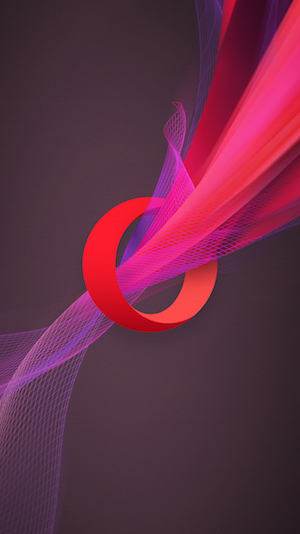
Opera introduces new logo and brand

Opera is off to a fresh start with its new logo, which comes accompanied by a revamped brand philosophy that better aligns with the company’s current endeavors. As it goes with any re-design, the Opera definitely put a lot of effort into making all the right decisions, so let’s tell you a bit about what’s going on here.
It’s still an “O”, but it’s much more than that!
Opera didn’t want to go too far off its original branding. After all, they need people to recognize that familiar “O” we have all grown so accustomed to. What they did is make it more three-dimensional and added intricate designs going through it.
The idea was to have the “O” look more like a portal. Opera is no longer just a simple browser. They envision themselves as enablers who give you access to content, answers, communication, fun, data savings and other online experiences. This is why the “O” ressembles a portal or gateway, and there is a stream going through one end, then materializing through the other.
By the way, this is the same reason why they got rid of the word “Software” in their logo.
How it came to be
The new image of the company was not only put together by their in-house creative team. Opera also called in DixonBaxi and Anti. The former worked on the global brand and creative strategy, while Anti was in charge of the visual identity.
When will we see the new branding in products?
It will take a bit of time before Opera can spread its awesome new branding all over the web, but they are definitely working on it. The new icon will be coming to Opera Mini for iOS and Windows Phone today (wait… what?!). Their advertising medium, Opera Mediaworks, is also adopting the improved design right away.
The rest of Opera’s family of apps will get the same treatment in the “next few months”. They will start with Opera for Android, Opera Mini for Android and Opera for PC. Opera Max and Opera Coast will follow soon afterwards.
What do you guys think? Are you liking the new logo and branding? I think it looks pretty snazzy! Oh, and Opera wants to make sure those who don’t have access to the new branding get some love in the meanwhile. They have released a couple wallpapers for your PC or your smartphone. Enjoy!

Google asks academia to help advance Cardboard VR research

Google announced its Cardboard VR headset basically as an afterthought at the end of its 2014 I/O conference, but since then the platform’s grown into a viable means of experiencing virtual reality. Much like its peers have done in the past, Mountain View is reaching out to academia to submit research proposals that’ll hopefully advance the medium. According to the project’s Google+ page (naturally) the team’s looking for research in areas including immersive audio; optics and displays; computer graphics and rendering and user input technology. Interested? You’ve got until October 15th to make your submission.
Source: Google Cardboard (G+)
The Dark Energy Spectroscopic Instrument will 3D map the universe

The quest to better understand our known universe took a step in the right direction today with the U.S. Department of Energy approving “Critical Decision 2,” authorizing the building of components for the Dark Energy Spectroscopic Instrument (DESI). Previous efforts to create Dark Energy maps will be further explored with the help of the DESI, a giant instrument that will target 30 million galaxies and quasars to create a 3D map that will date back 10 billion light-years. The project, spearheaded by the University of Michigan, is being conducted to understand the fundamentals of Dark Energy, a force that competed with gravity to shape the universe in its infancy.
“DESI will help us understand the fabric of empty space,” noted Gregory Tarlé, UoM physics professor. DESI will work by measuring the redshifts of millions of quasars and galaxies. A redshift is the shift of an astronomical body and to measure said shift is a determinate of an objects age. The bigger the redshift, the older the object. The DESI will be able to measure an object’s spectral wavelengths using a camera that contains 5,000 optical fibres. It will then use fossil imprints of sound waves from the first 400,000 years of the universe that are detectable as temperature patterns and variations and use these temperature differences to map early variations of density that eventually evolved into visible galaxies.

R. Lafever and J. Moustakas for the DESI Collaboration, background image by Dark Energy Camera Legacy Survey
A team of 200 physicists and astronomers are collaborating as the DESI collective, working to get the Spectroscopic Instrument up and running by 2019. To read more about the project, you can visit the official site for the DESI.
[Image credit: inga spence / Alamy]
Source: Berkeley Lab
Tronsmart’s trio of Quick Charge 2.0 chargers for all of your charging needs
With the passion and precision our singular focus here at Tronsmart, our Tech Geek team (designers) can spend months of research to better understand a new product. The process is repeated over and over again until the product is perfectly refined. By putting themselves in the customer`s shoes each and every component of a product is discussed, down to the tiniest detail, until the team believes it is complete. – Tronsmart
It’s rare to find a company these days whose mission statement matches their products. Tronsmart is one of those companies where they let their hard work, dedication to perfection, and understanding their customer’s needs reflect in the products they make and distribute around the globe. I was recently afforded the opportunity to review three of their chargers: The Tronsmart TS-WC3PC Quick Charge 2.0 Rapid Wall Charger, the Tronsmart CCF2 Two-in-One Car Charger and the Tronsmart CCFC Type-C Car Charger.
I’m not one to usually put a lot of care into my chargers, but after a couple weeks of solid usage, I decided the one who put the care and attention to detail into my chargers was Tronsmart. They did the worry for me and produced three outstanding products that I have no doubt will serve as my day-to-day chargers for years to come.
Tronsmart TS-WC3PC Quick Charge 2.0 Rapid Wall Charger
The Tronsmart wall charger has three USB ports, two of which are dedicated to VoltIQ charging and the other is for Qualcomm’s Quick Charge 2.0. VoltIQ is Tronsmart’s smart technology which can automatically determine what kind of charge your devices need. As rapid as technology is developing, many people don’t realize those chargers from three or four years ago are not designed for today’s tech.
Many people have multiple devices in their household, from tablets to wireless speakers to older and newer smartphones. Sure those older chargers will work, but a charger from three years ago may take six hours to charge my Samsung Galaxy Note 5 but may charge my older LG G2 in three hours. In order to charge your devices quickly and efficiently, you need to use the proper charger, and rather than remember which of your ten chargers belongs to a specific device, Tronsmart solves your conundrum with VoltIQ.

The three port charger Tronsmart provided me with is well thought out. It wasn’t so large that I could not use the plug next to it, but it was large enough to power three of my devices. I had my tablet, wireless speaker, and wireless charger connected to it, keeping my wall outlet optimized. It’s a pain when you use two plugs for two devices these days. With VoltIQ, I was not running into issues like over-charging, heating issues, or slow charging. The charger is compatible with all of the devices from yesterday, today and the future. It will charge your Note 1-5, iPhone, Galaxy S6, Xiaomi Mi3, Xperia Z3, Z4, Z5 – you get the picture.
With Qualcomm’s Quick Charge 2.0 you can charge a Note 5 to 60% in less than thirty minutes. If you don’t have a Quick Charge 2.0 home charger, pick up one of these today. You can’t go wrong with the price, quality and technology. Tronsmart’s dedication to perfection is well represented in this TS-WC3PC Rapid Wall Charger.
Tronsmart CCF2 Two-in-One Car Charger and the CCFC Type-C Charger
I was fortunate and was provided with two car chargers from Tronsmart with their names listed above. The Tronsmart Two-in-One Car Charger is a Qualcomm Quick Charge 2.0 compatible charger with two USB outlets. It has one USB port for the quick charging, and the other is reserved for VoltIQ. It can support up to 36 watts between the two ports which means you can charge your Qualcomm Quick Charge 2.0 compatible device while your significant other charges their iPhone 6 both at maximum speed. No need to fight over the fastest outlet.

The other charger Tronsmart provided me with was the CCFC Type-C Charger with a fixed plug for USB Type-C devices such as the OnePlus 2 and the new Apple Macbook Pro. As much of a tech geek that I am, or that I think I am, I do not own a USB Type-C compatible device so I was not able to test this review unit. But by looking it over, I could tell without a doubt that this charger will be a daily charger once devices catch up to Tronsmart. It is nice to know that Tronsmart is ahead of the curve and offers a high-quality alternative to device manufacturers expensive chargers.
When I need to switch out my chargers next year for USB Type-C I know this will serve my needs.

Usage
Between the car and wall chargers, with Qualcomm’s USB 2.0 technology, I found myself giving my older chargers to a co-worker of mine at my primary job. These chargers performed just as expected, and with VoltIQ I no longer need to worry about my Note 5 taking six hours to charge on an old USB standard.
I moved the wall charger from my kitchen outlet to my bedroom outlet a few times just to get a feel of how it would hold up over time, and I didn’t hear one squeak or creak. I know this charger will last many years to come just like the car chargers Tronsmart provided me with.
Summary
Don’t waste your time looking for other smart chargers. Tronsmart has you covered and you can trust that they really do put their tech geeks to the test in ensuring their customers get the right product. Tronsmart is in the tech business for the long haul and their pride and hard work is reflected in their chargers. I look forward to reviewing other Tronsmart products in the future.
If you want to read about Tronsmart check them out at their website.
The post Tronsmart’s trio of Quick Charge 2.0 chargers for all of your charging needs appeared first on AndroidGuys.
Stanford researchers ‘cool’ sunlight to improve solar cell efficiency

A team of researchers from Stanford University have devised an ingenious means of boosting the efficiency of solar panels by exploiting a fundamental physics phenomenon. Solar panels lose efficiency as they heat up. Just as the top of your head radiates excess body heat as infrared light, the researchers have developed a translucent overlay comprised of patterned silica that does the same for solar panels. The overlay separates the visible spectrum of light (which generates electricity) from its thermal radiation (aka heat), effectively “cooling” the incoming light, radiating the heat away from the panel while allowing more photons to be converted into electricity. The team, led by Stanford professor Shanhui Fan, recently published their findings in the journal, Proceedings of the National Academy of Sciences.
“Solar arrays must face the sun to function, even though that heat is detrimental to efficiency,” Fan said in a statement. “Our thermal overlay allows sunlight to pass through, preserving or even enhancing sunlight absorption, but it also cools the cell by radiating the heat out and improving the cell efficiency.” According to the team’s tests, the overlay cooled the panels surface by as much as 22 degrees F and boosted energy production by 1 percent (a sizable efficiency jump in the world of solar energy production).
[Image Credit: Getty]
Source: Stanford University
