


Withings Body Cardio: A stylish scale for fussy health nuts
A scale is an odd thing to review. For one thing, it’s one of the few gadgets you have to be completely naked to test. It also sends you down a rabbit hole of fitness tech, with too many apps and too many connected devices that do too many things. The Withings Body Cardio scale is emblematic of that, giving you your heart rate, body-fat ratio, bone mass, water mass, the weather (!) and something you never knew you needed called the “pulse wave velocity.” Oh, and your weight.
However, Withings, now part of Nokia, aimed to make the Body Cardio as simple and elegant as possible in terms of both design and ease of use. And for the most part, the French company succeeded. Once the scale is set up, you just have to stand on it to get all that data, and it’ll look great in your bathroom or anywhere else. The petit problème is the $180 price tag, which makes it one of the most expensive scales on the market.

Designed by French partner Eliumstudio, the Body Cardio measures 13 by 13 inches and just 0.7 inches (18mm) thick, with a much more refined design than the company’s previous high-end model. The reason it’s that lean is that it doesn’t have any feet, which helps it work on just about any surface, including carpet. The tempered glass and aluminum body has a clean, dare I say Apple-like design, and the black or white models should blend in with most bathrooms. With a built-in rechargeable battery that goes nearly a year on a single charge, you don’t have to buy AA or AAA cells.
I set up the scale and Withings Health Mate app in about a half hour, but not without some fiddling and an aborted attempt. During installation, it also installs the MyFitnessPal partner app. Not counted in that time is getting both Withings and MyFitnessPal to play well with Google Fit. Doing so enabled me to send exercise data from my Samsung Galaxy S6 Edge (and LG R watch) to Withings and import my weight, body fat other vitals into Google’s ecosystem. It also works with Apple’s Health app.

Once the setup is over, using it is simple: Just stand on the scale. Depending on your preferences, it gives you your weight, fat mass, total body water, bone mass, muscle mass, heart rate and the weather forecast (that’s pretty handy in the morning, actually). The more data you want, the longer the weighing sessions take. As for the vaunted “pulse wave velocity,” you have to stand on the scale five times before you get your first measurement, and it only shows the figure on the Withings app.
So what is pulse wave velocity? It’s the speed that your blood flows through your arteries, and supposedly a good indicator of your cardiovascular health. If the velocity is slow and regular, it means your arteries are flexible, and when they’re stiff and unhealthy, the speeds will be higher. The scale calculates PWV by measuring when blood is first ejected from your heart. The electrodes measure when it arrives at your feet and, knowing your height, can calculate the pulse speed. (You can’t turn the electrodes off, so the scale shouldn’t be used by pregnant women or folks with pacemakers.)
Withings tested the PWV against instruments used by cardiologists and found a “good correlation.” It’s not meant for clinical use, of course, as the FDA merely classifies it as a “wellness device.” Nevertheless, a high PWV could provoke some folks to see a doctor and possibly nip a serious issue in the bud.

The Body Cardio is a very accurate scale (it even takes the gravity at your location into account) and pegged my weight to within 0.2 pounds nearly every time. The bone, fat and water composition measurements were also consistent. Consistency is good, but bear in mind that impedance scales are notoriously inaccurate at gauging body fat.
My heart rate varied a lot, going from 55 bpm during one measurement up to 100 bpm in another. If I was extra careful to keep my feet in exactly the same spot on the scale, the range tightened up a bit, but still varied as much as 15 bpm. Withings told me that it’s normal for that measurement to vary because just standing up can make your heart rate jump considerably. However, after checking my pulse with my finger and a stopwatch, it’s clear that the device often misread it.

The pulse wave velocity measurement is taken independently of your heart rate and gave me consistent readings between 7.2 and 7.9, which is supposedly normal, though not optimal. Withings doesn’t give a lot of information about how to improve that, other than obvious things like exercising more and eating better.
However, the company’s researchers and doctors will study (anonymous) user data, compare it with other health factors, like activity level and diet, and eventually use those statistics to help users improve their health. Of course, Withings was recently purchased by Nokia and put in charge of its health division to compete against Apple, Google and other companies. So the Body Cardio will no doubt help it conduct research on cardiovascular fitness and other health factors.
The Withings app connects to the Body Cardio via Bluetooth, and if you connect the scale to your WiFi network, it will upload the data sans phone. You can then track and graph your progress to a T, either on your phone or a computer. If you also use MyFitnessPal and Google Fit or Apple Health, and a handset, fitness tracker or smartwatch, you can compare how exercise and diet affect your weight, BMI, pulse wave velocity, et cetera.

All that data is cool, but I prefer to just watch what I eat, exercise regularly and then weigh myself once a week to see if it’s working. And while the scale was consistent with most measurements, it often misread my heart rate (many smartwatches and trackers also fail in that are). I’d be more tempted by Withings’ Body scale, which launched along with the Body Cardio. It’s similarly sleek and gives you all the same data, bar the pulse wave velocity and heart rate, for $130.
If you’re not one to quibble over $50, the Body Cardio easily looks like it’s worth $180 thanks to the elegant, low profile design. And it delivers more health data than any other scale — which should put it high on the list for committed fitness junkies.
FirstBuild Prisma Cold Brew coffee maker First Take Release Date, Price and Specs – CNET
If you love coffee in its many delicious forms, then you’ve probably had the pleasure of drinking cold brew. This concentrated java drink is known for its sweetness, lack of bitterness and rich flavor. Making cold-brew coffee though takes a lot of time, at least 12 hours using traditional methods. Not so if you use the $299 Prisma Cold Brew Coffee Maker which its designers promise can whip up a carafe of the stuff in just ten minutes flat.
The Prisma was dreamed up by the engineers at GE’s FirstBuild Microfactory, the same group who brought to life the unique Paragon Induction Cooktop and Opal Nugget Ice appliances. According to FirstBuild, the Prisma is another example of its unconventional design and smart applied science providing real-world solutions consumers clamor for.
Get cold-brewed java fast with the Prisma…
See full gallery


1 – 2 of 6
Next
Prev
Fancy drip facade
At first glance, the Prisma looks very much like a standard home drip coffee brewer, admittedly an expensive one judging by the premium copper and glass materials in its chassis. Keep in mind, the Prisma units I looked at in person were a series of engineering prototypes, some functional and some not. That said, FirstBuild explained that what I saw is very close cosmetically to what customers will likely be able to purchase.

The Prisma almost looks like a fancy drip brewer.
Tyler Lizenby/CNET
The machine has a tall, hourglass shape with a flat top, and a wide upper body which tapers inward at its center then widens back out again toward the bottom. Up top under its flat lid is the main brewing chamber, which contains a metal retainer. At first I incorrectly thought the retainer was a regular filter basket — the sort you find in conventional drip coffee devices.

The bottomless retainer drum holds the paper filter in place.
Brian Bennett/CNET
In fact the retainer is really a bottomless drum perforated with large holes and is meant to stabilize paper filters (which you place under the retainer) within the brewing chamber. To make a batch of cold brew, put coffee grounds and water into the chamber, close the lid, then press a circular button on the Prisma’s base. Ringed by a color-shifting LED, the button will also glow in varying hues depending on the Prisma’s status (actively brewing, standby, etc.).

The button glows in different colors.
Tyler Lizenby/CNET
Cold-brewed via vacuum
There are many methods to make cold brew coffee but most involve immersing coarsely ground coffee beans in room temperature or chilled water. Compared with hot brewing, this style of steeping is low energy so is much slower. Instead of the four to six minutes a drip machine uses to makes pots of fresh joe, basic cold brew requires at least 12 hours to concoct. There are other techniques to speed up the process such as brewing your coffee in a pressurized vessel, for example a kitchen whipping siphon, which you place in the fridge.
The Prisma Cold Brew takes completely different approach. This appliance uses a vacuum pump inside its base to degasify water within the brewing chamber. FirstBuild engineers say the treatment greatly increases the solubility of coffee compounds in the Prisma’s water tank, or rather the efficiency of its water supply as a solvent. Apparently this is precisely how the contraption can produce cold-brewed coffee in a fraction of the time simple steeping requires. Another factor aiding the Prisma’s ability to extract coffee is that it’s made to brew finely ground beans. A smaller grind increases the surface area of the coffee grounds, which further ups its solubility in water.

Cold brew is collected in a snazzy glass carafe.
Tyler Lizenby/CNET
As for how the Prisma’s cold-brew quality stands up in real life, I’ll withhold judgment until I get my hands on the final version. I can say that what I tasted in person at the FirstBuild facility wasn’t bad, especially knowing it was made in an amazingly brief ten minutes. Still, the coffee used to prep these drinks was lighter roasts. I prefer to make my cold brew from darkly roasted beans, which tend to have more earthy, chocolate notes.
Home cold-brew addicts looking to score a Prisma Cold Brew Coffee Maker for themselves will have to be patient. While FirstBuild will launch a crowd-sourced funding campaign through Indiegogo in July 2016, the product isn’t expected to reach ordinary shoppers until the summer of 2017.
More facts about the Prisma Cold Brew coffee maker
- Makes five 5-ounce cups (750 ml) at a time
- Able to brew in a range of water-to-coffee ratios
- Will have Wi-Fi and its own mobile app
- Includes a premium glass carafe
iPad Mini 4 review – CNET
The Good Compact size, vivid display, works with split-screen apps in iOS 9. Basically, a shrunken-down iPad Air 2. Perfect hand feel for vacations.
The Bad Price is high for an 8-inch tablet. Slower graphics mean some apps and games don’t feel as zippy. Small screen makes for cramped typing and multitasking.
The Bottom Line Unless you’re absolutely in love with the iPad Mini 4’s smaller size, opt for the faster, larger, identically priced, and still pretty portable iPad Air 2.
The iPad Mini 4 is a tinier, slightly less powerful iPad Air 2. That’s basically all you need to know about this tablet, the 7.9-inch screen model which has been available since October 2015. I started sitting down the Mini 4 again, carrying it around every day in my bag, reading books — even using it to do work. This, after using Apple’s 9.7-inch iPad Pro as my general new go-to tablet. I even wrote this review on it. Which…wasn’t fun.
In a world of larger phones and more-capable hybrid laptops and tablets, the iPad Mini feels less relevant than it used to. And while it’s the best of Apple’s small iPads, with a still-really-nice design, it’s not the tablet I’d choose to carry around anymore. And Apple’s iPad pricing no longer favors it.
Since I first reviewed it last year, Apple has adjusted the pricing in its iPad line, pitting the iPad Air 2 as an identically priced alternative. And with that value change in mind, I wanted to ask the question: Is the Mini 4 a tablet you should still consider?
To that end, here’s what you should know.
 View full gallery
iPad Mini 4 next to the Air 2.
Sarah Tew/CNET
It’s the more powerful, better featured of Apple’s two Mini iPads. Compared to 2014’s iPad Mini 2, the Mini 4 has a better screen, better camera, faster processor and a Touch ID fingerprint sensor. (According to Apple, the 4’s CPU is 1.3 times faster, and its graphics performance is 1.6 times faster than those of the Mini 2.) It can also handle split-screen apps, which can come in handy for checking email or Twitter while working. It’s not my favorite iPad. But if you want something small, this is the best option.
It’s slower than the iPad Air 2. The iPad Mini 4 has nearly the same specs as the larger Air 2 — except for its graphics processor, which is more than one-third slower. You can feel it when playing some games (the frame rate is a little slower on some titles), and even when switching apps. Things that feel a little more buttery-smooth on the Air 2 don’t always feel as zippy here. And while it has 2GB of RAM, multitasking doesn’t feel as snappy or responsive as it should for a year-old tablet. It’s a good tablet. It’s not a great one.
The battery life’s not quite as good as the other Mini. Apple has two iPad Minis, but if you care about the longest battery life, get the Mini 2. Apple claims 10 hours across all its iPads, but the actual results on our video-playback tests in airplane mode show some differences. The Mini 4 lasted 9 hours 34 minutes. The Mini 2 lasted 11 hours, 20 minutes.
2016 Cadillac CT6 review – Roadshow
The Good The 3.6-liter twin-turbo engine, adaptive suspension and lightweight chassis work together to deliver a surprisingly fun drive. The rear camera mirror, OnStar LTE with Wi-Fi, an HDMI-sourced rear seat entertainment system and Android Auto and Apple CarPlay combine to make the 2016 Cadillac CT6 the most tech-forward Caddy in the fleet. The Bose Panaray audio system delivers both fantastically immersive sound and fantastic value.
The Bad The rear camera mirror takes a lot of getting used to; some drivers simply won’t like it. The CT6’s eight-speed automatic transmission’s shifts weren’t as smooth as we’d have liked at low city speeds.
The Bottom Line Lighter and more high-tech than you might expect, we like the direction that the 2016 CT6 takes the Cadillac brand. The luxury sedan makes a strong first impression, but faces stiff competition in this highly contested class.
When most people think Cadillac, they think of massive, classic luxury sedans with boat-like handling and supersmooth rides — or they think of the behemoth Escalade. Either way, Cadillac usually equals big. Which is why it’s weird that the brand’s newest flagship is so compact. Well, compact for Cadillac, that is.
Make no mistake, the 2016 Cadillac CT6 is still a large sedan in every sense of the word, but its 122.4-inch wheelbase sits about 2 to 4 inches below the BMW 7 series and Mercedes-Benz S-Class. Meanwhile, the Caddy’s 3,657- to 4,700-pound curb weight is hundreds of pounds lighter than its direct competitors and more in line with the smaller 5-Series and E-Class models. Straddling classes as it does, either Caddy’s carved out a unique niche for its flagship or it is making excuses for being the runt of the litter.
I spent a few days with the new CT6 to figure out which is more likely.
The driven: Backseat comfort and amenities
My experience started in the backseat with a chauffeured ride from the Los Angeles airport in a fully loaded CT6 Platinum.
The sedan offered plenty of leg and headroom on the second row and was equipped with the Platinum model’s optional recline and massage rear seats. Of course, the right-rear bucket is the best seat in the house when so equipped, thanks to there usually being more legroom for reclining behind the unoccupied front passenger seat in a chauffeur situation. There’s ample space, but this is no Maybach S600, so you probably won’t be getting the full recliner experience. Think premium cabin or exit row seat on an airliner, but not quite first class.
Cadillac has stated that it has no intentions of building a long wheelbase CT6 to compete with the longer variants of its competitors, so it will be interesting to see if the brand will eventually add an even larger luxury flagship later or commit to this more compact Caddy.

Pair your own Google Chromecast (seen here) or Amazon Fire Stick with the onboard 4G LTE to transform the rear-seat entertainment into a streaming hub.
Antuan Goodwin/CNET
While being driven, I was treated to the optional rear-seat entertainment system with dual power retractable seatback screens with tilt controls. Wireless Bose headphones provide discrete audio to the second row, or wired connections lets passengers bring their own cans. A Blu-ray player up front can be tapped as a rear-seat video source, as can a rear HDMI input.
I didn’t bring my Blu-ray box set of “Fast and Furious” movies along, but someone at Cadillac was clever enough to have outfitted my car with a Google Chromecast. You see, in addition to the HDMI input, the CT6 is also equipped with about six powered USB ports for gadgets and a standard 4G LTE-enabled in-car Wi-Fi network. Plug a $35 Chromecast into the HDMI and USB, connect it to the car’s Wi-Fi, and the rear seat entertainment suddenly becomes a streaming media hub. Cadillac has no official partnership with Google — it just wanted to demonstrate the sort of things a passenger could do with the tech onboard. The Amazon Fire Stick is also confirmed to work and, in theory, so would an Apple TV or any other streaming device that can use Wi-Fi and HDMI.
Cadillac claims that the CT6’s aluminum and steel construction techniques make this the stiffest and quietest Cadillac ever.
I noticed that the CT6’s ride is firm, but not uncomfortable. The bumps and potholes of downtown Los Angeles made themselves apparent during my ride and were pronounced enough that I found it difficult to make written notes. However, there was no edge to the bumpiness and no discomfort; I’d call the ride firm, but controlled. My assumption was that the CT6 was striking some balance between handling and comfort, but from the rear seat I wasn’t able to confirm. To be fair, it’s possible that my driver for this segment had the Magnetic Ride Control in its Sport setting rather than the more compliant Touring, but I neglected to ask. With my notes messily made, I queued up some YouTube clips and settled in for the ride.
The driver: Handling and performance
On day 2, I found myself in the the driver’s seat on twistier roads and could better experience the balance of handling and comfort. I enjoyed the responsiveness of the suspension and the steering, the latter being helped by the presence of rear wheel steering.
Cadillac’s Active Rear Steering turns the rear wheels up to 3.5 degrees opposite to the fronts to tighten the turning circle by a claimed 3 feet — Caddy claims the CT6 will match the BMW 5 Series’ turning radius despite being about 8 inches longer. At high speeds, the rears steer up to 2.75 degrees in concert with the fronts to reduce yaw during lane changes and increase highway stability. Through rear steering, Cadillac claims that it can offer the nimbleness of a much shorter car and the high-speed stability of a long wheelbase while keeping the CT6’s physical length in a sweet spot that is urban-friendly.
Active Rear Steering works in concert with the optional Magnetic Ride Control adaptive suspension, the optional all-wheel drive system, transmission and power steering systems — featuring sport and touring drive mode settings that change the attitude of the vehicle at the touch of a toggle. Put all of that under a lightweight, stiff chassis and things start looking good for the big Caddy.

Available active rear steering, magnetic ride control and all-wheel drive help the CT6 handle like a much smaller car.
Antuan Goodwin/CNET
In practice, however, blitzing a series of switchbacks on a mountain road is not really the aim of this or any big luxury sedan. Thankfully, Caddy’s done a good job of managing the inherent handling limitations of a car this big and delivered a great ride, all things considered.
The sedan handles a corner much better than I expected it to. The CT6 settles into sweeping bends nicely and offers quite good grip. On tighter, more technical bends I was able to push just a little bit harder than would be proper for a vehicle of this size before it started to push back, and I was impressed by the responsiveness and seat-of-the-pants feedback.
The power: Two turbocharged engine options
The new CT6 is available with three different engine options. At the entry point is 2.0-liter turbocharged four-cylinder engine that is, frankly, surprising to see in a vehicle of this size. Outputting 265 horsepower and 295 pound-feet of torque to the rear wheels via an eight-speed automatic transmission, the CT6 2.0T is also the lightest configuration.
I was totally prepared to be underwhelmed, but was pleased to find that this little engine more than exceeded my performance expectations. The throttle is very responsive, and the transmission always seems to be in just the right gear to deliver respectable levels of torque for passing and accelerating. Coming in at about 3,800 pounds with me in the driver’s seat, I was also able to best experience the CT6’s excellent handling in this configuration. With sweeping curves and little traffic, I really appreciated the 2.0T’s midrange torque, quiet operation and off-the-line responsiveness. However, the engine started to feel a bit taxed during a steep uphill climb, which made me wonder if I’d be having nearly as much fun with a full complement of passengers and luggage.
Next in line is the midrange 3.6-liter V-6, a naturally aspirated engine that features an anti-idling auto stop-start system and variable displacement tech. That last bit means that the engine can deactivate two of its cylinders during light-load operation, such as highway coasting downhill, and effectively operate as a V-4 engine to save fuel. I was not able to test this 335 horsepower, 285 pound-foot configuration, opting to jump to the top trim for the final leg of the trip.
I dare say that this is the most Audi-like Cadillac that I’ve ever driven
The top trim is a 404-horsepower, 400-pound-foot twin-turbocharged V-6 option displacing 3.0 liters. This engine is mated with an eight-speed automatic transmission that sends torque to the road via Cadillac’s all-wheel drive system. Around town, this engine just feels more confident and effortless than the four-banger and has a slightly more pronounced exhaust note that is much more pleasing to the ear. The additional weight of the all-wheel drive system is noticeable when cornering and doesn’t really add much to the handling.
However, the all-wheel drive does aid in making sure that the 404 ponies reach the road as efficiently as possible. Stomp the right pedal and the sedan simply launches. What I like most about the 3.0TT is that its performance is accessible and immediate. The eight-speed automatic’s downshifts are lightning quick, allowing the CT6 3.0TT to go from cruising to passing in a heartbeat and into triple-digit speeds if you’re not careful. Whether in the automatic Sport mode or while fingering the manual paddle shifters, I was able to have some real fun with so much power on tap. All the time, the CT6 felt stable and safe; its handling light and surprisingly nimble, but never squirrelly.
Fuel economy for the CT6 peaks at 22 mpg in the city and 31 on the highway for the 2.0-liter turbo and is at its lowest at 18 city and 26 mpg for the naturally aspirated 3.6-liter engine. The 3.0TT also features the same auto stop-start fuel saving tech as the 3.6-liter and the first implementation of variable cylinder management on a twin-turbo engine. Additionally, it only sacrifices one highway mpg when compared to the midtier model.

The 2.0-liter turbo is a surprisingly good little engine for the big CT6, but the 3.0-liter twin-turbocharged V-6 boasts the best passing power.
Antuan Goodwin/CNET
The Cadillac’s eight-speed automatic transmission, which served so well on the highway and during spirited driving, may have been the source of one maddening little annoyance that reared its head at lower, city speeds. When slowing, just before coming to a stop, the vehicle would jerk or shudder slightly. At first, I thought it was the auto stop-start system or the variable displacement system, but experimentation seemed to indicate that it was the transmission oddly timing one last downshift at the root of the unrefinement. It’s a small annoyance, but a persistent and very un-Cadillac one that seemed to happen at every traffic light. Interestingly, I don’t remember this being an issue during my initial testing, I only noticed it during the week of extended testing around our home offices, so maybe the shudder was unique to that example.
LG G5 Review: modular marvel or bold blunder?
2016 has so far been a year of impressive flagship phones with perhaps the most unique of the bunch being the LG G5. LG was coming off a year of success with two wonderful flagships (the G4 and V10) receiving rave reviews. Many speculated that the G5 would be a fusion of the two devices – stealing the most innovative features of the V10 but in a smaller, easier to handle body.
What we got was something completely different. As early as January, we brought you news that the G5 was going to have a metal unibody that pulled apart at the bottom and featured a removable battery. No one has ever tried this combination before and our interest was piqued. More news leaked about a “magic slot” that would allow users to expand the phone’s functionality with modules. This was truly something new and unique to the market. We’ve seen some of this functionality in beta devices from Project Ara (now named just Ara), but never in a consumer device.
What we got was controversial. Is it metal unibody? Sure is, but it doesn’t remotely feel like it. Does it have a “magic slot”? Yep, but how much it expands the functionality of the phone is debatable.
The G5 matches up in terms of specs with every other flagship on the market, but phones are more than a sum of its parts. What matters is how those chips and that silicon perform and how engaging and easy to understand the software is. LG has had issues with these areas in the past, and they’ve held LG back from challenging Samsung for supremacy in the Android market in the United States. Can the fifth iteration of the G series finally make the leap from also-ran to front-runner?
Software
LG has always deployed one of the heaviest skins of any of the Android OEM’s currently producing flagship phones. This hasn’t changed for the LG G5. Actually, not much has changed from the LG G4’s software, to be honest. This year’s model does ship with the most recent version of Android 6.0.1 Marshmallow, but unless you were looking in the settings, you could be forgiven for not knowing that. There are little enhancements that Marshmallow brings present in the G5, but you’re going to get almost the exact same experience on last year’s G4.

The most notable change in LG’s software is removing the Application Drawer on the default launcher. I did receive an update during the review process that enabled a Home + App Drawer launcher, but for the first week or so, I was stuck without it since I wasn’t using a third-party home replacement like Nova Launcher.
Removing the Application Drawer is a bold move, and I honestly hated it. I have no idea what the purpose of such a move would be other than to be more like Apple. Throwing over 100 applications into folders and hoping I remember where I put them is not a fun experience. It doesn’t lend to finding an app quickly, which is very frustrating when you’re pressed for time.
I hope LG got this out of its system and never tries it again. If I wanted to put every application on my home screen, I could already do that. Forcing me to goes against what Android is all about: choice.
I miss the app drawer
1 of 3


Luckily when I was living an App Drawer-less life, there wasn’t too much bloat to worry about. I am using an unlocked, unbranded version so there are no carrier-installed applications on the phone, but the suite of apps from LG wasn’t excessive. I had no use for apps like LG Friends manager, LG Health, Music, Quick Help, QuickMemo+, QuickRemote, SmartWorld, Tasks, but they were quickly hidden in a folder that I could forget about on a distant home screen.
Kudos to LG for not loading down the device with uninstallable crap from third parties. Android OEMs like to sign commercial deals where they add apps like Yellow Pages or Facebook to the phone to drive up profits, and I like that LG hasn’t sunk to that level.
Another huge win for LG is the quality of life improvements they made to the software. The ability to customize the navigation bar at the bottom of the phone is just smart. Not only can you choose on which side of the home button you want the back and recent apps buttons to be located, but you can add buttons for the QuickMemo+ app and one to drop the notification shade so you don’t have to reach the top of the phone. This is one of my favorite little features on any Android phone out there. LG has been including these options in its phones for a while now, and I hope it continues until Android makes them irrelevant.
You can see Marshmallow poking its head through occasionally. LG decided to keep the stock recent apps screen basically completely stock – clear apps button included. There’s also an always-on display that LG talked about a lot at its Mobile World Congress press conference that shows the time and some notifications. It’s a nice feature that I appreciate, but it’s nothing I think should influence your buying decision. This feature is becoming standard on most phones these days – the Samsung Galaxy S7, Moto X, OnePlus 3, and Nexus 6P all have various forms of this – and the inclusion of an LCD screen means that the G5 has to keep the entire screen on for this always-on display. It’s not ideal in its implementation, and I honestly don’t miss it when I’m not using the G5.
The puzzling choices LG made continue past using an LCD panel for an always-on display. The Settings app is a complete mess. The tabbed layout is confusing and frustrating. There is a reason that most phones use a longer list layout, and LG needs to get the memo that it’s a superior option. In fact, if it could use the stock Android settings menu and just add in the options it needs, do that. Google has made it pretty easy on OEM’s by including a great Settings app in AOSP, and yet, they keep screwing it up somehow.
LG seems to put a lot of effort into its software to make it a true selling point. There are some great little features that no-one knows about like the phone composing a ringtone based on the number calling you. That’s not a feature that is going to make your life easier on a day-to-day basis, but it’s something innovative that people will love. It’s cute. I wish LG would focus on features like this instead of theming every inch of the OS with its own brand of color vomit. Stop messing with things that already work just to make them different.
Performance
The LG G5 has a Snapdragon 820 processor clocked at 2.15GHz with 4GB of RAM and an Adreno 530 GPU. This is the standard loadout for a flagship phone released in the first half of 2016, which includes the Samsung Galaxy S7, HTC 10, and LG G5.
As much as I complained about the software in the previous section, this set of hardware is easily able to power through it. LG had been notoriously bad about its home screens redrawing every time you hit the home button on the G4, but luckily I’ve never seen that happen in the several weeks I’ve spent with the G5.
There are no lags in long menus or the recent apps window and zero stutters when swiping through home screen pages. App loading times are on par with the Samsung Galaxy S7 Edge, with maybe the slightest advantage going to LG, but it’s nothing that you’ll notice unless you have the two phones sitting right next to each other.
Consecutive AnTuTu Benchmark runs
1 of 4
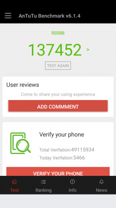

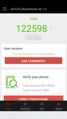

Since the G5 has a top of the line processor in it, expect it to power through extremely difficult tasks like 3D games and video editing. We’re living in 2016, and phones have gotten to the point where there is almost nothing you can throw at a flagship device that it can’t handle.
Benchmarks are always being blown up by the next generation of devices because of the giant leaps being made by companies like Qualcomm, and the G5 is no different. You can put it up against any device from last year and it’ll crush it. Will you see that performance gain in day-to-day use? The all depends on how you use your phone, but you shouldn’t be scared off from the G5 because you think something else can power through difficult tasks better. Everything is amazing these days.
Where you may run into some issues is with connecting to calls. I consistently had issues with phone calls taking forever to connect once I hit send. I am using T-Mobile in an excellent coverage area so there should be no issue. Tested next to other flagship devices, the LG G5 had significantly longer lag times between hitting the dial button and the phone beginning to ring. I don’t know where the issue is coming from. I think I can rule out T-Mobile because I tested it against other unlocked devices, but this just seems like a weird bug. Calls sound wonderful on both my end and the recipient once it actually connects, but I hope that LG is working on a fix for this because it was one of the most annoying issues that popped up while testing the G5.
The G5 does have one thing that most phones of today don’t, a removable battery. I consistently applaud OEM’s for including removable batteries in their devices due to the demands consumers are putting on their phones. The 2800mAh battery is smaller than last year’s flagship and it shows in the life, unfortunately.
Time and again I had trouble passing three hours of Screen on Time. I’m not one who pushes my devices to the limit so those three hours were filled mostly with listening to music with Google Play Music, reading Reddit, and the occasional glimpse at Facebook along with the normal calling and texting. To say I was disappointed would be a bit of an understatement.
To engineer a device as forward thinking as the modular G5 to have it only have it held back by terrible battery life is frustrating. I used to have to charge my phone multiple times a day in 2014, I don’t expect to do so in 2016. At least I can trade out the battery or use quick charging around lunch to get through the rest of the day.
Screen on Time
1 of 4

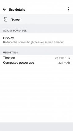


Quick Charging really does save this phone. The G5 actually has the latest in Quick Charge 3.0 which will let you charge up your device about 60% in 30 minutes. If you get an hour for lunch and keep your phone on the charger while eating, you should be good to go for the rest of the day. It’s just disappointing how much I had to utilize this feature. You’ll notice the battery drop especially quick during intensive tasks like heavy games. During setup (installing all my applications and setting them up the way I want) the battery dropped from 78% to 16%. That is a pretty ridiculous drop for the little over an hour it took to get the phone up and running.
Screen

LG brings back another 2560 x 1440p display for the G5, which is now the standard for flagship phones in 2016. Whether you need all of those pixels is still being debated on message boards and in comments sections of reviews like this, but the truth of the matter is that we’re never going to go backward on resolution. It’s a selling point and people want the biggest and best, and higher numbers rule the day.
The fact of the matter is that the display on the G5 is nothing wonderful. Sure, it has a ton of pixels, but it does tend to skew blue and colors simply don’t pop like on Samsung devices. Samsung tends to over-saturate colors and has a superior contrast ratio due to using AMOLED displays, giving it a huge advantage.
The inclusion of an LCD display of the G5 is disappointing if I’m being honest. The always-on display begs for the battery friendly AMOLED display if nothing else. I think LG also overdid it with the auto-brightness again; this is an issue I’ve had with the G3, G4, and now the G5. It doesn’t matter how good the display looks if it’s never lit up high enough to actually see it clearly. Even at max brightness, the G5 cannot compete with other phones on the market.
While the display does have good viewing angles, we would like to see the ability to adjust the display levels and white balance through software. Unfortunately, it’s simply lacking from the phone. There’s also an issue of backlight bleed when the screen is dark that won’t bother you much, if at all, but is present.
Camera
The camera is much like the display, there are a lot of big numbers and plenty of fancy marketing lingo, but it doesn’t blow away its competitors like LG might have hoped. This year we got dual cameras: a wide-angle camera set to capture more of the world around you and a regular field-of-view camera meant to capture more true to life pictures.
The regular camera can shoot up to 16 MP, which is about standard for 2016, while the wide-angle camera sacrifices some megapixels (it tops out at 8MP) to gain the desired effect.

Both cameras are really good. They take comparable pictures to others on the market, but we’re getting to the point in mobile photography where almost everything is fine for what we end up using the pictures for, social media and sending picture messages. Is this my first choice for a camera on a phone? Nope, but it got the job done just fine.
1 of 2

Default Camera

Wide Angle Camera
The camera does tend to bring in lots of light. This is great for those low-light situations that tend to make up many pictures, but can have an adverse effect in well-lit pictures. Luckily, there is a robust manual mode that will let you decide exactly how bright you want the picture to be before you ever snap it.

Pictures provided by our own Josh Noriega. Check out his Flagship Phone Camera Shootout to see how the G5’s camera stacks up against the Samsung Galaxy S7 and HTC 10.
Hardware
The body of the G5 is made out of metal. It doesn’t look like it, and it certainly doesn’t feel like it. There was a controversy when the phone first came out that most reviewers were calling out LG for not actually producing a metal phone.
It was eventually confirmed that LG has covered the body of the phone with a coating to hide the antennas and thus giving a false impression of the phone being made out of plastic. Whatever the reason for, it still doesn’t change the fact that it just doesn’t feel great in the hand. The size is good, but it doesn’t feel like metal, which is really what you want if you’re buying a metal phone.

We’re seeing a bit of a resurgence of phones that feature the microSD card. Both the HTC 10 and the Samsung Galaxy S7 feature the card slot, and LG follows suit with an expandable storage slot of its own. You can expand your storage up to 256GB, and even though adoptable storage isn’t enabled out of the box, it’s only an easy command prompt away.
Part of the advantage of being a modular phone is the removable battery that LG placed in the G5. The 2800mAh battery is smaller than competitors and previous LG flagships, and it shows. As I discussed previously, battery life isn’t great, but you can buy an extra battery to easily swap out when you get low.
Also, since the G5 features Quick Charge 3.0, you can get back about 60% of your battery in a half hour if you happen to be close to a wall outlet and have your charger on you. It’s not a perfect solution to sub-par battery life, but if I believe most people will get through the day on a single charge and a top-off before bed.
Audio output is a bit of a mixed bag. The bottom firing speaker isn’t great. It doesn’t get the loudest and can distort at higher volumes. If you’re often listening to YouTube videos or music in crowded places, you’re probably annoying other people anyway. If you’re using it for speaker phone, it should get you by.
The audio output from the 3.5mm jack is another story. It easily stacks up with the Samsung Galaxy S7 for best output on the market. It’s loud and puts out a quality sound. Props to LG here.

The last thing I want to touch on here is LG’s removable bottom and “Friends”. Having the ability to add in functionality is a great idea. I’ve never been so excited after a product press conference as I was after watching LG’s show at Mobile World Congress 2016. But I’m extremely disappointed in the practical usage of the phone.
The bottom of the phone slides slot, but there’s still a gap at the bottom. Not only that but on my unit, it doesn’t even line up correctly. There is a sharp edge where the phone should be flush, not to mention that the sides where the metal band meets the body is decently sharp too. It won’t hurt, but it is annoying.

I don’t believe LG’s Friends initiative provide enough functionality to justify the design choices it had to make. Right now, it’s a closed system with no real third party modules you can buy and everything that you can buy can easily be duplicated on other phones with different accessories. There’s nothing exclusive about the LG G5, and that’s a shame.
Conclusion
I’ve brought up a lot of negatives about the LG G5 in this review. Maybe I tend to skew toward the negatives because every phone is amazing these days. What really sets them apart is what they can’t do.
The LG G5 can do pretty much what every other phone on the market can do right now. It’s extremely fast and fluid, it takes fine pictures, you can expand the storage with low-cost storage, and charge up the battery incredibly quick.
Where I think LG took a huge misstep were the compromises they had to make for their modular body. Due to this design, it can’t be water resistant like the Samsung Galaxy S7, it doesn’t feel excellent like the hand like the HTC 10 and it isn’t cost efficient (likely to R&D costs) like the OnePlus 3. The functionality it adds is little more than a gimmick, and it gave up major selling points to do it.
Our thanks to B&H Photo for making this review possible!
2017 Mercedes-Benz E300 review – Roadshow
Jul 2016
The Good The 2017 Mercedes-Benz E300 is top of the segment in terms of technology. The small, turbocharged is gutsy enough for the target market, and the car cuts a sophisticated profile.
The Bad All the fun technology comes with a steep price tag over $10,000.
The Bottom Line The E300 is a high-tech machine with plenty of luxury features. The smooth ride and willing, although not eager, chassis make it a comfortable and pleasant midsize sedan.
Looking at a list of midsize luxury sedan manufacturers is like holding roll call for the UN. You can get your high-class on with the Japanese, British, Americans, Koreans or Swedes, but today we’re talking German luxury. More specifically, Mercedes-Benz richness in the form of the 2017 E300.
The E-class, long a top seller in the segment, routinely sells more than the BMW 5-series, the Audi A6 and Cadillac CTS. In fact, the only luxury sedan that sold more units in 2014 and 2015 is the Lexus ES. Deutschland, Deutschland almost über alles.
For its 10th generation, the E-class offers a whole new look and a massive amount of technology, adding good looks to affluent comfort, resulting in a sumptuous ride indeed. This overhaul likely won’t hurt its sales position.
Nerd alert
Mercedes-Benz calls the E-class the most intelligent sedan in the world, and while I’m not one for superlatives, it certainly is well on its way to autonomy. The Drive Pilot adaptive cruise control and semi-autonomous steering system can follow cars up to 130 miles per hour. What if you’re out on a dark, desert highway with no lead cars in sight? The E300 can read the speed limit signs and adjust the speed accordingly. Don’t worry speed demons. You can turn this feature off.

Chris Paukert/Roadshow
While not not perfect, the system does a good job of keeping your foot off the pedals while commuting. During heavy traffic the steering pilot pulled either extremely right or left, and at higher speeds it gently moved from side to side, instead of keeping me directly centered. Still it made my rush-hour voyage from San Jose to Monterey down the unpleasantly busy Pacific Coast Highway less stressful than usual.
The E300 can even change lanes for you when in Drive Pilot. Just signal your intention and the E300 will swing around the slower car, traffic permitting. However, it’s better to keep this assist to the straightaways. A left-hand lane change during the middle of a long right-hand sweeper confused the E300, but on straight sections of the highway it centered itself in the new lane just fine.
Save that squirrel!
I also got to experience Mercedes-Benz’s new evasive steering assist, though as a passenger, not as a driver. While barreling through the California countryside my drive partner and I came upon two squirrels who had decided the road was their turf. A flick of the wheel to the left and the system kicked in, offering extra steering torque to get us around the defiant rodents. One may think it would be easy for an experienced driver to overcorrect the computer’s correction, but we ended up perfectly centered in our original lane.
My turn to feel the computerized nannies of the E-class came on the freeway, when sudden traffic had me on the brakes quite firmly. Even though I had it all under control, the brake assist came on to give me a little extra boost so I stopped at least a foot away from the lead car’s bumper, and not merely inches.
A
totally
redesigned
Mercedes-Benz
E-Class…
See full gallery


1 – 6 of 30
Next
Prev
Other new safety features include Pre-safe Sound, which sends out a short burst of aural interference if a collision is detected. This interference triggers a protective reflex in the human ear, mitigating hearing loss in an accident. Further, if a lateral collision is detected the side bolster rapidly inflates, forcing the occupant towards the midline of the car to reduce the load of impact.
Look out, Virtual Cockpit
Mercedes-Benz adds some sweet technological advances to the E300’s infotainment system for 2017. A 12.3-inch LCD is standard in the center dashboard, but to my delight my test model had an additional 12.3-inch screen as the instrument cluster. Similar to Audi’s Virtual Cockpit, the layout of the screen can be changed to include radio, fuel economy or navigation information as well as different gauge layouts.
Sony Xperia X Performance review: $700 worth of disappointment
Oh, Sony. The company has tried time and again to craft a smartphone that would find success in the US, and time and again it has fallen short. But when Sony pulled back the curtain on a batch of new Xperia X’s at Mobile World Congress earlier this year, I allowed myself to get a little excited. Maybe these were the right phones at the right time, I thought, and maybe a company whose products I otherwise respected would find the foothold it was looking for. After being underwhelmed by the standard Xperia X last month, I still held out hope that the high-end Xperia X Performance would be the phone Sony needed.
Long story short, it’s not. Don’t get me wrong: It’s a serviceable device, and in many ways it’s actually very nice. The thing is, a $700 smartphone should be able to deliver some modicum of excitement to the person who owns it; the X Performance mostly just leaves me cold.
Hardware
Even though the X Performance is the most high-end of the four Xperia phones Sony plans to launch in the US, you wouldn’t be able to tell just by looking at it. In fact, do yourself a favor: Don’t put an Xperia X Performance down next to a regular Xperia X, because you’d probably never tell them apart. From the 5-inch, IPS LCD display up front to the 23-megapixel camera around back, these two devices are nearly identical. Well, until you spill a drink on them, at least. The X Performance picks up where previous Sony flagships left off with an IP68-rated chassis that helps it shrug off dust and water with ease, even when you stick it under a soda machine and let sticky stuff like Coke fly.

Beyond that (and as the name implies) we’re basically looking at an Xperia X with a faster quad-core Snapdragon 820. That has its ups and downs, though: The chipset, paired with 3GB of RAM, gives the X Performance flagship-level horsepower, but the phone still suffers from some irritating design quirks. For one, you’d think a modern flagship phone — one that costs $700, no less — would have a fingerprint sensor for quick and easy authentication. Nope! The international version has one, but we Americans have to do without. Meanwhile, the placement of the volume buttons beneath the sleep/wake button on the right edge just seems dumb. Unless you’re a professional finger contortionist, it’s really difficult to hold the X Performance in your right hand and turn the volume down. It might be a mainstay of Sony’s “OmniBalance” design language, but that doesn’t mean it’s not a bad idea.

It’s not all frustrating, though. The X Performance’s fit and finish are lovely, and there’s something alluringly … friendly about its look. There’s a physical, two-stage camera button sitting below those tricky volume keys, and it’s generally a joy to use. On the other edge is a SIM/microSD card tray you can pull out with just your fingernail, instead of having to rely on a paper clip you had to scrounge for. That tray, by the way, will take memory cards as big as 200GB, which is helpful, since 12GB of the X Performance’s 32GB storage allotment is eaten up by system software. Since the X Performance comes with a more powerful processor, it has a bigger battery than the normal X too, if only just. Think: 2,700mAh instead of 2,620mAh.
Display and sound

I liked this 5-inch, 1080p IPS LCD screen when I first saw it on the Xperia X, and my feelings about it haven’t changed. It’s a generally great panel, capable of bright, vivid colors and deep blacks. We have the one-two punch of Sony’s Triluminos display tech and its X-Reality engine to thank for those colors, though you have the option to tweak the screen’s white balance and saturation settings if the defaults aren’t your speed.
While the screen Sony used hasn’t changed, though, the context around that display couldn’t be more different. A 1080p panel is fine for an ostensibly mid-range phone like the Xperia X, but some of the most impressive flagships we’ve seen this year came with Quad HD displays. Remember, this is a phone that costs $700 — if Sony could squeeze an honest-to-goodness 4K screen into the Z5 Premium, why couldn’t it have tried to at least match its competitors with a screen running at 2,560 x 1,440?

Resolution aside, I really can’t complain about the X Performance’s screen. The speakers, on the other hand, leave a little more to be desired. There are two drivers baked into the Xperia’s face for stereo sound, and most of the time audio comes out clear, if a little spacious. The phone’s maximum volume falls short of some competitors’ too — though, really, you probably weren’t going to use this thing to run your next party playlist anyway. Curiously enough, you can make up for that lack of oomph a bit by putting it down on a table instead of holding it. Seriously! A selection of show tunes I played seemed noticeably meatier when the X Performance was sitting face up on a wooden table. Or, you know, you could just plug in a pair of headphones. If you do, you’ll be prompted to go through an “automatic optimization” process that didn’t seem to do much during my week of testing.
Software

While earlier Xperia phones didn’t receive software updates in a timely manner, there’s nothing to worry about here: The X Performance ships with Android 6.0.1 Marshmallow. As usual, it’s obscured somewhat by Sony’s custom interface, and it can be pretty damn polarizing. For the most part, I’m fond of Sony’s use of bold colors and minimal changes to the core Android experience. Those changes aren’t minimal enough for some, though; my new colleague Cherlynn is no fan of Sony’s changes, stylistic or otherwise. Sure, you’ll have to contend with a few widgets enabled out of the box, but for the most part Sony has done well staying out of Android’s way. My only real gripe: Swiping right in the app launcher brings up a search screen with recommendations for apps you should download, and some of them are sponsored. Ugh.

That’s not to say the X Performance doesn’t come with extras. The upside to Sony’s not having an overbearing carrier partner this time around is that there’s no carrier bloatware in sight. Instead, the few pre-loaded apps here are welcome additions: The SwiftKey keyboard is enabled by default, for one, and the PlayStation app is there for those who want to control their PS4’s. Still, you also get an undeletable copy of AVG Protection that you’ll probably never use, and a Sony app called Sketch lets you doodle on photos you’ve taken. Why did we need this? It’s a mystery for the ages. If it were up to me, all high-end Android phones would just ship with stock Android. Since that obviously will never happen, we’ll have to keep dealing with custom UIs painted on top of Android. At least Sony’s is among the least troublesome.
Camera

As mentioned, the Xperia X Performance has the same cameras as the bog-standard Xperia X, which means it has the same issues too. First, the good: The 13-megapixel selfie camera is pretty great, and the 23-megapixel main camera can snap some vibrant, detailed photos in well-lit conditions. It’s fast to lock on to targets too, if not quite as fast as Samsung’s Galaxy S7 line.
For situations with moving subjects, you’ll be glad to know you can tap the target on-screen to make the focus follow it. (In my experience, it’s good for babies, so-so for cats and kind of lousy for cars.) And there’s really something to be said for having a physical shutter button, one that you can half-press to focus on something. They’re more or less passé at this point, but as far as I’m concerned, the more physical controls, the better. If you require even more control, you can switch into a full manual mode that allows for adjustments to white balance, exposure and more.
Things get a little less pleasant in the dark, where you’ll start to see a fair amount of grain and soft edges appear. Sony tried to mitigate this from the get-go by setting the default image resolution to eight megapixels with oversampling. This mode basically tries to squeeze the data of a 23-megapixel photo into an 8-megapixel still, but it isn’t enough to give the Galaxy S7’s a run for their money. And while the X Performance typically does well in bright light, there’s such a thing as a situation that’s too bright. When that happens, you’ll notice colors start to get washed out. Oh, and you won’t be using the Xperia X Performance to shoot 4K video — another flagship feature that’s missing here. The 1080p videos the phone records are middling too, so I’m not really sure what Sony was trying to accomplish here.
And then there are the camera apps, which Sony uses to inject some silly fun into an otherwise cut-and-dried camera experience. These range from AR applications that put dinosaurs smack in the middle of your office to masks that cling to your face through the selfie camera to a beautiful sketch filter that turns the world around you into an art student’s homework assignment. The only problem is that these features can cause the phone to overheat; when they do, the camera app force-closes to keep things from getting out of hand. At no point was the phone uncomfortably warm, and I guess I’m glad it acted the way it did, but I can’t remember the last time a first-party feature forced a device to behave so drastically.
Performance and battery life

Thankfully, the Xperia X Performance manages to live up to its name: It feels as snappy as other flagships I’ve tested recently. That’s all thanks to the Snapdragon 820 chipset thrumming away inside, along with 3GB of RAM and an Adreno 530 GPU. As usual, my week testing the X Performance involved lots of Slack messages, emails, podcasts and camera use, not to mention playing Real Racing 3, Mortal Kombat X and Hearthstone. The verdict: mostly great. Aside from those moments when using the camera made the phone overheat, I saw only occasional moments of slowdown while multitasking. The Xperia X Performance has 1GB less RAM than most of its rivals, which probably accounts for those occasional hiccups, but it’s also worth noting that Sony’s flagship was basically spanked when it came to benchmark tests:
HTC 10
Samsung Galaxy S7
OnePlus 3
AndEBench Pro
12,637
16,673
14,168
13,841
Vellamo 3.0
3,307
4,876
4,285
5,202
3DMark IS Unlimited
26,070
26,747
28,529
30,058
SunSpider 1.0.2 (ms)
710
608
1547
699
GFXBench 3.0 1080p Manhattan Offscreen (fps)
37
48
45
48
CF-Bench
40,252
49,891
51,227
41,653
SunSpider 1.0.2: Android devices tested in Chrome; lower scores are better.
As it turns out, the 2,700mAh battery in the X Performance is a mixed bag. When putting it through our standard video rundown test (looping a high-definition video with the screen brightness set to 50 percent and WiFi connected), the phone lasted only nine hours and eight minutes. That’s about 50 minutes less than what we squeezed out of the OnePlus 3, and hours behind the HTC 10, LG G5 and both versions of the Samsung Galaxy S7. Thankfully, the X Performance fared better with daily use. I’d normally get a full day of work out it, with notable bumps in longevity on days I didn’t use the camera much. If I was smart about what I used the X Performance for (note: this rarely happens) and used the included Stamina mode, I could get it to last for almost a day and a half. This is one area where the normal Xperia X outshines its more powerful cousin: I could keep that thing alive for nearly three days of light usage on a single charge. Guess that Snapdragon 820 can get pretty thirsty.
The competition

The Xperia X Performance is a phone with a flagship processor and a flagship price tag, but I’ll be blunt: It’s a terrible deal. Sorry! Between the average camera, underwhelming battery, questionable design choices and lack of a fingerprint sensor and 4K video recording, this phone is a hard sell. You’re better off spending your $700 on a Galaxy S7 or an HTC 10, or even a OnePlus 3 and a fancy dinner. One could even make the argument that you’re better off buying a year-old Sony phone like the Z5 Premium: It has a stunning 4K display, shoots 4K video and boasts a bigger battery for far less than $700. Sure, you’d be giving up an improved front-facing camera and the latest version of Android, but some people probably wouldn’t mind the trade-offs at all.
Wrap-up

If anyone from Sony is reading this, here’s a serious question: What were you trying to accomplish with the X Performance? It’s a perfectly passable flagship, but is this really the sort of flagship you want your name attached to? I don’t mean to be overly harsh, because in most ways the Xperia X Performance is an adequate phone. The bigger issue is whether a phone that costs $700 should really just be “adequate.” I’d argue no. Sony’s competitors are busy innovating just to maintain some sort of edge over one another, be it Samsung devoting resources to building first-class cameras, HTC constantly refining its approach to software or LG basically throwing caution to the wind. And here’s Sony, with a smartphone that costs just as much as the others and brings nothing new to the table. The Xperia X Performance is far from a bad phone; it’s just halfhearted, and that won’t get Sony anywhere.
Securifi Almond 3 Wireless AC Router and Smart Home Hub Release Date, Price and Specs – CNET
The Almond 3 is Securifi’s first attempt to deliver on the promise of easily blanketing a large home with a strong Wi-Fi signal. It joins a growing crowd of “Wi-Fi systems” that include new names such as Eero and Luma.
Similar to these other systems, the Almond 3 system comprises multiple identical Wi-Fi units. The initial set of three currently costs $299 (discounted from $399) and each extra individual unit is priced at $119 (originally $149). You can connect these units together via network cables, or wirelessly, to dynamically scale up your Wi-Fi coverage.
According to Securifi, the discounted pre-order price will continue until a week before it starts shipping in early August. (UK and Australian prices have yet to be announced, but $399 converts to £300 or AU$535, and $149 is about £110 or AU$200.)
Is it a router? Is it a smart home hub? Securifi…
See full gallery


1 – 4 of 8
Next
Prev
For comparison, the Eero system costs $499 for a set of three, or $199 for a single unit, and the Luma is a little more affordable, starting at $149 for one, or $399 for three, same as the Almond 3’s regular price.
Dynamically scalable Wi-Fi coverage
Each of the units in an Almond 3 system can work as either a Wi-Fi router, an access point or a range extender. If you connect a single unit directly to an internet source (such as a cable modem) it will work as a router, just like any other Wi-Fi router.
When a second unit is connected to the first unit using a network cable, this unit will work as an access point, which extends the coverage area of the Wi-Fi network. But if an extra unit is added wirelessly, at the recommended distance of about 40 feet (12 meters) away, it will work as a Wi-Fi extender. In this case, the Wi-Fi speed of the extender will be just about half of that of the first unit.

There’s a touchscreen on the front.
Josh Miller/CNET
Whichever way you choose to connect up the units, the Wi-Fi network is extended automatically. Each additional unit replicates the Wi-Fi settings of the first unit. This means you won’t need to fiddle with setting them all up.
Securifi says one Almond 3 unit can cover about 1,300 square feet (120 square meters) with a Wi-Fi signal, which is enough for a small home. If you have a large home, however, three units will cover up to 5,000 square feet (465 square meters). And you can use up to five Almond 3 units together.

USB 2.0 port, in case you want to connect your printer.
Josh Miller/CNET
Almond, meet Alexa
Apart from the cheaper price, the Almond 3 has a few extra features that make it more appealing than the Eero.
First is the touchscreen, which, as with the original Almond, allows for easy setup and management of the system, without the need for a computer or a tablet. The Almond 3 also has three network ports: one Gigabit WAN and two Gigabit LAN ports (the Eero has only one LAN).

The mobile app lets you control connected devices from anywhere.
Josh Miller/CNET
On top of that, the Almond 3 also has built-in support for ZigBee 1.2, a popular wireless standard for home automation. Z-Wave, another wireless standard, is also supported but only through a dongle (not included) connected to its USB port. The Almond 3 is therefore compatible with hundreds of web-connected devices. And each Almond 3 unit even has a built-in siren, in case you connect it to your home security system.
The Almond 3 includes a mobile app for Android and iOS devices that allows for managing your home network when you’re away from the system, including its Parental Control feature.

Scenes are like shortcuts for your automation preferences.
Josh Miller/CNET
Securifi says the Almond 3 will work with all Amazon Alexa products, including the Echo, the Echo Dot, and the battery-powered Tap. That allows you to use voice control to activate the router’s pre-defined rules, called “scenes” — basically shortcuts. For example, you can create a rule called “Party Scene” that turns your connected speaker system on, dims the lights and sets the thermostat to a lower temperature. After that you can activate this rule by saying, “Alexa, tell Almond to activate Party Scene.”
The Almond 3 has a geofencing feature that triggers smart home gadgets when it detects your phone’s IP address leaving or coming back into range. It’s quicker and more accurate than using GPS data, but Almond 3 uses both to help avoid false triggers.

From behind it looks like your average router.
Josh Miller/CNET
As a Wi-Fi device, the Almond 2 supports the dual-stream (2×2) of the 801.11ac standard, meaning it has a top Wi-Fi speed of 867 megabits per second when working with 5GHz AC clients. For legacy Wi-Fi clients, it has a top speed on the 2.4GHz channel of 300Mbps.
The Almond 3 is available for preorder online now and will ship in early August. It’s also expected to be widely available for purchase in stores. Check back then for our in-depth review.
Panasonic DMP-UB900 Release Date, Price and Specs – CNET
It was 10 years ago that Panasonic introduced one of the first Blu-ray players, the DMP-BD10, and as a first-generation product it cost a small fortune: $1,300.
In the new era of 4K Blu-ray, though, prices have started out far more reasonable: The Samsung UBD-K8500 debuted earlier this year for $400, and the new Xbox One S will sell for the same price in August, with an even more affordable $300 version hitting later in the year.
Given that no one sends “memos” any more, it appears that Panasonic nonetheless didn’t get one about this pricing consensus. The company is pricing its first 4K Blu-ray player, the DMP-UB900, at $700 when it hits store shelves in September. (The player was first showcased back in January at the CES show in Las Vegas.)
While the US has to wait 9 months, the UK started selling the model in April for £599. Australia will also have to wait till September with pricing yet to be announced, but the US price converts to $932.

Panasonic
Panasonic is positioning the DMP-UB900 as a premium player that features playback of Ultra HD 4K Blu-ray discs including HDR playback. Based on a press demo at the Panasonic offices it appears that the company has put a lot of effort into video processing — particularly when it comes to converting HDR content for standard dynamic range TVs.
The player will be source agnostic, as it will also be able to stream 4K content from Netflix and YouTube. So, too, it will be able to play back high-resolution music via a network or from a USB source.
One odd thing about the player is that it will come with a number of “Digital Tube Sound” presets and based on the demonstration we heard, these made music sound less clear and somewhat distorted. As a result, you can probably leave it off.
However, it does offer these other features that may prove of more use:
- THX certification
- Dual HDMI outputs with 4:4:4 compatible output
- 7.1-channel analog audio output
- High-res audio playback (DSD (2.8MHz/5.6MHz), ALAC, FLAC, WAV)
- 192kHz/32-bit DAC x 5
- DLNA support
- Wi-Fi built-in (802.11ac)
- Backlit remote
- Quick Start mode
All the cool new gadgets at CES 2016 (pictures)
See full gallery


1 – 4 of 48
Next
Prev
LG LSXS26386D Door-in-Door Side-by-Side Refrigerator review – CNET
The Good LG’s Door-in-Door Side-by-Side refrigerator has an appealing minimalist design and a classy black stainless steel finish. It’s one of the most affordable models with that finish, and one of the most affordable models with a Door-in-Door compartment, too.
The Bad The design of that Door-in-Door compartment blocks off the in-door shelves on the inside of the fridge, making for irritating storage snafus. Performance also wasn’t as sharp as we’ve seen with LG’s non Door-in-Door models, or with similar models from competitors.
The Bottom Line This is a good-looking fridge, but we’ve seen side-by-side, door-in-a-door models that we like better.
LG sells a wide range of refrigerators with a feature called “Door-in-Door” that allows you to open the front panel to access the in-door shelves without technically opening the fridge. Most of these Door-in-Door refrigerators are French door models, but the $2,000 LSXS26386D is a side-by-side.
Two grand is about as affordable as LG’s Door-in-Door models get, which might make this slick-looking, black stainless steel side-by-side model a legitimate temptation. LG isn’t your only option, though. Kenmore sells a nearly identical version of LG’s Door-in-Door side-by-side fridge for several hundred less, and Samsung’s in the mix, too, with a “Food Showcase” fridge that’s one of our top-scoring side-by-side refrigerators to date. It costs a few hundred more, but I still think that Samsung model — available this year in its own shade of black stainless steel — is the better buy for fans of door-in-a-door gimmickry.
This LG side-by-side fridge has a door in…
See full gallery


1 – 5 of 11
Next
Prev

Press that button on the handle to open the Door-in-Door compartment.
Chris Monroe/CNET
Design and features
I can sum this section up with just two bullet points:
- Black stainless steel
- Door-in-door compartment
That’s really all this fridge has going for it as far as design and features are concerned. The shelves aren’t spill-proof. The crisper bins don’t have humidity sliders. It’s a very basic interior wrapped in a dark stainless-steel finish that’s admittedly nice to look at (if not a little bit monolithic), with a marquee Door-in-Door compartment of questionable utility.
I question its utility because ultimately, you’re still opening a door and grabbing your bottle of ketchup. It’s faux convenience, and I’ve struggled to understand the appeal ever since its inception, especially since our tests have repeatedly shown that using the Door-in-Door compartment has no real impact on how the fridge performs.
Even worse: LG blocks off those in-door shelves on the inside. You can access some of them by opening — you guessed it — another door, or by reaching in through a little window. Not the top shelf, though. It’s completely blocked off, meaning that the only way to get butter in and out is by going through the Door-in-Door panel. It’s a fridge with a learning curve.
Side-by-side fridges with a door in the door
| 16.9 cubic feet | 15.6 cubic feet | 16.9 cubic feet |
| 9.2 cubic feet | 9.1 cubic feet | 9.2 cubic feet |
| 26.1 cubic feet | 24.7 cubic feet | 26.1 cubic feet |
| Black Stainless Steel | Black Stainless Steel | Stainless Steel |
| Yes | Yes | No |
| 652 kWh | 640 kWh | 715 kWh |
| $78 | $77 | $86 |
| $2.99 | $3.12 | $3.30 |
| 7.5 | 9 | 6 |
| 1-year parts and labor, 7-year sealed system, 10-year linear compressor | 1-year parts and labor, 5-year sealed system, 10-year digital inverter compressor | 1-year parts and labor, 5-year sealed system, 10-year linear compressor |
| $2,000 | $2,300 | $1,400 |

We were able to fit all of our test groceries inside, along with five out of six large-sized stress test items (the extra large pizza box was an obvious no-go).
Chris Monroe/CNET
In fairness, it’s the same design that you’ll get with the Kenmore “Grab-N-Go” Side-by-Side — which isn’t surprising since that fridge is just a re-branded version of this LG build, albeit an older, less efficient model. But consider Samsung. Its “Food Showcase” Side-by-Side doesn’t block the in-door shelves at all, so you can easily get to them whether you’re going in through the front panel or opening the door like normal. With no plastic cage trapping the in-door shelves, that fridge was still a patently better performer than this LG model. It’s a much better design, and I wish LG had followed suit.
Still, LG has a leg up when it comes to storage space. With 26.1 cubic feet to its name, 16.9 of which are in the fridge compartment, it offers more room for groceries than Samsung. The extra space paid off in our storage tests — I was able to fit all of our groceries into the LSXS26386D, along with five out of six of our large-sized stress test items (the only one that didn’t make the cut was our extra large pizza box, which will likely never fit into a side-by-side fridge.)
Compare that to the Samsung Food Showcase side-by-side, which was only able to fit three of the six stress test items at once, and you’ll see that LG has the upper hand. That’s a win if your household has a lot of hungry mouths to feed — I just wish that it was as easy to get the groceries out of the fridge as it was getting them in.
