


The light bulb that did it all: The 1byone wireless Bluetooth speaker RGB light bulb (Review)
When I was first shown this little unicorn of a product, from 1byone, I wasn’t sure what to make of it. I mean, how much can a light bulb really do? I’m not going to lie, I was skeptical. For the $30 price tag I imagined a couple primary colors and audio quality equivalent to listening through a tin can, but boy was I wrong. The 1byone wireless Bluetooth RGB light bulb with a built-in speaker was one of the best surprises I had in awhile when it comes to an accessory.

Design
The bulb itself is a bit larger than the run the mill lightbulb and it has a metal band around the side to allow for the audio to be heard(speaker grill). There is an accompanying smartphone app, CHSSmartBulb, that is downloaded by using your phone to read the 2D barcode on the side of the box the light bulb comes in. The app isn’t available through the Google Play store so you’ll need to make sure you have the app restrictions turned off on your device.
There are no special connectors or plugs, it simply screws into a standard sized light bulb socket.


Usage
I gave the 1byone wireless bulb a spin in a couple different lamps before I decided on its new home, a tall floor standing lamp on the far side of my bedroom. The light, when first turned on, gives a very white illuminating glow just like a typical fluorescent bulb. In order to connect to it, a first for me connecting to a light bulb, the bulb required the very familiar bluetooth pairing motions on my phone. After getting setup, I opened up the app and quickly realized the full capabilities of this little overachiever. The bulb itself is capable of over 16 million colors and in ‘Manual’ mode and actually changes colors on the fly while you select the color in the color pallette in the app.
There is also an ‘Auto’ mode in the app where the light responds to the beat of the music playing from your phone or the sounds your phone makes. The app itself also contains a music player, an on/off switch, and a sleep timer to control the light. The audio quality is definitely higher than I expected for this featured-packed light bulb, although a little on the quiet side. With a fan and white noise machine running, it was just loud enough to listen to a book on tape from across my bedroom. But that was to be expected given this bulb doesn’t have a built-in amplifier like a typical bluetooth speaker.


Specs
Specification:
Product Power: LED 6W, AMP 3W
Working Voltage: AC 100V-240V
Working frequency: 50-60Hz
Light-flux: 300LM
LED light angle: 120 degree
Bulb specification: E27
Bluetooth version: 4.0+EDR
Color: White
Bluetooth distance: No obstacle 10M
Frequency band: 2.4GHZ
Working temp: -10 to 50 c
Summary
While I went into this review thinking, “How good can a Bluetooth speaker and LED light perform?”, I was simply amazed at how much value and entertainment 1byone provided with their product. The 1byone Wireless Bluetooth 4.0 Speaker Smart LED Night Light Bulb was simply impressive. After a little research, I discovered that red light actually helps preserve night vision, helping keep you from losing vision in the dark at night. After learning that I now use the red LED light as a way to not disturb my eyes when I wake up in the middle of the night.
It’s a great accessory that is out of the way and out of site, yet provides a speaker for audio books at night when I am falling asleep. It also has an auto-off feature built into the app which comes in handy as I doze off. For $30, I highly recommend you add one of these to your life. It not only can serve as a party light, but it also functions as a standard light with a speaker. You really can’t go wrong with the 1byone wireless light bulb. If you’re interested in making a purchase, click the box below to purchase the light bulb at Amazon.com.

The post The light bulb that did it all: The 1byone wireless Bluetooth speaker RGB light bulb (Review) appeared first on AndroidGuys.
Inateck Bluetooth Earphones review
When certain brands commercially take over a market space, it becomes easy for consumers to overlook underdogs who sometimes offer a better value. However, the cheaper option doesn’t always win out. Sometimes too many compromises are made in the attempt.
When I received Inateck’s in-ear Bluetooth headphones, I was interested to see how it did in this respect. Inateck isn’t a household name. But where others are charging a pretty penny for a good pair of Bluetooth earphones, Inateck is offering a quality pair for a fraction of that cost.
But do they actually hold up? Let’s find out.

Design
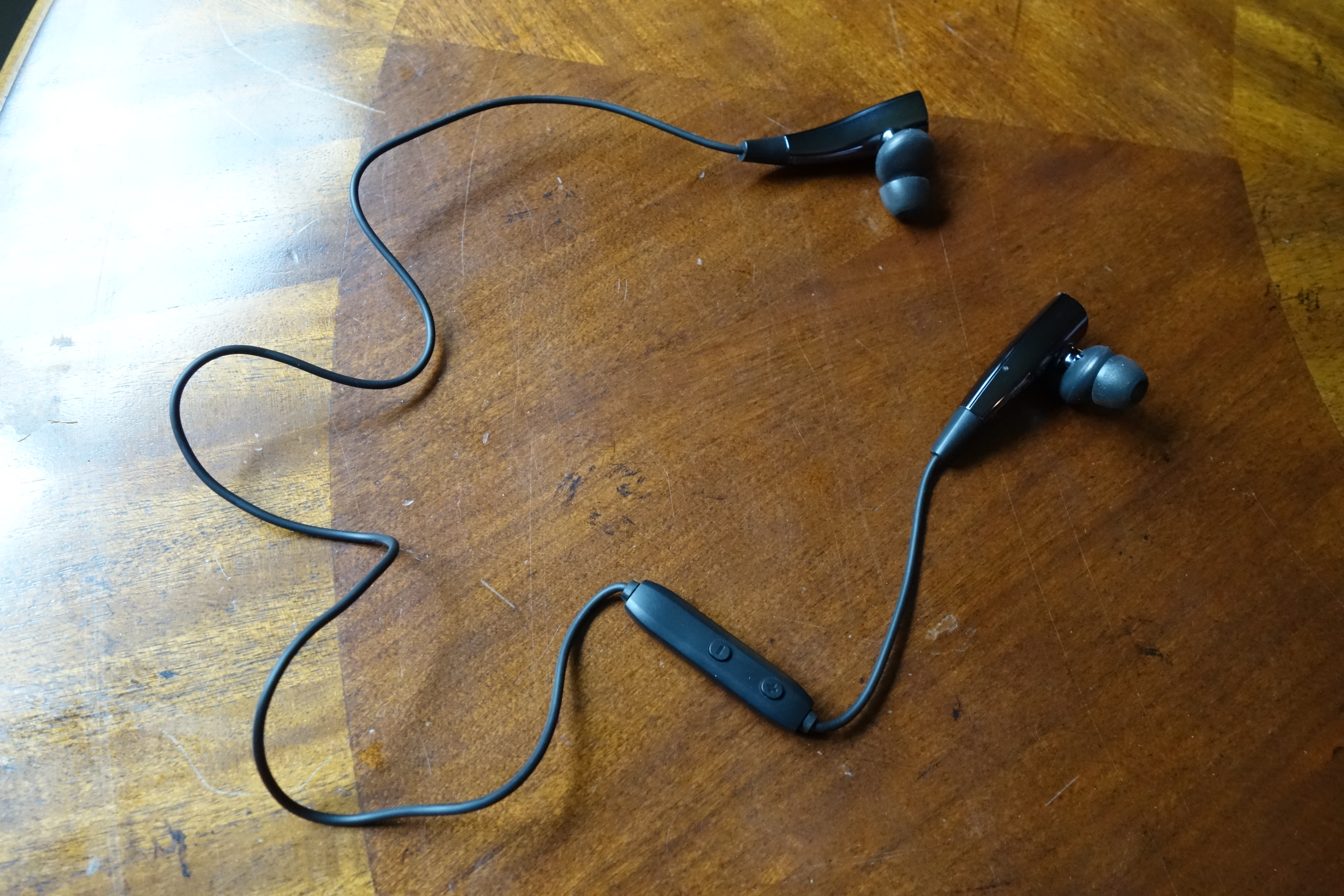
Inateck’s approach with this pair of in-ears is a unique one. Unique in both a good and a bad way. Let’s start with the good.
I would say the standout feature in the design is via the clever use of magnets. Both ear pieces are magnetically attracted. Therefore, when you’re not using them, they conveniently clip together for clean handling.
While it’s not a huge deal, I found magnetic connection to be a nice touch. The ear pieces stay together when you’re on the move and it feels thought out. You can even connect the ends together and wear the earphones like a necklace.


Inateck designed the earpieces like halves of one symmetric piece. The uniformity displays a sense of quality, which is also complimented by the choice in materials. The earpieces are made of a glossy plastic, which has a nice sheen. Where the cord is attached is a soft-touch, rubbery plastic. It all feels nice to the touch and not cheap.
The sound outputs from a stem that extends from the earpiece. It’s a somewhat odd design. I’m guessing the the acoustics is done within the plastic bubble, and the earpieces handle the electronics.

The remote housing is more of your typical, hard plastic affair (probably to save weight). It runs down about 3 inches from the right earpiece. There’s a volume buttons on one side and a button on the other side for the on/off and pairing functions. A small blue/red light tells the user what state the device is in: pairing mode (flashing between blue and red), playing (occasional blue flash), charging (constant red), or about to run out of battery (occasional red flash).

The entire cord length is about 22 inches. I found the length and cord material to be ideal.
Inateck was nice enough to throw in a zipper case for transportation. I appreciated that it’s a quality case, not something flimsy just for the sake of it. There’s a mesh pocket inside for the extra eartips and any other small accessories.

Usability
Usability of these earphones are a mixed bag. With all my praise of the design, there is a drawback: the earpiece size. These earpieces are large. They’re almost comically large in comparison to wired in-ears.

I mean, it makes sense considering that there is extra technology that needs to be fitted into the earpieces to make them wireless. However, I feel like the biggest compromise with these earphones was in not doing more engineering to shrink them down further.
Don’t get me wrong, they of course work. Your mileage may vary with the fit and with the earpieces staying in place. Fortunately, they’re not heavy, so there isn’t much travel if you’re bouncing around while exercising.
The eartips are of a typical silicon design, which goes within your ear canal. While moving around, I did have trouble retaining the isolation in one of my ears. But this is the same story with any eartip. It depends on how well the inner shape of your ear accepts the tip.
With that said, I wish Inateck included three sizes of eartips. These earphones only come small and medium sizes. There would be a better success rate of a good fit with more choices.

Battery Life
Inateck’s rating for the battery life of these earphones is 8 hours. That sounded great, especially considering that 8 hours is the widely-accepted length to a workday.
In my testing, I’m happy to say that the rating is accurate. Very accurate in fact. I got about 8 hours and 15 minutes in before it cut out.
It takes 3 hours to fully charge from a depleted battery. The earphones charge via a microUSB port, located on the right earpiece. There’s a flap protecting the port for when it’s not in use.

To help save battery, there are a couple nice features. First, when the earphones stop receiving the audio signal, they automatically shut off within a couple minutes of inactivity. They also automatically shut off upon detecting a magnetic connection. This is thoughtful because when you’re done listening and clamp them together, you don’t have that extra step of powering them off.
Sound
So we’ve talked about device itself plenty, how about the audio output? Bear in mind that we’re not talking about your audiophile-grade headphones here. In that respect, the sound quality is quite good and definitely exceeds the price tag.
I found there to be emphasis on the low-end (bass response). Other than that, the other frequencies are on the same level. I didn’t find the mids to be pushed back (a tendency of a lot of headphone manufacturers to bring the bass and treble out more). Vocals are satisfying on these earphones. Treble is decent, but it doesn’t reach far with detail.
In my experience, Bluetooth headphones tend to cause veiling (less clarity) in the overall sound. These earphones aren’t exempt from that, but it’s definitely acceptable.
Final Thoughts
I was pretty satisfied with Inateck’s Bluetooth earphone offering. Are they perfect? No. But are they a good value? Definitely.
If you’re looking for an affordable pair of wireless in-ears and want to push the bang of your buck, you should check these out. In my opinion, the sound quality significantly exceeds their price tag, and the battery lasts a long while. Yes, they’re on the large side, but compromise has to be made somewhere.
You can find these earphones on Amazon for only $33 (as of the time of this writing).
The post Inateck Bluetooth Earphones review appeared first on AndroidGuys.
Moto X Style (Pure Edition) vs Apple iPhone 6s Plus
It’s obvious that large smartphones have seen a rapid growth in popularity over the years, and while big displays have more or less become the standard in the Android world, even Apple finally gave in to the trend last year with a Plus iteration of their flagship smartphone. Apple recently unveiled their latest 2015 flagships, with there once again being a larger version in the mix, and it’s natural to be curious about how this device fares against the best large screen smartphones that Android has to offer.
With this in mind, we pit the latest plus-sized iPhone against Motorola‘s flagship, in an in-depth look at the Moto X Style / Pure Edition vs Apple iPhone 6s Plus!
Design

As far as the design is concerned, neither smartphone features a dramatic departure from their predecessors, and in the case of the iPhone, the design language is identical, given that this is an “s” iteration. The Moto X Style also retains a lot of the design language of the Moto X (2014), featuring the same metal frame, an identical placement of the buttons and ports, as well as the significant curve along the corners and the rear. The difference in the style comes when looking at the signature Motorola dimple on the back however, which is now housed in a metallic strip that includes the camera and flash, and is also much smaller in size and takes on a more subtle look.
As mentioned, the iPhone 6s Plus features the same design language as the iPhone 6 Plus before it, but unlike previous generations, where Apple has typically made the “s” iteration thinner and lighter, the iPhone 6s Plus is actually slightly thicker and heavier than its predecessor. This is because the iPhone 6s Plus is now made with a stronger 7000 series aluminium, which makes it less likely to bend, and there is also an additional pressure sensitive layer below the display, needed in order to utilize the phone’s new 3D Touch feature.

When comparing the two, the Moto X Pure Edition is thicker, but manages to be less tall and not as wide as the iPhone 6s Plus, despite the former featuring a larger display, courtesy of the very thin bezels the device features along the sides. This difference in size also means that the Moto X Pure Edition has the edge with regards to the handling experience, but both are still very large smartphones that do fall just outside the realm of comfortable one handed use.
One aspect that makes the Motorola flagship hard to beat is when it comes to the customization possibilities available to you. Moto Maker allows you to pick and choose your own color scheme, accent colors, and material for the back cover, and you also have the ability to add custom engravings and messages on the back, for that little bit more of a personalized touch. On the other hand, things are far simpler with the iPhone 6s Plus, with your choices limited to space gray, gold, and silver, with there now also being a rose gold version available for those who want it.
Display

On the display front, the Moto X Pure Edition comes with a 5.7-inch IPS LCD display with a Quad HD resolution, while the iPhone 6s Plus features a 5.5-inch IPS LCD screen, but with a lower 1080p resolution. The display of the Motorola flagship is understandably the sharper of the two because of its higher resolution and resulting pixel density, which allows for a great media-viewing experience.
Of course, the display of the iPhone 6s Plus is no slouch either and looks fantastic in its own right, but some differences are noticeable when looking at the two displays side by side. The screen of the iPhone 6s Plus does get significantly brighter, and the colors are more natural, when compared to the more saturated color tones of the Moto X Pure Edition. This default saturated look may be more appealing to some, but if it doesn’t quite suit your tastes, you do have the option to change it, which can easily be done in the Settings.
Performance

Judging purely by specs, the Moto X Pure (Style) certainly looks like it could easily trounce the iPhone 6s Plus, but let’s remember that there’s more to the story here. These two phones run on very different software, and Apple’s tight control over its ecosystem allows it to provide a level of optimization that Android OEMs just can’t offer. The subsequent result is that Apple can make due with much less aggressive specs and yet still offer flagship-level performance.
As far as their respective processing packages are concerned however, the Moto X Pure Edition comes with a hexa-core Qualcomm Snapdragon 808 processor, backed by 3 GB of RAM. In contrast, the iPhone 6s Plus features a dual-core Apple A9 processor, with 2 GB of RAM in tow, doubling the amount of RAM available with the previous generation of the iPhone.
Despite the significant difference on paper, there is barely any disparity when it comes to real world performance. Both devices perform extremely well, and both handle multi-tasking and gaming equally impressively. That said, the iPhone 6s Plus actually manages to outperform the Moto X Pure Edition when it comes to benchmark scores, with the former featuring much higher single core and multi-core scores when compared to the latter, when using Geekbench. The Moto X Pure Edition is certainly of the snappiest Android devices available in the market right now, but you are going to get an overall more consistent experience on the iPhone, when it comes to things like gaming.
Hardware

When it comes to on-board storage, the Moto X Pure Edition is available in 16 GB, 32 GB, and 64 GB iterations, while the iPhone 6s Plus also features a base 16 GB model, but with the larger storage options being 64 GB and 128 GB. 16 GB is not a lot of storage with any smartphone, but is still a possible choice with the Motorola device, given that it also comes with expandable storage via microSD card, by up to 128 GB. With no expandable storage available with the iPhone 6s Plus, 16 GB of on-board storage may not be enough for a lot of users.
The iPhone 6s Plus doesn’t hold a candle to the Moto X Pure Edition when it comes to speaker quality however. The dual-front facing speakers of the latter not only get very loud, but also provides high quality audio, further enhancing the media-consumption and gaming experience. The speaker of the iPhone 6s Plus does delivery some decent audio as well, but considering that it is a single speaker unit mounted at the bottom, the audio experience is obviously not going to be the most impressive around.

Neither device packs a whole lot extra on the hardware front, but the iPhone 6s Plus does get the leg up here with the addition of a a really good fingerprint sensor. Touch ID is faster than ever, and simply pressing the home button will instantaneously unlock the phone. The fingerprint sensor is actually a little too fast, which is a weird thing to complain about, but if you are trying to glance at your notifications in the gap between pressing the button to turn on the display and the device unlocking, you will likely not be able to. The obvious work around here is to use the power button to wake the device first before unlocking it, but is something you may have to get used to, depending on which device you switch from.
When it comes to the battery, the Moto X Pure Edition packs a 3,000 mAh battery under the hood, while the iPhone 6s Plus comes with a 2,750 mAh unit. The battery life is pretty good with both smartphones, with both comfortably allowing for a full day of use, which sometimes goes up to a day and a half with the iPhone 6s Plus. Where the Moto X Pure Edition has the advantage here is when it comes to charging. With Motorola’s Turbo Power charger, the Motorola device charges extremely fast and will get you back to full capacity in around 75 minutes. On the other hand, the proprietary lightning cable may not allow for any fast charging, but the cable is reversible, which sounds minor, but makes plugging in the device that much easier and more convenient.
Camera

Historically, flagships from Motorola and Apple have been at opposing ends of the smartphone camera quality spectrum, with Apple releasing great cameras year after year. As expected, Apple has introduced a few improvements to their camera experience with the iPhone 6s Plus, but this time around, Motorola promised a significantly improved one as wellm with the aim to at least bring its camera at par with the impressive competition out there.
With the Moto X Pure Edition, you get a 21 MP rear camera with a dual tone LED flash and phase detection autofocus, while the iPhone 6s Plus features an also upgraded 12 MP unit, with optical image stabilization on-board. This is a significant bump for both smartphones, and in the case of the iPhone, the new sensor finally allows for video recording in 4K. Another new feature the iPhone 6s Plus comes with is called “live” photos, which essentially records 1.5 seconds before and after a photo is taken. To see them, you use 3D Touch on the photo you took, and image will instantly come to life in the form of a short video.

The front-facing cameras have also received upgrades on both smartphones, with both now featuring 5 MP units, compared to the 1.2 MP and 2 MP front-facing cameras seen with the iPhone 6 Plus and the Moto X (2014). The interesting part about the Moto X Pure Edition’s camera is the availability of a front-facing flash, included to help with taking selfies in low-light conditions. The iPhone 6s Plus may not have this, but comes with what Apple calls “Retina Flash,” which is basically the screen lighting up when you a take a photo.
Neither implementation is revolutionary, but Apple’s Retina Flash does work a little better at evenly illuminating the face, and isn’t as blinding as the front-facing flash on the Moto X Pure Edition. Another difference between these two front-facing cameras is that the Moto X Pure Edition camera is of the wide angle variety, which will allow you to fit multiple subjects into the frame, which isn’t possible with the iPhone 6s Plus.
The camera of the Moto X Pure Edition has proven to be very good this year, but when compared to the images of the iPhone 6s Plus, there is a big disparity in the way that both devices handle post-processing. The images with the Motorola smartphone are a lot more saturated and with more contrast, while the iPhone 6s Plus maintains a more natural look. Which one you prefer boils down to personal taste, but where the iPhone really outshines the Moto X Pure Edition is in dynamic range. There is a lot more detail to be found in darker areas like shadows, and highlights aren’t blown out like they are on the Moto X.
Things remain along the same lines when it comes to taking shots in low-light conditions as well. The photos with the Moto X Pure Edition aren’t bad by any stretch of the imagination, and there is certainly a huge improvement when compared to the camera of its predecessor. That said, the highlights are typically blown out, and there is quite a bit of noise reduction and over brightening being performed, which results in a much softer and grainier photo. For something that doesn’t feature OIS, this camera is a decent performer in low light, but definitely pales in comparison to the much sharper and cleaner looking images that the iPhone 6s Plus manages to capture.
Software

As is the case with any Android versus iPhone comparison, you are looking at two completely different experiences and ecosystems on the software side of things.
With the Moto X Pure Edition, you get a near stock Android experience of Android 5.1.1 Lollipop, which helps keep everything running smoothly, and should also provide for speedy updates to future versions of Android. There are some really useful features baked in by Motorola though, such as Moto Voice, that lets you use a custom catch phrase to call on the device, even when the phone in an idle state. There is also Moto Display, Moto Actions, and Moto Assist, that allows for a variety of different features, like subtly peeking at your notifications, twisting your wrist to launch the camera, or automatically silencing your phone during any preset times.
With the iPhone 6s Plus comes iOS 9, and if you having been using iPhones previously, there won’t be too many surprises here. Everything remains largely the same aesthetically, and it is still the same grid of icons as it has always been, which isn’t necessarily a bad thing, if you are looking for a pretty straightforward software experience.

The most notable addition with the latest iPhones is the addition of 3D Touch, which lets you perform functions that Apple likes to call “peek” and “pop.” Keep in mind that 3D Touch isn’t the same thing as a long press, which still works as it would normally. With 3D Touch, you are physically applying pressure on the display, and this will allow for access to certain additional features and functions.
As an example, if you are in the Mail application, pressing down on a e-mail lets you take a quick glance at it without fully opening it, and pressing a little harder will take you into the full email, if you decide that it something you want to go through further. This can also be done with applications on the homescreens, so if you were to use 3D Touch on the camera app, you can quickly take a photo, record a video, and even take a selfie.

Most of Apple’s own applications already come with 3D Touch support, and while third-party app support is limited for now, that number will continue to go up as more developers update their applications. Even without a heavy amount of third-party support, there is still a lot you can do with 3D Touch, such as easily moving the cursor around by pressing down on the keyboard, or jumping into the multi-tasking screen by pressing the display and sliding from the side. It is quite fun to just poke and prod at things to see what works and what doesn’t, and from the looks of it, this feature certainly offers a lot of potential for Apple.
Specs comparison
| Moto X Style / Pure Edition | iPhone 6s Plus | |
|---|---|---|
| Display | 5.7-inch TFT LCD display Quad HD resolution, 520 ppi |
5.5-inch IPS LCD display Full HD resolution, 401 ppi |
| Processor | 1.8 GHz hexa-core Qualcomm Snapdragon 808 Adreno 418 GPU |
1.8 GHz dual-core Apple A9 PowerVR GT7600 GPU |
| RAM | 3 GB | 2 GB |
| Storage | 16/32/64 GB expandable via microSD up to 128 GB |
16/64/128 GB no expansion |
| Camera | 21 MP rear camera with phase detection autofocus, dual tone LED flash 5 MP front-facing camera |
12 MP rear camera with OIS 5 MP front-facing camera |
| Connectivity | Wi-Fi 802.11 a/b/g/n/ac Bluetooth 4.1 GPS + GLONASS NFC microUSB 2.0 |
a/b/g/n/ac Bluetooth 4.2 GPS + GLONASS NFC ( with Apple Pay only) USB 2.0 |
| Software | Android 5.1.1 Lollipop | iOS 9 |
| Battery | 3,000 mAh | 2,750 mAh |
| Dimensions | 153.9 x 76.2 x 11.1 mm 179 grams |
158.2 x 77.9 x 7.3 mm 192 grams |
Gallery


Pricing and final thoughts
The Moto X Pure Edition is easily one of the most affordable flagship smartphones currently out there, and for just $400, you can get yourself a completely customized device. The iPhone 6s Plus, on the other hand, with set you back $750 for the 16 GB base model, and pricing goes up from there, based on your storage needs. The iPhone 6s Plus is definitely not cheap, but you do have the option of picking it up at a subsidized rate through network carriers, an option that isn’t available with Moto X Pure Edition.

So there you have it for this in-depth look at the Moto X Pure Edition vs iPhone 6s Plus! You of course, can’t go wrong with either smartphone, but what the Moto X Pure Edition brings to the table is customization, a clean software experience, and microSD expansion, all for a price point that is significantly cheaper that most other current-generation flagships. The iPhone 6s Plus will offer everything you’ve come to expect from previous iPhones, will adding and improving features like the camera and 3D Touch.
If you absolutely want an iPhone, the iPhone 6s Plus, is the best one that money can buy. On the flipside, for those that want the freedom provided by Android, and also want to save some hard cash, the Moto X Pure (Style) remains one of the best choices on the market.
Bell Canada gets slapped for fake App Store reviews

Bell Canada has been handed down a $1.25 million CAD ($970,719) fine by Canada’s competition bureau after its employees posted fake reviews of Bell apps. According to the regulator, the carrier “encouraged” staff members to post glowing testimonials of the MyBell Mobile and Virgin My Account apps on the App Store and Google Play. Unfortunately, these overenthusiastic write-ups neglected to mention that they were written by people on Bell’s dollar. Oops.
The dodgy behavior was initially exposed by Scott Stratten, who was already well aware of the apps’ poor standing on iTunes. Suddenly, however, the rating skyrocketed thanks to a series of five-star reviews, and Stratten smelled a rat. After some digging on LinkedIn, he uncovered that the most praiseworthy mentions were all directors, marketing managers and other people paid by Bell Canada. Oooops.
The company admitted that certain employees had been encouraged to post the ratings, but as soon as bosses were made aware, they ended the practice. As part of the settlement, the firm has pledged to tighten up its compliance program, making sure every employee knows to hit no whenever they’re asked to review the app. The firm is also being forced to sponsor a workshop to “enhance Canadians trust in the digital economy,” which will probably open with a seminar on how not to get caught gaming your own app.
Via: 9to5Mac
Save yourself money and get CHOETECH’s fast Wireless charging pad (Review)
As more devices are sold with Qi wireless charging built-in, like the Samsung Galaxy Note 5, S6, S6 Edge and so on, the need for wireless charging grows. Wireless charging is one of those features you have lived without since you have owned mobile phones, but once you go wireless it is really hard to go back. So for many of you who have wireless charging compatible devices, now is the time to give it a try.
Qualcomm’s Quick charge revolutionized charging last year as it drastically reduced charge times on our devices. With 15-30 minutes of charging many devices could go half a day without having to recharge again. Fast charging made wireless chargers a nice-to-have feature, because the ability to fast charge overruled the desire to wireless charge devices. Wireless chargers were just too slow.
Come 2015 and we now have access to fast wireless charging thanks to Samsung. That doesn’t mean you have to pay Samsung’s high prices though for their charger. CHOETECH is here to offer a high-quality alternative to fast wireless charging with their latest Wireless Charging Pad. This pad is currently compatible with the Samsung Galaxy Note 5 and Galaxy S6 edge plus which have fast wireless charging as a feature, and it is also capable of standard wireless charging for other compatible devices. Lets check it out.
Design & Usage
Like all other CHOETECH accessories I have reviewed, the Fast Wireless Charger Pad is of the highest quality. It is a thin disk shape made from durable plastic and metal with a rubber ring on the bottom and top to prevent slippage on surfaces as well as creating a grip for your smartphone. This addition of these rubber rings may seem insignificant, but considering the Note 5 and S6 edge plus are made from glass, I really don’t want my devices slipping off my nightstand from simple bumps. Nothing would ruin my night more than seeing a crack in my Note 5.
CHOETECH also added green LED lights to the front of the charger to show when it is fast charging, and blue LED lights for when it is charging a device at standard speed. I know lights are just lights, but it is really cool. To top it off, CHOETECH included a light sensor which dims the LED lights as there is less light in the room in order not to disturb your sleep. And it doesn’t just turn the LED lights off, it actually dims the LED lights matching the light level in the room. For a third party device, I was thoroughly impressed.

The green LED lights weren’t your typical super bright green- they were more of a standard grass colored green(I apologize for my lack of color palette knowledge). I actually thought the choice of green was a nice change from the super bright LED’s that we are so used to these days. It looked rather sophisticated on my nightstand.
In order to take advantage of fast wireless charging you will need a Quick Charge 2.0 wall charger which CHOETECH provided me with and can be purchased from Amazon.com as a package saving you even more money.

I found this latest wireless charger from CHOETECH to be my favorite of all of the ones I have used so far. With every generation of product they just keep getting better.
Specs from Amazon.com
Fast Charge Wireless Charging Pad
This CHOETECH Fast Charge Wireless Charger allows you to charge Galaxy Note5 or S6 edge+ device up to 1.4x faster than standard wireless charging pads.
Universal Compatibility
Fast Charge Model(10W Output Max) only for your Galaxy Note 5 and S6 Edge+, Standard Charge Model(Output 5W Max) for your standard QI enabled device like S6,S6 Edge.
Smart Lighting Sensor
The ambient light sensor automatically dims the LED lights as the light in the room lessens.
Unique LED Indicates Charging Status
Solid blue led light for standard wireless charging model(5W output max); Solid green led light for fast wireless charging (10W Output Max)
Compact Size and Anti Slip Rubber Grip
The Qi charger is compact in size (3.3 *3.3 * 0.7in)and has rubber grip on its top and bottom that does not allow cell phones made up of glass body like Galaxy Note 5/S6 Edge+to get skid off.
Compatible devices:
Note 5/S6/S6 Edge/S6 Edge Plus
Nexus 7 2nd Gen/Nexus 4/Nexus 5/Nexus 6
Nokia Lumia 920/1020/928
Note:
1.The Fast Charge feature is compatible with ONLY Galaxy Note5 and Galaxy S6 edge+ models
2.QC 2.0 Adaptive Fast Charger is required for the fast charge wireless charging feature
Summary
I was shocked at how much I needed fast wireless charging in my life. Less waiting for charging is one of those things you get used to rather quickly. Having the CHOETECH Fast Wireless Charging Pad for my Note 5 made me realize it was time to give away the other wireless chargers in my household. From now on it is fast wireless charging or wall charging only. At $34.99 you can save yourself %50 by getting this charger versus Samsung’s official fast wireless charging pad. Add in the ability to not disturb my sleep with the ambient light sensor, I can see myself using this charger for a long time to come. If you’re interested in getting this charger head on over to Amazon.com.
Fast Wireless Charging Pad Black only – Link
Fast Wireless Charging Pad Black plus Quick Wall Charger – Link
Fast Wireless Charging Pad Silver only – Link
Fast Wireless Charging Pad Silver plus Quick Wall Charger – Link
The post Save yourself money and get CHOETECH’s fast Wireless charging pad (Review) appeared first on AndroidGuys.
Need for Speed: No Limits review – a great game for a very limited time

EA just recently brought its new racing game to the Google Play Store. It’s called Need for Speed: No Limits, and just like other recent NFS games, it features great graphics, a somewhat lacking storyline and tons of underground races. So does this title bring anything new to the table? I’ve spent a good amount of time with this game, and there are definitely some things you should know about it. Here is everything you need to know about Need for Speed: No Limits.
Gameplay and story

In Need for Speed: No Limits, you’ll be competing in countless underground street races on your journey to be the best street racer there ever was. At least, I think so. Just like with most other NFS games, the storyline doesn’t really matter all that much. You’re quickly introduced to a slew of generic characters that for the most part stay out of your way throughout the entirety of the game. To be honest, though, I’m perfectly content with a lacking storyline. No story is better than a bad one, at least in this case. Just let me race.
Even though the story is pretty lacking, there is a lot here in terms of overall content. There are a total of 30 cars in the game, each with their own set of upgradeable parts and customizations. The more races you complete, the more parts you’ll win.

No Limits is brought to us by the folks who made Real Racing 3, which is one of the most realistic looking racing games (surprise, surprise) available in the Play Store. And judging by No Limits’ graphics, it’s very apparent that they put a lot of effort into making this game as beautiful as possible. Like other Need for Speed titles, this game is riddled with reflections, smoke and other not-so-realistic aspects of car racing that make the game look really pretty. I could hardly find a dropped frame playing this on my 2013 Nexus 7, which really helps with the overall experience.

The game’s controls are probably the most simplistic I’ve ever experienced with a racing game. There are no accelerator or brake pedals to tap, and no steering wheel to move around on the side of the screen. Instead, you tap the right or left sides of the display to turn, swipe up on the screen to boost, and swipe down to drift around corners. Your car is always in full acceleration mode, which makes it much easier to navigate through winding roads.
These simplistic controls mean that you’ll never have to actually put on the breaks, only drift around corners. That’s fine, but it can make each track feel a tad monotonous and each car behave just about the same way in the handling department.

There are a few different types of races in the game, including timed races, standard start-to-finish races and more. Each race is extremely short, some being only 30 seconds long. This is great news for folks who don’t have a ton of time to play the game, but this can get pretty old if you just want to race. After each race is finished, you’ll need to click through a multitude of reward screens and wait for the game to load, which really isn’t ideal when you’re finished with each race in under one minute’s time.
In all, though, racing is pretty fun. It’s much easier than most other racing games, and it’s especially easier than other Need for Speed titles. This makes it easy to get hooked on upgrading your cars, parts and customizations, since the game allows you to do so frequently.
Need for Speed: Limitations

Okay, I’m going to be completely honest here. This game surprised me. I thought, “Just how did EA, king of the free-to-play games, manage to get me hooked on a free-to-play racing game?” It’s entirely possible, and it might happen to you. That is, until you hit… the wall.
The folks at Electronic Arts are very smart and know how the free-to-play thing works. They get you completely hooked, almost to an addicted level, and then bam – you magically can’t play anymore. I played for about 3 hours straight without ever running into an issue. You have a limited amount of gas, and each time you race your gas level goes down. At the start of the game, you level up really quickly, and each time you level up, your gas gauge gets refilled. No problem, right? Wrong. There’s a wall, and you’ll hit it eventually. It will stop being so easy to level up, and that means you’ll have to wait a certain period of time before you get to race again. Of course, you can refill your gas tank for 30 gold, and you can purchase more gold with real money. See how this works?

For a game riddled with in-app purchases and limitations, it’s surprisingly not so in-your-face about making you spend money. Only a few times have I run into a pop up telling me to purchase a Monthly Gold Card. And aside from those few instances, No Limits is quite tame when it comes to this method of getting you to spend money.
Wrapping up
At its core, Need for Speed: No Limits is a solid racing game that features simple, intuitive controls, addictive gameplay and tons of options to keep car buffs happy. Look at any other aspect of the game, though, and you’ll quickly realize that fun 30 second-long races can only go so far. If you’re trying to stay away from over aggressive free-to-play titles, you’ll probably want to take a pass on this one. But if you can get past that fact, it’s actually pretty fun.
Need for Speed: No Limits is available for free from the Google Play Store.
Download Need for Speed: No Limits from Google Play
Have you played No Limits? If so, what are your thoughts? We’d love to hear what you think in the comments below.
All-In-One Toolbox keeps your phone up to speed [App Review]
If you’re running a budget Android device, it can be rather daunting to experience slow speeds and lag. Fortunately, there are a few solutions, and today we are going to take a look at one of the simpler fixes: A performance boosting app. While there are several on the Play Store, we’ve got our hands on one of the better ones: All-In-One Toolbox.
Setup
Unlike most other cleaning apps, the All-In-One Toolbox app is straightforward from the moment you click the app icon. You’re taken directly to the main screen and don’t have to sign up or read boring tutorials. Once you are in, you can tweak a wide plethora of settings. Mostly related to features of the program, you can adjust anything from the notification icon to enabling silent boot (which mutes sounds at boot up and shut down).
Features
The first thing that you may notice is the simplicity and cleanliness of the app. There are no confusing sections or areas to get lost in. One central place branches off to the features, and it’s a breeze to use.
Speaking of features, there are three main tools for you to use. “Clean” is a function to clear out storage hogs by cleaning the cache and any excessive files that the app detects. It cleared out 1.12GB on the first clean, proving its effectiveness.
You also get “Boost”, which is designed to clean up RAM and memory. You can select which processes you want killed, and 567MB got cleaned the first time around. However, the majority of this will soon come back so it’s more of a gimmick than an actual useful feature.
And lastly, there’s the “Toolbox”. This divides into many handy tools, such as App2SD and Backup & Restore. These features allow you to move apps to your external SD card and create a backup of content before you reset your phone. This also rids the need of having several different apps to fulfill these actions.
Perhaps the best feature here is the ability to download plugins. Some of these include “GameBooster Plugin” and “AppLock Plugin”, all features that you can easily get if you want them. Again, these may come in handy as they eliminate the need to have several different apps that take up large storage space.
Everything was smooth and no glitches or lag was experienced. There are adverts, but these can be removed by purchasing the full version, in-app, for $3.99.


What we liked:
- Clean and easy user interface
- Range of handy features
- Stability and effectiveness
And not so much:
- Annoying notifications
- Advertisements
4 out of 5 stars
At the end of the day, the All-In-One Toolbox app is really ideal for users who have poor performance from their devices. The effective range of features leaves no one in the dust with a slow phone.
The post All-In-One Toolbox keeps your phone up to speed [App Review] appeared first on AndroidGuys.
Moto 360 (2nd Gen.) review
With Motorola kicking off the round Android Wear smartwatch trend last year with the original Moto 360, there was a palpable anticipation as to what its follow-up would bring. Its successor, however, enters a smartwatch market that has seen rapid growth in the number of premium, round-faced, smartwatches, with various OEMs throwing their hats in the ring.
In the face of this increased competition, does the latest smartwatch iteration from Motorola manage to stand out? We find out, in this comprehensive Moto 360 (2nd Gen.) review!
Design

As far as the design is concerned, Motorola tries to inject much of their smartphone buying experience into the second generation Moto 360, introducing the customization capabilities available with Moto Maker for their latest smartwatch. Granted, the level of customization on offer isn’t as robust as what is available with their flagship smartphones, but you do get to choose between different sizes, the design on the bezel, the color of the metallic case, and various watchstraps. This is a pretty important part of the Moto 360 experience now, with the user having a lot of control over how the watch looks.

Apart from the availability of Moto Maker, the new Moto 360 has changed quite a bit from the design language of its predecessor, with positive effect. A metallic body can now be finished in a few different colors, and the aluminum bezel can also be given a patterned design, called Micro Knurl, although that will set you back an additional $20. The crown-like button has now moved to the 2 o’ clock position, and has a very solid click to it. Motorola certainly isn’t trying to hide the button either, with it being quite large and obvious, with a lining around it, and the Motorola logo on it.

The main design additions are the nubs on the top and bottom, which are a much-appreciated departure from the watchstrap location found with the original Moto 360, and makes it very to easy to switch out the watch straps, especially with the inclusion of the quick release pins. There are also a couple of options available as far as the size is concerned. Seen in this review is the 46 mm version, which can be very big for those with smaller wrists, but a 42 mm iteration is available as well.

The way the nubs are designed actually add to the overall aesthetic, with their rigid angles fitting in nicely with the large body, which is just over 11 mm thick. This thickness isn’t unsurprising when considering other smartwatches on the market, but Motorola does seem to acknowledge the rather large size, especially of this 46 mm iteration, better than others. Motorola knows that their smartwatch is bulky, and makes every design element reflect that. Industrial might be the best way to describe each and every part, with straight lines everywhere, instead of more curves that others have added for a perception of luxury.
Display

Motorola was the first to bring the round watch face form factor to the Android Wear game, but the company did receive a lot of flak for the inclusion of the infamous “flat tire,” a small portion on the bottom that houses the ambient light sensor. In terms of utility, its presence isn’t as big of an offense as some believe, and now that it returns with the Moto 360 (2nd Gen.), seems to be more like a defining design trait. Motorola continues to justify its existence as the location for the sensor, which provides the benefit of smaller bezels.

As far as the display itself is concerned, the IPS LCD screen features a 360 x 330 resolution, and is protected by a Corning Gorilla Glass 3 panel. The 46 mm iteration comes with a 1.56-inch display, while the smaller version features a 1.37-inch screen.

The display performs as well as it should. Daylight viewing is pretty good at the highest brightness settings, and the ambient light sensor means that the user will not have to micromanage the screen. As is the case with any mobile device, the screen can still be a nuisance in dark situations, like in movie theaters, and some input will be required on the user’s part to enable Theater Mode. With it featuring just a slightly higher resolution and resulting pixel density when compared to its predecessor, the display experience isn’t all that different this time around, and for viewing and controlling Android Wear, it continues to get the job done.
Performance

Under the hood is a Qualcomm Snapdragon 400 processor and 512 MB of RAM, and given the fact that this is the de facto processing package for Android Wear, the new Moto 360 won’t let you down as far as performance is concerned. As such, swiping among all of the different notifications and cards were smooth and snappy, and extra input methods are available via companion applications and voice input.

We did have a few issues with getting the watch to recognize our voices with the “OK Google” prompt, which is certainly odd, with the device coming from a company that has been famously good at sound and voice recognition. Granted, these issues are common with other smartwatches when using them in really loud environments, like when driving a car, but we felt that these issues were even more common with the Moto 360 (2nd Gen) than most of its competition. For fitness tracking, Google Fit and Moto Body do try and provide some insight on your step count and lost calories, but these numbers tend to be pretty arbitrary. Then again, with a metallic body and leather or metal strap, this smartwatch might not be an obvious fitness companion anyway.
Hardware

In hardware, we start with the typical heart rate monitor that is available with almost every Android Wear smartwatch out there. In this case, it works well enough for the user that is curious about their current heart rate, and it can be used during workouts to get a little more fitness insight. The Moto 360 (2nd Gen) does come with IP67 certification for resistance against dust and water, but if you decide to go with a leather strap, having one makes this a watch that you will probably be removing before getting into any water-based situations anyway.

As already mentioned, the performance of the microphone is a little uneven in its performance. It failed to register the voice prompt a noticeable number of times, even when not in a particularly loud environment. It felt like consciously speaking into the microphone hole in the bottom left corner was required, and that little bit of necessary awareness was something that should ideally not be needed.

In battery, Motorola brings back their wireless charging dock, that makes the watch a kind of landscape bedside clock while charging, and remains one of the better smartwatch charging implementations out there. The battery gets a small bump to 400 mAh, and the battery life available with the Moto 360 (2nd Gen) is pretty standard. About a full day of use is possible, but it generally won’t go much beyond that. With charging times of around an hour and a half to get to 100 percent, placing the watch on the charger at opportune moments can keep it going easily throughout the day however.
Software

Finally, on the software side of things is Android Wear, which hasn’t changed a whole lot since the original Moto 360. Aside from being a notification machine, with the cards and Google Now suggestions, functionality stays pretty standard across the board. You are essentially just swiping all over the place, and occasionally using your voice to trigger a few functions.

Companion applications can be used when applicable, but as nice as some of them are, it is a small fraction of the overall Android Wear experience. The ability to respond to messages via voice input is always nice to have, but you do have to be wary of outside noise and that might make things difficult. Motorola adds in a number of functions through the companion smartphone app, and also includes customizable watchfaces, but going through the Google Play Store to find even better ways of customizing the experience is certainly the recommended way to go here.
Gallery


Pricing and final thoughts
The price of the base model of the Moto 360 (2nd Gen) is higher that it was with its predecessor, at $299, not including additions like the patterned bezel for $20, the gold body for $30, and metal bands for $50. While the hike in the price point is a bit of a bummer, changes in the overall design of the smartwatch, and the addition of the Moto Maker experience, keep the watch from feeling like a forced acceptance, because you are responsible for how it turns out.
 Looking back: Moto 360 review – probably the best Android Wear smartwatch yet

So, there you have it, for this in-depth look at the Moto 360 (2nd Gen)! Overall, the latest smartwatch offering from Motorola is a worthy update to the original, that benefits from the company’s customization system. Its big size may be a concern for some, but a slightly smaller iteration is available for those who want it, and all said and done, this kind of size has become pretty commonplace with smartwatches. Android Wear continues to be as standard as ever, and even with Motorola trying to add some extras, the shell of the device itself feels more important than what it is ultimately presenting. Thankfully, you get more control over that than with most other devices out there, and we think that is the main selling point of the Moto 360 (2nd Gen).
Get this Bluetooth adapter with Google Now integration
A few months ago I had the opportunity to review a Bluetooth car adapter and I left the review thinking that it was the best thing since sliced cheese. Mostly in part, because my 2011 Honda Odyssey did not come with Bluetooth from the factory. The iClever Himbox Bluetooth adapter has given me a new frame of reference and has made me reconsider my initial rating.
iClever Himbox Bluetooth adapter overview
 The iClever Himbox Bluetooth car adapter is a versatile adapter that adds Bluetooth to your vehicle or any other device with an auxiliary audio input. While it is geared towards being an adapter for your vehicle, there are clever little features that make it compatible with other devices as well. The first feature is that the power adapter for the Himbox is USB based. If you so desired, you could detach the USB cable from the vehicle power adapter and plug it into another USB power source. This will allow you to take the adapter out of the car and into your office or home.
One added bonus is the magnetic control unit. There is a metal base that sticks to your dash so that you can easily attach the magnetic control unit, but if you were to connect it to a home receiver unit you could stick it to the metal sides of the receiver or anything else that’s metal.
There is also, of course, a male auxiliary cable that will plug into a female 3.5mm jack. This is how your music will be output to whatever system that you are interfacing with.
The control unit features 3 lighted buttons. Forward, reverse, and the main control unit, which also happens to be the star of the show. A simple press of the button will answer a call, hang up a call, and pause or play your music, but if you hold the button down for a few seconds then something magical will happen that I will explain in a moment.
iClever Himbox Bluetooth adapter setup
The steps to get your iClever Himbox BT receiver connected to your vehicle are fairly simple.
- Connect the USB cable to the included power adapter
- Plug the power adapter into the vehicle’s accessory power port
- Peel the paper cover off of the adhesive tape attached to the metal base plate
- Affix the metal base plate in the desired area or your dash
- Attach the magnetic control unit to the metal base plate
- Connect the 3.5mm auxiliary cable to the vehicle’s auxiliary port
- Turn the vehicle on and select the audio source to auxiliary
- From your phone search for Bluetooth devices and select HB01 Plus
- Follow any prompts on your phone
Now you are connected and ready to go.
iClever Himbox Bluetooth adapter usage
Now to the part that you actually wanted to read, Android Auto functionality. I should clarify something. There is no screen unless you have your phone mounted to the dash or windshield somewhere. Even then, the screen will not show the Android Auto interface. Having said that, you can use all the voice commands available within Android Auto as long as you have Google Now installed on your device.
When you hold the control button down for a few seconds, Google Now will initiate. Once you hear the Google beep, you can issue it any command from Play music to navigate me to the nearest Wally World. You can also compose and send SMS messages. About the only thing you can’t do is listen to received SMS messages. I found that this was my favorite feature of the iClever Himbox BT adapter.
Not to be outshined by voice commands, the Himbox sound quality really is superb. In part, this is due to the Bluetooth 4.0 and the Apt-X codec support. The high notes sound amazingly clear and the lower base notes were able to play with no distortion. There was also little to none latency issues. The music streamed at the same time it played on my phone.
It’s not all rainbows and unicorns, though. When there is no music playing or active call, the speakers would emit a whine that would increase and decrease with the engine’s RPMs. Also, the buttons used to skip the song would sometimes produce delayed results, but it’s possible that it could have been my phone. My LG Tone headphones will sometimes do the same thing. I can’t be sure.
What we liked
- Audio quality
- Google Now integration
- Flexibility
What could be better
- Button backlights could be brighter
- Engine whine was annoying
- Button delay


iClever Himbox Bluetooth adapter summary
If you don’t already have Bluetooth in your car, or you just want to add Google Now functionality, this is a great device. Who am I kidding? It’s a great device if you want to add Bluetooth audio to anything. You can even add it to your parents old 1970’s receiver unit with a 3.5mm to RCA jack adapter and a USB wall outlet.
If you’re interested, you purchase the iClever Himbox Bluetooth adapter for a limited time at $29.99 with free shipping for Amazon Prime customers. The regular price is $69.99.
What do you think? Are you considering this for your vehicle?
The post Get this Bluetooth adapter with Google Now integration appeared first on AndroidGuys.
AudioFly AF33 in-ear headphones review
I recently got the opportunity to review AudioFly’s complete performance in-ear headphone collection. There are four headphones in this collection that each fit into a consumer’s budget. There is the under $50 pair, the under $75 pair, the around $100 pair, and the around $200 pair. Today, I’m taking a look at the AF33 earphones that fall at the low end of the price range.
Unboxing and Accessories

The AF33’s come in a box you would expect for $40 headphones. It is cardboard box with a plastic insert that holds all of the contents in place. There is nothing out of the ordinary in this package. You get your earphones, several pairs of different sized tips, warranty information, and a pouch to store everything in.
Design and Build Quality
For earphones at this price, the AF33’s are surprisingly well built. Of course, everything is plastic, but they feel sturdy and there are no gaps in the construction. Best of all, the cable does not feel like it is going to rip in half if you snag it on something.  Speaking of the cable, you will notice that there is a button right where the cable splits. You can use this button to control your music, and with the in-line microphone on the right side, you can make and answer calls.
The overall design of the AF33’s is subdued and minimal. They do not really stand out from the rest of the earphones out there, but that is not a bad thing. They are well made and the design makes they extremely comfortable to wear for long periods of time. Even though these are the least expensive earphones of the group, they are the second most comfortable. Their minimal design helps them fix nice and snug in your ears, and they are lightweight which makes them seem to almost disappear after wearing them for a while.
Sound Quality
 It does not matter how good the earphones look if they don’t sound good, and thankfully the AF33’s produce great sound. They are definitely some of the best sounding earphones in this price range.
I am not a huge fan of pounding bass, and many lower priced earphones tend to pump up the bass to appeal to the younger customers buying them. Thankfully, these earphones do not over stress the bass. It is present and the sound is tight and well defined.
Mids and highs are also quite nice. At moderate volumes, they both hold up well. Mids are clear and smooth which makes for a great listening experience. Highs are crisp and deliver decent separation and detail.
If you also plan on using these earphones to make calls, you will not be disappointed. Calls sounds great on both ends, and the buttons located at the split is convenient for making calls without taking your phone out of your pocket. The microphone is located about halfway up the right cable which puts it at a great position to pick up what you’re saying without scratching across your clothes as you walk.
All this being said, these earphones start to suffer when brought to higher volumes. The highs become tinny and shrill a some points, and mids become less defined. If you are planning on playing your music at the highest volumes you can imagine, you should check out the headphones higher up in the price range.
For their $40 price point, the AudioFly AF33’s deliver a great listening experience. Sound quality is not going to blow you away, but they can hold their own in this price category. If you are looking to spend under $50 on a pair of earphones and aren’t planning on cranking your music up to 11, I would definitely recommend taking a look at the AF33’s because they are great performers. You can pick up a pair on AudioFly’s website or on Amazon!
The post AudioFly AF33 in-ear headphones review appeared first on AndroidGuys.
