


Impossible Project l-1 Instant Camera Release Date, Price and Specs – CNET
It may seem ludicrous to make a new instant film camera in a time where even a standalone digital camera for many is no longer a necessity. But that’s exactly what the Impossible Project has done with the I-1.
For a bit a background, in 2008, the last Polaroid film factory closed and the Impossible Project stepped in and bought its machines. It had to reengineer the instant film from scratch, but it is now the only manufacturer of original format instant films for Polaroid cameras.
But those cameras, for however good they are, are stuck in the past. The I-1 camera, on the other hand, has the simplicity of those old cameras while also taking advantage of the smartphone in your pocket.
“It’s generally a great point-and-shoot camera, but on top of that we developed an app,” said Impossible Project CEO Oskar Smolokowsi. “It’s a fully analog camera, and the app is something that helps you control it and get more features out of it.”
Impossible Project I-1 a modern take on the…
See full gallery


1 – 4 of 13
Next
Prev
The camera has built-in Bluetooth that’s used to connect to an iPhone. With the iOS app, you can remotely trigger the camera — a nice option if you want to be in your shots or simply don’t want to shake the camera by pressing the shutter release. But what really expands the camera’s usability is access to a manual mode. With it shutter speeds can be set from 1/250 of a second to 30 seconds and the aperture range covers f8 to f60.
There are also creative tools in the app for doing things like light painting and multiple exposures. Smolokowski said more of these tools are being developed in house and, depending on interest, they’re considering an open software development kit.
If you don’t want to use the app, though, you can just turn the camera on and shoot. Around the shutter release on the right side is a ring that turns the camera on (it also switches on the Bluetooth). Half-press the shutter release to focus and finish pressing down to take your shot with all the camera settings handled automatically.

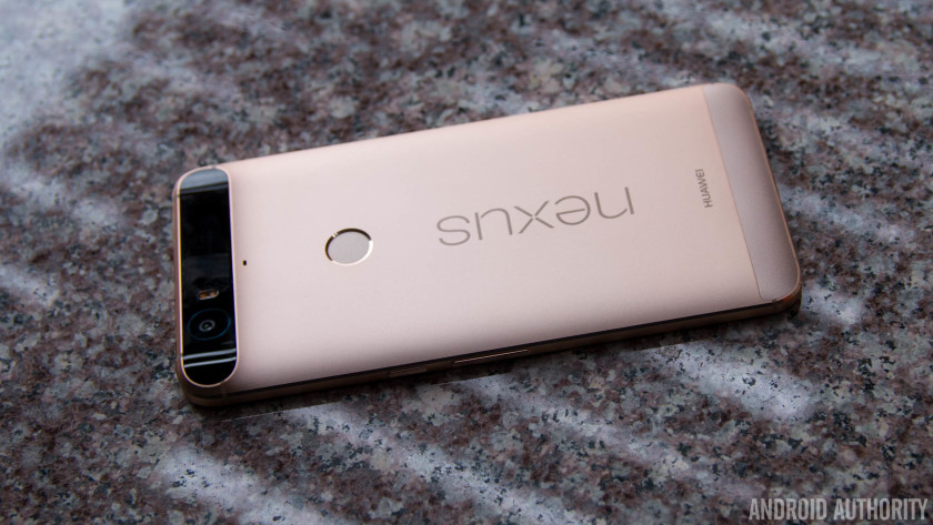
The I-1 has a very simple, clean design that’s familiar, but still new.
Lori Grunin/CNET
On top is a simple pop-up viewfinder. Magnets securely hold it in place, but since it’s removable, the company plans to offer other accessories that can quickly be attached such as a waist-level viewfinder.
With a maximum aperture of f8 you’re going to need a lot of light for your shots, so there’s a ring flash around the lens to help brighten your subjects. Well, that, and letting you know how many shots are left in your pack of film. The camera can be used with Impossible I-type and 600 type film cartridges. Each pack has eight shots and costs approximately $20, £17 and AU$29 or more each (though there is a discount if you buy multiple packs). That’s $2.50 a picture.
The I-1 instant camera itself retails for $299 (AU$390, £229) and is available exclusively at the MoMA Design Store, Colette, Paul Smith and Selfridges in the UK, as well as on http://www.impossible-project.com.
It would be easy to write this off as a novelty for hipsters and, even for instant cameras, the I-1 and its film is a pricey one to own and operate. However, instant cameras are popular. If you look at Amazon.com’s best sellers in its camera category, half of the top 20 products are instant cameras or the film for them. The fact is, just like shooting and sharing with our smartphones, instant film cameras let us capture a moment and still share it instantly. So maybe making the I-1 isn’t all that ludicrous after all?
TAG Heuer Connected Watch review – CNET
The Good The TAG Heuer Connected has striking, aggressive looks, it’s made from luxury materials and the fashionable name of its maker will appeal to those of you looking for the finer things in life.
The Bad It’s extremely expensive yet functionally offers nothing that you won’t find on Android Wear watches that cost a fraction of the price.
The Bottom Line The TAG Heuer Connected is the most fashionable way of adding smart functions to your wrist. But it’ll cost you a hell of a lot for privilege.
Visit manufacturer site for details.
So you want a smartwatch, but you don’t want a tech brand name like LG or Samsung clashing with your fancy suit? Cast your eyes, then, over the TAG Heuer Connected.
The Connected’s chunky, angular titanium body and thick rubber strap gives the watch a striking look I’m very keen on. It’s certainly more aggressive-looking than the sleek simplicity of the Apple Watch — in fact with a range of great-looking TAG Heuer watch faces to choose from (styled after the company’s analogue watches), you might not think it’s a smartwatch at all. It’s a big guy, though, so those of you with more dainty wrists will want to try before you buy.
 View full gallery
Andrew Hoyle/CNET
Running the same Android Wear software as the LG G Watch or Moto 360, it connects to your phone (either Android or iPhone) and shows incoming notifications, steps taken and a wide variety of other information from. There are about 8,000 apps that work with Android Wear watches now, but they all essentially function as a second screen for your phone.
You swipe through the notifications — shown as “cards” on the screen — using the round 1.5-inch touchscreen. It’s bright and responsive, and the 360×360-pixel resolution is sufficient for reading texts (although close up you can see individual pixels). I’d like to see a higher resolution, given the high price.

View full gallery
Andrew Hoyle/CNET
Which brings me on to my final point: the price. The watch costs a whopping £1,100 in the UK, $1,500 in the US and AU$2,000 in Australia. That’s a lot to pay for a watch that does the same as the Moto 360, which costs only £229 or $300 (it’s not yet available in Australia).
As a sweetener though, TAG Heuer has a scheme that allows you to trade in your Connected watch after two years, pay an extra £1,000, $1,500 or AU$2,000 and swap it for a mechanical watch, exclusively reserved for those of you who bought the Connected model. It’s difficult to say whether this is a good deal or not, but it does at least mean that you’ll have a watch to use long after the technology inside the Connected has become obsolete.
There’s nothing wrong with the Connected watch itself. It’s beautifully designed and those of you who want a fashionable name on your wrist, as well as a fancy new gadget, should at least go and take a look at one in a store. There’s just no escaping that massive price tag though. If you’re more excited about the smart features than the fancy name, save your money and go for any of the cheaper options.
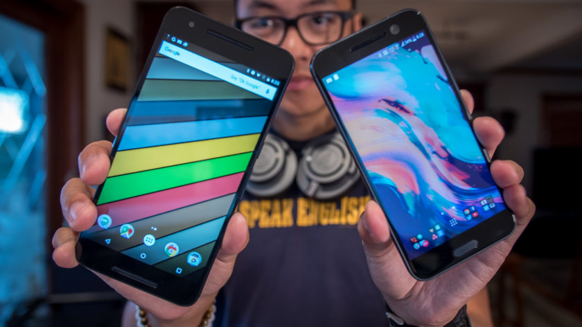
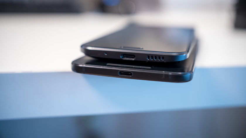
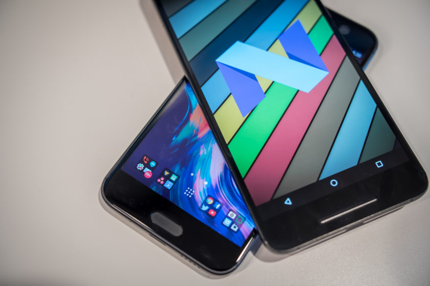
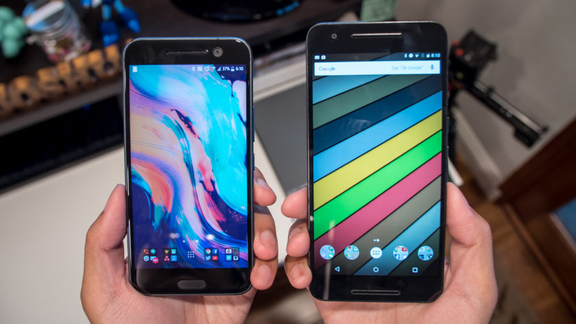
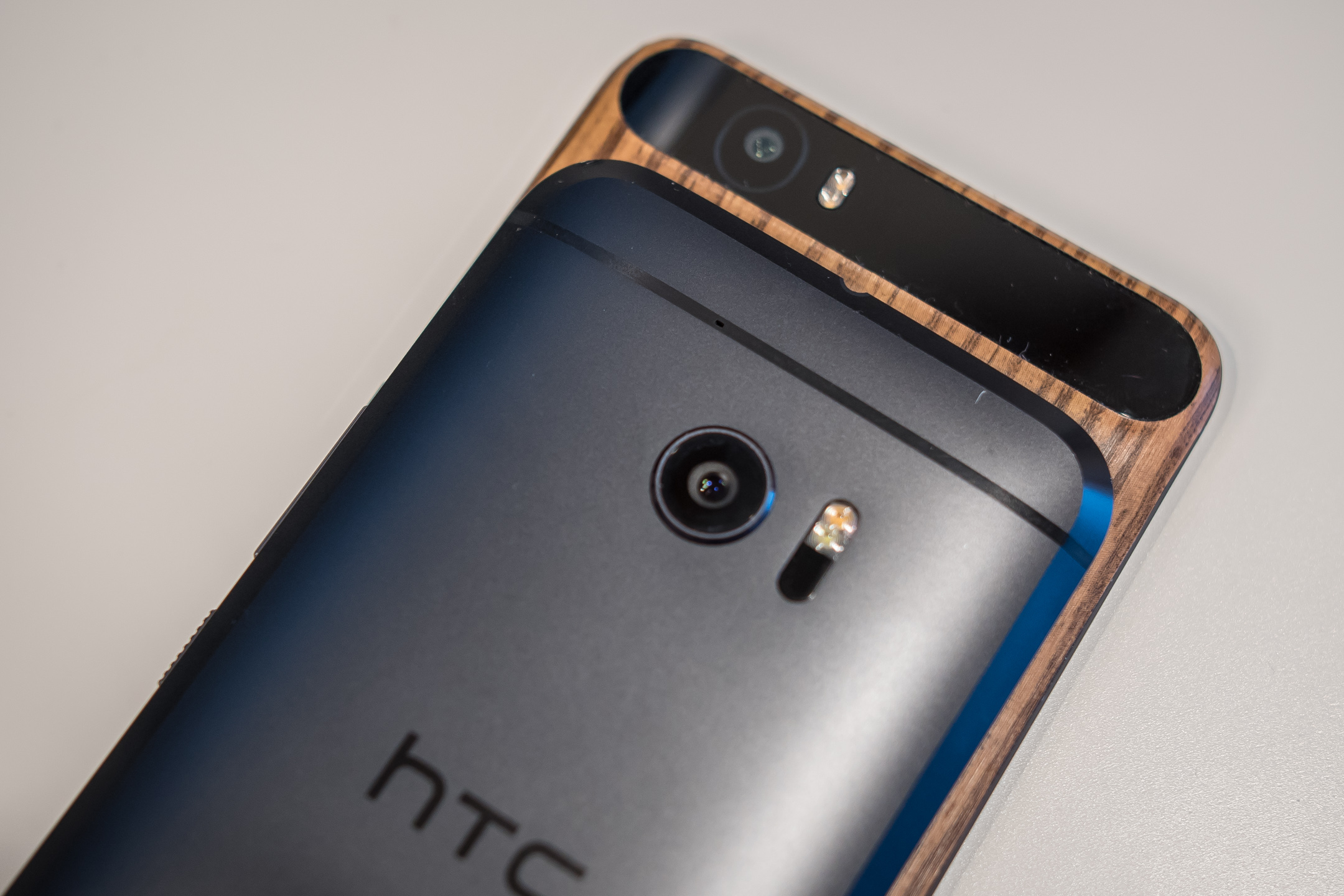
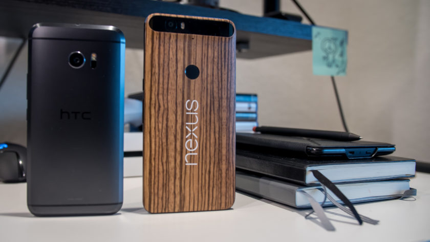
HTC 10 vs Nexus 6P
Buy the Nexus 6P
Buy the HTC 10
In the current smartphone landscape, metal is the way to go for a device to be considered “premium,” and pretty much every flagship incorporates metal into their designs, be it in the form of metal frames and glass or plastic backings, or with full metal constructions. However, as the company would gladly remind you, HTC was the first to this party, starting with the One M7, and with continuing refinements and improvements to the overall package, what we get with their latest high-end offering is the greatest and most complete HTC smartphone yet.
- HTC 10 review
- Nexus 6P review
On the other hand, Google, along with various hardware manufacturers, initially had a difficult time defining what the Nexus program should be. After the budget-friendly Nexus 5, the Nexus 6 was Google’s first attempt at bringing a truly high-end smartphone to the market, but that unfortunately meant that the key factor of affordability went by the wayside. However, 2015 is when Google seems to have got it right, with consumers given two devices to choose from. For those with budgetary concerns, the Nexus 5X is the way to go, and with the metal-clad Nexus 6P, manufactured by Huawei, Google finally has on offer a truly compelling flagship that can stand tall against its competition.
HTC’s newest, and arguably greatest, offering goes up against the best Nexus device yet, as we take an in-depth look at the HTC 10 vs Nexus 6P!
Buy the Nexus 6P
Buy the HTC 10
Design
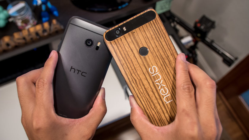
Before getting started, I have to mention that my personal Nexus 6P has been skinned to have a wooden look on the back, but for this comparison, we will take into consideration the device as it is out of the box. Metal is the name of the game with both smartphones, as they take metal to different places in their design.
The Nexus 6P without a skin
The Nexus 6P employs a full metal unibody construction with a glass bump area at the top on the back that houses the camera setup, and this has certainly been a polarizing design element. Some consider it a fashionable choice, others consider it an ugly one. Ultimately, we do think that it looks quite good and is a nice touch that makes it stand out from the competition.
With a 5.7-inch display, the Nexus 6P is understandably taller, wider, and also heavier, than the HTC 10, but Huawei has done a great job with keeping the overall footprint compact enough to allow for manageable one-handed usability. The Nexus 6P is also symmetrical up front, with speakers above and below the display for a dual front-facing speaker setup, something that is unfortunately no longer available with the HTC flagship.
The HTC 10 brings some subtle changes to a design language that we’ve already loved with previous generations. While there is still a certain familiarity when looking at the back of the phone, HTC has added a bit of girth all the way around the edges. The chamfered edges allow for a silhouetted effect that is subtle but looks great, and does enough to differentiate the HTC 10 from its predecessors.
The HTC 10 is a little wider than it should be, but because of its smaller size overall, this device certainly offers the better handling experience when compared to the Nexus 6P. However, in both cases, the metal does make both smartphones quite slippery, which can take some getting used, and you are likely better off using a case that allows for more grip to keep this beautifully designed smartphones in pristine condition.
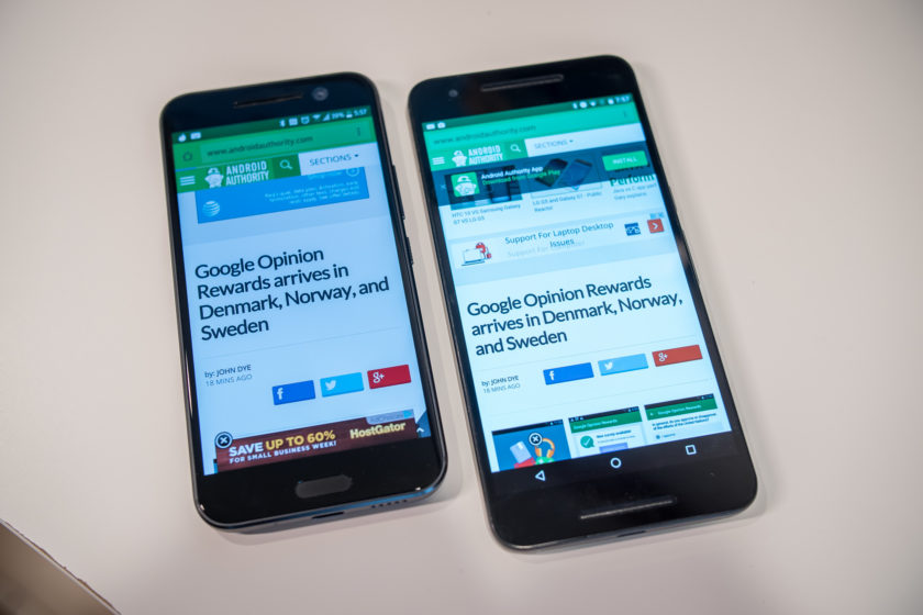
Display
The HTC 10 comes with a 5.2-inch Super LCD 5 display with a Quad HD resolution, resulting in a pixel density of 565 ppi. This display adheres to the HTSC standard, and does so while providing impressive saturation and overall performance. HTC claims that the screen has low latency when it comes to your touch and what happens on the screen, and while this may not be something that is easily noticeable, it’s still a positive with regards to the performance of the phone.
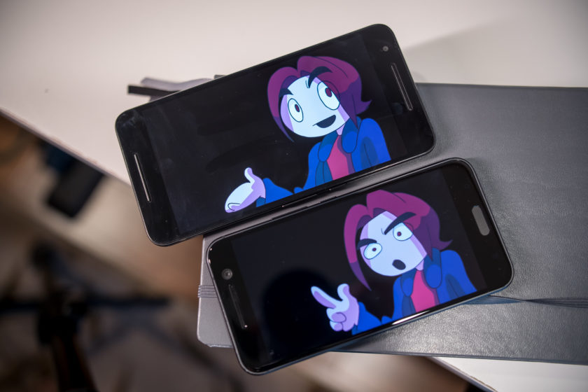
The Nexus 6P is not behind at all when it comes to the display, featuring a 5.7-inch AMOLED screen, also with a Quad HD resolution, resulting in a pixel density of 518 ppi. With an AMOLED display, you are going to get the expected deep, inky blacks and much higher saturation. However, in this comparison, there isn’t as much of a discrepancy between the two. Media consumption and gaming can be more enjoyable on the larger screen that is available with the Nexus 6P, but when it comes to the general viewing experience, both displays do an excellent job.
Performance
Performance is another area where you will not see a lot of difference between the two smartphones, given that the Nexus 6P was launched in the latter half of 2015, but the HTC 10 does see the benefits of being a newer release. The Nexus 6P comes with an octa-core Qualcomm Snapdragon 810 processor, clocked at 2 GHz, and backed by the Adreno 430 GPU and 3 GB of RAM, while the HTC 10 is powered by the quad-core Qualcomm Snapdragon 820 processor, clocked at 2.15 GHz, and backed by the Adreno 530 GPU and 4 GB of RAM.
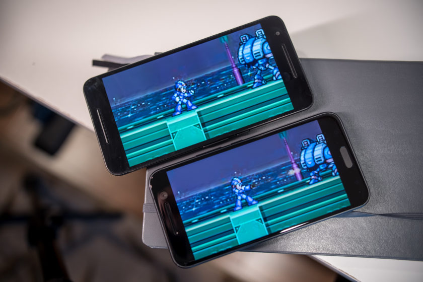
The HTC 10 is obviously going to be faster, but there isn’t that much of a difference when it comes to real world performance, with the additional gig of RAM that the HTC flagship packs being the only real differentiator. That’s not to say that the Nexus 6P will get overwhelmed easily even if you have a number of apps running in the background simultaneously, but for those of you who are spec hungry, 4 GB of RAM is what you will need. The overall performance is fantastic with both smartphones, helped along by the streamlined software experiences that is available with these smartphones, but more so in the case of the Nexus 6P, that is running stock Android.
Hardware
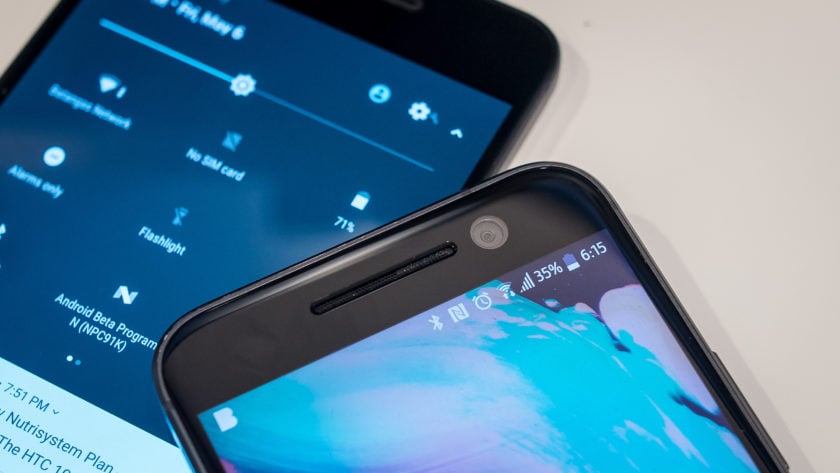
As is the case with any current generation flagship smartphone, both devices come with fingerprint scanners, but with different implementations. In the case of the Nexus 6P, the scanner is found on the back, placed ideally to be within easy reach of an index finger, and can be used to quickly wake and unlock the phone in one go. The fingerprint scanner of the HTC 10 is found up front, embedded into the capacitive home key, and is as fast and accurate as the sensor of the Nexus 6P.
32 GB and 64 GB are the built-in storage options available with the HTC 10, and you do get expandable storage via microSD card for up to an additional 200 GB. On other hand, the Nexus 6P also adds a 128 GB version, but with no expandable storage available, users are dependent on getting one of the larger storage options, and paying the associated premium, to cover their needs. Both devices come with a standard suite of connectivity options, but with the larger focus on audio, the HTC 10 also adds Air Play support.
Speaking of audio, the Nexus 6P comes with a feature that was originally one of the biggest selling points of previous HTC flagships, but is no longer available with the HTC 10 – dual front-facing speakers. With the HTC 10, you now get one speaker above the display, that is coupled with a woofer at the bottom. This does mean that the lows and mids are better, but it certainly doesn’t get as loud as the dual front-facing setup of the Nexus 6P.
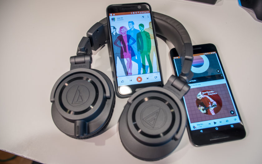
However, it’s when you plug headphones in to the HTC 10 that BoomSound earns its name. BoomSound here is Dolby enhancements, along with audio profiles that can be created by answering a few questions, or by actually going through different frequencies, using more advanced tutorials. Once everything is set up, audio sounds amazing with the HTC 10. A 24-bit DAC provides even clearer audio and a wider sound stage with good headphones, and an amp allows for the loudness that other smartphones can’t really provide, which includes the Nexus 6P.
The larger 3,450 mAh battery of the Nexus 6P allows for more longevity when compared to the 3,000 mAh unit of the HTC 10, with the former providing up to two full days of use, especially if you stretch it out using the Doze feature that is built into Android 6.0 Marshmallow. With the HTC 10, the battery life can be pushed to about a day and a half, and getting a full day of use with more than average usage isn’t going to be an issue with either smartphone. Both smartphones come with USB Type-C ports, USB 2.0 in the case of the Nexus 6P, and USB 3.1 with the HTC 10, as well as fast charging capabilities.
Camera

The Nexus 6P comes with a 12 MP rear camera with a 1.55µm pixel size, and a f/2.0 aperture, OIS, and laser auto focus system. The spec sheet of the HTC 10 is mostly identical, save for the f/1.8 aperture.
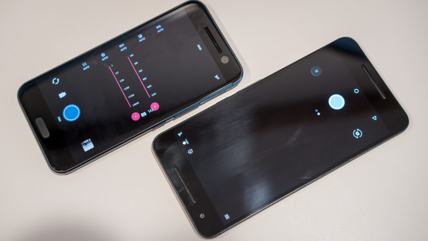
Simplicity is the main focus when it comes to the respective camera applications, with HTC further streamlining the camera app to make it easier to use. Of course, it doesn’t get any simpler than the Google camera app available with the Nexus 6P, which doesn’t come with a lot of modes, but also lacks a Pro mode, which is something that is available with the HTC 10, allowing for granular control over various settings.
HTC 10 camera samples

Optical image stabilization is also available with the front-facing camera of the HTC 10, which is a first for any smartphone. This means that you will get better looking selfies in lower-light conditions, but the availability of OIS also allows for better video capture when using the front-facing camera. It doesn’t make a particularly significant difference, but it is something that is noticeable when comparing video captures side by side, and is a subtle and small change that HTC does deserve recognition for.
Nexus 6P camera samples

The HTC 10 did receive a few software updates to improve the performance of the camera, and we will go in-depth with these changes in an upcoming feature focus. With both of these cameras being quite similar, it is a toss up between them in terms of image quality. You will see a brighter exposure in the shots taken with the Nexus 6P, with the HTC 10 dialing it back with the updates. In low-light conditions is where you will see a noticeable difference, with the HTC 10 opting for a warmer color temperature. However, with both cameras, you do sometimes end of up with grainy and noisy photos in poor lighting conditions.
The HTC 10 also has its advantage when it comes to sound, with the ability to record hi-res audio regardless of whether you are using the front or back camera. However, this does mean that processing the videos requires some tinkering, as we found that the .mkv files that the HTC 10 creates have to be tinkered with before they are recognized by most video editing software.
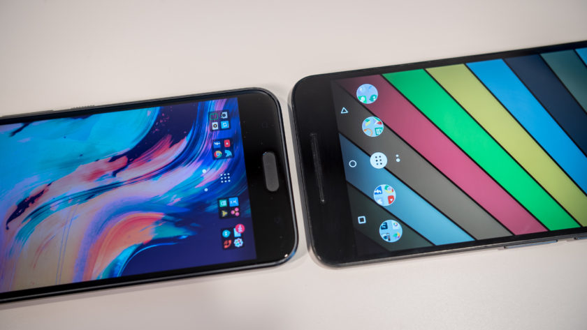
Software
On the software side of things, both smartphones are running Android 6.0 Marshmallow. HTC Sense isn’t drastically different from stock Android, especially when compared to the Samsung and LG smartphones out there. In this case, some differences are seen, since I am using the Android N beta version on the Nexus 6P, which is one of the advantages of the Nexus line.
Any Android purist will know exactly what to expect from stock Android, with the new features including Doze and Google Now on Tap, which allows for easy Google searches regardless of where you are in the phone. A lot of users enjoy stock Android because of how simple it keeps things, with functionality being the priority. HTC Sense doesn’t add a whole lot to the formula either, which is one of the best parts about it.
Sense is far more utilitarian when compared to TouchWiz or the LG UX, and aside from BlinkFeed, everything is quite familiar. There aren’t many extra features, and there are no longer any app redundancies either. For example, if you have Google Photos, you don’t get the HTC Gallery, and if you use the HTC Messages app, you are not going to have Google Messenger. HTC Sense uses a dark theme of sorts which is easier on the eyes, but there is a Themes engine available if you are looking to change the look. Overall, function is definitely king no matter which of these versions of Android you use. So, while we do love stock Android, you won’t find yourself looking to replace HTC Sense out of the box with a third-party launcher.
Specs comparison
| Display | 5.2-inch Super LCD5 display Quad HD resolution, 565 ppi |
5.7-inch AMOLED display Quad HD resolution, 518 ppi |
| Processor | 2.15 GHz quad-core Qualcomm Snapdragon 820 Adreno 530 GPU |
2 GHz octa-core Qualcomm Snapdragon 810 Adreno 430 GPU |
| RAM | 4 GB | 3 GB |
| Storage | 32/64 GB expandable via microSD up to 200 GB |
32/64/128 GB not exapndable |
| Camera | 12 MP rear camera, f/1.8 aperture, 1.55µm pixel size, OIS, laser autofocus 5 MP front-facing camera, f/1.8 aperture, OIS |
12 MP rear camera, f/2.0 aperture, 1.55µm pixel size, OIS, laser autofocus 8 MP front-facing camera |
| Connectivity | Wi-Fi 802.11 a/b/g/n/ac Bluetooth 4.2 GPS + GLONASS NFC USB 3.1, Type-C 1.0 connector |
Wi-Fi 802.11 a/b/g/n/ac Bluetooth 4.2 GPS + GLONASS NFC USB 2.0, Type-C 1.0 connector |
| Battery | 3,000 mAh non removable |
3,450 mAh non removable |
| Software | Android 6.0.1 Marshmallow HTC Sense UI |
Android 6.0.1 Marshmallow |
| Dimensions | 145.9 x 71.9 x 9 mm 161 grams |
159.3 x 77.8 x 7.3 mm 178 grams |
Gallery
Pricing and final thoughts
The HTC 10 is available for the premium monthly installment rate with the various network carriers, but can also be picked up unlocked, priced at $699. On the other hand, the Nexus 6P is currently available for the far more affordable $399, which is a great prospect, given that you are able to get a solid high-end flagship for a lower price, while providing a lot of the same features.
So there you have it for this closer look at the HTC 10 vs Nexus 6P! These two smartphones actually have quite a bit in common, and if you are in the market for a metal clad device, it doesn’t get better than these two. The Nexus 6P is a steal at its current price point however, but the HTC 10 has a couple of compelling features that make it stand out, with the main one being the audio experience it provides. The HTC 10 camera has also seen some improvements following a few software updates, and these changes are something we will explore further in an upcoming feature focus.
Buy the Nexus 6P
Buy the HTC 10
The ThinkPad X1 Tablet is like a Surface with a business twist
Imagine the unholy union of Microsoft’s Surface lineup and the iconic Thinkpad, and you have the ThinkPad X1 Tablet. It’s not Lenovo’s first Surface clone — that would be the cheaper and less equipped Miix 700 — but it’s the company’s first for its ThinkPad lineup, which is targeted at the professional crowd. After years of honing the art of building convertible laptops, Lenovo seems like a safe bet for delivering a solid, Surface-like hybrid tablet. And for the most part, it succeeds.
Hardware
If you have a soft spot in your heart for the iconic ThinkPad design, the X1 will probably strike your fancy while it’s in laptop mode. It has a minimalist black metal case, a fairly spacious keyboard and heck, there’s even the love-it-or-hate-it bright red TrackPoint. It’s a subdued design that reminds me of a classic, business-oriented Windows laptop.
But of course, it’s much more than that: Its keyboard is ultra-thin and completely removable. There’s also a kickstand on the back of the tablet. And, lest you forget, it’s as much a tablet as it is a laptop. It doesn’t look as ultra-modern as the Surface devices, but it’s no less impressive. Toeing the line between respecting ThinkPad tradition and pushing entirely new form factors is tough, but the X1 Tablet manages it well.

Thanks to its 12-inch screen, it’s fairly hefty for a tablet, clocking in at 1.7 pounds. Together with the keyboard case, it weighs 2.35 pounds. That’s almost exactly the same as the Surface Pro 4 (a part of me wonders if Lenovo is trying to prove it can go toe-to-toe with Microsoft). It’s significantly heavier than standalone 10-inch tablets like the iPad Air, but it’s only around 0.1 pounds heavier than the 12.9-inch iPad Pro. In a way, the X1 is the antithesis than the iPad Pro: It can be a tablet when you need it, but most people would be buying it as an ultraportable laptop.
The actual tablet portion of the X1 isn’t much to look at. Its chassis is mostly made out of magnesium (with a bit of plastic thrown in), and it measures an impressive 8.6 millimeters thin. It feels just as sturdy as other metal ThinkPad cases, which PC users have long been praised for their ability to take a licking. Lenovo says the X1 passes 10 military certification tests, which are a big deal for government clients, and it’s capable of running between -20 degrees Celsius (-4 Fahrenheit) and 60 Celsius (140 Fahrenheit).

From the front, there’s a significant amount of bezel around the display, a 2-megapixel webcam up top and a fingerprint reader on the right side. From the back, it’s a bit more interesting: A small latch opens up the kickstand, which folds out from the bottom of the tablet (the Surface’s stand comes out from the top). While that orientation seems a bit odd at first, it makes the X1 far easier to hold on your lap than the Surface tablets, since there’s more than just a single edge of the stand digging into you.
There’s an 8-megapixel camera on the back of the X1, and around the sides you’ll find a USB 3.0 port, a USB-C connector, a single Mini DisplayPort and a combination headphone/microphone jack. The USB-C port is also used to charge the X1, something that’s quickly becoming the norm for thin tablets and laptops these days. In addition, there’s a microSD card slot under the kickstand for extra storage.

The X1’s keyboard comes bundled with the tablet (something I’ve long argued that needs to happen with the Surface) and it’s pretty thin, measuring at just 4.6 millimeters thick. It has a full-sized array of chiclet keys, and as I mentioned above, there’s the standard ThinkPad TrackPoint nub. Below that, there are two physical mouse buttons, a scrolling button and a large multitouch Mylar trackpad. It snaps onto the X1 easily via a magnet, and like the Surface, that connection is strong enough to hold up the entire tablet by the keyboard (just don’t shake it too much).
One intriguing aspect of the X1 is its expandability, thanks to a few optional modules that plug onto the bottom of the tablet. Lenovo’s $150 productivity module, for example, adds a HDMI and a few more USB ports, along with five extra hours of battery life. There are also modules for taking 3D images, and projecting images onto walls. Lenovo didn’t have any of these expansion offerings available to test at the time of this review, but we’ll update once we get some hands-on time with them.
Display and pen input

The ThinkPad X1’s 12-inch screen packs in a 2,160-by-1,440-pixel resolution, which is decent for its size, but not quite as sharp as the Surface Pro 4’s 2,736-by-1,824 pixel display. Still, it looks good, with accurate colors and more than enough brightness (I typically kept it around 50 percent indoors). Outdoors, the X1 was usable in direct sunlight; it’s far easier to see than my 2014-era MacBook Air, even while wearing sunglasses. But as with every device with a glass-covered screen, you should expect a bit of glare.
As a tablet, the X1’s screen is at its best when you’re viewing videos and digital comics. It’s a 3:2 aspect ratio panel, so you’ll get black bars with widescreen videos, but it made movies and TV shows look great. Those proportions were also well-suited to comics, since they could fill up the screen easily without needing to zoom in. I still feel a bit cramped working on a 12-inch display, especially after growing used to to the 13-inch MacBook Air and my 24-inch desktop monitors. It’s also a bit too heavy to hold with one hand for extended periods, but it’s fine for the occasional comic or news article.

Lenovo also packs in a stylus, called the ThinkPad Pen Pro. It uses Wacom’s active electro-static (AES) technology to deliver 2,048 levels of pressure sensitivity — twice as much as the latest Surface Pen. The Pen Pro is powered by a single AAAA battery, which thankfully comes in the box. Unfortunately, though, there’s no place to stow the pen on the X1 itself. Lenovo includes a plastic holster that plugs into a USB port, but that’s not really useful if you need to use the tablet’s only USB connection. (It also just looks weird having the stylus hang off the side.)
In Lenovo’s WriteIt app, which comes preloaded on the X1, the Pen Pro felt surprisingly accurate. The pen had no trouble determining different levels of pressure, and it captured my scribbles without any big delays. Unfortunately, it’s a bit too slippery on the screen for taking notes, or for extended use. Microsoft mostly avoided that issue with the Surface Pro 4, which feels more like putting pen to paper (and you can customize it further with replaceable stylus tips).
Typing experience

The ThinkPad X1 is a bit deceptive on the keyboard front. It looks like a typical, full-sized ThinkPad keyboard, but its buttons don’t have the same amount of depth as Lenovo’s traditional laptops. I was still able to type fairly quickly, but the actual act of pressing down on keys felt mushy and not very satisfying. Perhaps I’m just too demanding as a heavy typer (I make a lot of noise!), but I expected a bit more from Lenovo, especially since Microsoft was able to deliver a truly great keyboard with the latest Surface Type Cover.
With the kickstand folding down from the bottom of the X1, I had no problem balancing it on my lap, bed and a variety of other scenarios. It’s a smart change from Microsoft’s Surface hinge: In typical laptop mode, it creates a flat surface that makes the X1 feel more like a laptop, and not a tablet being held precariously. It’s also more comfortable on bare legs, which is a good thing if you’re wearing shorts.

While I got used to the feel of the X1’s keyboard eventually, I never quite got the hang of its Mylar trackpad. It always felt a bit too stiff and jerky; it’s nowhere near as smooth as glass trackpads like we see on the MacBooks and the Surface Type Cover. It ended up being a problem navigating menus and options in our ancient CMS and Windows apps like Evernote, which have way too many small buttons to click on.
I’ve never been a big fan of the ThinkPad TrackPoint nub, but I learned to appreciate it on the X1, as I was stuck on a flight next to a particularly inconsiderate seat neighbor. Since I didn’t have enough elbow room to use the trackpad, I was forced to get the hang of the TrackPoint, which only requires gently moving a finger around. It took me longer than usual, but I was able to deal with my email backlog and write a few posts without constantly elbowing the person next to me. This is all to say: I finally get it, ThinkPad nerds!
Performance and battery life
| Lenovo ThinkPad X1 Tablet (1.2 GHz Core M7-6Y75, Intel HD 515) | 4,951 | 3,433 | E1,866 / P1,112 | 2,462 | 298 MB/s / 545 MB/s |
| Samsung Notebook 9 (2.5GHz Core i7-6500U, Intel HD 520) | 5,309 | 3,705 | E2,567 / P1,541 / X416 | 3,518 | 539 MB/s / 299 MB/s |
| Dell XPS 13 (2.3GHz Core i5-6200U, Intel Graphics 520) | 4,954 | 3,499 | E2,610 / P1,531 | 3,335 | 1.6GB/s / 307 MB/s |
| HP Spectre x360 15t (2.4GHz Core i5-6200U, Intel HD 520) | 5,040 | 3,458 | E2,672 / P1,526 / X420 | 3,542 | 561 MB/s / 284 MB/s |
| Razer Blade Stealth (2.5GHz Intel Core i7-6500U, Intel HD 520) | 5,131 | 3,445 | E2,788 / P1,599 / X426 | 3,442 | 1.5 GB/s / 307 MB/s |
| Toshiba Radius 12 (2.5GHz Intel Core i7-6500U, Intel HD 520) | 5,458 | 3,684 | E2,865 / P1,622 | 3,605 | 552 MB/s / 489 MB/s |
| Microsoft Surface Pro 4 (2.4GHz Core i5-6300U, Intel HD 520) | 5,403 | 3,602 |
E2,697/ P1,556/ X422 |
3,614 | 1.6 GB/s / 529 MB/s |
| Lenovo Yoga 900 (2.5GHz Core i7-6500U, Intel HD 520) | 5,368 | 3,448 |
E2,707 / P1,581 |
3,161 | 556 MB/s / 511 MB/s |
| Microsoft Surface Book (2.4GHz Core i5-6300U, Intel HD 520) | 5,412 | 3,610 |
E2,758 / P1,578 / X429 |
3,623 | 1.6 GB/s / 571 MB/s |
I tested the highest-spec X1 tablet (which comes with a Core M7 CPU, 8GB of RAM and a 256GB SSD) for more than a week with my normal workflow. That usually consists of having several programs and windows open at once, including Slack to chat with coworkers, multiple browsers and dozens of tabs open for research and writing, Evernote for note taking and Spotify for some tunes. Despite being a lower-powered Core M CPU, the X1 had no problem keeping up with my demanding routine.
It was also my only computer on an intense work trip to Austin, which involved covering a major NVIDIA press event. I wasn’t initially planning to use the X1 in such a high-stress environment, but I managed to get a lengthy article out and a few pictures while balancing it on my lap in a crowded auditorium.
As you can see from the benchmarks above, the X1 I tested lands somewhere between the Surface Pro 3 with a Core i5 4300U processor and the Surface Pro 4 with a Core i5 6300U chip. That’s respectable, given that Lenovo’s tablet was running at a paltry 1.2GHz clock speed, while the Surface Pros were running between 1.9GHz and 2.4GHz. It also managed to stream 4K videos from YouTube without skipping, and it kept up with my workflow even when I had to start image editing and moving large photos around. No, it won’t smash any speed records, but it’s enough to be productive while barely breaking a sweat.

The X1’s biggest problem is battery life. In my typical usage, it lasted for a mere four and a half hours. Our battery test, which involves viewing an HD video on repeat until it runs down, was a bit more promising, yielding around seven hours of runtime. It could just be that it’s very efficient at playing video (I tried to turn off all the power optimizations I could), but the X1’s subpar performance in other scenarios is worrisome. If you’re considering it, I’d seriously recommend the optional $150 productivity module for additional battery life. (But keep in mind that’ll make the X1 heavier.)
Battery life
Lenovo ThinkPad X1 Tablet
7:05
Surface Book (Core i5, integrated graphics)
13:54 / 3:20 (tablet only)
MacBook Air (13-inch, 2013)
12:51
HP Spectre x360 (13-inch, 2015)
11:34
Surface Book (Core i7, discrete graphics)
11:31 / 3:02 (tablet only)
Apple MacBook Pro with Retina display (13-inch, 2015)
11:23
iPad Pro
10:47
HP Spectre x360 15t
10:17
Chromebook Pixel (2015)
10:01
Lenovo Yoga 900
9:36
Microsoft Surface 3
9:11
Samsung Notebook 9
8:16
Apple MacBook (2015)
7:47
Dell XPS 13 (2015)
7:36
Microsoft Surface Pro 4
7:15
Microsoft Surface Pro 3
7:08
HP Spectre x2
6:43
Razer Blade Stealth
5:48
Dell XPS 15 (2016)
5:25 (7:40 with the mobile charger)
Toshiba Radius 12
5:12
Configuration options and the competition

When the X1 was initially announced at CES, Lenovo said it would start at $899 with its keyboard. But it seems the price has been bumped up over the past few months. The entry-level X1, which comes with a Core M3-6Y30 processor, 4GB of RAM and a 128GB SSD, now starts at $1,029. Coincidentally (or perhaps not so much), that’s the same price as the cheapest Surface Pro 4 ($899) plus the $130 Type Cover. Lenovo probably thinks it can justify the higher price since Microsoft is doing the same thing, but that also undercuts one of its initial advantages over the Surface.
For $1,349, you can snag the X1 with a Core M5-6Y57 processor, 8GB of RAM and a 256GB SSD. And at the top end, there’s the $1,649 model I’m testing, which adds the Core M7-6Y75 processor. That’s a surprisingly wide pricing spread, but for the most part, I think most consumers would be better off with the $1,349 model. That’s if you can get over the X1’s mushy keyboard and short battery life, though.
If you’re looking for a modern hybrid tablet/laptop, the Surface Pro 4 is still a better option, even though you have to shell out extra money for its keyboard. It has faster hardware, a better keyboard (and trackpad), as well as far more reliable battery life.
Still, I recognize that some businesses are committed to the ThinkPad brand, and most corporate workers don’t have a choice when it comes to choosing what type of computer they can use. If that’s your situation and portability is your main concern, then the X1 remains a solid option.
Wrap-up

We’ve seen Lenovo dabble with hybrid ThinkPad designs with its Helix series over the past few years, but the X1 Tablet is its first truly successful hybrid. No, it’s not perfect: I’d love to see better battery life and an improved keyboard. But it does a decent job of bringing some of the most intriguing elements of Microsoft’s Surface lineup to business users.
Meizu Pro 6 review – CNET
The Good The Meizu Pro 6’s 10-core processor delivers speedy non-gaming performance, the phone has premium touches like USB-C and a fingerprint sensor and its sub $400 price is relatively cheap.
The Bad A jarring copycat iPhone design, poor gaming performance and awkward navigation that makes the Pro 6 clumsy to use.
The Bottom Line The Meizu Pro 6 packs impressive specs into a relatively cheap frame, but it loses key Android functionality in its attempt to look like an iPhone.
Visit manufacturer site for details.

One of these phones is not like the others.
Dave Cheng/CNET
The Meizu Pro 6 looks a lot like an iPhone.
The similarities can be hard to get over, but that’s likely by design, given the energy the Chinese vendor has clearly put into making an iClone. And though it houses some respectable tech, the Pro 6 tries too hard to be an Apple product to really excel at being an Android.
The three main areas the Pro 6 is a let down are clumsy navigation, an operating system not fit for western users and, despite having a 10-core processor, surprisingly weak gaming capabilities.
The conspicuous absence of a return (back) button is perhaps most bothersome. With no button, you swipe across the home button panel to go back (or forward). You can also use “smart touch”, which puts a small thumbstick on the screen which you can tap to go back, toggle side-to-side to navigate between apps, and so on. Both methods are functional but feel awkward. I never noticed how important the back button of an Android was until I didn’t have one.
Meizu’s customized software layer, FlyMe 5.6, is a modified version of Android 6.0 Marshmallow. It’s designed to look a lot like Apple’s iOS operating system, with almost identical lock-screens and, as is typical of many Chinese phones, no app drawer — that means that app icons spread out across multiple home screens. Unlike iOS, though, you can add widgets.
Meizu packs USB-C and other premium touches…
See full gallery


1 – 5 of 8
Next
Prev
FlyMe works well, but is built for the Chinese market. Apps will push notifications in Chinese, even with English set as the default language. There’s also no support for Google services, like the Google Play Store. All of this can be fixed by manually installing the Play Store and a custom launcher, but it’s bad news for those who want a phone they can unbox and use right away.
One considerable downer is the phone’s poor gaming performance. It scored low in our benchmark testing, and 3D games like Sonic Dash didn’t feel completely smooth to play.
Meizu’s new flagship isn’t officially available in the US, UK or Australia, but you can buy it online. It comes in black, gold and silver variations, and retails in China for 2,499 yuan, which converts to roughly $385, AU$510 and £265.
2016 Nissan Altima review – Roadshow
The Good The Altima’s so-good-it’s-nearly-invisible CVT provides a smooth drive with solid fuel economy, and the car is quite the looker, too.
The Bad The infotainment system lacks Apple CarPlay and Android Auto smartphone connectivity, and the interior gets a bit drab when ordered in black.
The Bottom Line If you can’t decide between sporty or cushy, the 2016 Nissan Altima is a wonderful middle ground that can give drivers a bit of both.
Roadshow’s spent some time in the past few weeks with midsizers both sporty and soft, but after a week behind the wheel of Nissan’s refreshed Altima, I’ve come to find that the Altima strikes a good balance between those two extremes.
It’s not too soft, and it’s not too harsh. It’s not too racy, and it’s not a complete snooze fest. I’ll spare you the full Goldilocks analogy. I’m sure you get where this is headed.
One heck of a refresh
Nissan threw everything but the kitchen sink at its venerable middle grounder as part of a mid-cycle refresh for the 2016 model year. While the rear end has been sharpened a bit, most of the action is in front of the A-pillars, where the Altima’s countenance is reminiscent of the new Maxima.

The Altima’s rocking one of the best looks in the segment.
Andrew Krok/Roadshow
Personally, I think the coalescing of styles under Maxima is a very good thing. The “V Motion” grille gives the front end a nice shape, and the contours on both the headlights and front fenders give the car a much stronger look than before. In a segment rich with competition, not all of which possess style points, Nissan’s done a good job here giving the Altima a beefier look that puts it close to other sportier-looking cars, such as the Mazda6.
There have been far fewer updates to the interior than I’ve seen on the exterior, but that’s because it didn’t need much. It’s a straightforward affair, with just a bit of dashboard layering to give it a premium sheen. The plastics are all on the harder side, and if you order the entire interior in black, as my test car’s was, it’s going to be a bit drab and cavernous.
That said, the cloth seats are comfortable — not too hard, not too firm — and they heat up quick in conjunction with the SV trim’s optional front heated seats. Storage is ample, too, with a small-purse-sized center console cubby and another one under the center stack. The interior is just a bit more boring than the exterior would have you expect.
Plenty tech-y for the average buyer
Whether you prefer to access in-car tech through the infotainment system or your smartphone, there’s plenty to dig on the Altima, even if you’re not vying for the top trim with all the options possible.

Some simple map controls, like zooming in and out, are hidden behind other buttons, which can be a little counterintuitive.
Andrew Krok/Roadshow
There’s one USB port and two 12-volt outlets up front, but nothing for rear-seat occupants. Plug your phone in with the USB connection, and it will start charging even before the car is turned on. That’s a nice little touch.
Speaking of touch, the touchscreen infotainment system is quick to respond to both button and finger presses. I tested the optional 7-inch screen, but 5 inches is standard. Switching between functions is easy, thanks to the physical navigation buttons flanking the screen. Bluetooth phone pairing is initiated through the screen and it takes about 30 seconds to complete.
The infotainment system has a wealth of on-board apps that rely on the satellite-radio antenna. These include traffic and weather alerts, sports scores and movie-ticket information. Using your phone’s connection, you can also access Google search, Pandora and TripAdvisor.
You can also connect the car with your phone thanks to the NissanConnect app. That gives you access to the car’s functions (locking, unlocking, starting) and information. It also allows you to manage in-vehicle destinations and reassures overprotective owners with warnings such as the speed alert and a valet alert, which notifies you if the car travels more than 0.2 miles away. It’s not the flashiest app, but it’s effective.
Finally, there’s an information display nestled between the gauges that delivers loads of information. Using the steering wheel controls, you can access tire pressures, fuel economy readouts, navigation directions, audio information, vehicle warnings and settings. It’s big, colorful and easy to read.
LG Phoenix 2 Release Date, Price and Specs – CNET

AT&T
I’d love to say that AT&T’s new LG Phoenix 2 bursts with cutting-edge tech befitting its exciting name, but the reality is that we’re looking at a relatively entry-level smartphone for AT&T’s prepaid GoPhone brand.
Hey, at least it’s affordable!
Here’s what you get for $100:
- Android 6.0 Marshmallow software
- 5-inch screen
- 8-megapixel rear camera
- 5-megapixel front-facing camera
- 1.3GHz quad-core processor
- 2,125mAh battery
- 16GB internal storage, 1.5GB RAM
- MicroSD card support (up to 32GB)
- Color: Black
Wallet-watchers can pick up the prepaid phone online at AT&T’s website immediately, or wait for May 14 to pick it up at “select” retail stores.
The phone makes its way to AT&T retail shops starting June 10.
Tikteck Multi-Color Bluetooth LED review – CNET
The Good Tikteck’s colors are vivid and accurate, and the app’s ability to set lighting timers works well, even when your phone is out of Bluetooth range.
The Bad The bulb’s white-light tones aren’t as bright as advertised, and the music sync feature didn’t work at all. And don’t expect compatibility with Nest, Alexa, or any of the other third-parties that work with bulbs like Lifx or Hue.
The Bottom Line This is a pretty unexceptional smart bulb, but it delivers on most of its promises at a bargain bin price. For basic, app-enabled color control, it’s a decent pick.

Tikteck does a good job with colors that Hue struggles with, like green and cyan. None of the colors are very bright, though.
Ry Crist/CNET
Color-changing smart bulbs are often stupid expensive, but the $10 Tikteck LED is an exception. At a fraction of what you’d expect to spend on bulbs from Lifx or Philips Hue, Tikteck’s Bluetooth LED offers app-enabled color control, along with a scheduling feature that’ll program the bulb to turn on or change colors at a specific time.
Mind you, this is a simple, unexceptional smart bulb we’re talking about, with a generic-looking app that won’t work with Nest, IFTTT, Alexa, Apple HomeKit, or any other notable third party. If that’s the sort of smart-home integration you’re after, then you’re better off splurging on a better-connected bulb. That said, as far as basic, bargain-priced novelties go, Tikteck gets the job done better than you might expect. And hey, “Hue for cheapskates” isn’t the worst pitch I’ve ever heard.

Tikteck’s app is nothing special, and the badly translated English is confusing at times, but it still does a fine job with color control and scheduling.
Screenshots by Ry Crist/CNET
The Tikteck LED’s packaging pegs it at 600 lumens, but I clocked it at 424 lumens at its default white-light setting (about as much as you’d expect from a 40W incandescent), with a color temperature of roughly 3,500 K. You can dial the color temperature up to around 5,500 K or down to about 2,800 K, but the brightness dips either way. You can also dim the bulb cleanly down to zero right in the app.
The Tikteck app also gives you a color wheel. Tap one of its colors, and the bulb will follow suit. I don’t like that the app gives no indication of the currently selected shade, but it’s quick and responsive to use, and the bulb’s colors are vivid and more accurate than I’d honestly expected. They weren’t very bright, though, none of them registering above 100 lumens. That’s good enough for mood lighting, or maybe accent lighting at a party, but not much else.
Aside from the controls for brightness, color and color temperature, the app has a variable-speed color-cycling mode that works fine, a nightlight mode that simply dims the bulb way down, and a music syncing mode that I couldn’t get to work at all. You can also schedule lighting changes that will run even if your phone is out of Bluetooth range, or out of battery — a nice touch for anyone looking to use this thing as a wake-up light. And sure, Tikteck’s smarts are nowhere near as sophisticated as what you’ll get with Lifx or Philips Hue, but at $10 a pop, that really doesn’t matter too much. If color-changing lights have tempted you in the past, but the high prices have turned you off, then maybe this is the bulb you’ve been waiting for.
Dlodlo Glass V1 Release Date, Price and Specs – CNET

The Glass V1 looks more like a pair of sunglasses than a VR headset.
Aloysius Low/CNET
If you’ve found current VR headsets bulky and hot to use, Chinese VR maker Dlodlo (pronounced “dodo”) has just the thing: the Glass V1, which makes an appearance here in Shanghai at CES Asia. At just 2.75 ounces (78 grams), it’s about half the weight of LG’s 360 VR, itself light by most standards.
Looking like a chunky pair of aviator sunglasses, the Glass V1 easily fits into a pocket, unlike its more bulky counterparts. It won’t be cheap — Dlodlo says its second VR headset will retail for around $500 (that’s around £350 or AU$680). That’s because Dlodlo isn’t skimping on the Glass V1’s components, with a resolution of 2,560×1,024 pixels for each eye, with a 100-degree field of view and support for those with myopia.
While I would have loved to have tried on a pair, the company only had production samples on hand that were not working, and this doesn’t really inspire much hope in me. Unlike VR headsets such as the Samsung Gear VR, there’s nowhere you can slot in a mobile phone.
Instead, like the 360 VR, you connect the Glass V1 to a mobile phone or Dlodlo’s D-Box. This bundled box runs Android and is powered by a quad-core CPU, 4GB of RAM and 32GB of onboard storage. There’s just one thing that concerns me — the connecting wire could get in the way of the VR experience.
I’m hoping the Glass V1 won’t be as bad as LG’s 360 VR, but it has the same open style, which in the 360 let in light and ruined VR’s sense of immersion. The Glass V1 will likely be sold online when it launches in three months’ time.
What you need to know
- On sale in August
- Super light at just 2.75 ounces (78 grams)
- $500 (£350 or AU$680)
- Comes bundled with Android touch-enabled box
Jawbone UP3 review
Buy now from Amazon
The Jawbone UP3 is one of the most attractive fitness trackers on the market right now, even though it’s over a year old. It’s thin, lightweight, and looks more like a piece of jewelry than anything — something most other fitness trackers can’t say for themselves. But we all know looks aren’t everything, which is why we still want to review the UP3. It’s price is getting lower and lower every day, but can it survive in a world filled with entry-level, affordable activity trackers? Find out this, and more, in our Jawbone UP3 review.
Review notes: I’ve been using the Jawbone UP3 as my main fitness tracker for the past two weeks, though I’ve been using it intermittently for roughly three months. The Nexus 6P has been my smartphone companion of choice for the duration of this review.
Design
It’s not a stretch to say that the UP3 is a good-looking device. In my opinion it doesn’t come with any eyesores or anything that really makes it look like a fitness tracker. It’s comprised mostly of a premium rubber material that’s plenty durable and comfortable on the skin. The top of the device — the part that carries all the internals — is made of plastic. Our particular unit has a ridged pattern on the top, though other models with different textures are available, as well.

This is the most uncomfortable fitness tracker I’ve ever worn
Unfortunately that’s where the positives end for the UP3 in the design department. On the inside of the device you’ll notice five little gold spikes. These are the bioimpedance sensors that will keep track of your heart rate. The placement of these sensors is what makes the UP3 so uncomfortable to wear, though. They dig right into the skin and often leave marks, as you can see below. During the review period, I was constantly adjusting the placement of the tracker on my wrist in hopes to make it a little more comfortable. No matter if I was wearing it closer to my hand or further away from it, I just couldn’t find a comfortable position.

It would have been nice if Jawbone included an optical heart rate sensor, like you’d find on the Fitbit Charge HR or Blaze. We’ll talk more on this later, but I can’t help but think an optical HR monitor would make the device much more comfortable to wear everyday.
 See also: Fitbit Charge HR review3

The awkward clasp mechanism Jawbone implemented here isn’t very good, either. No matter where I wore it on my wrist or how tight I was wearing it, I found the UP3 falling off multiple times per day. This is obviously not something you want to see on a fitness tracker, but unfortunately that’s the case here, at least with my unit. And most of the time I wouldn’t even be exercising and it would fall off. Whether I was wearing it at the grocery store, cleaning the apartment, going for a run or sleeping, I just couldn’t get this thing to stay on my wrist.

As you’ve probably already noticed, there’s also no display on the UP3. There are only three little LED-lit icons that tell you which mode you’re in. This means that if you want to see how many steps you’ve taken for the day, when your next alarm will go off, or anything else, you’ll need to fire up the UP app and wait for your tracker to sync.
Features and performance

The usual bevy of fitness tracking metrics are offered by the UP3. It will track your steps taken, distance traveled, calories burned and even your sleep. I compared the UP3’s fitness tracking results with my Fitbit Alta and Withings Activité Steel, and all three trackers seemed to give me similar results in terms of step, distance and calorie tracking.
 See also: Fitbit Alta review2

Since there’s no display on the UP3, you won’t need to manually select a start workout now button when you plan to start your exercise. All of your workouts are recorded automatically in the UP app, which works most of the time. Oftentimes I’d find the UP3 would record my workouts to be a little shorter than they actually were. So if I went on a 40-minute run, for instance, the device would sometimes record it as a 34-minute workout or even less than that. You can always edit your workouts in the UP app after the fact, but that’s not really ideal.

On a positive note, the UP3 will remind you to move if you’re inactive for any time between 15 minutes and 2 hours. You can also set times where this feature is turned off, so it won’t annoy you when you’re trying to relax at the end of the day. This is a small feature, but one I found to be quite handy.

Sleep tracking is also present here, and it’s one of the tracker’s main features I didn’t have a ton of problems with. The UP3 can record your light sleep, deep sleep and awake times throughout the night, and I’ve found the results to be accurate. It also comes with a cool feature called Smart Alarm that will wake you up at just the right moment in your sleep cycle. Smart Alarm is also one of those little features I really loved about the UP3.
The sleep tracking feature isn’t helpful when the band falls off at night
This is unfortunately another area where that horrible clasp mechanism comes into play. Remember when I told you the UP3 would fall off at the grocery store and basically everywhere else? Yeah, that doesn’t get much better during sleep. A lot of the time I’d wake up and the UP3 would be lying next to me or unclasped but still on my wrist. Plus, since it’s so uncomfortable to wear because of those bioimpedance sensors, it was tough to forget I was wearing it when I went to bed.

Heart rate tracking on the UP3 is sort of a disappointment. Since it doesn’t come with an optical heart rate sensor, the bioimpedance contacts will only measure your resting heart rate and passive heart rate. This means it will collect your HR data throughout the day and store it within the app, but you won’t be able to manually choose when it records this data. So if you’re working out, just went for a long walk or are simply sitting around, you won’t get real-time HR stats, which is arguably what most people want out of a fitness tracker with a built-in heart rate sensor. That’s not to say resting heart rate data isn’t necessary or useful — it is, and very much so. Resting heart rate data will help you determine how factors such as caffeine, stress and more affect your heart each day. But when Jawbone originally claimed the UP3 was the “world’s most advanced fitness tracker”, I thought it would bring a little more to the table than what it currently offers.
All in all, the heart rate readings I was given were mostly accurate. It wasn’t too far off from what the Charge HR or Blaze would give me, and that seems to be the case with most other wrist-mounted fitness trackers out there.

The lack of proper waterproofing is a disappointment
We should also talk about what’s perhaps the most controversial part of the UP3: waterproofing. Well, lack thereof, actually. Jawbone delayed the launch of the UP3 for 6 full months because it couldn’t figure out how to waterproof the device properly. The UP3 eventually shipped out to consumers, but it was water-resistant, not waterproof. This means you can wear it in the rain and you don’t need to worry about sweat or getting it wet in the shower. You do, however, need to take it off before jumping in the pool or relaxing in the sauna.

One other no-so-bad part of the UP3 is its battery life. Jawbone says it will last 7 days on a single charge, and I’ve been able to achieve just that, if not more. It’s sort of a pain to charge the device, though. You don’t really have to plug the device into anything, per se, but you do have to sit it awkwardly on the induction USB charger just right otherwise it won’t charge.
| Heart rate monitoring | Yes – passive and resting heart rate, but not active heart rate |
| Splash-proof | Yes, but not water-proof |
| Sleep tracking | Yes |
| GPS | No |
| Power and battery | Battery life: up to 7 days 38 mAh lithium-ion battery |
| Sensors | Bluetooth 4.0 BLE Tri-axis accelerometer Bio-impedance: -Heart rate -Respiration -Galvanic Skin -Response (GSR) |
| Compatibility | Android, iOS, Windows Phone |
| Dimensions and weight | 220 mm x 12.2 mm x 3.0 mm-9.3 mm 29 g |
Software

Jawbone’s UP app isn’t necessarily the most intuitive thing out there, but it does a good job at displaying your most important information at the forefront. It not only gives you standard step, calorie and distance information, but also tips and tricks on how to achieve your next round of goals.


It also hooks up to a large number of other apps like MyFitnessPal, IFTTT, Runtastic, and even other devices like the Nest Thermostat and Withings Scale.


Gallery

Should you buy it?
Buy now from Amazon
No, you should not buy the Jawbone UP3. It’s not the best or cheapest fitness tracker on the market… not even close. It’s clasp is poorly designed, it isn’t comfortable, it’s not waterproof, and doesn’t have a display. So what does it do well? It can handle step and sleep tracking well enough (when it manages to stay on your wrist), and it looks good. You also don’t really need to worry about charging it too often. That isn’t a recipe for a successful product, though.
If you absolutely need a Jawbone device with similar functionality, you can always check out the UP2. It has a better clasp, it’s cheaper, and comes with all the same features aside from heart rate monitoring.
I was really looking forward to the Jawbone UP3. But even with it’s sub-$100 price point, I can’t recommend this product to anybody
Note: You may have noticed the Jawbone UP3’s overall score is much lower than what was determined by our standard rating system. Since the battery scored so well and brought up the end score, we decided to override the total score and bring it down to a number we saw fit.
