


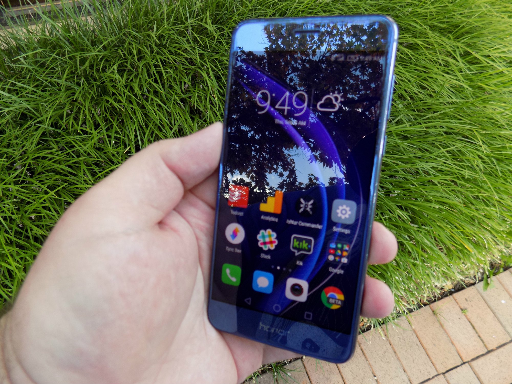
The Passport foldable drone makes for a fun travel companion
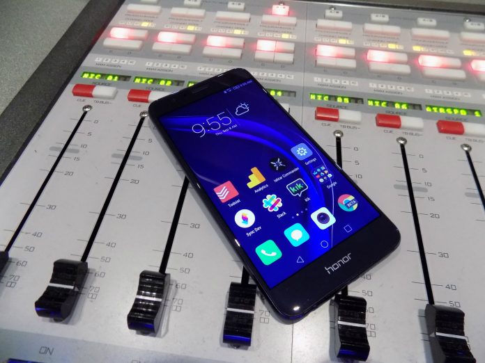
My first drone flight experience was with the DJI Phantom 2 Vision, and as much as I appreciated its advanced capabilities at the time, I longed for something more compact — a device so small that I wouldn’t need to carry a separate bag or case for it, preferably without sacrificing performance. Eventually, a Chinese startup called Zero Zero Robotics released the $599 Hover Camera Passport, which comes in the unique form of a foldable cage while packing cool features like body tracking, face tracking and orbiting. I got to spend some time with the Passport over the past few weeks, and eventually it got to the point where I rarely leave home without it, lest I find time to take it for a quick spin.
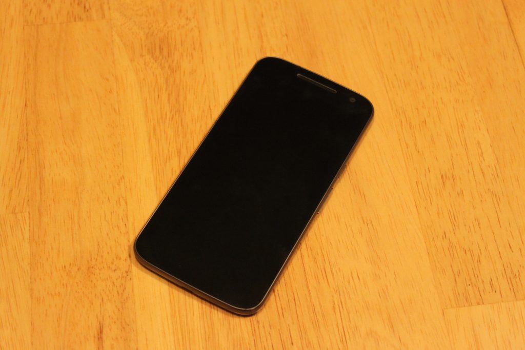
Compared to higher-end foldable drones like DJI’s Mavic Pro and GoPro’s Karma (assuming GoPro issues a fix for random power losses), the Passport’s major advantages are its size, weight and caged propellers. At just 242 grams, or 0.53 pounds, the Passport is exempt from the FAA’s mandatory registration and is also unlikely to hurt anyone should something go wrong, as its propellers are shielded by a carbon fiber enclosure. When folded, it’s just 33mm (1.3 inches) thick, and even in its 45mm-thick protective case (which stores the drone and two batteries), it fits in my backpack with plenty of room to spare.
Speaking of, I’m impressed by the thoughtful set of accessories included in the box. In addition to that aforementioned protective case, there’s a shoulder strap for it, a soft bag (just make sure you won’t squash the drone), a second battery, a dual-battery charger, a USB 3.0 cable, four spare propellers, 12 extra screws and a pair of screwdrivers.
Zero Zero Robotics is currently only selling the full drone package, but you’ll soon be able to buy spare accessories as well, including batteries for $40 apiece. (In fact, the company will be throwing in a third battery plus free shipping as part of a Black Friday promotion.) From my experience, each battery offers a flight time of about 10 minutes, as promised, and it takes about 40 minutes to recharge each, so the more the merrier.

The Passport doesn’t come with a dedicated controller, as it’s geared mostly towards casual users. You’ll have to download the companion Hover Camera app onto your iOS or Android device and then connect it to the drone’s WiFi hotspot over 2.4GHz or 5GHz (you’ll want the latter for better streaming quality; both go up to 20 meters). This is all very straightforward as is navigating through the relatively simple interface. As someone familiar with the basic controls for the DJI Phantom series, I tend to pick the “Joystick” control mode (my preferred mode) instead of “Classic” (up and down buttons for height and a four-way pad for horizontal direction) or “Motion” (a height stick and a toggle button for tilt control).
Unlike most other drones, the Passport can only be launched from one’s hand: Hold up the powered-on unit with its wings open, tap the power button to rev up the propellers for about one second, and then release the unit to let it hover. Similarly, you can retrieve the hovering Passport with your hand without ever having to worry about the blades: Grab it and tap the power button to kill the propellers, or you can first tilt the unit downward to slow the propellers down before tapping the power button. When the battery level is critically low, the drone can slowly land itself using the sonar sensor under its belly; you can also use the One-Touch Landing button to toggle automatic landing at any time.
It’s safe to say that the Passport is one of the very few — if not the only — drones that can be launched and retrieved so safely. This is guaranteed to impress your family, friends and strangers alike — in my case, strangers include the security officers at Xiamen Gaoqi International Airport who were so curious they didn’t mind me flying the drone inside the building.

The Passport’s camera features a 13-megapixel CMOS sensor that can capture video at 4K, 1080p and 720p, all with a normal frame rate of 30 fps. All captured images and videos are stored in the 32GB internal memory (my unit showed 22.6GB of usable space after formatting), and since the Passport is basically a Qualcomm Snapdragon Flight 801 device running on Android, you can transfer its content to your PC in the same way you do with Android phones. With the exception of 4K clips, you can also download the content directly from the app to your smartphone.
During my vacation in Okinawa, I captured all my Passport footage in 4K without realizing that only the lower resolutions support electronic stabilization — a necessary feature since the camera hinges on just a one-directional gimbal as opposed to the three-axis gimbal on more advanced drones. I’m glad that I did use the 4K setting by accident as, truth be told, even with the slightest breeze I was bound to see some shakiness, regardless of the video resolution. If it’s a moderately windy day, forget it — the lightweight Passport won’t stand a chance. That said, braver folks may want to challenge Mother Nature by toggling “Beast Mode” for the maximum flying speed of eight meters per second (about 17.9 miles per hour).
Back in Hong Kong, I found that it’s only a tad better with electronic stabilization at 1080p resolution, but it’s the loss in detail that’s more noticeable. In some cases, I could even see some annoying warping across the frame due to the electronic stabilization. To put things in perspective, the Passport’s 1080p clips have a maximum video bit rate of 16 Mbps (I get 17 Mbps from the Samsung S7 Edge and 20 Mbps from the Xiaomi Mi 5s) whereas its 4K clips are capped at a more impressive 60 Mbps (beating the S7 Edge’s 48.1 Mbps and the Mi 5s’ 42 Mbps).
Simply put, I don’t think it’s worth giving up the 4K sharpness for that little bit of stabilization; I’d rather stick with 4K and use PC video-editing software to stabilize the clips afterwards. Shakiness aside, I’m actually quite happy with the general picture quality offered by the Passport, so long as there’s plenty of daylight. There were a few still images which could use a slight boost in exposure, but that’s an easy fix. And when it’s dark, you can try using the dual-tone LED flash for the still shots.
As I mentioned earlier, the Passport is capable of face tracking and body tracking. Just pick one of these features in the sidebar, and when you see a yellow bracket around you (you need to keep a minimum distance of four meters from the drone), tap on it and off you go (it’ll start recording as well if you weren’t already recording). Despite the wind, my unit did surprisingly well in chasing after me along the beach in Okinawa. I also had similar success on a soccer field and along a waterfront park in Hong Kong, and the drone could even follow me walking up the stairs — up to the point where I had to make a turn to walk along the bridge, but the bridge wall partially blocked the drone’s sight of me.
Another neat video recording feature is the orbit mode because it’s the easiest way to make anyone look cool. Once the app recognizes me, I just have to tap the yellow bracket on my face and the drone will start circling around me until I stop it. The one thing you need to be wary of here is that the drone may drift a little in the wind, thus ending up with an incomplete orbit. Last but not least, there’s the 360 spin feature that does exactly what it says. Again, you have to tell it to stop spinning. Check out what I got out of these in the above sample video reel.
Even after playing with the Passport for several weeks, I continue to be impressed by how capable and unique this drone is. It’s essentially your personal travel cameraman, except you won’t have to buy an extra plane ticket for it. Better yet, Zero Zero Robotics has already delivered a couple of firmware updates to improve the Passport’s video quality plus body tracking performance, and it’ll continue to do so in the many days to come. But, due to its form factor, little can be done about the drone’s weak resistance against even moderate wind — either avoid the breeze or spend an extra $400 on the Mavic Pro if you want to avoid the hassle.
Google Pixel XL: Hands on, early impressions, and camera samples

Announced at a San Francisco event on October 4th, the Pixel and Pixel XL are the two new smartphones from Google for 2016. The pair of phones are the first to offer the Google Assistant software technology and look to head further down the path already started by the nexus line.
What makes this year’s effort different from those in the past? As it turns out, plenty. Not only is the Pixel line smarter and more capable than all other phones, but it also packs a world-class camera experience, too. Indeed, the Pixel offers up a rear camera that bests all previous smartphone shooters.

Digging into the hardware, the Pixel boasts a Qualcomm Snapdragon 821 processor, among the first smartphones to do so. Clocking in at 2.15GHz (four cores) and 1.6GHz (four cores), the handset also benefits from having an Adreno 530 GPU. Toss in 4GB of memory and you’ve got the making of one of the most well-rounded phones of all time.
Storage comes in the form of 32GB and 128GB options but you won’t find a microSD expansion card slot. This might push some away as some of us have come to rely on external storage for housing our media. But, before you get out the pitchforks, know that the Pixel and Pixel XL give customers unlimited lifetime storage of photos and videos at full, original resolution. Yes, that also means the 1080p and 4K videos you’re starting to see emerge.

Available in three distinct colors, the Pixel line can be had in Very Silver, Quite Black, and Really Blue. Prices start at $650 for the Pixel and $770 for the Pixel XL with availability through a number of online retailers. At start, Verizon Wireless will be the exclusive service provider to offer the phone. Don’t let that scare you off, though, as the unlocked models will work with other carriers, too.
Pixel versus Pixel XL
What’s the difference between the Pixel and Pixel XL? In short, it’s a larger display; 5.5-inches at 2560 x 1440 pixels instead of 5.0-inches at 1920 x 1080 pixels, and a bigger battery. The Pixel packs a 2,770mAh power source while the Pixel XL gets a 3450mAh unit.
A Qualifying Statement
We’ve spent the last few days with the Pixel XL and are ready to offer up some initial impressions. While we wish this was a full-on review, there’s simply no way to get that much feel for a device after only four days, two of which span a weekend.

Design
The phone takes a very minimalistic approach which starts at the box itself. With very little printed on the outside of the box, it feels somewhat like how Apple might package the device. Gone are the days of flashy boxes with all sorts of specifications and photos; this one is as bare bones as it gets.
Sliding the box out of its shell and opening it up we are greeted with the phone on the left and power supply and cable on the right. Underneath we find the additional cable and an OTG USB adapter for transferring files from another device It’s worth noting that we did not receive any headphones with this device so we cannot attest to whether this is the norm. Our box did not have any Verizon branding on it but we did receive a Verizon sim card to use for testing purposes. There was no extra space for headphones; they are not listed as included in the box on Google’s website.

Looking the phone over it definitely has a quiet and simplistic design. It is altogether very basic and boring yet still a little bit refined and unique. The bottom black is more than pictures suggest and the top is a little shinier in person. Both materials, however, are soft and slippery to the touch.
I’ll be honest, I would prefer the Silver version over the Back or Blue. In my time with the demos at Google’s press event, I found it to be in line with my preferred style and generally more stylish. But, given that I will ultimately protect this black one with one of Google’s Live Cases at some point, that color becomes a non-issue.
At a distance of a few feet, the black Pixel XL looks like a very utilitarian an almost uninspired slab phone. Pick it up, though, and you can feel the design choices in the material. The glass feels strong and secure and not prone to pick up fingerprints. The back, smooth and premium, also comes across as well-intentioned and thought out. But, were it not for the shiny upper third, the phone might be construed as generally boring – in black at least. Again, the Silver and Blue models felt “new” where this color is just “meh”.

The power button is located to the right of the display with the volume rocker sitting almost halfway up on the same side. Up top we find the 3.5mm headphone jack while below the screen is the USB Type-C port and speakers. Well… one speaker; more on that below.
Display
Whereas the screen does have a slight bezel to both the left and right of the display there is a much more pronounced one above and below the screen. I am not certain as to why there is so much going on below the screen as there are no soft buttons or physical buttons to be found. To be sure, it does feel like a lot of wasted space. My gut tells me it has something to do with having a uniform or mirror approach where the top reflects the bottom.
Staying with the topic of the display, the ever-so-subtly curved edge around the screen is quite nice. And, when you factor in the Gorilla Glass 4 and protective, oleophobic coating that keeps it from getting smudges and fingerprints, we can surmise that this display will take a decent beating and still look sharp in the process.
As far as the picture quality goes, the 2560 x 1440 pixels image is sharp and vibrant. We’d expect nothing less in a flagship phone with a 5.5-inch screen, especially in late 2016. Given that, it’s easy on the eyes with a well-balanced color.
Around back we locate the fingerprint reader which is about one-third of the way down from the top. It is essentially in the same spot as the Nexus 6P and feels very natural when reaching for it. Above and to the left of the fingerprint reader is the rear camera and its flash and Phase Detection Autofocus (PDAF) and Laser Detection Autofocus (LDAF).
Branding

Then, of course, comes the branding of the device. Gone is the “Nexus” that emblazoned the flagship line of phones. Also gone is any mention of the word “Google”, too. In fact, the only thing you’ll find now is the stylized G which represents the brand itself. If you squint, the bottom displays a “phone by Google”, but it’s not outwardly obvious.
Android and UI
Powering on the device we are greeted with a very stripped down approach to Android. Nothing that is startling, mind you but it is quite refreshing to go back to a stock Android experience that is only what Google wants you to have. You won’t find any bloatware of carrier-branded software or services. This is as raw as it gets, and you’d be silly not to want for it.
To us, there’s nothing quite like the default vanilla Android builds. We’ve reviewed plenty of Android phones over the years and one common thread that skews scores more favorably is how the Android OS works. Google’s vision of Android is something we’ve always come to love. The stuff we’ve seen in this version of Nougat is no different. Hell, it’s better than ever.

The Android 7.1 build is very easy to learn navigate. Having tested every version of Android so far this one feels the most intuitive and user-friendly. The round icons are nice and uniform for the most part, however there are a few that stick out such as Allo and Keep. And, once you start to install other applications, that cute uniform user interface doesn’t look so uniform.
A few weeks from now, when we have a bunch our daily driver apps, the app tray won’t look as pretty. Call us silly, but this is where a custom launcher and icon pack can make all the difference in the world.
Setup
Going through the initial setup is a breeze, and Google does an excellent job of walking customers through the process. If you are migrating from one platform to another, Google will hold your hand as you make the jump from iOS to Android. Not only is the software there to support you, but there are cables in the box to assist as well.
If you already have an Android device, this setup makes it easy to get your phone back up to where you want in no time at all. And, if you are brand new to smartphones altogether, the Pixel and Android 7.1 are smart, intuitive, and comprehensible. The best part? You’re getting into an ecosystem (Google) of which you are likely already familiar and not one put forth by a wireless provider with an agenda.
Carried over from previous versions of Android, the launcher brings up all of your relevant news and information with a simple swipe to the left panel. As somebody who is quite fond of Nova Launcher and custom launchers, I am actually not in a hurry to get rid of the default Google setup. There is something very appealing about the way Google designed the interface.
With that said, I like the way in which users can swipe up from the bottom row of the phone to access the app drawer. No longer are you required to tap a specific icon; this is refreshing and comes across as “why didn’t they do this all along?”. The general color scheme, icons, and other Material Design cues work better than ever and come across as cohesive.
Google Assistant
We’ll be honest, it takes a little bit of time to understand what Google Assistant can really do for you. It is much smarter than a simple Google search or using Google Now. While you might be familiar with asking very specific and explicitly defined questions in the past, the Assistant is much smarter and more forgiving.

We like that we can use this from anywhere on the device and get help on just about anything. We even relied on it to help us find certain settings in the software on our phone. If there’s one are we’ve slowly eased yourself into with Google Assistant, it’s being able to talk more normally.
Look up Red Lobster, for instance, and then you can follow with, “how late is it open?” instead of, “how late is Red Lobster open?” Moreover, follow that with, “navigate me there” and you’re handed off to Google Maps.
Other Software Touches
Playing around with the settings, we found the “moves” and gestures to be rather helpful. Users can toggle one of three settings to make the overall experience quicker or more intuitive. One will let you double tap the power button to quick to launch into the camera while the other one lets you flip your wrist to go from rear-facing to front facing camera. It is not unlike what Motorola does to launch into its camera application.

The one we like the most, however, is this swipe for notifications. Users can swipe their finger down the rear fingerprint scanner to slide the notification shade down. Slide up, and they go away. It is very simple to unlock your phone and check for all notifications with just one finger.
Battery
In terms of battery, we think this one is a real winner. The standby time and talk time have been spectacular in these first four days, and we’ve only had to charge the phone twice. This includes using the charge that came out of the box which was roughly ⅔ full.

Plug the Pixel XL into the wall four a half hour and you’ll find you are back up and running with damn near a full day’s worth of juice again. Google claims 15 minutes of charging equates to seven hours of mixed use battery life.
Sound
While it might appear that the bottom of the phone houses stereo speakers, it’s really a case of one speaker and a placeholder cutout to match it. Indeed, the one on the right side is a dummy that doesn’t put out any sound. With that said, the lone speaker does provide a rather loud experience that’s clear and full. Watching a video in portrait will put the sound out in your right hand and, depending on how you hold it, could be muted by your palm.
Camera
Let’s talk about that camera, eh? We’re not experts in the area of photography, but we were seriously blown away by what the Pixel XL delivers. It’s super fast and color accuracy is as good as anything we’ve ever seen in a phone. And Google wasn’t lying when it said that HDR was enabled by default.

Was the camera perfect? No, we still had blurred images, for instance, when trying to capture a moving dog in lower lighting conditions. Moreover, there were traces of noise in night shots, too. But, when zoomed out and stacked up against other phones, the Pixel has already become a favorite still shooter around here. You can take a look at the embedded images below to get a feel for how the camera performs on the Pixel XL.
Performance
We’ve only loaded a few of the daily driver applications on this device so we can’t speak to the long-term viability, but we are quite optimistic. Things move about very quickly in all aspects of this device. The screen responds to our touch quickly, the apps load instantly, and Google Assistant never wastes time and getting you the right answers. The same goes for the camera shutter and fingerprint scanner.
Early Conclusion
All things considered, we’re very pleased with the Pixel XL thus far. There’s nothing here that alarms us, but it’s still not a perfect device. We’ll always champion for external storage and a waterproof coating is one of those features which should be standard by now. But, a few quibbles aside, it’s one slick piece of kit.
When you look at how much phone you can get for $400 today, it begs the question of whether the Pixel or Pixel XL are worth the extra money. To us, that comes down to a personal use case. Do you want or expect to take a lot of photos or video? If so, the Google line is one to keep an eye on.

With unlimited cloud-based storage, you’d easily spend money on another service for that kind of hosting. Ask a photographer or media creator how much they’d like to have 4K video service that houses things for them.
How important is it to you to have the Google Assistant? What about the latest release of stock Android? The 7.1 Nougat definitely has its advantages in both departments.
First time smartphone buyers might not necessarily head for the best of the best when it comes to devices. But, should they want to dive in head first, the Google Pixel and Pixel XL are worthy contenders. This goes double if you need a helping hand; the built-in 24×7 support is something you won’t get elsewhere.
We’ll spend another few weeks with the phone and circle back to provide you with our full review.
Our fingerprints, eyes and faces will replace passwords
Passwords are a pain in the ass. They’re either easy to crack or hard to remember, and when breaches occur you have to come up with a whole new one. So people are trying to do away with passwords altogether, and so far fingerprint scanners are doing the job nicely.
Still, fingerprints alone are not enough. Online security has become increasingly important, forcing service providers to come up with better measures such as two-factor authentication to defend user information. Companies are turning to other parts of our bodies to find biometric complements that are up to the task, and our faces and eyes are at the top of the list. Although facial and eye-based recognition appear gimmicky for now (the Galaxy Note 7’s iris scanner, anyone?), they may soon become as prevalent and popular as fingerprint scanners. That pairing could eradicate passwords and clunky text-message two-factor verification altogether, making it a completely biometric process.
Before you brush the notion aside, think about the history of fingerprint scanners on smartphones. After Apple first put Touch ID on the iPhone 5s in 2013, people pointed out that it didn’t work very well and that it wasn’t secure. But Apple soldiered on, improving the hardware and implementing more useful features. Since then, many other tech giants have followed suit. Today, they’re basically a given feature on flagship Samsung, Nexus (or Pixel), LG and HTC phones, and are even spreading to more affordable handsets such as the $99 ZMax Pro, the $200 Huawei Honor 5X, the $400 OnePlus 3 and the $400 ZTE Axon 7. We can expect to see them everywhere soon, said Sayeed Choudhury, Qualcomm’s senior director of product management.

Despite the proliferation of fingerprint sensors, companies continue to chase convenience and novelty by introducing new biometric methods of logging in. We started seeing facial recognition as a method of identification when Google first revealed Face Unlock on Android 4.0 Ice Cream Sandwich. Years later, eye-print authentication started popping up on phones such as the ZTE Grand S3 and the Alcatel Idol 3. The latter two used a retinal scan to match the user by looking at the full eye and veins.
The good thing about this method, said Choudhury, was that it doesn’t require additional hardware — you could just use the selfie camera. The challenge in retinal scanning is in its computation and algorithms, which Choudhury said is “very heavyweight” and “almost always uses the GPU in addition to the CPU.” This means it takes longer to detect and recognize your prints. Indeed, in my experience reviewing the Eyeverify system on ZTE and Eye-D on the Alcatel Idol 3, snapping a pic of my eyes to unlock the phones was always excruciatingly slow.

In contrast, iris scanning, which was one of the highlights of the Galaxy Note 7 when it launched (and before all that exploding hoopla), uses more compact algorithms, said Choudhury. That means faster detection and a shorter wait time. Plus, iris scanning has been around for a long time. People have been using it to get into secure labs, buildings and even through airport security (Global Entry), so the technology is pretty mature. It’s also more secure than fingerprints. According to Choudhury, “Iris recognition technologies found in devices today identify 3-5 times more ‘feature markers’ to classify a specific iris versus what today’s fingerprint technologies can do.” The bad news with iris scanning, though, is it requires an infrared (IR) camera, which isn’t on many phones. But Samsung isn’t alone in looking to implement it — other brands will likely follow suit.
One of the biggest forces pushing the move towards eye-based authentication is the payments industry, said Choudhury. “What we’re seeing, driven by the mobile payments industry, is that both iris and retina biometrics are going to be incorporated in many more devices,” he said. Mobile payments are a “killer use case,” according to him, and it certainly has a history of forcing even the most stubborn companies to adopt new technologies. The most obvious example of this would be Apple finally incorporating NFC into the iPhone 6 to enable its payment system, after years of resisting the tech that’s proliferated in Android phones.
Payments giant Mastercard is one of the proponents of the biometric security bandwagon, which encompasses fingerprints, eyes and faces. “We want to remove passwords,” said Ajay Bhalla, president of global enterprise risk and security at Mastercard. “Passwords are a big problem for people — they keep forgetting it or they use passwords which are very simple and dumb,” said Bhalla.

The company has been researching biometric authentication methods using facial recognition, eye-based tech, fingerprints, heartbeats and voice, because these are unique to the user and don’t require memorizing or guesswork. It found fingerprints and face detection to be the most easily scalable. “We feel it’s reached a stage where it can become mainstream — it’s on devices, and consumers understand it,” said Bhalla.
Mastercard recently launched its Selfie Pay authentication method in Europe via its Identity Check Mobile app. As its name suggests, Selfie Pay lets you authorize transactions by taking a portrait of yourself, and blinking to prove it’s you and not a picture some wannabe hacker printed.
While it may sound cheesy to hold up your phone and pose for a picture each time you want to buy something, the company claims it is well-received. According to research from its 2015 trials, 90 percent of respondents found the Identity Check app more convenient than what they had been using. 71 percent rated facial recognition as “highly convenient,” while 93 percent rated fingerprint recognition the same.
The popularity, prevalence and convenience of fingerprint scanning means it is here to stay, and by no means are face and eye recognition meant to replace it. Both Choudhury and Bhalla see the newer method as a complement to fingerprints, providing a more convenient second-factor authentication as opposed to entering a text code sent to your phone. While the tech we have right now may not be fast or secure enough to be truly convenient and helpful, we’re getting close. Using the adoption of fingerprint scanners as a model, Choudhury estimated that we are about five years away from iris scanners and face detection becoming just as widespread. Until then, we’ll have to deal with changing our crappy passwords every so often and hope we don’t forget them.
Alcatel IDOL 4S review: Can it stay king in 2016?
When Alcatel released the IDOL 3 last year, I called it the best budget phone of 2015. This year, Alcatel has come out with its successor that is meant to improve upon the IDOL 3 in every way. Unlike last year, competition has gotten incredibly steep around budget flagships in 2016, and the IDOL 4S has to give everything its got to carry the title of Best Budget Flagship this year. Let’s see if it can claim the crown once again!
Design and Build
 Last year, Alcatel took a more subtle approach to the design of the IDOL 3. It featured a plastic back and sides that felt and looked nice but didn’t create an overall sense of luxury or precision. For its 2016 flagship, Alcatel completely ditched the plastic and opted for a killer metal and glass design. With a glass back and metal sides, the IDOL 4S is a stunner that screams quality straight out of the box. The glass on front and back is slightly curved along the side making the phone comfortable to hold for pretty much anyone.
Let’s take a look around the 4S before we dive in. On the front is the 5.5″ display that we will talk more in depth about later along with the dual front-facing speakers and selfie camera. On the left side, you’ll find the power button and SIM card/MicroSD card slot. On the right are your volume controls along with an extra button Alcatel refers to as the Boom Key. On the bottom are the MicroUSB port for charging and a microphone. Finally up top, you have your 3.5mm headphone jack (thankfully) and another microphone. Flip the phone over and you’ll find the main camera along with a fingerprint scanner.

Overall, the IDOL 4S is lightyears ahead of the IDOL 3 in terms of style and design. The glass and metal build feels incredible to hold. However, I have a love-hate relationship with the glass back because it is a fingerprint magnet. It is one of the worst phones I have ever used in terms of how quickly it picks up fingerprints. In fact, I put a case on it almost immediately just because of how often I had to wipe off the back. Also, the glass back means that any accidental drops could end up shattering it along with your screen. And trust me, this phone is slippery. Accidental drops are bound to happen.
As beautiful as the IDOL 4S is, I must recommend that you at least get a skin or a case to keep from dropping it and cracking the glass. Thankfully, Alcatel is one step ahead and includes a case and screen protector in the box.
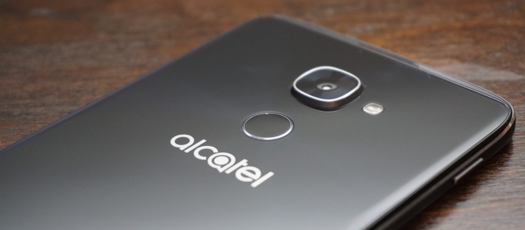
While the power button is still located annoyingly on the left side of the device, the IDOL 4S kept the double-tap to wake feature from the previous generation. But I doubt you’ll even be using that as the fingerprint scanner on the back with also turn on the phone when you go to scan your finger. In terms of speed and accuracy, the fingerprint scanner impressed me. It is not as fast as the latest from Apple and Samsung, but it is plenty fast for most people.
The only main complaint I have is that it is not set off from the back of the phone at all. This makes it hard to locate blindly and position your finger correctly, but after a while, I found that I got much more accurate.
Display
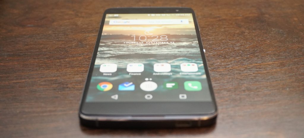
Alright, it is time for my favorite upgrade from the IDOL 3. This year, Alcatel ditched IPS for AMOLED and cranked the resolution up to 2K. All I can say is, nicely done! The increased resolution is great for gaming, video, and VR (more to come on that) and pairs nicely with the front-facing speakers.
Going for an AMOLED panel was the right choice as colors look clear and vibrant. Like the IDOL 3 before, the 4S has one of the brightest screens I have ever seen. I usually have to keep my screen at above half brightness, but I could easily turn the display on the IDOL 4S down to 30% with the same results. There is no need to worry about outdoor visibility with this display.
I would love to say that the display is perfect, but I found one major annoyance during my time using it. Even as someone who always makes sure to carry my phone is a separate pocket away from loose change and keys, the display on my IDOL 4S still picked up scratches. None are horribly obvious and cannot even be seen with the display on, but I was disappointed that the screen scratched so easily.
Performance
The IDOL 3 was a mid-ranged device that provided competitive performance at an incredible price, but that was in 2015. This year, the IDOL 4S got a price bump while other companies started focusing more on budget-friendly flagships. The 4S definitely has more competition this year so it better come with the performance to keep its high standing.
The IDOL 4S is running on a Qualcomm Snapdragon 652 with 3GB of RAM and an Adreno 510 GPU, and while the processor may not be an 800-series, it still packs quite a punch. For storage, you get 32GB of onboard memory along with a microSD card slot to add extra space when needed. Needless to say, the IDOL 4S is more than powerful enough to handle even your craziest of social media binges. I was impressed with how snappy the Snapdragon 652 was as I was able to fly through most apps without a single frame drop.

Asphalt 8 seems to be the de facto game for testing a phone’s gaming performance so that is the app I used. Ninety percent of the time, the IDOL 4S handled the game like a champ. However, there were a couple of times where I noticed a slight frame drop. I doubt that most would even notice it before it went back to normal, but there were definitely a couple of slow downs. The phone itself never seemed to get hot enough to throttle so I am assuming the hardware just wasn’t fast enough to fully handle the game. Most games will play wonderfully on the IDOL 4S, but graphically intensive games may have a couple of struggles.
Last year, this would not have been a big deal since the IDOL 3 sold for $250 and smoked basically every other phone in that price range. However, the IDOL 4S is priced at $399 which puts it right up there with phones like the OnePlus 3, which is running a Snapdragon 820.
Along with price, Alcatel heavily marketing the IDOL 4S on how well it performed with virtual reality, and while the preinstalled titles do play well, more graphically intense VR games will likely exhibit some stuttering. We will have a post coming out soon fully dedicated to VR on the IDOL 4S so keep your eyes out for that.
So what does this mean for performance on the 4S? Overall, it is incredibly fast and smooth in almost every situation. However at this price point, there are phones that beat it on the performance side.
Software
 The IDOL 4S comes running a slightly skinned version of Android 6.0 Marshmallow (no word yet on a Nougat update). As far as most Android skins go, the one on the 4S is fairly minimal. It’s not as close to stock as something like the Moto G4, but it is nowhere near as intense as Samsung’s TouchWiz.
The IDOL 4S comes with a custom launcher, custom icons for basic apps, and Alcatel’s versions of stock apps like Contacts. There are some preloaded apps, but the majority of them can be uninstalled immediately from the phone.
Even with all the uninstallable apps removed, there are still several apps unique to the IDOL 4S that remain on the phone. These include VR apps and games, an equalizer app, an FM radio app, and some video editing and live streaming apps. While some of them are needed for VR applications, I still wish that they could be removed easily or uninstalled completely.
 The custom launcher comes with a couple of neat tricks up its sleeve. The first is a parallax wallpaper effect that makes it seem like the icons are floating above the wallpaper. I am not a big fan of this effect, and it is easy to turn off from the wallpaper selector. If you are on the homescreen and push the Boom Key, there will be a visualization of the current weather in your location. While it is not particularly useful since the weather is also displayed on the homescreen widget, I cannot deny that it looks super cool, and I find myself pushing the Boom Key to trigger it all the time.
My single favorite feature from the IDOL 3 made a return on the 4S, and that is the Reversible UI. Basically, this allows the screen to rotate a full 360-degrees so that no matter what way you pick up the phone, it is always right side up. Unfortunately, I found this feature less useful now that there is a fingerprint scanner. When I hold the phone upside down and reach for the fingerprint scanner, I immediately realize that I am holding the phone wrong and flip it around.
The feature is still useful for quickly answering calls without having to spin the phone around, but I am sad to see my favorite feature become less useful.
Speakers

One of my favorite features on the IDOL lineup are the dual front-facing speakers, and the IDOL 4S does not disappoint in this area. The JBL-certified speakers pump out a loud sound that is crisp and clean regardless of the volume.
Being phone speakers, the low end does leave some to be desired, but I would challenge you to find a better sounding set of speakers on any smartphone especially in this price range. Whether you are playing a game, watching a video, or just listening to some music, the IDOL 4S speakers will do more for you than basically any other phone speaker out there.
When you lay the phone face down while playing something through the speakers, it will actually route the audio towards the back of the device so that volume and quality are not hindered.

When you are using the speakers, pressing the Boom Key activates one of the special experiences of the IDOL 4S. Alcatel claims that pressing it boosts the bass and volume of the music, and while I did notice a volume increase, an increase in audio quality is questionable. Some of my music sounded fuller when the Boom Key was activated, but other times it sounded too echo-y. It does help with some songs, but it was not something that I enabled every time I listened to music.
The best time to use the Boom Key is while gaming. When I played Asphalt 8, I pressed the Boom Key and the audio became much more immersive. It almost seemed like surround sound at times. While the Boom Key might not improve all the audio you listen to, it definitely increases the immersion while playing games.
Camera

The camera on past IDOL phones has always been pretty good but consistently left me wanting more. The IDOL 4S comes with a 16-megapixel f/2.0 main camera and an 8-megapixel front camera, and I can fully say that these are the best cameras on any IDOL to date.
Throughout my time with the 4S, I found the camera is quick to focus and takes detailed shots with good color reproduction as long as the lighting is good. Unfortunately, it looks like many of the pictures I took with the IDOL 4S suffered from oversharpening like the IDOL 3 before it. While the camera often exposes correctly, I found that it has a tendency to overexpose and highlights easily get blown out.

Thankfully, the IDOL 4S had a pretty solid HDR mode. Unfortunately, there is no option for AutoHDR, which means you need to switch it on and off as needed, which makes taking quick shots more difficult. There are a few Boom Key features within the camera app. You can press it to take a photo, or while taking a video, you can press it to immediately livestream through the preinstalled app TiZR.
If you are looking to record video with the IDOL 4S, you were probably happy to see that it supports 4K at 30fps; however, there is no OIS (optical image stabilization) on the cameras so videos come out looking shaky even with the electronic image stabilization. I think that leaving out OIS was a big mistake on Alcatel’s part.
Overall, the camera is the same story that it was with the IDOL 3. The camera is okay and capable of taking some good shots, but it still has problems that hold it back from being a truly great camera.
Battery
 I was pleased with battery performance on last year’s IDOL 3, but I am full on impressed with what I was able to get out of the IDOL 4S. The phone is powered by a 3000mAh battery and comes equipped with QuickCharge technology for a quick fill up when you don’t have much time.
I am a fairly heavy smartphone user, and I manage to kill most phones before the day is done. My typical day includes streaming music and YouTube videos for about an hour each. I text and check social media consistently throughout the day, and I also have 3 email accounts that are constantly pulling down new emails. Other than that, I do browse the internet over WiFi and LTE along with some light gaming.
 After putting the IDOL 4S through its paces on a daily basis, I found that I consistently got over five hours of screen-on-time with some days tending closer to five-and-a-half hours. For a phone with a 2K AMOLED display, I am extremely pleased with the battery performance. I still have to charge it every night, but at least I am making it to the end of the day now.
Conclusion
There is no hiding that the IDOL 4S is a wonderful phone and a huge improvement over last year’s IDOL 3. However, the price jump of $150 dollars has put the IDOL 4S against some incredible competition. Phones like the OnePlus 3 and Nexus 6P are available close to that price and each of them comes with a beefier processor, which provides even better performance.
So is it the best budget phone of 2016? Unfortunately, I am going to have to say no, but that is simply because the competition is extremely fierce in the budget arena now. I’d be hard pressed to name any phone as the best budget flagship. That being said, the IDOL 4S is one of the best budget phones of the year. It has great build quality, a stellar screen, loud speakers, and strong battery life. I would definitely recommend the IDOL 4S to any interested, and I doubt it will leave you unimpressed.
One thing that the IDOL 4S has going for it is the inclusion of a case, glass screen protector, and VR goggles when you purchase it. Head on over to Alcatel’s website or Amazon and pick up an IDOL 4S for yourself for only $399!
It takes two: A visual history of dual-camera mobile phones
With the recent launches of the iPhone 7 Plus and the LG V20, the dual-lens smartphone camera is once again a hot topic. Of course, many other companies will want to remind you that they were there first, except some have long since given up on the technology. So what happened? And why isn’t this yet a standard feature on all flagship smartphones? For those intrigued, it’s worth taking a trip seven years back in time.
First thoughts and impressions of the Huawei Honor 8
2016 will be known as the year of the budget flagship device with the release of the ZTE Axon 7, OnePlus 3, and the Huawei Honor 8. We recently got our hands on the Honor 8 and while our full review isn’t ready just yet, we do have some initial impressions to pass along.
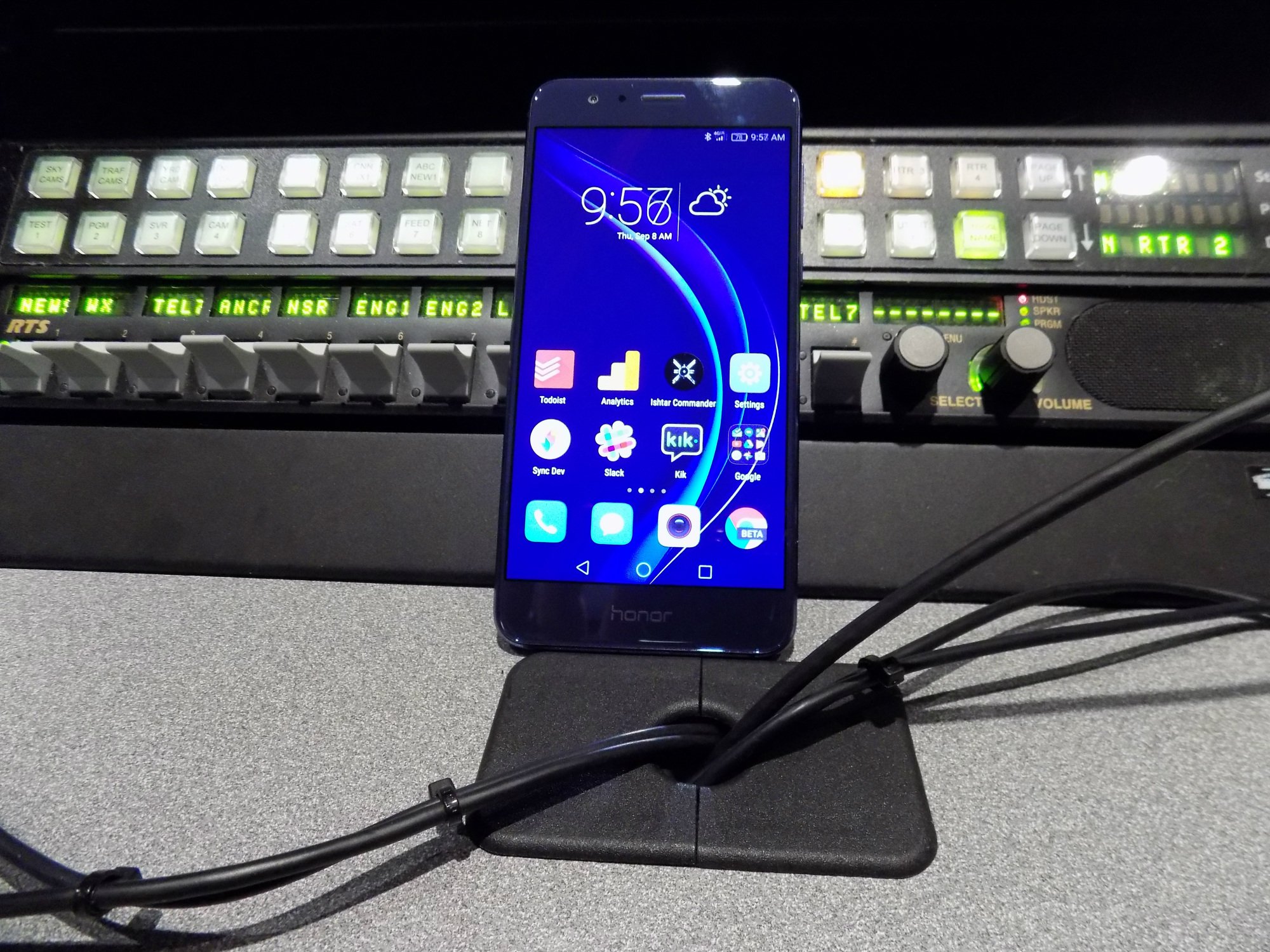
Huawei is starting its push into the United States and the likes of LG and Sony should be worried. It has shown that it can be a true powerhouse in Asian markets and now Huawei taking what its learned there and bringing it to our shores. With build materials rivaling the Samsung Galaxy S7 and one of the most interesting takes on mobile software, the Honor 8 is unlike anything else on the market right now.
Everything down to the packaging was well thought out by Huawei. The phone slots into the box instead of sitting atop of the books, charger, and cable like every other device on the market. It’s these little things that show Huawei is focused on doing things differently. Not every change is for the better, but it is truly focused on making its own phone, a big departure from the Google-guided Nexus 6P of last year.
Build
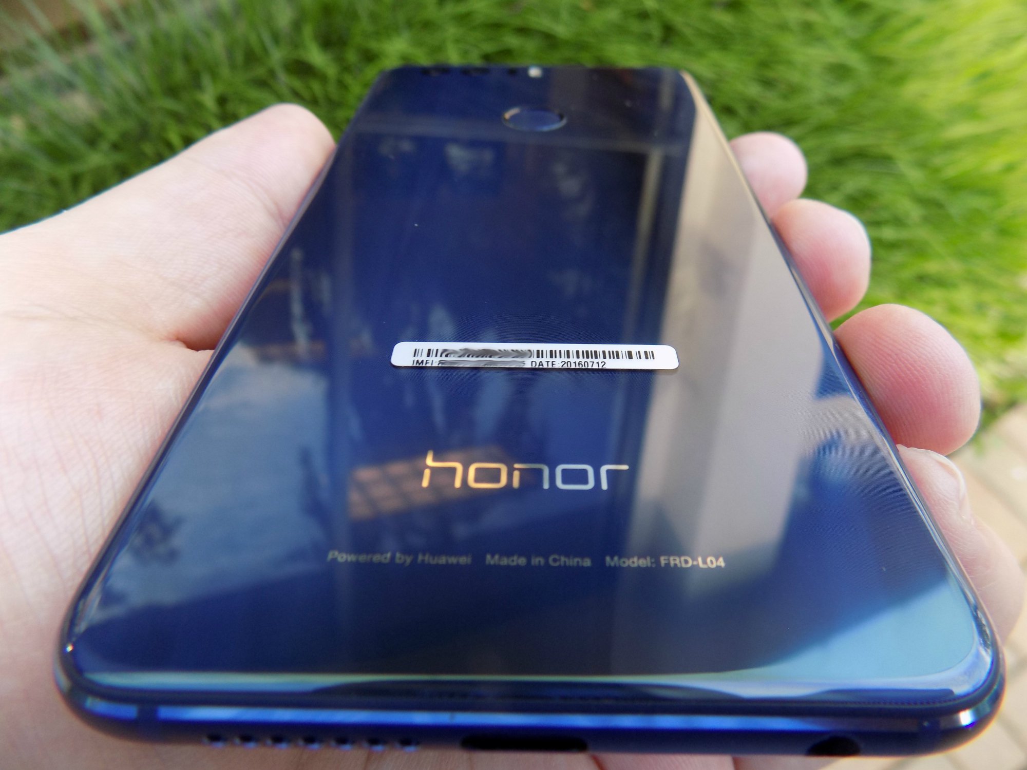
Wow. I knew that the build quality and materials on the Honor 8 were supposed to be good, but I can honestly say that I’m blown away. The Honor 8 falls just short of the Samsung Galaxy S7 in terms of build quality. But, It’s pretty close. The phone definitely channels the S7 with its glass and metal build, while keeping a more rounded edge. Those who handled the phone in our short time with it mentioned how much the sides looked and felt like an iPhone.
The Honor 8 may not feel as dense or solid as the S7 but it does weigh the almost the exact same, 153 oz for the Honor 8 and 152 oz for the S7. Both phones are also remarkably close in size. The Honor 8 is a few millimeters taller and wider and a half a millimeter thinner. After using a Nexus 6P for a few days, I was blown away how light the Honor 8 felt the first time I picked it up.
The bezels are slim and the power and volume buttons are clicky. These are two things that can truly ruin the experience with a phone and Huawei did well here. The bottom chin isn’t massive and the top of the phone is just big enough to hold the speaker and sensors. Overall I’d say it’s a pretty compact device that can easily be used in one hand.
Even though the Honor 8 looks excellent and feels great in the hand, I do wonder about how well it will hold up to scratches and falls. Phones like this tend to be fragile and I can tell my behavior changes when I’m using them as a daily driver. Added onto the suspected fragility of the device is how slippery it is. It reminds me a lot of the Samsung Galaxy S6 which is notorious for sliding off level surfaces. You won’t be able to just let this sit on your leg or a pillow because it will slide off as I found out in my first 24 hours with the phone.
If you’re one of the many people out there that feel Samsung ruins its devices by putting its branding on the front of the phone, you may feel the need to pass on the Honor 8. The Honor name is printed on the bottom chin of the phone and interestingly enough, the exact same logo is in the exact same place on the back of the phone. I know why Huawei is doing this, but it doesn’t look great and I wish they would’ve just stuck to the branding on the rear of the phone.
I find it ridiculous that this is even an issue but yes, there is a 3.5mm jack for your wired headphones.
Software
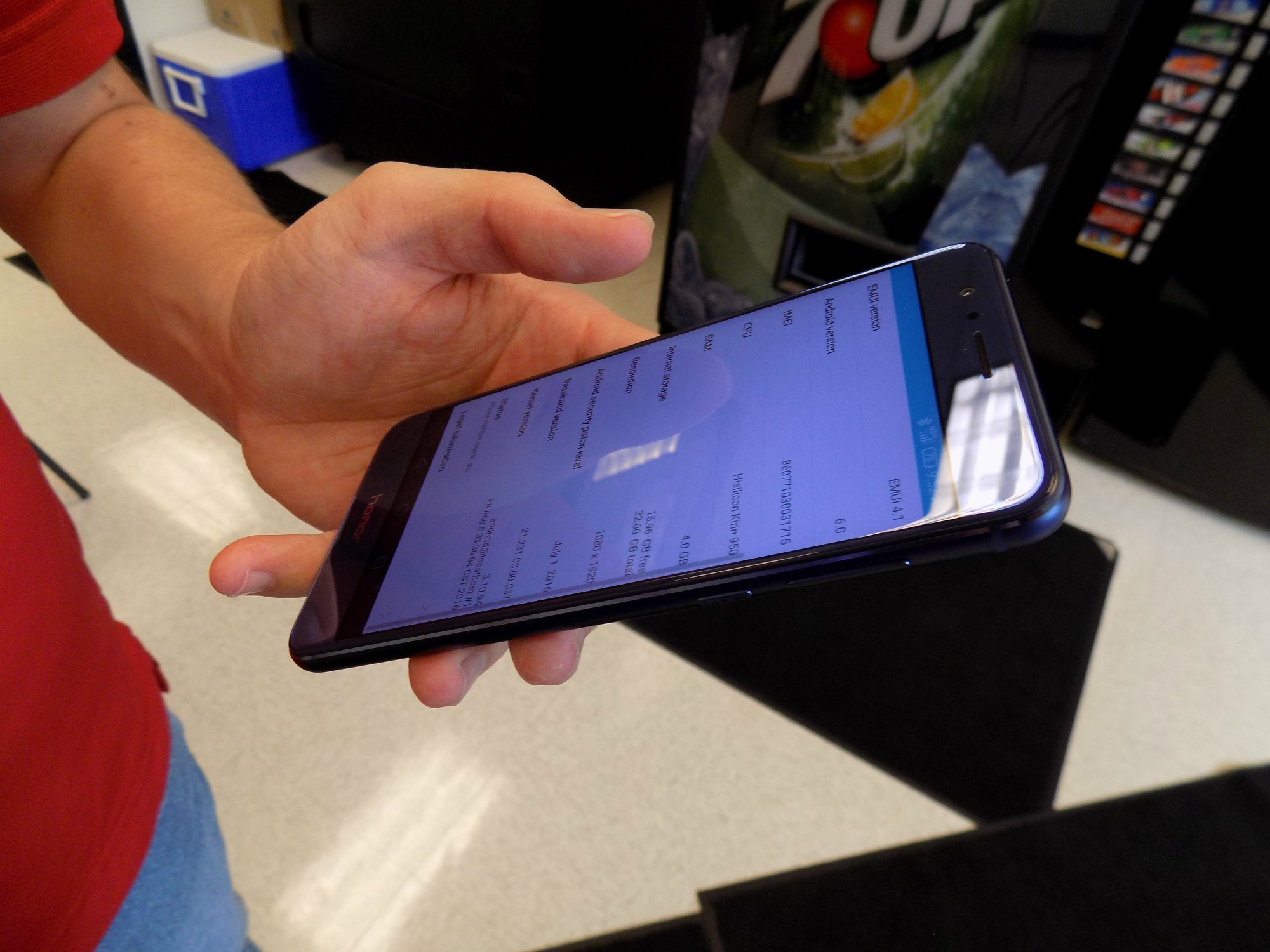
After only a small amount of time playing with the Honor 8, I feel like I could write entire books about software customizations that Huawei made atop of Android 6.0. The Honor 8 runs EMUI, or Emotion UI 4.1. If you want Android customization with all of the charms of iOS (no app drawer!) then EMUI might be for you.
To be honest, I’ve found myself a little bored with Stock Android as of late so EMUI is a nice change of pace. EMUI touches every part of the OS much like LG’s skin but goes even further with its customization. You will not find settings and options where you normally would in Stock Android. Sometimes that’s for the better, sometimes not.
The notification shade is redesigned to have two panes, one for notification and one for shortcuts that you get to with a swipe to the right. The shortcuts are what you would expect to find nested in the Stock Android notification shade, WifI, Bluetooth, Auto-rotate and the rest. One of the coolest things that Huawei did here, and it does extend to some other places like the messaging app, is give your notifications more of a timeline feel with times and an order to how your notifications show up. It may not be any different in practice to how stock 6.0 shows notifications, but it does make you feel more on top of your day when looked at in this view.

The lack of the app drawer does mean that apps are everywhere and there are plenty preloaded onto the Honor 8. The Tools folder has 9 preloaded apps for everything from the Weather app to the Mirror app. We’re also greeted by a Top Apps folder that has such crapware as Facebook, Twitter, Shazam, Booking.com, News Republic, Lyft, and a few Huawei apps. I know adding these apps in are money-makers for Huawei and if that’s what keeps the cost down, I’m alright with adding these in as long as they can be uninstalled- which these can.
We’ll delve deeper into the software here in our full review, but suffice to say, if you’re looking for something different, EMUI certainly offers a different experience.

So far, I’m impressed. There have been a few little hiccups like some struggles scrolling through long lists but that might be chalked up to the phone breaking in. I’m trying to keep in mind that this is a $400 phone but it feels like it’s punching above its weight. The build quality feels like a device twice the price and will challenge the best from Samsung, LG, Sony, and HTC.
We’re going to spend a few weeks with the Huawei Honor 8 so we can bring you a thorough review. Let us know what you think about the Huawei Honor 8. Is it something you’d consider? Does the software disqualify it for you? Let us know down in the comments.
Moto G4 Review: No longer a game-changer (Video)
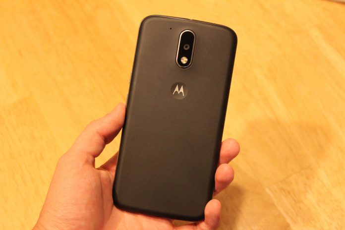
Before Lenovo bought Motorola from Google in 2014, the company created a few very interesting lines of phones under the Moto brand that sought to change the way we buy phones. One of these is the Moto G line, that was introduced a few years ago and offered an very reliable and speedy phone for less than $200 unlocked. The Moto G eventually became Motorola’s highest selling phone of all time.
Fast-forward to today, Lenovo hopes to carry on the legacy of the Moto G, and offer a quality, affordable successor in a world where most other smartphone companies are offering their new phones for lower prices. The Moto G4 is here, and literally bigger than ever.
Build
The Moto G4’s build quality hasn’t improved from the previous years iterations, but it feels solid for a $200 plastic phone. At 155 grams, it has the perfect amount of heft for me. I really like the plastic back of the phone which has a slightly textured feel to it and feels almost like rubber, although the oil from your hands will visibly show up on it after just a little usage. Wash your hands at all times.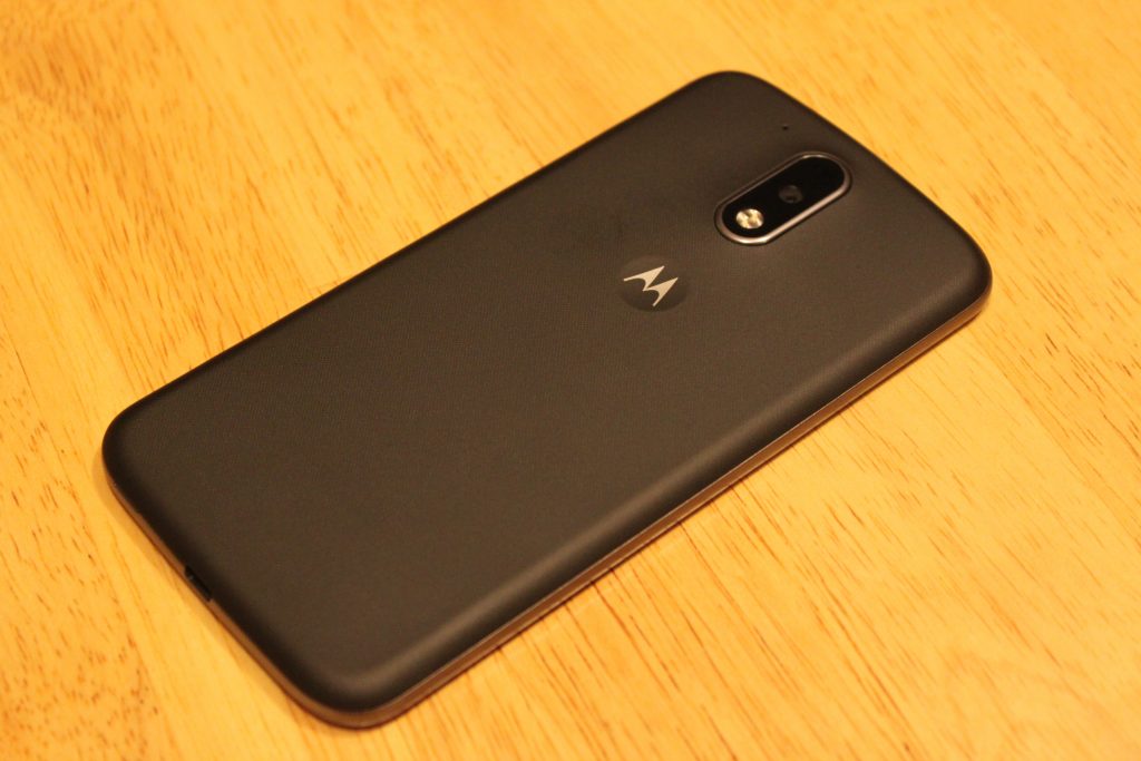
The front of the device brings the classic minimalistic style I’ve loved since the Nexus S came out a long time ago. In fact, the design of this phone reminds me so much of a bigger Galaxy Nexus – front and back. There’s nothing on the front except the secondary camera and a single front-facing speaker right above the screen. No Lenovo logo, no Moto logo. That’s a +1 right there. While I’m bummed they didn’t include dual speakers like last year’s Moto G, I can’t complain for the price. Plus, the single speaker does get very loud, and almost competes with speaker quality on flagship phones using single speakers on the bottom.
As for the power and volume buttons, someone at Lenovo should’ve spoke up about these. They feel cheap, and barely provide any feedback when pressing them. It takes more effort to press the volume buttons than any other phone I’ve used. The power button at least has a horizontal line texture on it to distinguish it from the volume.
Screen
Easily the highlight of this phone. I’ve seen quite a few cheap LCD displays on phones before, even on more expensive phones, but the 1080p LCD display on the Moto G4 rocks.
I was disappointed with Lenovo’s decision to put a 5.5 display on the Moto G, but after using it for a week, it doesn’t feel like a big phone at all. 71% of the front of this device is covered with screen, so it doesn’t feel bulky to me.
Aside from the size, the quality of this screen seriously impresses me for what it’s worth. If any of you still own the OnePlus One or OnePlus 2, the display quality is right with those. I will say, the viewing angles are not great, as the brightness decreases and colors go yellow as soon as the device is slightly shifted away from your eyes. However this isn’t a problem for me, as my phone is directly facing me 98% of the time I use it.
Comparing the screen to other LCD displays like the Nexus 5X and Nexus 5, I immediately prefer the display on the Moto G4. The colors look very washed out on the LCD Nexus devices compared to the Moto G4, which is able to produce colors almost as vivid as an AMOLED display.
The 1080p resolution is perfect for this device. I started using this phone right after using the OnePlus 3, and believe it or not, I prefer this screen. These phones both have 5.5 inch 1080p displays, but the pentile AMOLED screen on the OnePlus 3 holds it back in comparison in terms of image sharpness. Images are sharper, more accurate, and the whites on the G4 look much better. I still much prefer the deep blacks on the OnePlus 3’s AMOLED screen though.
Performance
In 2016, it’s hard to find a phone running Android 6.0 that doesn’t perform well. The Moto G4 runs on a Snapdragon 617 processor which was unveiled by Qualcomm in September of 2015. I was expecting a sluggish experience, and to this day I’m waiting for the inevitable crashes or hair-pulling slowdowns to happen. But so far, this phone runs well! If I were to compare the everyday speed of the Moto G4 to something else, I would say it’s neck and neck with the Nexus 5 from 2013 – which still runs like a champ on Marshmallow with its Snapdragon 800 chip.
After using the phone for a couple hours on AT&T LTE while browsing on Chrome, the phone didn’t get as warm as other phones have, and quick-charging it with the Motorola Turbo-Charger doesn’t make the phone as hot as previous Motorola phones, specifically the hot-plate that is the Droid Turbo.
If you’re into mobile gaming, you might want to look the other way. The Adreno 405 GPU here does not handle most games very well, and loading times are pretty terrible. I primarily play Fallout Shelter, and while I had zero hiccups and quick loading times playing it on a phone with a Snapdragon 820 chip, the loading time to get into my game on average took a staggering 72 seconds on the Moto G4. This was if the game didn’t freeze or crash mid-load, which happened 20% of the time. I experienced similar results with other 3D games.
Camera
Don’t expect miracles here, people. But also don’t expect a bad camera. The Moto G4’s 13-megapixel with f/2.0 aperture provides pictures more than deserved for a $200 phone. Pictures in daylight look a little more dim than they should be.

Low-light pictures lose a lot of detail, but having HDR mode on really helps balance out the bright parts of the photos and the darks. Notice the overexposure of the Subway sign and interior in normal capture mode.

HDR off

HDR on

Daylight HDR on

Daylight HDR off
The camera app takes a couple seconds to open, which is annoying when trying to grab a quick shot. The app comes with some useful features such as professional mode that allows for manual tweaks, slow motion mode (although the 540p resolution for this is kind of a joke) and auto-HDR.
Software
I was a little nervous Lenovo would take Motorola’s near-stock Android skin and mess it up, but things have barely changed since previous Moto phones.
This is basically stock Android with the addition of a few useful features. First, we have Moto Gestures, which includes four ways of interacting with the phone. When it’s off, you can make a chopping motion with the phone to turn on the flashlight. Keeping the phone face down immediately mutes the phone and keeps it silent. When someone calls, picking the phone off the table cuts the noise of the ringer. Finally, whether the phone is on or off, twisting it will launch the camera.
On top of this, Moto Display is back, showing your notifications when the phone is sleeping, however it;s nowhere near as useful as it is on the Moto Z, or previous Moto X phones that have sensor on the front for hand waving gestures, or the AMOLED screens that actually save battery when using the Moto Display. On this phones LCD display, you can totally tell the entire screen is on, and it just doesn’t look great.
Battery
A 3000mAh battery is becoming common for a high-end phone, so the decision to put one in the $200 Moto G4 was a great move from Lenovo. This phone lasts until the very end of the day for me with 10-15% left. To be exact, I unplug the device at 6:45 AM, stream Play Music for 30 minutes to work, browse reddit and Chrome for about an hour a day, text my imaginary friends using Textra, send between 20-30 snaps with Snapchat, and use a lot of GroupMe until I’m tuckered out at 10:30 PM. That’s 16 hours of “moderate” usage.
I haven’t felt concerned with running out of battery in a day yet, but if I do, this phone comes with a Turbo-Charger that supports Qualcomm Quickcharge. I remember when I had to pay extra for a Turbo-Charger when I bought a Moto X 2014… so I’m very pleased with this.
Conclusion
I’m satisfied with the Moto G4. I’m not blown away by it, and I’m not disappointed with it. Lenovo didn’t take risks with this device, and they didn’t push any boundaries. The build quality lives on from previous Moto G generations, and the display quality is something I never expected to see on a $200 smartphone. But is a bigger, better display worth the removal of dual front-facing speakers and a waterproof exterior? If I were to give an answer, I would say the screen is more important to me than speakers I rarely use, or having the ability to pour champagne on my smartphone.
At $199 for the 16GB model, the Moto G4 is less impressive than it was in its earlier generations, and faces serious competition from smartphones in similar price ranges, such as the all-metal, fingerprint scanner included Honor 5X. For $199, I would recommend the Honor 5X over this phone, but you won’t be disappointed with a purchase of the Moto G4, especially with the experience of customizing it through the innovative Moto Maker website.
You can purchase the Moto G4 here
Xbox One S review: A worthy successor — to the Xbox 360
Microsoft is making a lot of assumptions with the Xbox One S. It’s a 40 percent smaller, 100 percent whiter version of the Xbox One that launched nearly three years ago, albeit with a few key differences. First is the built-in 4K Ultra HD Blu-ray player and compatibility with high dynamic range video for increased contrast and a wider color gamut. Then there’s support for Ultra HD streaming from apps like Netflix and Amazon Prime Video. As for the rest of the system? For better and worse, it’s basically the same.
The benefits of upgrading from 2005’s launch Xbox 360 to the Xbox 360 S in 2010 were pretty clear-cut. That isn’t the case this time around, though: Microsoft didn’t have to fix a loud console with an incredibly high failure rate. No, thanks to a slew of software updates, the Xbox One’s most serious issues have already been mostly addressed. And that makes the Xbox One S’ value proposition tricky.
Let’s say you have a 4K TV or plan on buying one in the relatively near future. Should you shell out $400 for the One S? What if you don’t plan on upgrading your TV any time soon and don’t see the appeal in collecting even more “perfect-er” Blu-rays? After spending a weekend testing the system in each of the above situations, the answer remains clear.
Hardware
Though they share a similar name, you’re not likely to confuse the Xbox One for the One S. The S measures 9.125 x 11.7 x 2.5 inches, versus the original’s 13.1 x 10.8 x 3.1 inches, and “floats” on a half-inch-thick slab of black plastic that’s flush with the back panel, but inset a quarter of an inch everywhere else. Microsoft boasts that the console is almost half the size of its predecessor.
That sounds impressive enough on paper, but the difference is even more striking in person, when you place the two consoles side by side. Every time I glance at them sitting next to each other I’m in disbelief that Microsoft managed to cram the same hardware and a power supply into a dramatically smaller package. Thanks to all this, putting the console in a backpack or messenger bag to use away from home is actually feasible — especially given the drop in weight, from 7.8 to 6.4 pounds.

The 2TB launch model sports a “robot white” chassis with black accents, whereas the original was a mix of glossy and matte black with chrome accents. After the Xbox 360’s overheating epidemic, Microsoft made a concerted effort to cover the Xbox One with vents. They’re here on the One S too, but they look different. Diagonal slats have given way to circular perforations throughout, with a 5-inch fan opening on the broadest panel. In seven consecutive hours of gaming, Ultra HD Blu-rays and streaming in 4K, I really didn’t hear it turn on — and if it did, the fan was extremely quiet.
Up front, the USB 3.0 port that was awkwardly stuck on the left side of the Xbox One has been moved to the lower left corner of the front face, below the slot-loading Ultra HD Blu-ray drive. Now there’s a small circular eject button sitting in the middle of the front side, while a push-button Xbox jewel near the right edge powers the system on and off. Immediately below that is the most important addition to the console: an IR blaster. Navigating the system dashboard and controlling streaming apps with a universal remote no longer requires Microsoft’s do-all Kinect sensor, because the One S itself can take commands from a remote. That’s your not-so-subtle hint that the Kinect is basically dead.

That take-it-or-leave-it approach to Kinect is obvious from the backside too. Whereas the Xbox 360 S added a dedicated port for the camera/mic gizmo, the One S strips it away entirely. If you still want to use the device for Cortana voice commands, for example, you can order a USB adapter from the Xbox website, free of charge. What finally doesn’t require an additional dongle, though, is the power supply. Since 2005, every Xbox has needed a bulky external power brick. That’s thankfully no longer the case: The One S uses a power cable similar to what’s included with many other modern devices.
The rest of the back panel remains unchanged. Microsoft may have given up on Kinect, but it hasn’t abandoned the HDMI input for connecting your cable box to the system. An HDMI-out socket, a pair of USB 3.0 connections, IR output, optical audio and an Ethernet jack round out the rest of the ports. Oh! And with the One S, there’s an included stand you can use to position the console vertically. It snaps into place easily, but I’m not sure how many people will actually situate their console that way.
Gamepad
I didn’t like the gamepad that came packed in with the 2013 Xbox One. It felt unfinished, with sharp edges and stiff shoulder buttons. Thankfully, the controller included with the One S represents the revisions Microsoft has made since then. The device now has rounded seams with satisfyingly clicky shoulder buttons and a 3.5mm headphone jack directly below the D-pad. This joypad will work as a Bluetooth controller for your gaming PC, and Microsoft says it has better range too. The subtle texture on the underbelly adds a fair amount of grip and reminds me a lot of the PlayStation 4 gamepad’s bottom side. All of those refinements make this controller a joy to use for extended sessions.
Thanks to these changes, the $150 Xbox One Elite controller is a lot less necessary now. The custom key bindings and swappable thumbsticks are still great, but spending that much feels even more like overkill now than it did last year.

Software
Without the Windows Anniversary update, there’s nothing different about the Xbox One S. Over the weekend, Microsoft started rolling out the patch that unlocks 4K UHD streaming, Ultra HD Blu-ray playback and support for HDR video. That’s right, none of the headlining features of the console are usable out of the box without a large software update. Again. In 2013, this was kind of understandable: Following a controversial E3 keynote five months before launch, Microsoft had to drastically retool the system software.
This time should have been different, though. The company has presumably been working on the Xbox One S for a while. And yet, the device’s headline features aren’t available in the box. Similar to what happened with the original Xbox One launch, if you wanted to pull the One S out of the box and start watching The Revenant or streaming Man in the High Castle you’ll have to sit through a lengthy update. On my modest 90 Mbps connection, it took me about 45 minutes from unboxing to actually using the console. I cannot stress how ridiculous it is that this is still a thing. More than that, the Blu-ray player app doesn’t come pre-installed either.
Once that’s out of the way, though, it’s smooth sailing. The recent Anniversary Update makes the console feels complete. You can listen to music from any source while you’re playing games or just navigating the dashboard now, and accessing your games and apps is a lot easier with a handy shortcut button in the home screen’s upper-right corner. This officially marks the debut of Cortana on the Xbox platform as well.
4K UHD
For all the external changes, it’s what’s inside the Xbox One S that matters most. Support for 4K Ultra HD video is the console’s headline feature. Good thing, then, that it handles 2160p playback without a hitch. Not all movies and TV shows are created equal, though. Sure, Netflix has a raft of UHD programming on offer, but not everything looks nearly as good as House of Cards or Stranger Things in 4K. That’s partly because not everything uses high-dynamic range video for improved contrast and color saturation.

Same goes for movies, like last year’s The Revenant. Each scene carries a tremendous amount of depth and detail; the picture quality and award-winning cinematography makes the movie feel like a BBC nature documentary on steroids. Truthfully, though, the film is going to look amazing on any UHD Blu-ray player regardless of the manufacturer. It’s a testament of the talent involved, not who made the playback device.
The Xbox One will also play HDR-enabled games. However, none of them will be available until this fall when the Microsoft-developed Gears of War 4 and Forza Horizon 3 come out. Working with HDR is going to be expensive for developers to implement, though, so don’t expect many games aside from Microsoft’s own to actually use it. Is there a difference playing normal games like Forza Horizon 2 or last year’s Rise of the Tomb Raider in 4K versus 1080p? Not that I could tell. The Xbox One S upscales those games’ 1080p resolution to 2160p, matching the UHD display it’s connected to, but I otherwise couldn’t spot any differences.
The Competition
Ultra-HD Blu-ray players from Samsung and Philips cost around $300 and have built-in streaming apps, but you can’t play Madden or Halo on those. That’s the value proposition here: You can rely on your TV or Ultra-HD Blu-ray player to access the programming that’ll make the most of all those pixels on your new display, but you can’t play Xbox games on those. The PlayStation 4 still only plays 1080p Blu-rays and despite Sony’s claims that the console can output 4K video, we haven’t seen it happen yet. Sony has teased a higher-spec PS4 too (codenamed “Neo”), but the company hasn’t said anything about UHD Blu-ray playback.
Really, the Xbox One S’ biggest competition comes from Microsoft itself. The company may have kicked off its E3 keynote by unveiling the Xbox One S, but it wrapped the event with news of “Project Scorpio.” It’s a high-spec Xbox One that the company claims will play games at a native 4K resolution and also in virtual reality. It’s slated to arrive late next year. Microsoft so far hasn’t said anything about price, but given its specs, it’s safe to say it won’t be cheap.
In terms of money, the One S is in direct competition with the original Xbox One. The $300 One S’ with 500GB of storage doesn’t come out until later this month. Meanwhile, you can buy the original Xbox One with 500GB for just $250 — half of what it cost three years ago. This fire sale is indicative of Microsoft’s future plans for the One S: It’ll become the default, with Project Scorpio aimed at more serious gamers (or those with deeper pockets).

Wrap-up
Unless you own a fancy new display or have one earmarked for the future, there’s no reason to upgrade from your existing Xbox One. The only benefit you’ll see is the increased internal storage space and, even then there are existing Xbox One models with 2TB of room for games and apps. That said, there’s a lot to like about the system, especially if your TV can support all the super high-resolution bells and whistles on offer. There isn’t one distinct reason to buy one today, but if you don’t already own an Ultra HD Blu-ray player, you won’t be disappointed if you decide to pick one up. The S is the Xbox One you know, but tailored for the future.
Blu Studio Touch review: yet another unlocked $100 phone worth a look
When it comes to the topic of reviewing a phone that carries a retail price of roughly $100, it’s easy to view them in a favorable light. How can something that doesn’t cost all that much ultimately disappoint? Surely, it’s worth the price tag, right?
As it turns out, there are instances where you can quickly identify where a phone cuts corners. Be it in the build materials, or camera quality, or half-baked interface, there are times where we’d be totally happy spending a bit more in order to get something a little better. And, as the price of unlocked phones continues to bottom out and get more competitive in the sub-$200 space, we find some brands doing better here than others.

Miami-based smartphone maker Blu gets it. As a company who consistently releases lower-cost alternatives to bigger brands, its phones are typically a great value proposition. In other words, you don’t have to spend a lot of money on its products; you often walk away with a device that justifies its cost.
The latest from Blu is its Studio Touch, a $100 unlocked smartphone that works with GSM networks such as AT&T, T-Mobile, Cricket, and MetroPCS. On paper, its hardware specifications read like a mid-range phone from 2014. But, there’s just enough here to help it stand out from those older devices.
Software
For starters, the Studio Touch runs Android 6.0 Marshmallow, the latest official release from Google. Yes, there’s the 7.0 Nougat stuff breathing down our neck, but it’s going to be some time before we start seeing a plethora of models rolling out with that version.
Having such a modern build of Android is a pretty big deal, particularly in the area of security. By running 6.0, the Studio Touch comes with protection against those pesky mobile threats that plague outdated phones.
Another key benefit of having Android 6.0 comes in the user interface, customization, and optimization. By that we mean stuff like Project Volta, Android Doze, and, of course, Material Design. You likely won’t find those details in that 2014 handset with similar hardware.

As it typically does, Blu has opted for a stripped down approach to Android. You’ll find very little installed on the phone that isn’t from Google. And, because it is carrier-agnostic, you won’t be looking at pre-installed apps from wireless providers or third party developers.
This is not to suggest that the phone is completely void of any additional software, though, as there are a couple of titles present. Among them are Amazon, Amazon Kindle, Amazon Apps & Games, McAfee Security, Truecaller, and Opera.
As for the Google apps, the Studio Touch comes with the usual suspects in Gmail, Chrome, Drive, Maps, Hangouts, Messenger, and Play Store, Play Movies & TV, Play Music, and YouTube. The phone is also loaded with utilitarian apps for FM Radio, SIM toolkit, videos, email, file managing, music, and a few others. There’s a little something for everyone here with a bit of overlap, but nothing aggravating to the end user.
Design
There’s nothing about the Studio Touch that jumps out at you, but we didn’t expect that going in, either. The “black” version we reviewed offered up a black face but more of a slate grey back panel.
The front side of the phone finds a 5-megapixel camera sitting just off from the top speaker, while below the screen is a fingerprint reader. Yes, you read that right. There’s a fingerprint button which can be used to secure your login and apps. It also doubles as a home button when physically pressed.

On the right side is where the power and volume buttons are located. The power button features a textured design but it’s not all that noticeable to touch. It’s the first one up the side of the phone, but, otherwise, you won’t feel the ridges when blindly looking for the button.
Around back is the 8-megapixel rear camera which is horizontally centered and just down from the top. Down near the bottom is the speaker where you’ll get your music. It’s worth noting that there is Blu branding on both the front and back of the phone but neither is gaudy or awkwardly placed.
The Studio Touch features an internal, non-removable battery; however, the back panel does pull off so that you can insert one of two microSIM cards and/or a microSD card. We found it rather strange to remove the case as it almost looks like you’re pulling the display out instead of a metal case off the back.

Props to Blu here as the aluminum metal casing gives the phone a more premium feel than one might need for this price point. It would be easy to forgo the metal material in favor of the polycarbonate stuff you find in lesser expensive phones. Cheaper doesn’t have to be mean cheaply made and Blu got that right.
The battery cover wraps around the side and comes up to the screen. Save for the very tiny little notch in the top right you would be forgiven not knowing how to remove it. A weird design choice, yes, but fortunately one you don’t have to deal with often.
Display

At 5.0-inches, we really like the pocketability and one-hand experience of the Studio Touch. We have internal debates about whether we need more or less, but it always comes down to personal choice. If your hand isn’t all that big, and you want to be able to reach the edges of your phone with one hand, this one should feel good to you.
As for the resolution, the Studio Touch gives up a 720 x 1280 pixel picture, or technically HD. Were the screen any larger we might have had a beef with this, but it’s perfectly acceptable here. For one, it helps to keep price down. Also, it doesn’t impact the battery as much as something with more pixels.

Reading text, browsing the web, and playing games was as to be expected, and we didn’t run into instances where we felt like it was lacking. Throw the phone into a Google Cardboard, though, and it becomes obvious why we tend to like 1080p and 2k resolution in our devices.
Color was accurate and balanced, but we might have liked for a brighter picture in spots. We found that we had to keep the display brightness dialed up near full more often than in other phones. Other than that, the viewing angles were great and the picture was generally quite satisfactory.
Camera
We found the camera experience to be a fairly good one, just so long as you have proper lighting. Unfortunately, low-light indoor shots proved to be a problem for the Studio Touch.
Moreover, there were cases when we found the picture to have a slight haze and/or white glow to them. Outright dark environments and situations with less than perfectly still pictures gave us trouble.

Generally speaking, we were happy to use the camera. There were very few instances where we thought, “this doesn’t work for us”. And, to be fair, even a $200 or $500 phone might have issues in some of those conditions. But, we did end up with daytime photos that could have benefited from more sharp lines and distinct edges. All things considered, for a phone that borders on the edge of $100 it is almost exactly what we would have expected.
Flickr Gallery Samples

If you are looking for a phone that has a kick-ass camera, you’ve probably already got your eye on something else, something specific. If you are in the market for a phone with a camera decent enough to snap silly or keepsake moments to share on social media, the Studio Touch more than fits the bill.
At 8-megapixels, it delivers large photos that can be cropped and retouched; imperfections can also be overcome in select instances. It may take some learning in what you can and can’t get from the Studio Touch’s camera. Don’t be in a hurry out of the gate to get rolling as you could run into a series of less-than-desirable pics.
Performance
Keeping in mind what hardware specs are, the Studio Touch delivers a decent experience. Given we spend so much time with flagship phones and cutting edge tech, we noticed how the phone struggles in areas. The quad-core processor and 1GB RAM are certainly low on the totem pole today. It’s definitely not going to run today’s best games, one of which being Pokemon Go. Indeed, the augmented reality game is built with phones of 2GB RAM in mind.

Suffice it to say, we were leery about first person shooters and driving games. Throwing on a couple of other casual games, though, weren’t a challenge for the Studio Touch. Get into social media, basic photo editing, and music and podcasts, though, and this one works as well as a phone twice its price.
We enjoyed having the fingerprint reader for security and Play Store authentication. This, and the other buttons, responded well to pressing, and gave a tactile feedback. There was no questioning whether something was pressed.
For whatever reason, Blu opted for software buttons on the screen above the fingerprint reader. There’s wasted space on both sides of the reader. While we commend Blu for integrating the added security measure, we would have loved for Blu to fully commit to hardware buttons or software keys. As it turns out, it’s more like one and a half ways of navigating.
Listening to music and speakerphone calls reminds us why we like Bluetooth speakers and headphones. After a few minutes of a playlist, we were reaching to dial down the audio. Not for being so loud or overpowering, but because it “sounded like a phone”. In other words, the range could be much better, the bass heavier, and the max volume louder.

We didn’t think we’d get anything better out of the experience, but we did ponder whether it might be worth stepping into a different phone. Our usage doesn’t call for much music via the phone’s single rear speaker, but yours might. If you play a lot of YouTube videos or expect to watch movies on it, you’ll want to toss in some headphones.
Battery, which is an internal 2500mAh power source, lasts more than a day of average use. We get the sense that we’re getting such decent life because of our conscious efforts. There aren’t any heavy hitting games that we’re playing over and over. It doesn’t hurt to have Android 6.0’s optimizations at play, either. You won’t find any Quick Charge capability here as that’s relegated to select Qualcomm Snapdragon processors. Expect to put in a couple of hours to safely go from empty to full.
Conclusion
Consumers who want a phone that’s going to keep pace with top games will need to look elsewhere. It’s already not able to handle the demands of some current titles; next year’s crop are all but guaranteed to be too much for the phone. On the other hand, buyers looking for a device that keeps them connected to work and social media will be happy with the Studio Touch.

This isn’t the sort of phone that you buy to keep a teen happy, but it’s plenty for parents who don’t find themselves with a face in the screen all day. With support for two SIM cards, it’s also a good solution for people who want a home and work line in one device.
It’s getting more difficult for companies to stand out in the sub-$200 phone space. Blu, who has long positioned themselves as a less expensive hardware maker has delivered a “typical” $100 phone. It’s not outstanding, but it’s certainly not lacking. Are there corners cut? Sure. But they’re not huge cuts and there’s no place where the phone feels lopsided.
You have to set an expectation of what you should get for this sort of money. Blu didn’t set out to release a flagship phone in the Studio Touch. As such, you shouldn’t set out to do the same things your friend is doing with their high end Samsung.
As we were readying our review of the Studio Touch we learned that Blu is releasing an alternate version in September. For only $10 more, customers can double down on memory and storage, getting 2GB and 16GB, respectively. We can’t say without testing it, but that theoretically opens up the door to more games and multi-tasking.
Will it get the next major version of Android? It’s hard to say. But, ask yourself when, if ever, your $400 or $600 phone will get it, too. One of the best things about Blu is that its phones are inexpensive enough to replace when the time comes for a new, key Android release.
We’ve yet to run into a Blu phone that we couldn’t recommend for the money and certainly aren’t ready to do that with this one. If you’re in the market for an unlocked phone to pair with AT&T, T-Mobile, or any of their respective MVNO’s, the Studio Touch is one to consider. This goes double when you have to work with a smaller budget.
OnePlus 3 Video Review

OnePlus is back this year and stronger than ever with the release of the OnePlus 3, it’s high-end flagship quality phone that ships with all the hardware you need including 64GB of storage for almost half the price of similar ranged phones. After watching, check out our full review from Daniel Treccagnoli here.
