


The Posh Volt LTE L540’s insane battery, dual SIM and $120 price tag make it the perfect travel phone (review)

“Good phones are getting cheap, and cheap phones are getting good.” YouTuber MKBHD has been known to repeat this in his videos and he’s generally right. Sure, we do have phones like the Samsung Galaxy Note 7 and the Apple iPhone 6S Plus (64GB) with price tags that can reach north of $800, but generally, good phones are getting cheaper and cheap phones are getting better and better every year.
Posh Mobile might not be a name you know right now, but there is a good chance you will soon. It has received some notoriety lately for having the largest LTE phone on the market (review coming soon!), but today we’re focusing on one of its best phones, the Volt LTE L540. It has impressive specs, a sub-$200 price tag, and a massive battery.
Specs
- Display: 5.0″ 720p IPS LCD
- Processor: Mediatek MT6735P Quad-core 1.0 GHz
- Storage: 16GB (expandable 128GB)
- RAM: 3GB
- Camera: 8MP main, 5MP front
- Battery: 4000mAh (embedded)
- Software: Android 5.1
-
Connectivity: Dual-sim,
GSM: 850/900/1800/1900
4G HSDPA+: 850/1900/2100
LTE: 2/3/4/7/17
Read More: Reference guide to US carrier bands and networks
Build
Build quality is one of the most popular areas for OEM’s to cut corners so it can control its costs. Posh has done a pretty good job of walking the line of using decent materials and cost savings. It definitely feels like a plastic phone, but I don’t hate it. I’m used to glass and metal phones at this point from my time spent with the OnePlus 3, Samsung Galaxy S7 Edge, and Samsung Galaxy Note 7 so the L540 is definitely a downgrade in terms of those phones, but it also costs half as much as the cheapest phone in that list, the OnePlus 3 ($119 vs. $400). Those phones are also very fragile, where the L540 isn’t.

The battery cover is a removable hard plastic that comes off easily and provides only a little bit of flex when removed from the phone. It’s decently strong and I think the biggest advantage of having a phone with a plastic backing is that you’re not going to break or dent it with due to a fall. I’ve dropped the L540 a few times and my daughter knocked it off an end table onto hardwood floors and it still looks like I just took it out of the box. When you remove the back you’re greeted by an embedded battery, two SIM card slots, and a micro-SD card slot. Posh passed on dual use SIM/micro SD card slot that has become pretty popular so you can insert all three cards at once.

The camera on the rear of the phone barely sticks out at all and has a small flash directly under it. The only other two features on the faux brushed metal back are the Posh logo and the deceivingly large speaker grill. It’s a very simple design without being too boring.

Posh chose a simple and angular design for the front of the device. The rectangular screen sits inside of pretty big bezels on the top and bottom and larger than we’d like bezels on the right and left. The chin on the bottom reminds us of an HTC device sans front face speakers. The top of the phone houses the standard speaker, sensor, and front-facing camera.
With the screen off you could be forgiven if you thought that the screen had zero bezels on either side, but once you turn the display on, the illusion is quickly broken. The bezels on the sides are among the biggest I’ve seen on a phone this size and absolutely scream “budget phone”.
SEE ALSO: Stop paying for big brand overhead; Buy an unlocked phone online (Elephone)

The L540 feels solid and light in the hand. This is partially due to the fact that the smaller screen size makes the phone a little more compact, but also because it only weighs a touch under 6 ounces. This puts the phone right on par with flagships like the Galaxy Note 7, HTC 10 and budget phones like the ASUS Zenphone 2.
The L540 is by no means provides an offensive experience, but you definitely get what you pay for here.
Display
The display on the Posh Volt L540 is a 5″ 720p LCD IPS display. As with most budget phones, you’re getting LCD instead of AMOLED here. The blacks get decently dark without looking gray which some LCD panels can struggle with. Viewing angles are great with text still able to read at extreme angles and minimal color shifting.

Where the display struggles is top end brightness and color accuracy. I normally keep my devices on auto-brightness during review periods but the aggressive dimming of the display can make it very hard to use. When taking it off auto-brightness you’re forced to jack up the brightness to at least 75% to get a decent experience. It’s rough to try and use it in direct sunlight since the of the low brightness ceiling. On the other hand, the brightness floor is sufficiently low with nighttime reading in bed a pleasing experience.
Colors, unfortunately, feel washed out on the display. This is very obviously not a current-generation display and may, in fact, be something off the shelf several years old. It reminds me a lot of early smartphone displays that you dealt with because there was simply nothing better on the market. That’s exactly what the display is here, just something you deal with. It, again like the build of the device, isn’t offensively bad, but it’s not a standout feature either.
Software
The L540 is running Android 5.1 Lollipop with a custom skin atop of it. If you’re someone who has used Android before, the first thing you’ll notice is the lack of an app drawer. I actually find this pretty puzzling because the software experience across Posh’s device lineup is not standard. Some of its devices feel like Stock Android, some feel heavily skinned. Some have an app drawer, some drop it. I hope at some point Posh can standardize the software across its lineup so customers have an idea of what to expect.


If you’re worried about bloatware, you can rest your head easy because there isn’t much installed on the L540. No, not much bloatware but not much period. It comes with only the basically Google mandated apps like the App Store, YouTube, and Maps and a few that Posh loaded onto it like FM radio, a music player, and a Sound Recorder.
Prominently displayed in the dock alongside the dialer, messenger, and browser is the “Posh Apps” application. The app allows you to earn tokens when you complete surveys, watch videos and install suggested applications that you can spend on app deals and accessories. You’re given 100 tokens right off the bat, but I was never able to do anything with them because the app won’t actually load beyond the tour and splash page. I don’t know if Posh is having issues with the service, it hasn’t begun operations or it’s already killed it, but for right now it’s just an icon taking up space on my phone screen.
SEE ALSO: Xiaomi and Meizu gain first U.S. carrier sales via T-Mobile MNVO (UPDATED)
Performance
Posh Mobile seems to be able to push the quad-core 1.0GHz chip in the L540 about as hard as it can. It does fine with normal tasks like social media apps, texting, and most web browsing. You won’t have an enjoyable experience if you try to play any kind of graphics intensive games with it, though.
I generally stay away from benchmarks, especially on phones like this because I think it sets false expectations. This isn’t a phone that you’re going to swap out your Galaxy S6 or LG G4 for. If you have something like HTC Desire 816 from back in 2014, this would probably seem like an upgrade. You can easily get through the basic tasks with some occasional lag when scrolling through long lists or the graphics get a bit heavy.
Expect to stick with just one task when using the L540. I saw some pretty bad lag and dropped frames when I would run YouTube in the background listening to music and trying to do anything else.

Battery life is easily the standout feature of the L540. Due to the large battery and the low resolution of the display (720p), the battery can easily last two full days of use. When the processor pushes hard you can see a noticeable dip in battery life, but for standard use, a teenager or senior citizen looking for their first smartphone should see wonderful battery life.
Camera
The camera frankly reminds us of something straight out of 2013 or 2014. While it is possible to snap good pictures in optimal conditions, it is a bit of a mess in overly bright or low-light situations. You’ll see foggy pictures, blown out brights, crushed blacks, and soft focus. The camera is best suited for social media pictures and MMS only. Taking pictures with the intention of blowing them up or printing them is outside the capabilities of this camera.

Conclusion
The Posh Mobile Volt LTE L540 definitely makes some compromises to keep the cost down, but that doesn’t mean it’s a bad phone- in fact, it’s a pretty good one. The L540 won’t be an upgrade to may of you who own flagships from the last two years, but there are a couple of groups of people I would recommend it for.

First being travelers. If you’re navigating around a city while on holiday or a work trip, the dual SIM capabilities and a huge battery will keep you in contact with your friends, family, and colleagues until you can get back to a charger.
The second group of people would be those seeking their first smartphone, such as kids and seniors. Again, the huge battery will come in handy for those who are on their phones a ton doing social media or might forget to charge their phones at night since they’re coming from flip phones that last multiple days.
I’m not in love with the build materials or the camera, but I’m also coming from flagship phones like the Samsung Galaxy Note 7. This phone isn’t for me. As a reviewer, though I can definitely see that the group of people who this phone is made for would absolutely love it.
The Volt LTE L540 isn’t a perfect phone, but it is a very good one for the price. You can pick it up on Amazon.
Fitbit Charge 2 Release Date, Price and Specs – CNET
Fitbit’s best-selling tracker is the Fitbit Charge HR. Since its January 2015 debut, it’s been one of our favorite fitness trackers at CNET. It’s affordable, can track heart rate decently and isn’t too big.
Now, just in time for the all-important holiday shopping season, Fitbit is unveiling its inevitable sequel. The Charge 2 costs the same as its predecessor ($150 in the US, or £130 in the UK/AU$250 in Australia), does a bit more. Really, the biggest difference is design: the new steel body and swappable bands mean you can add accessories — leather, rubber or even a slightly pricier special edition ($180, or £150/AU$290) with a different band finish.
Design is also the big attraction for the Fitbit Flex 2, the other new Fitbit the company announced today. The Flex 2 lacks a display and heart rate measurement and is more squarely focused on fashion, with optional bangles and pendant accessories.

Exercise modes can be picked on-band, or tracked automatically.
Sarah Tew/CNET
Solid sequel
Most of the Charge 2’s features are largely the same as on the Charge HR: 5-day battery life, continuous heart rate, automatic step and sleep tracking. But the new model is better designed, I think, with replaceable bands and a larger OLED black-and-white display that shows a lot more data than the Charge HR. It felt better on my wrist, but the band also comes across as slightly thicker than the Charge HR.
In fact, now the Charge 2 looks like a larger, thicker version of Fitbit Alta, which launched earlier this year. Like Charge HR, the strap has a standard watch buckle (which I prefer), and a physical button on the side of the tracker to go with a tap-sensitive display that sometimes takes several hard taps to register.

Feels comfy.
Sarah Tew/CNET
I’ve been wearing the Charge 2 for about a week, but this isn’t a full review. That’s because the final software update still isn’t here yet. But so far, the Charge 2’s bigger display is a big help. I can see the time and up to two stats at once: steps and heart rate, for instance. That’s pretty much all I need.
The bad news? The Charge 2 still lacks some stuff that other fitness bands have: this isn’t water resistant for showering or swimming, and it doesn’t have GPS (but it will use your phone’s GPS to record map data for runs, like the watch-like Fitbit Blaze released earlier this year).

Breathing, plus respiration feedback.
Sarah Tew/CNET
Chill out
Fitbit’s finally gotten into meditation, sort of. A new “Relax” mode estimates respiration on the band based on heart rate intervals and triggers either a 2 or 5-minute breathing session. Inhale, exhale. If you time your breaths just right, the background sparkles.
The session doesn’t get recorded on the Fitbit app at all: according to Fitbit, it’s just exploring the idea of mindfulness without statistics. It’s a bit like Apple’s Breathe app for Apple WatchOS 3. I tried it, and it helped me focus a bit. Was it like true meditation? Sorta. I got a feeling I was learning to pace my breathing. But I didn’t really understand if this was helping me in any measurable way. I’d prefer if Fitbit’s app encouraged using Relax at certain times, like after a workout or a long day.

My Cardio Fitness Score.
Sarah Tew/CNET
A new measure for heart health
There’s also a new focus on understanding heart rate. “Cardio Fitness” is Fitbit’s way of trying to boil down heart rate data to make sense as an everyday measure of health. In Fitbit’s newly updated app, a score now gets generated based on everyday activity, which is meant to represent your fitness relative to age and gender.
According to Fitbit, it’s calculated based on “resting heart rate and user profile.” Mine said I was “average to good.” The Cardio Fitness score is based on VO2 Max, a recognized test used to determine how much oxygen is used during exercise. Fitbit’s app offers a more accurate way of sensing Cardio Fitness by running with GPS enabled. I haven’t tried that yet, but stay tuned.
If Fitbit can crack gamifying cardio better, that could be the most important feature update of all. But it’s hard to tell if it works. The Cardio Fitness displays show what level I could be with more exercise or weight loss, but in a generalized way. And there’s a reminder that super-fit athletes can have Cardio Fitness scores well beyond mine. (Thanks, Fitbit.)

Swappable bands.
Sarah Tew/CNET
A few more features
Fitbit’s get-up-and-move way of encouraging standing — which requires 250 steps every hour — is onboard too, just like it is on the Fitbit Alta and will be on the Blaze. It’s less forgiving about being sedentary, which is good because the Apple Watch seems to mark me down as standing for every hour I’m awake.
There are a few notifications that come in on this band: incoming calls, texts and calendar notifications. It’s enough to know if someone’s trying to reach you, but not much more.
A lot of Fitbits
Fitbit makes a lot of trackers right now. This year, there have already been four: the Alta, Blaze, Charge 2 and Flex 2. Thankfully, Charge 2 replaces both the Fitbit Charge and Charge HR. But picking which Fitbit to buy isn’t exactly easy. The Blaze is bigger and has a few more features. The new Flex 2 is waterproof, but doesn’t have heart rate. Only the Surge has GPS, but that older watch now lacks newer features the others have. Charge 2 might end up being the best middle ground.
Full review coming soon
As a replacement for the Fitbit Charge HR, the Charge 2 looks promising. But also, a somewhat safe bet. The real question is whether Fitbit can truly conquer deciphering heart rate and making everyday fitness coaching easier to understand…and whether the Fitbit platform remains a strong sell for people looking to upgrade. I’d say this looks like a modestly improved Charge HR…and for the new display alone, I’d consider an upgrade.
Fitbit Flex 2 Release Date, Price and Specs – CNET
The Fitbit Flex 2 just might be the most stylish Fitbit we have seen to date.
It’s also the company’s first waterproof tracker, and the latest in an already large lineup of products that includes the Fitbit Blaze, Alta and newly announced Charge 2.
The Flex 2 is 30 percent smaller than its predecessor, the Fitbit Flex. It’s slim, discreet and has long battery life (up to five days). I can’t help but be reminded of the Jawbone Up2, which was an old favorite of mine.
The tracker is available now for $100 (£80, AU$130) and will begin shipping towards the end of September or early October. It comes with a rubber strap in both large and small sizes, but the beauty of the Flex 2 is its customization.

The Fitbit Flex 2 comes with a rubber strap.
Sarah Tew/CNET
The actual tracker is incredibly small, and pops into a new USB charger when it needs a top-off. It can also be used with a variety of accessories, including leather straps, metal bangles and necklaces. There will even be more luxurious bands from designers like Tory Burch and Vera Wang. The actual tracker is incredibly small, and pops into a new USB charger when it needs a top-off.
Related Links
- Everything Fitbit announced
- Hands-on with the Fitbit Charge 2
- Everything new in the Fitbit Blaze
As for features, it’s what you would expect from a Fitbit: It can measure steps, distance, calories burned, active minutes and sleep. The tracker also includes move reminders and can automatically recognize and record a variety of exercises like running and biking.
But there’s no heart-rate sensor or a display. The Flex 2 instead features five LED lights (along with vibration) to show step goal, move reminders and even alerts for incoming calls and text messages. After wearing it for a few days, I still get frustrated when I look down at my wrist expecting to see the time. It’s slim, but I wouldn’t wear it with a another watch.

The Flex 2 does not have a display.
Sarah Tew/CNET
Part of the reason we like Fitbit’s products is for the ecosystem. The Fitbit app is easy to use and has a large social base. The company is also adding a new adventures feature that uses your daily step goal to digitally travel to remote locations, such as Yosemite National Park. It’s an interesting concept that we haven’t seen before.
The band feels nice and the accessory straps, which start at $15 (roughly £10 in the UK and AU$20 in Australia) for rubber straps and go all the way up to $100 (£75 in the UK and AU$130 in Australia) for the gold bangle, help give it some extra personality. It doesn’t have all the bells and whistles of more expensive Fitbit products, but the Flex 2’s discreet style and waterproof design will be hard to pass up.
We will have a full review of the Flex 2 in the coming weeks. Stay tuned.
Sky Q review: The live TV box you don’t use for live TV
It’s more than a decade old, but Sky+HD remains one of the leading set-top boxes available to subscribers in the UK. YouView, TiVo and others all have their merits, but in terms of longevity, speed and ease of use, Sky’s had it all sewn up for years. But while internet-connected boxes like Now TV are Sky’s future, it needed a new piece of subscriber gear to get it through the next decade. The result is Sky Q, a family of devices that ensure you’ll never think about cancelling Sky and going to Netflix ever again. But here’s the gag: after years of development and a glitzy launch, Sky Q is a TV box that actively discourages you from watching TV. No, that’s a good thing.
Ecosystem

Sky Q isn’t a single set-top box, but a collection of products that, together, form an ecosystem of gear with gratingly similar names. Replacing the Sky+HD box under your TV is the Sky Q, which comes in either Black or Silver models. Silver is the premium option, offering 4K support (and channels), a 2TB HDD, five tuners and the ability to stream content to up to two mobile devices at once. The Black, meanwhile, tops out at 1080p, comes with 1TB storage, four tuners and streaming to just one mobile device.
If you previously wanted to watch Sky in more than one room of your home, you’d need a second set-top box wired directly to the same dish as the primary box. Q ditches this archaic system in favour of the Sky Q Mini, which piggybacks on the main Q box to stream live channels or recorded shows to a second TV. You can buy up to four Mini boxes with your subscription (first free, £99 each thereafter) if you’ve added the £12 per month multiscreen bundle, but be aware that you can only sustain two of them at a time, or just one if you have the Black box. You’ll also need the multiscreen add-on to stream to mobile devices using the Sky Q app.
Rounding out the lineup is the Q Hub, a revamped wireless router that’ll sit next to your phone line. This is only available to Sky Broadband customers, and choosing one gets you vastly improved WiFi performance. That’s because all of the Sky Q-branded devices in your home will form a mesh network that should banish any black spots without the use of additional boosters. Although, privately, Sky will supply extra boosters if your home is somehow incapable of sustaining a blanket WiFi network. Unfortunately, your humble reviewer lives in a Virgin area, and the Hub was unavailable for review.
Hardware
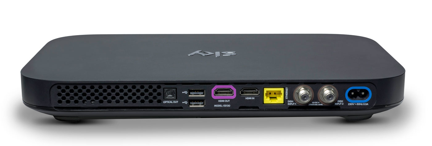
Do you remember how massive the original PlayStation 3 looked, and how tiny the PlayStation 4 was by comparison? The Sky Q boxes are similarly eeny-weeny, to the point where it’s almost shocking to see them side-by-side with the older model. The hardware measures just 330 x 210 x 43mm, down from the 364 x 255 x 73mm of the Sky+HD. In order not to break the sleek, elegant lines of the front, the viewing card slot is now hidden on the right-hand side. Up front, you’ll find a WPS button, the Q logo (which, when pressed, will cause your remote to bleep to make itself known) and an IR sensor. Round back, you’ll find the usual coterie of ports, including power, HDMI (x2), USB (x2), Ethernet, two dish connectors and an optical audio-out.
The Mini, meanwhile, measures in at 232 x 155 x 35mm and looks like a version of the main Q that’s been shrunk in the wash. Round back you’ll find slots for Ethernet, HDMI, 3.5mm audio-out, optical out and USB. If there’s one negative thing I could say about the Q Mini, is that I expected it to be smaller. Sky is an investor in Roku and the latest Now TV box (with a Freeview tuner) is a lot more diminutive than its wider and thicker cousin.
Remote

Here’s the bad news: your existing Sky remotes (even the branded ones) will not work with Sky Q. Except for the Sky Accessible remote, that is, which is designed for people with reduced dexterity and/or poor vision. For the rest of us, the company actually makes two controllers for the new gear: the futuristic Touch Remote, and a more traditional button remote that comes with the Mini.
For the purposes of this review, Sky let me borrow both a Touch Remote and a spare Mini remote that was paired with the Silver. This has turned out to be a Very Good Thing, because the former handset, for all of its bells and whistles, is going to be very divisive. Even Sky employees, off the record, have admitted that they struggle to use the newer handset and sometimes find themselves reaching for the simpler alternative.
The top third of the Touch Remote is dominated by a black, circular clickpad that you’ll use to gently scroll through the Q’s vast menus. The clicks are satisfying and the swipes have a real weight to them, and the further you pull south, the faster you scroll. That’s fine, and it’s really the only way to get around the significantly more dense UI that Sky Q is offering.
The issue comes with the capacitive playback controls that are housed in a half-ring above the clickpad. The bar offers a Play/Pause button and two arcs that end in a Rewind or Fast Forward command. Rather than a hard press, a dainty tap is all you need to get things moving, and you can actually slide across the arc to dictate the speed of play. Those with long memories will be reminded of the jog dial wheel that you’d find on super-expensive VHS players, updated for the 21st century.
Written down, it sounds fantastic, and futuristic, but in reality there are problems with how subtle the remote requires you to be. Linger too long, or press too heavy on the buttons, and you’ll find yourself picking the wrong option. Or you’ll press play, and follow through and put it back on pause again because the sensitivity is far too high. I’ve also had the remote on the sofa beside me, and my upper thigh brushing the controls is enough to jerk the picture into a frenzy of rewinding.
The Mini remote ditches the clickpad and capacitive controls for hard buttons, and I’ve asked plenty of visitors to try the both on for size. While I find the Touch Remote to be problematic, others have struggled to use it altogether, and express a liking for the simpler, nicer Mini remote. It’s less elegant for pawing through all of the Q’s menus, but it’s certainly easier to use in general.
I’ve always had a soft spot for the Sky+HD remote, with its easy-to-memorise control scheme and clear separation of sections. The Q remotes are a challenge to that muscle memory, not to mention that the “Back Up” button, an easy way to dismiss menus and overlays, is now a thing of the past. Instead, you have the “Home” button (which takes you to the Q Menu) and “Exit,” which lets you walk backwards one step, like a browser’s back button.
The other button below the clickpad is the apps menu, which lets you access apps for Sky News, Sky Sports News, Photos, Weather and Sky Help. I’m not sure that the menu deserves such a prominent button placement, especially given the limited utility of those features. It’s my hope that, down the line, Sky will let you add and remove other apps to the panel at your whim. For instance, it makes perfect sense to add YouTube to that list, given that’s where so many videos people look for are now housed.
Another annoyance is the loss of a dedicated subtitles button, great for when you need to translate a mumbled line of dialogue in a TV show. Previously, you could simply rewind a moment, hit subtitles and finally understand what the actors are saying when they move away from the microphone. Now, you have to come out of the show you’re watching, dive into the overall settings menu, find the accessibility panel and activate subtitles for all programs, forever. Suffice to say, it’s too involved to bother with, so I just live a life of ignorance.
Software

Shortly after the launch of Sky Q, BSkyB allegedly received a complaint from the BBC saying that Sky was deliberately burying public service channels. I can see why the BBC would feel this way, and there may be some legitimacy to its complaint, but the whole point of Sky Q is to bury all TV channels. Enter the home screen and you’ll be first presented with the Top Picks section rather than the channel menu. Hit the silver Sky logo at the top of the remote, and you’ll be dropped straight into your recordings.
It’s here that Q really earns its keep, simply by using My Q and Top Picks as a way of serving up content straight to your eyeballs. The latter is curated by flesh-and-blood humans at Sky HQ, while the My Q menu looks at what you’ve already watched and will make suggestions based on that. Every time I’m bored and begin to think about channel flipping, I never have to bother, because some new tidbit is being offered to me. If there’s one complaint, it’s that the content is skewed towards commercial stations and Sky’s own output. For instance, I’m currently being offered shows from the likes of ITV, Channel 4, Sky Atlantic, Nickelodeon and Disney XD. Part of that, I hope, is because it’s not yet learned that, as an adult, I’m not Nickelodeon’s typical audience.
There’s also an on-demand layer which will give you access to the catch-up TV platforms from all the main channels, including BBC iPlayer. But, while I’m not going to assume malice here, it does seem strange that BBC shows aren’t seen inside any of the curated pages. Unless there’s some technical or legal boundary that’s preventing proper integration, it’s enough to propel a half-decent conspiracy theory.
Sky’s previous channel menu was already vastly superior to pretty much everything else on the market. As such, the firm has taken the “if it ain’t broke” approach to the Q’s navigation menu, which has had a minor polish. The video preview has been moved from the top right corner to the left rail, leaving more vertical room for the channel list itself. It also uses smaller, clearer fonts that allow Sky to fit several more entries on the screen without scrolling.

Whoever’s in charge of channel ordering at Sky really does need to have a long think about user experience. It’s 2016, and I’d wager that HD is dominant enough now to end the days when HD channels are ghettoized in the channel order. It’s insane to think that channels 101 and 103 — BBC One and ITV One — are broadcast in SD. Their high definition counterparts, meanwhile, languish as channels 115 and 178. Clearly, there are contractual, technical and legal wrangles that probably prevent this being changed on Sky’s part, although I wish there weren’t. Perhaps the company should offer a setting that lets us re-order the list to end such a user-hostile move.
What has changed, and for the better, is the in-channel selection, for those moments when you don’t wanna stop watching your current show but are curious what’s about. Pressing up or down lets you sift through the channels in chronological order, but brilliantly, each one now comes with a video preview of what’s going on. I foresee this being a great way to avoid commercial breaks during your favorite shows, by switching to something else and using the preview as a second screen.
There are plenty of neat little touches, like being able to download a HD film in full if you catch it part-way through on a Sky Cinema channel. Similarly, hitting record on a show now presumes you want a series link, rather than just to catch that one individual instalment. Similarly, watching the first episode of a TV series on-demand will prompt the Q to download the second, ensuring you can bingewatch as if you were engrossed in your favourite Netflix show. Pushing shows to your tablet is relatively easy, although it’s an annoyance that the Sky Q app can’t be used on smartphones as well. After all, I do most of my remote TV watching on my 5.5-inch smartphone rather than on a 9.7-inch tablet.
Pricing
Sky Q, with all of its whizzes and bangs, now occupies the rarified space on top of the firm’s product line. But, as much as +HD is now the norm, Q is already getting cheap enough that people will begin to upgrade as a matter of course.
A Black Q (aka the 1TB box) will currently cost you £32 a month, but that doesn’t include any other channel bundles such as HD, box sets, movie or sport packs, and you can’t use the multiscreen feature either (an extra £12 per month). Silver (aka the 2TB box) is no costlier, but the one-off setup cost jumps from £49 to £99.
To give you an example of a fully featured package, a 2TB box with all the HD, movie, sports channels and multiscreen (with a free Mini thrown in) costs £86 per month with a £10 setup fee. Depending on what options you select, though, this or that will be discounted, like the £10 one-off charge (as opposed to £49 or £99) if multiscreen is included in your package. The pricing structure is an absolute mess right now. The fact 4K channels are included with the most basic of Silver subscriptions, yet you have to pay extra for HD channels, is a testament to that.
I know plenty of people for whom a Sky subscription with all the trimmings is a sacred part of the family budget. A sum like that, however, may be on the fringes of many people’s purchasing power — though a £74 per month Sky+HD subscription is equivalent to an £86 Sky Q package, albeit without the Q’s fancy value-added features. If you can afford it and you want the best, then go knock yourself out. If you can’t, then I wouldn’t suggest worrying over it, as I’m sure patience will ensure you’ll get cheaper access to it soon enough.
Wrap-up
I like watching TV, and my home setup can access Virgin Media, Netflix and Amazon Prime, which I have on almost constantly. Since I’ve been testing Sky Q, I can count the amount of times I’ve felt compelled to open Netflix and Amazon Prime on a single hand. And most of those were to watch the latest episodes of (AMC’s new Amazon Prime exclusive) Preacher. I already had access to a compelling list of movies and TV shows, and Sky’s content library isn’t so much better that I’m being swayed unnecessarily.
In fact, it’s more that the Q hardware is very specifically designed to serve up fresh, relevant stuff that I’ve not yet come across. Every time I go back to the home screen, it’s pulled up some new treat to dangle in front of my eyes, knowing that I’ll bite. Aside from watching the coverage of the European Championships, I’ve barely scrolled through the TV guide at all. Why would I need to? After all, why spend hours looking for something to watch when my set-top box can do the work for me?
This is the killer feature of Sky Q, and the hardware’s bells and whistles are secondary to simple editorial and algorithmic curation. By keeping you constantly hooked on a drip feed of stuff that the box thinks you’ll like, you very quickly forget all about the chore of scrolling through channels. With Sky Q, on-demand video really is king.
Philips Hue Motion Sensor Release Date, Price and Specs – CNET
This is typically the time of year when Philips tells us what’s new with Philips Hue. And, sure enough, here we are with a new Philips Hue motion sensor accessory. Sync it up with your smart-lighting setup when it arrives this October, and you’ll be able to trigger your color-changing smart bulbs just by walking into the room.
The device doesn’t look much different from other motion sensors on the market. It’s a small, square gadget that you can hide under the bed, mount on the ceiling or stick to the fridge thanks to an included magnet attachment.
Also included: a built-in daylight sensor that promises to save energy by activating lights only when you actually need them. That’s a smart little extra that you won’t find in most other motion detectors.

There’s an ambient light detector built into the top of the Philips Hue Motion Sensor. Its job: to keep the sensor from turning on lights unless you actually need them.
Tyler Lizenby/CNET
The motion sensor is completely wireless, and runs on a pair of AAA batteries. You can pair up to 12 of them with the Philips Hue Bridge, then program which lights each one should control within the Philips Hue app. Once you’ve got everything set up, Philips promises that the lights will come on within a half-second of motion being detected.
All that said, you could argue that the motion sensor isn’t the biggest thing Philips is announcing today. The company also claims that it’ll soon start selling new and improved versions of its signature White and Color Ambiance LEDs — specifically ones designed to shine a little brighter, and to do a better job with greens and blues. That’s a welcome fix for one of Hue’s biggest flaws, but people who spent $200 to buy in with the second-gen bulbs last October might be justifiably peeved that Philips didn’t fix it a year ago.
You’ll be able to spot those new bulbs in packaging that carries a new “richer colors” badge. A Philips spokesperson tells us, “Existing Philips Hue White and Color Ambiance bulbs will continue to work as before; however, to get the benefits of the richer colors consumers will need to purchase the new bulb.”
In addition to the new motion sensor and the improved White and Color bulbs, Philips is announcing the arrival of some new skews for its Philips Hue White Ambiance LED. That bulb offers adjustable tones from the white-light spectrum — now, you’ll be able to get one with a GU10-shaped base, as well as a BR30-shaped floodlight variety.
The Philips Hue Motion Sensor will cost $40 when it arrives this October (international pricing isn’t available yet, but that price comes out to about £30/AU$55, converted roughly). You’ll find it on the Philips Hue website, as well as on Amazon and at Best Buy. We’ll be sure to test it out in the CNET Smart Home and let you know how we like it.
Samsung CF791 Release Date, Price and Specs – CNET
Samsung announced two new gaming monitors at IFA 2016.
The sleek, ultra wide 34-inch CF791 will go for $999 (converts to AU$1,330 and £760), and the CFG70 monitors, which come in 24-and 27-inch variants, are priced at $399 (roughly AU$530, £300) and $499 (around AU$660, £380), respectively. The new monitors notably have curved edges, a design trend Samsung is fully embracing.
Samsung’s new curved monitors are prime for…
See full gallery


1 – 4 of 9
Next
Prev
The CF791 is a flashy white and silver 34-inch model, but the more subdued CFG70 works better for gaming purposes. It has AMD FreeSync Technology and a speedy 1ms response time. It’s also competitively priced in comparison to other 24- and 27-inch gaming monitors.
As an electronic giant that makes a little bit of everything (TVs, tablets, smartwatches, fridges, baby monitors, the list goes on) Samsung is no stranger to computer monitors, but gaming monitors are not something the company has focused on much, until now. Samsung is committed to curved gaming monitors with fast response times and has plans on making UHD models as soon as next year. If you can’t wait that long, the CF791 and CFG70 are expected to hit stores in Q4.
| 34″ | 23.5″ | 27″ |
| 21:9 | 16:9 | 16:9 |
| VA (Curved) | VA (Curved) | VA (Curved) |
| 1500R | 1800R | 1800R |
| 3440×1440 | 1920×1080 | 1920×1080 |
| 4ms | 1ms | 1ms |
| 125% | 125% | 125% |
| 100Hz | 144hz | 144hz |
| Yes | Yes | Yes |
| No | Yes | Yes |
| No | Yes | Yes |
| 7Wx2 | No | No |
| Yes | Yes | Yes |
| No | Yes | Yes |
| 1 | 1 | 1 |
| 2 | 2 | 2 |
| Yes | Yes | Yes |
| 1Up, 2 Down | No | No |
| $999 | $399 | $499 |
Motorola’s latest wireless earbuds don’t live up to expectations
In June, Motorola unveiled its VerveLife line of “lifestyle” products, with the VerveOnes+ wireless earbuds being the first to go on sale. These are truly wireless, existing as two independent pods that you wedge into your ear holes, with no wires or headband to be found. Needless to say, I was excited at the prospect of ultracompact Bluetooth earbuds — especially after reading about the Bragi Dash, a very similar device. Sure, these headphones will be easy to lose (something the company addresses), but having a semi-smart audio system without tangles that’s easy to stow in your pockets… that seemed like the future. Sadly, while there are some useful features and the sound quality is indeed respectable, the form factor itself still has some lingering issues — most notably, drops in earpiece-to-earpiece syncing. That’s a problem, given the $250 price tag.
The package includes two wireless earbuds and a charging case, which you’ll unfortunately need to keep close at hand most of the time. The Hubble Connect companion app for iOS and Android gives you a place to customize the settings, but the buds will need to be inside the case in order for the app to connect with them. Without the app, you can still control playback, select EQ presets and connect to Google Now or Siri through simple button presses. If you misplace the buds, the app will help locate the last place they were synced, which is helpful, if only a bit.
The orange and black design with matching charging case is attractive, but unlike in the press photos, the bulky buds don’t sit flush and tend to hang a bit awkwardly out of your ear. I suppose someone out there with larger ears than mine could pull these off a bit better, but for me, it’s tough. Sure, the battery and audio drivers add to their size, but the similar Bragi Dash manages a far sleeker design, with more features inside, no less. That’s not to say the VerveOnes+ ever felt like they were going to fall out of my ears, they sit in pretty well, but do feel as big as they look. As a bonus, at least, IP57 waterproofing means they can withstand sweaty workouts and even the occasional dunk in a sink.

There’s definitely a tradeoff of style for functionality, then, but even that doesn’t seem totally worth it. The headphones have deal-breaker levels of audio dropouts between the left and right earbuds (and sometimes the pocketed source-device), which makes listening a bumpy ride. A recent firmware update helped keep the signal solid while I was sitting at my desk, but go outside amongst the Bluetooth-emitting populace and it’s dropout city.
As for audio quality — dropouts aside — they sound pretty good. Motorola, which actually licensed this product from Binatone, hasn’t revealed the frequency range, but they have 6.8mm dynamic drivers providing what’s described as “deep, rich HD sound.” That’s not much to go on unless you’ve given them a listen yourself, but the bass is indeed deep and full, with solid mid-range tones and generally crips highs, especially with high-resolution audio files. These earbuds also support Bluetooth aptX, so if you have a phone or player that supports the format, you can expect “CD-quality” wireless listening.
To tweak the output, you get six pre-set EQ profiles to choose from: Bass, Brilliant, Balance, Rhythm, Live and Moto Sound. I’ve found Balance and Moto Sound to be the best for normal listening. To get a preview of the settings, just press the earbud button on either side for six seconds while music is playing. It’ll cycle through the options. Press once to lock in your EQ when you find one you like.

Other system options include Ear Detect — an IR sensor switches the buds on once inserted into your ear and vice versa. There’s also Voice Answer for taking calls using the onboard dual mics, and Pass-Through, which lets in a tinny version of the outside world. While this definitely helps, it’s not a safe enough (or often legal) solution for cycling and wind noise also becomes a major problem with Pass-Through enabled. All these settings are supposedly accessible through a six-second button press (without music playing), but so far I’ve only heard a prompt for toggling either music or video mode (something not indicated in the manual). Still, these are generally options that you’ll set once, which you can accomplish easily through the app, while the earbuds are stowed in the case.
One of my favorite features is actually using Google Now (since I’m on Android) for verbal inquiries or turn-by-turn directions when walking or biking around. You can trigger access with a long (but not six-second long) press of the left earbud button until you hear the Google “listening” tone as it accesses your phone. Saying “walking (or biking) navigation directions to a [specified location]” usually took me right into spoken prompts indicating where to go. I usually prefer not to plug up both ears with headphones when I’m out and about, so I’ve taken to using just one. Incidentally, that also solves the annoying audio-dropout issue.
Having a single earbud that can serve up music from your phone and provide one-click access to Google Now for searches, random info and especially directions is actually pretty great. Unfortunately, if you have Ear Detect on and happen to drop them into your pocket for five minutes or more, the buds will go to sleep and only the charging case will be able to wake them up. The workaround is to turn off Ear Detect, leaving the earbud on continuously. Your freedom will only last as long as it takes for each 72 mAh battery to run down, which is listed as about three and a half hours per earbud while in use.

The 600 mAh charging case also provides an additional charge, giving you enough juice for a total of more than 12 hours of playback time once you re-up. The 115-hour standby claim also seems valid. I’ve left them in my bag (in the charging case) for four or five days and they usually still had a healthy charge.
When I first tried these headphones, they seemed like an obvious skip. If I had paid good money and the earbuds cut out as much as they had, I’d be clamoring for a refund. I had high hopes that the recent firmware update would improve their ability to stay connected, but that only helped while indoors with few people around. It’s not just the Motorola VerveOnes+, though, that have difficulty with earpiece-to-earpiece and source device connectivity. Erato’s Apollo 7 buds and the Bragi Dash suffer some of the same problems, but the Dash at least has onboard memory, so you can listen to tunes without bringing a phone (and without suffering any dropouts). And again, they also offer a sleeker fit, which is important in a product with this form factor.
I look at these headphones as examples of fledgling technology: still at the mercy of what’s technically possible. If you can afford to experiment, you may get some enjoyment out of these earbuds, but for $250 most will be disappointed. Truly wireless still seems like a great idea, but the connectivity — a key factor here — is still not where it needs to be.
Lenovo’s Thinkpad X1 Yoga will make you want OLED everywhere
The dream of large OLED screens has, for the past few years, seemed perpetually on the horizon. LG has had OLED TVs on the market for a while, but they’re still far more expensive than comparable LCDs. If you’ve wanted to get your OLED fix recently, you’d have to get it on a smaller phone or tablet screen. Now, the technology is finally making its way to laptops from the likes of Dell’s Alienware, HP and Lenovo. So you can bet that I jumped at the opportunity to test out the new OLED-equipped Thinkpad X1 Yoga as soon as review units appeared. For the most part, it’s a pretty typical Thinkpad convertible PC, but its screen is truly a thing of wonder.
Hardware
The Thinkpad X1 Yoga doesn’t offer up many surprises design-wise. It sports a black matte case, clean lines and it’s built out of some sturdy material (a combination of a carbon fiber cover and magnesium alloy elsewhere). Its understated aesthetic befits its purpose: it’s here to do work, not game or be an entertainment powerhouse. That doesn’t mean it’s ugly, it just resembles very traditional PC laptops, much like its sibling the X1 Tablet. Really, the X1 Yoga doesn’t need any design flourishes, as it ensures the 14-inch OLED touchscreen is the real star of the show. (More on that below.)
While it’s built like a workhouse — there’s no flex to the case, and it feels like it could survive some major tumbles — the X1 Yoga is also impressively portable, at 2.8 pounds and 0.67-inches thin. That’s about on-par with most other Ultrabooks (and it’s even 0.2-pounds lighter than the 13-inch MacBook Air). It’s not as razor-thin as HP’s stunning new Spectre, but because of that it’s surprisingly versatile, with three USB 3.0 ports, HDMI and miniDisplayPort connectors, and a microSD card slot. There’s also a proprietary OneLink+ port for connecting to Lenovo’s docks, as well as a fingerprint sensor to the right of the trackpad.

Being a Yoga device, the X1’s screen can bend a full 360-degrees around the case, effectively turning it into a very large tablet. (In that mode the keyboard also recesses into the case, to prevent stray strokes and key damage.) You can also fold the screen over at an angle in a “tent” formation. That’s ideal for standing it up on a table, or on your lap in bed. Lenovo designed a new double hinge for this device, and it’s one of their smoothest implementations yet. The screen is easy to move around, but it also feels secure once you set it in place.
Lenovo also tucked a stylus into the side of the X1 Yoga, which is useful for drawing or quickly jotting down notes. It’s powered by super capacitor technology, which charges it whenever it’s sitting inside the case.
Display and pen input

The X1 Yoga’s OLED display doesn’t waste any time impressing you. The red border around Lenovo’s logo has an almost electric feel upon boot-up, and that carries over to everything in Windows. OLED displays are known for their bold colors and deep black levels, and this one doesn’t disappoint. Watching videos and perusing photos is a revelatory experience. OLED adds an enormous amount of depth to images that makes them seem almost three-dimensional.
With a resolution of 2,560 by 1,440 (1440p/2K), the X1 Yoga’s OLED screen is significantly sharper than a 1080p display, though it’s not quite 4K. That’s just fine, though, as Windows 10 still isn’t well suited to 4K, and the benefits of such a high resolution are wasted on laptop screens.
The X1 Yoga might not look like an ideal media machine from afar, but it ended up being one of my favorite ways to watch Netflix in bed. Mostly, that was due to sheer immersiveness of the screen. Its speakers sit right below the screen, and as is usual with Lenovo’s gadgets, they were merely adequate. If you really want to get into a movie or TV show, bring along a good pair of headphones.

The laptop’s ability to flip around in a variety of different orientations also made it very useful. When I needed help in the kitchen, the tent formation was perfect on my countertop for watching videos and references recipes. And when I wanted to dive into the NYT, Comixology or a digital magazine app, the tablet mode was immensely convenient. It also worked well in direct sunlight, but be prepared to deal with some reflectivity depending on how it’s oriented.
While the built-in stylus was convenient for jotting down quick notes, it’s also too light and flimsy to use for a very long time. It doesn’t feel as substantial as Microsoft’s Surface Pen or Apple’s Pencil, instead it’s like trying to write with an incredibly skinny pen. If you’re really looking forward to handwriting on the X1 Yoga, though, you’re probably better off investing in something that won’t cramp your hand after a few minutes. On the plus side, the stylus is pressure sensitive, which could be useful for artists.

Typing and trackpad experience
If there’s one thing you can be guaranteed to find on a Thinkpad, it’s a solid keyboard. That’s been true of the line since IBM debuted it decades ago, and it’s something Lenovo has maintained ever since it took over Big Blue’s computer arm. The X1 Yoga’s backlit chiclet keyboard is one of the most comfortable I’ve used in an Ultrabook. I had no trouble quickly typing up notes and reports from Intel’s Developer Conference, or banging out most of this review. The keys are sloped inward slightly, which feels comfortable as you’re resting your fingers on them, and they have a satisfying amount of depth.
Basically, the X1 Yoga’s keyboard feels like a balance of traditional Thinkpad typing with the modern chiclet style. I wish Lenovo included some media keys among its second functions though. Even the ability to start and stop music would be helpful (and being able to move between tracks would be even better). Lenovo used to offer some media keys on the X1 Carbon’s capacitive touch strip, so hopefully we’ll see those return eventually.

The Thinkpad’s trackpad is incredibly smooth, though it’s not as roomy as the MacBook Air’s or those found on other Ultrabooks. And if you’re a Thinkpad diehard, you’ll be pleased to learn there’s also red Trackpoint nub among the keys, as well as mechanical mouse buttons right below the keyboard. For the most part, I relied on the X1 Yoga’s trackpad, which was accurate for mousing, though it sometimes got confused between left and right clicks. I’m not a huge Trackpoint fan, but it was admittedly helpful while I was cramped in a middle airplane seat. In situations like that, being able to mouse with just your finger, and without moving your elbows, is immensely helpful.
Performance and battery life
| Lenovo Thinkpad X1 OLED (2.6GHz Intel Core i7-6600U, Intel HD 520) | 4,892 | 4,186 | E2,609 / P1,419 | 3,577 | 2.2 GB/s / 1.3 GB/s |
| HP Spectre 13 (2.5GHz Intel Core i7-6500U, Intel HD 520) | 5,046 | 3,747 | E2,790 / P1,630 / X375 | 3,810 | 1.61 GB/s / 307 MB/s |
| Huawei MateBook (1.1 GHz Core M3, Intel HD 515) | 3,592 | 2,867 | E1,490 / P887 | 2,454 | 538 MB/s / 268 MB/s |
| Lenovo ThinkPad X1 Tablet (1.2 GHz Core M7-6Y75, Intel HD 515) | 4,951 | 3,433 | E1,866 / P1,112 | 2,462 | 545 MB/s / 298 MB/s |
| Dell XPS 13 (2.3GHz Core i5-6200U, Intel Graphics 520) | 4,954 | 3,499 | E2,610 / P1,531 | 3,335 | 1.6GB/s / 307 MB/s |
| Razer Blade Stealth (2.5GHz Intel Core i7-6500U, Intel HD 520) | 5,131 | 3,445 | E2,788 / P1,599 / X426 | 3,442 | 1.5 GB/s / 307 MB/s |
| Microsoft Surface Pro 4 (2.4GHz Core i5-6300U, Intel HD 520) | 5,403 | 3,602 |
E2,697/ P1,556/ X422 |
3,614 | 1.6 GB/s / 529 MB/s |
| Lenovo Yoga 900 (2.5GHz Core i7-6500U, Intel HD 520) | 5,368 | 3,448 |
E2,707 / P1,581 |
3,161 | 556 MB/s / 511 MB/s |
On the hardware front, the Thinkpad X1 Yoga offers everything you’d expect from an Ultrabook today. It starts with an Intel Core i5-6200U, 8GB of DDR3 RAM and 128GB SSD. The model we reviewed is a bit beefier, with a Core i7 6600U, 16GB of RAM and 256GB SSD.
It tackled just about every productivity task I threw at it: My daily workflow typically consists of having several browsers open with dozens of tabs, Slack, Spotify, and photo editing software running all at once. The Thinkpad handled video streaming from Netflix and Hulu just fine, and it processed dozens of large photos without any issues. It was about as fast as other recent ultraportables, like the new HP Spectre, when it comes to benchmarks. Tough, since it’s sporting Intel HD 520 graphics, it can only tackle basic games.
Unfortunately, I was disappointed by the Thinkpad X1’s battery life. It lasted only around 4.5 hours during typical usage, and I always had to recharge it in the afternoons. In our battery test, which involves playing an HD video continuously at 50 percent brightness, it lasted 8.5 hours. It’s likely just far more efficient at handling video than a plethora of different programs running at once.
Configuration options and the competition
 As always, expect to pay dearly for the privilege of using OLED. This Thinkpad X1 Yoga model starts at $1,682, while the standard LCD version starts at $1,400. Its hardware starts with the specs I’ve mentioned above, but it would cost you $2,168 to upgrade to all of the specs from our review model. Still, the premium is likely worth it if you’ve been hankering for some OLED goodness.
While there’s plenty of ultraportable competition on the market, there are few alternatives that pack an OLED screens. HP recently revamped its Spectre x360 convertible with the technology, which starts at a more reasonable $1,499. And Alienware’s gaming-ready OLED models come in at $1,800. It might be worth sticking with the Thinkpad if you want OLED with the best productivity build quality, but if you’re a gamer, Alienware’s option is worth a look too.
Wrap-up
 It’ll likely be a while before OLED becomes the norm on laptops, but the Thinkpad X1 Yoga is a fine example of why we’d want it in all of our devices. Yes, even in a laptop that looks like it belongs in a boring corporate cubicle. That could also be appealing to some buyers: it looks like a dull Thinkpad on the surface, but it’ll blow your mind when you actually turn it on.
The Thinkpad X1 Yoga is a reminder that OLED isn’t just bright and bold, it’s a transformative display technology. Now if only it weren’t so expensive.
Lenovo ThinkPad X1 Yoga (OLED) review – CNET
The Good The new OLED display looks stunning, and this professional-level Yoga has a great keyboard, active stylus, and rugged body.
The Bad It’s not as thin or light as the more consumer-oriented Yoga hybrids, and adding the OLED screen is an expensive option.
The Bottom Line The best 2-in-1 Yoga Lenovo makes gets even better with the addition of a stunning OLED display.
Configure at Lenovo.
Has it really only been four years since Lenovo’s first Yoga hybrid? That 13-inch two-in-one PC was the biggest argument in favor of the then-new Windows 8 and its tile-based interface, because it could transform into a touch-friendly tablet with ease, and because it did so without compromising the familiar clamshell laptop experience that nearly every PC user is accustomed to.
It turned out that the Yoga really was the one hybrid to rule them all, and every other major PC maker, including Dell, HP, Toshiba and others, experimented with all sorts of flipping, folding, rotating, and shifting hybrid PC design before settling on a similar 360-degree hinge. Today, you can’t even casually browse a computer store (either brick-and-mortar or online) without tripping over Windows PC with kiosk and table tent modes.
 View full gallery Sarah Tew/CNET
Lenovo went on to make several variations on the Yoga, including different screen sizes, different colors and higher-end models with watchband-style hinges. But the overall best Yoga design the company produced was the ThinkPad Yoga. This variant, part of the buttoned-down ThinkPad line of business computers, kept the best parts of the transforming Yoga experience, but also added a clever keyboard trick.
When the hinge rotates from its clamshell position all the way to its tablet position, the keyboard tucks itself away inside the base. It looks and feels like a retractable keyboard, but in reality, the outer edge of the keyboard tray raises up slightly to be flush with the keys, which are in turn locked into position. But the end effect is the same, so feel free to keep calling it a retractable keyboard. It’s a great feature missing from the standard IdeaPad Yoga systems, which leave a deactivated keyboard clacking under your fingers when in tablet mode.
Still, the ThinkPad Yogas were never as thin, flashy or lightweight as the consumer models, so I could see going with a slim IdeaPad Yoga 900 instead. Until now.

View full gallery Sarah Tew/CNET
The latest 14-inch ThinkPad model, called the X1 Yoga, adds an OLED display (in its highest-end pricing configurations), making it one of the first laptops anywhere to have this stunning new type of screen. This isn’t a surprise development, Lenovo announced OLED was coming to the Yoga back in January at CES 2016, but it’s taken until now for the first units to finally ship. We recently reviewed a version of Dell’s Alienware 13 with an OLED screen, and my colleagues and I were blown away by what a big difference it made in everything from gaming to video viewing, and to a lesser extent, casual web surfing and productivity work. The Samsung TabPro S, a Surface-like tablet hybrid, has a similar AMOLED screen and was also very impressive.
Here in the larger 14-inch X1 Yoga, you can really appreciate why OLED screen technology sets the standard for excellence in the best-looking current-gen big-screen televisions, and why, despite the very high costs, TV buyers crave them. Even for a smaller laptop screen, there’s still a premium to pay. The exact high-end configuration we tested, with the OLED 2,560×1,440 display, a Core i7-6600U processor, 16GB of RAM and a big 256GB SSD, costs $2,289, as configured through Lenovo’s website. In the UK, you can get an identical OLED configuration for £2,286. In Australia, the same configuration costs AU$3,999.

View full gallery Sarah Tew/CNET
If you’re looking for OLED on a budget, Lenovo also offers a Core i5 version in the US with the same OLED display but half the RAM and SSD storage for $1,682.
ThinkPad Yogas always cost a few hundred dollars more than the consumer versions, because of the retracting keyboard, better construction and built-in IT-friendly security features. Adding OLED drives the price up even further, but it’ll be a least a few more years before OLED laptops and TVs are as inexpensive as their LCD counterparts.
Lenovo ThinkPad X1 Yoga (OLED)
| $2,289 |
| 14-inch, 2560 x 1440 OLED touch display |
| 2.6GHz Intel Core i7-6600U |
| 16GB DDR3 SDRAM 1866MHz |
| 128MB Intel HD Graphics 520 |
| 256GB SSD |
| 802.11ac wireless, Bluetooth 4.0 |
| Micorsoft Windows 10 Pro (64-bit) |
This new X1 Yoga keeps much of the look and feel of previous models, from the low-key matte black color to the red trackpoint nestled between the G, H and B keys — a throwback to an earlier era of laptop computing that feels more like a branding play than a practical navigation tool these days.
Garmin Forerunner 735XT review – CNET
The Good Lightweight and waterproof, and has GPS for tracking a variety of sports and an optical heart-rate sensor. All-day activity tracking, interval training and phone notifications are helpful. There’s a multisport mode to time triathlon transitions and easily switch sport profiles. It’s compatible with a wide-range of Garmin accessories.
The Bad It’s expensive; there’s no altimeter for measuring ascent and descent; and battery life may not be long enough for a full Ironman triathlon.
The Bottom Line The Forerunner 735XT is an exceptional watch for serious triathletes, but there are better and cheaper alternatives for both dedicated runners and more casual athletes.
The Garmin Forerunner 235 is one of my favorite running watches and for good reason: It has everything runners need to take their training to the next level. It’s not ideal for multisport athletes, though.
The 235 is primarily a running watch, but its more expensive cousin, the Forerunner 735XT, is equally good and better suited for serious triathletes. This watch can track running, cycling, swimming and other sports, includes an optical heart-rate sensor, and has interval training, all-day activity tracking and phone notifications. Its special triathlon feature can time transitions and switch sport profiles with a single button press.
The Forerunner 735XT costs $450, £360 or AU$700. That’s a premium of $120, £80 or AU$230 over the 235, but for hardcore triathletes, it’s a price I think is well worth paying.
Hands-on with the Garmin Forerunner 735XT…
See full gallery


1 – 5 of 12
Next
Prev
A laundry list of features
The watch is comfortable and lightweight. It feels good on my wrist when training or while wearing it throughout the day. It’s a tad lighter (40.2 grams compared to 42 grams) and has less of a bezel, but otherwise the two devices are remarkably similar, but only when it comes to design. Garmin was able to squeeze even more functionality into the 735XT. It has all of the features of the 235 and more — a lot more.
 View full gallery
The Forerunner 735XT (left) next to the 235 (right).
Sarah Tew/CNET
Here’s everything that’s different:
- Added tracking for pool swimming, open water swimming, paddle boarding, rowing, hiking, cross country skiing and strength training
- Added support for running dynamics (with a special optional heart-rate chest strap, it can measure ground contact time, vertical oscillation, stride length, vertical ratio and more)
- Added stress score, lactate threshold, functional threshold power and performance condition measurements (when paired with a chest strap)
- Added Courses, Virtual Partner and Virtual Trainer features to compete against a digital person or past runs
- Compatible with Garmin Vector pedals, Varia Radar and lights, Shimano Di2 electronic shifters, Varia Vision heads-up display and ANT+ power meters
- Compatible with Garmin Tri and Swim-HRM straps
Triathlon support
The watch includes a profile specifically for triathlons, along with an auto-multisport feature. That means you can switch between each sport (swimming, biking and running) with a single button press, rather than having to manually stop one and start the other. It also times how long you take during your transition period. This isn’t unique — this mode, or a similar one, is also present on the Garmin Fenix 3/HR, Forerunner 920XT, Polar V800 and Suunto Ambit3.

View full gallery Sarah Tew/CNET
You won’t have any problems wearing the watch in the pool, the ocean or the shower. The 735XT carries a water-resistant rating of 5 ATM, which means it can withstand depths of up to 50 meters.
The built-in heart-rate sensor doesn’t work while swimming, although that’s true for most devices. Garmin is instead offering a triathlon bundle for $500 that includes the Swim-HRM (pool) and Tri-HRM (open water) chest straps. Both of these record heart rate data while swimming — the latter also supports running dynamics — but the data isn’t displayed in real time and will only be available for review after your workout has been completed.

View full gallery Sarah Tew/CNET
Missing features
The 735XT doesn’t have a barometric altimeter, which is used for measuring altitude. It attempts to measure altitude using the GPS, although I found it wasn’t nearly as accurate when compared to the altimeter-equipped Fenix 3.
