


Kenmore 13479 review – CNET
The Good The $500 Kenmore 13479 cleans better than models that cost two to three times as much. It’ll wipe away almost any dirt you throw at it, and it has a fine mix of cycles and a countdown timer.
The Bad The countdown timer is the fanciest feature you’ll find on this bare-bones model. It doesn’t even have basics like fold down tines or wine stem holders.
The Bottom Line If you want to save money without sacrificing cleaning power, and you don’t care about features or design, this is the dishwasher for you.
Visit manufacturer site for details.
Testing the $500 Kenmore 13479 dishwasher made me nervous. For a built-in standard-sized dishwasher, it’s priced at the low end. If it performed as such, that would have meant a lot of extra work for me. We spread 13 different types of foods over 112 different dishes, then let them sit for 24 hours before testing the cleaning prowess of our dishwashers. If the low-cost Kenmore 13479 wasn’t able to remove any dirt, I would have to do it.
Lo and behold, Kenmore came through. Price aside, it’s one of the best performing dishwashers we’ve ever tested. So when you take the price into account, the Kenmore 13479 makes for a great bargain as it out-cleans dishwashers that cost almost three times as much. This $500 dishwasher doesn’t have a whole lot else going for it. It’s bland and it doesn’t really have any special features. The interior is a little cramped. To an extent, you get what you pay for, but that doesn’t hold true as far as cleaning.
If you’re looking for a low-cost, no frills dishwasher that can handle your messes, the Kenmore 13479 fits the bill nicely. Consider the $700 Kenmore 13699 as well for a similarly capable dishwasher with a few more features.
Kenmore’s ugly dishwasher will make your…
See full gallery


1 – 5 of 8
Next
Prev
Looks like a pauper
Saying the Kenmore 13479 is a “no frills” dishwasher is being too generous. It’s not just missing high-end extras. It has no fold down tines, no wine stem holders, you can’t adjust the height of the upper rack and it only has room for 12 place settings. It also has a plastic tub instead of an energy saving stainless tub, but I’d expect that at this price. For $500, I also wouldn’t expect higher-end adornments like a third rack, specialized jets for difficult to wash dishes or customizable cycles for either the upper or lower rack. However, one or two simple add-ons would have been nice.
The exterior is an unadorned plain black. The model’s also available in white or stainless steel, though the stainless costs around $100 more. The curved handle is nice, as is the status light on the front which shines green as the dishwasher works. Otherwise, this dishwasher blends in enough to be forgettable, which is as much as I can say for its design.

Both the exterior and interior are pretty bland.
Tyler Lizenby/CNET
The interior is similarly bland, and again, it has no features to speak of to make loading easier. The red jets on the spray arm at the bottom and the red cap on the rinse aid dispenser are the only hints of color. Without features, even our load of 10 place settings felt cramped, though the design isn’t so egregious as to get in the way. Though some plates overlapped, they all sat firmly in their spots when we loaded according to the pattern recommended in the manual.
The control panel on the top lip feels cheap and plasticky, but it does have a countdown timer and a nice set of six cycles. The hour-long speed cycle is a little slow, but the Kenmore has an otherwise standard but suitable mix including Pots and Pans, China Gentle and Smart Wash — which senses dirt and saves energy.

The 13479 does have a nice selection of cycles.
Tyler Lizenby/CNET
After you select your cycle, you can add on any of three options — Sani Rinse, High Temp and Heated Dry — another fine if underwhelming mix. If you spend an extra $200, the Kenmore 13699 adds a set of fold down tines on the bottom rack, an upper rack with adjustable height and an extra option which focuses water through jets specialized for a casserole dish. The 13699 isn’t feature-rich by any means, but it’s not quite as bare-boned as the 13479.
Other budget-friendly dishwashers
- GE GDF610PMJES
- Frigidaire FGID2466QF
- Kenmore 13699
Still, you can get the 13479 for less than $500. As is typical with Kenmore products, it’s only available at Sears, and as of this writing it’s listed for $400. I wouldn’t expect a lot of features for such a low price, and what it does do, it does extremely well.
Juiceman 3-in-1 Total Juicer review – CNET
The Good The Juiceman 3-in-1 Total Juicer functions as a citrus juicer, blender and produce juice extractor.
Most of its parts are dishwasher safe.
The Bad It doesn’t make much juice even for a low-performance centrifugal extractor.
It’s complex and has a lot of parts to wash, assemble and keep track of.
The Bottom Line While it can do the job of personal blender, produce juice extractor and motorized citrus reamer in a pinch, the Juiceman 3-in-1 Total Juicer can’t match other juicers for blending power.
The $120 Juiceman 3-in-1 Total Juicer is designed to handle the work of three separate kitchen appliances: an all-purpose produce juice extractor, a motorized citrus juicer and a travel-sized food blender. Delivering that much versatility is a tall order, and sadly the Total Juicer falls short.
It unlocks less juice from similar products which cost half the price. Its numerous parts are a hassle to deal with and the entire apparatus gets dirty too easily. Instead of the Total Juicer, consider the $300 Omega J8006. While the Omega is pricey and can’t blend like the Juiceman, it processes produce like a champ. The elite machine is a snap to clean too and has few components to fuss over. If you’re on a budget, the $40 Black & Decker JE2400BD makes more drinkable juice than the Juiceman at a third of the price.
This Juiceman 3-in-1 has way too many parts
See full gallery


1 – 5 of 11
Next
Prev
Design and features
If you’re familiar with basic centrifugal juice extractors, the Juiceman 3-in-1 Total Juicer, at least in its standard form, won’t look out of the ordinary. The machine consists of a heavy cylindrical base that houses an 800-watt electric motor. This engine spins a metal filter basket equipped with sharp blades at its bottom.

The Juiceman 3-in-one Total Juicer comes with lots of parts to tackle many duties.
Chris Monroe/CNET
Rotating at high speed, the basket essentially acts as a cheese grater on overdrive. Its blades both pulverize and liquify fruit and vegetables that land inside of it. Due to its weight, any liquid released in this process is sucked through the mesh strainer by centrifugal force. It then flows through the Juiceman’s spout and into a waiting juice cup. Lighter bits, and hopefully pulp smashed free of moisture, are thrown clear of the filter to land inside a waste container.
A clear plastic lid sits over both the filter basket and pulp container. It channels fruit and veg into the juicer via a wide-mouth food chute and provides a path for pulp to enter the collection jar. On the Juiceman’s base are a trio of suction cups that anchor the machine to smooth surfaces such as kitchen counters and table tops.

Transform the Juiceman into a dedicated citrus juicer.
Chris Monroe/CNET
What really sets this appliance apart, in theory, is its flexibility. You can remove all of its juice extractor parts — six in all — from the Juiceman’s base. If you then attach a separate set of four components to the base, the machine transforms into a stand-alone citrus juicer. One piece shifts the motor to a lower gear. Another part, a traditional citrus cone, spins slowly to ream pulp and juice from the halves of round citrus fruit. The other sections include a circular juice strainer, and a cylindrical pulp collector which also has a spout to feed liquid into the juice cup.
Lastly the Juiceman 3-in-1 morphs into a blender thanks to one additional part. This is a blending base complete with its own array of blades. You also use the juice cup as a travel-size blending cup. There’s a lid for the cup too so you can grab your drink and take it with you.
Huawei Mate 9 review
Editor’s note: Full review video to follow soon. In the meantime, our initial hands on video can be found above.
The spectacular failure of the Galaxy Note 7 earlier this year has presented an opportunity for companies to create the best big-screen Android alternative and Samsung’s misfortune could play right into the hands of Chinese OEM Huawei.16
Huawei’s Mate range dates back nearly as long as Samsung’s Note series and by offering metal unibody designs, large displays and fantastic battery life, the range has grown in popularity. The Mate 9 continues this trend with better internals, a large display and an upgraded version of the P9’s LEICA dual camera setup but, crucially, it also brings a major revamp to Huawei’s EMUI interface in the form of EMUI 5.
Buy now on Amazon
Alongside the regular Mate 9, Huawei also announced the first device in its partnership with Porsche Design – aptly named the Porsche Design Mate 9 – which brings the same internals coupled with a curved QHD display, 6GB of RAM and 256GB of storage. The Porsche Design Mate 9 is limited edition and with a price tag of €1399, it’s definitely not for everyone.
Is the Mate 9, in either form, the perfect smartphone for those wanting a big-screen Android experience? Let’s find out in this, our Huawei Mate 9 review.
About this review: We’ve been using the Huawei Mate 9 and Porsche Design Mate 9 for around five weeks now as our main phone. Until early December, both handsets were running pre-release firmware and while some of our impressions were based on the non-final software, we’ve retested both phones on their latest software for this review.
All reviews published prior to November 30th 2016 were based on the non-final software and we’ve noticed several ‘issues’ in this build have been fixed in the latest software. Throughout this review, we’ll be referencing these improvements and tweaks as a reference point against issues raised in other reviews.
Huawei Mate 9: Design

The design of the Mate 9 isn’t really surprising as it’s largely unchanged from last year, although Huawei has made it a little more compact and ergonomically friendly. Alongside this, Huawei has also added a curved unibody finished with soft-feeling aluminium and the result is a smartphone that doesn’t feel as large as you’d expect.
Considering there’s a 5.9-inch display, you could be forgiven for thinking the Mate 9 is a big phone and while the display is certainly large, narrow vertical bezels and a slim profile mean it handles a lot better than other large devices. Compared to the Google Nexus 6P or the iPhone 7 Plus, the Mate 9 is infinitely easier to handle and use, despite the larger display.


To the right of the Mate 9 you’ve got the power and volume keys while on the left is the dual-SIM tray. On the bottom is a USB-C port and one of the dual speakers, while the headphone jack and infrared port can be found up top. Huawei has also added brushed patterns and a slight chamfer to the edges which adds grip, improves the handling and makes the Mate 9 more ergonomically friendly.

On the back, you’ve got a dual-camera arrangement in a vertical layout, rather than the horizontal layout found in the Huawei P9. Beneath this is Huawei’s typical fingerprint sensor which, in typical fashion, remains one of the fastest on the market. Rather interestingly – considering Huawei’s habit of mentioning the iPhone camera bump during its press conferences – the camera is on a slightly raised hump, although this does sit flush when you use the case supplied in the box.

Although the Mate 9 is a good looking smartphone, the Porsche Design Mate 9 is Huawei’s real design champion and whether it’s a sign of things to come – or a game of imitation – it’s definitely a looker. Almost all the design elements have been changed; rather than a regular display, you’ve got a dual-curved screen like the one found on the Galaxy S7 Edge.
The design changes don’t just stop there; the screen is smaller than the Mate 9 (more on that later), the fingerprint sensor is moved to the front beneath the display and flanked by back and recent keys and the back is covered in a pitch-black anodized metal that looks striking and shimmers in the light.

The curved display itself is surprising as it’s incredibly subtle and more an element of design rather than a feature in itself. The different finish on the rear also means the Porsche Design Mate 9 attracts more fingerprints but is easier to hold and provides a hard edge to grab a hold of, and more grip than the regular Mate 9.
Rather than a revolutionary design, the Mate 9 is another step in the evolution of Huawei’s design strategy. Huawei is demonstrating that big doesn’t always have to feel big, and that they can pull off a large display that’s still friendly to your hand. Personally, while the Porsche Design Mate 9 is definitely a looker, I prefer the feel of the regular Mate 9 in the hand.
Huawei is demonstrating that big doesn’t always have to feel big, and that they can pull off a large display that’s still friendly to your hand.
Huawei Mate 9: Display

The Huawei Mate 9 sports a 5.9-inch 2.5D Full HD IPS display with a density of ~373ppi, while the Porsche Design brings Quad HD resolution in a smaller 5.5-inch AMOLED display with ~534ppi density.
You could be forgiven for judging the regular Mate 9 purely on the Full HD resolution but to do so would take away from the fact the display is fantastic. Like previous Huawei devices, there’s a super high contrast ratio (1600:1+) which offers an immersive experience and helps to shield the fact it’s not an AMOLED display.

Running both devices through our testing reveals both have a cool display out of the box – with the Porsche Design more accurate than the regular Mate 9 – although this can be easily changed in the settings menu. Like most flagships, both devices also come with a blue-light filter, which is branded as “Eye Comfort” mode and works just as you’d expect by changing the display tone to a much warmer color. Digging further and the Porsche Design Mate 9 has a max brightness of 383 nits, while the Mate 9 tops out at over 600 nits.
The Porsche Design Mate 9 aside, Huawei has always stuck to its guns when it came to adopting higher resolutions and the Mate 9 screen goes to show that you don’t always need more than Full HD. Yes, it would have been nice to have better than Full HD resolution on the regular Mate 9 but this display is fantastic regardless.
Huawei Mate 9: Performance

As you might expect, the Mate 9 is packed with the latest internals from Huawei in the form of the Kirin 960 chipset, which is made up of ARM’s latest Cortex-A73 chipset (versus the A72 used in the Mate 8 and Huawei P9). The Kirin 960 comes equipped with four Cortex-A73 ‘performance’ cores clocked at 2.4GHz, paired with four Cortex-A53 lower power cores clocked at 1.8GHz. The Mate 9 is also the first handset to run the new 8-core Mali-G71 MP8 GPU, which is expected to power the Galaxy S8 and other flagship devices next year.
The regular Mate 9 comes equipped with 4GB of RAM and either 64GB of storage, while Porsche Design Mate 9 owners will get 6GB of RAM and 256GB of storage. If you do opt for the regular Mate 9, you do get expandable storage, while the Porsche Design Mate 9 is limited to 256GB of storage.

The combination of the latest processing package, ample amounts of RAM and lightning fast UFS 2.1 storage means both versions of the Mate 9 fly through everything you throw at it. On the regular Mate 9, there’s between 2.4GB and 2.6GB of RAM free with no apps running and even with 20 apps running (including a couple of games), we’re yet to hit below 1.5GB of RAM free. Based on the RAM utilization, the Mate 9 is the closest we’ve seen a smartphone come to PC-levels of optimization and resource usage.
The Mate 9 is the closest we’ve seen a smartphone come to PC-levels of optimization and resource usage.
A large part of this is down to Huawei’s new machine learning algorithm, which learns your habits and prioritises your favourite apps to ensures there’s always the right resources available when you need them. Huawei goes a step further to say that their machine learning algorithm means your phone is fast out of the box and remains fast, even after months of usage. Of course, we can’t confirm this but so far, the results are certainly promising.

How do both versions of the Mate 9 stack up to the competition and how much better is the Kirin 960 than the Kirin 950? In AnTuTu, the regular Mate 9 scores 127507 while the Porsche Design Mate 9 scores 111354. In comparison, last year’s Mate 8 scores 51432, the Exynos-8890 powered Galaxy S7 Edge scores 127507 and the Snapdragon 821-powered Pixel XL scores 136883.

Moving on to GeekBench 4 and the results are quite similar; the regular Mate 9 scores 1910 in the single-core test and 5311 in the multi-core test while the Porsche Design Mate 9 scores 1936 and 5921 respectively. By way of comparison, the Mate 8 scores 1070 and 1787, the Galaxy S7 Edge scores 1578 and 3858, and the Pixel XL scores 1575 and 4090. Interestingly in the multi-core test, the regular Mate 9 is the first Android smartphone we’ve tested that’s on par with the iPhone 7 Plus (5395) while the Porsche Design Mate 9 leads the field comfortably.

The last of our regular benchmark tests is 3DMark, where we put the new GPU to the test and the regular Mate 9 scored 2203 on the Slingshot test, while the Porsche Design Mate 9 scores 1600. By way of comparison, the Mate 8 scores just 351, the Galaxy S7 Edge scores 2178 and the Pixel XL scores 2476.

To test the GPU further, we also ran another graphics-based benchmark (which we’ll be doing more of in 2017) in the form of GFX Bench. In the T-Rex HD on-screen test, the regular Mate 9 achieved 58 frames per second (fps), while in the Manhattan on-screen test, it scored 28fps. Meanwhile, in the same tests, there was quite a drop in the Porsche Design Mate 9 results at 41fps and 20fps, which is not overly surprising given the higher resolution and extra pixels the GPU has to power. By way of comparison, the Mate 8 scores just 39fps and 17fps, the Galaxy S7 Edge scores 50fps and 14fps and the Pixel XL scores 55fps and 30fps.
Overall, the benchmark results show how much the Kirin 960 has improved over previous versions, especially in the graphics department, where the Mali GPU has almost completely closed the gap to the Adreno GPU used in Snapdragon chipsets. On paper, the Kirin 960 may not be perceived as one of the best chipsets, but the experience on the Mate 9 is almost as smooth as the Pixel XL.
Huawei Mate 9: Hardware

Like most flagship handsets, the Mate 9 comes equipped with the latest internals, including an array of sensor, a fingerprint sensor, and connectivity options. Huawei also demonstrates its network infrastructure prowess through the addition of smart WiFi features, excellent antennae and full control over dual SIM functionality.
Beneath the camera on the rear, the regular Mate 9 has a lightning fast fingerprint sensor, in the same vein of those we’ve come to expect from Huawei. It takes around half a dozen taps to register your fingerprint and once enrolled, you can wake and unlock your phone in under a second. The fingerprint sensor also comes with gesture support, allowing you to tap once to go back a step, press and hold to return to the home screen and swipe down to access your notifications and shortcuts.

On the Porsche Design Mate 9, the fingerprint sensor is moved to the front of the device with the rear sensor replaced by a Porsche Design logo. The fingerprint sensor works almost as well as on the regular Mate 9, although there does seem to be a slightly longer delay in reading your fingerprint when the display is turned off. This sensor also supports gestures, albeit they are different to the regular Mate 9 and if you opt to switch off the capacitive navigation keys, you’ll use swipe-based gestures on the sensor to navigate between screens.
The Mate 9 comes with a dual stereo speaker setup with a single speaker found on the bottom and a secondary speaker built into the earpiece above the display. The speakers are fantastic and louder than you’ll ever need them to be, but when set to above 60%, there is a noticeable tininess to the audio. However, you probably won’t need to set it to higher than this as it’s plenty loud without distortion for general usage.

Unlike many smartphones, the Mate 9 keeps the regular 3.5mm headphone jack, which can be found up top. The design might be questionable – I personally prefer a bottom mounted headphone jack – but the wired audio output isn’t, with the Mate 9 able to drive ample amounts of power to a variety of headphones. It’s not quite on par with audio-centric smartphones such as the LG V20 and ZTE Axon 7 but it comes very close and offers one of the best audio experiences on a flagship smartphone.
Like most flagships, the Mate 9 offers a plethora of connectivity options that include NFC, Bluetooth, Wi-Fi and an infrared port. It’s especially great to see that Huawei kept the infrared port, which can be used to control your home appliances and entertainment. The dual SIM card slot allows you to use either two SIMs or a SIM card and microSD card (on the regular Mate 9 that is) and call quality is fantastic, especially as when you put the phone to your ear during a call, the Mate 9 eliminates ambient noise. This, coupled with the speaker in the earpiece, results in excellent call quality.
Huawei Mate 9: Battery Life

One of the principle cornerstones of Huawei’s smartphone philosophy is battery life and in particular, a desire to prioritize battery life over features (such as higher resolution displays).
The Mate 9 is no different and its 4,000mAh battery is one of the largest found on an Android flagship smartphone. Coupled with a Full HD display, you get excellent battery life as you might expect from such a large battery. By way of comparison however, the Porsche Design Mate 9 has a higher resolution (yet smaller) display and the same 4,000mAh battery capacity and there is a noticeable drop in battery life.
How does the battery stack up to the competition? Using our custom battery tester app, we’re able to say that the battery life on both devices is firmly up there with the best smartphones on the market.

The first of our tests focuses on gaming and each smartphone is charged to 100 percent, the display brightness is set to 200 nits and all sync is turned off (with Wi-Fi remaining on). During this test, the Mate 9 lasted 5 hours and 12 minutes, while Porsche Design lasted 4 hours and 34 minutes. By way of comparison, the Mate 8 lasts 4 hours and 48 minutes and the Pixel XL lasts 4 hours and 43 minutes. Our testing has revealed that no Android smartphone comes close to the iPhone 7 Plus, which lasts for 12 hours and 37 minutes when gaming.

Moving onto the next criteria and we use the same 1080p HD video file, charge phones to full and loop the video until the battery drains completely. In this test, the Mate 9 lasts for 14 hours and 12 minutes, while the Porsche Design lasts for 10 hours and 36 minutes. By way of comparison, the Mate 8 lasts for 10 hours and 34 minutes and the Pixel XL lasts for just over 7 hours.

Our last battery test focuses on wifi browsing and our apps loads the same six webpages in a continuous loop until the battery drains completely. In this test, the Huawei Mate 9 lasts for 14 hours and 4 minutes, while the Porsche Design lasts for 11 hours and 28 minutes. By way of comparison, the Mate 8 lasts for 11 hours and 57 minutes and the Pixel XL for 10 hours and 38 minutes.


Huawei has often claimed that it resisted the market transition to Quad HD displays because of the effect on battery life and as our testing has revealed, the QHD display on the Porsche Design Mate 9 has an impact on the battery life, when compared to the FHD display on the regular Mate 9. With that being said however, both smartphones offer exceptional battery life and even with heavy usage, neither device fails to last for more than a day. On several occasions, the 4000mAh unit has been enough to see us through the entirety of the second day, and sometimes, even half of the third.
With the Mate 9 Huawei proves that flagships can have lasting battery lives.
Throughout six weeks of testing, we’ve experienced screen on time ranging from 5 to 8 hours, whereas the Porsche Design Mate 9 achieves between 4 and 7 hours. For the most part, six hours of screen on time is regularly achievable for heavy users. Whether you’re a heavy, medium or light user, the Mate 9 will power you for days on end. Battery life is a problem that plagues all smartphone users and both variants of the Huawei Mate 9 are excellent solutions to this long-running concern with modern technology. Battery technology hasn’t progressed as fast as other areas of smartphone tech, but with the Mate 9 Huawei proves that flagships can have lasting battery lives.


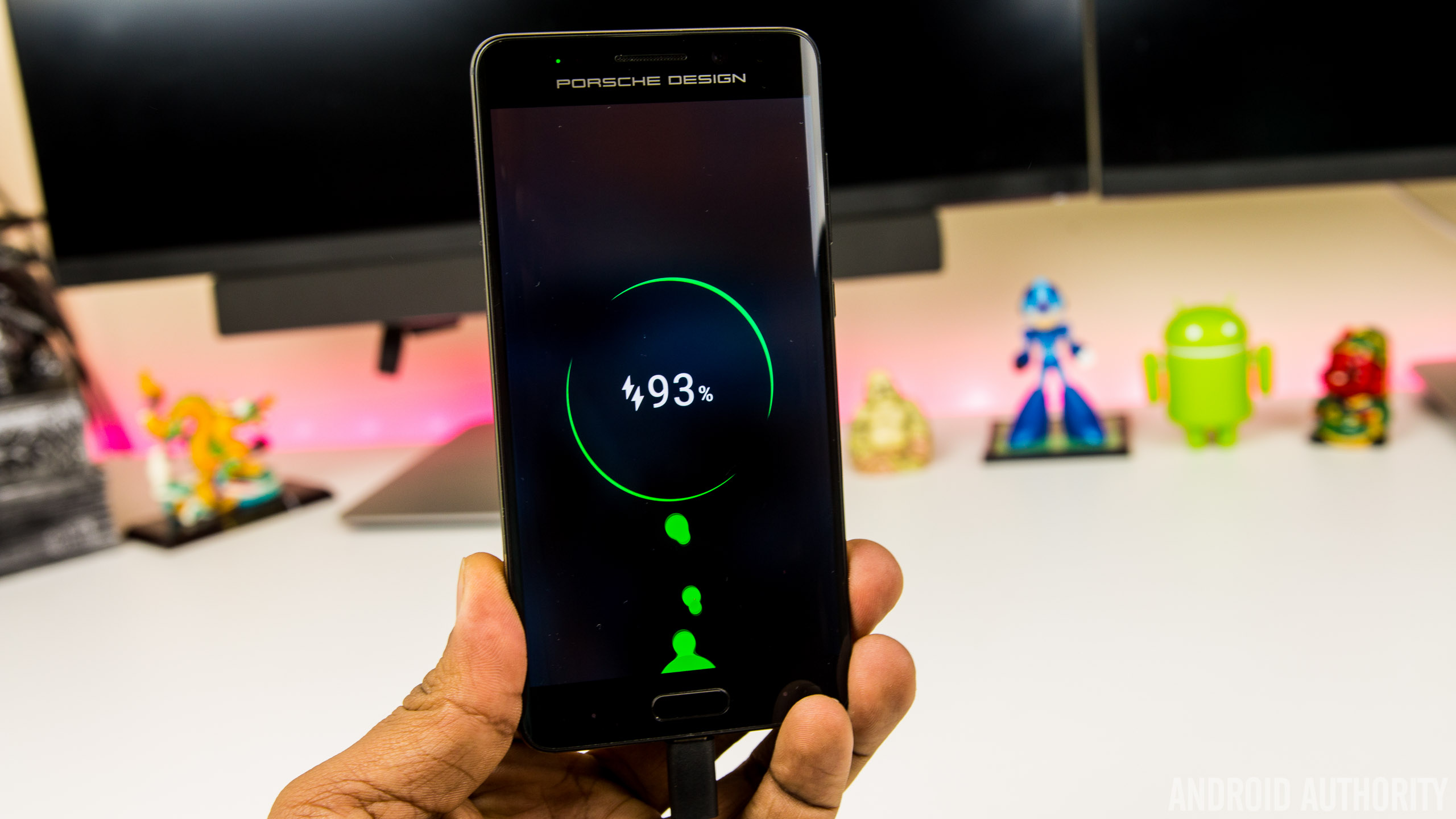
For the times when the battery is running low, the Mate 9 and Porsche Design Mate 9 are the first handsets to come equipped with Huawei SuperCharge, a proprietary fast charging solution that’s designed to rival Qualcomm’s QuickCharge and other OEM solutions. Charging the 4,000 mAh battery inside the Mate 9 is incredibly fast using the bundled SuperCharge charger (either the wall or the car charger), with the battery taking around 90 minutes to charge from full. How does this compare to the competition though?

Huawei claims its new 4.5V/5A charging technology is also designed to be cooler than rival fast charging solutions, and in a direct dig at Samsung, says a processor inside the charger communicates with your phone, continuously monitors the temperature of your Mate 9 and will slow charging down if it notices the handset is overheating. Below 50 percent, it charges rapidly and once it gets to 75%, the charging process slows a little. On the lock screen, the Mate 9 shows whether you’re charging at standard, “fast” or “super” speeds and while it’s not slated to work with rival fast charging solutions, the Mate 9 does charge quicker than normal when plugged into a QuickCharge 3.0 charger.
Huawei Mate 9: Camera

Huawei’s partnership with Leica continues with the Mate 9 sporting a new and improved second generation dual camera setup. Much like the one in the Huawei P9, the camera is centred around a Leica-branded dual camera, with a 12MP RGB sensor supplemented by a 20MP monochrome sensor. Both sensors are behind lenses with f/2.2 aperture and the RGB sensor also sports Optical Image Stabilisation for additional stability in photos and videos.
Like the P9, the RGB sensor captures the colors in a scene while the monochrome sensor enhances the detail and this means the Mate 9 is capable of capturing images with a very impressive bokeh effect. In the right conditions, you’re able to take images that top the same effect found in the iPhone 7 Plus and the photo sphere feature found on the Pixel XL.

Overall, image quality from the Mate 9’s dual camera array has been impressive. In daylight, you get images that are crisp, full of detail with colors that are more realistic (and less saturated) than those captured by the Galaxy S7 Edge or Pixel XL.
Huawei’s camera app means Pro mode is just a tap away and offers settings to adjust the exposure, ISO and focal point to take stunning photos. In the default mode, the Mate 9 seems to struggle with picking the right focal point (images are often under or over exposed) but manually selecting the right focal point or tweaking the scene in Pro mode allows you to take fantastic photos.


One of the biggest improvements in the final software build is the low light performance of the camera, with the Mate 9 now capable of taking low light pictures that are on par with the Galaxy S7 Edge. However, while low light shots are vastly improved, the Mate 9 does struggle with slight movement in low-light, with OIS proving less effective than in other flagship devices.
The Huawei camera app is rather straight forward to use, with options for flash, wide aperture and filters found in the viewfinder. A swipe to the right brings up the settings menu, while camera modes such as monochrome (black and white), Beauty, slow-mo, panorama, light painting and HDR can be found by swiping to the right.


HDR mode in particular is interesting as there’s no way to enable it by default or have it automatically turn on so you’ll need to remember to activate it by swiping left. The Mate 9 does activate HDR automatically in certain conditions, but hiding it in the modes menu means it’s less user-friendly than on other smartphones. HDR does a decent job of boosting colors, reducing blowouts and brightening shadows, but the effect is less pronounced than on other smartphones and the difference is minimal enough that you won’t activate HDR as much as you might with another Android device.
Moving to video and the Mate 9 is capable of shooting 4k video at 30 frames per second and like in photos, video quality is decent in daylight, but becomes a little grainy in low light. The Mate 9 is one of the first phones to shoot 4k using the new h.265 codec, but given it’s so new, very few apps (including YouTube) know what to do with it. Although there’s ample storage on the Mate 9, Huawei’s compression algorithm means 4k video file sizes are up to 50% lower than on other devices. The Mate 9 also supports shooting in 1080p at 60 frames per second (where you get software-based stabilisation) and 720p video at 120 frames per second for slow-motion footage.


The front camera on the Mate 9 is an 8MP sensor with f/1.9 aperture lens, capable of shooting Full HD video at 30 frames per second. For the most part, selfies come out rich and full of colors in good lighting and in low light, the camera does a good job at boosting the ISO and letting more light into the camera.
Huawei Mate 9 & Porsche Design Mate 9 camera samples

However, a very irritating part of taking low light selfies is the amount of time it takes the camera to actually take a photo. When the flash is set to auto (there’s no way to keep it on by default) and there’s not enough light, the screen lights up for two to three seconds before the camera fires. Unfortunately, most selfie takers won’t hold a pose for that long (especially as the screen can be quite blinding at full brightness), and especially not when taking a group selfie, resulting in selfies that have motion blur. This does seem to be a software-based issue so hopefully this will be resolved in the next update.
The Mate 9 takes gorgeous photos that you’ll be proud to share
Overall, the camera on the Mate 9 certainly doesn’t disappoint and it seems to be on par with other Android flagships. In particular, the improvement in the camera performance from pre-release to final software was drastic enough for us to change our thoughts on the camera; initially, there were several issues, especially in low light, but these are no longer a concern with the final update. It’s not perfect – no phone is after all – but the Mate 9 takes gorgeous photos that you’ll be proud to share.
Huawei Mate 9: Software

Look at past Huawei phones and there’s a single trend that has defined the company’s smartphone efforts to now: hardware is always great but poor software. Like most Chinese OEMs, Huawei used to develop its global software in China, without taking into consideration how different the Chinese market is from, well, everywhere else.
Earlier this year, we heard that Huawei was working on a revamped version of its EMUI interface, that would look to address a lot of the issues raised in previous reviews. In the Mate 9 we have just that, with EMUI 5 bringing the latest Android 7.0 Nougat OS as well as several fixes to issues that have plagued Huawei smartphones for generations.


With that out of the way, what’s new with EMUI 5? There’s a lot of changes, starting with the new Azure color scheme that’s present throughout the UI. It brings with it a complete visual overhaul, with the odd color scheme of old replaced by white backgrounds, faint grey accents and blue highlights and tones. The changes don’t end there as Huawei’s own stock apps adopt more of Google’s Material Design guidelines and the icons no longer look like out-of-place and inspired by iOS.
The biggest new feature of all? An app drawer. It sounds so simple, but finally EMUI brings the option for an app drawer in the settings. It’s not enabled by default – and when it is activated, there seems to be a one second lag before the home screen shows when you return from an app – but the app drawer brings the familiar Android interface, and vastly improves the overall user experience.
The result is a familiar software experience chiseled and refined into something closer to the bone of Android.
Android 7.0 Nougat also brings some improvements and tweaks that lend to the overall experience and it’s refreshing to see that Huawei has resisted previous habits of overhauling everything. Instead, EMUI 5 brings tweaks to the stock Android experience with Huawei showing flair and tweaks in selected locations rather than throughout the OS. The result is a familiar software experience chiseled and refined into something closer to the bone of Android.
Swiping down from the top brings a new, darker notification shade that displays more icons than before and can be heavily customised. In the settings menu, there’s an option to toggle between individual notification icons in the top bar or the total number of unread notifications. For the data-driven type of user, there’s also the option to display the current network speed – surprisingly useful at diagnosing when you have connectivity issues – as well as the carrier name, which is useful to distinguish between carriers when you’re using two SIM cards.


Moving further around EMUI 5 and one thing is clear; this is a rapid interface, with bloatware – on the global version at least – kept to a minimum. The few preloaded apps can generally be uninstalled, save for a few that Huawei uses to provide core EMUI f5 features. The launcher is fast, full of features and heavily customisable and aside from the aforementioned slight stutter when you have the app drawer enabled, there is no noticeable lag. Although the launcher’s color scheme is pleasant and usable, if it’s not for you, there are plenty of themes available in Huawei’s theme store, although these won’t change the look and feel of Huawei’s own default apps.
During a briefing on EMUI 5 in China, Huawei revealed that EMUI 5 had been redesigned to ensure most tasks were only a couple of taps away. The exact figures they quote are being able to reach 50% of features within two taps and over 92% within three taps and nowhere is this more noticeable than in the settings menu. In previous generations, you’d find options nested inside options inside further options and so on, but with EMUI 5, the Settings menu is more user friendly and easier to navigate.


Take the battery menu for example; in EMUI 4.1, the battery menu could be found nested three levels deep but in EMUI 5, it’s a top-level menu. Dig into this menu and you’ll find the usual plethora of options including an ultra-power saving mode (which reduces your usage to a couple of apps only), regular power saving and the ability to reduce the screen resolution to eek out the last hours of your battery.
Battery management has also been revamped in EMUI 5, with a large improvement in the way the interface handles power-intensive apps. Previously, Huawei phones would prompt you with constant notifications about resource-heavy apps, and these are a lot less persistent in EMUI 5. Huawei’s new machine learning algorithm can be seen at work here as apps that you use frequently – in my case, this include Slack and FIFA Mobile – will appear in these prompts but won’t be killed off by default. EMUI now also gives you the option to blacklist rogue apps that might be the cause of battery drain and have them automatically killed when you turn off your display.


EMUI 5 also adds the ability to use multiple accounts with single-account applications like WhatsApp and Facebook, using the Twin App feature. How does EMUI does this? Essentially, the Mate 9 runs two instances of the app at the same time. If you have two SIM cards and have been frustrated as you couldn’t run Whatsapp with both numbers on the same phone, then the Twin App feature is the perfect solution.
What about the Porsche Design Mate 9? Does the curved display have any software benefits? In a word: no. The software experience is almost identical, save for some ugly Porsche Design themes, tweaks to UI tuning to take advantage of the high res display and a dark mode to save on battery life. The biggest difference is in day-to-day usage, where the on-screen keys from the regular Mate 9 are replaced by back and recent apps keys flanking the home button; these keys aren’t labelled so you can swap them around and work just like you’d expect. Although it is possible to disable the keys and navigate by swiping the home key, it doesn’t really work as well as you’d hope, and we wish using on-screen keys like the regular Mate 9 was an option.
EMUI 5 is smooth, feature-rich and easily Huawei’s best software to-date
Overall, EMUI 5 feels more polished than previous generations and with a lot of features built-in like Samsung’s TouchWiz, it may yet serve as the next best alternative to the Galaxy Note 7. From EMUI 4 to EMUI 5, Huawei shows just how much can be achieved by listening to customer feedback. The result are clear to see: EMUI 5 is smooth, feature-rich and easily Huawei’s best software to-date.
Huawei Mate 9: Gallery
Huawei Mate 9: Specifications
| Size | Height: 156.9mm; Width: 78.9mm; Depth: 7.9mm |
| Weight | About 190g |
| Colors | Space Gray, Moonlight Silver, Champagne Gold, Mocha Brown, Ceramic White |
| Display | 5.9” FHD display |
| 2.5D glass | |
| 1080p (1920 x 1080), 373ppi | |
| 16.7M colors, Color saturation (NTSC) 96% | |
| High contrast 1500:1 (Typical) | |
| CPU | HUAWEI Kirin 960; Octa-core (4 x 2.4 GHz A73 + 4 x 1.8 GHz A53) + i6 co-processor |
| GPU | Mali-G71 MP8 |
| Operating System | Android™ 7.0 (Nougat) |
| Emotion UI | EMUI 5.0 |
| Memory | 64GB ROM |
| 4GB RAM | |
| microSD card slot, support up to 256GB (uses SIM 2 slot) | |
| Dual SIM | Dual SIM |
| NFC | NFC-supported |
| Connectivity | Wi-Fi 2.4G/5G, 802.11a/b/g/n/ac with Wi-Fi Direct support |
| BT4.2, support BLE | |
| USB Type C (High Speed USB) | |
| Camera | Front: 8MP AF, F1.9 |
| Main: Dual, 20MP Monochrome + 12MP RGB, F2.2 | |
| OIS (Optical Image Stabilization) | |
| 4K video | |
| Battery | 4000 mAh (Typical Value) |
Huawei Mate 9: Price & Final Thoughts

The Mate 9 isn’t a revolutionary upgrade over its predecessor, nor is it going to be for everyone, but it does excel in the key areas that Huawei intended it to: battery, performance and camera. 2016 is arguably the year where Huawei broke through, first with the P9 and now with the Mate 9. With all things considered, the Mate 9 is probably the best big-screen Android smartphone you can buy right now.
The very-public demise of the Galaxy Note 7, coupled with the current trend for smartphone displays to measure 5.5-inches or less, means the Mate 9 is one of just a handful of big Android devices currently available. The LG V20 is another of these but there doesn’t seem to be an LG V20 launch planned for Europe, meaning the Mate 9 is the only big-screen flagship currently available for this market.
What will the Mate 9 cost? At the launch in Munich, Huawei confirmed the Mate 9 would cost €699 when it launches in Europe this month. Pricing for the US is yet to be confirmed but given the EU pricing, it’s likely to cost around $700 when it launches at CES in January. For those in the US that really want it right now though, you can find it online for around $750. This pricing puts the Mate 9 firmly in the flagship Android smartphone category, and while it’s not perfect, it can definitely hold its own against other devices.

What about the Porsche Design Mate 9? Well, if the glorious QHD display, subtle curves and stylish design have piqued your interest, it will set you back €1,395. Yep, the Porsche Design Mate 9 costs over a thousand Euros, which makes it a luxury smartphone, that isn’t designed for the mass market.
If you’re after a smartphone that offers exceptional battery life, an intriguing dual camera and incredible performance, the Mate 9 delivers in spades
Should you buy either of them? If you’re after a smartphone that offers exceptional battery life, an intriguing dual camera and incredible performance, the Mate 9 delivers in spades. If money is no object and you want a smartphone that is unattainable to most customers, the Porsche Design Mate 9 is certainly worth considering.
Buy now on Amazon
Sony’s Xperia Ear is not the hands-free assistant I wanted
In theory, Sony’s newest wearable sounds promising. The Xperia Ear is a single Bluetooth earbud that lets you dictate messages, get weather updates and smartphone notifications, and carry out other little tasks just by talking to it. It’s like having an Amazon Echo in your ear, except with far fewer skills and third-party integrations. Sony also promises a long-lasting battery that can endure a full workday of talk time with the included charging case, so you can have the assistant ready for your commands all day. Unfortunately, the Xperia Ear simply doesn’t do enough to justify its $200 asking price.
Hardware

The Xperia Ear is a single black wireless earbud. The thumb-sized, round-rectangular device has a slightly protruding speaker to help it latch onto your ear. There’s also a semi-circular hook-like extrusion above the speaker, which doesn’t appear to serve a purpose (other than perhaps helping it maintain a firmer grip on your ear). On its gray outer surface is a physical button that you can press to trigger the assistant, as well as a blue indicator light.
Inside, the earpiece houses a host of sensors, including a gyroscope, accelerometer, Bluetooth radio, NFC transmitter and proximity sensor. It also meets the IPX2 standard for water resistance, meaning it can survive light splashes or rain. I did not encounter wet weather during my testing period, but the Ear did survive the drops of water I splashed on it.
Importantly, the device comes in a sturdy, pager-sized holder that charges the core unit when you stow the latter in there. This case was small enough to carry in even my tiniest of purses, which I appreciated.
In use
Getting started with the Ear is simple. But first, know that it’s only compatible with Android, so if you’re an iPhone user, you should probably stop reading this review. Sony says it is “currently focused on creating the Xperia Ear host app for Android as it’s powered by Sony Agent Technology, which is specifically designed and currently only available for Android.” The company declined to comment on whether iOS compatibility is on the way, so don’t hold your breath.
On your Android device, your first step is to download the Xperia Ear app and then pair the Ear with your phone over Bluetooth. You can also smush your phone together with the earbud if you have an NFC-enabled handset, which makes connecting them a cinch. I paired the Ear with the Huawei Mate 9, and the NFC handshake between both devices was indeed quick.
Once I was all set up, I put the earpiece on and went about my business. The Ear felt surprisingly secure, and didn’t fall out even when I shook my head vigorously to test just how well it would stay put. Wearing the Ear was comfortable until an hour later, when I started feeling a dull ache on the side of my head. It wasn’t super painful, but I didn’t always feel like putting up with it either. Taking off the earbud made the discomfort go away, and I ended up having to periodically remove the device during my review.
Most of your interactions with the Ear are going to involve you pressing the device’s button, waiting for it to say it’s listening and waiting for its three-tone chime (like the beep after a voicemail greeting). Only then can you ask your question. If that sounds tedious, it’s because it is. Sony could remove two steps from this process by getting rid of the redundant chime and the button push; the resulting speed gained would make the Ear feel much more responsive.
I really want the Xperia Ear to always be listening for a trigger phrase, because pushing a button against my ear repeatedly makes the side of my head feel slightly sore over time. Plus, it’s not really a hands-free experience if you have to use your hands to get some help. But that function would come at the expense of battery life, so this is a tradeoff I’m willing to accept.
You can set up the Ear so that a long press of the button activates OK Google, allowing you to use an assistant you’re probably already familiar with. But by default, you’ll be working with Sony’s unnamed helper, which is very new compared to existing offerings. And with that youth come some quirks that, together with its one-sided, Bluetooth-headset-inspired design, make the Xperia Ear feel dated.

Talking to Sony’s assistant feels like I’m interacting with a “futuristic” machine from Demolition Man. Its voice sounds artificial, robotic and disjointed, especially compared to Siri, the Google Assistant and Alexa, which have human voices with more natural inflections. Ear pronounced my name the same way Engadget’s Southern-bred editor-in-chief Michael Gorman does — as in, “Churl-lynn,” with a hard “ch.” Thanks a lot, Sony.
That’s an understandable mistake, considering my name is quite uncommon, but the Ear made the same error when reading a news piece about actress Charlize Theron. It took me a few seconds to realize who the assistant was describing. It also mispronounced the word “cleanses,” saying “clean-suhs” instead of “clen-suhs.” For the most part, though, the Ear is easy enough to understand if you’re paying attention.
The reason I was talking about Charlize Theron, by the way, is because whenever you stick the device in your ear, it greets you and starts rattling off the time, your agenda for the day and news headlines since you last put it on. The actress was the subject in one of several headlines that Sony pulled together. You don’t get to pick the news sources you prefer; instead, you can only decide in the app settings whether or not you want to hear headlines at all.
You can also choose to get voice alerts from apps such as Calendar, Email, Gmail, Hangouts, SMS, Twitter and Facebook. This causes the Ear to recite your incoming notifications as they arrive on your phone, which can be distracting. I happen to be excellent at tuning out noise, though, so this didn’t bother me. You can also dismiss each alert at any time by pressing the button on the earbud. I actually appreciated having someone read out my new emails to me, since it means I can multitask even more effectively.

Instead of having to go to my inbox whenever I saw a new message, I could simply listen to the Ear narrate the entire email and decide if it was worth an immediate response. It was also adorable when the Ear read managing editor Dana Wollman’s email that opened, “Good news, bad news (mostly good news, I think),” but slightly less funny when it read out every last detail of each sender’s email signature, down to their zip codes. Still, with some software tuning, this feature could become truly useful for hardcore multitaskers like myself.
There are a few other things that Ear can do, including setting timers, reporting the weather, answering calls, streaming music from your phone and sending text messages. The earpiece’s dual microphone, noise suppression and echo cancellation worked well, and people I spoke with using the Ear heard me clearly despite my loud Netflix video in the background. Because it’s a one-sided earbud, the Ear isn’t a good option for listening to music, but it works in a pinch. Just don’t expect great audio quality here; songs generally lack bass, with vocals sounding the clearest against tinny background instruments.
One of the most nifty uses for the Ear is using voice dictation to compose messages. In general, the device accurately relayed what I said, but it spelled my name wrong. Again, given that I have a unique name, this isn’t a big deal, especially since most other words were spelled correctly.

Now, talking out loud is a rather conspicuous way to interact with any device, especially if you’re in an open office or walking outside. For those who want to be more stealthy, Sony built in an effective way to communicate non-verbally with the Ear. You can nod or shake your head in response to yes or no questions. This is a limited application, yes, but useful nonetheless for quick, discreet reactions. The device correctly interpreted my gestures (acknowledging them with a satisfying chime) when I answered its questions about whether the message it transcribed was correct and if I wanted to send my text.
That’s impressive for a first-generation device, but the Ear has its glitches. For instance, the earpiece would start reading out its greeting and list of headlines any time it got moved or bumped, even when I wasn’t wearing it. It was also inconsistent in delivering my alerts — I randomly received alerts about two really old unread Hangouts messages on my first day wearing the Ear.
Another gripe I have with the Ear is its inability to reconnect seamlessly with the synced phone after I leave and reenter Bluetooth range. That means, when I go to the bathroom or leave the phone in a different room, the Ear stops working, only saying, “Device not connected.” When I get back to the phone, I have to press the button on the earbud to re-sync the devices. This should happen without any action on my part.

Like any other wireless earbud, the Xperia Ear’s battery life varies wildly depending on how much you use it. On my first day testing the device, which included a lot of email alerts and nearly an hour of song streaming, the Ear conked out (from a 60 percent charge) after a full day’s work. Another time, on a full charge, the Ear dropped just 60 percent of its energy after two days of testing, which included five to 10 minutes of music playback and multiple phone calls, text message dictation and other small tasks. You can extend that runtime by activating Sony’s Battery Care mode via the companion app.
Speaking of the sort, recharging the Ear is easy — just put it back in its carrying case. The holder has two indicator lights: the top shows you by flashing red, yellow or green how full the earbud’s battery is. Another LED on the bottom indicates the amount of power left in the case, which you can plug in via micro-USB. It took about a week for the container’s charge to go from green to red, after it recharged the earbud a handful of times.
The competition
The Xperia Ear is a unique device — nothing else on the market claims to do exactly what it does. The thing is, though, you can get a similar experience with some of today’s wireless earbuds that let you tap your phone’s digital assistant. Case in point: The $250 Bragi Dash lets you tap your cheek to talk to Siri. You can also activate Siri with your existing Apple earphones with a long press on your remote control. Android owners don’t have a similar wireless option, though.
Compared to other wireless earbuds, such as the $200 Samsung Gear IconX and the $250 Jabra Elite Sport, the Xperia Ear is expensive, especially since it only covers one side. Plus, the Samsung and Jabra devices are geared towards fitness users, and offer more features (and two earbuds instead of one) for less than twice the price of the Xperia Ear. They also deliver better audio quality than the Xperia, although Sony’s device offers longer battery life. Still, neither of these let you control an assistant yet, and the Ear retains that advantage over the competition, at least until its rivals add that feature (which, let’s be real, is inevitable).
Wrap-up

I was excited about the Xperia Ear and what it promised, until I realized that, as it stands, the device does nothing different from Siri or Google over wired earbuds. In particular, the fact that it requires you to use your hand and press a button to use it makes me question the device’s existence in the first place. What’s the point of getting a whole new gadget for an assistant in your ear if not for the convenience when your arms are full? It’s not like this is a cheap purchase either.
Still, this is a first-generation device that has potential to become truly useful, if Sony tweaks its software. That’s an easy enough fix. The trouble is, makers of other wireless earbuds could almost as easily offer the same features, by tapping into Siri or the Google Assistant. If, or when, they do, the Xperia Ear risks becoming a completely forgettable device.
Huawei Honor Magic Release Date, Price and Specs – CNET

The Honor Magic can do cool things thanks to artificial intelligence.
Huawei
What does it take for a phone to be “magic”? According to Huawei, maker of the brand-new Honor Magic, it’s a whole lot of built-in AI that makes the phone know who you are, what you’re doing now, and what you might want to do next.
A few examples of the Magic’s powers:
You pick it up and its infrared sensors scan not just your face, but also your hands to verify that you’re really you (there’s a fingerprint scanner built into the home button as well).
The Honor Magic only surfaces notification messages when the phone has verified it’s you, so that nosy neighbors don’t get to see who’s pinging you or why.
GPS meets your calendar and other apps to pull up stuff you need to reference at the exact time you need it, like: Your tracking number surfaces on-screen when you get to the post office, or perhaps your boarding pass pops into view when you arrive at the airport.
If it’s dark, the phone can surface a flashlight option. You still decide if you want to turn it on or off, but having the flashlight at your fingertips will theoretically make it faster and easier to find and use.
Huawei also points out some capabilities that seem like rebranded features from Google Now on Android, like pressing and holding the home screen button to find out more information about a topic or place (Huawei calls this “deep think”). On the whole, though, we haven’t seen sensors used to quite this extent, and it sounds like it makes a lot of useful sense. I definitely want to try out this “magic” for myself.
Honor Magic specs
- 5-inch screen with 2,560×1,440-pixel resolution
- 12-megapixel dual-lens camera
- 8-megapixel front-facing camera
- Android 6.0 with Magic Live software layer
- 2.3GHz octa-core Huawei Kirin processor
- 2,900mAh battery with quick charge: 70 percent charge in 20 minutes
- 64GB internal storage/4GB RAM
- Colors: Golden black, porcelain white
Huawei has announced the phone for China right now, but we’ll keep our eyes peeled for other global launches in the coming weeks.
Vizio E-Series 2016 review – CNET
The Good The Vizio E series offers the best picture quality available in its price range, thanks to local dimming. The Google Cast system offers more apps and frequent updates than many dedicated smart-TV systems.
The Bad Many models in the series don’t match the image quality of ones we reviewed. Roku TVs and other models with actual onscreen menus are more convenient for streaming apps. No built-in tuner on many models.
The Bottom Line If you’re OK with its missing extras, and make sure to get the right model, Vizio’s E series will reward you with the best budget TV picture quality yet.
The Vizio E series can be a great buy, but read the fine print.
If you get one of the better ones you can expect superb image quality for a budget TV, head and shoulders above Roku TVs and better in many ways than competing midrange sets. Other E series models have picture quality likely no better than budget competitors (don’t worry, I’ll tell you which is which in the next section).
Vizio E series places picture quality over…
See full gallery


1 – 5 of 23
Next
Prev
There’s also the matter of its app-based Google Cast operation, and lack of a tuner. The E series is the closest thing you can find today to a “dumb TV,” and that’s not necessarily a bad thing. To do anything more advanced on this set than turn it on, switch inputs or adjust picture mode, you’ll need to use your own phone and Vizio’s app. If that sounds appealing to you — or if you don’t plan to do anything more advanced than that — it’s great.
Otherwise we like Roku TVs like the TCL S3750/FP110 series and US5800 series better. They deliver the best built-in smart TV system on the market, so you don’t need to connect an external device and can use one remote for everything. They also have actual built-in tuners, complete with the ability to pause live TV, which will appeal to cord cutters especially. Finally, they’re usually even cheaper than E series sets.
So should you get an E or a Roku TV? If you want the best picture you can get for a budget price and can’t afford an M series, go for one of the E’s I specify below, and leave some budget for an external device like a Roku Premiere (especially if you want to stream Amazon video). If you’re OK with a “good enough” picture and value convenience and built-in smarts, go Roku.
 View full gallery Sarah Tew/CNET
Not every E is created equal
Vizio’s E series is complex and sprawling, comprising a wide range of screen sizes and technologies. I performed a hands-on evaluation of the 50-inch E50-D1 and the 65-inch E65u-D3.
Normally I tell readers that the picture quality of the sizes I actually tested is similar to other screen sizes in the series, but that’s not the case for the E series. In other words, if you’re looking to buy an E series other than those two exact models above, pay attention.
First off, the image quality remarks in this review don’t apply to any of the E series TVs under 43 inches since they lack the local dimming that was so effective on the models we tested. They also don’t apply to the E50-E3 because it lacks local dimming, the E55-E1, the E43u-D2 or the E55u-Do because they use an IPS-based LCD panel, and the E43-D2, E48-D0 and E55-D0 because Vizio refused to specify whether they have IPS panels. IPS typically delivers inferior image quality.
Here are the only E series TVs this review applies to. They’re the ones we’re confident perform similarly to two we tested.
Vizio E series models covered in this review
| Size | Resolution | Dimming zones | Clear action | Panel type | TV tuner |
| 48 inches | 4K | 10 | 240 | VA | No |
| 50 inches | 1080p | 12 | 240 | VA | Yes |
| 50 inches | 4K | 12 | 240 | VA | No |
| 55 inches | 4K | 12 | 180 | VA | No |
| 60 inches | 4K | 10 | 180 | VA | No |
| 60 inches | 4K | 10 | 240 | VA | No |
| 65 inches | 4K | 12 | 180 | VA | No |
| 65 inches | 4K | 12 | 240 | VA | No |
| 70 inches | 4K | 12 | 180 | VA | No |
| 70 inches | 4K | 12 | 240 | VA | No |
See the Features sections below for an explanation of the terms in the table and how they affect image quality.

View full gallery Sarah Tew/CNET
Generic glossy-black design with spindly legs
Nothing much to see here when the E series is turned off. The frame around the screen is a glossy black and thin, so from the front it looks like almost all picture, while the cabinet is relatively thick seen from the side.
Rather than a pedestal stand, the E series utilizes the same kind of splayed, spindly legs found on most TVs today. They’re a bit different-looking thanks to a pattern of triangle-shaped cutouts.

View full gallery Sarah Tew/CNET
Your phone (and Vizio’s app) required
Unlike the more expensive P series and M series, the E doesn’t include a free tablet remote, so you’ll have to use your own device (phone or tablet) and Vizio’s SmartCast app (for iOS and Android) for setup and advanced control.
The TV lacks a traditional onscreen menu and smart TV system entirely, replacing it with Google Cast, the popular streaming platform exemplified by devices like the $35 Chromecast. If you want to watch Netflix on the E series, for example, you’ll have to use the Netflix app on your phone or tablet and “Cast” to the TV. The same goes for any other streaming app — except the handful that aren’t supported by Cast, notably Amazon Video (see the Chromecast column here for a full list). Don’t have a phone or tablet handy in the living room all the time? Then either use a device like a Roku or Apple TV, or buy a different TV.
The SmartCast app can control every function of the TV, from power-on to input switching to advanced picture adjustments, audio controls, setting timers and everything else. You’ll pair your phone to the TV using it in the initial setup process, and use it to connect the TV to Wi-Fi and receive software updates. The app also offers TV and movie discovery features, but they’re not very advanced.

View full gallery Sarah Tew/CNET
The E also comes with a standard remote control for basic functions, and will work with universal remotes like Harmony.
Vizio’s app-based system has grown more stable and reliable in the past year, and worked fine with the iOS and Android phones I tried, but it’s still more of a pain than an traditional onscreen menu. Especially one with as superb of a Smart TV system as Roku.
Features: Local dimming FTW
Key features
| LED LCD |
| Full array with local dimming |
| 4K or 1080p |
| No |
| Flat |
| Google Cast |
| App and standard |
| No |
The best thing about the E series is local dimming, our favorite image quality improvement in LCD TVs, and rare at this price point. E TVs have anywhere from five to 12 dimming zones. More local dimming zones equals better image quality; the M series, for example, has 64 zones. We don’t expect much difference between the models with 10 or 12 zones to which this review applies.
Unlike the M series, the E is not HDR compatible. All of the E series models to which this review applies have 4K resolution, with the exception of the E50-D3 I tested, which is 1080p. In our tests the 4K model didn’t exhibit much better image quality than the 1080p one, but since Vizio won’t specify whether the 1080p models are IPS or VA, this review doesn’t apply to any 1080p E series sets aside from the E50-D3.
In the past I’ve found that IPS (in-plane switching) has worse image quality than VA (vertical alignment), the panel type used on the other sizes. IPS delivered worse black-level performance and contrast, and although it’s slightly better from off-angle, it’s still usually worse overall.
We also don’t expect much image quality difference at all between the models with Clear Action 180 as opposed to 240, despite Vizio’s claim that “when enabled, it offers higher motion clarity performance.” None of these sets offer the smoothing Soap Opera Effect, and all have what I suspect are 60Hz native refresh rate panels. Vizio didn’t confirm as much and calls them “120Hz effective,” a typically fake specification, but the ones I tested behave like 60Hz panels.
Lenovo Yoga 910 review – CNET
The Good The Lenovo Yoga 910 premium convertible has a gorgeous display that spans nearly the entire lid and delivers solid performance and long battery life for the category. It’s a really nice-looking laptop, too.
The Bad The right-hand Shift key is poorly placed and sized. Webcam is at the bottom of the screen. No direct video output or SD card slot. Separate USB Type-C ports for power and video-out kill the option for a single connection all-in-one dock.
The Bottom Line With a beautiful design, excellent performance and battery life and a great display, the Lenovo Yoga 910 is one head-turning hybrid.
Many people still don’t see the value of a touchscreen on a laptop, but with hybrid PCs like Lenovo’s Yoga line it’s hard not to appreciate the flexibility.
The all-metal Yoga 910 is a perfect example of just how good a hybrid can be, too. Its compact size and relatively light weight is matched with an excellent 13.9-inch touchscreen that goes nearly edge-to-edge, which brings it closer to the look and feel of a regular tablet when folded back on itself.
Rotate the display around on its watchband-like 360-degree hinge and you’ve gone from a big screen tablet to a great ultraportable laptop. The hinge is stiff enough to hold the screen in any position, but moves freely enough you can adjust its angle with a single finger.
 View full gallery
The Lenovo Yoga 910 fits more screen into less space with a 13.9-inch display in the body of a 13-inch laptop.
Sarah Tew/CNET
It might seem silly to be impressed by a hinge, but it works well, keeps the design as thin as possible and it looks cool. The hinge we’ve seen before on the 900 and the Yoga 3 Pro, but the display is a first for the line.
Available in full HD and 4K UHD resolutions, the multitouch display doesn’t have the typical wide frame or bezel found on other laptops on the top and sides. This allowed Lenovo to fit a 13.9-inch screen into approximately the same space as a 13.3-inch display. Not only does it give you more room to work, but it looks great, too, with excellent brightness and color.
Lenovo Yoga 910
| $1,299 |
| 13.9-inch 3,840×2,160-pixel touch display |
| 2.7GHz Intel Core i7-7500U |
| 16GB DDR4 SDRAM 2,133MHz |
| 128MB dedicated Intel HD Graphics 620 |
| 512GB SSD |
| 802.11ac and Bluetooth 4.1 |
| USB 3.0 Type-C with video-out, USB 2.0 Type-C with charging, USB 3.0 with always-on charging, audio combo jack |
| Windows 10 Home (64-bit) |
To make this design possible, Lenovo had to move the built-in webcam from above the screen to below it. It makes for some awkwardly large hands if you’re typing and using the camera at the same time. Fortunately, you can flip the laptop over into a tent position and connect an external mouse and keyboard to keep working.
Typing on the laptop’s backlit keyboard is generally good with one exception: The right-hand Shift key. With the 900 it was small and to the left of the Up arrow. Now it’s to the right of the Up arrow and still too small. Typing with any amount of speed inevitably resulted in the cursor moving somewhere it didn’t belong. You might be able to adjust to the key size and placement over time, but I found it beyond frustrating.
The touchpad, on the other hand, is just about perfect. Fingers glide easily over its smooth surface, and I never experienced any cursor jumps caused by a brush from my palm. There are multitouch gestures that are easily adjusted within Windows’ settings, so if you’re not a fan of pinch-to-zoom or three-finger swipes you can just turn them off.
ASUS’ ROG Strix GL502VS is a mid-range (and VR-ready) gaming laptop
The idea of a “gaming laptop” usually brings to mind one of two images: an oversize laptop with enough power to rival a desktop machine, or a shockingly thin (and expensive) notebook that punches above its weight. Somewhere in between you’ll find 15-inch systems like the ASUS ROG Strix GL502VS, a gaming laptop small and light enough to lug around, yet thick enough to house the sort of powerful internals you’d need to play just about any game you want. Though it’s not a premium machine by any means, the Strix strikes a nice balance between power and portability.
Design

Spotting a gaming laptop in a crowded coffee shop is easy — just look for the loudest, most garish machine in the room. Indeed, ASUS’ Strix wouldn’t take long to find: The laptop’s otherwise subdued chassis is adorned with glowing neon orange highlights. Colorful touches against a dark frame are a common design trope in gaming notebooks, but the Strix’s obnoxiously bright shade of orange is the ultimate “look at me” color, with accents everywhere from the speaker grilles, logos, WASD keycaps, and keyboard lettering to the touchpad. It’s also the machine’s only visual flair; apart from the dim red hue of the Strix’s air vent, the rest of the chassis is a study in black plastic and straight lines.
The Strix lacks the premium feel of an aluminum milled machine, but the trade-off is worth it: The plastic chassis makes this relatively light for a midsize gaming laptop, weighing in at just over five pounds. It doesn’t feel cheap for the sake of the material either — a brushed plastic palm rest mimics the look and feel of the single aluminum plate adorning the lid. It’s a handsome machine, and a fairly portable one too. All told, its 1.18-inch-thick frame is just thin enough to comfortably fit my backpack’s laptop sleeve.

Those thick edges leave plenty of room for connectivity too, including three USB 3.0 ports, a headphone jack, an SD card reader, Ethernet and outputs for HDMI and Mini DisplayPort. Worried the next generation of peripherals will leave you in the dust? Don’t. The Strix also has a single USB Type-C connector. Not bad.
Keyboard and trackpad

You could use the Strix’s keyboard to write home, but you wouldn’t. It’s nothing special. That isn’t to say there’s anything wrong with it; the Strix’s well-spaced keys offer 1.6mm of travel and land with a firm but not hard stop. It’s a perfectly serviceable keyboard with little to add to the experience apart from a dark red backlight. In fact, the only thing that sets it apart from any other is an ASUS standard: The company has replaced the ten-key pad’s Num Lock toggle with a dedicated button for calling up its ROG Gaming Center software (more on that later).
It’s mostly a harmless change, but vigorous typists may accidentally find themselves launching ASUS’ gaming suite when they mean to strike the backspace key. Well, I did anyway. The keyboard at least has standard “gaming keyboard” features, including a set of colored WASD keycaps (draped in the same obnoxious orange as the rest of the laptop’s highlights) and anti-ghosting support for up to 30 simultaneous key presses.
The trackpad, on the other hand, can be a bit flighty. The large, smooth mousing surface works fine for basic cursor manipulation, but I found it unreliable when it came to multi-touch gestures. On more than one occasion, the surface misread two-finger scrolling as a zoom pinch. At least once, too, it misinterpreted my attempt to pinch the zoom back to normal as a scroll. Most of the time, it reads either gesture just fine, but these are the kind of issues that have long given Windows touchpads a bad reputation. Combined with the pad’s stiff buttons, this trackpad feels like a step backward.
Display and audio

The display here has everything you could ask for from a gaming laptop: a non-reflective screen with wide viewing angles, deep contrast and bright, beautiful colors. In fact, ASUS says the Strix’s panel covers 98 percent of Adobe’s RGB color space and 100 percent of the sRGB standard. That’s great for gamers, but even better for folks using the machine to do video editing or Photoshop work.
Laptop audio is almost never remarkable, but the Strix’s speakers are somewhat notable. Instead of flanking the keyboard, like on most laptops, the Strix’s speakers live on either side of the touchpad. It’s sort of clever: The speakers’ already clear sound pops just a little more by dint of being closer to the user. It’s nice. Beyond that trick, however, the audio seems to be on par with that of other gaming laptops: clear, but not particularly deep. As always, a good equalizer goes a long way; turning off the ROG Gaming Center’s audio enhancements leaves the machine sounding a bit dull.
The Strix also comes equipped with a trio of microphones designed to filter out ambient sounds, but the array failed in my recording tests to remove noise from a fan on the other end of my house or even the sound of passing traffic. There may be three laptop microphones in this gaming rig, but at the end of the day they’re still just laptop microphones.
Performance and battery life
| ASUS ROG Strix GL502VS (2.6GHz Intel Core i7-6700HQ , NVIDIA GTX 1070 620) | 5,132 | 6,757 | E15,335 / P13,985 | 25,976 | 2.14 GB/s / 1.2 GB/s |
| HP Spectre x360 (2016, 2.7GHz Core i7-7500U, Intel HD 620) | 5,515 | 4,354 | E2,656 / P1,720 / X444 | 3,743 | 1.76 GB/s / 579 MB/s |
| Lenovo Yoga 910 (2.7GHz Core i7-7500U, 8GB, Intel HD 620) | 5,822 | 4,108 |
E2,927 / P1,651 / X438 |
3,869 | 1.59 GB/s / 313 MB/s |
| Razer Blade (Fall 2016) (2.7GHz Intel Core-i7-7500U, Intel HD 620) | 5,462 | 3,889 | E3,022 / P1,768 | 4,008 | 1.05 GB/s / 281 MB/s |
| Razer Blade (Fall 2016) + Razer Core (2.7GHz Intel Core-i7-7500U, NVIDIA GTX 1080) | 5,415 | 4,335 | E11,513 / P11,490 | 16,763 | 1.05 GB/s / 281 MB/s |
| ASUS ZenBook 3 (2.7GHz Intel Core-i7-7500U, Intel HD 620) | 5,448 | 3,911 | E2,791 / P1,560 | 3,013 | 1.67 GB/s / 1.44 GB/s |
| HP Spectre 13 (2.5GHz Intel Core i7-6500U, Intel HD 520) | 5,046 | 3,747 | E2,790 / P1,630 / X375 | 3,810 | 1.61 GB/s / 307 MB/s |
| Dell XPS 13 (2.3GHz Core i5-6200U, Intel Graphics 520) | 4,954 | 3,499 | E2,610 / P1,531 | 3,335 | 1.6GB/s / 307 MB/s |
| Razer Blade Stealth (2.5GHz Intel Core i7-6500U, Intel HD 520) | 5,131 | 3,445 | E2,788 / P1,599 / X426 | 3,442 | 1.5 GB/s / 307 MB/s |
So how do you make up for a gaming laptop’s gaudy orange highlights and the disappointment of a mediocre touchpad? By overshadowing them with high-end internals and excellent gaming performance. With a 2.6GHz Intel i7-6700HQ CPU (3.5GHz with Turbo boost), 16GB of RAM and 1TB of storage on top of a 256GB SSD boot drive, the Strix handled my workload with aplomb. Still, we don’t buy gaming laptops to manage cloud documents, chat applications, music players and Photoshop; we buy them to play games. So how’d ASUS’ kit do? Just fine, thank you.
The Strix’s NVIDIA GeForce 1070 GPU didn’t completely shrug off my PC game library, but it certainly kept pace with it. Games like TitanFall 2, Just Cause 3, Hitman and Battlefield 1 all maintained solid frame rates of 60 to 90 fps on their highest graphic settings, though Battlefield 1 could occasionally drop into the high 40s on busier multiplayer maps. More demanding titles like The Witcher 3 and Watch Dogs 2 dipped just below the 60-fps threshold on “Ultra” settings, but could be coaxed above it with a few tweaks. All told, there wasn’t a single game in my library the Strix couldn’t comfortably play at its highest settings. Well, at least not until you put those games in virtual reality.

That’s right, we’re living in a new era of gaming laptops — an age when any machine worth its salt will bear a “VR Ready” sticker. The Strix is the first of this breed to land on Engadget’s review desk. With a score of 6,135 in VRMark’s “Orange Room” benchmark (and 1,640 in the more intensive “Blue Room” experience), the GL502VS is indeed a VR-capable gaming PC. It can run pretty much everything available in today’s consumer virtual reality market. It can’t, however, play all those VR games at their highest fidelity.
The laptop can run most virtual reality titles at their default settings, but configuring games like Raw Data and Serious Sam VR on Ultra can give the Strix serious pause. Pushing these games to the max turned their virtual landscapes into laggy, stuttering realities, resulting in the kind of head-tracking delays and low frame rates that can lead to nausea and VR headaches.
Fortunately, you’d really have to go out of your way to get a bad experience: Few VR games offer configurable graphics for this very reason, and everything I ran on the Strix played beautifully on default settings. That’s more than good enough for the first generation of PC VR games, but you also shouldn’t consider the machine future-proof by any means. Still, it’s good enough for now. Keep your virtual worlds tuned for performance, and not visual fidelity, and you’ll be happy.
Battery life
ASUS ROG Strix GL502VS
3:03
Surface Book with Performance Base (2016)
16:15
Surface Book (Core i5, integrated graphics)
13:54 / 3:20 (tablet only)
Apple MacBook Pro 2016 (13-inch, no Touch Bar)
11:42
HP Spectre x360 (13-inch, 2015)
11:34
Surface Book (Core i7, discrete graphics)
11:31 / 3:02 (tablet only)
Apple MacBook Pro with Retina display (13-inch, 2015)
11:23
Apple MacBook Pro 2016 (15-inch)
11:00
iPad Pro (12.9-inch, 2015)
10:47
HP Spectre x360 15t
10:17
Apple MacBook Pro 2016 (13-inch, Touch Bar)
9:55
ASUS ZenBook 3
9:45
Apple MacBook (2016)
8:45
Samsung Notebook 9
8:16
Microsoft Surface Pro 4
7:15
HP Spectre 13
7:07
Razer Blade Stealth (Spring 2016)
5:48
Razer Blade Stealth (Fall 2016)
5:36
Dell XPS 15 (2016)
5:25 (7:40 with the mobile charger)
Gaming laptops rarely get good battery life, and the GL502VS is no exception. In Engadget’s standard battery test (where we loop an HD video at fixed brightness until exhaustion), the Strix barely lasted three hours. Sadly, that’s barely below par for the majority of larger gaming laptops, but still: It’s disappointing. When competitors like Alienware, Razer and HP can make high-performance rigs that last between six and eight hours, three is just underwhelming. ASUS can, and probably should, do better.
Software

As the years go on, manufacturer pack-in software has become less and less necessary. Most laptop builders have done away with branded update tools, display managers and audio filters. ASUS hasn’t, but its software suites get slimmer year by year. In the past, ASUS’ ROG Gaming Center application served as a hub for half a dozen purpose-built programs for adjusting the audio equalizer, tweaking screen settings and configuring keyboard macros. Now all of that is simply integrated into the main application. Unfortunately, that app is unintuitive and messy and doesn’t even do much.
The ROG Gaming Center will let you adjust the color temperature of your screen (including normal, vivid, manual and “eye care” modes); choose from five audio presets; and disable the Windows key. But that’s about it. There’s an “advanced tuning” button as well as a system resource monitor, but these features just replicate the functions of the built-in Windows Task Manager. Being able to tweak screen and audio presets in one place is nice, but it’s not useful enough to warrant a dedicated keyboard button. If only the software suite included a key mapper — at least then the laptop’s ROG button might be able to do something useful.
The Strix does pack in one more standard ASUS gaming application: the Gamefirst network manager. This program isn’t necessary, but it is sort of neat, offering users an overview of their PC’s internet activity. Want to know what programs are using the most bandwidth, or prioritize Steam over Chrome for downloads? You can do that here.
Configuration options and the competition

My $1,700 review unit came with the maximum specifications ASUS offers for its Strix laptops: an Intel Core i7-6700HQ 2.6GHz CPU (3.6GHz with Turbo Boost), 16GB of RAM, 1TB of onboard storage with a 256GB SSD boot drive, and an NVIDIA GeForce GTX 1070 graphics chip. Downgrading the GPU on that machine to NVIDIA’s GTX 1060M will save you $200.
To cut the price by another $120 and change, be prepared to give up the “VR Ready” sticker, cut the solid-state storage in half and settle for last year’s GTX 970M GPU. Finally, bottom-dollar buyers can find a $1,200 model with the same CPU and RAM as our review unit, sans solid-state drive and paired with an NVIDIA GeForce GTX970M graphics card. ASUS says additional configurations exist too, but they vary from one country to another.
Not sure this is the right 15-inch gaming rig for you? You have plenty of other options: Dell’s Alienware 15 comes in an array of VR-Ready configurations between $1,350 and $1,750, with plenty of RAM, fast processors and NVIDIA GTX 1060 graphics chips — but you’ll need to shell out $2,150 for the top model if you want to match the Strix’s GTX 1070. MSI’s GT652VR Dominator is a close match to our review laptop as well, but it’ll cost you $100 more and leave you with half the RAM.
If you don’t mind having a slightly larger screen, the best bang-for-your-buck alternative might be HP’s 17-inch Omen, which can be configured with the same processor and GPU as the Strix for only $1,500. The trade-off: It ships with only 512GB of storage.
Wrap-up

ASUS’ Republic of Gamers brand has a strong pedigree for reasonably priced, powerful gaming laptops, and the GL502VS Strix is exactly that: a mid-range gaming rig that can handle just about anything you might throw at it, even virtual reality. Some garish flourishes, subpar battery life and a disappointing trackpad keep it from being a truly excellent machine, but for those looking to split the difference between the category’s large, overpowered gaming rigs and its expensive ultraportables, the Strix is a solid choice.
