


Smart Launcher 5 review: An amazing balance of customization and simplicity

Smart Launcher has blossomed this spring into a launcher that can fill a lot of different niches.
Smart Launcher has been around for years, known for its iconic Flower home screen and categorically-sorted app drawer. It’s long been a stable — if a little bit boring — launcher, but if you haven’t given it a look since it upgraded to Smart Launcher 5 back in March, stop what you’re doing and go download it. Whether you’re interested in a setup that’s as quick as it is beautiful or being able to get your widgets and icons exactly the way you want them, Smart Launcher 5 is worth a fresh look.
A deceptively simple home screen
The home screen on Smart Launcher 5 can be broken down into three easy elements: the icons, Smart Search, and widgets. Most launchers allow you to place app shortcuts in any open grid space on the home screen; Smart Launcher, however, places your icons automatically based on one of the four available icon layouts: the default Grid, SL3’s iconic Flower, single-hand-friendly Arch, and the experimental HoneyComb.
You can reorder the icons in your chosen pattern but cannot place them outside the pattern. It’s unusual, but most users stack their icons in rows at the bottom of the screen anyway, so this will work for them.
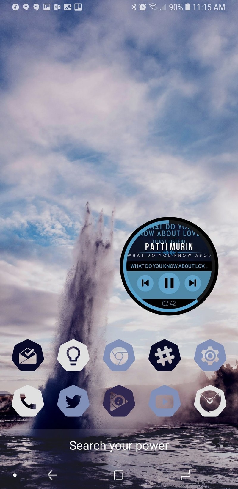
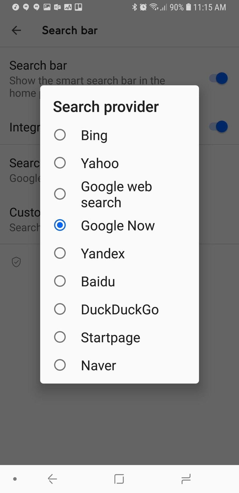

The second aspect of the home screen is the newly redesigned Smart Search. Smart Search is now the default swipe up gesture on your home screen in addition to a tastefully subtle search bar in the dock, which can be disabled. The Smart Search page has also been redone, presenting some of your most used apps, favorite contacts, and of course web searches. The smart search screen is blindingly white, and while I wish it would take on the same Ambient Theme the app drawer does, the Smart Search screen is here to help you find things quickly, not to be easy on your eyes at 2 am.
Smart Launcher 5 takes widgets to the next level — a gridless level.
You can also switch search sources for Smart Search, so you can use Bing, Yahoo, DuckDuckGo, and a slew of other search options if you don’t want to use the standard Startpage.
You can even set Google Feed as the source, but you can’t set Google Assistant as the search source yet. If you’re a Smart Launcher Pro user, you can also change the display text of the Smart Search bar, setting it to a helpful hint or to a motto or quote to help the bar fit in with your theme better.

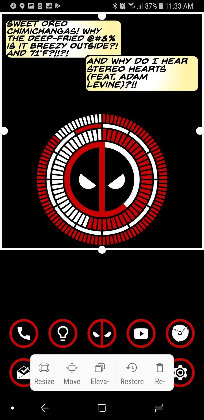
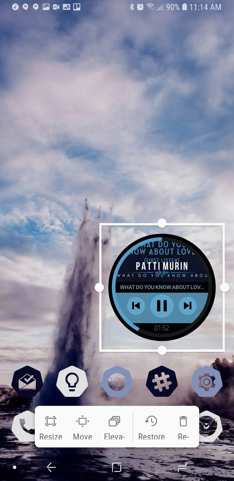
We then come to the final component of the home screen: widgets. Boy, howdy, have widgets on Smart Launcher 5 gone to infinity and beyond. Since Smart Launcher doesn’t use the traditional grid system for widgets, that means you can resize widgets to be exactly as big or small as you want and line them perfectly with your wallpaper.
The only downside for widgets might be that you can only have multiple widgets on a page if you pay for Smart Launcher Pro, which you should absolutely do anyway to unlock the full potential we’ll be talking about a little later.
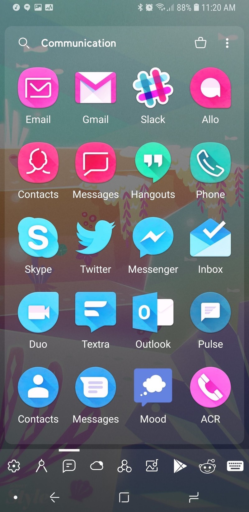
A very complex app drawer
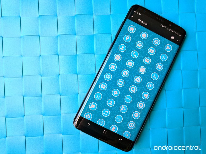
Smart Launcher has long stood out for its categorically sorted app drawer, and that drawer is still smartly sorted, if a bit more smartly dressed now. Smart Launcher pulls a color from your wallpaper to Ambient Theme your app drawer so that no matter your wallpaper, your app drawer fits it.
If you’re not a fan of the category app drawer, you can also disable categories for the traditional all apps together app drawer, but you should at least give the categories a chance.

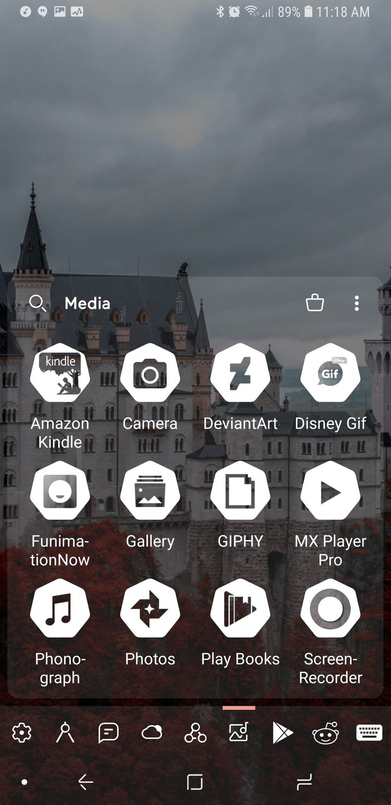
By default, Smart Launcher will have several default categories that it will sort your apps into based on what you have installed. I, for instance, have a lot of theming and customization apps installed, so my two fullest categories are Settings and Utilities, whereas my Media and Entertainment tabs were rather light. Thankfully, you can switch apps between tabs easily enough to help balance things out.
Customization is the name of the game here, and that’s why I recommend you upgrade to the Pro version for a few bucks.
If you purchase Smart Launcher Pro, you can add and remove categories, letting you do brilliant things like sequestering your work apps so that you’re not tempted to check them on the weekend. I have loved custom tabs because I can keep all the apps I’m reviewing for Best Apps roundups together for easy browsing and comparison.
Smart Launcher Pro users also have a few more sorting options within your categories. You can choose to sort by name, by most used, and then there’s also sorting ‘by user’, which is just a polite way of saying you can arrange it, however, the heck you want.
If you’re feeling especially vibrant, you can also sort apps by icon color, giving you a rainbow app drawer and the easiest Pride theme ever. If you’re using an icon pack with a warped color palette, like Unicorn or Retrorika, you can get different sorts than you would with the normal Adaptive icons.
Well, I wouldn’t call the Adaptive icons in Smart Launcher 5 “normal”.
A gateway launcher to customization
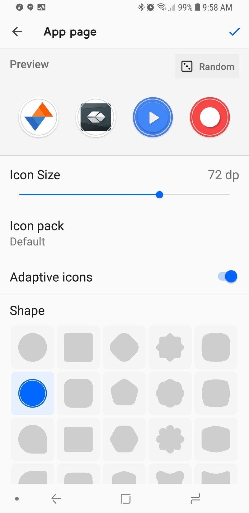
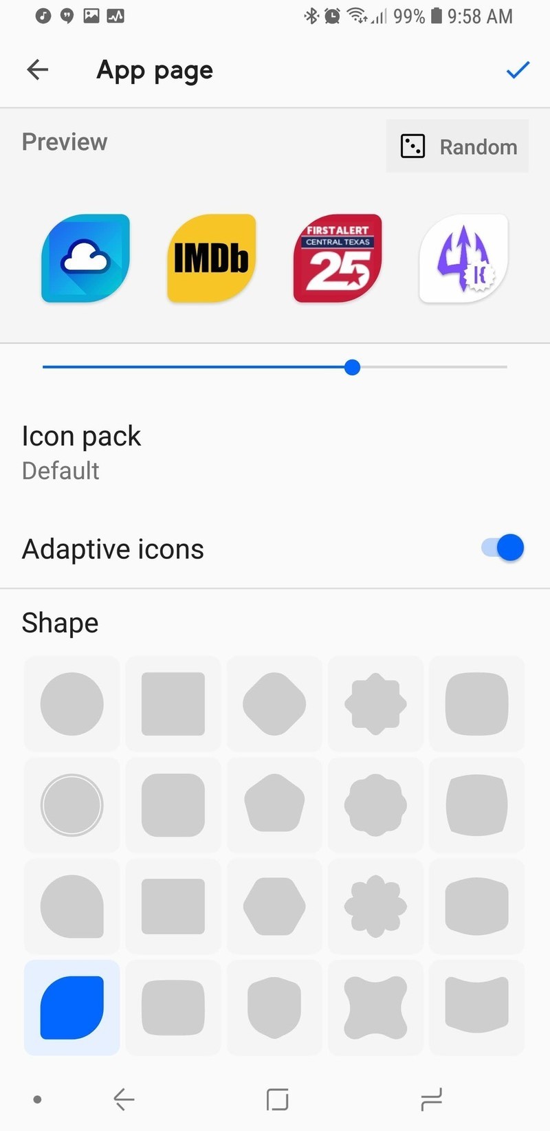
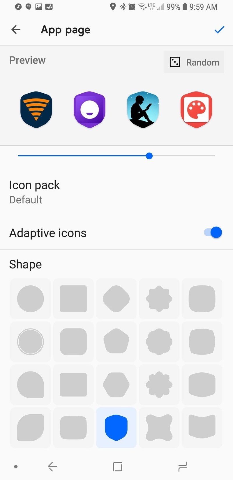
Smart Launcher 5’s icons not only take Adaptive Icons to new heights, they can also surpass them entirely with one of Smart Launcher’s side apps. Most launchers only have four to five shape choices for Adaptive Icons.
Smart Launcher 5 has the traditional five available to free users, but Pro users can choose from 20 shapes, including shields, leaves, flowers, and a plethora of polygons, and you can tap the Random button to change the preview icons to other apps on your device, letting you see how each of your icons will look with a particular shape or style.
Want to really get creative with your icons in Smart Launcher? Try Icon Pack Studio.
Icon Pack Studio goes five steps beyond Adaptive Icons by letting users customize and build your own personalized icon packs using an expansive icon base and a top-notch masking system to produce icon packs that fit your theme or wallpaper to a T. You can even add fun effects to give yourself a metallic icon pack, custom drop shadows, and build an icon pack that will switch colors as you switch wallpapers.
Icon Pack Studio is here to do what Adaptive icons can’t
Smart Launcher extends the same philosophy to Gestures that it does to Adaptive icons: Free users have access to the more basic gesture shortcuts, and then the more complex shortcuts are available to Pro users.
You can set double-tap to sleep the screen with a timeout to avoid interfering with Smart Lock, just like Nova Launcher and Evie Launcher. Then there’s Smart Display Off, which puts your screen to sleep when you set the phone down on a flat surface. If you tend to set your phone down and keep using it like I do, this feature can go from awesome to annoying in five seconds flat, but it’s an interesting idea.
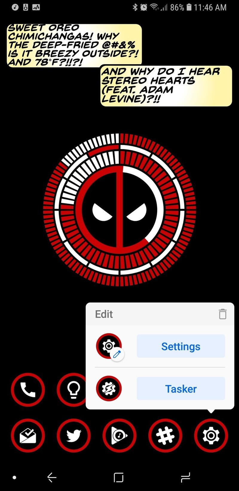


Even if you don’t go in for a lot of complicated gestures and fancy icons, Smart Launcher 5 has a tiny bit of customization that every user should take advantage of: Double tap icons. The icons on your homepage can add a double-tap action that can open another app or fire off an Android Shortcut — like a Tasker shortcut or a Direct Dial.
Pro users can even open a pop-up widget with a double-tap, and you can set any widget to open with a double-tap, not just widgets from that app. Several launchers have a similar feature which lets users swipe on an app shortcut to trigger a widget, app shortcut, or folder, but the double-tap on Smart Launcher 5 is much more intuitive. Long-pressing on a home screen app will also bring up their App Shortcuts.
A smart way to stand out in a crowded launcher market

Smart Launcher 5 has a lot here to like, from a responsive and comprehensive categorical app drawer to some of the most precise widget placement on Android to the most diverse icon options on the market. Want a search bar that links to something other than Google? Smart Search can use the engine you prefer. Want your apps sorted just the way you like? Smart Launcher Pro will let you sort everything your way. Like having a minimal home screen but want more functionality? Go nuts with Smart Launcher’s double-tap icons and gestures.
Smart Launcher has been one of our favorite launchers for years, and this year, it is reaching new heights. So, is Smart Launcher smart enough to fit your lifestyle and Android style? Tell us in the comments, and show up what awesome themes you’re rocking with it.
Download Smart Launcher 5 (free, in-app purchases)
Visible: Everything you need to know about Verizon’s new phone service
Visible is a new startup from Verizon offering phone service via an app. Here’s what you need to know.

When looking at pre and post-paid cell phone service providers in the United States, there are countless options to choose from. Along with the big names such as AT&T and T-Mobile, you’ve also got competition from small brands like Mint Mobile and Cricket Wireless.
It can be hard to stand out in this industry, but Verizon’s trying to do just that with a new startup it recently launched called Visible. Visible aims to make phone service as dead simple and affordable as possible, and even in such an early stage, looks to be darn promising.
How much does it cost and what do you get?
Visible only offers one plan and it costs $40/month. For that price, you’ll get unlimited calls, text, and data in the United States.
There aren’t any contracts, meaning you can cancel at any time.
How’s the coverage?
Visible uses Verizon’s 4G LTE network for service, and as such, you’ll be covered just about everywhere you go.

Download speeds are capped at 5 Mbps, which Visible notes is “just right for streaming” and that most videos you watch will be shown in 480p.
According to Visible’s site –
We’re built for life on the go, so instead of giving you extra speed you don’t need (and making you pay for it), you get unlimited data at a speed that’s perfect for streaming.
Can you bring your own phone?
Yes! In fact, that’s the only way you can use Visible right now.
Visible says it’ll have devices you can purchase directly from it in the future, but for the time being, it’s exclusively BYOP.
After signing up for your Visible account, a SIM will be shipped to your address and should arrive as soon as the next day.
What makes Visible unique?
Here’s where things get interesting. Rather than worrying about carrier stores, multiple plans, and everything else, Visible houses everything into its mobile app. After signing up for the plan, download the Visible app, enter your account info, and then pop your SIM in when it arrives. After that, you’re ready to rock and roll.
Everything you do with Visible is handled through the app, including billing, customer service, and paying your bill. Along with regular credit and debit cards, Visible also lets you pay with PayPal and Venmo.
When will it work with Android?
There’s currently just an iOS app for Visible, meaning it’s not yet compatible with any Android phones. Thankfully, Visible says that it’ll be “expanding compatibility soon.”
See at Visible
Carriers

- Which unlimited plan should you buy?
- Verizon’s Unlimited plans: Everything you need to know
- Everything you need to know about the T-Mobile ONE unlimited plan
- Everything you need to know about the AT&T Unlimited plan
- Everything you need to know about Sprint’s Unlimited Freedom plan
- Join the Discussion
The best announcements from Google I/O 2018!
Hey Google, write this article for me.
Google I/O is finished for another year, but the effects from last week’s keynote are still being profoundly felt, both in the developer community and here, closer to home.
While many of Google’s initiatives haven’t yet rolled out, or are still pipe dreams, there’s a lot to be genuinely excited about this time around.
Here’s what the Android Central team loved from this year’s show.
Ara Wagoner
I’ve been excited to see Assistant’s perpetual growth — especially on phones — and Google I/O gave us announcements that will bring Assistant closer to the personalized personal assistant that we’ve been dreaming of. More voices and Continued Conversation will (hopefully) let users feel like they’re building more of a relationship with Assistant instead of just barking order after order at it. Speaking of barking orders, the I loved the Assistant announcement about helping us all learn — or re-learn — a very important word: “Please.”
As a new generation of kids is raised around technology that will give them just about anything they ask for, Pretty Please is a big step forward for Google Assistant. Requiring children to say please when asking for something can help reinforce the importance of being polite, especially because Google will thank and compliment users who ask for things nicely. Also, making the parents say please not only shows the kids that their parents have to be polite to Google, too, but can nudge us to take a gentler and more conversational approach to our prompts for Google Assistant.
Also, I need that magical chime on my Google Assistant right now. Please.
Daniel Bader

Google I/O this year was all about reclaiming time. Time from your phone, time from your phone calls, and time for the people that matter. To that end, as someone who admittedly uses his phone too much, Google’s Digital Wellbeing initiatives are a good start. They’re not perfect — Andrew already summed up their flaws and limitations well — but, at least for me, they lay the foundation to understanding how I use my phone and how I can lay off the excess.
The Dashboard, which will be coming to a future version of Android P, shows how this will work: metrics to provide the basis for a more grounded knowledge base of how you use your phone on a day-to-day basis. I know that I spend a lot of time in Twitter and Instagram, but when the Dashboard tells me I spend 80% of my day in either one, I’m hoping that will be enough impetus to cut down. (To be honest, it probably won’t, but knowledge is power, as they say.)
On the other hand, I’m comforted by the fact that Google is finally acknowledging, and taking steps to assuage, the growing problem of smartphone dependency.
Marc Lagace

My favorite announcement from Google I/O was about new features coming to one of the most-used apps on my phone: Google Photos.
I love all the smart features that Google has been adding to Google Photos in the past, and the stuff they showed off this year will surely cement the app as my go-to for viewing, processing, and sharing photos I take on my smartphone. The colorization of black and white photos is super cool — although admittedly not a feature I’m likely to use on a daily basis — but the ability to recognize, scan, and convert documents into PDF is long overdue.
Joe Maring

As much fun as I’m having with Android P and its crazy gestures on my Pixel 2, I found myself most excited about the Google Assistant-related announcements at this year’s I/O.
I use the Assistant every single day between my phone and Google Home(s), so features like Continued Conversations that’ll allow me to ask follow-up questions without having to say “OK, Google” or “Hey, Google” over and over and over again is a God-send.
Something else that really caught my eye was the revamped UI for the Assistant on phones. The chat-like interface that we currently have is fine, but I love all of the new elements Google’s working on. The new “home” page that offers contextual information/cards is something I’ve been longing for since the Google Now page was killed off and I love the idea of having interactive controls for things like smart bulbs and thermostats built right into the Assistant.
Also, can we talk about Google Duplex? I had to pick my jaw up off the floor after that first demonstration and cannot wait to see where Google takes this going forward. I understand the apprehension some people have about a technology along these lines, but the fact that Google created something that beat the freaking Turing Test is BONKERS.
Jerry Hildenbrand

At Google I/O, the company finally opened up Chromebooks for “regular” Linux apps. They didn’t give many details other than saying, “Android Studio for Linux will run on the Pixelbook because it can safely run Linux applications”, but thankfully the right nerds looked in the right places and we have a good idea of the what and how.
A custom distribution of Linux will run in its own container, much like Android does. Since it won’t be locked down like Android, that container runs inside its own kernel-based virtual machine. This way it won’t have access to the actual Chrome OS system files. This is in the beta channel for the Pixelbook and should be available for all Chromebooks with 64-bit processors “soon”.
It’s perfect. I can keep my Pixelbook safe and sound while having access to the huge library of excellent desktop software I already use. That Pixelbook with 512 GB of storage looks a lot better now.
Hayato Huseman

I think my favorite announcement from this year’s Google I/O is the JBL Link Bar. It may not be as terrifyingly impressive as Google Duplex or as practical as the new walking directions coming to the camera, but I’ve been in the market for a soundbar for years. As far as TV audio goes, I’ve always just settled with the poor sound the built-in speakers wheeze out, and I’ve had my eye on the Sonos Playbar, but having Android TV and Google Assistant baked into a single unit makes the Link Bar super appealing to me.
I’m also really excited for Android to finally start embracing gestures. I’ve been using the iPhone X for a few months now, and I’ve fallen in love with gesture navigation all over again after the last decade without webOS forced me to move on. I know, I know — a lot of people think it’s just change for the sake of change, and I honestly don’t disagree with that. But for the time being anyway, it’s purely optional, and if you prefer the traditional three-button layout, it’s still alive and kicking.
Russell Holly

Google dropped a lot of cool stuff on us, but the best by far, in my opinion, is the Google Maps walking directions update. Using the Visual Positioning System originally intended for Protect Tango and making it a seamless part of Maps for more accurate walking directions. As someone who is regularly lost in big cities, this is a huge deal for me.
I’m also a big fan of the fun little fox Google added as a feature we might see when it rolls out. That fox is part of the Google Poly kit, and a great way of pulling ARCore into a proper Google app.
Tom Westrick

In terms of things I’ll actually use on a daily basis, my favorite announcement is Android P. The AI announcements are interesting, and new Linux apps on Chrome is going to be cool, but my most used device will always be my phone. And most of my time spent on the phone will be navigating around the interface, so the new UI in P is something I’m looking forward to.
The gestures are a bit broken — beta software and all — but they look promising. It is going to be a bit awkward to have the navigation functions split between gestures — multitasking and opening the app drawer — and tapping buttons — home and back. We have a few more months before P is officially official, so there’s time to tweak things.
Andrew Martonik

Android P reaching its first beta release was exciting, and being able to get an updated look at the new features and design of the latest release months in advance is always great. But what really took me by surprise was the expansion of the beta program to phones from seven different Android manufacturers beyond Google’s own Pixel phones.
Sure this is neat for owners of these non-Pixel phones, particularly those that are on the cheaper side, as they can get an early look at Android P if they want. But what’s really important is giving more companies earlier access to the next version of Android. Every single one of these companies gets to work with Android P a full six months before it will be released to the public, and that means they get a head start on their engineering. That should translate into faster updates for phones going forward, particularly now that Project Treble is in play, but also more stable software for phones that launch with Android P as well.
Sure these phones won’t all have a stock-like software experience that looks the same as the beta does today, but getting the latest features and software updates is always a move in the right direction no matter what the interface customizations may be.
Your favorite announcement
What did you love about Google I/O this year? Let us know in the comments down below!
Android P
- Android P: Everything you need to know
- Android P Beta hands-on: The best and worst features
- All the big Android announcements from Google I/O 2018
- Will my phone get Android P?
- How to manually update your Pixel to Android P
- Join the Discussion
U.S. Senate will vote on May 16 to possibly restore Net Neutrality
Even if the vote passes the Senate, there’s still a long battle ahead.
In mid-December last year, the FCC voted to repeal Net Neutrality. That repeal will officially go into action on June 11, but not before the U.S. Senate votes to hopefully restore it.

FCC Chairman Ajit Pai
On May 14, Democratic Senator Ed Markey announced that he and other fellow Democrats have pushed the U.S. Senate to vote on whether or not the FCC’s repeal of Net Neutrality should be reversed. The vote will take place on Wednesday, May 16, and it’s being done as part of a Congressional Review Act (also known as a CRA).
Commenting on the announcement, Senator Markey said –
By passing my CRA resolution to put net neutrality back on the books, we can send a clear message to American families that we support them, not the special interest agenda of President Trump and his broadband baron allies. May 16 will be the most important vote for the internet in the history of the Senate, and I call on my Republicans colleagues to join this movement and stand on the right side of digital history.
So far, 50 of the 100 Senators have said they’ll vote to restore Net Neutrality (one of which is a Republican). Considering this and the fact that Republican Senator John McCain will be absent due to his current health conditions, there’s a chance the Democrats could get the vote to go through.
If that happens, however, that doesn’t necessarily mean Net Neutrality will once again be alive and well. After the Senate, the vote will then need to through the House of Representatives where Republicans have the majority of seats at 236 to 193. If it by some miracle gets through the House, there’s still the chance that President Trump will veto it.
Even with those obstacles in mind, it’s still somewhat reassuring to see that action is being taken to roll back FCC Chairman Ajit Pai’s decision.
What do you expect will happen this Wednesday?
Net neutrality, consolidation, monopolies, and you
At Google I/O, an Apple fan discovers the importance of cross-platform support

I’m iPhone and you’re Android so we can’t be friends — that’s such a backward sentiment and it’s time we stop thinking that way.
If you wonder what it feels like to be an Apple fan in a sea of Android enthusiasts, you might be surprised to know that it’s really no different from being surrounded by people who are like-minded about the operating system they prefer. In other words, we all love technology and have the same agenda: to make great advancements and have the best user experience.
I spend the better part of a week with Googlers and my Apple-minded takeaway is let’s make great technology for everyone, no matter which devices we use.
Google shoots for the moon

At the I/O keynote, Google announced a bunch of new features I’m super excited about that are supposed to launch “in the coming weeks.” Stuff like Continued Conversations using Google Assistant, Pretty Please to teach kids about manners while they’re using tech, smart editing features in Google Photos, Android Dashboard, which gives you a quick view of how much your using your phone and provide settings to help you reduce screen time, and visual positioning in Google Maps for more accurate walking directions.
Google encourages a culture of coming up with the most ridiculous of possibilities (or impossibilities), and then asks, “How can we make this a reality?” Some stuff doesn’t ever see the light of day, but when they get it right, it’s pretty amazing.
That’s the joy of exploring new technology. When it works, it has the potential to benefit everyone they’re willing to share what they’ve learned. Each one of the upcoming Android-only features made me think, “Cool! I wish iOS had this.”
What I’m tired of hearing when one company announces cool new tech is, “Big deal. Google/Apple has been doing this for years.” Guess what? It doesn’t matter who did it first. I only care whether everyone gets the chance to use it.
In the music world, we have this saying, “There are no more songs left to be written.” The idea is that there are only so many times the same chords can be used in a specific order. At some point, all the ways you can string together notes have been used. It doesn’t mean one artist is copycatting another. It’s about the song’s creation that matters, not who put C, D, and E together first.
That privacy though
My Apple-loving brain is sometimes at odds with Google’s collection of my data. I could write a completely separate editorial about this, but that’s not why I’m here.
What I am here to say is that I see the benefit of allowing Google to store some of my data if it’s being used responsibly, which the company makes clear in its Privacy Policy.
I steadfastly believe that Google Assistant is markedly better than Siri, in part, due to the fact that Google Assistant is allowed to remember things.
I’ve compared Siri to a person who’s had a memory charm cast on them. If you remove your assistant’s memories every day before they leave the office, they’re not going to be a very good assistant, are they?
If you protect my data, maybe it’s not so bad that you store some of it on your servers to create a better experience for me.
Maybe (I’m still working this out).
The things Apple and Google are doing right

One take away I have from attending I/O is how Google is working toward integrating more cross-platform content.
ARCore, for example, is something I’m really excited about because it makes it possible for me, on my iPhone, to play AR games with you, on your Android phone, thanks to Cloud Anchors.
Cloud Anchors connect multiple devices in the real world to augmented reality content. The information is sent to the cloud, which is then sent to a second (or third or fourth) device, which also sends information back to the cloud. The result is cross-platform supported multiplayer AR gaming and I love it.
I love that Google created this cool technology and made it compatible with ARKit. I love that Apple didn’t tell Google, “Nope” when it wanted to share the technology across all supported devices.
This is how Apple and Google should be working together on everything.
The things I hope Apple and Google will do more of in the future

If I learned anything at I/O its that I want everyone to experience the same amazing technology.
I want to see more collaboration between the two companies (and, why not throw Microsoft into this discussion, too).
If Apple users are concerned with how Google collects data, maybe Apple should share some of its vast knowledge of privacy.
If Google is behind the times when it comes to accessibility, maybe it should ask Apple for advice.
If Siri can’t stop sucking as a personal assistant, maybe it should call up Google Assistant for an AI chat (um, I think I can help).
In conclusion
As much as I love practically everything about Apple, I also love practically everything I saw at Google I/O. Maybe that makes me a dope, but maybe there are a lot more people like me in the world and maybe we should stop talking about what the other guy is doing wrong and start figuring out how to make everyone’s experience better, no matter what tech we use.
The $35 Corsair Survivor Stealth is a tough 128GB USB 3.0 flash drive
Keep all your files safe.
The Corsair Flash Survivor Stealth 128GB USB 3.0 Flash Drive is down to $34.99 on Amazon from a street price around $65. This is a match for its lowest ever, a drop we’ve only seen once or twice before. The 64GB version is priced at just over $34 right now as you’re getting double the space for the same cost.

If you’ve got files you absolutely do not want to lose, this flash drive is made from hard-anodized, aircraft-grade aluminum. It has a water seal that is water-resistant up to 200 meters. It is vibration and shock resistant thanks to the molded shock damping collar. In addition to all that you get a high-performance USB 3.0 drive that’s compatible with Mac, Windows, and Linux and comes with a five-year warranty.
See on Amazon
Google One is replacing Drive for paid online storage
The service also comes with expert help, Play credits, and more.
Google I/O may be over, but that doesn’t mean Google-centric announcements stop. Today, the search giant announced that it’s upgrading its paid Drive storage plans under a new Google One moniker.

Similar to what you can get with Drive storage right now, Google One will allow users to buy additional space in the cloud for housing all of your files across Google Photos, Gmail, and Drive. The fundamentals of the service are remaining the same, but there are a few nice upgrades coming along with the new logo.
All Google One users will get 15GB of free storage like we currently have, but some of the paid tiers are gaining some extra bang-for-the-buck.
- There’s an all-new 200GB tier that costs $2.99/month
- The $9.99/month plan now comes with 2TB instead of 1TB
- Anyone on an existing 1TB tier through Drive will automatically be upgraded to 2TB for free
Aside from these three changes, the rest of the existing plans remain the same.
With the rebrand to Google One, you’ll also be able to share your cloud storage with family members. Google notes that you can allow up to 5 accounts to access one plan and each member will have their own private section of storage only they can use.
Last but not least, Google One subscribers will get fast access to “experts for help” and benefits for being a customer, “like credits on Google Play or deals on select hotels found in Google Search.”
Google One will be rolling out to users in the U.S. over the coming months and will later be followed by a global expansion.
Sign up for Google One updates
Carpool Karaoke’s Distribution in Apple’s TV App Suggests Roadmap for Future Shows
On Friday, Apple began promoting its streaming show Carpool Karaoke: The Series inside of the TV app, marking the first time the entire series will be available for people who don’t subscribe to Apple Music. Carpool Karaoke and Planet of the Apps — which represent Apple’s foray into original television content — have been mainly housed inside of the Music app since they both launched last year, and in the ensuing months the company has been connected to over a dozen upcoming original TV shows.
Apple has set aside $1 billion for its TV efforts, with a global team working on high-quality dramas that reports have compared to Stranger Things and Westworld, in terms of scale. Due to the amount of money it’s putting into the initiative, Apple is expected to distribute the shows via subscription service of some kind, and with the recent expansion of Carpool Karaoke into TV we now have a potential hint at what Apple might do when launching its next set of shows.
Apple started off leaning into Apple Music as its home for new shows, with a “TV & Movies” category in the Browse tab, so it’s been somewhat unclear how the company will go about launching its own streaming TV service. Possibilities include keeping the shows within Apple Music and bundling a TV category into user subscriptions, launching a completely new streaming service and connecting it to iTunes somehow, or making the service and shows available in the existing TV app.
That last option appears like a solid guess now that the entirety of Carpool Karaoke is rolling out on TV. When the app is opened this week, Apple gives Carpool Karaoke prime placement on the “What to Watch” tab, along with an exclusive tab bar that highlights the free episodes of the show. One of the advantages of Apple TV and the TV app is a quick snapshot of every app that a show or film is available on, and for Carpool Karaoke instead of just “Music,” it’s now “Available on TV.”

This means that when you click the play button, you won’t be diverted to another app to stream the show since it’ll be playing directly in TV, similar to how purchased movies and TV shows from iTunes work in the app (on the other hand, Planet of the Apps does not have an “Available on TV” label and still must be watched in Music). If combined with its upcoming plan to offer subscriptions to other streaming services in TV, Apple could then let users subscribe to its own service within the app, with a dedicated area for shows exclusive to the company.
Apple’s weekly rollout model for episodes of Carpool Karaoke could also be a hint at how some shows might debut on the dedicated streaming service. Following the first two episodes, Apple will now put one episode onto the TV app every Friday until the season is finished at episode 19. Streaming networks vary in episode distribution strategy, with Netflix popularizing the all-at-once model while Hulu chooses to release episodes of its shows, like The Handmaid’s Tale, one episode per week.
 Every Friday, Apple will add a new episode of Carpool Karaoke into TV
The tricky thing is that Apple Music itself does connect to the TV app, so even if some shows initially launch bundled into Apple Music, you’ll still be able to keep them organized in TV (like you can with Planet of the Apps right now), with the main difference simply being the actual location of streaming the series. Of course, we won’t know for sure how we’ll be watching Apple’s shows until the company lays down its plans for the rollout, which could launch as early as March 2019 according to the latest rumor.
Related Roundup: Apple TVTag: Apple’s Hollywood ambitionsBuyer’s Guide: Apple TV (Neutral)
Discuss this article in our forums
