


Rocket Racer: A Runner/Racer Hybrid with Character [Review]
Overview
Rocket Racer is a strange combination of familiar tropes; it’s a racing game that’s also a straight-line runner, that’s some combination of Star Wars Pod Racer and Mario Kart. The goal is to ride your rocket from point A to point B before the other racers, while collecting coins and power-ups and dodging obstacles. In between races you can upgrade your racer and your power ups with coins you collect in-race.
Developer: CatfishBlues Games
Price: Free (Ad-Supported, In-App-Purchases)
Highlights:
- Fast-paced, clean Racing/Runner hybrid.
- High production value.
- Quick sessions of play – not a time hog.
Setup
Rocket Racer was about as painless as I’ve seen a game to set up; login with Google Play if you want, and then get to racing.
Impressions
I’m going to be honest, at first I did not like this game. The rounds were too short, the controls too touchy, the lack of a variety of racers was frustrating…lots of things turned me off about it. But then I started playing, and something changed. I couldn’t tell you what it was; the races are still very short, the controls are very sensitive, and there are still only two racers to choose from, but I was having fun doing it.

Choose your racer.
The stages in Rocket Racer are these adorable little themed, single-direction levels littered with coins (used as currency to upgrade your racer, power ups, or purchase a new character), power ups (which look exactly like Mario Kart power ups, and function similarly), and environmental obstacles (ranging from rocks and trees to speed boosting ramps and explosive barriers. There’s a wide range of power ups to use, including: Rockets (three different kinds), Electric Shields, Time Slow, High Jump, and Invincibility. These power ups are generally not game-changing, because the races tend to be between 20 and 30 seconds long, but they can turn the tide if you’re clever with their use. With vibrant, full-3D graphics and a charming soundtrack, Rocket Racer’s production value is high as well.

Progression System.

Buy more coins.
Rocket Racer is ad-supported, but the ads are generally one of two varieties – small banner ads at the bottom of the screen, and large, full screen ads after every few races. Very reasonable, very unobtrusive. You can also buy Coins using real money, though in the experience I’ve had thus far that is completely unnecessary.
What I like
- Modest ads and IAPs.
- Quick sessions of gameplay.
- Good graphics and sound.
What I don’t
- Quick sessions of gameplay.
- Lacks a variety of racers.
Conclusion
Rocket Racer is a fast paced romp through a couple dozen courses – ads are reasonable and in-app-purchases are unnecessary, so for the price of entry, this is a quality game that’s bound to help you waste some time.
Google Play Store – Rocket Racer
Sennheiser IE 800 and Shure SE846 headphones [dual review]: Epic battle of the tiny giants
I’ve recently reviewed two $99 in-ear headphone offerings, from Sennheiser and Shure, that brought lots of bang for the relatively affordable buck. Now it’s time to bring out the big guns. If you’ve been keeping up with my headphone reviews, you can probably guess I’m somewhat an audiophile. This means that when I wanted to know how well flagship earphones perform, I dived in.
Sennheiser and Shure are two of my favorite headphone manufacturers, and both of their top-of-the-line earphones launched at a blistering $1,000. If you’re floored by that fact, welcome to the world of high-end In-Ear Monitors (IEMs). My obsession/curiosity has eventually led me to own both the IE 800 and SE846 (I know I’m crazy, you don’t have to tell me). So I saw a rare opportunity to do a head-on review, of both at the same time!

Shure SE846

Sennheiser IE 800
There’s a reason why I have both. Sennheiser and Shure take completely different approaches to earphones. These guys might as well be arch-rivals. The design, technology, and sound they’ve gone with couldn’t be more different, which makes them both excel in different ways. Let’s get into what makes these top-dollar earphones tick, and which pair you should leap into if your curiosity also gets the best of you!
Design
I wasn’t kidding when I said that the Sennheiser IE 800 and Shure SE846 couldn’t be more different. Just take a look at them side-by-side.

The size, shape, materials, audio driver technology, and even how you wear them are completely on different ends of the spectrum. It’s really interesting to me that both of these companies are aiming at perfection, but they don’t converge on any design aspect at all. The sound output is also just as different, but we’ll get to that later in the review.
The IE 800’s earpiece is built out of an unconventional ceramic housing. A glossy finish is laid on the material, to give it a shiny, expensive appearance and feel. I would say that out of the two, the IE 800 is more subtle about its lavish upbringing. It is small and black – a description for most earphones on the market. Although, a design feature you won’t find on any other earphone is bass ports protruding from the back of the earpiece.


The chassis smoothly tapers down to these two tiny holes, which are meant to equalize the pressure buildup from the bass output in your ear canal with the outside. The IE 800 produce among the deepest bass reproduction I’ve heard, and a large part of that is thanks to these bass ports. In case you’re wondering about sound leak, you won’t hear any audio escape from these tiny openings.
Now, Shure on the other hand went with a less refined approach. The SE846 follows its legacy pod design language, only with the extra technology crammed in. With Shure, it’s all about what’s under the hood. A good analogy is to think of the Shure earphone as a muscle car and the Sennheiser as a sophisticated german sports car, which is actually totally appropriate, because Shure is in fact an American brand while Sennheiser is a German company.


Therefore, the SE846’s chassis is merely plastic. But that in no ways means that it’s inferior build-wise, it’s as durable as they come. The feel just doesn’t back the exorbitant price tag. However, Shure does somewhat sidestep that fact by making the earpiece transparent and showing you exactly what your money bought you – technology.
The reason the SE846’s earpiece is so much bigger than the IE 800 is because it utilizes four audio drivers (per earpiece). That is, four Balanced Armature (BA) drivers in tandem, each assigned to their own frequency range and output in sync (without conflict). The clear earpiece lets you see the arrangement of micro drivers. If your eyes are good enough, you can even see the laser-etched labeling on each component. It’s unique and pretty darn neat to look at.

In contrast, the IE 800 only uses one driver, based on more conventional dynamic driver technology. But with that said, there’s nothing conventional about the way that Sennheiser produced it. Despite being tiny (only 7mm), it has an extra wide band (XWB) transducer, capable of an insane frequency response range of 8 – 41,000 Hz. I won’t get into the BA vs. Dynamic Driver discussion here, but just be aware that they excel at different aspects in the sound. Many high-end earphone manufacturers have moved on to BA drivers (some even packing 12 drivers per earpiece), but Sennheiser is sticking to its roots and proclaiming that the dynamic driver produces the truest sound.
Pulling out the eartips reveals more design differences. The SE846 have slender, metal nozzles, while the outlets on the IE 800 are stubbier and wider.

The IE 800 has a metal mesh screen to come between your earwax and the internals. The SE846 doesn’t have a protective mesh on the nozzle (maybe because it’s so thin), but Shure did put it on the eartip.
There is an interesting feature within the SE846’s nozzle. Shure incorporated a filter system, which allows the user to do a hardware tweak of the sound signature.


 It’s pretty easy to do. The SE846’s packaging includes a key tool for twisting off the nozzle cap. When you pull the nozzle out, you’ll see the colored filter sitting in there. There are three different sets of filters to choose from. Each filter has a differing density of foam, which blocks or allows a certain frequency range (1 kHz to 8 kHz) to pass through, by 2.5 dB. The effect is either a brighter (more treble) or warmer (less treble) sound.
The change affects bass by perception. When the treble is recessed, bass is more prominent, and vice versa. It’s certainly fun to play around with the different sounds, and discover what your ears like best. The stock filter (blue) is neutral – no alteration to Shure’s sound.
The differences between these two earphones continue down the cables. The IE 800 has a slender, pure copper cable, reinforced by a woven kevlar (41″ in total length; 10″ from earpiece to y-splitter). I think it looks sleek, and the small footprint (together with the tiny earpieces) makes it feel like there’s barely anything in your pocket. The SE846 on the other hand are made of nickle-plated copper and have a slightly thicker, clear cable. It’s a less refined feel, but solid.


A notable mention about Shure’s design is that the cable is removable. It uses a MMCX connector standard, which means that you can pop the earpiece right off.

This capability opens the doors to third-party cables. For instance, if you wanted different materials or lengths (Shure actually included two stock cables in the packaging – one at 46″ and the other at 64″ in total length; 16″ from the y-splitter). But probably the most important thing is if your cable fails, that doesn’t mean that your earphones are done for.
The cable on the IE 800 aren’t removable at the earpiece, but rather, on the y-splitter (via a 2.5mm jack). Despite Sennheiser’s previous flagship being detachable (the IE 80), the manufacturer forwent the feature with the IE 800. But at least, with respect to cable failure, there’s redundancy from being a two-part cable.

I think the only thing the same about these two earphones is that their 3.5mm jacks are both right-angled.

Usability
 The SE846’s cable curves from the earpiece by design (via a stiff, memory shrink-wrapping). It’s meant to route around the ear. The IE 800 on the other hand is the more traditional just stick in and you’re done. This totally comes down to user preference, but there are definite pros and cons. Resting the cable around your ears tremendously helps microphonics (noise from the cable rubbing on you). However, it’s much easier to don/doff the earpiece by just sticking it in and letting the cable fall. I prefer the latter, but have come to appreciate the around-ear method over time. The fit is more secure, as pulling down the cable pulls on your ear rather than the earpiece.
I will say that Shure does need to work on its cable ergonomics. The thicker shrink-wrapping that maintains the hook shape is pretty darn stiff, so instead of snugly hugging your ear, it springs up when fitted. The stiffness does loosen up over time, but never to my satisfaction. I ended up buying a thinner, third-party cable.
When talking about earphones, eartips are a hot topic. Both fit and seal are of the utmost importance, or else you won’t have the intended enjoyment. Additionally, eartip material plays a part in how the sound comes through. For instance, while foam tips isolate better than silicone, they can dampen bass.

The IE 800 comes with a variety of silicone tip sizes. There are also two differing shapes among those – circular and oval. Sennheiser is confident that your ear canal will find one that it likes. It took some playing around for me to determine a suitable shape. While the tips are flexible, they’re firm, so you’ll get a push-back if the tip can’t go any further (the earpiece is tiny, so it can go pretty deep in the ear). While the seal is maintained during light movement, it does come out pretty easily. I wouldn’t recommend the IE 800 for exercising; only if you stay put for the most part.
Shure includes both foam and silicone tips in the SE846’s packaging. Its signature “Olives” are installed out of the box. I’m torn between them. They isolate really well (and last longer than any other foam tip I’ve used), but they sound slightly muffled compared to the silicone tips. That’s the trade-off I talked about. However, it’s nice to have the choice. I use the silicone tips regularly and switch to foam in noisy environments.
I must mention that because the IE 800 has such a short nozzle, the tips are a proprietary design. There’s a thin grove on the nozzle that the tip’s internal lining has to match up to, for a secure fit. Therefore, the success rate with a third-party eartip (Comply foam tips, for instance) will be low to none.
Sound
*For my listening, I use the LG V10 (HiFi SABRE 9018 DAC setting) and Tidal HiFi music samples.
Before I get into the audio details, there’s a little background story that I feel is relevant to the experience with these earphones. When I tried them, I had no intention to own both. But I didn’t expect the decision on which to be so hard to make. What’s crazy is that they both excel in different ways; actually, they have what each other is missing (I’ll get to this shortly). But the exorbitant price tags meant I could only pick one. I went with the SE846, because it was closer to my preferred sound signature.
Only, after time went by, I couldn’t stop thinking about the IE 800. Elements in its performance are just unforgettable. So despite the impracticality, I saved up and bought it. Now, I switch between them almost daily and couldn’t be more happy. They bring very different experiences to the same music.
So let’s go over what I’m specifically going on about. The two things that won me over on the SE846 were the mids (mid-range frequencies) and the bass output from Shure’s uniquely designed low-pass filter.
Shure is known for giving special attention to the mid-range frequencies (vocals, guitar strums). Pushing them forward gives a satisfying fullness and lushness to the overall experience. It’s more engaging and vocalists sound so realistic and present, giving off a moving and intimate feel.

SE846 low-pass filter component
The low-pass filter adds another level of depth, that earphones haven’t achieved before – a subwoofer-like reproduction to the bass. Shure created a special acoustic pathway that gets triggered from 75 Hz (upper sub-bass to mid-bass range), made out of tiny welded plates with differing cutouts. It simuates the subwoofer roll-off effect (rumble), and you bet it works! I listen to quite a bit of Rock music and this is how the SE846 initally won me over.
I would say that the treble range is not Shure’s strong suit. Not saying that it’s not detailed or articulated well (it better be at this price-point!), but the presence and reach could be refined. It’s a consensus with SE846 users that the upper-end of the treble drops off; not extending as far as it should (i.e. sparkle on high-pitched instruments). I also find it a tad too recessed, but fortunately the filter system allows you to tweak that.

IE 800 exploded view
What’s interesting is that the IE 800’s strengths and weaknesses are almost completely opposite. The treble detail is what hit me off the bat; the IE 800 brings it all forward. It’s amazing. You hear things in music that you’ve never noticed before. Usually, it takes experience to gain a fine-tuned ear to notice these kind of details. But Sennheiser says “Screw that” and makes it loud and clear. I kinda thought in my first impression that the reproduction was artificial; it’s just hard to believe.
Next is that beautiful low-end bass response. Where the SE846 largely excels at mid-bass (80 – 150 Hz range), the IE 800 brings the best sub-bass I’ve heard (0 – 80 Hz). Sub-bass is comprised of both hearing and feeling, and the IE 800 completely nails it. It’s quite unbelievable that these tiny earpieces can do that.
Everything about the sub-bass is exquisite (definition, depth, and impact). When the music calls for it, the extension reaches deep into your skull. Now, I’m not talking about boomy, “Beats” kind of bass. Sennheiser has delicacy in its presentation. It’s silky smooth and delicious – where bass is something to savor, not indulge in. The bass ports must be what allows the bass to reach this depth (or else I think the pressure in your ear canal would induce a headache).
But the mids aren’t as strong/impactful as on the SE846. I wouldn’t call them recessed; the IE 800’s sound signature is very balanced. It’s just, when you hear the SE846’s fullness, it can feel like something’s missing in other headphones. I eventually managed to look past that; not calling one better but embracing the differing excellence that they offer.
Lastly, regarding soundstage (the acoustic spacing that the earphones simulate), I would give the win to the IE 800. While the SE846 covers a wide space (outward from your ears), the IE 800’s audio better simulates a 3D space around your head. This gives the IE 800 an advantage with imaging (placement of instruments in that virtual space). Both do it well, but the IE 800 has an extra level of depth.
Final Thoughts

When you plainly look at the stark size differences between these two earphones, it’s quite remarkable that they can compete. Shure goes with brute force and power, while Sennheiser keeps true to its finesse and technological expertise. I love those two approaches equally, so I found myself torn right down the middle.
If you ever get the chance to try them, don’t turn it down. It’s amazing and exciting where high-end earphones are heading these days. The IE 800 have dropped down from their initial $1K price tag, to $799, while the SE846 are still up there. Hit up the official details on these two amazing earphones in the links below.
Sennheiser IE 800 | Shure SE846
FUGOO Sport Waterproof Bluetooth Speaker review
Every year for the Fourth of July, I host a party with food, fun, and fireworks. The turnout is always good, but every year I run into the same problem; where to put my out of date stereo on the patio. There is only one outlet outside and it is right above where all the coolers go, so every time a guest wanted a drink, I had to move the stereo.
This year, that all changes when I break out my new Sport Bluetooth wireless speaker by FUGOO.

Design
This first thing you notice about this product is its sleek design. There are speakers literally all over this product resulting in 360 degrees of quality sound. This speaker boasts many features, including two neodymium tweeters (clear highs), subs for a midrange punch, and two passive radiators for deep bass. Moreover, it also offers up a digital signal path to help avoid interference and an air-tight seal for acoustic efficiency.
Specs
- 40 hr battery life
- Bluetooth wireless connectivity up to 33 feet
- 95dB SPL-A @ 0.5 meters
- 60Hz-20KHz
- Micro-USB for charging and updates
- 3.5mm audio input for wired connection
- Waterproof up to 3ft
- 1-year limited warranty
Setup
Setting up the speaker is a snap; first, you’ll want to charge it up using the microUSB connector. The Sport also comes with an AC adapter for quicker juicing up. From zero, it ought to take about three hours to fully top off. Fully charged, you’re set for 40 hours of battery life.

Turning the speaker on, the FUGOO Sport has an indicator light to notify users that it’s powered up. Pairing is done with the press of a dedicated Bluetooth button and comes quick and easy. On top of the unit are volume buttons flanking the power button.
Once you sync the FUGOO Sport to your favorite device, you’re off and running, ready to listen to your favorite iHeart radio stations or streaming audio. But, should a phone call come in, you can answer it and have your conversation right through the speaker. Indeed, the built-in microphone turns your speaker into a speakerphone.
Included in the box is a 3.5mm cable which allows for direct connection. This is a handy solution for those of you who might like to keep the speaker in one place, say a desk, for instance. Keep it in a conference room and connect a smartphone and you’ll have a great companion for remote calls.
Sound
Along with the ease of setup and the durable craftsmanship, this speaker also has excellent sound quality. I like a lot of different genres of music and played them all with the FUGOO Sport. I tested everything from heavy metal to thumpin’ hip hop. The sound came through clear as a bell with no distortion whatsoever.
I also hooked the unit up to my computer and used to listen to online school classes. No matter where I’ve used the speaker (basement, work, basketball practice) sound was always great.
The phone feature is nice as well; I’ve had a handful of people call me to test it out. The sound was decent, static-free, however, there was an occasional and slight lag in conversation from receiver to reception.
Versatility

If you don’t like the look of your speaker, there are two other jackets you can get: Style, Tough. Additionally, you can also purchase accessories such as a bike mount, a remote, a strap mount and a multimount. The FUGOO setup is not only highly portable with great sound, but it’s very versatile and can adapt to your changing needs.
Where to Buy
If you’re in the market for a Bluetooth speaker solution that offers excellent sound and flexibility, you’ll definitely want to consider the FUGOO Sport. Currently, you’ll find it on sale for about $170 through the manufacturer’s website. Looking to Amazon, we find about the same cost. On a normal day, you might see it fetch about $200; such is the case with Best Buy.
Nitro Dash – OH NOOO! (review)
Overview
Nitro Dash is a fast paced endless runner that has you hijacking cars, running from the cops, hitting pedestrians and causing utter mayhem for as long as possible. Success is measured 1km at a time.
Setup
Nitro Dash is a breeze to setup. Simply download the game from the Google Play store, find it on your device and click the icon.
When you first open the game, you will be asked to approve certain permissions for the game. The permissions are needed for the game’s public scoreboard mechanic. If you are not comfortable granting these permissions, the game is still playable if you deny them.


Gameplay
Nitro Dash’s gameplay has made this one of the most difficult reviews I’ve ever written. One minute, I love this game. The next minute, I hate it.
Nitro Dash’s description classifies it as a racing game. I disagree with this. Nitro Dash is an endless runner. There is no finish line. There is no end goal. Nitro Dash is all about surviving as long as possible, with success being measured in kilometers.
As an endless runner, Nitro Dash is great. As an endless runner with a Grand Theft Auto twist…sometimes it works; sometimes it doesn’t. Allow me to elaborate:
Nitro Dash’s levels are “procedurally generated.” I place procedurally generated in quotes because I am not sure if procedurally generated is appropriate to describe this games level design system. You will only see three environments: Neighborhood, Desert, City.
All three are seemingly the same each time. The only difference I really ever noticed was in the amount of traffic on the roads (and maybe the pedestrian count). Sometimes the traffic was light to moderate, while other times it was heavy to ridiculous. The roads could literally become so congested that you were lucky to even make it 1 km.

Do you think you can beat this score?
Your first obstacle to overcome in Nitro Dash is to not crash. Had this been Nitro Dash’s only obstacle, I probably would have given this game a perfect score. However, crashing is not your only concern.
Your vehicles in Nitro Dash lose consistent amounts of fuel as you drive. If your car becomes damaged, you will begin to lose fuel at an even higher rate. You’ve crashed your car once. The car is on fire, you’re one wreck away from an explosive death (cars in Nitro Dash can only survive one collision) and the fuel gauge is showing empty. What do you do? Why, hijack another car, of course!
Hijacking is accomplished by getting into close proximity with another vehicle and pressing the jump button. This mechanic has two glaring flaws:
You can’t specify which car you want to jump to
The jump button is unforgivingly small
There were plenty of occasions where I ended up jumping into an exploding car because I did not have the ability to choose what are I wanted to hijack.
The jump button’s size made it difficult to hijack cars in hairy situations while trying to keep track of my fuel and traffic. There were times when the Jump button seemed to not even respond at all when I actually was able to press it.
The key to success in this game is learning to hijack cars effectively. Unfortunately, this feature just doesn’t fit well in this game. You’re having to avoid traffic, monitor your fuel, time your hijack jumps and on top of that, make sure you hit the tiny jump button.
The game is just too fast paced to allow you to effectively monitor each of these elements. The game would be a lot more fun if all you had to do was drive and not crash. There are the occasional wrench power ups that can restore your car’s health, as well as the occasional gas can that can replenish your car’s fuel. These power ups can be difficult to get to and really offer very little in the way of help. Even after collecting one or the other, I still did not stay in that vehicle for any substantial amount of time rendering them pointless to even try and get to.
In addition to all of the hazards previously mentioned, there are also cops in the game. The cops will risk life and limb to destroy you if they catch you running over a pedestrian or if you crash into them. The game provides you a Nitro button to help you evade the police, but quite honestly, it’s useless.
You basically have no control over your car when you are using nitro and you just cannot expect go faster, have little to no steering and hope to avoid the copious amounts of traffic on the roads. Your car can survive one wreck. Wreck two equals boom. Nitro only hastens boom.

Boom!
To add insult to injury, not only is the Nitro button (and feature) useless; it’s also two times the size of the jump button!
Controls
Nitro Dash offers two control schemes:
Tilt – uses your device’s accelerometer to allow you to control your vehicle by physically tilting your device
On screen controls – your vehicle is controlled via a small virtual steering wheel on the bottom left of the screen
Both control schemes work well. I am not a big fan of tilt controls but I think they work better in Nitro Dash than the on screen controls.
Additional Content
Nitro Dash offers you a total of 12 characters to unlock. Each character comes with their own unique vehicle. Characters can be unlocked using coins or gears.

Enter In App Purchases.
There are two ways to obtain the in-game currency:
You can collect coins and gears while playing the game. You will find both scattered about on the game’s roads.
You can purchase gears using real money via In-App Purchases.

How does Nitro Dash encourage you to spend your hard earned money? Well, you can unlock further characters using gears or coins, but if you want to continue a game without losing your progress, it will cost you 20 gears.
That’s right. It’s either Game Over, lose your progress, or 20 gears. Or you can watch a video…

You have only about two seconds to decide
It won’t take long for you to discover this. When you start your first game, a game tips box will appear on the screen. Typically, a game will pause in the background when tips are being displayed. Not Nitro Dash. The game will just start in the background and your car will begin cruising down the street whether you are ready or not (and you won’t be). Do you read the tips, or do you crash?
You will crash. After your car explodes, you are given the choice: early male pattern baldness, 20 gears or watch an ad. The choice is yours. Choose wisely.

I CHOSE TO SPEND THE GEARS!!!!

In my time with the game, I never chose to spend gears or watch a video. I just started over. Thanks Indy!

You did great, kid!
The unlockable characters had no real advantage over each other. There really wasn’t a noticeable difference in the cars that came with them. The unlockable characters appear to be more about playing with a character that suits your aesthetic preference versus having any strategic advantage in who you choose.
Sound
Let’s change gears and talk about what Nitro Dash does right.
The sound design in the game is EXCELLENT! The music is fun and fits the game’s theme and pacing quite well. The sound effects are top notch. The pedestrian screams, crash sound effects and explosions all sound great.
What I love most about the game’s sound is the over the top Jimmy Hart announcer that yells “OH NOOOO!” after you explode.
Graphics
Nitro Dash looks phenomenal! It’s like Grand Theft Auto, Temple Run and Minecraft had a baby. From the cutesy boxy graphics to the impressive particle effects; Nitro Dash is sure to please those looking for top notch graphics in their game.

Performance
Nitro Dash ran pretty well on both devices I played it on. There is a High Quality Graphics option, but I’ll discuss that more in a moment.
At default graphics, Nitro Dash ran pretty well on my mid-range ZTE ZMAX 2. There was a little stutter but for the most part, the game ran like a champ.
Oddly, the game only played slightly better, with default graphics, on my NVIDIA Shield K1. This really baffled me, given that the Shield K1 is designed specifically for gaming; which leads me to my next point.

Nitro Dash ran poorly on both of my device’s with High Quality Graphics enabled. It was playable on both devices, but there was a a noticeable difference in performance.
With High Quality Graphics enabled, Nitro Dash ran about as well on the Shield K1 as it did at default graphics on the ZMAX 2.
On the ZMAX 2, High Quality Graphics caused the game to have a noticeable drop in frame rate and very noticeable stutter.
Bugs
There was only one major bug that I ran across that deserves mention:
- I only experienced this once. On one particular occasion of playing the game on my ZMAX 2, the game randomly decided to start itself almost immediately after the loading screen (without any input from me). When the game became playable, I was unable to control my vehicle and would crash. *IKCstudio – the only info I can provide you on this is that I was messing around with Zooper Widgets prior to playing the game on this occasion. The widget application did seem to cause some unnatural behavior on my phone, so the two may be related.
One Last Gripe
I have one final complaint about Nitro Dash. This is more for the benefit of IKCstudio than anyone else.
The game’s description really needs to be rewritten. When I was first assigned this review, I read the game’s description and I was immediately filled with excitement and anticipation. I thought I was going to be playing a portable version of something akin to Retro City Rampage.

Because what I played was so much different than the description I read, it really left a bad taste in my mouth. This bad taste made it quite difficult for me, in the beginning, to see and appreciate this game’s merits because I was judging them against what this game was said to be versus what it is.
Netscape Navigator: The Return, starring Dolph Lundgren

I may infect you. I apologize ahead of time.
This game has ads. They aren’t all that intrusive but was concerns me about them is their content. When I first started playing this game, I was consistently seeing ads that were encouraging me to click them to scan my device for performance issues, or to click them for a virus scan. Usually, I see these ads as malvertising and avoid them like the plague. The presence of these ads is concerning and needs to be addressed by IKCstudio.

Malvertising
I am playing a game on a mobile device in 2016; not surfing the web in 1996 using Netscape Navigator
Conclusion
Nitro Dash is a diamond in the rough. The game has lots of potential. It’s difficult for me to judge the game harshly because it is blatantly obvious that this game is a labor of love for IKCstudio. I have no doubt that they put a great deal of work into this game. Nitro Dash is challenging and can be lots of fun. Thankfully, the game has just enough charm to allow you to look past its flaws and see the true substance that lies deep beneath the surface.
Five for Friday – Apps to track your health and wellness.
We live in an age where most people are conscious about what they eat and how much they exercise, in some form or another. We’re conscious of fat intake, calories, carbs, protein, cardio…the list goes on and on, really. Actually keeping track of all that can be a challenge, especially if you’re working on a diet of some kind that prohibits or restricts one of more of those categories.
Smartphones, as with so many other things in the modern existence, can make this tremendously easier with the right app and a proper application of thumb (or finger) pressure. As such, I present you AndroidGuys’ Five for Friday; Apps to track your health and wellness. Five applications for your Android smartphone that can track food, exercise, and potentially even offer advice on how to improve both.

Built in recipes are unique to Everyday Health.
Calorie Counter – by Everyday Wellness
- Barcode scanning, manual entry, and database selection of foods and meals.
- Database of exercises.
- Database of healthy foods and meals, including recipes.
- Community forums on a variety of health topics, including mental health.
- Full registration at startup.

Share your progress with health professionals.
Calorie Counter – by FatSecret
- Quick signup (Google or Facebook).
- Searchable food and exercise databases.
- Ability to export nutrition and exercise reports.
- Sleep tracker.
- Ability to share your progress with a health professional of your choice.

Lose It!’s fun UI sets it apart.
Lose It! – by FitNow, Inc.
- Unique, intuitive User Interface.
- Social features – connect with your friends to help each other reach your goals.
- Challenges – turn health and nutrition into a game.
- Searchable food and exercise database.

SparkPeople’s Calorie Tracker has a wide, wide variety of options.
Calorie Counter and Diet Tracker – by SparkPeople
- Quick signup (Facebook)
- Reminder and tips via notifications.
- Health and Wellness news stories within app.
- SparkPoints – achievements based on activities and nutrition.
- Built-in coaching and tips.
- Social Features

MyFitnessPal – my personal choice of Calorie Trackers.
Calorie Counter – MyFitnessPal
- Social Features
- Quick signup
- Database of custom foods submitted by users.
- Under Armour supported.
- Custom reminders and notifications.
Pixel RPG Clicker: Wait, this is supposed to be fun? (review)
Overview
Your Android (be it a smartphone & tablet) is an amazing device, capable of incredibly complex gaming controls, graphics, sound, and strategy options. The combination of these options provides a wealth of gaming choices. Amongst this spectrum of lifelike gaming choices is a much more simple matter of digital goal-reaching, one that includes all the brainpower of repeatedly tapping the screen.
You heard me correctly; the control scheme of such a game includes nothing more than tapping your screen, over and over and over and over. Such a game is Pixel RPG Clicker by from Skarwild. Today I’m going to take you on a tour of such a game, but to be honest it’s going to be a pretty short ride.
 Setup
Setup
Setup is pretty easy; download from the Play Store. You can link to your Google Play Games account, if you’d like.
 Gameplay
The idea behind such a simple game is just that: instead of dealing with the complexities of a traditional RPG (Role Playing Game), like managing multiple quests, numerous relationships, and sometimes intricate control schemes, the idea here is to satisfy your inner-fantasy-hero with just a tap of the screen. You start with easy enemies to slay, using basic weapons. Each enemy has a certain number of “hit points” you need to reach in order to conquer it. Each weapon has varying amount of Hit Points (HP) available with each strike (screen tap). As you kill enemies by repeatedly tapping on your screen, you gain money. This money can be used for several things:
- Upgrading your current weapon.
- Acquiring a new weapon (and then upgrading it).
- Hiring other heroes with specific skills.

 You also gain experience points (xp) with each enemy killed. These xp allow you to unlock your own special skills to become more efficient at slaying your enemies.
This game goes on forever… at least I think it could. There are (seemingly unlimited) levels. Each level has 10 enemies to kill, in increasing difficulty; difficulty being defined by how my Hit Points it takes to kill them. The 10th enemy is always a boss, with a much higher Hit Point total that the previous 9.
Usually by this enemy, you should have acquired enough coins to upgrade your weaponry to kill that boss. Once you kill that level’s boss, it’s on to the next level where you start attacking (tapping the screen) the next 10 enemies standing in your way. The visuals of the enemies is a looping set of about eight different creatures, and they take turns swapping places in the line of 1 to 10 (or boss).
I’m to understand there’s a storyline driving this game, but I neither was presented it in its entirety nor did I have the patience to seek it out.
The graphics are the colorful 8-bit affair; actually pretty well-done for those of us old enough to remember the arcade D&D games. Sound & music is also a plus, with good fantasy-hero orchestrals that fit will with the quest at hand.
 Summary
Ok, I’m going to give myself some credit here. I had personally not heard of these 1-tap RPG games before downloading Pixel RPG Clicker. And within five minutes of starting gameplay, I was pretty lost. I didn’t understand that all there was to playing this game was tapping the screen as fast as I could (not counting going to the inventory to spend my money from time-to-time). I got frustrated at first and set it aside for a few days, not wanting to continue.
But a trip to Chicago (and a long train ride) ensued, and I gave it some time. I have to admit I got into getting to and killing the next boss in line a little bit, but after a while it petered out. I got to level 27 before writing this review, and that’s as far as I’ll get, forever. Maybe I’m old. Maybe I’m more of a traditional RPG gamer at heart. Or maybe I just don’t get it. But I think my wife summed up these types of games when she watched me play it for a few minutes while on our train ride when she said, “That’s it?”.
Traffic Rider – Console quality racing in a mobile package (review)
Overview
Traffic Rider is a fast paced racing game that has you speeding down perilous, traffic filled highways, on a motorcycle, trying to complete specific objectives. As you complete each race, you earn gold and in game currency that you can use towards upgrading and unlocking motorbikes.

Developer: Soner Kara
Price: Free (Ad Supported, In-App Purchases)
Highlights
- Fast paced, fluid racing
- Console quality graphics
- Great sense of speed
- Challenging
- Multiple game modes including: Career, Endless, Time Trial, Free Ride
- Day and Night cycles in races
Impressions
I loved Traffic Rider in the beginning. The game looked good. It felt good. I could feel the speed as I was barreling down a highway at 130 km/hr, all the while avoiding traffic. I was hooked.
The game starts you out with a simple moped. Doesn’t sound like much, but the bike flies. Looks are very deceiving with this one.

Deceiving, this one is.
As you complete races, you earn money and gold which you can use towards upgrading, customizing and buying new bikes. There’s also a leveling system that determines what bikes and game modes are available to you.
So there I was, racing my way through the career map when suddenly, I was thrust upon the foe that eventually defeated me: Overtake missions.

The look of defeat
Overtake missions can feel impossible. They are so difficult, so frustrating, SO ridiculous that they eventually made me want to stop playing this game.
They did.
The last mission I played (and could not get past) tasked me with achieving 30 overtakes in 60 seconds. This sounds easy enough, but when you stop and consider that an overtake in this game means bringing your motorbike to within inches (yes, inches) of a vehicle as you pass it at high speed, you can begin to understand the frustration.
If you crash, you will re-spawn where you died, but the timer will still be going and before you can perform any further overtakes, you’ll have to get back up to high speed, which can take several seconds.
Also bear in mind that at the beginning of an overtake race, it can take you upwards of three to five seconds to even get to a vehicle that you can overtake; and that’s only if you’ve reached what the game considers to be high speed.
You can earn more time by performing overtakes, but that time is to the tune of 1/10th of a second per overtake. Not much help.
Short and sweet version: If you crash you’re going to fail the overtake mission. No doubt about it.
The game has a great number of ads in it and they are quite intrusive. The ads range from banner ads to full page ads with videos. I experienced, several times, a bug that caused my phone to go to sleep after a race ended. Every time this happened, I would wake my phone up and some sort of ad had loaded. Every time.
It was very apparent to me, very early on (by mission five in fact) that this game uses tried and true methods to get you to spend real money. How do they do this? Bear with me here, because I have to dive into a conspiracy theory to explain this:
If you fail a race, you can continue from where your race ended, but it will cost you.

Give us your money
You have two options:
Spend gold for a continue (you can only do this twice per race)
Watch an ad for a continue ( you can only do this once per race)
Should you decide to pay the cost of one of these continues (30 seconds of your life you can’t get back, or in-game gold which is very limited) you are awarded with 10 seconds.
On rare occasions, this may be enough for you to finish the race. However, when you start getting missions that require 30 overtakes in 60 seconds, you’re going to end up purchasing continues left and right.
Before you know it, you’re going to be out of coins. What do you do? Trade 30 seconds of your life over and over again in exchange for 10 extra seconds in a race, or do you just take a few seconds and spend a couple of bucks to buy a large quantity of gold?
Spending the money seems to be the easiest route to take and, seemingly, fixes your problem.
Do you see the manipulation?
It’s not as obvious as a pay wall is in a game like Sim City: Build It, but the manipulation is there.

Sound
The game’s sound is adequate. There’s nothing spectacular about it, but it gets the job done. There’s very little variety in the bike sounds and the menu music gets irritating after a while.
Controls
Despite all of this game’s negatives, the controls really shine. Tilt and on-screen controls both felt very accurate and responsive.
I would advise against the ‘Buttons’ control option. It just didn’t feel right.
If you want to use on screen controls, go for the ‘Handlebars’ option.

What I Like
- Accurate and responsive controls (with the exception of the ‘Buttons’ option)
- Fantastic graphics
- Great sense of speed
- Console game feel
What I Don’t Like
- Sound
- Frequent and overly intrusive ads

Goood. Goood. Let the hate flow through you!
- Overtake missions
Conclusion
I really, really enjoyed Traffic Rider when I first started playing it. Unfortunately, the game’s intrusive ads and overtake missions ruined the experience for me and made me not want to come back.
Google Play Store – Traffic Rider
Samsung Galaxy A7 (2016) review
Buy now from eBay
When the Galaxy A line was first introduced by Samsung more than year ago, the series brought with it the company’s first experimentation with build materials, with all these smartphone being made entirely of metal. Since then, Samsung seems to have found a more definite path in terms of design and build quality, but the Galaxy A series continues to be a way for Samsung to bring flagship characteristics to a more budget-friendly package.
SEE ALSO: Samsung Galaxy A9 review
While the devices that are a part of the 2016 edition of the series are available in a variety of sizes and offer differing specifications and features, what we’re looking at here is one of the more high-end offerings of the line, overshadowed by only the even more premium and newly-introduced Samsung Galaxy A9. What does this other Galaxy A device have to offer? We find out, in this in-depth Samsung Galaxy A7 (2016) review!
Design
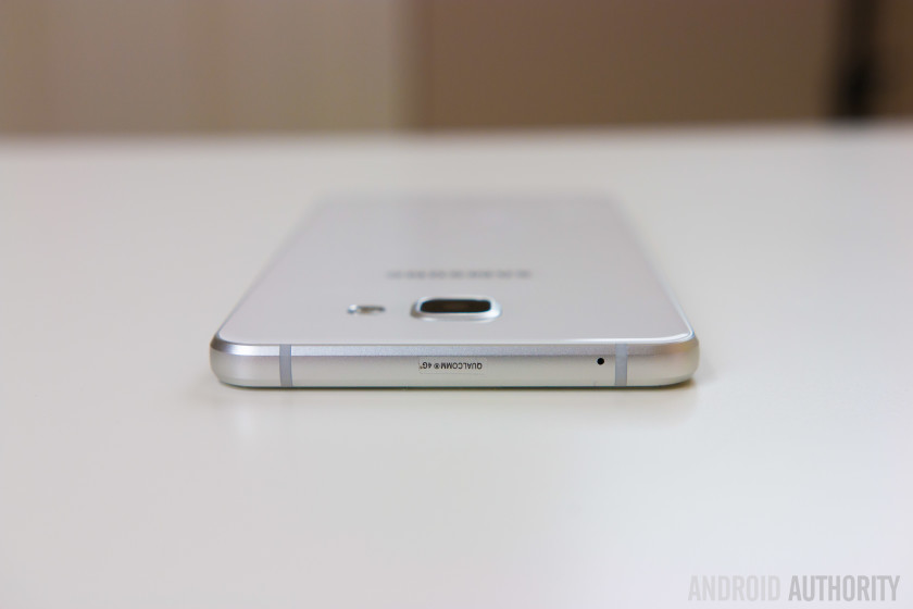
In terms of design and build quality, what the Samsung Galaxy A7 is essentially is a overgrown Galaxy S6, with the former featuring a similar design language and identical construction as the latter. Other than the size, the Galaxy A7 is a little more angular in its shape as well, with less rounded corners, but there is definitely an element of familiarity to it. The Galaxy A7 may not pack as much when it comes to power and features when compared to its flagship counterpart, but you do certainly get the look and feel of a premium high-end phone here.

You’ve got glass panels on the front and back that are held together with a smooth, chamfered metal frame that rounds out along the top and bottom, but flattens out along the sides, as is also seen with the Galaxy S6. While the predominant presence of glass does make for a somewhat slippery device, the flat metal sides help a lot with the grip. Glass is also pretty atrocious when it comes to keeping fingerprints and smudges at bay, so you’ll have to make an effort to keep the device looking pristine, unless you pick up the white version, where these are not as noticeable.

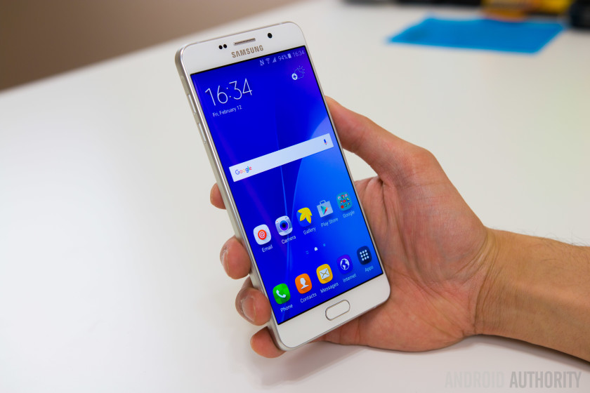
As expected, everything else is in its typical positions for a Samsung phone. The power button and volume rocker are to right and left respectively, and the metal-clad buttons offer a good amount of tactile feedback. With the Galaxy A7 being a touch more budget-friendly, it is not surprising that some flagship features, like the heart rate monitor on the back, are missing. However, you do get a fingerprint scanner here, once again integrated into the physical home button up front, which is flanked by the capacitive back and Recent Apps keys. At the bottom is the headphone jack, the microUSB port, and the single speaker unit.
With its 5.5-inch display, the Galaxy A7 is a decently-sized smartphone, and if you are switching from another device with a similar screen size, you’ll feel right at home with the Galaxy A7 in your hand. Samsung has also done a great job with keeping the bezels along the sides of the display very thin, and along with its thin profile, one-handed use with the Galaxy A7 is a lot more comfortable that what you’d expect. With a weight of 172 grams, the Galaxy A7 is also on the heavier side, and allows for a solid and substantial feel while holding the device, making the slippery glass backing less of a worry.
Display

The Galaxy A7 comes with a 5.5-inch Super AMOLED display, with a 1920 x 1080 resolution, resulting in a pixel density of 401 ppi. Quad HD may be considered the new standard, but Full HD more than just gets the job done, with Super AMOLED also playing its part in creating a great viewing experience. Everything from saturated, punchy colors, to the deep inky blacks are seen here, along with good viewing angles and brightness that allows for comfortable outdoor visibility. Web browsing, reading text, watching videos, or playing games are all very enjoyable on this screen, and you certainly won’t find yourself missing a higher resolution.
Performance

Under the hood, this version of the Galaxy A7 comes with an octa-core Qualcomm Snapdragon 615 processor, clocked at 1.5 GHz, and backed by the Adreno 405 GPU and 3 GB of RAM, but depending on the market, there is also an iteration that is powered by the octa-core Exynos 7580 processor, and backed by the Mali-T720MP2 GPU. In the case of this Snapdragon-powered review unit, the performance has been what you’d expect from this processing package, which has been the 2015 mid-range standard.
It runs reasonably well for the most part, and handles everything from web-browsing to multi-tasking, and even graphically-intensive gaming, perfectly well. However, there are occasional instances of animation stutter throughout the interface. It is very noticeable when it does happen, and the lag is almost always seen when moving from the Flipboard second screen to the main homescreen. Granted the latter is an issue with the high-end Samsung devices as well, but with the slower chipset in play here, the stutter is far more apparent. Some sluggishness is also seen when scrolling the pages and elements of certain apps, such as Snapchat.
Hardware
16 GB of on-board storage is the only option available here, but luckily, Samsung decided to bring expandable storage back into the fold with the Galaxy A series, allowing for an additional storage capability via microSD card by up to 128 GB. Some versions of the device, depending on the market, also come with dual-SIM capabilities, in which case the secondary SIM slot is what serves as the microSD card slot. In the single SIM versions of the phone, a dedicated microSD card slot is to be found.

As mentioned, the Galaxy A7 comes with a fingerprint scanner that is integrated into the tactile home button up front. This is the same implementation as seen with the Galaxy Note 5 and the Galaxy S6 before it, and works well. The setup process is a little longer when compared to some competing devices out there, but once you’re ready to go, the scanner is reliable, accurate, and generally pretty fast at unlocking the phone. Apart from unlocking the device, the fingerprint reader also sees its advantage when being used with Samsung Pay.

The single speaker unit is found at the same position at the bottom, as is the case with its flagship counterparts, and offers a similar sound quality. While the speaker gets decently loud and produces a clean and clear sound without any distortion even at higher volumes, you are of course, not getting the quality that is available with dual front-facing speaker setups.

The Galaxy A7 comes with a standard suite of connectivity options, including NFC. However, as far as network connectivity is concerned, there are quite a few versions of the device floating around, but unfortunately, none of them are intended for the US market, which means that you’ll have a hard time getting any sort of 4G LTE connectivity with the Galaxy A7. HSPA+ does get the job done, but for those that definitely want LTE in the US, this smartphone will unfortunately fall out of consideration.
Moving on to the battery, the Galaxy A7 comes with a large 3,300 mAh unit that provides a battery life that has been extremely good. With normal usage, the device comfortably lasted through a full day of use, and more often than not, survived an additional half a day as well. The screen-on time has been easily surpassing the 4 hour mark, and has been around 5 hours on most days. Wireless charging may not be available, but the Galaxy A7 does come with fast charging capabilities, which is useful when needing to quickly recharge a battery of this size. The Galaxy S6 has been plagued with battery life issues, but seeing as to how Samsung seems to have figured this aspect out with the Galaxy A series, is hopefully a pre-cursor for what we can expect with the upcoming Galaxy S7.
Camera

One of the biggest complaints with Samsung’s high-end offerings last year was the camera bulge, and while it hasn’t been completely eliminated with the Galaxy A7, the protrusion of the camera lens is significantly smaller this time around, and from an aesthetics standpoint, it definitely looks a lot cleaner.

The Galaxy A7 comes with a 13 MP rear camera with a f/1.9 aperture and optical image stabilization, but as you’d expect the camera experience doesn’t quite live up to what you’ll find on Samsung’s flagship devices. The camera doesn’t come with video recording capabilities in 4K, there is no Youtube live streaming feature, as well as no HDR Auto. The HDR toggle on the main camera interface is also missing, which makes switching between Auto mode and HDR and little more cumbersome than I’d like. What is retained, however, is the ability to quickly launch the camera with a simple double tap of the home button, a feature that was first introduced with the Galaxy S6.

As far as image quality is concerned, the shots possible with the Galaxy A7 are unfortunately mediocre at best. You can get some good looking photos in the right lighting conditions, but even when the environment is too bright, you will see a lot of overblown highlights and crushed shadows. The Galaxy A7 also seems to lack the typical Samsung post processing that results in vibrant colors and sharpness, making for images that appear quite dull. HDR mode does provide a more balanced shot and adds a slight boost to the colors, but without HDR Auto, you will have to remember to switch to HDR mode every time the camera is launched.
You will also see a lot of noise creeping in to the shots in medium to low light situations. Details begin to look extremely soft, colors are lacking, and you are still getting the overblown highlights that are seen in pictures taken in bright conditions. The camera of the Galaxy A7 is one that will get the job done, but is far cry from what Samsung has shown themselves to be capable of.

Software

On the software side of things, the Galaxy A7 is running Android 5.1.1 Lollipop out of the box, with the latest version of TouchWiz on top. While it is disappointing to see Android 6.0 Marshmallow not available on a device launched in 2016, a planned upgrade to the latest version of Android is in the works, and should make its way over shortly. This is the newer version of TouchWiz with the squarish circle icons, as seen with the Galaxy Note 5, and personally the look I prefer. The general look and feel of TouchWiz remains largely the same though, and the software experience is pretty much identical to what is available with something like the Galaxy S6.

Multi-window is available to cover all your split screen multi-tasking needs, there are useful motion gestures included, such as the swiping your palm over the screen to take a screenshot, a one-handed mode can be activated by a triple tap of the home button, and finally, the robust theme store is also found this time around. The theme store remains one of the best additions to the TouchWiz UI, and with numerous themes to choose from, you can easily cater the look and feel of the UI to your liking.


Specifications
Gallery

Pricing and final thoughts
The Galaxy A7 hasn’t officially been launched in the US, but can be found on eBay from anywhere in the $400 – $500 range, depending on your preference of color, with a choice between gold, pink, white, and black.
So there you have it for this closer look at the Samsung Galaxy A7! The Galaxy A7 certainly falls towards the higher-end of the “budget-friendly” spectrum, especially if you are trying to import it to the US. At this price range, a lot of other great options are available as well, including devices like the OnePlus X, Nexus 5X, the Moto X Pure Edition, honor 5X, and for a little extra, even the Nexus 6P. Not only will you potentially getting a device that is more powerful with these choices, but also one that will allow for full 4G LTE connectivity in the states.
For those considering picking up the device in other markets, the Galaxy A7 is a solid smartphone that brings a lot of flagship features to a more affordable package. From its premium design and build quality, to the availability of a fingerprint reader, the Galaxy A7 does tick the right boxes, but it is certainly far from a bargain. Considering how much the budget smartphone landscape has changed in just a short period of time, Samsung may have to reconsider a few things in order to allow the Galaxy A7 a fighting chance.
Buy now from eBay
Next: Samsung Galaxy S7 rumor roundup
Nextbit Robin Review
Crowdfunding isn’t a new concept and while many projects do fail to see the light of day, just occasionally, we’re treated to a project that has the potential to alter the way we use technology. The problem of limited storage is one that affects the growing number of devices that launch without microSD card expansion, but American company Nextbit has a unique solution to this growing problem with its Nextbit Robin smartphone.
Harnessing the power of the cloud, Nextbit’s first smartphone aims to supercharge the smartphone experience using smart cloud-based storage, which intelligently, and automatically, backs up your photos and apps to the cloud. When the company first launched on Kickstarter, many may have thought this was a dreamy concept that wouldn’t see the light of day, but several months later, the Robin is almost ready to jet into your pocket.
With over $1.3 million in backing on Kickstarter and a leadership team that has considerable mobile pedigree – including Scott Croyle, the former SVP of design at HTC and Tom Moss of Google – the Nextbit Robin has many ingredients for success. However, does it deliver and is cloud storage really the solution to a lack of storage? Let’s find out in this, our Nextbit Robin review.
As with the Mate 8 review last month, we have two reviews of the Nextbit Robin: above, you can see Josh’s video review of the smartphone, and below, you’ll find Nirave’s written review of the smartphone.
Design

In an industry of seemingly-homogeneous devices, the Nextbit Robin stands out from the crowd, despite being a throw back to older smartphones that were nothing more than rectangular slabs. Yet, with the industry widely adopting curved front and/or reader displays, the rectangular design of the Robin actually feels refreshing and there’s no denying that it’s unlike any other smartphone.
Since we first went hands on with an early unit of the Robin back in September last year, Josh and I have been waiting to experience the phone in all its glory, and for good reason: from the design to the cloud storage, the Robin is the most unique devices on the market, and both of us really like the design. As Josh puts it:
It’s very rare that you find a device that’s incredibly unapologetic about its design.
Opting for the flat rectangular shape has also allowed Nextbit to be quite clever in the design of individual elements; from the size of the bezels above and below the display (more on this later) to the front and back cameras and the speakers, all the individual elements are perfectly symmetrical to one another; the bezels are the same size and colour; the speakers are exactly placed; the cameras are exactly the same size and distance from the edge of the phone and the USB Type C port is perfectly in line with the headphone jack.
For a rectangular device, the symmetry makes the phone surprisingly pleasing to look at and the circular elements contrast the rectangular design perfectly. Aside from the power button, the SIM tray and the USB Type C port, all the other elements on the Robin are circular, which continues through to the OS as well.

Bezels are a necessity on almost all smartphones as they serve to hide the complex mesh of wiring, connectors and transistors that are packed tightly underneath them, but Nextbit have – quite cleverly – use circular elements to make the considerable size of the bezels more forgiving. For example, the company could have opted for more traditional shaped speakers, but by opting for circular speaker grilles, the bezel somehow feels a lot smaller.
One benefit to the rectangular and flat design is the graspability of the phone; whereas current smartphone designs that adopt curved sides can be quite difficult to grasp, the flat sides of the Robin makes the smartphone easy to pinch and hold. Furthermore, while some may make claims that a curved back is more ergonomically friendly in the hand, the flat design of the Robin refutes this.

There’s a lot to like about the design of the Robin but there are a few areas that takes adjusting to. One of these is the location of the USB Type C port, which is offset to the left of the bottom of the phone and means gripping the phone is extremely difficult when it’s on charge. While the software goes some way to solving this by allowing you to use it upside down – unless you’re on the home screen that is – it’s near on impossible to comfortably grip if you have the charger and headphones plugged in at the same time.
On the left of the Robin is the two circular volume keys that are recessed enough to provide solid tactile feedback, while on the right is the dipped power button, which also houses the fingerprint sensor. The design of this is similar to that found on Sony’s latest Xperia Z5 range, but the button is more dipped, meaning you have to press it down further than you might have first thought.

On the back of the Robin is the circular camera elements alongside a rather nifty cloud logo, which has LED lights underneath that light up when the Robin is connected to the cloud; it’s a cool design feature that makes the Robin feel ever more unique. The back is made of plastic but, as we’ll touch on later, it can get as hot as a metal smartphone does; that being said, the phone feels sturdy and quite comfortable in the hand.
As you can see by the plethora of images used in this review, the unique identity of the Robin is also largely down to the colour scheme; rather than the more-traditional black and white colours we see on other smartphones, the Robin is available in this rather quirky mint colour. This is also where Josh and I agree and disagree; while Josh prefers the midnight colour, I rather quite like the Electric Blue version, which is exclusive to those who backed the Robin on Kickstarter. Both of us agree that, while the mint colour is certainly unique and quite nice, the other colour options are more likely to appeal to you and, when questioned, Josh’s brother had no hesitation is saying the midnight colour was the one to buy.

Despite a few elements that do take adjusting to, there’s no denying that the Nextbit Robin is a striking smartphone in every sense of the word and, in a world full of devices that blend together – much like the clouds in the sky – the Robin certainly stands out. HTC have a considerable pedigree in making stylish smartphones and now – no doubt thanks to the influence of Scott Croyle – Nextbit does as well. If there’s one area that Josh and I definitely agree, it’s that the Nextbit Robin is one of the nicest smartphone designs we’ve used in many years.
Display

In between the bezels on the front, the Nextbit Robin has a 5.2-inch Full HD IPS display, which is acceptable given the price tag. Full HD has become the standard for affordable flagship devices and the Robin’s display is on par with the current crop of Full HD devices at the same size.
In actual usage, the display proves to be satisfactory, but not amazing. When testing the display in the Arizona sun, Josh found that the display remained legible when the phone was set to full brightness, which is somewhat surprising as other devices do struggle in direct light. Many of you may be contemplating whether QHD would have been a better choice to make the Robin stand out more from other affordable flagships, and while it would have helped, it’s unlikely the phone would have remained as affordable.
As Josh eloquently puts it, the display is absolutely fine and – when you have the right expectations of it (remembering that it’s a device that costs $349) – the display is actually great. If you’re coming from a more expensive device that has QHD resolution, you might find yourself a tad disappointed, but for the most part, the display on the Robin is certainly more than acceptable for an affordable flagship at this price.
Software

Aside from its unique design, the Nextbit Robin truly stands out from the rest of the smartphone market thanks to its unique selling point; the innovative cloud-based smart storage provided by the Nextbit cloud. However, before you rush to buy the Robin, it’s worth keeping in mind that this isn’t cloud storage in the traditional sense, and the experience vastly differs from cloud backup solutions such as Google Drive or Dropbox.
Why it differs so vastly is solely down to the implementation of cloud storage into the OS; while the Robin does run stock Android in its entirety, Nextbit’s Smart Storage features have been baked directly into the OS so it’s able to intelligently manage your storage. To do this, the Robin automatically offloads the apps and photos you’re not using to the cloud when your smartphone is running out of space, but this comes with its own set of issues.

For example, when we received our Robin smartphones, they had been set up as if they had been used for many months as it showed the smart storage in action. However, when you use the phone from new (or after a reset), and subsequently run out of space (if, for example you take thousands of images when travelling for a week), the smart storage features won’t offload any apps or photos as you’ve only just taken / installed them.
Furthermore, there’s no way to force a backup to the cloud as you, the user, have no control over the cloud storage feature. This is where many users are likely to be left disappointed and both of us are no different; the key selling point behind the Robin is the cloud storage feature, but as the user has no control over the storage – whether it’s being able to force a backup or use the storage as you see fit – the cloud features do leave you wanting.

With that being said, the smart storage features do have the potential to be incredibly useful. For the average consumer, who keeps a smartphone for two to three years, the cloud backup will come in handy after around 12 to 18 months, when you’ve filled up the phone and the lack of storage is becoming an issue. In its current state, it’s unlikely you’ll use the smart storage features too often in the first 12 to 18 months but with a simple tweak to the experience, Nextbit could make the Robin truly stand out.
What should Nextbit do? It’s simple; give users access and greater control over the cloud storage, whether it’s allowing them to force a backup or even use it as traditional cloud storage (like Google Drive). How could Nextbit do this without having to put considerable resources into building it into the next update? Josh has the perfect solution; build an app, ask users to login with their Nextbit account (which you have to sign up for to use the smart storage features) and you can manage all the cloud features from there. Will this happen? At the moment, it’s unknown but we honestly believe they’ll adopt this approach by the end of this year.

The cloud storage features may be a key selling point but what about the rest of the Nextbit software experience? For the most part, the company has stuck to stock Android, which is unsurprising as Mike Chan, the co-founder and CTO at Nextbit, was a software engineer at Google and worked on Android from its inception until Android 3.0 Honeycomb.
The changes to stock Android are minimal and mostly visual, with the key changes being the colour set and the launcher adopted by Nextbit. The company’s launcher is key to the cloud storage experience as apps that have been offloaded to the cloud are represented by a grayed out icon and restoring an app is as simple as tapping on it (although, there’s no way to offload a particular app or an app you’ve restored by accident). The launcher also supports pinned apps, which will never be offloaded to the cloud and there’s also an omnipresent menu button, which gives you quick access to various lists: your pinned apps, apps that you have archived to the cloud and all your apps.

You might be asking why you’d need a list for all your apps and the answer is somewhat simple; the Nextbit launcher comes without the app drawer found in the traditional Android experience. What is good however, is that if you choose to change the launcher to one of the excellent third-party launchers available, icons for archived apps are still grayed out and you’re still able to restore apps with a single click. This is crucial as – at least while running Nova launcher – you get the benefit of the smart storage features without being bound to Nextbit’s launcher. For those who do use the Nextbit launcher, you can easily pin an app by swiping down on it and we’d like to see Nextbit add the option to swipe up on an app to offload it to the cloud, as the ability to force a back up would really improve the smart storage experience.
There’s a particularly good reason you might choose to use an alternative launcher and that is the colour scheme used by Nextbit. The company has clearly attempted to make an ethereal experience using light colours and for the most part, the experience is mostly positive.


That being said however, there are a few areas that Josh and I agree could be improved; in particular, the notification menu is a light grey and semi-translucent colour that looks sloppy, especially when used in a light app. The translucency of the notification menu is quite nice when used in an app with dark colours, but the experience is strange when you pull the notification menu down while using an app that has predominantly light colours.
Despite a few changes to colour scheme, the Robin is stock in almost all its entirety and if you’re used to stock Android, you’ll find the Robin easy to use. I’m personally not a fan of stock Android, but the Robin feels like a smarter version of stock Android and is surprisingly enjoyable to use.
Camera

On paper, the 13MP camera on the back of the Robin should be average at best but the company has really surprised us with the quality of this camera. The sensor itself is the same one used by Samsung in the Galaxy Note 4 and, although it doesn’t have all the features included in the Note 4, the camera is certainly impressive.
The Robin’s camera comes equipped with Phase Detection Auto Focus and f/2.2 aperture and most images captured are usually quite vibrant and, despite the lack of optical image stabilisation, low light performance is much better than expected. It’s not without its flaws however, as as there is a fair amount of noise reduction happening in post-processing meaning images aren’t the sharpest on the market and in particular, noise is apparent when zooming into a particular image.

By far the biggest disappointment with the camera is the camera app itself, which is bare and leaves us wanting more. Firstly, this build of the Robin is lacking in camera modes, including panorama mode, which Nextbit say will be available in the next software update. Both, Josh and I, have also found that the camera app is rather slow with a noticeable lag when taking an image; when taking a normal image, the Robin takes between half a second and a second to take the image, while there is 2-4 seconds lag when capturing a HDR image.
That being said, the camera app does come with a few modes and by far, the most interesting of these are the HDR and manual modes. When capturing a HDR image, the Robin does well to brighten the image with less shadows, but it does fail to have an effect on blown out areas of the image.
Below you’ll see the effect of HDR on the Robin, with images on the left captured without HDR and the ones on the right, captured with HDR.


The other mode that you may use quite often is manual mode, which is nice but is not a true manual mode. For example, the first setting Josh changes in manual mode is shutter speed but this option isn’t available on the Robin. Furthermore, the white balance options are presets – such as cloudy, daylight, incandescent etc – and there’s no option to configure the white balance to a particular Kelvin figure. With that being said, the manual mode is really well designed as – if you’re holding the phone with two hands – the various settings load next to your left hand and, once selected, the control sliders load next to your right hand.
Overall, the camera is certainly impressive on the Robin and despite a few flaws, it’s actually rather impressive. From an affordable flagship that costs $349, you could be forgiven for expecting a less-than-stellar experience, but the camera on the Nextbit Robin is a pleasant surprise and is a lot better than it actually should be.

Performance & Hardware
Under the hood, the Nextbit Robin is certainly on par with most smartphones at the same price (and several that are more expensive as well). It’s powered by a Snapdragon 808 processor with Adreno 418 GPU, 3GB RAM and 32GB storage, and the performance of the Robin mostly lives up to the powerful internals it possesses.
On the software side, Josh and I haven’t found the handset to slow down and mostly, the performance is above average and definitely more than acceptable for an affordable flagship. The Robin does have the half-step of lag that is found on other Snapdragon 808 devices but, unlike the Nexus 5X, 3GB RAM does serve to make the experience almost-always snappy and responsive.

However, there are a few areas of performance that the Robin leaves us wanting; in particular, the heat management. I’ve personally found the handset can warm up considerably, and on one occasion, it even overheated to the point I wasn’t able to hold the phone without it burning my hand. Granted, this was while the phone was plugged in to a charger, the phone was running low and was trying to offload apps to the cloud while also downloading new apps from Google Play, but it was a major concern.
As covered earlier, the smart storage features don’t work as you expect them to and the actual performance of the automatic backup does seem to be a little hit and miss. It’s worth noting that Josh and I agree that it will take a while for you to fill the internal storage before you need to rely on the smart storage features, and it’s quite likely the cloud backup will be vastly improved by then.


Alongside the impressive hardware, the Robin also comes with NFC, which is missing from other smartphones at a similar price, and can be used with Android Pay that comes preloaded on the phone. It’s worth noting however, that when I tried to set up Android Pay, the Google authentication failed to recognise the Robin as an Android smartphone and, while this is should be simple enough to fix, it’s not currently possible to configure Android Pay on the Nextbit Robin.
By far the most surprising part of the Nextbit Robin is the dual front facing stereo speakers, which are absolutely fantastic and some of the loudest speakers on the market. HTC’s BoomSound feature is known for leading the way in terms of audio quality and the Robin does seem to imbibe the quality of these speakers. As an example, Josh was able to watch a YouTube video in a crowded restaurant and hear the audio clearly, with no issues at all.

Overall, the Robin features some impressive hardware that, while being older compared to the new chipsets of 2016, does offer a flagship experience. The company certainly needs to improve its smart storage features and implementation, but for the most part, the Nextbit Robin delivers an experience that is worthy of most flagship devices.
Battery Life
The area that the Robin most disappoints us is the battery life; under the hood, the Nextbit Robin is powered by a 2680mAh battery, which, coupled with Doze Mode in Marshmallow, should offer ample power for a full day’s usage. In actual practice however, the Robin does fail to deliver in the battery department.
Although the battery isn’t a 3000mAh unit like many other smartphones, there is the expectation that it will last a full day but it does struggle to do so. While testing the Robin in the Arizona sun – which included taking lots of photos and the phone was constantly searching for coverage – Josh found the phone struggled to make it to the end of the day, with around 3 hours’ screen-on-time.

One of the best features in Marshmallow is doze mode, which is meant to offer vastly improved standby time and, as we found in the Nexus 6P during Best of Android last year, it can be very effective when implemented correctly. On the Nextbit Robin however, doze mode is very ineffective and in some of my testing, the standby battery time is worse than on Lollipop. During day to day usage, I’ve found the Robin battery can drain to almost empty in less than two days with very minimal usage and, on one occasion, I’ve even had it drop 35 percent in less than three hours with no use.
Throughout our testing, Josh and I agree that there is something preventing Doze mode from being effective and this is most likely due to something running in the background. Given the Robin runs almost-stock Android, it’s likely that the company’s smart storage features are preventing doze mode from being effective and it’s a shame, as the battery life on the Robin definitely leaves us wanting more.
In effect, the Robin is actually a smartphone that runs Marshmallow, but with the battery life of a smartphone running Lollipop.
Although the Nextbit Robin only has a 2680mAh battery, the presence of doze mode gave us hope that the battery would make it through a day but it certainly struggles to do so. If you’re someone who uses your phone even moderately, it’s likely you’ll need to keep a portable charger with you, as you’re likely to be searching for a power outlet by the end of the day. In effect, the Robin is actually a smartphone that runs Marshmallow, but with the battery life of a smartphone running Lollipop.
Gallery

Final Thoughts

The Nextbit Robin is definitely one of the most interesting smartphones ever made and if you’re looking for a smartphone that different in many ways, the Nextbit Robin definitely sets the standard. Every bit the smartphone that the LG Nexus 5X and the OnePlus 2 should have been, the Robin has its head in the clouds, for better or worse.
Rather than being the complete product, the Robin is definitely a dreamer’s phone in the sense that it shows the potential of cloud storage, but with some improvements needed in the implementation. Giving Nextbit the benefit of the doubt, the company did say the cloud storage features worked in a particular way and they’ve definitely achieved this, but it’s not enough o make the Robin a truly cloud-first smartphone. Luckily for them, when you look at the Robin phone-first, it’s pretty fantastic.
At the moment, it’s a nimbus cloud, but given time for the smart storage to evolve, it has the potential to become a cumulus cloud.
At the end of the day, the Nextbit Robin is a very unique phone, but with this, comes its own set of flaws: mainly, it’s a new concept that, while performs exactly as Nextbit said it will, definitely needs improving. At the moment, it’s a nimbus cloud, but given time for the smart storage to evolve, it has the potential to become a cumulus cloud.
At a cost of $349, the price makes sense for a phone that is – cloud storage aside – rather fantastic, but by if users had control over the 100GB storage (which is provided for free by Nextbit), the phone and its price would be an absolute steal. As an affordable flagship, the phone is great and with the right tweaks and improvements, it has the potential to be a truly remarkable smartphone.
How to turn off Google Chrome desktop notifications – CNET

Sarah Jacobsson Purewal/CNET
I recently decided to switch from Google Chrome to Mozilla Firefox. No reason, I just felt like it was time to mix it up. I started using Firefox as my main browser, but I kept Chrome installed and occasionally running.
A few days into the switch, I noticed that I was getting frequent Facebook notifications in the lower right corner of my screen — little pop-ups that were, quite frankly, very annoying. I went into Facebook to try to turn them off. No luck. I went into Windows 10’s Settings menu and Action Center to try to turn them off. Again…no luck. Where the heck were they coming from?
Ah. Google Chrome. Because Google Chrome notifications will never die, even when you’re not actively using the browser, apparently. (Just kidding, Google Chrome was set to run in the background on my PC — here’s how to stop that from happening.)
Here’s how to get rid of Google Chrome’s desktop notifications:

Sarah Jacobsson Purewal/CNET
1. Open Google Chrome and click the settings menu (three bars) in the upper right corner. Choose Settings from the drop-down menu.

Sarah Jacobsson Purewal/CNET
2. At the bottom of the screen, click Show advanced settings…

Sarah Jacobsson Purewal/CNET
3. Under Privacy click Content settings…

Sarah Jacobsson Purewal/CNET
4. A pop-up window will appear. Under Notifications, choose Do not allow any site to show notifications if you want to block all notifications.

Sarah Jacobsson Purewal/CNET
If you want to block a specific site’s notifications, click Manage exceptions…and find the site you want to block. Click the site to select it, and choose Block from the drop-down menu under the Behavior column.
5. Click Done to save your settings.
