


LG G5 Review: modular marvel or bold blunder?
2016 has so far been a year of impressive flagship phones with perhaps the most unique of the bunch being the LG G5. LG was coming off a year of success with two wonderful flagships (the G4 and V10) receiving rave reviews. Many speculated that the G5 would be a fusion of the two devices – stealing the most innovative features of the V10 but in a smaller, easier to handle body.
What we got was something completely different. As early as January, we brought you news that the G5 was going to have a metal unibody that pulled apart at the bottom and featured a removable battery. No one has ever tried this combination before and our interest was piqued. More news leaked about a “magic slot” that would allow users to expand the phone’s functionality with modules. This was truly something new and unique to the market. We’ve seen some of this functionality in beta devices from Project Ara (now named just Ara), but never in a consumer device.
What we got was controversial. Is it metal unibody? Sure is, but it doesn’t remotely feel like it. Does it have a “magic slot”? Yep, but how much it expands the functionality of the phone is debatable.
The G5 matches up in terms of specs with every other flagship on the market, but phones are more than a sum of its parts. What matters is how those chips and that silicon perform and how engaging and easy to understand the software is. LG has had issues with these areas in the past, and they’ve held LG back from challenging Samsung for supremacy in the Android market in the United States. Can the fifth iteration of the G series finally make the leap from also-ran to front-runner?
Software
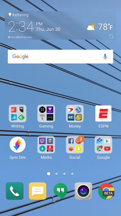
LG has always deployed one of the heaviest skins of any of the Android OEM’s currently producing flagship phones. This hasn’t changed for the LG G5. Actually, not much has changed from the LG G4’s software, to be honest. This year’s model does ship with the most recent version of Android 6.0.1 Marshmallow, but unless you were looking in the settings, you could be forgiven for not knowing that. There are little enhancements that Marshmallow brings present in the G5, but you’re going to get almost the exact same experience on last year’s G4.

The most notable change in LG’s software is removing the Application Drawer on the default launcher. I did receive an update during the review process that enabled a Home + App Drawer launcher, but for the first week or so, I was stuck without it since I wasn’t using a third-party home replacement like Nova Launcher.
Removing the Application Drawer is a bold move, and I honestly hated it. I have no idea what the purpose of such a move would be other than to be more like Apple. Throwing over 100 applications into folders and hoping I remember where I put them is not a fun experience. It doesn’t lend to finding an app quickly, which is very frustrating when you’re pressed for time.
I hope LG got this out of its system and never tries it again. If I wanted to put every application on my home screen, I could already do that. Forcing me to goes against what Android is all about: choice.
I miss the app drawer
1 of 3

Luckily when I was living an App Drawer-less life, there wasn’t too much bloat to worry about. I am using an unlocked, unbranded version so there are no carrier-installed applications on the phone, but the suite of apps from LG wasn’t excessive. I had no use for apps like LG Friends manager, LG Health, Music, Quick Help, QuickMemo+, QuickRemote, SmartWorld, Tasks, but they were quickly hidden in a folder that I could forget about on a distant home screen.
Kudos to LG for not loading down the device with uninstallable crap from third parties. Android OEMs like to sign commercial deals where they add apps like Yellow Pages or Facebook to the phone to drive up profits, and I like that LG hasn’t sunk to that level.
Another huge win for LG is the quality of life improvements they made to the software. The ability to customize the navigation bar at the bottom of the phone is just smart. Not only can you choose on which side of the home button you want the back and recent apps buttons to be located, but you can add buttons for the QuickMemo+ app and one to drop the notification shade so you don’t have to reach the top of the phone. This is one of my favorite little features on any Android phone out there. LG has been including these options in its phones for a while now, and I hope it continues until Android makes them irrelevant.
You can see Marshmallow poking its head through occasionally. LG decided to keep the stock recent apps screen basically completely stock – clear apps button included. There’s also an always-on display that LG talked about a lot at its Mobile World Congress press conference that shows the time and some notifications. It’s a nice feature that I appreciate, but it’s nothing I think should influence your buying decision. This feature is becoming standard on most phones these days – the Samsung Galaxy S7, Moto X, OnePlus 3, and Nexus 6P all have various forms of this – and the inclusion of an LCD screen means that the G5 has to keep the entire screen on for this always-on display. It’s not ideal in its implementation, and I honestly don’t miss it when I’m not using the G5.
The puzzling choices LG made continue past using an LCD panel for an always-on display. The Settings app is a complete mess. The tabbed layout is confusing and frustrating. There is a reason that most phones use a longer list layout, and LG needs to get the memo that it’s a superior option. In fact, if it could use the stock Android settings menu and just add in the options it needs, do that. Google has made it pretty easy on OEM’s by including a great Settings app in AOSP, and yet, they keep screwing it up somehow.
LG seems to put a lot of effort into its software to make it a true selling point. There are some great little features that no-one knows about like the phone composing a ringtone based on the number calling you. That’s not a feature that is going to make your life easier on a day-to-day basis, but it’s something innovative that people will love. It’s cute. I wish LG would focus on features like this instead of theming every inch of the OS with its own brand of color vomit. Stop messing with things that already work just to make them different.
Performance
The LG G5 has a Snapdragon 820 processor clocked at 2.15GHz with 4GB of RAM and an Adreno 530 GPU. This is the standard loadout for a flagship phone released in the first half of 2016, which includes the Samsung Galaxy S7, HTC 10, and LG G5.
As much as I complained about the software in the previous section, this set of hardware is easily able to power through it. LG had been notoriously bad about its home screens redrawing every time you hit the home button on the G4, but luckily I’ve never seen that happen in the several weeks I’ve spent with the G5.
There are no lags in long menus or the recent apps window and zero stutters when swiping through home screen pages. App loading times are on par with the Samsung Galaxy S7 Edge, with maybe the slightest advantage going to LG, but it’s nothing that you’ll notice unless you have the two phones sitting right next to each other.
Consecutive AnTuTu Benchmark runs
1 of 4
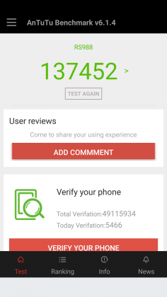

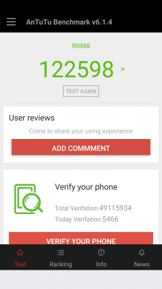

Since the G5 has a top of the line processor in it, expect it to power through extremely difficult tasks like 3D games and video editing. We’re living in 2016, and phones have gotten to the point where there is almost nothing you can throw at a flagship device that it can’t handle.
Benchmarks are always being blown up by the next generation of devices because of the giant leaps being made by companies like Qualcomm, and the G5 is no different. You can put it up against any device from last year and it’ll crush it. Will you see that performance gain in day-to-day use? The all depends on how you use your phone, but you shouldn’t be scared off from the G5 because you think something else can power through difficult tasks better. Everything is amazing these days.
Where you may run into some issues is with connecting to calls. I consistently had issues with phone calls taking forever to connect once I hit send. I am using T-Mobile in an excellent coverage area so there should be no issue. Tested next to other flagship devices, the LG G5 had significantly longer lag times between hitting the dial button and the phone beginning to ring. I don’t know where the issue is coming from. I think I can rule out T-Mobile because I tested it against other unlocked devices, but this just seems like a weird bug. Calls sound wonderful on both my end and the recipient once it actually connects, but I hope that LG is working on a fix for this because it was one of the most annoying issues that popped up while testing the G5.
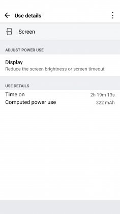
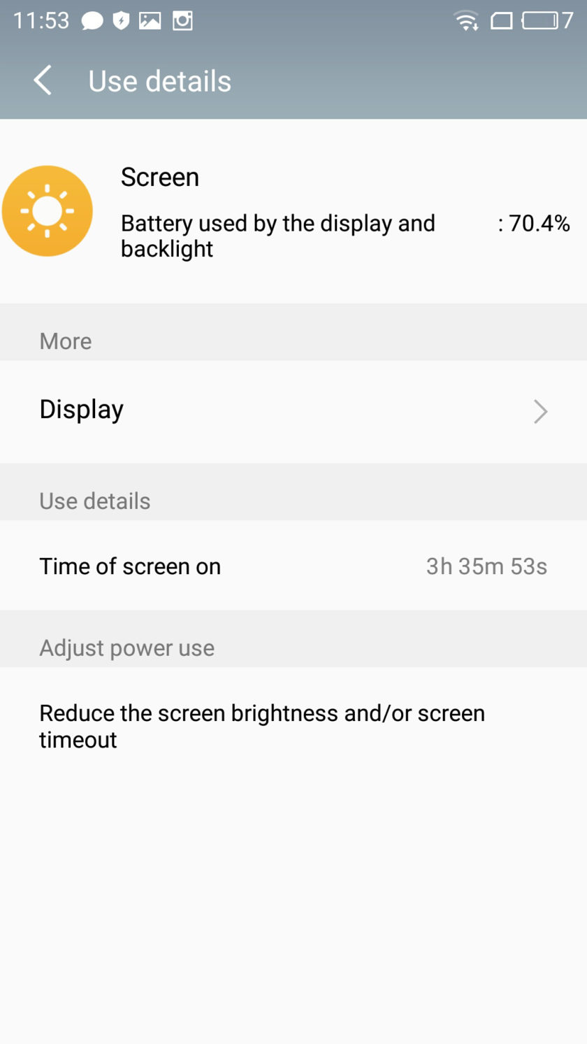
The G5 does have one thing that most phones of today don’t, a removable battery. I consistently applaud OEM’s for including removable batteries in their devices due to the demands consumers are putting on their phones. The 2800mAh battery is smaller than last year’s flagship and it shows in the life, unfortunately.
Time and again I had trouble passing three hours of Screen on Time. I’m not one who pushes my devices to the limit so those three hours were filled mostly with listening to music with Google Play Music, reading Reddit, and the occasional glimpse at Facebook along with the normal calling and texting. To say I was disappointed would be a bit of an understatement.
To engineer a device as forward thinking as the modular G5 to have it only have it held back by terrible battery life is frustrating. I used to have to charge my phone multiple times a day in 2014, I don’t expect to do so in 2016. At least I can trade out the battery or use quick charging around lunch to get through the rest of the day.
Screen on Time
1 of 4


Quick Charging really does save this phone. The G5 actually has the latest in Quick Charge 3.0 which will let you charge up your device about 60% in 30 minutes. If you get an hour for lunch and keep your phone on the charger while eating, you should be good to go for the rest of the day. It’s just disappointing how much I had to utilize this feature. You’ll notice the battery drop especially quick during intensive tasks like heavy games. During setup (installing all my applications and setting them up the way I want) the battery dropped from 78% to 16%. That is a pretty ridiculous drop for the little over an hour it took to get the phone up and running.
Screen
LG brings back another 2560 x 1440p display for the G5, which is now the standard for flagship phones in 2016. Whether you need all of those pixels is still being debated on message boards and in comments sections of reviews like this, but the truth of the matter is that we’re never going to go backward on resolution. It’s a selling point and people want the biggest and best, and higher numbers rule the day.
The fact of the matter is that the display on the G5 is nothing wonderful. Sure, it has a ton of pixels, but it does tend to skew blue and colors simply don’t pop like on Samsung devices. Samsung tends to over-saturate colors and has a superior contrast ratio due to using AMOLED displays, giving it a huge advantage.
The inclusion of an LCD display of the G5 is disappointing if I’m being honest. The always-on display begs for the battery friendly AMOLED display if nothing else. I think LG also overdid it with the auto-brightness again; this is an issue I’ve had with the G3, G4, and now the G5. It doesn’t matter how good the display looks if it’s never lit up high enough to actually see it clearly. Even at max brightness, the G5 cannot compete with other phones on the market.
While the display does have good viewing angles, we would like to see the ability to adjust the display levels and white balance through software. Unfortunately, it’s simply lacking from the phone. There’s also an issue of backlight bleed when the screen is dark that won’t bother you much, if at all, but is present.
Camera
The camera is much like the display, there are a lot of big numbers and plenty of fancy marketing lingo, but it doesn’t blow away its competitors like LG might have hoped. This year we got dual cameras: a wide-angle camera set to capture more of the world around you and a regular field-of-view camera meant to capture more true to life pictures.
The regular camera can shoot up to 16 MP, which is about standard for 2016, while the wide-angle camera sacrifices some megapixels (it tops out at 8MP) to gain the desired effect.

Both cameras are really good. They take comparable pictures to others on the market, but we’re getting to the point in mobile photography where almost everything is fine for what we end up using the pictures for, social media and sending picture messages. Is this my first choice for a camera on a phone? Nope, but it got the job done just fine.
1 of 2

Default Camera

Wide Angle Camera
The camera does tend to bring in lots of light. This is great for those low-light situations that tend to make up many pictures, but can have an adverse effect in well-lit pictures. Luckily, there is a robust manual mode that will let you decide exactly how bright you want the picture to be before you ever snap it.

Pictures provided by our own Josh Noriega. Check out his Flagship Phone Camera Shootout to see how the G5’s camera stacks up against the Samsung Galaxy S7 and HTC 10.
Hardware
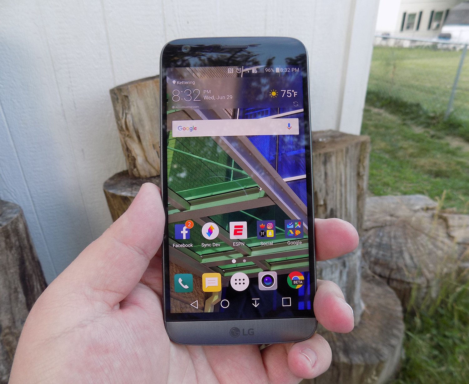
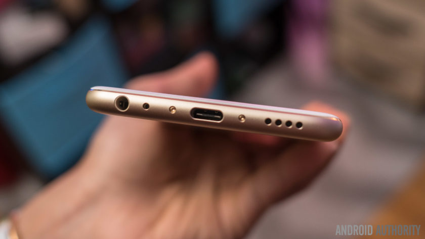
The body of the G5 is made out of metal. It doesn’t look like it, and it certainly doesn’t feel like it. There was a controversy when the phone first came out that most reviewers were calling out LG for not actually producing a metal phone.
It was eventually confirmed that LG has covered the body of the phone with a coating to hide the antennas and thus giving a false impression of the phone being made out of plastic. Whatever the reason for, it still doesn’t change the fact that it just doesn’t feel great in the hand. The size is good, but it doesn’t feel like metal, which is really what you want if you’re buying a metal phone.

We’re seeing a bit of a resurgence of phones that feature the microSD card. Both the HTC 10 and the Samsung Galaxy S7 feature the card slot, and LG follows suit with an expandable storage slot of its own. You can expand your storage up to 256GB, and even though adoptable storage isn’t enabled out of the box, it’s only an easy command prompt away.
Part of the advantage of being a modular phone is the removable battery that LG placed in the G5. The 2800mAh battery is smaller than competitors and previous LG flagships, and it shows. As I discussed previously, battery life isn’t great, but you can buy an extra battery to easily swap out when you get low.
Also, since the G5 features Quick Charge 3.0, you can get back about 60% of your battery in a half hour if you happen to be close to a wall outlet and have your charger on you. It’s not a perfect solution to sub-par battery life, but if I believe most people will get through the day on a single charge and a top-off before bed.
Audio output is a bit of a mixed bag. The bottom firing speaker isn’t great. It doesn’t get the loudest and can distort at higher volumes. If you’re often listening to YouTube videos or music in crowded places, you’re probably annoying other people anyway. If you’re using it for speaker phone, it should get you by.
The audio output from the 3.5mm jack is another story. It easily stacks up with the Samsung Galaxy S7 for best output on the market. It’s loud and puts out a quality sound. Props to LG here.

The last thing I want to touch on here is LG’s removable bottom and “Friends”. Having the ability to add in functionality is a great idea. I’ve never been so excited after a product press conference as I was after watching LG’s show at Mobile World Congress 2016. But I’m extremely disappointed in the practical usage of the phone.
The bottom of the phone slides slot, but there’s still a gap at the bottom. Not only that but on my unit, it doesn’t even line up correctly. There is a sharp edge where the phone should be flush, not to mention that the sides where the metal band meets the body is decently sharp too. It won’t hurt, but it is annoying.

I don’t believe LG’s Friends initiative provide enough functionality to justify the design choices it had to make. Right now, it’s a closed system with no real third party modules you can buy and everything that you can buy can easily be duplicated on other phones with different accessories. There’s nothing exclusive about the LG G5, and that’s a shame.
Conclusion
I’ve brought up a lot of negatives about the LG G5 in this review. Maybe I tend to skew toward the negatives because every phone is amazing these days. What really sets them apart is what they can’t do.
The LG G5 can do pretty much what every other phone on the market can do right now. It’s extremely fast and fluid, it takes fine pictures, you can expand the storage with low-cost storage, and charge up the battery incredibly quick.
Where I think LG took a huge misstep were the compromises they had to make for their modular body. Due to this design, it can’t be water resistant like the Samsung Galaxy S7, it doesn’t feel excellent like the hand like the HTC 10 and it isn’t cost efficient (likely to R&D costs) like the OnePlus 3. The functionality it adds is little more than a gimmick, and it gave up major selling points to do it.
Our thanks to B&H Photo for making this review possible!
OnePlus 3 review: King of the budget phones, but no heir to the flagship throne
OnePlus once touted itself as the “Flagship Killer,” offering top-spec’d phones at a budget price. With the first OnePlus device, they showed that they could swing with the big players, but were hampered by the oft-maligned invite system and poor marketing. The OnePlus 2 suffered a similar fate, coupled with some questionable design choices and average performance. Well, OnePlus seems to have found it’s groove with the OnePlus 3, a standout phone with flagship specs at a great price, and finally a invite-free purchase system that makes it much more available for everyone.
 OnePlus Three
The “Never Settle” mantra of OnePlus is on display here, as the OnePlus 3 features a 1080p AMOLED display, NFC, 3000mAh battery, a Snapdragon 820, USB-C and a whopping 6GB of RAM. It only has one storage option, 64GB, and features proprietary DASH rapid charging among other features. Certainly some impressive specs for a $399 phone, but how do they come together as a complete package?
Design
I immediately fell in love with the OnePlus 3’s design out of the box. Gone is the sandstone backing and overall cheaper feel to the build quality, replaced by a full-metal chassis and smooth curves, making it an absolute joy to hold. It has a premium feel in the hand comparable to that of an HTC device, which it seemingly borrows a lot of design cues from. Of all the OnePlus devices, this one is by far the best looking.
The OnePlus 3
1 of 5


The camera bump makes the phone rest at a slight angle.
The rear of the device is simple and clean. Only a set of antenna lines and a prominent camera bump, housing the 16MP shooter, adorn the back panel coupled with the small shiny OnePlus logo just below. It is admittedly a bit slippery to hold without a case, but not as bad as I expected it to be. The back has a nice arched contour for fitting in the palm, and is so light and sleek that I’d feel bad hiding it in a case. The OnePlus 3 is very reminiscent of current flagship phones in regards to appearance, which can be either good or bad depending on your opinion. Some may miss the sandstone texture and it’s unique feel and grip, and luckily there is a case offering that material from OnePlus if you’re feeling nostalgic for the older design. Along with the sandstone case, there are a number of other stylish protection cases in material such as bamboo, rosewood, carbon fiber and black apricot finish.
The front of the device is no slouch either, with an attractive slab of Gorilla Glass 4 housing the 5.5 inch AMOLED screen, and the prominent capacitive fingerprint scanner front and center. The fingerprint scanner is amazingly fast, OnePlus claims faster than Apple’s Touch ID, with the phone waking up seemingly the instant I touched my phone to the scanner. It’s flanked on either side by OnePlus’ trademark optional capacitive buttons, which are now simple illuminated dots that disappear into the bezel after a few seconds. Bezels are very thin on the sides of the screen, but the top and bottom ones are a bit big for my tastes on a 5.5 inch phone.
The side panels, measuring a scant 7.35mm thick, house the power button and dual SIM tray on the right side, and the volume rockers and still-present mute toggle switch on the left. The button placement and feel are excellent, they are easily reachable and satisfyingly clicky and responsive. The notification toggle switch is nicely textured and feels solid, but I wish they had reversed the order, with full notifications on top and none on the bottom.
 The top of the phone is bare metal, but the bottom is one of my favorite parts of the design. It holds the headphone jack, USB-C port, and surprisingly loud speaker. The whole bottom subtly curves towards the back of the phone, and the speaker grill holes and USB port are chamfered, lending even more to the premium feel and look of the 3. As bottoms of phones go, this one is truly excellent.
Display
The display of the OnePlus 3 has been a point of contention in the smartphone community. It’s a 5.5 inch “Optic” AMOLED display with a 1920×1080 resolution, that’s 401 ppi for those interested. It is a very nice screen, and a definite upgrade from the OnePlus 2, but the lower resolution is a bit of a downer considering pretty much every other Android flagship hits the 2560×1440 QHD resolution. The colors and image quality are clear and crisp, and more than enough for the average user but coming down from a Nexus 6P and it’s massive QHD  display, it’s a noticeable difference that made me miss the extra resolution for YouTube and movie watching. I will say that the lower resolution display has done well for battery life. OnePlus has included some decent customizations to the display, including the “Optic” tuning and a color balance slider, so you can adjust the color tone yourself.
For most people, the OnePlus 3 screen is perfectly capable, but anyone coming off of a QHD display may be in for some disappointment.
Performance and Software
The OP3 and its 6GB of RAM made headlines prior to it’s launch, and rightfully so. 6GB is a ton of RAM for such a small device, but does it have an impact on performance? The answer is… maybe. The RAM coupled with the Snapdragon 820 chip make this phone lightning fast and super snappy, jumping between apps with ease, but even with all that power under the hood it’s nothing mindblowing in terms of day to day performance. Gaming on the OP3 was satisfying and smooth, and app load times were in the expected range. Oneplus did add some nice tweaks to multitasking, including a clear-all button and a “clean” button to halt all background processes and clear all that RAM. It’s definitely comparable to today’s flagships in terms of speed, but it certainly isn’t the top contender in that regard.
One downside of the OnePlus 3 is the lack of expandable storage or larger storage options. 64GB is fine for me, but I know a lot of people who live and die by the SD card. It is disappointing for sure, but certainly not a deal breaker. Also, connectivity issues have been cropping up for many OP3 users, including myself. Difficulty with LTE connectivity, rapidly switching from 3G to 4G to LTE, as well as issues with wi-fi calling on T-Mobile have made using the OnePlus 3 off of wi-fi a bit harrowing at times. However, the problems are not nearly as bad as they sound, and regular daily use has been stellar otherwise, with these connection problems only popping up once in awhile.
The custom Android Marshmallow ROM, Oxygen OS, is just as light as before and with some welcome stability and performance improvements. OnePlus still offers those wonderful  tweaks to the stock experience, like optional hardware or software buttons, night mode, screen-off gestures and more. In place of the Google Now page on the left-most screen, OnePlus introduces the Shelf. The Shelf holds a place for widgets, recent apps, and a quick memo section for easy note taking. I initially avoided using the Shelf as I was so used to Google Now being there, but as I used the phone more and more I found it to be a welcome addition and very handy. Oxygen OS is easily one of the better ROMs for Android, being nearly as stock as a Nexus device but offering just enough customization and extra features to differentiate it.
Battery
Battery performance is very solid on the OP3. The 3000mAh battery and standard definition AMOLED screen do wonders for all-day use from 7 AM onwards, I rarely had to top off the battery with an average day’s usage. The phone does heat up a bit when under heavier use, but nothing too concerning so far. I was surprised at how well the OnePlus 3 stood up to my Nexus 6P with its larger battery, both managed to stay above 20% by the end of the day at 9 PM. OnePlus has done an admirable job of making sure users get the most out of the battery despite it’s pedestrian capacity.
Where OnePlus really shines is its DASH charging, a rebrand of Oppo’s VOOC charging technology. Using the included charger and cable, or any VOOC charger, the OP3 can get a full day’s charge, about 60-70%, in 15 minutes. It is mind boggling to plug in your phone and five minutes later see a 10-15% jump in battery life for the first time. Compared to the rapid charging on my Nexus, this was fast as hell and one of the best features of the OP3. It’s a shame that more chargers don’t support it, as I’d like to use a longer cord and still get the DASH results.
Camera
The camera on the OnePlus 3 is another area of merely average performance. The 16MP rear shooter is fine at all levels, but isn’t going to beat out the likes of Samsung when it comes to image quality. OIS is a nice touch, and shutter speed and focus are fast and responsive. Software-wise, the OnePlus camera app gets the job done, and has some nice manual options as well but the LG camera app from the V10 still has a bit of an edge in that regard. The front-facing 8MP camera is great for selfies, and works well. Snapchat users will have a great time using it to get those memorable snaps.
OnePlus 3 photo samples
1 of 4


Image quality has been satisfying on the OP3, especially in bright daylight. Low light pictures are fine, but the flash can be a bit aggressive if left on automatic, going off even in well lit areas causing a washed out image. I’m not generally a big phone photographer, so not the best judge of a camera, but the OnePlus 3 is certainly very good. Most people will have no issues at all taking some sweet photos.
Conclusion
Overall, the OnePlus 3 is an incredible deal at $399. You’d be hard pressed to find a more feature-packed device in this price range, with this few compromises. If I didn’t know better, I wouldn’t be able to tell that this was a device from a small Chinese offshoot brand at all. OnePlus should be commended on finally finding that perfect balance between specs, price, and design to make the OnePlus 3 a real hit. That being said, I still found myself drawn back to my 6P, for a few different reasons. The screen resolution and wifi calling issues are chief among them. The OnePlus 3 has all the element s to match or best the current crop of flagship devices from the likes of Samsung, LG, and HTC but if you’re currently using a 2015 or 2016 flagship device, the performance and specs aren’t enough to justify a swap unless you are a die hard OnePlus fan. If you are a budget conscious person, the price certainly crushed the competition and other phones in it’s price range just can’t compare. I would say that the OnePlus 3 is a excellent device, if maybe not as polished as it’s competition, but that doesn’t stop it from being one of best phones of 2016. The OnePlus 3 is king of the budget phones, and a great pick for those looking for an affordable phone that Never Settles for budget features.
Xiaomi Mi Max Review
Recently, several smartphone manufacturers have introduced extra-large smartphones, including the Samsung Galaxy A9, LeEco Le Max 2, and Huawei P8 Max. While flagship smartphones like the Samsung Galaxy S7 and HTC 10 have trended around 5.2″ for display size, Xiaomi has ignored this trend entirely for their first humongous smartphone: the Xiaomi Mi Max.
With a 6.44″ display, the Mi Max is much larger than what many would consider normal, and it definitely suggests that Xiaomi took the expression “go big or go home” quite literally. Interestingly, Xiaomi is positioning the Mi Max as an affordable mid-range device, one that won’t necessarily compete with LeEco’s phablet, but promises to still offer a great phablet experience.
Recent Xiaomi reviews:
- Xiaomi Mi 5 Review
- Xiaomi Mi 4S Review
- Xiaomi Redmi 3 Review
- Xiaomi Redmi Note 3 Review
So how well does the Mi Max deliver on that promise? Let’s find out with our written review of the Xiaomi Mi Max!
Buy the Xiaomi Mi Max now
Design
Typical: if I had to chose one word to describe the Mi Max’s design, it would definitely be typical. While there is nothing particularly exciting about the design here, I appreciate the Mi Max’s aluminum construction as it provides a premium look and feel. There’s also a few design aspects which make the Mi Max less difficult to hold such as its side tapers on the rear and the perfectly positioned power button and fingerprint reader.

While there are plastic caps on the top and bottom of the Mi Max, which presumably house necessary antennas, these caps are fairly continuous with the rest of the design, in both color and feel. With that said, they may be to blame for notable creaking noises while holding the phone and it’s very likely that they do not help with the phone’s weak structure.
Our Xiaomi Mi Max bends with merely a bit of pressure, an attribute which is remarkably disconcerting. After reviewing many Xiaomi smartphones with excellent build quality over the past few years (some half the price of the Mi Max), I found the Mi Max’s poor build quality to be shocking. Whether this will be an issue you for you will depend primarily on how you use the phone, and it is difficult to deny that this is a very considerable flaw with the device.
Many will detest the black border used around the display
The curved “2.5D” glass on the front of the Xiaomi Mi Max houses three illuminated capacitive keys, positioned in Xiaomi’s standard layout. The display’s side bezels are quite small, although many will detest the black border used around the display. It’s a shame that Xiaomi did not reconsider the use of the black border for the Mi Max, as it has been criticized with in the past when implemented in phones like the Xiaomi Mi 5.
Display

The extra-large 6.44″ 1080P display on the Xiaomi Mi Max places this phone well into phablet territory. When I fist started using the Mi Max, I had mostly mixed feelings. On the one hand, I immediately enjoyed the extra screen real estate for videos, but on the other, I worried how feasible it would be to use the Mi Max day-to-day. While it is possible to sometimes use the Mi Max with a single hand, it can get very uncomfortable very quickly. Once you are subconsciously accustomed to the Mi Max’s size, however, it seems much more normal in the hand. Still, its size does tend to make it slide out of many non-jean pockets, which is definitely annoying.
I immediately enjoyed the extra screen real estate for videos
Whether the extra-large size is the best fit for you will depend both on your usage and your willingness to change how you interact with your smartphone. For me, the transition to the Mi Max wasn’t difficult, but I will still be returning to my slightly smaller Nexus 6P, for its practicality.
The display itself looks pretty good; it has good viewing angles and accurate color reproduction. The 1080P resolution seems a bit low at this size, and I would have liked to see Quad HD, even if it meant for a slightly higher price. Sunlight readability could use some work, and while the reduced contrast sunlight mode does help, the screen on the Mi Max can still be difficult to read outdoors. With that said, kudos to Xiaomi for including Corning Gorilla Glass 4, something that we don’t often see at this price point.
Performance
The Qualcomm Snapdragon 652 processor strikes yet again in the Xiaomi Mi Max, and helps make the Mi Max performance comparable to phones with higher-end chips like the Snapdragon 808. MIUI, Xiaomi’s custom software, runs very smoothly on the Mi Max, and the base model’s 3 GB of RAM is generally enough for moderate-to-heavy multitasking. It is important to understand that there are different models available as well, although we do not imagine real-world performance differences between models to be significant.


I also had no trouble playing higher-end games like Asphalt 8, thanks to the phone’s Adreno 510 GPU.
Hardware
The Xiaomi Mi Max offers great call quality, and if you chose to use the device in an official market, you’ll receive 4G LTE speeds. However, if you’re in an unofficial market, like the United States, you’ll be limited to HSPA+ speeds on both AT&T and T-Mobile. That’s quite unfortunate, but it’s worth noting that the Mi Max is an unlocked dual-SIM device, and one of the SIM slots doubles as a microSD card expansion slot, allowing you to expand the phone’s storage up to 256 GB.

The fingerprint reader on the back of the Mi Max is accurate and, in my experience, just a hair faster than the one found on the Nexus 6P. That’s pretty good for the price, and many users will appreciate the added convenience when securing their phones.
What did strike me as odd was Xiaomi’s retreat to microUSB, the now outdated data and charging port standard. While some, like Samsung, have decided to allow USB Type-C to mature before implementing it, Xiaomi embraced it just months ago with phones like the Mi 5, so their inclusion of microUSB now feels like a step backwards more than anything else. With that said, microUSB may still be appealing to those who are still using the older standard and do not want to purchase brand new cables.
A side-firing speaker seems to be a nice compromise in this case
The single side-firing speaker on the Mi Max sounded pretty good in my testing, and sounded only slightly distorted at high volumes. While it would have been great to see front-facing speakers for an even more immersive media consumption experience, they would have likely added to the size of the phone. Therefore, a side-firing speaker seems to be a nice compromise in this case.
Battery Life
Battery life with the Mi Max was excellent in my testing, thanks to its very large 4850mAh non-removable battery. Screen on time did vary considerably depending on my usage. Primarily, I noticed that it did significantly better on Wi-Fi than it did cellular data, but even my heaviest usage was not enough to kill the Mi Max in a single day.


While it does support Qualcomm Quick Charge 3.0, Xiaomi has failed to include a Quick Charge 3.0 charger in the box. This was more acceptable even with the more expensive Mi 5, as the charge times still weren’t so bad even on Quick Charge 2.0. But with the Mi Max, the battery is much larger, and therefore takes about four hours to charge…on Quick Charge 2.0! Basically, a Quick Charge 3.0 charger is necessary here, and it’s a shame that Xiaomi is requiring users to purchase one separately.
 See also: Quick Charge 3.0 Explained31
Camera

The Xiaomi Mi Max is equipped with a very capable 16 MP f/2.0 rear camera with a dual-LED flash. After taking a closer look at the sample images, it seems that the Mi Max’s camera is one of the best we’ve seen at this price point. Images came out sharp and detailed with visually pleasing color reproduction and great dynamic range.
Autofocus is remarkably slow and finicky
The Mi Max’s camera is far from perfect, however. Autofocus is remarkably slow and finicky and, even when holding the device and subject still, the Mi Max would slightly miss focus more than what we normally expect. It also tended to oversharpen images, to the point of recognition in some images.

Just as is the case with virtually all sub-$250 smartphones, low-light is where the camera truly struggles. While it is possible to get a good image with the Mi Max in a darker environment, it simply can’t be counted out on like some other smartphone cameras can. That’s not a major flaw because of the phone’s price, but it is something to keep in mind.
MIUI’s camera app remains easy-to-use while also offering manual control for those who wish to take advantage of it. The built-in filters are nice to play around with, and the different modes like Panorama can be very helpful in some situations.
Software

Xiaomi has shipped the Mi Max with its own custom version of Android, MIUI 7. Although it is running on top of Android 6.0 Marshmallow, MIUI is a sharp departure from stock Android. And while I do generally enjoy using MIUI 7, I’m looking forward to the production release of MIUI 8, which will bring a great number of UI changes and improvements. At the time of writing, Xiaomi had just begun automatically rolling out MIUI 8 for those on the beta release channel. Normal users can expect the update in the coming weeks.
Since this phone is still shipping with MIUI 7, this part of the review will focus on the MIUI 7 software experience. MIUI has received a number of mixed reviews from Western media, with some criticizing it for being too similar to iOS, and with others praising it for the amount of polish and coherency it offers.

After using MIUI day-to-day myself, I think it’s a great alternative to stock Android, especially for users who wish to customize and tweak. The stock apps are well designed, the UI is remarkably responsive, and the ability to do things like restrict data for specific apps is invaluable. To top it off, the MIUI receives weekly updates, so you’ll be getting bug fixes and new features very often.
With all of that said, the software experience for those importing the device is far from perfect. Reseller loaded bloatware, a hellish bootloader unlocking process, and missing Google apps are major hurdles that importers will face. Even if you do get Google apps up and running with the installer app from the Mi App Store, there are still issues to be had. Random Google app crashes, Google Now issues, failure to place calls with Google Voice, and the inability to do things like consume DRM-protected content can make this experience less than ideal for Westerners.
Gallery

Price & Conclusion
You can purchase the Xiaomi Mi Max in a number of different models globally. Pricing starts at 1499 RMB in China, or about $228, but will pricing will vary based on region. Each model is available in either silver, gold, or dark grey.

The Mi Max is perhaps Xiaomi’s most interesting foray into a single smartphone sub-market. While it has undercut the competition in price, it has also cut corners in many areas, some more than others. The device’s cheap build quality, poor imported device software experience, and lack of U.S. availability are clearly disappointing attributes. But no smartphone is perfect, and the Mi Max has plenty to offer for the price. Its impressive camera, excellent battery life, and smooth performance are all great reasons to buy this phone.
Recent Xiaomi reviews:
- Xiaomi Mi 5 Review
- Xiaomi Mi 4S Review
- Xiaomi Redmi 3 Review
- Xiaomi Redmi Note 3 Review
If you are looking for a great extra-large smartphone on the cheap and can get past its quirks, the Xiaomi Mi Max is likely the best fit for you. With that said, similarly sized options like LeEco’s Le Max 2 are promising and, while they may be priced higher, they may also offer a much more refined experience overall.
It will be very interesting to see where this market heads in the near future. But, we want to know, would you switch to an extra-large smartphone? Let us know in the comment section below!
Buy the Xiaomi Mi Max now
Motorola Moto G4 Plus review
The original Moto G – released back in 2013 – was one of the first smartphones that kicked of the trend of affordable but high quality smartphones, and went on to become one of the best-selling Motorola smartphones ever. Motorola has continued to release a successor every year since then, but with a lot more OEMs offering options in this ever-growing category, Motorola did have to do something different with the forth generation of their affordable mid-range smartphone.
- Hands on with the Moto G4 and Moto G4 Plus
- Moto G4 Play announced
That something different arrived in the four of three variations of the latest Moto G, with the Moto G4 Play, the Moto G4, and the Moto G4 Plus, that come with varying display sizes, processing packages, camera setups, and other hardware features, with the latter being the highest-end of the lot. While more expensive when compared to its siblings, the Moto G4 Plus remains extremely affordable, and tacks on a few extras that ultimately make it far more compelling to users.
Buy the Moto G4 Plus now!
What does this device bring to the table? We find out, in this comprehensive Moto G4 Plus review!
Design
Unlike the flagship Moto Z, which features a dramatic departure from the norm, the new Moto G4 Plus retains a lot of the design language of its predecessors. There are a few minor aesthetic changes, but for the most part, the line of Moto G4 devices features a design that is largely reminiscent of previous Motorola smartphones.

The Moto G4 Plus comes with an all plastic build, and despite appearances, the frame is plastic, albeit with a metallic finish. Understandably, you don’t get the premium look and feel of a smartphone that features a metal or glass build, but for a phone made of plastic, the Moto G4 Plus is definitely one of the sturdiest ones out there. It doesn’t feel hollow, rattle, or creak in any way, and feels like a very solid phone overall. This is something that Motorola has always done a good job with, and its great to see this continue to be offered with the Moto G4 Plus.

On the back is the signature Motorola dimple, and the back cover has a nice texture to it, that helps a lot with the grip. However, the smooth finish of the sides does result in the phone being a touch slippery, but not enough to be a cause for concern. The back is also removable, and gives you access to the SIM card slot and the dedicated microSD card slot, with some versions of the device, depending on the market, also coming with dual SIM card slots. While the back cover is removable, the battery is not.

The power button and volume rocker are found on the right side. The power button comes with a textured pattern that makes it easy to differentiate from the volume rocker, but the button layout is unfortunately a little too high up on the chassis to be within comfortable reach. The power button should have also ideally been placed below the volume rocker, but that isn’t case, and requires a lot more effort to get to. The buttons don’t provide a lot of tactile feedback either, and you’re often left wondering whether you have actually pressed them, because of how they feel. The headphone jack and the microUSB port are at the top and bottom respectively.
Display

Unlike previous generations of the Moto G, the IPS LCD displays of the Moto G4 and Moto G4 Plus have been bumped up to 5.5-inches, with resolution getting a boost to Full HD as well, resulting in a pixel density of 401 ppi. That said, those who prefer a smaller size have the option of the Moto G4 Play, which comes with a 5-inch 720p display.
The larger display and higher resolution allows for a more enjoyable experience when reading text, watching videos, and playing games. It’s not the best Full HD display on a smartphone out there, but it certainly more than gets the job done. It looks sharp, with good viewing angles, and the display is vibrant enough for the colors to not appear washed out.
Performance

Under the hood, the Moto G4 Plus comes with an octa-core Qualcomm Snapdragon 617 processor, clocked at 1.5 GHz, and backed by the Adreno 405 GPU and 2 GB, 3 GB, or 4 GB of RAM, depending on which storage option you opt for. This particular review unit comes with 3 GB of RAM, and the performance has been pretty good.


You won’t see very impressive results when running benchmark tests, but as far as real world performance is concerned, everything has been fast and responsive. Apps launch quickly, multi-tasking is smooth, and the device can handle gaming without much of a hitch.
Hardware

The Moto G4 Plus is available with 16 GB, 32 GB, or 64 GB in built-in storage options, and as mentioned, this also dictates how much RAM you will be getting. There is also expandable storage via microSD card, up to an additional 256 GB. While there are versions of the device, depending on the market, that feature dual SIM capabilities, you will still get a dedicated microSD card slot, so the great news is that users won’t have to make the choice between dual SIM support and expandable storage, which is often the case with other affordable smartphones out there.

The Moto G4 Plus comes with a single front-facing speaker above the display, and is a part of the earpiece. There is no stereo sound to be had, but the single speaker does sound pretty good, and is capable of getting decently sound without sounding tinny or distorted.
Also up front is a fingerprint scanner placed below the display, and this is one of the extra hardware features that is available only with the Moto G4 Plus. The fingerprint sensor is as fast and accurate as expected, and is comparable in quality to the scanners found with more high-end smartphones as well.

It may sound a little nitpick-y, but it has to be mentioned that this scanner isn’t particularly attractive looking. The square shape clashes with the rounded and curved design of the Moto G4 Plus, and looks out of place. Another very minor issue is the fact that the sensor doesn’t double as a home button, and anyone who has used a device with a front-facing fingerprint scanner will find this something that takes some getting used to.
There is still no NFC available, which is unfortunate, and means that you won’t be able to use this device to quickly connect to Bluetooth speakers, transfer content, or use apps like Android Pay. Another point of note is that the Moto G4 Plus, and other devices in the line, aren’t water resistant anymore. While you will get some form of splash protection, that should keep it safe from a simple splash of water or a sprinkle of rain, these phones aren’t IP-certified, and will not survive being submerged in the water.

The Moto G4 Plus comes with a 3,000 mAh non-removable battery, which has become the standard size for a lot of current generation smartphones. The battery has been pretty good, and the device can provide a full day of use with average usage that involves sending and receiving messages, browsing the web, checking social media, watching a few videos and playing games for a little while.


With more intense usage, such as when playing a lot of games or taking a lot of pictures, the battery does run out pretty quickly though. However, the Moto G4 Plus does come with fast charging capabilities, so you will be able to get back to a full charge in a short amount of time.
Camera

The camera is another hardware feature that is better on the Moto G4 Plus when compared to the other devices in the Moto G4 series. The Moto G4 Plus comes with a 16 MP rear camera with a f/2.0 aperture, phase detection auto focus, and a laser auto focus system, along with a 5 MP front-facing shooter. However, there is no optical image stabilization available, which is unfortunate.

The Motorola camera app has also been improved significantly, with there being a shutter button now that makes taking pictures with one hand easier, and the app in general is simpler and easier to use. A swipe from the left side opens up a menu for basic camera settings, and a button on the upper right corner lets you quickly switch between photo and video, along with a few other modes like panorama and slow motion video. The most notable change with the camera app is the addition of a manual mode, which is something that was definitely long overdue.
As far as picture quality is concerned, it is actually surprisingly really good. Granted, it’s not going to stack up favorably against the high-end Samsung and LG flagships out there, but for a device that is so inexpensive, the camera is certainly capable of taking some nice looking shots. In good lighting conditions, you get shots with plenty of detail and vibrant colors, and the images are sharp, without looking over sharpened.

Dynamic range isn’t the best, with the camera tending to crush shadows a little too much, but that is all taken care of with HDR. Using HDR mode tones down the shadows and highlights, and adds some more vibrancy to the image, without making it appear unnatural or fake.
In low-light conditions however, is where the camera falls apart extremely quickly. We expect some noise to be present in images taken in poorly-lit situations, but the grain is quite significant with the Moto G4 Plus. Highlights are also typically overexposed, there isn’t a lot of detail to be had, and the camera also has trouble finding a point of focus in low light.

If you’re looking for a really good low-light smartphone camera, the Moto G4 Plus is unfortunately not going to cut it, but in most other situations, this camera more than gets the job done. The 5 MP front-facing camera comes with a wide angle lens, and proves to be more than adequate to cover all your selfie taking needs.
Software

On the software side of things, the Moto G4 Plus is running Android 6.0.1 Marshmallow, and this is as close to stock Android as you can get without it being a Nexus smartphone. There is virtually no bloatware to be found, and the software package isn’t as packed with features as what may be found with the high-end Motorola offerings.
There are some features available though, such as Moto Actions, which lets you do things like turning the flashlight on with a chopping motion, flipping the phone over to silence it when it rings, or launching the camera with a twist of your wrist. A simpler version of Motorola’s ambient display feature is also available, but with there being no sensors on the front, it is entirely contingent on motion.

You can’t wave your hand over the display to wake up the phone, and it also doesn’t continuously pulsate to indicate notifications. The only time it lights up is when you take the phone out of your pocket or pick it up from a table, or when you initially receive a notification. Other than these Motorola features, the software package is entirely stock Android, and sometimes, a clean and simple experience is all you need to keep things smooth and snappy.
Specifications
| Display | 5.5-inch IPS LCD display with 1920 x 1080 resolution 401ppi |
| Processor | 1.5 GHz octa-core Qualcomm Snapdragon 617 |
| GPU | Adreno 405 |
| RAM | 2/3/4 GB |
| Storage | 16/32/64GB |
| MicroSD | Yes, up to 256 GB |
| Cameras | 16MP rear camera with f/2.0 aperture 5MP front camera with f/2.2 aperture |
| Fingerprint sensor | Yes |
| Battery | Non-removable 3000mAh battery |
| Software | Android 6.0.1 Marshmallow |
| Dimensions | 153 x 76.6 x 7.9-9.8mm 155g |
Gallery

Pricing and final thoughts
If the standard black or white options aren’t enough, the Moto G4 Plus can be customized using Moto Maker, that lets you choose between different back cover and accent colors, and allows you to add an engraving as well. That said, the availability of Moto Maker is dependent on the market.
The price and availability of the Moto G4 Plus in the US is still unknown, but in India, the 32 GB version (with 3 GB of RAM) is priced at Rs 14,999 (~$230), while the 16 GB iteration (with 2 GB of RAM) is priced at Rs 13,499 (~$207), and we can expect the pricing to be similar in the US as well.

So, there you have it for in-depth look at the Motorola Moto G4 Plus! The Moto G series has always been among the best bang for your buck smartphones around, and things remain the same, even with the technically more expensive Moto G4 Plus.
- Hands on with the Moto G4 and Moto G4 Plus
- Moto G4 Play announced
The Moto G was in desperate need for an upgrade though, and the changes Motorola has made to the display and camera make the Moto G4 Plus a very compelling option for those who are looking for a smartphone that falls in the sub-$250 category.
Buy the Moto G4 Plus now!
What do you think of the Moto G4 Plus and the improvements made vs previous Moto G smartphones, and do you plan to buy one? Let us know your views in the comments below!
ZTE Grand X Max 2 Review
Smartphone enthusiasts may know ZTE for its flagship Axon line, but ZTE has long delivered phones to the prepaid market in the United States. By offering a multitude of affordable yet functional smartphones on prepaid carriers such as Cricket Wireless, ZTE has become the most successful Chinese smartphone manufacturer in the US by a wide margin.
More ZTE content:
- ZTE Axon 7 hands on
- ZTE announces Z-Community Forums
- Nubia Z11 Mini announced
- Interview with ZTE at CES 2016
ZTE’s Grand X Max 2 is the latest of these smartphones, but is it worth it? Let’s find out in our ZTE Grand X Max 2 Review!
Buy the ZTE Grand X Max 2 now!
Design
In terms of design, the ZTE Grand X Max 2 is slightly reminiscent of the recently announced Axon 7, as it shares the same port and button locations as well as a subtle curve to help with handling. Instead of an aluminum unibody however, the Max 2 is composed of a glossy plastic rear cover fixed to a plastic band with a number of clips. ZTE’s material choices could be described as not unlike those from the three-year-old Samsung Galaxy S4.
Overall, the phone looks very nice with its blue color scheme and subtle pattern on the rear. Despite its larger form factor, the Grand X Max 2 feels quite nice in the hand. It seems that the phone doubles as a fingerprint magnet at times, but this is nearly inevitable with either a plastic or glass rear. Although plastic is generally more durable than glass, we noticed many scratches on our Max 2 review unit after only a week of use.

Our unit also suffered from an approximately one meter drop onto concrete, and, although the plastic rear fared well, the side band was easily chipped in several locations. Build quality seems about average for the price, so you may want to consider also purchasing a case, as accidents do happen.
The three illuminated capacitive keys at the bottom of the phone match Google’s standard layout out of the box (back-home-multitask), but can be reconfigured in the settings for users wishing to have the back button to the right.
The confusion associated with the indeterminately labeled buttons wears off surprisingly quickly
This is a great setting to have, and the confusion associated with the indeterminately labeled buttons wears off surprisingly quickly. Now if only every smartphone manufacturer gave users this option…
Display

The Max 2 proves itself worthy of the “Max” tag with its beautiful 6-inch 1080P display. That’s considerably larger than most smartphones currently on the market, and surpasses virtually every prepaid option. While the Max 2 seemed small to me at first after coming from the 6.44-inch Xiaomi Mi Max, the Grand X Max 2 can definitely be unwieldy, especially if you have smaller hands. The phone is narrow enough to make one-handed use somewhat comfortable, however, and if you’re considering the Max 2, you’ve likely already been sold on the more immersive media consumption experience.
All things considered, I was quite impressed with the Max 2’s display, as it is one of the best I have seen for less than $200. It has great color reproduction, very good contrast, just the right amount of saturation, and is reasonably readable outdoors.
Performance
Powered by Qualcomm’s Snapdragon 617 – the successor to last year’s Snapdragon 615 – the ZTE Grand X Max 2 offers fairly good performance. It’s not going to crush any benchmarks by any means, but, paired with 2 GB of RAM, should be enough for the majority of users. Day-to-day performance is still quite good too, and the phone rarely had any UI hiccups during my testing.


Outside of the several preloaded resource-light games, the Max 2 can struggle a bit with its ageing Adreno 405 GPU. Although demanding titles like Asphalt 8 are still very playable, they can take some extra time to load and may exhibit some minor frame drops during gameplay.
Hardware

The ZTE Grand X Max 2 includes everything you’d expect from a modern smartphone: 802.11n Wi-Fi, Bluetooth 4.1, and GPS are each on board. Call quality seemed to be excellent during my time with the Max 2 on the Cricket network. There’s also 16 GB of internal storage, which can be expanded with the phone’s microSD card slot, up to 64 GB.
It sadly lacks a fingerprint reader
Although the Max 2 adopts a Quick Charge 2.0-enabled USB Type-C port for charging and syncing, it sadly lacks a fingerprint reader, a feature which we are beginning to expect, even from budget phones. Its absence may not be a deal breaker for those upgrading from an older smartphone without a reader, but I would personally find it difficult to switch over entirely.
 Check this out: Best USB Type-C cables13
The Max 2’s single side-firing speaker sounds very good, with minor distortion at high volumes. It’s a bit above what I would expect at this price point, and will do the job when wanting to watch videos or casually listen to music. There is a Hi-Fi audio chipset on board as well, which will appeal to those wishing to use headphones.
After reviewing the results of four battery life tests, it seems that the Grand X Max 2’s battery life can vary significantly, but the notable outlier I had (the one with less than three hours of screen on time) was a direct result of my heavy usage.


With an hour and a half of Google Maps navigation and a forty minute Google Hangouts video call, it’s easy to see why I didn’t get the same results I did on prior days. With that said, I never worried about having to charge the Max 2 before my day was over, and some users may be able to achieve two full days of light use.
Camera

ZTE has made a very interesting move by including a dual-camera setup on the rear of the Grand X Max 2. It seems that the second camera functions only when using the software bokeh mode, which attempts to emulate a professional photo’s depth of field. Unfortunately, this feature did not work well at all in my testing, and I see no other use for the secondary camera beyond as a marketing tool.

Image captured in bokeh mode
What’s worse is the actual quality of the images that the Max 2 produced. Its 13 MP camera appeared to be promising when first glancing at the spec sheet, but after taking a look at the photos, I am very disappointed. Even when factoring in the price, the Max 2’s camera is slightly below average.
Some of these images are simply out of focus, but that can be blamed on the phone’s slow and inaccurate autofocus
Firstly, many of the images that I took are noisy and distorted, something that is generally not expected in the well-lit environments that I was in. The images are also very soft, especially near the corners. Granted, some of these images are simply out of focus, but that can be blamed on the phone’s slow and inaccurate autofocus. The processing is incredibly inconsistent, with some images appearing over sharpened, with others appearing under sharpened. In addition, color reproduction can be rather bad, especially when capturing warmer colors like red and orange.
ZTE Grand X Max 2 camera samples:

Low-light performance was also not so great. The phone couldn’t focus correctly for virtually every shot, and, when it did, images came out extra noisy. It seems that the camera here is just not where it should be relative to the competition.
On a positive note, ZTE’s camera app is quite good, and offers an easy-to-use automatic experience. The bundled time lapse and panorama modes are welcome additions, and the manual mode is surprisingly comprehensive.
Software

ZTE is shipping the Grand X Max 2 with a lightly skinned version of Android 6.0.1 Marshmallow. It’s similar to stock Android in many ways, with only a few notable changes. One of which is the unlocking mechanism for the lock screen. Instead of swiping up, you just press and hold the screen for a second. That’s nice since you don’t have to move your finger back down to access your apps, but I did notice the phone unlocking, launching apps, and placing calls while in my pocket. You’ll want to be careful unless you use a passcode, which will add an extra step, of course.

The notification panel is similar to the one found in iOS in that it blurs the background as you pull it down, which, although different from stock Android, looks pretty good. The app drawer is also slightly transparent, and with the exception of a clear all button in the multitasking menu, there are really no other major UI changes. The app icons have been replaced with ZTE’s icons, however, but those still look nice.
My Cricket Wireless variant did ship with a some bloatware, but the three of ten apps that weren’t uninstallable were genuinely useful for Cricket subscribers. This sort of bloatware is definitely less than other carrier branded devices, with the number of uninstallable apps often numbering double digitis.
Gallery

Price
The ZTE Grand X Max 2 is now available exclusively from Cricket Wireless, for $199.99 with activation. There is currently only a single model, which comes in blue and includes 16 GB of internal, but expandable storage.
Conclusion

The ZTE Grand X Max 2 is an excellent choice for those on Cricket looking for a large affordable smartphone. Although I would have liked to see a much better camera and stronger build quality, it’s hard to fault the Grand X Max 2 given its price.
The Max 2 exceeds where it needs to with a beautiful display, great battery life, and an excellent software experience
The Max 2 exceeds where it needs to with a beautiful display, great battery life, and an excellent software experience. If you don’t take many images, you can avoid the achilles’ heel altogether and will likely be very happy with this phone.
Buy the ZTE Grand X Max 2 now!
So what do you think of the ZTE Grand X Max 2? Is it worth the money, even if the camera isn’t the best in its class? Leave a comment below to let us know!
Meizu Pro 6 review
Meizu is well known for their mid-range and entry-level smartphones that are surprisingly low-cost, but the Chinese OEM does have some solid high-end phones on offer as well, that continue to be priced quite aggressively.
For Meizu, these high-end devices are seen in the form of “Pro” iterations of their base “MX” flagships. This time around however, the company seems to have done away with the MX line altogether, by jumping directly into the releasing the latest Pro edition smartphone.
- Meizu MX5 Review
- Meizu MX4 Pro Review
What does this device bring to the table? We find out, in this comprehensive Meizu Pro 6 review!
Buy now from Amazon
Design
As has been the case with previous Meizu smartphones, the inspiration in terms of design is quite obvious at first glance. However, with the Pro 6, Meizu attempts to do things a little bit different and includes a few unique design elements, that allows for some separation from the design of the iPhone, and previous generation Meizu smartphones as well.
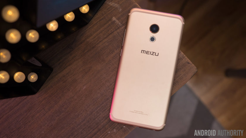
The Pro 6 does come with a full metal unibody construction, with the aluminium used appearing to be of a higher quality grade. There are no sharp or flat edges on this phone, with the back curving in along the sides to meet the front. The antenna bands appear at the top and bottom on the back as well, but with a unique look that certainly hasn’t been seen before. The rear camera is actually HTC 10-esque in its appearance, below which can be found a 10 LED flash.

The volume rocker and power button are on the right side, and at the bottom is the headphone jack, USB Type C charging port, and single speaker unit, in a design that will be extremely familiar. In fact, the overall design of the Meizu Pro 6 will be rather recognizable, but that isn’t necessarily a bad thing. Helping the well known design language is a high quality build that allows for the device to feel fantastic in the hand, and design is an aspect that most will consider to be a positive.
Display
Unlike previous Pro iterations that featured large 5.7-inch displays, the Pro 6 features a 5.2-inch screen, that allows for a more manageable handling experience, and the AMOLED display comes with a Full HD resolution, resulting in a pixel density of 424 ppi.
This display offers everything you’d expect to see from a high quality AMOLED screen, including vibrant, saturated colors, and deep, inky blacks. While some AMOLED displays tend to have a pinkish tinge when setting the display at the lowest brightness level, that doesn’t seem to be the case here either. It may not boast the highest resolution or pixel density when compared to its flagship brethren, but 1080p is more than enough at this screen size, and the display of Pro 6 proves to be quite impressive.
The display comes with a few interesting software and hardware features as well. On the software side, these features include eye protection, which results in an orange hue to help avoid the harmful effects of blue light, and is especially useful when you are trying to sleep. You can also manually change the color temperature of the display, and there are also various display modes that let you adjust the level of color saturation on this display.
However, the new addition, that will also result in more comparisons with the iPhone, is the availability of Meizu’s take on 3D Touch, called Force Touch. If you’ve used 3D Touch on an iPhone before, you will find the experience to be largely similar here. A force press will display different shortcuts, like video mode or selfie mode with the camera, and there is also a peek and pop gesture, where a bit of pressure will bring up a a preview of an image, and adding more force makes the image larger and larger, until it becomes a full size. Unfortunately, the number of third-party Android apps that support Force Touch is extremely limited, so for now, you are restricted to using these with Meizu’s apps only.
Performance
Under the hood, the Meizu Pro 6 comes with a deca-core MediaTek MT6797T Helio X25 processor, clocked at 2.5 GHz, and backed by the Mali-T880MP4 GPU, and 4 GB of RAM. You can see the benchmark scores in the screenshots below, but as far as real world performance is concerned, the device handled everything very well.


The Pro 6 didn’t really slow down in any instance, and everything from opening, closing, and switching apps, to all other everyday tasks is smooth and snappy for the most part. There are some issues as far as gaming is concerned though, with load times being a touch slow, and a few instances of lag and stutter seen when playing processor-intensive games.
Hardware
32 GB or 64 GB are the in-built storage options available with the Meizu Pro 6, but users with storage concerns will have to opt for the higher version, with the device not coming with expandable storage. You do get dual SIM capabilities here, which can be useful for some, depending on the market.
Below the display is a lone home button that also doubles as a fingerprint scanner. The performance of the scanner was actually very surprising, and is one of the fastest we’ve seen on a smartphone so far. Granted, you do need to press the home button and turn the screen on before the device can be unlocked, but when the screen is on, just a tap of the home button is enough to unlock the device. Of course, the sensor is very reliable as well but it doesn’t quite compare to other smartphone fingerprint sensors that allow you to unlock your phone without waking the phone first.
There are no on-screen of capacitive navigation keys to be found on this device, and Meizu has quite an unique implementation in place. The back button functionality is actually a part of the home button as well. While a press of the home button works as expected, a simple tap on it will work as a back key. This can take some getting used to, especially when considering that the majority of Android smartphones has a dedicated back and Recent Apps key, but is a nice way to keep the front of the device clean, and avoids using up any additional display real estate.
As far as the Recent Apps page is concerned, this can be opened by a swipe up from the bottom of the display. The app you are currently using will slowly shrink as the Recent Apps list comes up, with a good looking animation, and this works really well, for the most part. It can be a touch frustrating to trigger this action, with only a slow and steady swipe up guaranteeing a result every time, and this can get quite annoying for users who switch between apps often.
 The single speaker unit sits at the bottom of the device, and as is always the case, this isn’t the best position for a speaker. Not only is the sound going away from you when watching videos or listening to music, but the speaker is also easy to cover up when holding the device in the landscape orientation. However, Meizu does manage to impress when it comes to audio quality. The sound is clear and loud, and the speaker delivers a good amount of bass as well, and this is easily one of the best bottom-mounted speakers we’ve seen on Android smartphone thus far.
The Meizu Pro 6 comes with a rather small 2,560 mAh non-removable battery, but the battery life is still quite good. You will get around 3 hours and 45 minutes of screen-on time with moderate usage, and for the most part, that may be enough to get you comfortably through a full day of use. Depending on your usage, you may find yourself needing to recharge the phone half way through your day, but the good news is that the Pro 6 does come with a USB Type C port (USB 3.1) and some form of fast charging capabilities, that will allow you to be up and running in no time.
Camera

The Meizu Pro 6 comes with a 21 MP rear camera, with a f/2.2 aperture, a laser-guided auto focus system, and a 10 LED dual tone flash, along with a 5 MP front-facing camera with a f/2.0 aperture. There is no optical image stabilization here however, which is quite disappointing to see.
21 MP does allow for you to zoom in a lot into shots and crop in a good amount, but unfortunately, images don’t appear very sharp, with a lot of detail being lost as well. There is some noise to be seen, even in well-lit conditions, and the color reproduction is lacking as well. The camera is capable of taking some decent shots, but the lack of color is noticeable no matter what. HDR does help a lot in some situations, but sometimes that is often to a point where the shot begins to look unrealistic.
Image quality is definitely a mixed bag when it comes to this camera. The usual issues crop up when taking pictures in low-light conditions, with the loss of a lot of detail, colors being even more lackluster, and the overall image being generally dark and noisy. HDR is also hit and miss in poorly-lit situations. Sometimes, it will brighten the image just enough to create a good shot, but at other times, it will brighten the image way too much, which does bring out more detail in the shadows, but also results in overblown highlights.

You can shoot 4K video with the Pro 6, and while the video quality is decent for the most part, the lack of OIS is very noticeable here, making for some very shaky videos. The camera also sometimes struggles when it comes to focusing on objects when shooting video as well.
The 5 MP front-facing camera has a larger pixel size than most, in order to capture more light, but selfies are also below average. In brightly-lit outdoor situations, you can get a decent selfie, even though the image will often end up quite soft, and with some amount of noise. If you’re taking a selfie in anything other than well-lit conditions however, the images will turn out to be very blurry, or with lots of distracting noise.
Software

On the software side of things, the Meizu Pro 6 is running the latest version of the Flyme OS, based on Android 6.0 Marshmallow. Past iterations of the Meizu’s custom OS weren’t the best, but the company has been making some useful changes the help make the user experience a lot better.
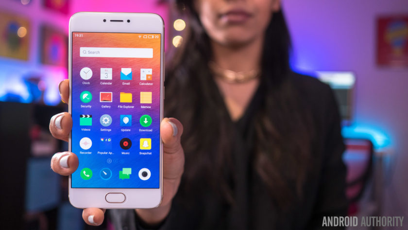
There’s still no app drawer available though, leaving users dependent of creating folders to keep things organized. Some of the changes include the Recent Apps screen that can be opened with a swipe up from the bottom of the display, and comes with a cool animation and is presented in a nice layout. The pull down menu isn’t divided into two sections anymore, with the quick toggles and notifications all housed in a single page. Finally, Meizu has also added a Settings icon and shortcut at the top of the notification drop down, something that was surprisingly missing from previous iterations of the Flyme OS.


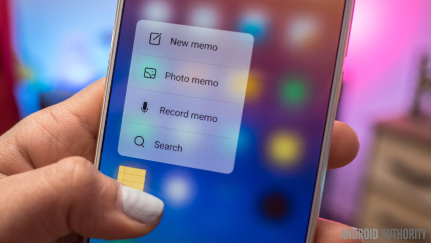
There are some nice features baked in as well, such as a slew of gesture controls, that include double to wake, a gesture input to pull down the notification shade, and up to eight different letter inputs that can be assigned to bring up specific applications. The Flyme OS offers a very different take on Android than what you may be used to, but different doesn’t have to mean bad, and it certainly doesn’t in the case of the Meizu Pro 6.
Specifications
| Display | 5.2-inch Super AMOLED display Full HD resolution, 423 ppi |
| Processor | 2.5 GHz deca-core Helio X25 processor Mali-T880MP4 GPU |
| RAM | 4 GB |
| Storage | 32/64 GB |
| Camera | 21 MP rear camera, f/2.2 aperture, laser auto focus, 10 LED flash 5 MP front-facing camera, f/2.0 aperture |
| Connectivity | Wi-Fi 802.11 a/b/g/n/ac Bluetooth 4.1 NFC GPS+GLONASS USB Type C 1.0 (USB v3.1) |
| Battery | 2,560 mAh |
| Software | Flyme OS based on Android 6.0 Marshmallow |
| Dimensions | 147.7 x 70.8 x 7.3 mm 160 grams |
Gallery

Final thoughts

So there you have it for this in-depth look at the Meizu Pro 6! The latest flagship Meizu managed to impress in more ways than one, and while there may not be anything unique to help this device stand out from the crowd, it does really well with the features it does have to offer. The fingerprint scanner is fast, and while the placement of the bottom-mounted speaker isn’t ideal, the audio quality is surprisingly good. Meizu has also managed to clean up their software experience to some extent, and while it will still take some getting used to, the additional features end up being quite useful.
That said, the camera isn’t particularly impressive, which can be a deal breaker for a lot of users. The Pro 6 isn’t the most affordable when importing the device to the US, but in markets where the phone is officially available, what you do get is a solid smartphone that proves to be dependable for the most part.
Buy now from Amazon
What do you think of the Meizu Pro 6 and do you intend to buy one? Let us know your views in the comments below!
OnePlus 3 review
Making a splash in the increasingly-homogenized smartphone industry often involves breaking away from the norm, and upstart OnePlus did just this back in 2014 with the launch of their first smartphone, the OnePlus One.
Fast forward a year and the OnePlus 2 and OnePlus X somewhat failed to excite consumers as much as the first two handsets did – mainly due to some very questionable product-related questions – so the company has been forced to revisit the drawing board somewhat with the OnePlus 3.
- OnePlus 3 announced: everything you need to know
- Flagship spec showdown: OnePlus 3 vs the competition
- OnePlus 3 vs OnePlus 2 quick look
- What would you change about the OnePlus 3?
Is the third time really the charm for OnePlus, and can the OnePlus 3 prove itself to its biggest critics? Or is it more of the same with the OnePlus 3 ticking some boxes but failing to tick others? Let’s find out in this, our in-depth OnePlus 3 review.
Buy the OnePlus 3 now!
Design
Traditionally, OnePlus has tried to stray away from conventional smartphone design in a bid to keep its handsets unique, but with the OnePlus 3, the company has almost done the opposite.
Rather than keeping the plastic and/or glass finishes of previous handsets, the company has now moved to a full metal unibody smartphone. As a result, a key differentiator for its handsets is no longer quite the same: StyleSwap covers.
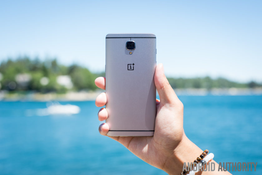
With a display that measures 5.5-inches, the OnePlus 3 is actually quite a large phone, especially considering the bezel itself is quite minimal. Although the bezel on the sides of the display could be considered minimal, the overall size of the OnePlus 3 can largely be attributed to the bezels above and below the screen, which are quite large.
Beneath the display, the bezel is largely forgivable thanks to the home button which is flanked by the capacitive navigation keys. The fingerprint sensor itself is similar to other handsets in that it allows you to unlock the phone in a fraction of a second (.3 seconds, to be exact) without needing to wake the phone from standby. The capacitive keys have a very neutral design, no doubt due to the customization options available in OnePlus’ latest OS (which we’ll cover in more detail below).

Moving around the rest of the phone and the usual OnePlus elements also make a return; the very bottom of the phone houses the USB Type-C port which sits adjacent to the single speaker and the headphone jack. The power button is on the right side of the handset while the volume keys are on the left. Above the volume keys, the traditional activity slider also returns, and lets you easily change the notifications profile, even without looking at the handset.
On the rear, the biggest change from past OnePlus devices becomes apparent – the choice of material for the build. By adopting a full metal unibody design, OnePlus has also made the conscious decision to do away with StyleSwap covers as we know them. In previous devices, the StyleSwap covers would have replaced the back of the phone but with the metal build on the OnePlus 3, they now act just like traditional cases for a smartphone.
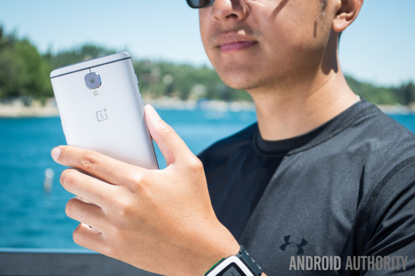
Handling for a phone of this size and stature is as expected and for the most part, it’s no different to any other smartphone. Reaching side-to-side across the phone is more than possible but given the phone itself is quite tall, its likely some users might face difficulties trying to access all areas of the display.
The metal finish is quite slippery as well, which further compounds the problem of handling and means that StyleSwap covers are almost a necessity. Although they are a consolation prize versus the total customization offered by the covers on past OnePlus devices, the sandstone material helps to reduce the size of the camera bump and vastly improve the grip offered by the handset.
 OnePlus 2 StyleSwap cover hands-on comparison, availability and more25
For fans of the original OnePlus StyleSwap covers, the compromise with the OnePlus 3 may prove to be a disappointing implementation – especially as the OnePlus 3 is very much a smartphone that adheres to the convention of 2016 flagships rather than aims to break the mould. All things considered however, the OnePlus 3 is still a very sleek and good-looking phone, even if it is does employ a more atypical smartphone display this time around.
Display

Prior to the launch of last year’s OnePlus 2, rumors suggested we would see OnePlus go with a Quad HD display, but the company ended up sticking with Full HD. This time around, there’s no change as a 5.5-inch Full HD panel makes its way to the OnePlus 3. OnePlus did opt for an Optic AMOLED panel with the 3, which we must say is quite nice.
Although most flagships have moved towards Quad HD displays in 2016 (and arguably for the most part in 2015), the Full HD panel in the OnePlus 3 still performs well and the larger size of the display provides a good amount of real estate. Of course, Full HD doesn’t live up to the current standard of flagship displays and although the OnePlus 3 screen is certainly nice, it’s definitely not on par with current flagships.

Employing AMOLED display technology in the OnePlus 3 does allow the company to offer a couple of welcome flourishes. A feature that is seemingly a necessity for a 2016 flagship is an always-on display. Although it is very similar to the iterations on the OnePlus X and other smartphones, the Ambient Display on the OnePlus 3 can be trigged by waving a hand near the proximity sensor, which is a nice touch.
The OnePlus 3 also lets you customize and tweak the color temperature of the display via a slider in the settings, which can be useful for those worried about the emission of blue light. A night mode in the Quick Settings dropdown makes for much easier viewing in darker conditions by increasing the warmth of the color temperature, and as a result, this makes the overall experience much easier on the eyes in dark conditions.
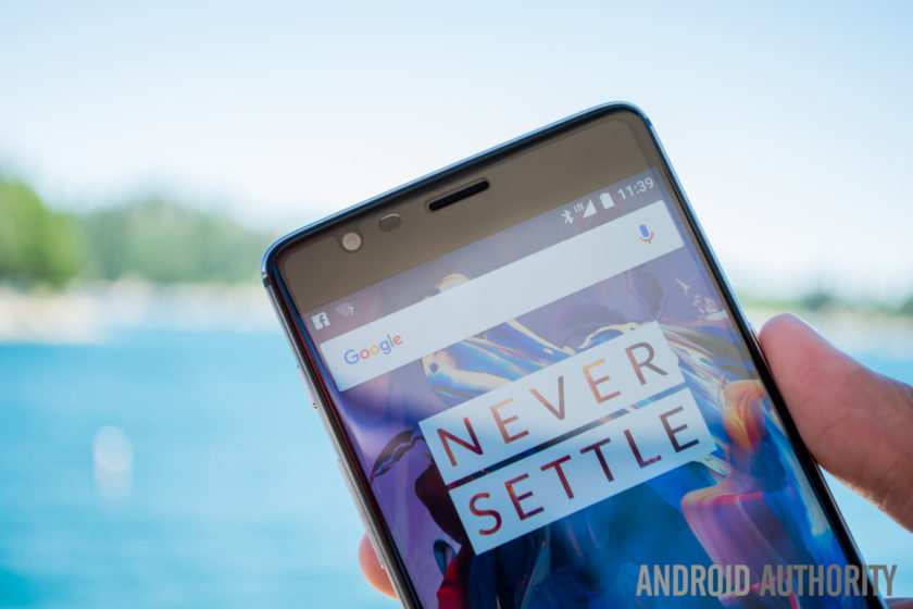
Viewing angles are mostly acceptable and legibility in bright daylight is about average, although OnePlus claim the dual-polarizing layer does help to increase sunlight legibility. Overall, the OnePlus 3 display is certainly not a superstar like certain other flagship devices, but considering the price of the handset (and everything else it offers), it’s certainly no slouch.
Performance
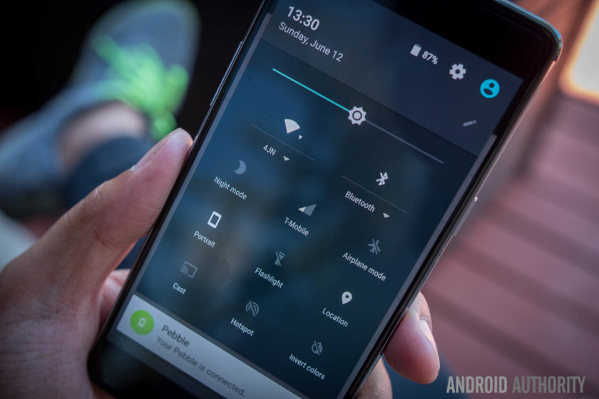
In previous years, OnePlus has sought to help its handsets stand out through the use of flagship specs without the flagship price point, and this year is no different. The OnePlus 3 delivers the very best internals on the market at the moment and offers them at a price which shows it is possible to obtain flagship performance without breaking the bank.
Under the hood, the OnePlus 3 is powered by the latest Qualcomm Snapdragon 820 processor coupled with an Adreno 530 GPU and 64GB of non-expandable storage. As such, performance has been very smooth and while some of this is down to the refined and polished Oxygen OS, there’s no denying that using the latest processing package certainly helps.
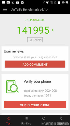

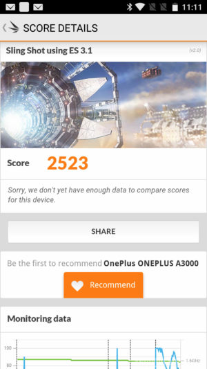
How does the processing package compare to other flagships? Running the usual benchmarks, we can see that the OnePlus 3 scores 141955 in the AnTuTu Benchmark, which is higher than the 140955 and 129375 scored by the Galaxy S7 Active and Galaxy S7 respectively. Moving on to GeekBench 3, it scores 2378 and 5465 for the single core and multi score scores respectively, which is again higher than the 2269 and 5156 scored by the Galaxy S7. Lastly, a 3D Mark score of 2523 shows the Adreno 530 is no slouch and is on par with the 2528 and 2535 scored by the Galaxy S7 and Galaxy S7 Active respectively.
A common problem in Android devices is also being addressed here, as apps don’t slow down even when there’s heavy loads working in the background. Why so? It’s simple: OnePlus has equipped the OnePlus 3 with 6GB of RAM, making it one of the only handsets to offer this.
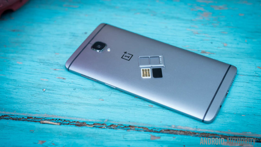
Adopting the highest RAM available on a smartphone to-date means performance is silky smooth and there’s plenty of RAM available to offer breathing room for users. Far too often, manufacturers will offer 4GB of RAM but only make 1GB available with no apps running (as the rest is taken up by background processes), but the OnePlus 3 leaves enough free RAM to ensure its always able to perform any task you ask of it.
From gaming and media consumption to browsing apps and webpages, the OnePlus 3 sails through anything you ask of it and there’s no question that the OnePlus 3 is a very viable addition to the flagship market when it comes to overall performance.
Hardware

For the most part, OnePlus handsets have always offered the usual array of internal hardware specs that we’ve come to expect from flagship smartphones, with the exception of one feature: NFC.
Yes, NFC proved to be a very costly assumption by the company in the OnePlus 2 as the mobile payments industry was thrust into the limelight and the omission of NFC – as no-one uses it, according to Carl Pei – meant the OnePlus 2 was left out of this wave. Fast forward a year and the company has clearly learnt from its mistakes, with the OnePlus 3 now supporting NFC and the payment and transfer opportunities the feature affords.

NFC aside, the OnePlus 3 brings the usual array of connectivity options including dual-SIM capabilities which are an out-of-the-box feature. For those who want a dual-SIM experience, the OnePlus 3 could even be one of the best options available. Throughout our testing, there were no issues with dropped calls or call quality.
On the subject of audio, the OnePlus 3 sports a bottom-mounted single-firing speaker which is an average performer. The speaker is loud – which is nice to have – but there is little body to the sound, which is expected from a single bottom mounted speaker. That being said, audio through a good pair of headphones is definitely above average. And while the experience is short of the one offered by an audio-centric device like the HTC 10, it’s definitely better than some more expensive handsets.
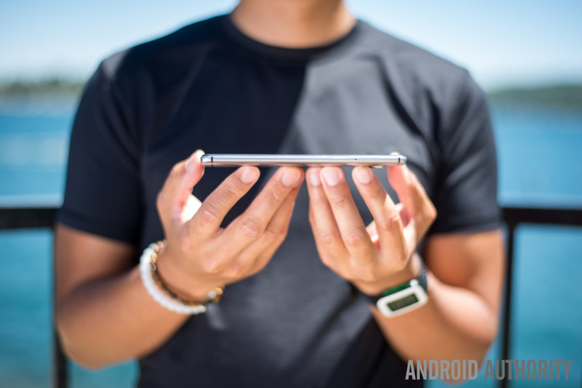
The home button beneath the display sports a fingerprint sensor, and just like most flagships, it can wake the phone from standby and unlock the phone in just .3 seconds when you place your finger on the sensor. Setting up the fingerprint sensor is a breeze and overall, it certainly performs like a flagship fingerprint sensor. The positioning may not to be to everyone’s taste, but it’s definitely a flagship-worthy feature.
The alert slider is also present on the OnePlus 3 and, just like previous devices, it lets you quickly swap between all notifications, priority notifications or no notifications. In the past I’ve never used this much as I wear smartwatches all the time, though I do find myself reaching in my pocket to make sure the phone is muted whenever I need it to be. With a textured design on the key, it also means it’s easy to locate and differentiate between the slider and the volume buttons.

The OnePlus 3 is powered by a 3000mAh non-removable battery, which couples with Dash charging to power the entire experience. With quite a few days of heavy usage that included GPS navigation and plenty of music consumption, the OnePlus 3 was able to achieve 3 and a half hours of screen-on time. For the most part, the handset usually ended the day with a single digit of battery life remaining but it never quite drained completely.
Dash Charge is OnePlus’ take on fast charging technology. The company claims the OnePlus 3 can now charge the phone to 60% from empty in half an hour. In our testing, the claims are certainly true and the addition of fast charging is definitely a boon for the OnePlus 3, meaning if the battery is running low, it’s very easy to get the power needed to finish off the day.
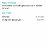
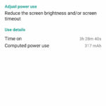

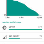
Overall, the hardware inside the OnePlus 3 is certainly premium. While the display and design may not stand out too much, it’s under the hood where the OnePlus 3 shows its true flagship-worthiness. NFC makes a return, 6GB of RAM keeps everything running smooth and Dash Charge means you’ll never be without a charge; whichever way you look at it, these are definitely specs worthy of any premium flagship smartphone.
Camera
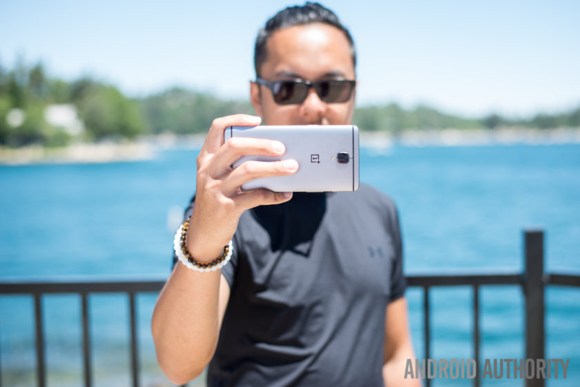
On the rear of the OnePlus 3 is a 16MP camera equipped with f/2.0 aperture, Optical Image Stabilization and phase detection autofocus. On paper, the camera is certainly on par with some flagship devices but as we all know, good camera specs on paper don’t necessarily translate to a great camera experience.
The camera app is still quite simplistic but it has been refined and polished to make it even easier to use. That being said, there is on area of the UX which I just can’t quite understand; when swiping on the viewfinder to get to the different modes, getting to the panorama mode puts the phone in portrait orientation, meaning you have to swipe differently to get back to the other modes.
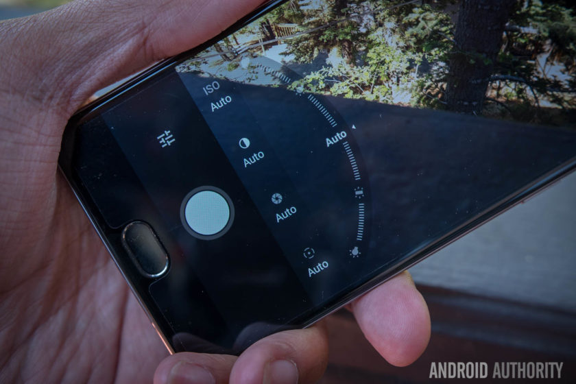
Manual mode in the camera app features some very nice sliders for changing the focal point of the image, the shutter speed and the white balance and tweaking images in manual mode is as easy as adjusting the slider. By far the best feature in manual mode is the ability to first set the exposure point and then drag the middle to find a proper focal point: it’s an intuitive way of catering the shot to your liking and it works perfectly in Auto mode.
Despite the positives in the camera interface, the actual camera performance is a let down thanks to some of the typical pitfalls. Color saturation in photos is rather inconsistent as while some shots result in good looking photos, others fail to capture the colors in vibrant scenes. E.g. in the eccentric scenes of Hawaii, we were left disappointed by the lack of vibrancy captured by the images.

HDR can traditionally help smartphones in this regard but with the OnePlus 3, it doesn’t seem to be quite as effective. On the OnePlus 3, HDR seems to be working ineffectively, by increasing the shadows rather than bring down the highlights and add in more color. The camera woes continue in the panorama mode, where issues with the stitching make parts of the photo look really choppy.
For most smartphones, low light performance is the biggest challenge and this is also true of the OnePlus 3, where slower shutter speeds compromise the exposure. Although it has Optical Image Stabilization, the shakes produced by long shutter speeds are still readily apparent and this means you’ll need very steady hands if you don’t want blurry photos more often than not.
OnePlus 3 camera samples:
The same issues are apparent in video where OIS does a good job of stabilizing the footage, but noise and a lack of color saturation plague all the video recording modes, including 4K. Considering that 4K video recording is growing in popularity, the poor footage captured by the OnePlus 3 is certainly a concern, especially for users who rely on shooting footage on their phone.
Though it may not come as a huge surprise, it’s still very disappointing to see that OnePlus haven’t quite figured out the camera on its smartphones. Without doubt the camera is one of the most important parts of a smartphone and it’s disappointing to see that the OnePlus 3 is bogged down by one of the most important features that a 2016 flagship needs to perfect.
Software

Just like its past devices, the OnePlus 3 runs on OnePlus’ Oxygen OS, and the latest version is based on Android Marshmallow with some polish and streamlining that makes the overall experience better. In the past, OnePlus has been criticized for providing an experience that’s too akin to stock Android without any extra features that differentiated it. This time around, the features have been ironed out to provide an overall experience that feels like it has its own identity.
Customization is a large part of the overall OnePlus experience and to that end, the Dark Mode is a great addition to the Oxygen OS. In adding the Dark Mode, OnePlus have added a feature that’s still not available in beta versions of Android N and the feature enables a dark interface with customizable accent color that’s likely to appeal to a lot of people who have wanted a dark theme for Android.
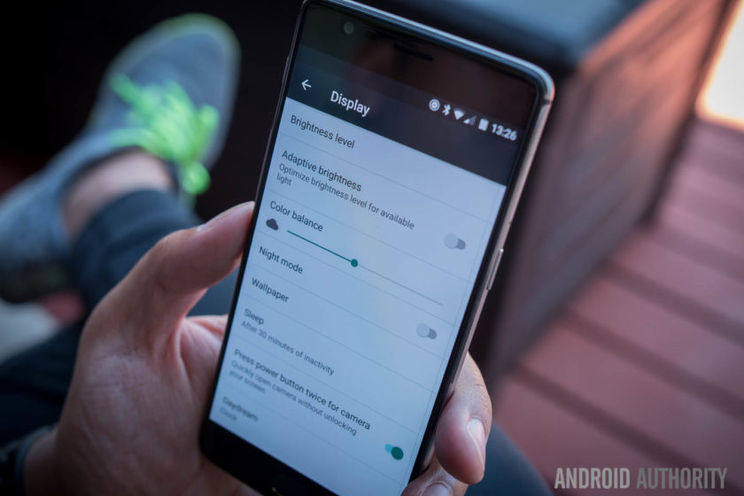
OnePlus devices have been known to come with gestures to launch apps and actions but with the addition of the fingerprint reader in the home button, you can now also launch the camera by double pressing the home button. This renders the gestures somewhat less needed but they are still present for those who are used to them.
The capacitive buttons that flank the home button are now dots rather than bars, and this is particularly good because they don’t have to adhere to the particular function that they indicate. Indeed, Oxygen OS provides the ability to customize the behavior of the keys – with different actions for long or double presses – as well as the option to disable them altogether in lieu of a bar of soft keys.
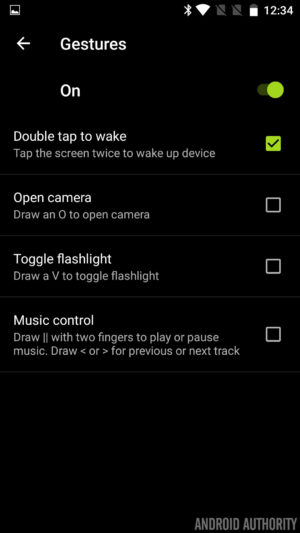
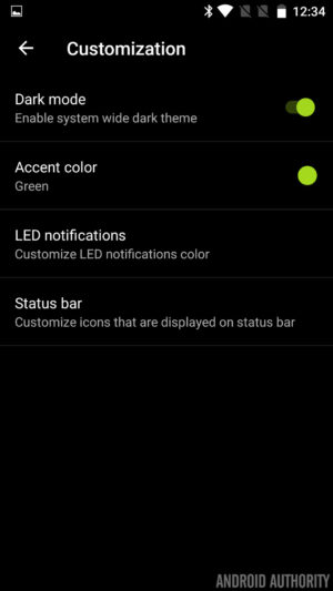
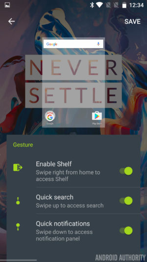


Finally, the Shelf returns and is still a bunch of boxes in which to add some widgets for safe keeping, but now widgets are scrollable. The Shelf also has a new dialog box which allows you to create quick memos and this makes it easy to take notes very quickly. It’s really the small flourishes that make this version of Oxygen OS a pleasure to use and whether it’s little icon indicators – for turning off the background, Dash charging and more – or the ability to quickly swap lockscreen and homescreen wallpapers, the tweaks help enhance the Oxygen OS experience.
In fact, whereas Oxygen OS once felt like stock Android attempting to replicate the feature set once offered by Cyanogen on previous OnePlus devices, it is now starting to feeling like a user interface all of its own.
Specifications
| Display | 5.5-inch Optic AMOLED display 1920 x 1080 resolution, 401ppi Gorilla Glass 4 |
| Processor | Quad-core Qualcomm Snapdragon 820 Kryo: 2x 2.2 GHz, 2x 1.6 GHz |
| GPU | Adreno 530 |
| RAM | 6GB, LPDDR4 |
| Storage | 64GB |
| MicroSD | No |
| Cameras | Rear camera: 16MP Sony IMX 298 sensor with PDAF, 1.12μm, OIS, EIS, f/2.0 Front camera: 8MP Sony IMX 179 sensor with 1.4μm, EIS, f/2.0 |
| Software | OxygenOS based on Android 6.0.1 Marshmallow |
| Sensors | Fingerprint, Hall, Accelerometor, Gyroscope, Proximity, Ambient Light and Electronic Compass |
| Ports | USB 2.0, Type-C Dual nano-SIM slot 3.5 mm audio jack |
| Connectivity | GSM: 850, 900, 1800, 1900 MHz North America model: WCDMA: Bands 1/2/4/5/8 FDD-LTE: Bands 1/2/4/5/7/8/12/17 CDMA EVDO: BC0 Europe/Asia model: WCDMA: Bands 1/2/5/8 FDD-LTE: Bands 1/3/5/7/8/20 TDD-LTE: Bands 38/40/41 |
| NFC | Yes |
| Audio | Speakers: Bottom-facing speaker Microphones: Dual-microphone with noise cancellation |
| Battery | Non-removable 3,000mAh Dash Charge (5V 4A) |
| Materials and colors | Materials: anodized aluminum Colors: Graphite, Soft Gold (Available shortly after launch) |
| Dimensions and weight | 152.7 x 74.7 x 7.35mm 5.57oz (158g) |
Gallery
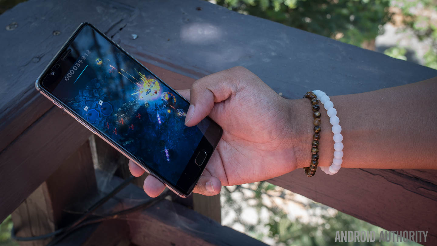
Final thoughts

The OnePlus 3 is available to buy now for $399. The biggest news around the handset is that OnePlus has finally dropped its dreaded invite system. In previous years, you had to wait weeks or months and go through a lot of steps to acquire an invite before buying the phone, but now you’ll be able to buy one directly from OnePlus. Of course, it’s likely you’ll end up waiting a few weeks for delivery but it’s definitely easier than waiting for an invite.
What happens when a manufacturer puts together the best features of flagships for an affordable price point? That phone is called the OnePlus One. Unfortunately, the OnePlus 2 tried to bring a few forward facing features but didn’t fully flesh them out.
To make a success out of their third phone, it almost feels like OnePlus had to bend to convention.
That misstep has been rectified in the OnePlus 3, where the philosophies of the previous two devices have come together to make an incredibly solid device for a good price. In order to do that however, and appeal to the masses, OnePlus had to make a couple compromises – the camera is still not where a flagship should be, and the design takes a step back from uniqueness. To make a success out of their third phone, it almost feels like OnePlus had to bend to convention.
Buy the OnePlus 3 now!
Overall, the OnePlus 3 is still a great device that hits almost all the right notes – exactly what would be needed to make a ‘flagship killer.’ Perhaps now the phrase to look closer at is ‘Never Settle’ – where OnePlus once made a splash was in being bold, taking changes, and requiring invites to make the phone feel more exclusive. Without all of that, the OnePlus 3 feels just like an almost-flagship device for a midrange price. Though that in and of itself is great for most users, it also simply isn’t as exciting as before.
- OnePlus 3 announced: everything you need to know
- Flagship spec showdown: OnePlus 3 vs the competition
- OnePlus 3 vs OnePlus 2 quick look
- What would you change about the OnePlus 3?
What do you think of the OnePlus 3 and are you planning to buy one? Let us know your views in the comments below!
Samsung Galaxy S7 Active review
For the past few years, Samsung has introduced a rugged version of their Galaxy S flagship a few months after the former launched so it came as no surprise to see the Galaxy S7 receive the same treatment. With the original Galaxy S7 already sporting water and dust resistance despite its glass finish, the need for an Active variant was diminished, yet Samsung clearly sees demand for a rugged flagship.
- Galaxy S7 Review
- Galaxy S7 Edge Review
- Galaxy S7 Active vs Galaxy S7 Quick Look
In past years, the Active range has always differentiated heavily from the Galaxy S flagship with diminished specs the compromise for a more durable offering. Yet this year, it shares many of the same specs as its flagship sibling meaning there’s very little to differentiate the two handsets.
Is the Galaxy S7 Active an after-thought or is it the final piece in the jigsaw of the perfect smartphone? Is brawn more important than beauty? Our Galaxy S7 review called the handset refined, polished and possibly the best smartphone ever but does this also apply to the Galaxy S7 Active? Find out in this, our Galaxy S7 Active review.
Buy the Galaxy S7 Active now!
Design

The biggest difference between the two handsets is in the design; the original Galaxy S7 features an all glass and metal design but the Galaxy S7 Active swaps this out for a more rubberized body. Like previous Active devices, the rubber build does result in quite a thick phone that is honestly a little bit bulky but this trade-off is certainly not new to the Galaxy S7 Active.
Most people who drop their phone find the handset can break (often beyond repair) when it lands on a corner or leading edge and to prevent against this, Samsung has reinforced the corners in a bid to ensure the Active doesn’t suffer the same fate as other less durable handsets. Naturally, you do lose the sleek curves and corners of the original Galaxy S7 but the compromise is certainly worth another look when you consider this phone is much more likely to survive a hefty drop.

The rugged exterior means the Galaxy S7 Active conforms to the MIL-STD-810G military standard for protection against extreme conditions. As a result, the phone is rated as being resistant to drops from heights under 5 feet and being able to survive harsh conditions including salt, dust, humidity, rain, vibration, solar radiation, transport and thermal shock. Like every rugged smartphone, the Galaxy S7 Active does have a limit and you will be able to break it if you try hard enough but it’ll survive a lot more knocks than most, if not all, other current flagships.
Build quality aside, the Galaxy S7 Active also trades the capacitive navigation keys of the Galaxy S7 Active for physical hardware buttons for the recent apps and back keys. Instead of the simulated vibration-based feedback provided by the original’s capacitive keys, the Galaxy S7 Active’s keys provide real tactile feedback and although they take getting used to, they are certainly very easy to press.
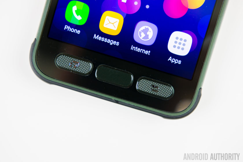
The home button is no different to other Samsung devices but unlike last year’s Galaxy S6 Active, you still get the home button which means the Active range now supports authentication-based features such as Samsung Pay.
The majority of other buttons and ports are in the same place as the Galaxy S7, with the exception of the headphone jack which is moved to the top of the phone. The Galaxy S7 Active does gain the ‘Active key’. The key is completely user definable and can be configured for three different actions – your standard short press, a long press and a double press – which can be used to open any application you choose, with a further option to allow the app to open when the phone is locked.
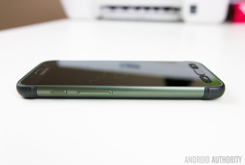
How does it feel to go from the sleek and slender Galaxy S7 to the larger and beefier Galaxy S7 Active? The simple way to explain it is that the Active very much feels like the Galaxy S7 inside of a case, which comes complete with the front lip to protect against any damage. Yes, it doesn’t have the sleek finish of the Galaxy S7 but the rugged features mean this smartphone can withstand more than most and if the fragileness of the Galaxy S7 is a concern for you, the Galaxy S7 Active certainly addresses these.
Display
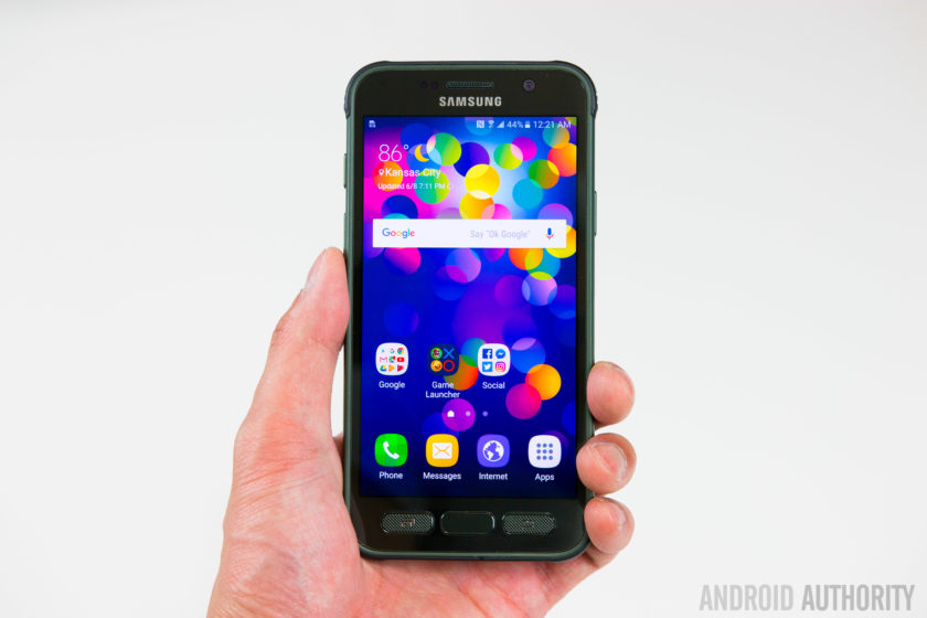
While the Galaxy S7 Active shares the same 5.1-inch QHD Super AMOLED display as the Galaxy S7 – which offers 2560 x 1440 pixels resolution – it does gain one very crucial feature: shatter resistance.
The display is shatterproof up to 5 feet meaning the handset should survive a drop from shoulder height for most people, or so Samsung claims. The display is protected by a Corning Gorilla Glass 4 panel – which we know is susceptible to shattering – with a plastic protector on top so shatter resistant, not shatterproof, is the more applicable word to describe the display.
A problem with screen protectors or devices that use a plastic panel on top of the display is that often it can detract from what could be a very good display. Luckily, with the Galaxy S7 Active, this is not an issue but the plastic panel does scratch easily, which may eventually detract away from the Active’s appeal.
Battery Life
The last major change between the Galaxy S7 and Galaxy S7 Active is the size of the non-removable battery. Last year’s Galaxy S6 sported quite a small battery (at 2560mAh) and this year, Samsung beefed it up by 18% to a more acceptable 3000mAh in a bid to provide improved battery life.
 Related: Samsung Galaxy S7 battery life review99
The Galaxy S7 Active raises the bar yet again, with a 4000mAh battery that is 33% larger than its sibling, and even bigger than the excellent 3600mAh unit inside the Galaxy S7 Edge. On occasion a larger capacity battery doesn’t always translate to exceptionally better battery life but Samsung clearly has the formula figured out, with the Galaxy S7 Active proving to excel in the battery department.
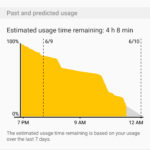


Despite heavy usage that included hours of gaming and YouTube streaming, the Galaxy S7 Active’s battery proved to be stubborn and very difficult to drain completely in one day. During our testing, screen on time often exceeded 7 hours despite resource-intensive tasks throughout the day and there’s no doubt that the Galaxy S7 Active offers the best battery life in the Galaxy S7 family.
Performance & Hardware

Aside from the key differences outlined above, the rest of the Galaxy S7 Active is very much the same as the Galaxy S7. Under the hood, this is powered by the Qualcomm Snapdragon 820 processor with 4GB RAM and with the Active being exclusive to AT&T in the USA, it’s unlikely we’ll see an Exynos-powered version launched in the near future.
On paper, the thought of AT&T’s additions to the software would lead to the assumption that performance will be inferior to a device that doesn’t have this additional load but in actual performance, the Galaxy S7 Active shows no signs of having carrier apps added. In regular use, there’s no lag of note and generally performance is almost identical to the Galaxy S7.
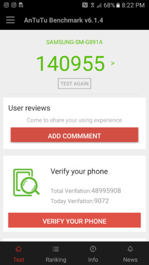
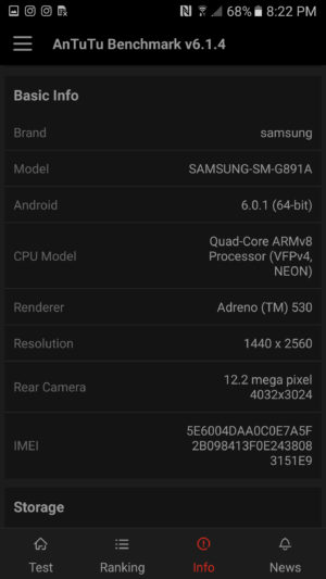
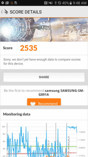
Running the usual benchmarks also corroborates this theory, with the Galaxy S7 Active proving to be on-par with, if not better, than the Galaxy S7 and S7 Edge. In AnTuTu’s benchmark test, the S7 Active scores 140955, whereas the regular S7 scored 129375. Moving on to GeekBench 3, the S7 Active scores 2282 in the single-core test and 5201 in the multi-core test, which is almost identical to the 2269 and 5156 scored by the Galaxy S7. Our last benchmark result comes from 3DMark, where the Galaxy S7 Active scores 2535 while the regular Galaxy S7 scores 2528.
Overall, there’s no denying that the performance of the Galaxy S7 Active is certainly one of the best on the market and unlike previous years, keeping mostly similar internals to the regular Galaxy S7 family has meant the Galaxy S7 Active offers performance on par with, if not better, than the best flagships on the market.
Camera
The camera on the rear of the Galaxy S7 Active is the same 12MP sensor with f/1.7 aperture and lightning fast dual autofocus found in the regular Galaxy S7. The images produced are sharp, vibrant and contrasty and the camera excels in most lighting conditions.
 Recommended: Camera shootout: Galaxy S7 vs the best flagships339
Like the regular Galaxy S7, you can still double press the home button to quickly launch the camera and the camera software remains mostly the same, with features such as selective focus and live broadcast to YouTube also present.
One new feature that does set the handset apart is the Aqua mode which has been made specifically for the S7 Active and it lets you use the active key to take photos and the volume keys to record video when you’re using the S7 Active underwater.
Galaxy S7 Active Camera Samples:

With the Galaxy S7 offering an excellent camera experience and the Galaxy S7 Active sporting the exact same camera offering, it comes as no surprise that Samsung’s latest rugged flagship has an excellent camera. The addition of an aqua mode arguably makes the camera better than the Galaxy S7 but whatever the condition, you can certainly rely on the Galaxy S7 Active’s camera.
Software

The Galaxy S7 Active is running on Android 6.0.1 Marshmallow with Samsung’s TouchWiz interface on top. Generally, the Galaxy S7 family sports a heavily refined user experience that has been optimised and streamlined to offer the best performance possible and, for the most part, the S7 Active certainly continues this trend.
Where the issue arises however is in the handset’s exclusivity with AT&T in the USA, which inevitably leads to the addition of carrier apps and bloatware to the software. From the Galaxy S5 to the Galaxy S7, Samsung worked hard to make its software bloat-free and as streamlined as possible while keeping the company’s targets in mind but the AT&T bloatware undoes a lot of Samsung’s positive move.


That being said, the benchmarks and real-world usage reveal that the carrier bloat doesn’t have a big effect on the performance, which is not typical of the normal effect carrier bloat has on a smartphone. Yes, none of the apps can be uninstalled and you’re unlikely to use some of the preloaded apps – which include AT&T’s own services, Lookout security, the Yellow Pages and Direct TV – but they don’t seem to have a marked effect of any kind on performance.
For some users however, non-removable carrier bloat can be a deal breaker and that’s really the biggest downside to the Galaxy S7 Active. For more on the overall software experience, check out our TouchWiz Feature Focus video below:
Specifications
Here’s the key specs for the Samsung Galaxy S7 Active:
| Display | 5.1-inch Super AMOLED display 2560 x 1440 resolution Shatterproof display |
| Processor | Quad-core Qualcomm Snapdragon 820 2x 2.15GHz, 2x 1.6GHz |
| RAM | 4GB |
| Storage | 32/64GB |
| MicroSD | Yes, up to 256GB |
| Durability | IP68 rating
MIL-SD-810G certified (dust, salt, humidity, rain, vibration, solar, transport, thermal shock resistant) |
| Cameras | 12MP rear camera with f/1.7 aperture, 1.4-micron pixels, OIS 5MP front camera with f/1.7 aperture |
| Battery | Non-removable 4000mAh battery |
| Fast charging | Yes |
| Wireless charging | Qi and PMA |
| Software | Android 6.0 Marshmallow |
| Dimensions | 9.9mm thick 185g |
Gallery
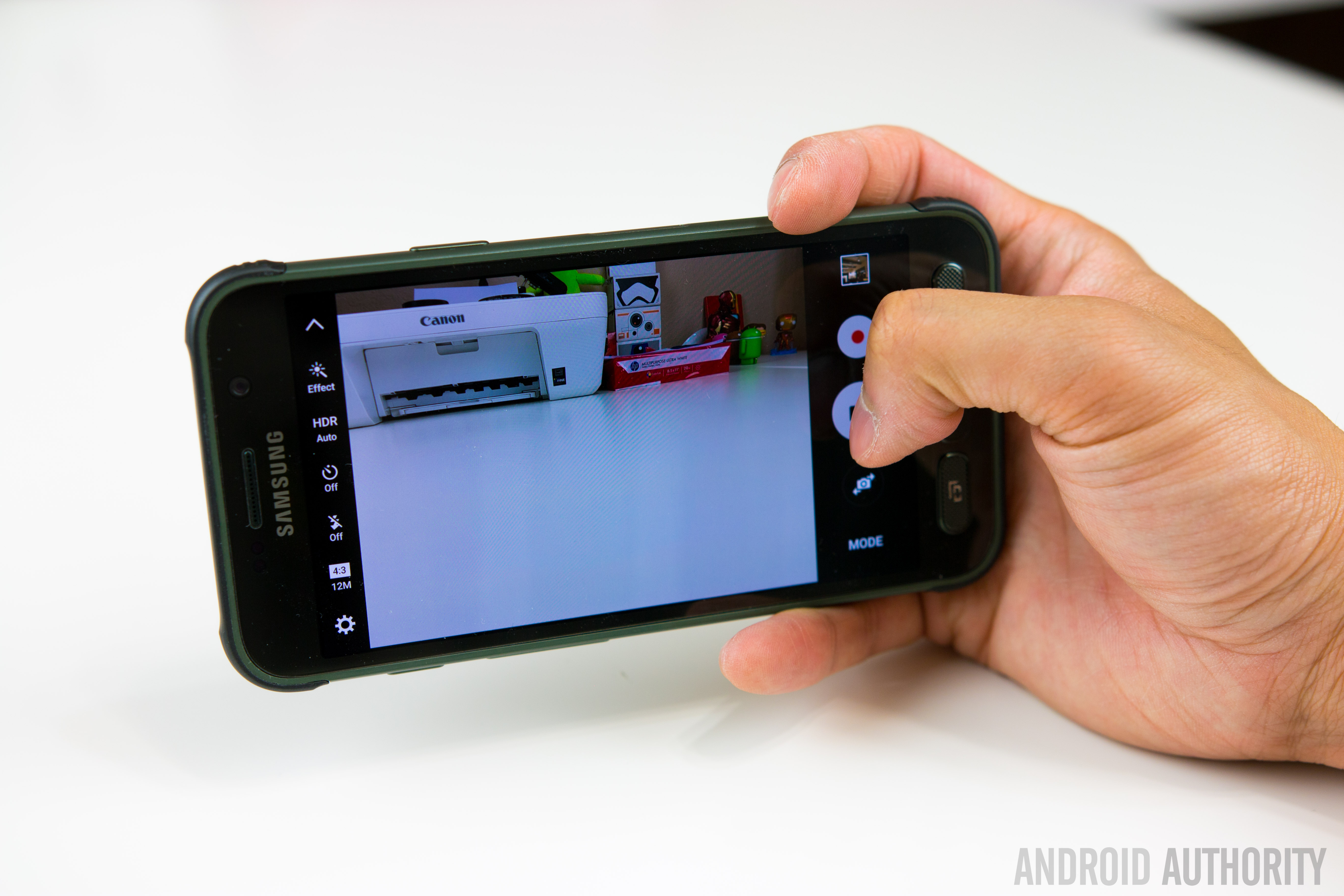
Conclusion

There’s no denying that a rugged smartphone with the capabilities of the Galaxy S7 Active will appeal to a lot of users but AT&T’s exclusivity, coupled with the effect on software, does mean a lot of users won’t be able to acquire the Galaxy S7 Active even if they wanted to. In fact, a few years in with proven interest in the Active range, it remains surprising that Samsung hasn’t struck deals to bring the Active range to other carriers and markets.
If the Galaxy S7 were a sports car, the Galaxy S7 Active could only be considered a tank; both will get you to your final point but only one will handle whatever you throw at it.
The Galaxy S7 Active is certainly not the best looking phone but the more rugged design and better battery life are more than worth the compromise. In fact, considering the more fragile build of the Galaxy S7 and its susceptibility to damage, the S7 Active is arguably the better smartphone. If the Galaxy S7 were a sports car, the Galaxy S7 Active could only be considered a tank; both will get you to your final point but only one will handle anything you can throw at it.
- Galaxy S7 Review
- Galaxy S7 Edge Review
- Galaxy S7 Active vs Galaxy S7 Quick Look
The Galaxy S7 Active shows that sometimes, brawn really is more important than beauty.
With comparable performance and hardware, an excellent camera and much better battery life, the Galaxy S7 Active is arguably what the Galaxy S7 should have been. At first glance, the S7 Active may not seem like the smartphone for you but don’t be fooled: they say you shouldn’t judge a book by its cover and the Galaxy S7 Active shows that sometimes, brawn really is more important than beauty.
What do you think of the Galaxy S7 Active and would you rather have the sleek Galaxy S7 or its rugged, more durable cousin? Let us know your views in the comments below!
Huawei P9 Review – an iPhone by any other OS would still taste of Apple
Since I own and use a Huawei Nexus 6P as my daily driver, I find myself in the unique position of being able to compare these two phones – one crafted with direct input from Google, and one the result of Huawei when left to its own means – side by side. Many of my observations in this piece will be comparisons between the two, despite the piece as a whole being a review of the Huawei P9, specifically.
Build
The aluminum frame feels great in the hand. It’s got a slim profile and weighs next to nothing – a stark contrast to the Nexus 6P, which is bigger and noticeably heftier in-hand. Oddly, the P9 is only 0.3mm thinner than the 6P, but feels much smaller – perhaps because the 6P is 38 grams heavier. The P9 is so light, in fact, that when it slipped out of my pocket when I sat down and embedded itself in the couch cushion, I never noticed until I went to check it.
The downside to that all-aluminum body is that when the phone gets hot, it gets hot. A video call with my sister for a mere 15 minutes made the thing nigh-unholdable (that is not a word), lest I burn the fingerprints from the tips of my fingers.
Time to acknowledge the elephant in the room – the P9 looks just like an iPhone. From the shape, to the dimensions, to the random Torx screws on the bottom of the phone, it reeks of Apple design. I understand that people think Apple is the pinnacle of build quality, but ripping Apple’s aesthetic while using Google’s operating system seems so very wrong on so many levels.
Aside from looking like an iPhone, the rest of the phone is structured like a Nexus 6P – volume buttons and power button on the right side of the frame, fingerprint sensor on the back, Type-C USB on the bottom (although the headphone jack is on the bottom as well, not the top).

Screen
Quantitatively, the Nexus 6P is a superior screen – 0.5″ bigger on the diagonal (5.7″ AMOLED), a higher pixel density, and an oil resistant coating on top of corning Gorilla Glass 4 all work in the 6P’s favor. In practice, though I’ve found the P9’s display (5.2″ IPS LCD) to be equal or better in nearly every way.
The pixel density difference is not immediately obvious to the eye, and the supposed oleophobic coating on the 6P didn’t prevent it from picking up fingerprints at the same prodigious rate as the P9. The latter’s display is every bit as gorgeous as the former’s, despite the 6P’s AMOLED screen. In certain side-by-side instances, the colors on the P9 are even more vibrant. Either way, the P9’s screen is pretty damn good. I took a side-by-side shot of the two screens to show the difference – presented without comment.

Cameras
I’m gonna do this quick; like a bandaid, just tear it off – the P9’s camera blows the 6P out of the water. Badly. In all of my (amateur, highly unscientific and purely subjective) head-to-head comparisons, I preferred the P9 – both in terms of how easy it was to get the desired shot, and how the shot looked on its screen and on my computer. I’ve uploaded a gallery of images taken with the two phones for your perusal.

The P9’s camera software more robust than Google’s, and it seems more responsive. The options list for the P9’s camera is extensive, to say the least: Photo, Monochrome, “Beauty” mode, Video, HDR, Panorama, Nighjt Shot, Light Painting, Time-Lapse, Slow-Mo, Watermark, Audio Note, and Document Readjustment. Wow.
This software also features a pretty nifty feature that turns off the camera if you leave it open for too long without doing anything with it – this would undoubtedly save some accidental battery loss.
The focus of the P9 is far superior to the 6P’s, making taking close-up shots way easier to capture; take a look at the Lego closeup and the closeup of the gaming miniature to see what I’m talking about. Additionally, the shutter speed on the P9 seemed a lot snappier than the 6P, which was sluggish by comparison.
In terms of front facing cameras, the P9’s really picks up insane amounts of detail – to the point where I saw my own selfie and thought “ugh, dat skin tho.” In short, the P9’s selfie cam is straight up better. I video chatted a few times with the P9 as well to get a feel for if the quality was any better on the receiving end, but my partner in crime for those calls didn’t seem to notice a difference.
Battery Life
In terms of battery, the P9 performs about how you’d expect with a 3000mAH battery; I got less than a day of my usage, which is to say about 3 hours of screen on time streaming music, refreshing Twitter like mad and texting like crazy. For comparison, my Nexus 6P manages about 4 hours of screen-on time before I need to charge it. The P9 doesn’t quite have the same lasting power, but it’s also no chump. With some battery saving considerations, there’s no reason the battery couldn’t last most people until bed time.
The P9 does not support the 6P’s 3A charging speeds, but the smaller battery and Type-C USB port mean it still charges pretty quickly compared to other devices.
Data, Coverage, Etc.
It’s important to note that the P9 does not support CDMA bands, only GSM – which means Sprint and Verizon customers are out of luck in the US (note that it does support HSPA and LTE, however). My reception with my T-Mobile nano SIM was pretty flawless, with no connection drops and very good quality calls.
WiFi performed as expected – in my case, lots of drops and lag, because the internet in my neck of the woods is awful, and I need to yell at the AT&T guy again. At Starbucks, however, the WiFi was just fine.
Features
The fingerprint reader is arguably faster than the Nexus 6P’s, but I feel like the 6P’s registers my finger correctly more often – note that this may be because of the way I set up my fingerprint on the two devices, which has a margin of human error.
The speaker placement on the P9 isn’t ideal, especially in comparison to the front-facing dual speakers of the Nexus 6P. Holding the phone one-handed in my typical left-handed grip – index finger bracing the left side, middle finger supporting the back, pinky under the bottom of the frame – actually blocks the speaker, muffling the volume. When unimpeded by fat fingers, the volume can compete with the best of them, but the overall sound quality seems a bit hollow to me.
Firmware
Long story, short: if you like iOS’s launcher, or MIUI, this phone is for you. It eschews Google’s signature app drawer in favor of spreading each and every single icon of each and every single app you install on your homescreen. This, to me, results in way too many icons – especially if you start adding widgets.There are a number of cute options within the launcher: transition animations, auto-align icons, shake to align, and homescreen looping are among them.
In terms of performance, I ran into a number of jitters and hesitations when running around in the menus, but to its credit the P9 ran Android 6.0 admirably, and didn’t lag a whole lot; buttery smooth, for the most part. One area the P9 does struggle with, though, is the keyboard – I ran into a bunch of occasions where it would hesitate to input my keystrokes, resulting in many, many backtracks.
Final Thoughts
I had a really great time with this phone. It often felt as good, if not occasionally superior, to my Nexus 6P, especially in terms of how it felt in the hand. The launcher – and, indeed, Huawei’s modified OS in general – was not my bag, for I’m an AndroidGuy (I’m ashamed of that plug), not an Apple Guy.
Basic Spec Comparison
Phone: Huawei P9
Android Version: 6.0
Screen: 5.2″ IPS LCD
Resolution: 1080×1920 (401ppi)
CPU: HiSilicon 2.5ghz Octa-core
RAM: 3GB
Storage: 32GB internal (expandable)
Camera: 12mp duo camera
Battery: 3000mAh, Type C Charging
Price: 599.99 at Amazon
Phone: Huawei Nexus 6P
Android Version: 6.0
Screen: 5.7″ AMOLED
Resolution: 1440×2560 (518ppi)
CPU: 2Ghz Qualcomm Snapdragon 810
RAM: 3GB
Storage: Up to 128gb (nonexpandable)
Camera: 12.3mp
Battery: 3450mAh, Type C Charging
Price: 419.99-569.99 at Amazon
HTC 10 is among the best smartphones to date (Review)
Launched in spring of 2016, the HTC 10 is, at first blush, a simple evolution of the One series introduced a few years back. But, spend some time with the device and you’ll see that it’s not just another trip to the well for HTC. Indeed, this one sprinkles in a bit of revolution, too. The HTC 10 is a surprisingly strong contender for phone of the year.
The target demographic for the HTC 10 is a consumer looking for a powerful experience that offers up some of the latest and greatest in hardware. The specifications for the phone put it right in line with top models such as the Samsung Galaxy S7, LG G5, and Apple’s iPhone 6. If you’re the type who buys based on bullet points and fact tags, the HTC 10 should quickly rise to the top of the heap. In short, the HTC 10 is flagship through and through.

First Impressions
Let’s be honest here. It’s getting harder and harder to create a smartphone that physically stands out or doesn’t resemble every other handset on the market. For some companies that’s not really a problem and coming to market with a lookalike or slight variation on last year’s phone is okay. It seems to work for Apple and Samsung has been guilty of it for a few generations.
The 2016 crop of devices is somewhat different so far in that LG has shaken things up in the G5 and it’s not as similar to the G4 as it could have been. The Galaxy S7, for its part, is a departure from the Galaxy S6. As for HTC, this year’s model looks similar enough to the previous generations that you won’t mistake it for another brand. A few minutes of holding it, though, tells you things are different here, too.
I was pleased to see that the HTC 10 carries over some of the design language of its predecessors. There was nothing wrong with the M7, M7, and M9; they were just a little too close to each other. The HTC 10 brings forth a combination of that line as well as elements introduced in the One A9 last year.

The HTC 10 looks, and feels, like a premium phone. Thanks to a unibody aluminum chassis with chamfered edges, the handset is weighty and durable and has the air of a well thought out design. The brushed finish is a nice touch and plays nicely with any color variation. Pick the phone up and you immediately know that HTC isn’t messing around.
Like the One M models before it, this phone has a tapered design to the rear. It’s comfortable to hold in hand; the pronounced chamfered edges call for attention but also make for an easy grip around the edges. Tossing this into a pocket is fantastic as it simply slides along the curves. A word of caution, though, as it can feel slippery at times.
One of the things I like to do with every new phone is grab it from the ends and sort of twist or apply pressure. It’s here where you’ll sometimes figure out which phone is cheaply built. The HTC 10 did not creak or move, even under moderate pressure.
Design
Again, it’s kind of hard to reinvent yourself each year and there’s only so many ways to design a smartphone before it feels awkward. The HTC 10 doesn’t do anything strange with its button configuration or SIM card placement.

Looking straight on, the right side features the volume rocker about 3/4ths of the way up. Below that is the power button. As is the case with the One A9, the HTC 10’s power button has a textured feel to it. This makes it very easy to feel in the dark as there’s no mistaking it for the volume controls. All three buttons are responsive and let the user know for certain that they’re being pressed.
On the left side of the phone is where you’ll find the memory card and SIM card tray. Located near the top, it pops out to allow for access. Those of you who have a microSD card will be happy to know the HTC 10 supports up to 2 terabytes of external storage.
Down below the display you’ll locate the lone fingerprint reader which doubles as the home button. HTC has opted for capacitive buttons for this year’s model; the “back” is found on the left side while the “multitask” button is on the right. The fingerprint sensor is fast, accurate, and works well even if you’re fingers or the phone is slightly damp. It’s a little cramped down here as the button is ever so closer to the edge of the phone than the display.
At the very top of the front panel is a speaker grille and front-facing camera. There’s no dual-speaker setup this time around. The top is for the BoomSound tweeter while the other speaker is located below the phone next to the charging port.

We appreciate that HTC integrated a USB Type-C charging port for this model as it’s quickly becoming a standard. Moreover, the Quick Charge 3.0 support lets us plug in for fast recharges.
Around back we locate the rear camera with flash and antenna lines. The camera module does jut out from the phone a bit but the sapphire glass keeps things from getting scuffed. Getting back to the unibody design, the rear stays put. You’ll not be able to remove anything here, particularly a battery.
Display
At 5.2-inches, the HTC 10 is a great size for most smartphone users. Sure, we do get spoiled by those models that tread into the 5.5-inch and 5.7-inch space, but those phones are often unwieldy or hard to use with one hand.
The 2,560 x 1,440 pixel display is gorgeous and puts HTC back in the conversation of high resolution screens for a flagship phone. The Super LCD 3 panel is fantastic, represents colors very well, and can be pushed to a really bright image. Indoor, outdoor, it doesn’t really matter where you use it. Taking pictures in broad daylight is no challenge. Thanks to an oleophobic coating, the screen is built to withstand scuffs and scratches.
Call Quality
The model we reviewed was an unlocked variant which supports AT&T and T-Mobile here in the US. We used a T-Mobile SIM for the duration of our testing and found it connected about as good as other phones we’ve used in the same areas. There are spots where we’d see it display less bars on the screen than normal, but calls worked well nonetheless. Unfortunately, there are pockets where T-Mobile doesn’t pick up near the house so we had to rely on WiFi for calls. It seemed we had to use Wi-Fi a little more than other phones as of late but that could also be attributed to more trees and foliage at this time of year.
Sound
Placing a call on speaker phone was a pleasure with sound filling rooms clearly. Inside of an office is one thing, but even outside, with ambient noise and random traffic, worked well.
Whereas BoomSound stereo speakers typically shared the load equally between them, the HTC 10 is different. The top speaker provides the highs while the one below the phone gives the lows. If you’re holding the phone in portrait mode, you may find yourself somewhat covering the a speaker.
Place the phone on a table for music or for watching YouTube videos and you’ll find a loud sound. Playback is clear and crisp and it gets very loud. Speaking of which, you’ll want to keep that in mind when setting alarms. You surely don’t want to wake up to this phone at top levels.
We did find that holding a phone in landscape mode for video can also create a somewhat wonky listening experience. Given we naturally want to hold the edges of our phone, it’s pretty easy to cover half of the sound. Along those lines, it’s sometimes strange to watch longer videos with sound not balancing equally.

Camera
After taking a year off with the M9, HTC is back to using its “UltraPixel” camera for pictures. As some of you know, the number of pixels doesn’t necessarily equate to picture quality. To that end, don’t let the 12-megapixel sensor in the HTC 10 fool you into thinking it’s lesser quality than some other brands and their 16-megapixel, or higher, shooters. The ultra aspect means larger pixels with more light and improved low-light images.
The HTC 10 camera features optical image stabilization and a f/1.8 aperture. What does this mean to you? It means incredible pictures in a whole host of light settings.
We found the HTC 10 camera to be among the absolute best smartphone shooters we’ve ever tested. Time and again we were impressed with the shutter speed, focus, and colors. There are few things that we enjoy more about a handset’s camera than being able to set it on automatic and trust things would work. That’s exactly what we found with the camera in the HTC 10.

Very rarely did we move over to Pro (manual) mode to mess with some of the settings. And, even when we did, the options were clearly presented on the screen and the dials were intuitive. Don’t know what ISO or WB settings are as it pertains to your end result? Play with it a bit and watch how it impacts your picture.
If you’ve used an HTC phone from before, you’ll know that the camera app can be a tad overwhelming. That’s not the case this time around as HTC has trimmed the shooting modes down, rejiggered the layout, and generally simplified the experience. Hopping to and from video is quick; switching to manual mode, panoramic, or Zoe is also in the same place. We especially liked the convenience of toggling on and off the HDR.
The laser assisted focus is lightning fast and we found ourselves capturing the exact moments we wanted. You know that issue with phones where you have to snap the camera a hair sooner than what you really need? That’s not the case here. The HTC 10 grabs the photo you want the moment you take it – even with HDR on.
If we could be picky for a moment, the notifications that pop up for the laser focus can be a tad aggressive. Simply putting your finger up near the lens results in a notification. We get it – we shouldn’t cover it up. Please stop telling us.
Recording video is just as pleasurable; the phone allows for up to 4K capture. We’d recommend sticking to 1080p for your video unless you really wanna show off. Seeing as how not too many of us own 4K televisions yet we don’t see the need for the video. Also, if that’s what you want to do with your phone, make sure you’ve got a sizable external memory source because 4K files are huge.
Battery
At 3,000mAh, the battery is not quite as capacious as it would have been one year ago. We’re now expecting our flagship phones to have this much juice, especially if it’s an internal, non-removable unit.
HTC claims the battery can give users up to two days of normal usage. In our testing we deduced that for most people, this is more than enough capacity to get them through a full day’s use with extra to spare. A more aggressive person who likes to game, or enjoys videos on a regular basis… maybe a day.
As mentioned above, the phone employs support for Quick Charge 3.0. This means you’re going to charge up super quick. We’re talking almost to the point where you’re looking at your phone and watching it tick up.
Get about halfway through your day and need to insure the phone’s going to stay up late with you? Throw it on a charger for a half hour and you’re all set. A typical commute home from work is likely all you need to top off your phone with enough battery to see you through a long night.
You can squeeze more life out of your battery by enabling the Power Saver mode or Ultra Power Saver mode. Each can slow down CPU cycles, reduce screen brightness, adjust vibration settings, and more. One just happens to be way more aggressive than the other. Suffice it to say, we didn’t have to use the Ultra aspect once in the few weeks we’ve tested this device.
Software
Running Android 6.0 Marshmallow, the HTC 10 employs a custom launcher known as Sense UI. Around for the better part of a decade now, it is the handset maker’s way of delivering a user experience that it thinks is right for consumers. In the past it was knocked for being too heavy or bloated. As time went by it didn’t evolve much and became outdated feeling. The idea was right but the execution was not. This is not the case any longer.
 The Sense UI is much lighter than it was in the past and doesn’t come across as some branded agenda. You’ll find there’s still traces of customization and HTC-infused features, but nothing you’ll dread. If you’ve ever used an HTC Android phone in the past, we invite you to revisit the Sense experience. For those who have not, we venture to guess you’ll be hard-pressed to discern where stock Android ends and where HTC’s tweaks begin.
Users will have a variety of lock screen behaviors and settings to choose from, each with a slightly different setup. It’s possible to tailor how much information is present on the lock screen, keeping your important details hidden away if that’s your thing. Also present with the lock screen is the shortcut icons to launch quickly into various functions of the phone.
 As mentioned before, there’s a fingerprint scanner with the phone so there’s that extra layer of security, too. We trained the sensor to recognize multiple fingerprints; the phone is very quick to recognize the presses. It didn’t take long for us to prefer the fingerprint for unlocking the device.
The first time you load up the phone you’ll find two home screens, one of which is the BlinkFeed (social news aggregator). It’s quite easy to start customizing and tweaking the look and feel as HTC puts options in easy-to-discover places. Want to change the fonts, icons, and widgets? That’s no sweat with HTC’s software. Actually, that leads into the next aspect of the software experience: themes.
Like other recent models from the company, the HTC 10 lets users shop for custom themes. And, rather than sticking to your standard rows and columns, the Freestyle themes let you place stuff exactly where you want, without adhering to grids. The selection of themes has continually improved and there’s something for everyone. Minimal, futuristic, cartoon, professional, or another design, you’ll find a look you love.
There’s a new Boost+ app that comes loaded HTC which is designed to keep the phone running smoothly. With the app you’ll be able to perform quick checks on performance, free up RAM and storage, and uninstall unused apps. Additionally, Boost+ lets HTC 10 owners lock individual apps to where they’re only unlocked via a password or fingerprint.
Performance
Let’s just cut to the chase; the HTC 10 is going to handle anything you ask it to do. Not only that, but it’s gonna do it quickly and without hiccups. This is exactly what you’d expect when you pair 4GB RAM with the latest Qualcomm processor, the Snapdragon 820.
As a daily driver for typical users, the HTC 10 doesn’t even come close to tapping into its potential. Gamers and those who like to push their tech will be pleased with the performance of the handset. Whether it’s a first-person shooter, racing game, or something else with flashy graphics, the phone chews it right up.
One reason the HTC 10 might do so well is that it isn’t full of bloatware that runs in the background. Although we tested an unlocked model with nary a carrier app or service, HTC says the network-branded versions are light on clutter. The less there is sipping at the resources, the better. Oh, and let’s not discount the way Android 6.0 Marshmallow handles processes. All of these things provide a perfect storm, of sorts.

Conclusion
It’s very easy for us to recommend the HTC 10 for your flagship smartphone needs. It’s the perfect balance of performance and beauty; the handset is everything we want.
The metal design, chamfered edges, and brushed finish offer up one of the most physically appealing models available today. It’s somewhat ironic, then, that this phone is mostly an evolution of the previous One M line. There’s just enough different here to bring old M8 and M9 users back.
In previous years HTC was applauded for build quality when other companies were going the cheaper, polycarbonate route. Now that other brands seem to have caught on to using premium materials HTC’s effort might be construed as simply keeping pace. Is that the case? Perhaps. Does it stand out that much over some of the other flagships of the day in terms of build quality? Maybe. It’s a solid phone either way and there’s no denying HTC cared about the overall product. It’s certainly no less quality than any other phone.
We’re really impressed with the way HTC has managed to dial down the Sense UI yet still retain the custom experience. Although we love and prefer stock Android, HTC Sense UI is nowhere near as obnoxious or outdated as it was one or two generations ago. In fact, we’re kinda digging the stuff that’s present. Moreover, we’re not in a hurry to install a custom launcher now that the themes are where they are today.
Sure, we’ve come to love and expect the uniform approach of something like Nova Launcher, but we’re not everyone. The customization that comes with HTC’s themes are well-rounded and feature unique flavors to breathe new life into the UI. Best of all, however, is the simplicity in which they can be installed.
In terms of performance, it’s going to be hard to top the Snapdragon 820 processor and 4GB RAM. As of right now you can’t. There’s so much to love about the HTC 10 and its ability to handle tasks and games. Time and again we were throwing as much as we could at the phone and it never stuttered.
If you’re in the market for something powerful and finely crafted, the HTC 10 should be on your short list. Not everybody wants or needs to spend $500+ for a phone, but for those who do, this one certainly deserves your attention.
