


The PlayStation 4 revisited: Small improvements for a solid system
Engadget is re-reviewing the current generation of game consoles, each of which has benefited from major firmware updates, price drops and an improved selection of games. We’ve already revisited the Xbox One, and now it’s the PlayStation 4’s turn. Though we’ve raised the score from 83 to 86, you can still find our original PS4 review here, if you’re curious to read what we said at launch.
The PlayStation 4 has outsold its closest competition, the Xbox One, for most of the time since the two systems launched in November 2013. In fact, according to recently released sales figures Sony has moved some 40 million units over the past two years. Based on the company’s earnings reports, those sales have helped keep Sony afloat — even after the console’s price dropped from $400 to $350.
Similar to the Xbox One, the PlayStation 4 has received a steady stream of post-launch updates, along with a ton of new features. But unlike the Xbox, the PS4 hasn’t seen any patches that fundamentally change how the console operates. Instead, features like a dedicated Twitch app, Spotify integration, rapid resume from low-power mode, and game streaming to a PC or Mac have improved upon how the system already worked.
With time, however, fresh issues appeared that we couldn’t have possibly predicted when we originally reviewed the console in 2013. Some are even the result of new features Sony has added since then.
Hardware
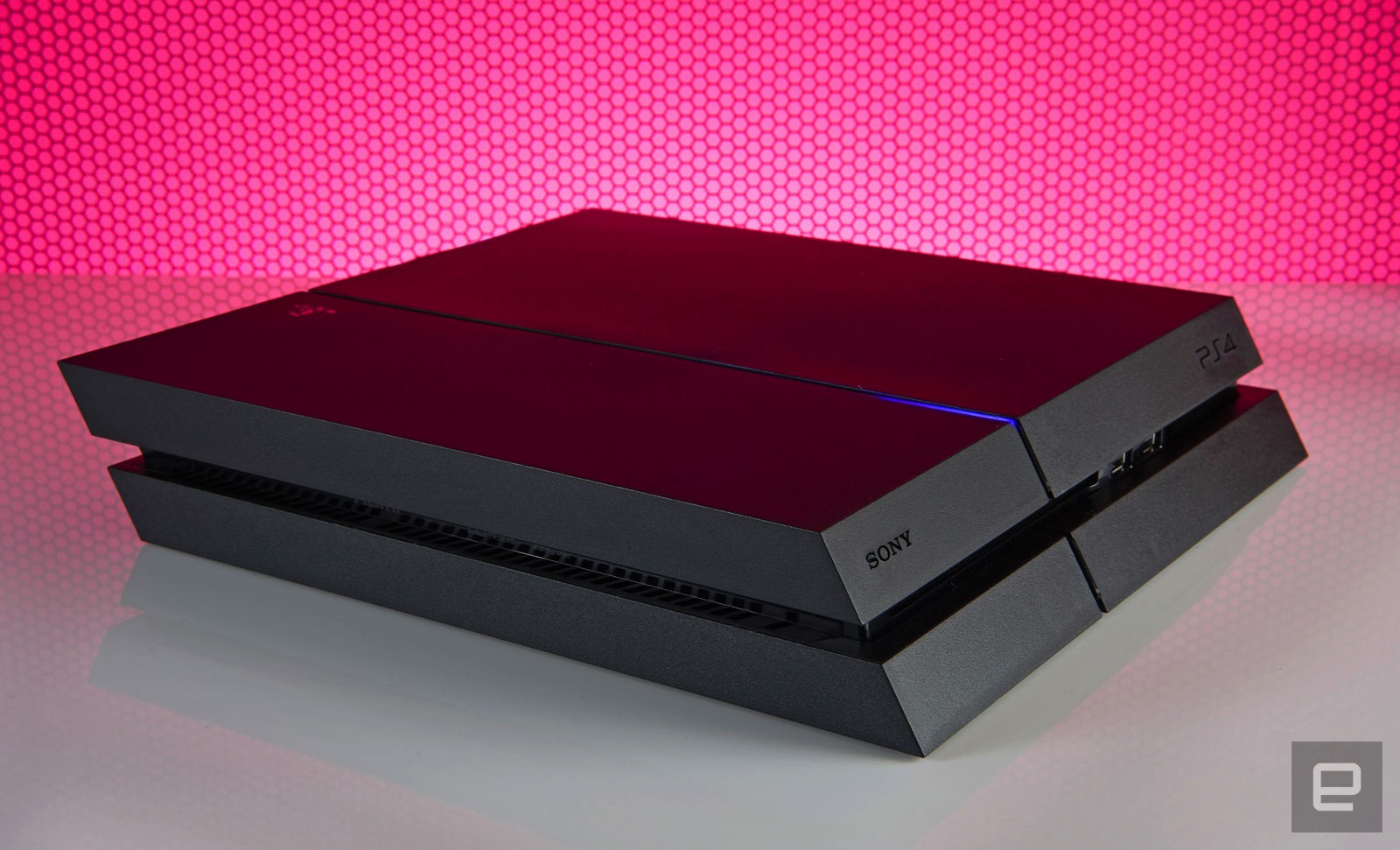
Sony has confirmed the existence of a newer console, the so-called PS4.5, but hasn’t said when you’ll actually be able to buy it. For now, then, the model that launched over two and a half and a half years ago is the one we’ve got. The system’s overall design hasn’t changed either. Aside from a nostalgic, ultra-limited edition console released in honor of PlayStation’s 20th anniversary, the standard version remains a coal-black obelisk. Except now, you can swap in game-themed or different colored faceplates if you’d rather the console not blend in with the rest of the black A/V gear in your living room.
Up front there’s a slot-loading Blu-ray drive, a pair of USB 3.0 ports and two touch-sensitive buttons for powering the system on and ejecting a disc. If you’re still mixing up which button does what (it’s OK, I do it myself occasionally), the top turns it on and the bottom spits your discs out. Finding them in the dark is a pain, but they’re directly in line with the LED strip that runs from front to back. It glows orange when the system is in low-power mode, making it easy to find the buttons by feel. Around back, meanwhile, you’ll find you’ll find an HDMI socket, digital audio output, Ethernet jack and a dedicated PlayStation Camera port.
The system is also surprisingly portable. Because the PS4 uses the same-style power cable as the PlayStation 3 Slim (and many other electronics), along with a standard HDMI cable, there’s no need to unwire your entire A/V setup just because you’re housesitting and don’t want to be away from Uncharted 4: A Thief’s End for a weekend. There’s no bulky external power supply to carry around, and the console itself is small enough to easily fit into a backpack or messenger bag.
The disadvantage here versus Microsoft’s console is the PS4’s lethargic 802.11b/g/n wireless card. If you take multiplayer seriously or just want the fastest downloads possible, you should always run a hard connection to any gaming device, but sometimes being close enough to a router to do so isn’t possible.
Doing anything on the PS4 over WiFi is a time-consuming process, be it downloading a game from the PlayStation Network Store, or an update for a game or the system itself. Indeed, some Engadget staffers have seen downloads almost three times slower on WiFi versus a wired connection. Over Ethernet, the system’s built-in speed test reports 79Mbps downloads and 4.4Mbps uploads on my home network. With WiFi that number dropped to 32Mbps down. That said, our gaming reporter Jessica Conditt has never experienced such issues on her PS4.
In 2013 the iPhone 5s supported 5GHz wireless, and Microsoft also packed dual-band capabilities into the Xbox One, which came out that year. This was a weird omission on Sony’s part, then, and it’s become all the more noticeable considering how many people buy their games digitally these days, and how large these files are. Uncharted 4 comes in at over 50GB, for instance. A faster WiFi card would also make streaming a game to another device via Remote Play a better experience.
Unlike the Xbox One, the PS4 doesn’t support external hard drives, which would augment the system storage. That’s partly because it doesn’t need to: You can swap in a new internal hard drive as large as 4TB, a step up from the base model’s paltry 500GB of storage. The dearth of USB connections is a bit of a problem, though. If you’re using the PlayStation Gold wireless headset, for instance, that eats up half of what’s available. Listening to music via a thumb drive and your DualShock 4 controller’s battery dies? It’s time to decide which is more important unless you have another device with unused USB ports nearby that you can use to charge the gamepad.
DualShock 4 controller
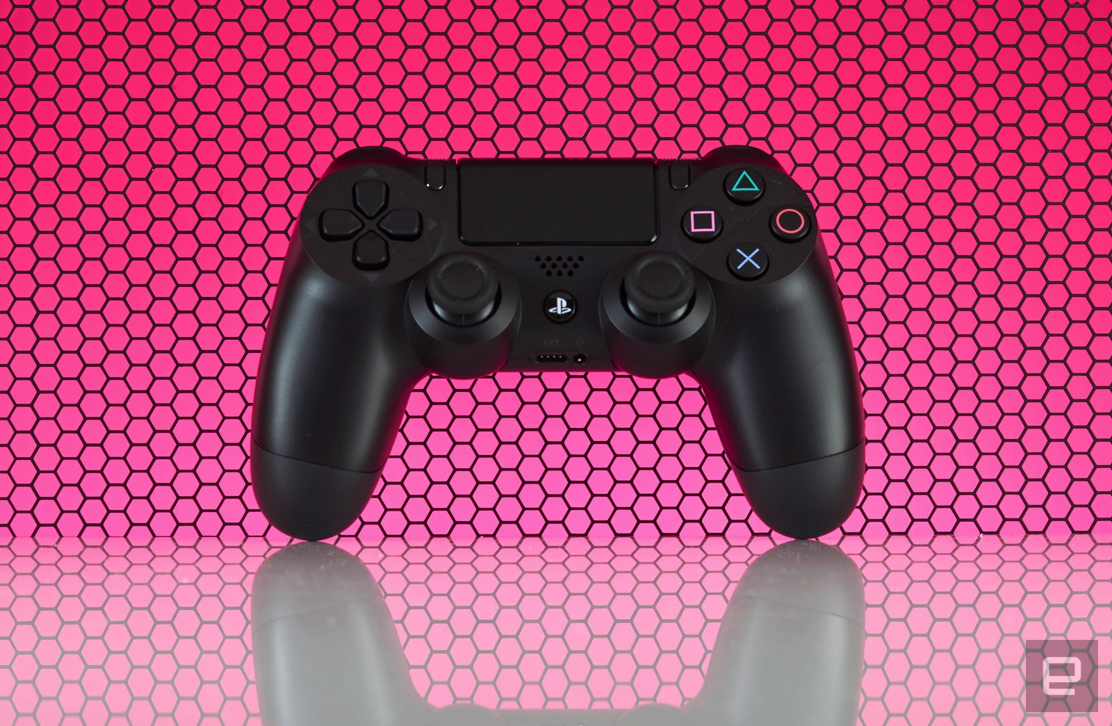
Speaking of which, the DualShock 4’s battery life is still awful. System updates have added the ability to change the brightness of the controller’s lightbar (a likely culprit for battery drain) but I’m still lucky if I can go more than two play sessions, totaling about eight hours, before having to charge it again. In contrast, I only need to replace the batteries in my Xbox One controllers every few months. Maybe Sony could address these issues the way that Microsoft did and release a premium-priced controller with higher-quality components and improved battery life. I’d buy one.
In other gamepad-related woes, the concave thumbsticks that original reviewer Ben Gilbert raved about have an inherent flaw: Their grippy, rubber covering is susceptible to tearing with normal use, revealing sharp plastic underneath. You can hit Amazon for a variety of inexpensive replacement sticks, but that requires tearing open the gamepad to install them — not an easy feat for most. The better solution is opting for silicone caps that stick on your stock thumbsticks. But this honestly shouldn’t be an issue in the first place, especially considering how comfortable and well-designed the rest of the controller is.

The inclusion of a standard 3.5mm headphone jack on every paddle means that you don’t need to shell out for a gaming headset if you already have stereo earphones. That said, aside from a handful of games like the excellent, Sony-developed Tearaway Unfolded, the on-board speaker goes mostly unused.
Same with the clickable touchpad that dominates the gamepad’s face. A vast majority of the time its touch-sensitive surface is neglected in favor of developers just treating it as an extra button. When a developer does make use of these novel features they tend to be really well implemented. It’s a shame more don’t take the time to. What isn’t a gimmick, though, is the “share” button to the immediate left of the touchpad, but more on that later.
PlayStation Camera
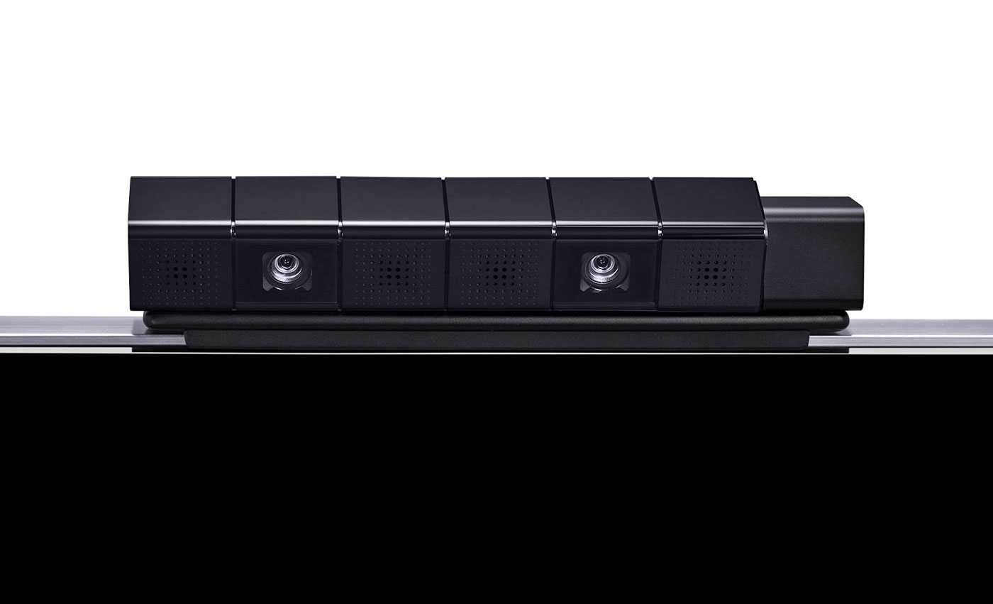
Lastly, we have the PlayStation Camera, an accessory that has been mostly forgotten by game developers. Like the touchpad, speaker and color-changing lightbar on the DualShock 4, very few devs have taken advantage of this accessory. Until Dawn uses it to record video of who’s playing during scary moments, and Tearaway Unfolded took advantage of it to occasionally break the fourth wall, but until PlayStation VR launches it’s not necessary. Sure, logging into my PS4 profile with my face is novel, but I couldn’t tell you what triggers the facial ID system to launch on start-up; I still regularly have to log in the old-fashioned way, choosing my profile with a controller. There’s just no compelling reason to own one right now.
UI

For the most part, zipping around the PS4 interface is fast. It’s an iteration of Sony’s Xross Media Bar UI from the PS3 (yeah, substituting an “X” for a “C” is still awkward), with a horizontal row of tiles for recently used items like games, apps and streaming services. Each game offers patch notes, and each tile has a drop-down menu featuring additional content. You’ll also see your saved screenshots and videos, along with recent activities from friends like trophies unlocked. It’s a lot like the social feed from the Windows 10 patch on Xbox One, but integrated on a per-game basis rather than one river of everything. Even with a speedy, wired connection, though, the drop-downs (which rely on data from PlayStation Network) are slower to load and navigate compared to the main UI.
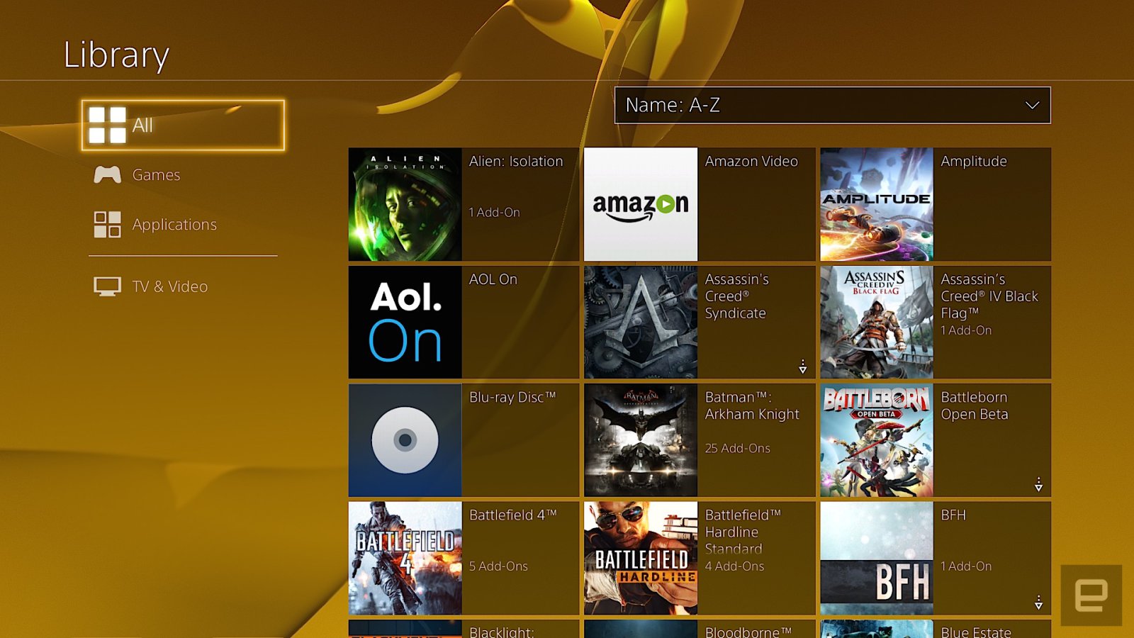
The PlayStation Store where you access streaming applications and game downloads sits at the far left; on the opposite side is the library. The library was added after launch, and it’s where your entire collection of games and applications resides. Anything you’ve downloaded or installed lives here in a grid. The problem is, it’s a pain to navigate because even if you’ve uninstalled something, it still stays on the list. That means the Destiny First Look Alpha I was part of two years ago is there alongside Doki-Doki Universe, a demo I grabbed but never played. This means sifting through a lot of clutter just to get to the stuff you own.
The library was supposed to help streamline the main UI, but in practice it’s about as effective as shoving your laundry in a closet before company comes over, to give the illusion that you actually cleaned your house. Your most recently used items stay on the main screen, but with time, unused ones will migrate here too. What’d be really nice is the option to customize the main UI or at least pin specific apps and games to the home screen, similar to what the Xbox One has offered since 2013.
Pressing up on the d-pad reveals tabs for the PlayStation Plus premium service, notifications, your friends list, an event calendar, messages, party chat, user profile, trophies, system settings and power options. With the exception of the PlayStation Plus tab, everything loads almost instantaneously, and is logically sorted. In the system settings, for example, Sony removed some of the arcane video settings that were on the PlayStation 3 and opted for a more streamlined setup. That simplicity extends to options for adjusting audio output, and connecting social accounts, among other things.
My biggest gripe with the PS4 is how it handles system storage. Countless times, I’ve gone to either download or install a game and the console has given me an error message saying there isn’t enough free space on the hard drive. Except there is. The most recent offense was with Doom. My PS4 currently has over 60GB of free space, and Doom is a 47GB download. Entering my redemption code, I received an error message and was transported to the system storage screen to clear up some space. Deleting 86GB of games I wasn’t playing anymore should’ve solved the problem, but didn’t. I’ve since power-cycled the console and rebuilt the system database from safe mode. Forty-five minutes after the initial attempt, I was finally able to start downloading the game.
And that’s the best-case scenario. On previous occasions, rebuilding the database and deleting over 100GB of installed games didn’t fix the error. I’m not even sure what I did to eventually fix it those times, now that I think about it. When I asked a Sony engineer about this, he didn’t have a clear answer for me. One response was that game files need more space to uncompress than their download size suggests, hence the error about not having enough storage space. But the engineer I spoke with couldn’t explain why, even after deleting and rebooting, that sometimes didn’t address the error message.
Social
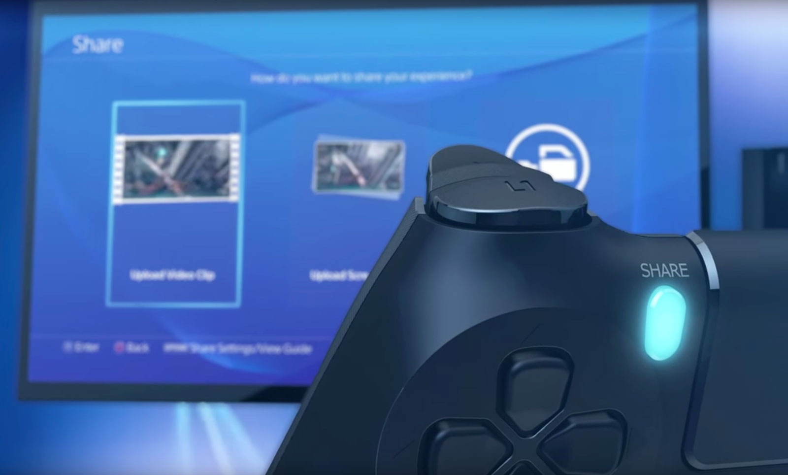
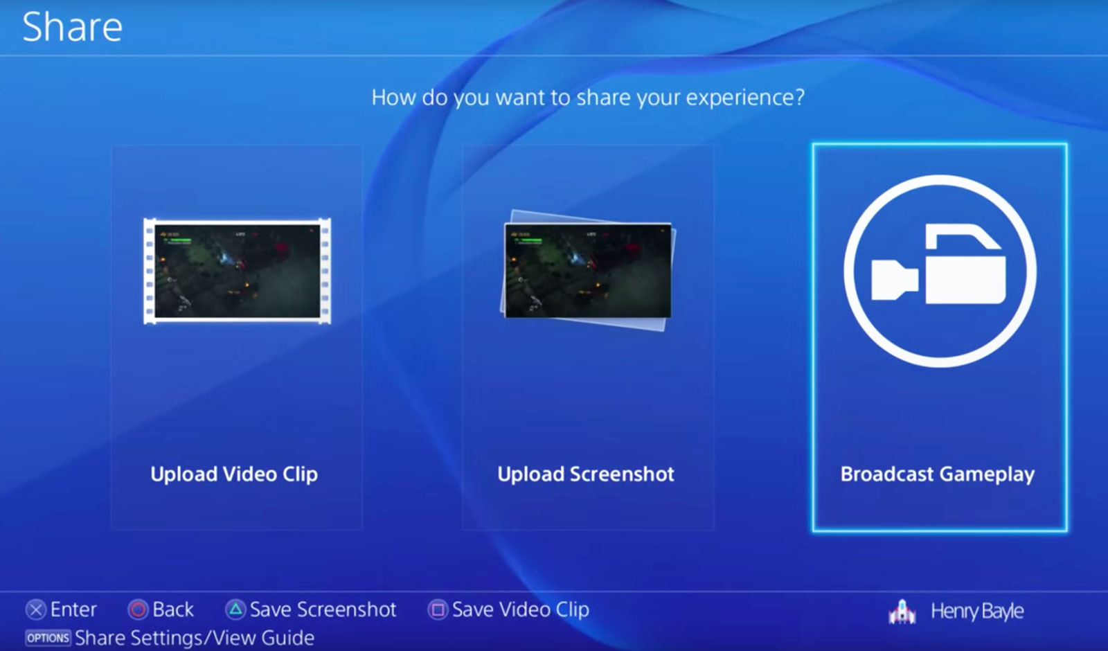
The heart of the social experience on PS4 is located right on the gamepad, where you’ll find the “share” button. Pressing it takes screenshots, records video and starts a game-sharing session or a broadcast on Twitch or YouTube. Depending on your preference, you can configure the button a few ways. You can also configure what happens when you press it. Personally, I have the button set up so that a single press grabs a screenshot and a double tap starts recording a video clip.
This saved media can be shared in a variety of ways, including as a message or to Facebook and Twitter. That will post the screenshot or video clip to the “What’s New” activity feed on the home screen. Unlike the Xbox One’s “community” tab that sorts everything into a reverse-chronological river, What’s New is three tiles wide, pushing game broadcasts from the community, not your friends list, notices of trophies unlocked by friends, suggested friends and PSN Store advertisements into one feed. It’s a mess to navigate and I rarely use it.
What I constantly take advantage of is how easy it is to take and share screenshots on PS4. Sharing them via social media is seamless and takes five button presses and I’m back to whatever I was playing prior. The annoying thing here is the inability to simultaneously share to Facebook and Twitter. Being able to take screenshots almost anywhere (and save them as PNG files instead of just JPEGs) almost makes up for it. Aside from the Twitch app, all the screenshots taken for this review were captured without using external methods. Even better? You can save them to a USB stick and do what you want with them; no need to upload to OneDrive and then download to a computer like on the Xbox One.
Another destination for your screenshots is the Communities feature introduced in the last big firmware update, version 3.5. Communities are what you make of them, and can be used to organize clan games, share screenshots to the discussion board and, well, that’s about it.
Game broadcasting
When the PlayStation 4 debuted, there wasn’t a fully dedicated Twitch app. You could watch streams originating from PlayStation via the Live From PlayStation application, but if you wanted to check out a stream of, say, the Dota 2 International you’d have to load Twitch on the system’s web browser. It was incredibly janky. Live With PlayStation broadcasts aren’t just favored; they’re the only ones that are picked up by the homescreen drop-down menus and the “What’s New” tab. But at least now there’s an official Twitch app for watching broadcasts. It works like the Xbox One version does, with a main grid of channels to choose from on the home screen, video and chat taking center stage on a given broadcast, and past streams and channel info off to the right.
While the streaming options started out limited, today they’re pretty robust. You can stream to YouTube, Twitch or even Dailymotion. You can also customize your stream with camera effects and a green screen (to remove any background from what the PlayStation Camera picks up). It offers more flexibility than broadcasting from Xbox One does, but you’re still better off launching your pro-streaming career with a PC and capture device.
PlayStation services
Sony really likes the “PlayStation” name: It’s put it on a number of services accessible from the PS4. PlayStation Now is the company’s quasi-Netflix-for-games streaming service; PlayStation Vue is its TV app for cord-cutters; and PlayStation Plus is its monthly premium service, granting access to online multiplayer and three free game downloads per month.
Rather than offer true backward compatibility for older games via software emulation a la Xbox One, if you want to play a bulk of Sony’s legacy titles on your PS4 you’ll have to pony up $100 for a yearly PS Now subscription, $45 for three months or $20 per month. Is it worth it? Not really. Even with a solid internet connection, game streams cap out at 720p, audio quality isn’t on par with a disc-based game and there’s lag stemming from streaming gameplay off Sony’s servers, to your PS4 and then returning your controller input to the server. Taking the price and user experience into account, it’s a far better idea to pull your PS3 out of the closet. If you have a hankering for an even older game, downloading a PlayStation or PlayStation 2 game from the PSN Store and playing it on a PS Vita is a much better idea.
Microsoft wanted to control your TV’s main HDMI input with its plan to make the Xbox One into the ultimate set-top box, but it’s Sony that’s come closest in that regard, thanks to PlayStation Vue. Even then, using the app (up to $50 per month depending on the package) that wants to be your stand-in for a cable subscription is still a rough experience.
I rarely play multiplayer games online, so paying for access to do so isn’t my cup of tea. But PlayStation Plus is so much more than that. It gives me three free games per month, the occasional option to vote on what games will be free and discounts for digital purchases. A majority of the games are from indie developers, and while the quality of said games may have dipped as of late (not everything can be the killer survival horror game Outlast or local co-op adventure Lara Croft and the Temple of Osiris), they still regularly best what Microsoft gives away with its Xbox Live Gold promotions.
Different ways to play

In one form or another, Sony’s Remote Play feature has been around since at least 2010. But using the company’s PlayStation Portable handheld to access a PS3 and playing games from it always felt kludgy. Using a PS Vita handheld to do the same with the PS4 is dramatically better, but my giant mitts aren’t ready to trade a DualShock 4 for the Vita’s comparatively cramped confines just so I can play Destiny from my bedroom.
More than that, the Vita is missing a few buttons that the DualShock has, so you need to remap them to the handheld’s rear touchpad. Streaming to a Sony tablet and connecting the gamepad via Bluetooth works like a dream. If you’re after precision, though, and the game you’re playing requires lightning-fast responses, like streaming with PS Now, you’re going to be disappointed. Remote Play is an interesting feature, but unless you have the perfect setup for your network (home or otherwise), the tradeoffs might not be worth playing PS4 games away from your TV.
It’s the same with Share Play, the futuristic PS4 feature that lets you virtually pass a controller to someone else via the internet. The ability to have a friend across the country help you get past a tricky spot is pretty nuts. When it works, anyway. Same goes for playing couch co-op with a friend who isn’t in the same room with you. The problem is that Share Play requires an extremely fast connection between both people to provide the best experience. My modest 85 Mbps connection floated between “low” and just a few notches into the “good” rating. Even starting a session is dicey.
But when it works — and, more importantly, when the game you’re playing doesn’t block the feature — it feels crazy. The initial setup is really unintuitive, and the amount of lag will make or break whatever you’re playing. The X-Wing training mission in Star Wars: Battlefront is okay because it doesn’t require twitch reflexes for your co-op partner, but dipping into the game’s first-person shooter survival mode can be unplayable because of lag. Simply watching a friend play a game works pretty well, though, because it’s a passive experience and doesn’t rely on transmitting gameplay data from your console to your buddy’s.
Game selection
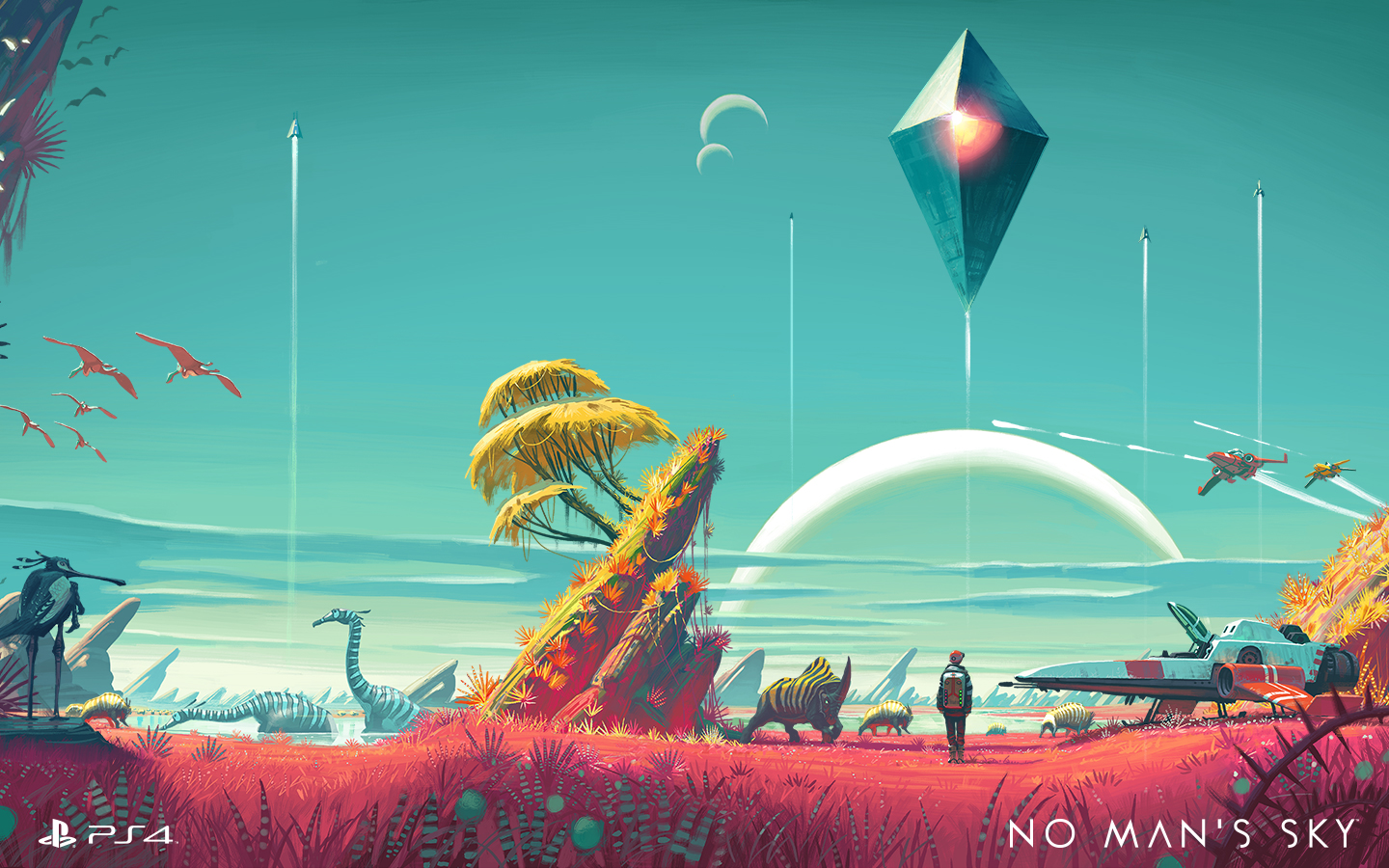
The list of fresh exclusives on PS4 keeps growing. Last year alone saw the ultra-tough Bloodborne, the perennial MLB: The Show and the interactive horror flick Until Dawn. That’s in addition to all of the indies that hit Sony’s latest console before Xbox One, like Rocket League. This year we’ve seen Ratchet and Clank, The Witness (a console exclusive), Uncharted 4: A Thief’s End, and another edition of Sony’s gorgeous baseball franchise, The Show ’16. There’s still No Man’s Sky, The Last Guardian and all of the upcoming PlayStation VR games as well. Simply put, there are lots of reasons to own a PS4, with even more to come.
Wrap-up

It’s easy to see how Sony has moved over 40 million PS4s. After getting kicked in the teeth for most of the last hardware cycle, Sony wasn’t about to let that happen again. The PS4’s focus has always been on games, not replacing your cable box. By focusing on that first and then augmenting the device with services like game streaming, Sony has built an excellent — in fact, the best — game console. It isn’t perfect, to be sure, but it keeps improving on a formula that already works well.
Pentax K-1 review – CNET
The Good The Pentax K-1 delivers excellent photo quality and a ton of features in a sturdy, well-designed body.
The Bad The autofocus is inconsistent and the image stabilization isn’t as good as competitors’.
The Bottom Line For photographers who want great photo quality for less than $2,000, the Pentax K-1 hits the bullseye.
Pentax’s full-frame dSLR debut, the K-1, hits at an opportune time. Canon hasn’t updated its 6D or 5D Mark III in at least a couple of years, nor has Nikon done so with its D750 or D610. That makes a new model at an aggressive price a welcome option. The K-1 offers a ton of features with excellent photo quality and a great shooting design, but it also has one of the least-sophisticated autofocus systems and occasionally sluggish performance.
The K-1 costs $1,800 (£1,600, AU$2,900) for the body. Pentax recently released two lenses optimized for the camera: the company’s K mount works for both APS-C and full frame, but the older lenses aren’t designed for the K-1’s high-resolution, 36-megapixel sensor. There’s the fast, wide-angle HD Pentax-D FA 15-30mm F2.8ED SDM WR ($1,450, £1,550, AU$1,350) and a more consumer-focused, less-expensive HD Pentax-D FA 28-105mm F3.5-5.6ED DC WR ($500, £580 and AU$850).
I tested it with the 28-105mm. While it’s nice that Pentax offers a relatively inexpensive lens for the K-1, I really didn’t like it much. It feels very much like an APS-C kit lens: I do recommend it for Pentax’s other cameras, but it just doesn’t do the K-1 justice.
Great photos, at its own pace
The camera’s photo quality is generally excellent. I don’t like the default Bright image setting, which overdoes contrast and saturation, but Pentax gives you plenty of options to fine-tune the options to your taste, and the camera can produce quite accurate colors. I’m a Natural girl.
JPEGs look clean through ISO 1600 and depending upon the image, remain usable at least up through ISO 12800. The JPEG processing is pretty good, too; while you can get a little more detail shooting raw, out-of-the-camera JPEGs will suit a lot of people.
The camera retains color well as sensitivity rises, too, though the raw files show a lot of hot pixels in dark images. That said, between the high resolution and solid dynamic range, I was able to get decent results cropping way into photos where I had to bring the exposure up five stops because the flash didn’t fire (not Pentax’s fault). I wouldn’t count on photos beyond ISO 51200, though. Blown out highlights are more hit-and-miss when it comes to recoverability.
Pentax K-1 full-resolution photo samples
See full gallery


1 – 5 of 12
Next
Prev
I didn’t see much moire in stills; there was a bit in video, though. The video quality is OK. You’ll need to play with the settings to retain highlights (there’s a flat image profile), and it’s just not very sharp.
Analysis samples

The K-1’s JPEGs are clean through ISO 800. They’re not exceptionally sharp at ISO 800, but I think that’s just the lens I used for testing.
Lori Grunin/CNET

You can see some blurring at ISO 3200, but JPEGs aren’t bad through ISO 12800.
Lori Grunin/CNET

Depending upon the scene, you can still get usable JPEGs through ISO 51200. Above that they’re pretty noisy.
Lori Grunin/CNET

With the Natural image settings, the colors are quite accurate.
Lori Grunin/CNET

Even as high as ISO 51200 you can recover some highlight detail.
Lori Grunin/CNET
OnePlus 3 review: King of the budget phones, but no heir to the flagship throne
OnePlus once touted itself as the “Flagship Killer,” offering top-spec’d phones at a budget price. With the first OnePlus device, they showed that they could swing with the big players, but were hampered by the oft-maligned invite system and poor marketing. The OnePlus 2 suffered a similar fate, coupled with some questionable design choices and average performance. Well, OnePlus seems to have found it’s groove with the OnePlus 3, a standout phone with flagship specs at a great price, and finally a invite-free purchase system that makes it much more available for everyone.
 OnePlus Three
The “Never Settle” mantra of OnePlus is on display here, as the OnePlus 3 features a 1080p AMOLED display, NFC, 3000mAh battery, a Snapdragon 820, USB-C and a whopping 6GB of RAM. It only has one storage option, 64GB, and features proprietary DASH rapid charging among other features. Certainly some impressive specs for a $399 phone, but how do they come together as a complete package?
Design
I immediately fell in love with the OnePlus 3’s design out of the box. Gone is the sandstone backing and overall cheaper feel to the build quality, replaced by a full-metal chassis and smooth curves, making it an absolute joy to hold. It has a premium feel in the hand comparable to that of an HTC device, which it seemingly borrows a lot of design cues from. Of all the OnePlus devices, this one is by far the best looking.
The OnePlus 3
1 of 5


The camera bump makes the phone rest at a slight angle.
The rear of the device is simple and clean. Only a set of antenna lines and a prominent camera bump, housing the 16MP shooter, adorn the back panel coupled with the small shiny OnePlus logo just below. It is admittedly a bit slippery to hold without a case, but not as bad as I expected it to be. The back has a nice arched contour for fitting in the palm, and is so light and sleek that I’d feel bad hiding it in a case. The OnePlus 3 is very reminiscent of current flagship phones in regards to appearance, which can be either good or bad depending on your opinion. Some may miss the sandstone texture and it’s unique feel and grip, and luckily there is a case offering that material from OnePlus if you’re feeling nostalgic for the older design. Along with the sandstone case, there are a number of other stylish protection cases in material such as bamboo, rosewood, carbon fiber and black apricot finish.
The front of the device is no slouch either, with an attractive slab of Gorilla Glass 4 housing the 5.5 inch AMOLED screen, and the prominent capacitive fingerprint scanner front and center. The fingerprint scanner is amazingly fast, OnePlus claims faster than Apple’s Touch ID, with the phone waking up seemingly the instant I touched my phone to the scanner. It’s flanked on either side by OnePlus’ trademark optional capacitive buttons, which are now simple illuminated dots that disappear into the bezel after a few seconds. Bezels are very thin on the sides of the screen, but the top and bottom ones are a bit big for my tastes on a 5.5 inch phone.
The side panels, measuring a scant 7.35mm thick, house the power button and dual SIM tray on the right side, and the volume rockers and still-present mute toggle switch on the left. The button placement and feel are excellent, they are easily reachable and satisfyingly clicky and responsive. The notification toggle switch is nicely textured and feels solid, but I wish they had reversed the order, with full notifications on top and none on the bottom.
 The top of the phone is bare metal, but the bottom is one of my favorite parts of the design. It holds the headphone jack, USB-C port, and surprisingly loud speaker. The whole bottom subtly curves towards the back of the phone, and the speaker grill holes and USB port are chamfered, lending even more to the premium feel and look of the 3. As bottoms of phones go, this one is truly excellent.
Display
The display of the OnePlus 3 has been a point of contention in the smartphone community. It’s a 5.5 inch “Optic” AMOLED display with a 1920×1080 resolution, that’s 401 ppi for those interested. It is a very nice screen, and a definite upgrade from the OnePlus 2, but the lower resolution is a bit of a downer considering pretty much every other Android flagship hits the 2560×1440 QHD resolution. The colors and image quality are clear and crisp, and more than enough for the average user but coming down from a Nexus 6P and it’s massive QHD  display, it’s a noticeable difference that made me miss the extra resolution for YouTube and movie watching. I will say that the lower resolution display has done well for battery life. OnePlus has included some decent customizations to the display, including the “Optic” tuning and a color balance slider, so you can adjust the color tone yourself.
For most people, the OnePlus 3 screen is perfectly capable, but anyone coming off of a QHD display may be in for some disappointment.
Performance and Software
The OP3 and its 6GB of RAM made headlines prior to it’s launch, and rightfully so. 6GB is a ton of RAM for such a small device, but does it have an impact on performance? The answer is… maybe. The RAM coupled with the Snapdragon 820 chip make this phone lightning fast and super snappy, jumping between apps with ease, but even with all that power under the hood it’s nothing mindblowing in terms of day to day performance. Gaming on the OP3 was satisfying and smooth, and app load times were in the expected range. Oneplus did add some nice tweaks to multitasking, including a clear-all button and a “clean” button to halt all background processes and clear all that RAM. It’s definitely comparable to today’s flagships in terms of speed, but it certainly isn’t the top contender in that regard.
One downside of the OnePlus 3 is the lack of expandable storage or larger storage options. 64GB is fine for me, but I know a lot of people who live and die by the SD card. It is disappointing for sure, but certainly not a deal breaker. Also, connectivity issues have been cropping up for many OP3 users, including myself. Difficulty with LTE connectivity, rapidly switching from 3G to 4G to LTE, as well as issues with wi-fi calling on T-Mobile have made using the OnePlus 3 off of wi-fi a bit harrowing at times. However, the problems are not nearly as bad as they sound, and regular daily use has been stellar otherwise, with these connection problems only popping up once in awhile.
The custom Android Marshmallow ROM, Oxygen OS, is just as light as before and with some welcome stability and performance improvements. OnePlus still offers those wonderful  tweaks to the stock experience, like optional hardware or software buttons, night mode, screen-off gestures and more. In place of the Google Now page on the left-most screen, OnePlus introduces the Shelf. The Shelf holds a place for widgets, recent apps, and a quick memo section for easy note taking. I initially avoided using the Shelf as I was so used to Google Now being there, but as I used the phone more and more I found it to be a welcome addition and very handy. Oxygen OS is easily one of the better ROMs for Android, being nearly as stock as a Nexus device but offering just enough customization and extra features to differentiate it.
Battery
Battery performance is very solid on the OP3. The 3000mAh battery and standard definition AMOLED screen do wonders for all-day use from 7 AM onwards, I rarely had to top off the battery with an average day’s usage. The phone does heat up a bit when under heavier use, but nothing too concerning so far. I was surprised at how well the OnePlus 3 stood up to my Nexus 6P with its larger battery, both managed to stay above 20% by the end of the day at 9 PM. OnePlus has done an admirable job of making sure users get the most out of the battery despite it’s pedestrian capacity.
Where OnePlus really shines is its DASH charging, a rebrand of Oppo’s VOOC charging technology. Using the included charger and cable, or any VOOC charger, the OP3 can get a full day’s charge, about 60-70%, in 15 minutes. It is mind boggling to plug in your phone and five minutes later see a 10-15% jump in battery life for the first time. Compared to the rapid charging on my Nexus, this was fast as hell and one of the best features of the OP3. It’s a shame that more chargers don’t support it, as I’d like to use a longer cord and still get the DASH results.
Camera
The camera on the OnePlus 3 is another area of merely average performance. The 16MP rear shooter is fine at all levels, but isn’t going to beat out the likes of Samsung when it comes to image quality. OIS is a nice touch, and shutter speed and focus are fast and responsive. Software-wise, the OnePlus camera app gets the job done, and has some nice manual options as well but the LG camera app from the V10 still has a bit of an edge in that regard. The front-facing 8MP camera is great for selfies, and works well. Snapchat users will have a great time using it to get those memorable snaps.
OnePlus 3 photo samples
1 of 4


Image quality has been satisfying on the OP3, especially in bright daylight. Low light pictures are fine, but the flash can be a bit aggressive if left on automatic, going off even in well lit areas causing a washed out image. I’m not generally a big phone photographer, so not the best judge of a camera, but the OnePlus 3 is certainly very good. Most people will have no issues at all taking some sweet photos.
Conclusion
Overall, the OnePlus 3 is an incredible deal at $399. You’d be hard pressed to find a more feature-packed device in this price range, with this few compromises. If I didn’t know better, I wouldn’t be able to tell that this was a device from a small Chinese offshoot brand at all. OnePlus should be commended on finally finding that perfect balance between specs, price, and design to make the OnePlus 3 a real hit. That being said, I still found myself drawn back to my 6P, for a few different reasons. The screen resolution and wifi calling issues are chief among them. The OnePlus 3 has all the element s to match or best the current crop of flagship devices from the likes of Samsung, LG, and HTC but if you’re currently using a 2015 or 2016 flagship device, the performance and specs aren’t enough to justify a swap unless you are a die hard OnePlus fan. If you are a budget conscious person, the price certainly crushed the competition and other phones in it’s price range just can’t compare. I would say that the OnePlus 3 is a excellent device, if maybe not as polished as it’s competition, but that doesn’t stop it from being one of best phones of 2016. The OnePlus 3 is king of the budget phones, and a great pick for those looking for an affordable phone that Never Settles for budget features.
2016 Ford Mustang GT review – Roadshow
The Good The Ford Mustang GT features a standard electronic line locker and, with the manual transmission, launch control. With 435 horsepower, this thing is a burnout and quarter-mile machine. Sync 3 is so much better than the last generation of Ford’s infotainment. The new rear suspension and convertible top make this very comfortable tourer.
The Bad The cabin materials feel more economy car than “GT Premium.” The convertible top has a pair of odd plastic bits to cover exposed hardware when retracted. Many of Ford’s driver aid features are missing from the Mustang’s option list.
The Bottom Line The Ford Mustang is an extremely flexible sports car. It’s a bargain at the base level; in GT trim it’s an exciting performer; and it transforms into an airy, comfortable grand tourer with a convertible top.
I don’t know about your neck of the woods, but summertime on the California coast means that you’re pretty much guaranteed to see dozens and dozens of rented ragtop Mustang convertibles packed with tourists making their way slowly down some of the best driving roads in the nation. I’m beginning to think that the Pacific Coast Highway and the Ford Mustang convertible were made for each other.
To put this hypothesis to the test, I hit the coastal highways south of San Francisco in a 2016 Ford Mustang GT California Special. And just when I thought it couldn’t get any more on the nose, my example arrived in a San Francisco Giants-esque bright orange-and-black color scheme. Alrighty then, let’s play tourist.
California Special edition
What’s so special about this “California Special” edition? Well, nothing performance-related, this is basically a visual and styling upgrade. The package adds California Special badging inside, outside and in the engine bay. It features a selection of black trim bits; we’ve got 19-inch black wheels, black stripes, spoiler and hood accents. Up front, there’s a unique grille and in the cabin there are suede inserts on the seats and door panels.

Antuan Goodwin/Roadshow
Motorized convertible top
I was eager to hit the road, but this GT is a convertible so I first took some time to explore the motorized ragtop.
The Mustang’s top drops with the twist of a release at the top center of the windshield hoop and the touch of a button, lowering in about 13 seconds and rising back up in about 16. You can control the entire motorized operation from the driver’s seat and the Z-fold top mostly forms its own cover when retracted, but leaves some of its hardware exposed through two sizable gaps at the corners.
Ford has included a pair of plastic trim bits that you’re supposed to snap into place to clean up the look of the retracted top, but I’m not going to get out of the car to fiddle with them whenever I want to put the top down and again when it’s time to close up and, I’m guessing, you won’t either. I left them awkwardly flopping around in the trunk all week. You’ll probably want to toss them into a closet somewhere.
After a few days logged behind the wheel, I began to understand why I see so many rented Mustang convertibles clogging the Pacific Coast Highway every weekend. (Well, V-6s, not GTs.) With the top dropped, the front seats don’t experience a whole lot of buffeting from the wind, even at highway speeds. (I can’t speak for the rear seats, but with so little legroom back there, I’d wager the winds would be the least of your troubles.) The ‘Stang offers a pretty comfortable ride and an unobstructed view of the world around the car.

Antuan Goodwin/Roadshow
Coulda had a V-8…oh, wait. I do
Beneath the “Special” garnish and the Competition Orange paint — not my favorite hue, by the way — is the standard, but awesome, Mustang GT Premium trim level.
The GT is packing a 5.0-liter V-8 engine making 435 horsepower and a flat 400 pound-feet of torque. My example was even equipped with a six-speed manual transmission, a gearbox that feels pretty good whether you’re cruising, creeping through traffic or hammering it home. It’s not a perfect shifter, but does pretty well as a jack-of-all-trades.
Other available engines include the base 3.7-liter V-6 (300 horsepower and 280 pound-feet of torque) and a 2.3-liter EcoBoost I-4 option (stated at up to 310 horsepower and 320 pound-feet of torque). And, in addition to the standard manual transmission, all three engines can be mated to an optional six-speed SelectShift automatic gearbox with paddle shifters.
2016
Ford
Mustang
California
Special:…
See full gallery


1 – 6 of 40
Next
Prev
For the GT, zero-to-60 mph happens in about 5 seconds, if you drive like I do and tend toward preserving the clutch. The officially quoted 0-60 time is 4.7 seconds, which is already down from the GT coupe’s 4.5. That motorized top and its extra weight dull the Mustang GT’s performance edge just a hair compared with the hardtop. You’re unlikely to notice such a small difference in straight-line performance.
If by some chance you are stressing about 10ths of a second, then you should probably be looking at the 526-horsepower, 429-pound-foot Shelby GT350R, not a grand tourer-cruiser like this.
Burnout mode: Initiated (Electronic Line Lock)
All 2016 Mustangs feature a rear-wheel-drive power train configuration with available torque and traction balanced and optimized by a standard rear limited-slip differential and a new rear independent suspension.
The GT’s drive and traction control systems feature four modes that adapt the performance to the task at hand. There’s sport, normal, race and snow — yes, the more tame GT convertible features a potent race mode that makes it a potent-enough performance toy for enthusiast track days and casual autocrossing.

Antuan Goodwin/Roadshow
The GT models even feature a standard Electronic Line Lock feature, a sort of instant burnout mode aimed at warming up the rear tires for maximum grip in preparation for a quarter-mile launch in the most spectacularly smoky way possible. When activated via an in-dash menu, the system momentarily keeps the front brakes locked while leaving the rear wheels free to burn out the tires without burning out the rear brakes.
2016 Mazda Mazda3 i Grand Touring review – Roadshow
The Good The Mazda3 features an engaging ride, interior design above its class and an infotainment system with redundant touch and physical controls.
The Bad The infotainment system lacks the latest smartphone connectivity options, the gorgeous interior can be a bit drab in all black and its ride will not appeal to drivers of all flavors.
The Bottom Line With excellent on-road poise, bang-on aesthetics and an attractive price, the Mazda3 stands as a solid alternative to the segment’s stalwarts.
In a stomping ground long owned by two major players, the Honda Civic and Toyota Corolla, other small sedans seem like they’re just playing second fiddle. But the Mazda3 carves its own path, and it’s doing so in the only way that Mazda knows how — driving dynamics.
It would be tough to outclass the stalwarts in other ways. No economy car can truly be a technological runaway these days, not in the era of standard touchscreens and high-tech safety systems. The same goes for the interior — nearly every automaker realizes the days of the hard-plastic penalty box are behind us.
But when it comes to making a car that’s fun to drive without being a complete (and literal) pain in the tuchus for your average owner, boy howdy, that’s where the Mazda3 shines. Aside from the new-for-2016 Honda Civic, the Mazda3 has the whole segment by its neck in this regard.
Handsome without trying too hard

The Mazda3 has one of the strongest body lines I’ve seen. It could cut butter, albeit on a warm day.
Andrew Krok/Roadshow
The Mazda3 keeps to some pretty classic proportions. It doesn’t err on the side of gaudy, choosing thicker tire sidewalls even on higher trim levels. Although prominent, the character lines on the side refrain from giving the car a boy-racer aesthetic. It’s a pretty car that’s a little less futuristic than the new Civic, and it’s likely to age better as a result.
The real visual gem of this car lies inside. The 3’s interior is one of, if not the best in its class. Sure, there’s a bit of hard plastic here and there, but bear in mind this car starts below $20,000. Just like the exterior, the interior manages to avoid being boring without looking like it’s trying too hard.
The leather on the steering wheel and seats feels soft and pleasant to touch. The sensibly laid-out gauges include a perhaps-too-small digital tachometer to the left, and an information display to the right. The infotainment controls, including those mounted on the steering wheel, are easy to figure out and easy to use without distraction.
The biggest point of consternation is the standalone LCD display atop the dashboard. Not everyone likes the look, but I do. It’s certainly better than trying to build a dash bulky enough to swallow the whole screen, and it makes for good sight lines.
Sadly, the rear seat lacks much legroom. It’s smaller than both the Civic and Corolla, which is quite apparent with longer-legged front-seat occupants. Headroom can also be a bit cramped for passengers taller than 6 feet.
The
2016
Mazda3
i
Grand
Touring
is
a…
See full gallery


1 – 6 of 41
Next
Prev
Infotainment, two ways

The knob’s so good, you might even forget the screen is touch-capable.
Andrew Krok/Roadshow
Mazda caters to both early adopters and Luddites with its Mazda Connect system, which features both a touchscreen and redundant controls just aft of the shifter. In fact, I found the physical controls so easy to figure out, that I almost never touched the screen itself.
Mazda Connect is one of my favorite infotainment systems because it’s straightforward. Every page gets its own little dock of icons with descriptions. The navigation map is easy to use, even if not every street name pops up as I approach it. I can stream audio via Bluetooth while the phone is plugged in, which is not a possibility on every model, so my battery won’t die just because I want to listen to music not stored on my phone.
Connectivity options are limited, though. The car lacks both Apple CarPlay and Android Auto, or an onboard data connection for destination searches. I found its Aha integration a convenient way to find new points of interest while also expanding my listening options, even though it requires downloading and signing up for Aha’s service.
Frigidaire FPID2497RF review – CNET
The Good The Frigidaire Professional FPID2497RF dishwasher is well-designed and easy to use with handy features like jets that spray deep into your water bottle. The main jets do a good job of scraping dirt off of your dishes and not missing many spots.
The Bad The jets do get a lot of the dirt off initially, but the filter can’t keep up, so if you don’t scrape or rinse your dishes before loading them, you’ll notice small bits of food sprinkled throughout. For $1,100, I wish this dishwasher had a third rack and a couple of unique extras.
The Bottom Line If you’re willing to rinse your dishes, the FPID2497RF is a fine machine, but it needs to be more than that to be worth the premium $1,100 price.
I almost feel sorry for the Frigidaire Professional FPID2497RF dishwasher. It does a great job covering every inch of every dish with water and scraping off coffee, cheese and chili, even egg and wine stains. And we’re pretty tough on our dishwashers when we test them, tasking them with cleaning 13 different types of food that’s been sitting on our plates, bowls, glasses and silverware for 24 hours.
The Frigidaire gets almost all of the food we slather onto the dishes to come off, but the filter lets down the otherwise good design, so bulky foods mix into the water used to clean your dishes and end up spreading across the load.
Like I said, I almost feel sorry for the dishwasher because it does such a good job initially, and because the design of everything but the filter is appealing and effective. But the lofty $1,100 price erases any sympathy points I might have awarded this model. It’s a competent machine with a nice design and a passable number of features and cycles, but I don’t recommend it at its premium price.
The Frigidaire FPID2497RF brings class to…
See full gallery


1 – 5 of 8
Next
Prev
Polished looks
Typical of Frigidaire’s Professional line, the FPID2497RF features straight lines and an attractive stainless-steel finish that does well to resist smudges.
You can purchase the FPID2497RF from Lowe’s, and Frigidaire’s site will direct you to other retailers in your area. As with most large appliances, you can find it cheaper than the listed retail price. Currently, you can buy the FPID2497RF from Lowe’s for $700.
Pull the handle and the display on the right side of the hidden control panel atop the dishwasher’s door lights up.

Pick your cycle and options, and the display will estimate the time it’ll take.
Chris Monroe/CNET
On the left side of the panel, you can switch between the six main cycle options at a touch, then select from five options on the right to add extra dry time or increase the wash temperature. You can also save the cycle and options you use the most to the “My Favorite” button.
The cycles include standards such as a heavy, normal, and express wash, though Frigidaire calls the first one “Powerplus.” The express cycle is aptly named “30-minute wash” and it does do a satisfactory job on more lightly soiled dishes in the shorter time span.

The cycle options.
Chris Monroe/CNET
This Frigidaire doesn’t have any unique cycles or extra options that we’ve found on other high end dishwashers. Both the GE PDT750SSFSS and the LG LDT9965BD distinguished between the normal cycle and an auto-sensing cycle. GE’s dishwasher lets you run a cycle just on the upper or lower rack, and LG’s similarly lets you run a half load and specify if you want an extra rinse.
Inside, the Frigidaire FPID2497RF again isn’t missing anything egregious. The upper rack raises and lowers a couple of inches for added loading flexibility. The back two rows of tines on the bottom rack fold down so you can fit larger dishes. A couple of tines on the upper rack do the same.

This Frigidaire’s stem holders are well designed.
Chris Monroe/CNET
The FPID2497RF even has a couple of nice extras like well-designed wine glass stem holders that firmly clip your fragile glasses into place, and jets specifically meant to spray into tall bottles. The blue of those bottle jets and main jets at the bottom of the tub stand out in an appealing way from the otherwise understated gray of the inside of the tub and the racks.
Samsung Galaxy Note 7 Release Date, Price and Specs – CNET
Apparently, six is overrated. Rumors swirling around the next Samsung Galaxy Note — Samsung’s annual large-screen device with a stylus for navigation and drawing — say its name is jumping from 2015’s Note 5 straight to the Note 7, skipping the Note 6 model entirely.

Another Note will join this rogue’s gallery.
Josh Miller/CNET
But even more important than fretting over the Note’s new name is piecing together its identity: what kind of phone will the Note 7/6 be? Will it simply iterate off of the Note 5 and S7 that came before, or will it wow us with unforetold (or hinted at and unconfirmed) hardware goodies that shake us from the eyelid-drooping expectations of smartphones today?
The most reliable rumors suggest that the Note keeps its 5.7-inch screen, but adds a USB-C port (they’re all the rage) and an iris scanner for unlocking the phone with your eyes. Let’s take stock of the most telling rumors. (P.S. remember, they’re unsubstantiated, so anything could happen!)
Note 7’s the name
Chronology be damned! The internet agrees, the next Note will be the Galaxy Note 7 and not the Galaxy Note 6, even though 2015’s model was called the Note 5 and 2016’s version should logically be the Note 6. But who cares about logic when there’s branding at stake?
However, this would make for a mini-trend in phones named “7.” Samsung already has the Galaxy S7, and ZTE’s Axon lunged from the Axon to the Axon 7, and now this Note 7 rumor. Why? It could be a desire for Samsung to keep the Galaxy S and Note series in line, or perhaps phone makers have no wish to be left behind the gold standard Apple’s already established when and if Apple releases its iPhone 7 this fall as we approach 2017.
And yet, when you count up Notes 1-5 and add in the little-remembered Galaxy Note Edge, this next Note would make the line’s legitimate seventh addition. So there’s that math for ya.
We won’t know for sure until Samsung spills the beans, but the company remains tight-lipped for now.
Launch date: Early August instead of late August
Samsung’s Note line has been a mainstay at the IFA conference held in Berlin, Germany in late August, but whispers suggest an early August arrival. Either way, the phone would come ahead of Apple’s yearly iPhone launch in early September, which usually falls in the first two weeks of the month. Twitter tipster Evan Blass, who has built a reputation of accurate leaks, suggests that the phone will start selling around August 15.
Totally new software interface
New software, new name. The TouchWiz interface that Samsung has used for years to differentiate its phones from other Android-makers could see a major overhaul down to its name. We might kiss TouchWiz goodbye and open our arms to Grace, a more paired-down yet interactive take on the phone software, shown in an allegedly leaked video (below) from Italian site HD.Blog.IT. It’s suggestive even if you don’t understand a lick of Italiano.
The video goes pretty deep on widgets, and transparent folder effects, but one cool reveal is that you can swipe up on an icon to see a window that opens more cool stuff. Likewise, pressing and holding on a quick-access toggle in the notifications shade may snap open extra options for you to act on, like on the flashlight and Wi-Fi settings. For instance, the video shows that you can lower the flashlight brightness and change your Wi-Fi network without having to exit the notifications pull-down.
In essence, this could make the home screen and notifications shade even more of an activities hub than they are now.
The photo gallery could expand and condense with a pinch and zoom of your fingertips.
Updated Note software, too
Samsung usually previews its freshest take on its TouchWiz (or maybe Grace) software on the year’s Note release, but the changes go down to the pen level, too. This time, according to the HDBlog.It video above, we could see a lightly refreshed style with different icons, but much the same functionality to handwrite, scribble and navigate with a touch of the S Pen to the screen.
Pressure-sensitive screen? Not too likely
From what I can see in the Italian video above (which cites the build-of-unknown-origin as “Note5”), then the Note 7 doesn’t look like it borrows Apple’s pressure-sensitive display, which lets you press and hold until the screen gently jostles to pull up more granular data. Still, this is a persistent rumor, and one we also heard about the Galaxy S7 (it didn’t happen).
Iris scanner for real this time
We’ve also heard tell of an iris scanner that can unlock your phone by staring you in the eye. The iris scanner loomed large in Galaxy S4 rumors, too, but turned out to be a different feature that kept the screen from locking when you looked at it often enough. Now that Microsoft’s iris-scanning “Windows Hello” feature in the Lumia 950 has made the security option a reality, it’s much more likely that Samsung will include a real iris scanner this time around.
Other suspected specs
- 5.7-inch screen
- 12-megapixel camera
- 5-megapixel front-facing camera
- IP68 certified against water and dust
- 64GB of space expandable through a microSD card
- USB Type-C port; Quick Charge 3.0
- 4,200mAh battery
- Black, silver, blue colors
What about Android N?
Notably missing from the seething rumor mill is an indication of the Note 7’s operating system. Google’s Android N isn’t out yet and won’t be until fall, so don’t expect the new Note to come with the heretofore unnamed software to debut on this Note. Instead, expect Android 6.0.1 Marshmallow, with an upgrade later on, at least a few months after Google’s Nexus phones get a chance to show off all that N can do.
Price and availability
As a rule of thumb, Samsung’s prices hover on the higher end of the scale, and a stylus-packing handset like the Note goes for more than a smaller, more mainstream model like the S7. If prices hold from 2015, expect the 64GB version of the Note 7 to sashay out for roughly $800, which converts to roughly £600 and AU$1,080. Prices will vary further by region, carrier, storage capacity and promotional deals.
Samsung responded to a request for comment by saying “we don’t comment on rumors or speculation.”
Updated at 11:54 a.m. PT with Samsung comment.
Huawei Matebook review – CNET
The Good The Huawei Matebook fits a full Windows 10 PC into an iPad-sized tablet chassis. The fingerprint sensor is fast. Its screen and speakers are excellent.
The Bad You’ll get periodic pauses when launching applications or loading web pages, and battery life is merely OK. Huawei charges extra for the keyboard, stylus and dock you’ll need to use the Matebook like a PC.
The Bottom Line If you like what the Matebook offers, pick the Samsung Galaxy TabPro S instead. The TabPro S has an even better screen, better battery life and throws the keyboard in for free.
Visit manufacturer site for details.
What is Huawei? Just a Chinese company that could become the No. 1 phone maker in the world. Did you know the Google Nexus 6P is a Huawei? You do now. But the company’s latest device isn’t a phone — it’s a 12-inch Windows tablet that’s as slim as an iPad Pro. It’s just a shame Huawei couldn’t match it by every other metric.
Why to buy
Starting at $899 in the US (roughly £680 or AU$1,225, though UK and Australian availability is TBD), the Huawei Matebook is one of the first full Windows 10 computers to fit inside an iPad-sized chassis. (Not the 9.7-inch iPad, mind you — it’s closer to the size of a 12.9-inch iPad Pro.) The secret sauce is Intel’s new Core M processors, which don’t require any noisy fans or other ornate, girthy mechanisms to keep cool.

Left: The iPad Pro. Right: The Huawei Matebook.
Sarah Tew/CNET
Yes, it’s sleek — and like an iPad Pro (or Microsoft’s bulkier Surface Pro), you can attach a wrap-around keyboard folio to turn this tablet into a far more productive machine. I’m typing this entire review on the Matebook’s leather-bound backlit keyboard right now, and while I wouldn’t want to type a novel on these fairly stiff keys, they get the job done. The built-in touchpad is impressive too, with an extremely fine surface that makes for accurate mousing.
Meanwhile, the Matebook’s ridiculously fast fingerprint sensor logs me into Windows with a snap — seriously, watch our video above. And the Matebook’s screen and speakers are among the best compared to other tablets on the market. I actually enjoy listening to music on these speakers, which CNET tablet expert and resident audiophile Xiomara Blanco assures me is a mighty fine compliment. Just don’t expect any bass.

View full gallery
These key components don’t come in the Matebook package.
Sarah Tew/CNET
Why to avoid
Now that I’ve made the Huawei Matebook sound like a dream computer, it’s time to bring that dream crashing down.
Caveat No. 1: Intel Core M-powered computers aren’t all the same. A Core M in a thin tablet like this one is notably weaker than one in a laptop-sized chassis. I was able to get all my work done on the Matebook, but sometimes it would bog down. There’d be a huge pause before applications would launch or web pages would load. Thicker Core M machines haven’t given us as much trouble.
Caveat No. 2: The Matebook doesn’t actually come with the keyboard. $899 buys you a bare slate, with no way to control it except the touchscreen. That’s right: The Matebook isn’t even a “book” unless you pay an extra $129. The stylus pen costs $59, and the docking station you’ll need in order to add a monitor, pair of USB ports and an Ethernet jack is $89.
