


AE Electrolux 9000 Series washing machine Release Date, Price and Specs – CNET

The AEG Electrolux 9000 Series washer softens water for gentler cycles.
Electrolux
Imagine if your laundry appliances could ruthlessly rid dirt from clothes yet be gentle enough to never damage their delicate fabric and fibers. It may sound like an unrealistic dream but AEG Electrolux says its new line of washers and dryers are built to do exactly that. Freshly announced at IFA 2016 in Berlin, the new 9000 Series Washing Machine is especially capable of preserving laundry items.
According to the company this advanced washer actually filters and softens its water supply to clean more efficiently but at extremely low temperatures. The benefit of this approach claim AEG Electrolux is a washing machine which launders without leaching bright colors or deep blacks from your favorite garments even after scores of laundry cycles.
Use the app to choose a cycle
Another clothes-friendly tool in the 9000 Series Washer’s arsenal is the My AEG app, a mobile application which provides specific care advice based on the type of cloth you plan on cleaning. The app also chooses a recommended cycle plus tweaks its individual settings accordingly for optimal performance.
Built into the application as well are general tips and a guide to interpret the often cryptic symbols you see on clothing labels You can download versions of the software for either iOS or Android depending what platform suits your needs best.

Get laundry handling help from the My AEG mobile app.
Electrolux
Along with the 9000 Series, AEG Electrolux also unveiled the 8000 and 7000 Series washing machines though both are less sophisticated and lack water softening technology. In addition neither have the ability to link to the My AEG mobile application.
Better than air
AEG Electrolux pulled the tarp off of a pair of new dryers too designed to pair with their fancy washer siblings. Named the 8000 and 7000 Series Tumble Driers, the most notable is the 8000 series machine. It boasts cycles Electrolux claims safely dries items sown from unforgiving materials such as silk and wool.
An “Outdoor” mode is supposedly as safe as air drying and handles water-resistant, windproof, and breathable sportswear lightly enough to remove moisture but is hot enough to flatten wrinkles. That said the cycle won’t harshly strip away chemical coatings or destroy synthetic fabrics.
AEG Electrolux hasn’t yet disclosed pricing for these appliances nor did it release specific availability beyond sometime in 2017. The company does plan to have its connected laundry app up and running by, “mid-2017.”
YI 4K Action Camera review – CNET
The Good The YI 4K Action Camera is a remarkable camera for the money, offering great features and performance in an easy-to-use package. It has long battery life for its size. A touchscreen gives you full control of the camera or you can use the high-speed Wi-Fi to connect to your phone and control via an app. App handles shooting, editing and sharing. YI continues to add features through firmware updates.
The Bad You’ll need to buy accessories such as a waterproof housing. Though YI used Gorilla Glass, the touchscreen is not shatterproof. The microSD card slot is a little hard to access. Parts of the English app are still in Chinese.
The Bottom Line An action cam with a lot of features, excellent video quality and a more affordable price, the YI 4K is undeniably a good deal.
GoPro might be the undisputed leader in the action cam market, but its cameras are not without weaknesses. The greatest of those at the moment is age: GoPro’s top Hero4 Black camera was released nearly two years ago.
The YI 4K Action Cam kicks the cane right out from under that elderly camera by using the newest versions of the tech found in the Hero4, including an Ambarella A9SE75 chipset, a Sony IMX377 image sensor and a high-speed Broadcom BCM43340 dual-band Wi-Fi module.
These specs translate into a camera that has the same shooting options as the Hero4 Black, such as recording high-bit-rate 4K-resolution video at 30 frames per second (fps), 1080p at 120fps and 720p at 240fps, but it runs cooler and has better battery life. The performance is so much better that YI even put a touchscreen on the back — something only available for the Hero4 Black as an attachment or on the step-down Silver model.
 View full gallery
High performance on the cheap, YI’s 4K-resolution camera packs a lot of features into its tiny body.
Sarah Tew/CNET
On top of that, the YI 4K is $250 (roughly AU$330 or £190), around half the price of Hero4 Black, which is still selling on GoPro’s site for its original $500 (though Amazon has it for about $70 less). Having high-end components doesn’t guarantee great performance, but in the case of the YI 4K the result is an excellent little camera and a lower-cost substitute for a GoPro Hero4.
YI has continued to issue firmware updates for the camera, too, improving performance and adding shooting options. This includes a flat color setting for easier color adjustments when editing and an “Ultra” resolution setting that, like GoPro’s SuperView setting, takes a 4:3 aspect ratio video and digitally stretches it to 16:9 to get more of a scene top to bottom in your shot. The complete list of capabilities is extensive to say the least and is available on YI’s site.
Unfortunately, what it doesn’t correct for is the amount of chromatic aberration (purple fringing) around high-contrast subjects, such as the buildings against the sky in the above video. In general, you probably won’t see it when squeezed down for viewing on a smartphone or tablet. But blown up on a computer screen it’s easy to see. Also, like most small-sensor cameras, highlights can easily be blown out, costing you details in bright scenes.
Android 7.0 Nougat review: All about getting things done faster
After a surprise debut and months of previews, Android 7.0 Nougat is ready for primetime. The broad strokes haven’t changed since we first met Nougat back in March (when it was just “Android N”), which means it’s still not the game-changer of an update some people have been hoping for. Instead, what we got was a smattering of big (and overdue) features mixed with lower-level changes that make Android more elegant. That might not make for the most viscerally exciting update, but that doesn’t make Nougat any less valuable or useful.
The caveat
Before we go any further, let’s get on the same page about a few things. Yes, it might be a while before you get your OTA Nougat update. Yes, that wait will stretch out even longer if you’re not using Nexus hardware. Carriers and OEMs are keeping mum about their specific Nougat update plans, but if you do have a Nexus device, you can enroll it in the Android Beta program and install a full-fledged Android 7.0 build.
The first taste
I hope you weren’t looking of a dramatic revamp of Android’s stock look and feel — that definitely wasn’t in the cards for this first release. (Bigger interface changes might come with the launch of Google’s new Nexus devices, which will probably sport a sleek new launcher.) In fact, once you’re dumped onto your homescreen, you might notice anything new at all. That changes very quickly as you start to swipe around.
For all that Google has added to the Android formula in this release, there are two features that fundamentally changed how I used my Nexus. The first, dull as it might seem, is an improved take on notifications. In prior versions of Android, notifications would fill up the pull-down shade and just sort of sit there until you interacted with them. Then, pfft — they’d disappear. Nougat, however, does a much better job of bundling them up by app and let you get things done.

In the midst of writing this paragraph, two new emails popped up in my inbox. On a Marshmallow device, all I could do is tap on the notification to jump into Gmail and see what people were asking me. Fine. Under Nougat, though, I can expand that notification to see the full sender names and subject lines of a handful of my recent emails. Another tap lets me see the first few sentences of the email and (more importantly) archive or reply without ever jumping into another app. Google’s own apps all play nice with these expanded notifications, and other apps crucial for my life — like Slack, mostly — do the same. Even better, you can manage notifications for individual apps just by long-pressing one of their notifications. Your mileage may vary, but these changes have become crucial to me.

Then there’s split-screen multitasking, a feature that’s a big deal for big phones and gives Android tablets an extra edge. Here’s how it works: if you’re in a compatible app, you can long-press the Recent or Overview key (also known as “that square one”) to squeeze it into the top half of your display. The bottom half is taken up by the usual view of recent apps, and tapping one finagles it into the remaining free space. (If you’re working on a tablet, replace “top” and “bottom” with “left” and “right”.) In my experience, most apps worked in their diminutive forms pretty well. Sometimes they will make a fuss and proclaim they “might not work” properly running in a reduced size, but they’re usually fine — you’ll just notice some kludginess while apps try to figure out how to operate with such limited room.
Just for giggles, I ran Shazam in one window and Spotify in another, and wouldn’t you know it? The former could easily tell the latter was pumping out some Jacques Loussier. It’s a silly example, certainly, but it worked despite Shazam struggling to render all its interface bits in the right places. In time developers will (hopefully) smooth out the rough edges. The thing is, it can be tricky to work with both windows at the same time. I tried copying a bit of text from a Chrome window to a Hangouts window on the Nexus 6P for instance, and more often than not the necessary pop-up menus never appeared. Check this process out: I made Chrome full-screen, copied the text, went back to the split-screen view and then tried to paste into Hangouts. I didn’t get the pop-up option to do so, though, so I had to make Hangouts full-screen and finally pasted the text.

Of course, some apps don’t even try to adapt to smaller sub-displays. Games that take over the screen and obscure Android’s navigation keys certainly don’t and neither does image-heavy Instagram. When you try to force one of them into split-screen mode, they just sort of balk and refuse. Now, it’s understandable why the examples above don’t allow themselves to be contained in half a window: if they did, the experience would downright suck. What’s more puzzling is why Google didn’t extend this split-screen functionality to its own search app. You can have two Chrome windows working next to each other just fine, but you’re out of luck if you want to glance at info gleaned from Google’s search bar. It’s silly, arbitrary and more than a little annoying.

Thankfully, there are a few subtle features that help mobile multitasking work better. There’s an option to change the display size, for one, which scales everything on-screen up or down. For the people with lousy eyesight, display size can be cranked up three levels. For the folks who want maximum screen real estate, though, there’s a “small” setting below default size that neatly shrinks text, icons and more.
I always hated how big app icons were rendered on the Nexus 6P (one of the actual reasons I stopped using the phone), and this feature just fixed it all for me.
There’s also an option to clear all running apps when you’re sifting through the familiar stack of app cards (just like most other Android skins in recent years). Perhaps the single most useful Nougat addition falls under this category too — you can double-tap the Recents key to jump straight back into the app you were using last. It took maybe an hour for this to become second nature, and as far as I’m concerned, there’s no going back.
Diving deeper

Still other handy — though less exciting — features become apparent once you start digging around a little more. Nougat still offers the option of customizing your quick settings options, for instance. They’re arrayed in a 3×3 grid, with extra icons shunted onto another page. For even quicker access to your five most used settings, look to a new bar at the top of the notifications shade. It’s useful enough, especially when you’re in a rush to turn that flashlight or get that WiFi going.
For whatever reason, everyone finds themselves in their device’s settings eventually. Luckily for them, Google finally overhauled it a bit. While the old settings layout was basically just a list of categories you could dive into, the new one peppers the list with really helpful bits of context like remaining battery life, current ringer volume and how many apps were blocked from sending notifications. Settings sections like Display and Battery offer most of the same options, but now you can bring up a navigation sub-menu that lets you jump between those sections. Handy, but easy to miss. The main settings menu also offers suggestions that aren’t really all that helpful. It can tell you about setting up a fingerprint (on compatible devices) and change your wallpaper, but did we really need this? Most of the time Nougat just suggested I add another email account. Thanks, but no thanks.

The revamped Settings page, by the way, is where you’ll find more of Google’s new handiwork. Consider Data Saver, for instance: the feature lets you define which apps can use your data plan without limits and which ones can’t, which is all too handy if you haven’t migrated onto one of those unlimited data plans carriers have started talking up lately. And if you’re one of those fortunate polyglots, Nougat added support for 100 new languages. Maybe more important is how you can now also have multiple languages enabled at the same time, creating what Google calls a “multi-locale” — when Google searching, for instance, you’ll get results back in whatever enabled language you typed your query in.
Then there’s all the other stuff — the smaller changes that help Nougat feel more thoughtful and polished. At long last, you can set different lockscreen and homescreen wallpapers in stock Android. How it took this long to implement, I’ll never understand. There are 72 new emoji here because of course there are! (They’re part of the Unicode 9.0 standard). You can display emergency info like your name, blood type and allergies on your phone’s lockscreen, too, and Android Nougat also allows you to block calls and text messages from specific phone numbers. Oh, and the best part? Those numbers stay blocked across different apps.
Meanwhile, not everything Google planned for Nougat made the final cut. Remember that Night mode that showed up in the first developer preview? Well, it’s gone — sorry, folks. Google apparently chalked its excision up to poorer-than-expected performance, though you can re-enable it pretty easily if the thought of Dark Android does it for you.
Under the wrapper

Just as important in Nougat is all of the stuff you can’t “see”, strictly speaking. These foundational changes aren’t as eye-catching as some of Nougat’s other new features, but they’re more important — and more useful — than you might think. The most obvious of these low-level changes is Doze on the Go, which builds off of a similarly named feature that debuted in Android 6.0 Marshmallow. Think of it as a light sleep — when the device is locked but in motion, a set of rules kicks in that limit what apps can do and restrict their network access. Then, when the device can tell it’s staying put for a while, the original Doze rules from the Marshmallow update kick in, leading to still more restrictions meant to preserve battery life even further. The one-two punch of Doze and Doze on the Go might not blow your mind, but it should still move the needle — my Nexus 6P seemed to gain about an hour or two of standby battery life.
This year’s Android updates also folds in support for Khronos’ Vulkan API, which should make for some seriously good-looking mobile gaming. There’s a dearth of compatible games right now, though; here’s hoping more developers get to pushing performance and graphical limits soon. You might also notice apps installing and launching a little faster than usual, depending on what kind of hardware you’re working with. That’s thanks to Nougat’s just-in-time compiler, which works with existing systems to determine when to compile an app’s code.

The arcane stuff goes on. Encryption has been moved to the file level, which — among other things — means your secured device can boot up and compatible apps can do their thing before you even unlock your gear. It should also mean lower-end phones can be partially encrypted (and run a little better) since full-disk encryption can really screw with performance sometimes. Alas, I didn’t get to try this out on a low-end phone because who knows when Nougat will make it beyond the Nexus playground.
The value of other features won’t be apparent for a while, either. Consider the case of seamless updates: Nougat can support two system partitions, one for handling your day-to-day work and another that can install big software updates that quietly download in the background. Once those updates are installed, you’ll be told that Android will update itself next time it restarts, at which point the device starts using that updated partition (complete with all your stuff). It’s possible that some phone makers will never embrace this feature and existing devices like the Nexus 5X or 6P don’t play nice with it either. But we can at least assume it’ll pop up in this year’s new batch of Nexuses.
Those Nexuses, by the way, are likely to be the first devices to fully embrace features Google revealed at its 2016 I/O developer conference. Nougat ships with a VR mode, for instance, a sort of high-performance system that drives down the time gap between your head’s motion and the image on-screen updating. Neat, certainly, but we’ll get a better sense of the benefits VR mode brings to the table when Google’s Daydream virtual reality platform launches this fall. Meanwhile, we know that Google’s new intelligent Assistant will be baked into the company’s Allo messaging app and the Amazon Echo-like Google Home speaker, but recent evidence suggests it’ll also be made part of Android thanks to an upcoming maintenance release.
Wrap-up

After playing with Nougat for a week, one thing has become abundantly clear: Android is smoother, smarter and more elegant than ever. That doesn’t mean it’s completely issue-free — split-screen multitasking isn’t nearly as elegant as it could be and it kind of sucks that seamless software updates won’t happen on older hardware — but the platform’s foundation is in great shape. It’s a good thing, too. The version of Nougat you’re playing with now is just the first step, and you can bet the features we’re really looking forward too, like Daydream and Assistant, will build off of what was wrought in this update. Yes, chances are you’ll have to wait for a taste of Nougat, and yes, that blows. Just know that the improvements here, subtle though they may be, are worth the wait.
Garmin Fenix Chronos Release Date, Price and Specs – CNET
Garmin isn’t the first name that comes to mind when you think of luxury, but the fitness company is trying something new with its latest sport watch. The Fenix Chronos is a $1,500 (£1,100) multisport GPS watch with a titanium body and band, an ultra-durable sapphire crystal display, heart-rate sensor and a ton of tracking features. It’s strong, yet lightweight, but also very expensive and very big.
The Chronos also comes in a stainless steel option that is slightly more affordable: $900 (£850) with a leather strap or $1,000 (£950) when paired with a 316L stainless steel band. Aside from the titanium and stainless steel casing, all units are based on Garmin’s high-end Fenix 3 HR watch and have the sapphire crystal display, heart-rate sensor and other features.
Unboxing Garmin’s elegant Chronos sport watch…
See full gallery


1 – 4 of 21
Next
Prev
Features
The Chronos has an omni-directional GPS and GLONASS antenna for tracking a variety of different activities, including running, biking, swimming, triathlons, hiking, climbing, skiing, rowing, paddle boarding and golfing.
Other features include all-day activity tracking for things like steps, distance, calories burned, sleep and heart-rate, as well as smartphone notifications when connected to an iPhone or Android phone. The watch also includes auto stop, auto pause, running dynamics (a feature that can provide feedback on your runs when using a special heart rate chest strap), a recovery advisor, an altimeter, barometer and compass, and is waterproof up to 100 meters (about 328 feet).
 Sarah Tew/CNET
The Chronos is essentially a Fenix 3 HR (a watch I like a lot but find a bit too big) in a slimmer and more premium shell with some key differences. The optical heart-rate sensor on the back doesn’t bulge out as much, which makes it a little more comfortable to wear. It also doesn’t include Wi-Fi (it relies solely on Bluetooth to upload data) and has a smaller battery (180mAh on the Chronos compared to 300mAh on the Fenix 3 HR).
Battery life
You’re trading style for performance with Chronos when it comes to battery. Battery life is good, but not as good as the Fenix 3 HR. The Chronos will last up to 13 hours with an active GPS signal (3 hours less than the Fenix 3 HR) and up to a week as a watch and activity tracker.
A special UltraTrac mode will extend battery life to 25 hours when using GPS, but it disables the heart-rate sensor and reduces how often the GPS is pinging the satellite.
 Sarah Tew/CNET
Premium from the start
The Chronos is like no other Garmin device before it. Similar to the Huawei Watch and higher-end Apple Watch models, all three Chronos watches are packaged in a premium wood box. In addition to the watch, the box contains an instruction manual, charging cable and a second silicone watch strap (the straps have a quick release which makes swapping them quick and easy).
I’ve really enjoyed wearing the stunning Chronos the past few days. It has all of features that you could ever need for training, competing or walking around town, plus it doesn’t look like a normal sport watch. The Chronos can easily be paired with a dress shirt or suit jacket, although it is big and could look a little funny on smaller wrists.

Here’s the Chronos with the silicone watch band on.
Sarah Tew/CNET
Should you buy it?
Almost everyone reading this is better off getting a Fenix 3 HR or one of Garmin’s other watches. Technology is changing at a rapid pace, and $1,500 (or even $900) is a lot of money to spend on a device that will be outdated in the next two or three years.
The Chronos doesn’t do anything new, but if you put a premium on design and have some extra cash laying around, the watch has everything a budding athlete with a large checking account could ask for.
Alcatel Fierce 4 Release Date, Price and Specs – CNET
 Alcatel
Who says a big phone has to cost the moon? Alcatel’s Fierce 4, a 5.5-inch beast, offers large-screen lovers a budget deal. Really budget. In the US, it sells for $69 with prepaid carrier MetroPCS. T-Mobile will sell it in the fall, but we don’t have pricing yet.
That’s a shockingly low price. And with it comes the typical specs trade-offs to make the phone more affordable. Like the 720-pixel screen resolution, which is low for an expansive display, an 8-megapixel camera and the lower-powered processor. This is a phone for first-timers, for casual users and for people who really just need an inexpensive phone.
Hardware inside
- 5.5-inch HD display with 1,280×720-pixel resolution
- 8-megapixel camera
- 5-megapixel front-facing camera
- 1.1GHz quad-core Qualcomm Snapdragon processor (MSM8909)
- 16GB storage; 2GB RAM
- 2,500mAh battery
- MicroSD card up to 128GB
- Android 6.0 Marshmallow
The bottom line: Our quick verdict on the Samsung Galaxy Note 7
Samsung’s enormous, pen-toting Galaxy Note was something of a curiosity when the original came out five years ago — unwieldy and built for a niche audience. Since then, big phones have become the norm, and the Note line in particular has become ever more comfortable to hold. The new Note 7 is surprisingly easy to grasp one-handed, despite its 5.7-inch screen — not to mention well built and attractively designed with fast performance, long battery life and a top-notch camera.
Even if you choose to disregard the pen features, then, this is still a nearly perfect handset. In fact, one of our biggest complaints has little to do with the device itself: the steep $849 asking price. Other drawbacks include the not-always-accurate eye scanner and the fact that the updated S Pen feels a little flimsier than the last-gen version. Those few cons aside, this is the company’s best phone yet — of any screen size.
Fitbit Charge 2 Release Date, Price and Specs – CNET
Fitbit’s best-selling tracker is the Fitbit Charge HR. Since its January 2015 debut, it’s been one of our favorite fitness trackers at CNET. It’s affordable, can track heart rate decently and isn’t too big.
Now, just in time for the all-important holiday shopping season, Fitbit is unveiling its inevitable sequel. The Charge 2 costs the same as its predecessor ($150 in the US, or £130 in the UK/AU$250 in Australia), does a bit more. Really, the biggest difference is design: the new steel body and swappable bands mean you can add accessories — leather, rubber or even a slightly pricier special edition ($180, or £150/AU$290) with a different band finish.
Design is also the big attraction for the Fitbit Flex 2, the other new Fitbit the company announced today. The Flex 2 lacks a display and heart rate measurement and is more squarely focused on fashion, with optional bangles and pendant accessories.

Exercise modes can be picked on-band, or tracked automatically.
Sarah Tew/CNET
Solid sequel
Most of the Charge 2’s features are largely the same as on the Charge HR: 5-day battery life, continuous heart rate, automatic step and sleep tracking. But the new model is better designed, I think, with replaceable bands and a larger OLED black-and-white display that shows a lot more data than the Charge HR. It felt better on my wrist, but the band also comes across as slightly thicker than the Charge HR.
In fact, now the Charge 2 looks like a larger, thicker version of Fitbit Alta, which launched earlier this year. Like Charge HR, the strap has a standard watch buckle (which I prefer), and a physical button on the side of the tracker to go with a tap-sensitive display that sometimes takes several hard taps to register.

Feels comfy.
Sarah Tew/CNET
I’ve been wearing the Charge 2 for about a week, but this isn’t a full review. That’s because the final software update still isn’t here yet. But so far, the Charge 2’s bigger display is a big help. I can see the time and up to two stats at once: steps and heart rate, for instance. That’s pretty much all I need.
The bad news? The Charge 2 still lacks some stuff that other fitness bands have: this isn’t water resistant for showering or swimming, and it doesn’t have GPS (but it will use your phone’s GPS to record map data for runs, like the watch-like Fitbit Blaze released earlier this year).

Breathing, plus respiration feedback.
Sarah Tew/CNET
Chill out
Fitbit’s finally gotten into meditation, sort of. A new “Relax” mode estimates respiration on the band based on heart rate intervals and triggers either a 2 or 5-minute breathing session. Inhale, exhale. If you time your breaths just right, the background sparkles.
The session doesn’t get recorded on the Fitbit app at all: according to Fitbit, it’s just exploring the idea of mindfulness without statistics. It’s a bit like Apple’s Breathe app for Apple WatchOS 3. I tried it, and it helped me focus a bit. Was it like true meditation? Sorta. I got a feeling I was learning to pace my breathing. But I didn’t really understand if this was helping me in any measurable way. I’d prefer if Fitbit’s app encouraged using Relax at certain times, like after a workout or a long day.

My Cardio Fitness Score.
Sarah Tew/CNET
A new measure for heart health
There’s also a new focus on understanding heart rate. “Cardio Fitness” is Fitbit’s way of trying to boil down heart rate data to make sense as an everyday measure of health. In Fitbit’s newly updated app, a score now gets generated based on everyday activity, which is meant to represent your fitness relative to age and gender.
According to Fitbit, it’s calculated based on “resting heart rate and user profile.” Mine said I was “average to good.” The Cardio Fitness score is based on VO2 Max, a recognized test used to determine how much oxygen is used during exercise. Fitbit’s app offers a more accurate way of sensing Cardio Fitness by running with GPS enabled. I haven’t tried that yet, but stay tuned.
If Fitbit can crack gamifying cardio better, that could be the most important feature update of all. But it’s hard to tell if it works. The Cardio Fitness displays show what level I could be with more exercise or weight loss, but in a generalized way. And there’s a reminder that super-fit athletes can have Cardio Fitness scores well beyond mine. (Thanks, Fitbit.)

Swappable bands.
Sarah Tew/CNET
A few more features
Fitbit’s get-up-and-move way of encouraging standing — which requires 250 steps every hour — is onboard too, just like it is on the Fitbit Alta and will be on the Blaze. It’s less forgiving about being sedentary, which is good because the Apple Watch seems to mark me down as standing for every hour I’m awake.
There are a few notifications that come in on this band: incoming calls, texts and calendar notifications. It’s enough to know if someone’s trying to reach you, but not much more.
A lot of Fitbits
Fitbit makes a lot of trackers right now. This year, there have already been four: the Alta, Blaze, Charge 2 and Flex 2. Thankfully, Charge 2 replaces both the Fitbit Charge and Charge HR. But picking which Fitbit to buy isn’t exactly easy. The Blaze is bigger and has a few more features. The new Flex 2 is waterproof, but doesn’t have heart rate. Only the Surge has GPS, but that older watch now lacks newer features the others have. Charge 2 might end up being the best middle ground.
Full review coming soon
As a replacement for the Fitbit Charge HR, the Charge 2 looks promising. But also, a somewhat safe bet. The real question is whether Fitbit can truly conquer deciphering heart rate and making everyday fitness coaching easier to understand…and whether the Fitbit platform remains a strong sell for people looking to upgrade. I’d say this looks like a modestly improved Charge HR…and for the new display alone, I’d consider an upgrade.
Fitbit Flex 2 Release Date, Price and Specs – CNET
The Fitbit Flex 2 just might be the most stylish Fitbit we have seen to date.
It’s also the company’s first waterproof tracker, and the latest in an already large lineup of products that includes the Fitbit Blaze, Alta and newly announced Charge 2.
The Flex 2 is 30 percent smaller than its predecessor, the Fitbit Flex. It’s slim, discreet and has long battery life (up to five days). I can’t help but be reminded of the Jawbone Up2, which was an old favorite of mine.
The tracker is available now for $100 (£80, AU$130) and will begin shipping towards the end of September or early October. It comes with a rubber strap in both large and small sizes, but the beauty of the Flex 2 is its customization.

The Fitbit Flex 2 comes with a rubber strap.
Sarah Tew/CNET
The actual tracker is incredibly small, and pops into a new USB charger when it needs a top-off. It can also be used with a variety of accessories, including leather straps, metal bangles and necklaces. There will even be more luxurious bands from designers like Tory Burch and Vera Wang. The actual tracker is incredibly small, and pops into a new USB charger when it needs a top-off.
Related Links
- Everything Fitbit announced
- Hands-on with the Fitbit Charge 2
- Everything new in the Fitbit Blaze
As for features, it’s what you would expect from a Fitbit: It can measure steps, distance, calories burned, active minutes and sleep. The tracker also includes move reminders and can automatically recognize and record a variety of exercises like running and biking.
But there’s no heart-rate sensor or a display. The Flex 2 instead features five LED lights (along with vibration) to show step goal, move reminders and even alerts for incoming calls and text messages. After wearing it for a few days, I still get frustrated when I look down at my wrist expecting to see the time. It’s slim, but I wouldn’t wear it with a another watch.

The Flex 2 does not have a display.
Sarah Tew/CNET
Part of the reason we like Fitbit’s products is for the ecosystem. The Fitbit app is easy to use and has a large social base. The company is also adding a new adventures feature that uses your daily step goal to digitally travel to remote locations, such as Yosemite National Park. It’s an interesting concept that we haven’t seen before.
The band feels nice and the accessory straps, which start at $15 (roughly £10 in the UK and AU$20 in Australia) for rubber straps and go all the way up to $100 (£75 in the UK and AU$130 in Australia) for the gold bangle, help give it some extra personality. It doesn’t have all the bells and whistles of more expensive Fitbit products, but the Flex 2’s discreet style and waterproof design will be hard to pass up.
We will have a full review of the Flex 2 in the coming weeks. Stay tuned.
Sky Q review: The live TV box you don’t use for live TV
It’s more than a decade old, but Sky+HD remains one of the leading set-top boxes available to subscribers in the UK. YouView, TiVo and others all have their merits, but in terms of longevity, speed and ease of use, Sky’s had it all sewn up for years. But while internet-connected boxes like Now TV are Sky’s future, it needed a new piece of subscriber gear to get it through the next decade. The result is Sky Q, a family of devices that ensure you’ll never think about cancelling Sky and going to Netflix ever again. But here’s the gag: after years of development and a glitzy launch, Sky Q is a TV box that actively discourages you from watching TV. No, that’s a good thing.
Ecosystem

Sky Q isn’t a single set-top box, but a collection of products that, together, form an ecosystem of gear with gratingly similar names. Replacing the Sky+HD box under your TV is the Sky Q, which comes in either Black or Silver models. Silver is the premium option, offering 4K support (and channels), a 2TB HDD, five tuners and the ability to stream content to up to two mobile devices at once. The Black, meanwhile, tops out at 1080p, comes with 1TB storage, four tuners and streaming to just one mobile device.
If you previously wanted to watch Sky in more than one room of your home, you’d need a second set-top box wired directly to the same dish as the primary box. Q ditches this archaic system in favour of the Sky Q Mini, which piggybacks on the main Q box to stream live channels or recorded shows to a second TV. You can buy up to four Mini boxes with your subscription (first free, £99 each thereafter) if you’ve added the £12 per month multiscreen bundle, but be aware that you can only sustain two of them at a time, or just one if you have the Black box. You’ll also need the multiscreen add-on to stream to mobile devices using the Sky Q app.
Rounding out the lineup is the Q Hub, a revamped wireless router that’ll sit next to your phone line. This is only available to Sky Broadband customers, and choosing one gets you vastly improved WiFi performance. That’s because all of the Sky Q-branded devices in your home will form a mesh network that should banish any black spots without the use of additional boosters. Although, privately, Sky will supply extra boosters if your home is somehow incapable of sustaining a blanket WiFi network. Unfortunately, your humble reviewer lives in a Virgin area, and the Hub was unavailable for review.
Hardware
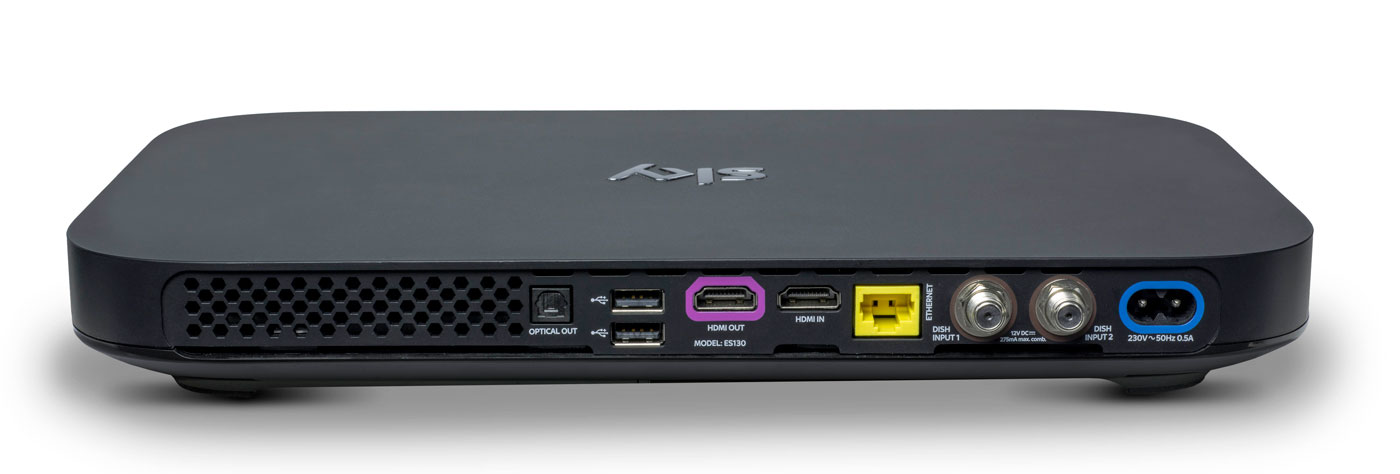
Do you remember how massive the original PlayStation 3 looked, and how tiny the PlayStation 4 was by comparison? The Sky Q boxes are similarly eeny-weeny, to the point where it’s almost shocking to see them side-by-side with the older model. The hardware measures just 330 x 210 x 43mm, down from the 364 x 255 x 73mm of the Sky+HD. In order not to break the sleek, elegant lines of the front, the viewing card slot is now hidden on the right-hand side. Up front, you’ll find a WPS button, the Q logo (which, when pressed, will cause your remote to bleep to make itself known) and an IR sensor. Round back, you’ll find the usual coterie of ports, including power, HDMI (x2), USB (x2), Ethernet, two dish connectors and an optical audio-out.
The Mini, meanwhile, measures in at 232 x 155 x 35mm and looks like a version of the main Q that’s been shrunk in the wash. Round back you’ll find slots for Ethernet, HDMI, 3.5mm audio-out, optical out and USB. If there’s one negative thing I could say about the Q Mini, is that I expected it to be smaller. Sky is an investor in Roku and the latest Now TV box (with a Freeview tuner) is a lot more diminutive than its wider and thicker cousin.
Remote

Here’s the bad news: your existing Sky remotes (even the branded ones) will not work with Sky Q. Except for the Sky Accessible remote, that is, which is designed for people with reduced dexterity and/or poor vision. For the rest of us, the company actually makes two controllers for the new gear: the futuristic Touch Remote, and a more traditional button remote that comes with the Mini.
For the purposes of this review, Sky let me borrow both a Touch Remote and a spare Mini remote that was paired with the Silver. This has turned out to be a Very Good Thing, because the former handset, for all of its bells and whistles, is going to be very divisive. Even Sky employees, off the record, have admitted that they struggle to use the newer handset and sometimes find themselves reaching for the simpler alternative.
The top third of the Touch Remote is dominated by a black, circular clickpad that you’ll use to gently scroll through the Q’s vast menus. The clicks are satisfying and the swipes have a real weight to them, and the further you pull south, the faster you scroll. That’s fine, and it’s really the only way to get around the significantly more dense UI that Sky Q is offering.
The issue comes with the capacitive playback controls that are housed in a half-ring above the clickpad. The bar offers a Play/Pause button and two arcs that end in a Rewind or Fast Forward command. Rather than a hard press, a dainty tap is all you need to get things moving, and you can actually slide across the arc to dictate the speed of play. Those with long memories will be reminded of the jog dial wheel that you’d find on super-expensive VHS players, updated for the 21st century.
Written down, it sounds fantastic, and futuristic, but in reality there are problems with how subtle the remote requires you to be. Linger too long, or press too heavy on the buttons, and you’ll find yourself picking the wrong option. Or you’ll press play, and follow through and put it back on pause again because the sensitivity is far too high. I’ve also had the remote on the sofa beside me, and my upper thigh brushing the controls is enough to jerk the picture into a frenzy of rewinding.
The Mini remote ditches the clickpad and capacitive controls for hard buttons, and I’ve asked plenty of visitors to try the both on for size. While I find the Touch Remote to be problematic, others have struggled to use it altogether, and express a liking for the simpler, nicer Mini remote. It’s less elegant for pawing through all of the Q’s menus, but it’s certainly easier to use in general.
I’ve always had a soft spot for the Sky+HD remote, with its easy-to-memorise control scheme and clear separation of sections. The Q remotes are a challenge to that muscle memory, not to mention that the “Back Up” button, an easy way to dismiss menus and overlays, is now a thing of the past. Instead, you have the “Home” button (which takes you to the Q Menu) and “Exit,” which lets you walk backwards one step, like a browser’s back button.
The other button below the clickpad is the apps menu, which lets you access apps for Sky News, Sky Sports News, Photos, Weather and Sky Help. I’m not sure that the menu deserves such a prominent button placement, especially given the limited utility of those features. It’s my hope that, down the line, Sky will let you add and remove other apps to the panel at your whim. For instance, it makes perfect sense to add YouTube to that list, given that’s where so many videos people look for are now housed.
Another annoyance is the loss of a dedicated subtitles button, great for when you need to translate a mumbled line of dialogue in a TV show. Previously, you could simply rewind a moment, hit subtitles and finally understand what the actors are saying when they move away from the microphone. Now, you have to come out of the show you’re watching, dive into the overall settings menu, find the accessibility panel and activate subtitles for all programs, forever. Suffice to say, it’s too involved to bother with, so I just live a life of ignorance.
Software

Shortly after the launch of Sky Q, BSkyB allegedly received a complaint from the BBC saying that Sky was deliberately burying public service channels. I can see why the BBC would feel this way, and there may be some legitimacy to its complaint, but the whole point of Sky Q is to bury all TV channels. Enter the home screen and you’ll be first presented with the Top Picks section rather than the channel menu. Hit the silver Sky logo at the top of the remote, and you’ll be dropped straight into your recordings.
It’s here that Q really earns its keep, simply by using My Q and Top Picks as a way of serving up content straight to your eyeballs. The latter is curated by flesh-and-blood humans at Sky HQ, while the My Q menu looks at what you’ve already watched and will make suggestions based on that. Every time I’m bored and begin to think about channel flipping, I never have to bother, because some new tidbit is being offered to me. If there’s one complaint, it’s that the content is skewed towards commercial stations and Sky’s own output. For instance, I’m currently being offered shows from the likes of ITV, Channel 4, Sky Atlantic, Nickelodeon and Disney XD. Part of that, I hope, is because it’s not yet learned that, as an adult, I’m not Nickelodeon’s typical audience.
There’s also an on-demand layer which will give you access to the catch-up TV platforms from all the main channels, including BBC iPlayer. But, while I’m not going to assume malice here, it does seem strange that BBC shows aren’t seen inside any of the curated pages. Unless there’s some technical or legal boundary that’s preventing proper integration, it’s enough to propel a half-decent conspiracy theory.
Sky’s previous channel menu was already vastly superior to pretty much everything else on the market. As such, the firm has taken the “if it ain’t broke” approach to the Q’s navigation menu, which has had a minor polish. The video preview has been moved from the top right corner to the left rail, leaving more vertical room for the channel list itself. It also uses smaller, clearer fonts that allow Sky to fit several more entries on the screen without scrolling.

Whoever’s in charge of channel ordering at Sky really does need to have a long think about user experience. It’s 2016, and I’d wager that HD is dominant enough now to end the days when HD channels are ghettoized in the channel order. It’s insane to think that channels 101 and 103 — BBC One and ITV One — are broadcast in SD. Their high definition counterparts, meanwhile, languish as channels 115 and 178. Clearly, there are contractual, technical and legal wrangles that probably prevent this being changed on Sky’s part, although I wish there weren’t. Perhaps the company should offer a setting that lets us re-order the list to end such a user-hostile move.
What has changed, and for the better, is the in-channel selection, for those moments when you don’t wanna stop watching your current show but are curious what’s about. Pressing up or down lets you sift through the channels in chronological order, but brilliantly, each one now comes with a video preview of what’s going on. I foresee this being a great way to avoid commercial breaks during your favorite shows, by switching to something else and using the preview as a second screen.
There are plenty of neat little touches, like being able to download a HD film in full if you catch it part-way through on a Sky Cinema channel. Similarly, hitting record on a show now presumes you want a series link, rather than just to catch that one individual instalment. Similarly, watching the first episode of a TV series on-demand will prompt the Q to download the second, ensuring you can bingewatch as if you were engrossed in your favourite Netflix show. Pushing shows to your tablet is relatively easy, although it’s an annoyance that the Sky Q app can’t be used on smartphones as well. After all, I do most of my remote TV watching on my 5.5-inch smartphone rather than on a 9.7-inch tablet.
Pricing
Sky Q, with all of its whizzes and bangs, now occupies the rarified space on top of the firm’s product line. But, as much as +HD is now the norm, Q is already getting cheap enough that people will begin to upgrade as a matter of course.
A Black Q (aka the 1TB box) will currently cost you £32 a month, but that doesn’t include any other channel bundles such as HD, box sets, movie or sport packs, and you can’t use the multiscreen feature either (an extra £12 per month). Silver (aka the 2TB box) is no costlier, but the one-off setup cost jumps from £49 to £99.
To give you an example of a fully featured package, a 2TB box with all the HD, movie, sports channels and multiscreen (with a free Mini thrown in) costs £86 per month with a £10 setup fee. Depending on what options you select, though, this or that will be discounted, like the £10 one-off charge (as opposed to £49 or £99) if multiscreen is included in your package. The pricing structure is an absolute mess right now. The fact 4K channels are included with the most basic of Silver subscriptions, yet you have to pay extra for HD channels, is a testament to that.
I know plenty of people for whom a Sky subscription with all the trimmings is a sacred part of the family budget. A sum like that, however, may be on the fringes of many people’s purchasing power — though a £74 per month Sky+HD subscription is equivalent to an £86 Sky Q package, albeit without the Q’s fancy value-added features. If you can afford it and you want the best, then go knock yourself out. If you can’t, then I wouldn’t suggest worrying over it, as I’m sure patience will ensure you’ll get cheaper access to it soon enough.
Wrap-up
I like watching TV, and my home setup can access Virgin Media, Netflix and Amazon Prime, which I have on almost constantly. Since I’ve been testing Sky Q, I can count the amount of times I’ve felt compelled to open Netflix and Amazon Prime on a single hand. And most of those were to watch the latest episodes of (AMC’s new Amazon Prime exclusive) Preacher. I already had access to a compelling list of movies and TV shows, and Sky’s content library isn’t so much better that I’m being swayed unnecessarily.
In fact, it’s more that the Q hardware is very specifically designed to serve up fresh, relevant stuff that I’ve not yet come across. Every time I go back to the home screen, it’s pulled up some new treat to dangle in front of my eyes, knowing that I’ll bite. Aside from watching the coverage of the European Championships, I’ve barely scrolled through the TV guide at all. Why would I need to? After all, why spend hours looking for something to watch when my set-top box can do the work for me?
This is the killer feature of Sky Q, and the hardware’s bells and whistles are secondary to simple editorial and algorithmic curation. By keeping you constantly hooked on a drip feed of stuff that the box thinks you’ll like, you very quickly forget all about the chore of scrolling through channels. With Sky Q, on-demand video really is king.
Philips Hue Motion Sensor Release Date, Price and Specs – CNET
This is typically the time of year when Philips tells us what’s new with Philips Hue. And, sure enough, here we are with a new Philips Hue motion sensor accessory. Sync it up with your smart-lighting setup when it arrives this October, and you’ll be able to trigger your color-changing smart bulbs just by walking into the room.
The device doesn’t look much different from other motion sensors on the market. It’s a small, square gadget that you can hide under the bed, mount on the ceiling or stick to the fridge thanks to an included magnet attachment.
Also included: a built-in daylight sensor that promises to save energy by activating lights only when you actually need them. That’s a smart little extra that you won’t find in most other motion detectors.

There’s an ambient light detector built into the top of the Philips Hue Motion Sensor. Its job: to keep the sensor from turning on lights unless you actually need them.
Tyler Lizenby/CNET
The motion sensor is completely wireless, and runs on a pair of AAA batteries. You can pair up to 12 of them with the Philips Hue Bridge, then program which lights each one should control within the Philips Hue app. Once you’ve got everything set up, Philips promises that the lights will come on within a half-second of motion being detected.
All that said, you could argue that the motion sensor isn’t the biggest thing Philips is announcing today. The company also claims that it’ll soon start selling new and improved versions of its signature White and Color Ambiance LEDs — specifically ones designed to shine a little brighter, and to do a better job with greens and blues. That’s a welcome fix for one of Hue’s biggest flaws, but people who spent $200 to buy in with the second-gen bulbs last October might be justifiably peeved that Philips didn’t fix it a year ago.
You’ll be able to spot those new bulbs in packaging that carries a new “richer colors” badge. A Philips spokesperson tells us, “Existing Philips Hue White and Color Ambiance bulbs will continue to work as before; however, to get the benefits of the richer colors consumers will need to purchase the new bulb.”
In addition to the new motion sensor and the improved White and Color bulbs, Philips is announcing the arrival of some new skews for its Philips Hue White Ambiance LED. That bulb offers adjustable tones from the white-light spectrum — now, you’ll be able to get one with a GU10-shaped base, as well as a BR30-shaped floodlight variety.
The Philips Hue Motion Sensor will cost $40 when it arrives this October (international pricing isn’t available yet, but that price comes out to about £30/AU$55, converted roughly). You’ll find it on the Philips Hue website, as well as on Amazon and at Best Buy. We’ll be sure to test it out in the CNET Smart Home and let you know how we like it.
