


Apple Leases More Than 40,000 Square Feet of Office Space for Bengaluru, India Center
Earlier this year, Apple announced plans to build an iOS App Design and Development Accelerator in Bengaluru, India, for the purpose of supporting engineering talent within the Apple ecosystem and giving developers tools to “create innovative apps for customers around the world,” according to CEO Tim Cook.
A few new details about the development center have emerged today, including news that Apple has leased more than 40,000 square feet of space for the Bengaluru offices.
According to sources speaking with The Economic Times, the new Apple center will cover two floors at Galleria, located in North Bengaluru. The office space Apple is interested in is owned by Standard Brick Tile Company, and includes other companies like Atkins and Comviva as tenants within the building.
Tens of thousands of developers in India make apps for iOS, the mobile operating system that is the foundation for iPhone, iPad and iPod touch.
The company said Apple’s team would work to inspire and instruct developers on best practices, help them hone their skills and transform the design, quality and performance of their apps on the iOS platform
Apple’s current plan is to open the new iOS App Design and Development Accelerator sometime in early 2017. The space in Bengaluru will be the second biggest of Apple’s facilities in India, following the company’s proposed 250,000 square foot campus in Hyderabad. That location will be the focus of developments in Apple Maps, with up to 4,000 employees expected to be hired at the site, which will cost the company $25 million to build.
Tag: India
Discuss this article in our forums
Casio Edifice EQB-500: Watch first, connected device second
Smartwatches have taken a few headlines over the past year, with devices like the Apple Watch offering a whole range of features for when you don’t want to be using your phone.
The most important thing about the Casio Edifice is that it’s a good looking watch. That’s a great thing, because as soon as you have the Edifice on your wrist, you’ll appreciate that it’s a watch you want to wear.
This is where many of the existing smartwatches go wrong: although there’s talk of premium luxury design, many fail to fulfil those aspirations. There are exceptions: we think the Apple Watch is interesting and refined in its design, and we think the Tag Heuer Connected hits the mark too.
But the Casio Edifice EQB-500 (which shares a design with many of the models in the Edifice range) hits that design mark well. It’s a big watch, with a depth of around 13mm, a face that’s around 43mm in diameter and a weight of approx. 175g. We love the blue colouration too: it’s unique and distinctive. There definitely aren’t enough blue watches around.
Pocket-lint
We like that, because it has substance. The weighty feel imparts a sense of quality: where some watches are very light, the Edifice isn’t. The size of the face means you can fit plenty of information on it and the stainless steel case is liberally adorned with buttons that control the various functions on offer.
The face of the Edifice EQB-500 is a solar panel, harvesting energy from light to power its functions, so there’s no need to change the battery or wind it up. The face offers a mock-chronograph look, fused with the chunkiness of a typical diver’s watch design. There are big hour markers, a ticking second hand and illumination on the hour and minute hands.
The main crown screws down for protection against water ingress, with a 100m water resistance offered.
The metal link strap offers a folding clasp and fairly simple adjustment from the push pin links. If you are going to remove the links yourself (which is easy), make sure you don’t lose the small locking sleeves that sit inside the links to stop the pins falling out. The links have arrows on the underside to indicate the direction you should push the pins out, so it’s an easy DIY job.
Pocket-lint
Casio Edifice Watch app
Casio has long been associated with watches that do a lot, from the G Shock family through to Edifice. In the case of this model, it offers Bluetooth, which means it offers a range of connected features in conjunction with the smartphone app.
A long press of the Bluetooth button will see the second hand spin around to the Bluetooth logo on the watch, as it seeks the app to connect to. This generally describes how you identify all the functions on watch, because hands move to point to fairly subtle indicators on the face, so you know what you’re looking at and others won’t.
Connection to the app is fairly easy: it takes a little time to pair, but generally once it’s done, it’s easy to connect again.
Generally speaking, the app is there to manage all the watch’s functions and so that you can see what’s going on. It lets the watch sync to the time on the phone, although you can also manually power the hands back and forth directly on the watch if you need to.
One the aims here is to make it simple for those who travel. When you arrive in a new location and your phone changes timezone, the app will notify you to connect your watch so it can be automatically set to the local time.
Pocket-lint
There are world time functions, so you can allocate a zone for a second dial. If you have family or business contacts in a different location, or are away from home and want at-a-glance confirmation of what time it is, than that dial is for you.
The watch app will also let you set alarms, manage notifications from emails – although there’s no display to see what they might be, and you have to register your email account in Casio’s app, so it’s not great. There is also a stopwatch and timer functions, with a range of race tracks included in the app. As Edifice is aligning itself with motor racing, this fits the theme.
The app, however, is possibly the worst aspect of the Casio Edifice. The user experience is poor, the app is badly laid out and when the watch isn’t connected, the app permanently asks to be reconnected – on Android at least. That sees the app always in the notifications area of your phone, and you have to force stop to get rid of it.
In reality, it either needs to connect in the background on its own, or it needs to close until you open it again, rather than wait, as if tapping its foot, suggesting that your watch is the most important thing you phone is connected to.
Pocket-lint
Overall, the Casio Edifice EQB-500 is a nice watch. It looks good, it’s clear in telling you the time and it feels great on the wrist. It’s a cut above your average smartwatch in build and design, although it doesn’t attempt to give you the functionality that an Android Wear or Apple Watch watch might through its Bluetooth connection.
The Casio Edifice EQB-500 is available now for around £300, if you want something that’s watch first, connected device second.
Motorola Moto E3 (2016) vs Moto E (2015): What’s the difference?
Lenovo-owned Motorola has launched several phones this year, hitting a range of price points. The Moto Z aims for the higher end of the market, the Moto G falls towards to lower end of the mid-range, while the latest Moto E continues to fulfill the budget sector.
How does the Moto E3 compare to last year’s model though and do you get more for your £100 this time around?
We have put 2016’s Moto E3 up against 2015’s second generation of Moto E to see what the differences are and how much has changed.
Motorola Moto E3 vs Moto E (2015): Design
The Motorola Moto E3 takes its design cues from the Moto G4. It has a slim body that measures 8.6mm, a front-facing speaker at the bottom and the rear has a camera lens and LED flash housed in the same raised element.
The signature indented “M” is also present beneath the camera and flash array. The Moto E3 has a footprint of 143.8 x 71.6mm and hits the scales at 141g.
The Motorola Moto E second generation is a little bulkier than the latest model, measuring 12.3mm at its thickest point, but it is smaller at 129.9 x 66.8mm. It weighs 145g so it is slightly heavier than the new Moto E.
The rear features a larger camera lens, still centralised like the new Moto E, but there is no LED flash. The signature indented “M” sits in the same place, while the front has one speaker at the top, but not the bottom.
Motorola Moto E3 vs Moto E (2015): Display
The Motorola Moto E3 has a 5-inch display that is protected by Corning Gorilla Glass 3. It is an IPS LCD display and it has a resolution of 1280 x 720 pixels, which results in a pixel density of 294ppi.
The 2015 Moto E has a slightly smaller 4.5-inch display, which is the same size as the Moto G when it originally launched. It too is an IPS LCD screen and it is also protected by Gorilla Glass 3.
The resolution on the second generation of Moto E is 960 x 540 pixels, which results in a pixel density of 245ppi. That means the new Moto E does theoretically have a sharper display than its predecessor, but the difference is pretty minor because of the size increase and won’t be noticeable to the human eye.
Motorola Moto E3 vs Moto E (2015): Cameras
The Moto E3 features an 8-megapixel rear camera, with an LED flash as we mentioned, coupled with a 5-megapixel front-facing camera. The rear will be capable of 720p video recording and it will offer features including burst mode, HDR and panorama.
The second generation of Moto E has a 5-megapixel rear camera with an aperture of f/2.2. It doesn’t offer a flash of any kind but the LTE model is also capable of 720p video recording. The front-facing camera on 2015’s model of Moto E is VGA, which means the new model should offer significant improvements when it comes to selfies and video calling.
Motorola Moto E3 vs Moto E (2015): Hardware
The Motorola Moto E3 features a quad-core 1GHz MediaTek processor, along with 1GB of RAM, 8GB of internal storage, microSD expansion up to 32GB and a battery capacity of 2800mAh.
Last year’s Moto E features a quad-core 1.2GHz Qualcomm Snapdragon 410 processor and 1GB within the LTE model. It also comes with 8GB of internal storage and microSD support for storage expansion up to 32GB.
The 2015 Moto E has a battery capacity of 2390mAh so the new Moto E should last a little longer, although it does have a larger screen to power.
Motorola Moto E3 vs Moto E (2015): Software
The Moto E3 launches on Android 6.0 Marshmallow and features very little bloatware over the top, delivering an almost pure Android experience. It will no doubt see an update to Android Nougat shortly after the software launches officially towards the end of September.
The previous Moto E originally launched on Android Lollipop, but it has since been updated to Marshmallow. It too has very little bloatware meaning quick software updates. It isn’t yet clear if it will be updated to Nougat though.
Motorola Moto E3 vs Moto E (2015): Conclusion
The Motorola Moto E3 sees some quite significant developments over the second generation. The design has improved, the display is larger and offers a higher resolution and the battery capacity has also increased.
The Moto E3 also sees some good developments in the camera department including the addition of a rear flash and an increase in resolution, the latter of which should be especially noticeable in the front-facing snapper.
You get quite a bit for your £100 with the Moto E3. For those choosing between the two devices being compared here, the new model is definitely the one to opt for. For those considering moving from last year’s model to the Moto E3, there certainly appears to be plenty to warrant the upgrade.
Scientists create glasses-free 3D for the movie theater
Watching glasses-free 3D on a TV is no longer an outlandish concept, but that hasn’t been true for movie theaters. How are you supposed to create the same parallax effect for everyone, whether they’re up front or way in the back? Researchers at MIT CSAIL and Israel’s Weizmann Institute for Science finally have a practical answer. Their Cinema 3D tech creates multiple parallax barriers in a single display, using lenses and mirrors to deliver a range of angles across the whole theater. And unlike previous attempts at large-scale glasses-free 3D, you don’t have to take a hit to resolution.
You won’t get to forego the unwieldy eyewear for a while. The prototype is only slightly larger than a pad of paper, and uses 50 lens/mirror combos to achieve its 3D effect. You’d need a far bigger and more intricate system to make it work at the local movie house, which might make it prohibitively expensive. However, it’s imaginable that a future, optimized version might find its way into theaters and spare you from one of the biggest hassles in modern moviegoing.
Source: Weizmann Institute of Science, MIT CSAIL (YouTube)
Windows 10’s Anniversary Update makes a great OS better
“It’s nice, for once, to be able to recommend a new version of Windows without any hesitation.” That’s how I summarized my review of Windows 10 last year, and for the most part, it’s lived up to my expectations. Other than Microsoft’s bafflingly forceful automatic upgrade policy (which has led to lawsuits and plenty of ticked off users), the operating system’s first year on the market has been relatively smooth.
Microsoft says the software is now running on over 350 million devices worldwide, and it’s seeing the highest customer satisfaction ratings ever for a Windows release. So expectations are running pretty high for the Windows 10 Anniversary Update, which arrives August 2nd. But while it definitely delivers some useful upgrades to key features like Cortana and Windows Ink, don’t expect any massive changes to Windows 10 as a whole.
Cortana

Expect to see Microsoft’s virtual assistant just about everywhere in the Anniversary Update. Cortana is accessible through the lock screen, allowing you to ask simple questions or do things like play music, without even having to log in. She’ll also control some apps like iHeartRadio and Pandora, with voice commands. (Unfortunately, there’s no Spotify support yet.)
Perhaps most intriguingly, Cortana will also work across different platforms, with the ability to talk to Windows Phone and Android devices. You’ll be able to see notifications from your phone right on the Windows desktop, as well as alerts like when your phone is running low on battery. While there’s a Cortana app on iOS, this extensive integration won’t be available to iPhone users just yet. Microsoft reps say one reason for that is that it’s simply harder to implement it on Apple’s platform.
Cortana is also getting the smarts to act like a real assistant. Just like before, you can send her reminders and have her recall them at any point. Now, you’ll also be able to add photos to those reminders, as well as create them from Windows apps directly. And yes, those reminders carry over to Cortana’s mobile apps too. They’re particularly useful for things like frequent flyer numbers or complex parking spot locations, where asking your phone to look it up is easier than searching through your notes manually. She can also search within your documents for specific bits of text.
While I still find Google Now to be more accurate at listening to voice commands, Cortana stands out as the only voice-powered digital assistant on a desktop OS. Apple’s Siri will be the highlight of MacOS Sierra this fall when it’s officially released (though you can try it in beta form now), but Cortana still has that beat feature-wise.
Windows Ink

With the Windows 10 Anniversary Update, Ink finally steps out from behind the scenes for stylus users with an interface all its own. Clicking the eraser button on the Surface Pen, for example, brings up a new menu on the right side of the screen. From there, you can create a Sticky Note (basically a digital Post-It), access a blank sketch pad or jot notes down on a screenshot of whatever you’re looking at. Other active stylus models will have access to the feature too, and you’ll even be able to use it with a keyboard and mouse (right-click on the taskbar and choose “Show Windows Ink Workspace” button).
While it’s still fairly rudimentary, the current Ink interface is a lot more useful than what Microsoft offered in the past. Previously, hitting the Surface Pen’s eraser button would simply open up a blank OneNote document. It was great for people who liked to sketch or jot down handwritten notes, but that was about it. I’ve found myself using the stylus even more now with the Surface Pro 4 to create Sticky reminders, or simply caption an image to share with friends.
Just like Cortana, you can also access all of the new Ink features from the lock screen. So if you have to take some emergency notes for class, or simply want to jot down a burst of inspiration, you won’t have to wait to log into Windows to do so.
Windows Hello
Microsoft’s biometric authentication feature is branching out from the lock screen to let you sign into apps like DropBox and iHeartradio. It’ll even log you into some websites when you’re using the Edge browser. Hello was one of the best additions to Windows 10, so it was only a matter of time until its zippy login capabilities spread throughout the OS.
Still, the problem with Windows Hello is actually being able to use it. Fingerprint sensors and depth-sensing cameras (like Intel’s RealSense) still aren’t all that common. You’ll find them on the Surface machines and some high-end notebooks and tablets, but you can forget about them if you’re on a budget. And if you’re using a desktop, you’re even worse off. You can buy a third-party fingerprint sensor, but it won’t be as fast or accurate as the hardware used inside phones. And, for some reason, external depth-sensing cameras are still practically non-existent (unless you pay through the nose for a RealSense developer device).
At this point, Microsoft doesn’t have an answer to the lack of Windows Hello-compatible hardware out there. But company reps say they hope that once Microsoft adds more features to Windows Hello, manufacturers will feel more compelled to add the necessary hardware.
Microsoft Edge

Remember all the promises of browser extension support on Edge? Well, they’re finally here with the Anniversary Update. You’ll be able to choose from a handful of popular options like LastPass, AdBlock, Pocket and Evernote’s Clipper. The selection was pretty limited during my testing, but hopefully developers will adopt Edge’s extensions quickly. Microsoft claims that Edge is more power efficient now (something it already touted over its competitors), and it has even more support for newer web standards.
Start Menu
Rather than just highlighting a few apps in the Start Menu, the Anniversary Update brings all of your installed apps into a single (and very long) drop-down list. It might seem a bit overwhelming to new users, but it saves power users an extra click when they need to peruse their apps. Live Tiles are smarter now as well: If you click on a news app displaying a specific story, you’ll be directed to that story once the app launches. Sure, neither change is as drastic as the return of the Start Menu, but they’re still helpful tweaks.
Wrap-up
If you were expecting a huge change with the Windows 10 Anniversary Update, then you’ll probably be disappointed here. But, in a way, its lack of any major additions says a lot about how much Microsoft got right when it first launched Windows 10. It’s a stable, secure and fast OS. The Anniversary Update simply makes it better, and that’s something I think every PC user will appreciate.
See how VFX puts the realism and fire into ‘Game of Thrones’
Warning: mild spoilers ahead. The last two shows on Game of Thrones season six were particularly spectacle-laden, so the show’s VFX houses were busier than ever. Mackevision and Rising Sun Pictures have released new demo reels showing exactly how they turned extras into a huge crowd or just (digitally) murdered them. Rising Sun (below) was charged with the King’s Landing scenes in the final episode, which featured fiery green explosions, a huge bell crushing a hapless citizen and the incineration of a certain not-well-liked character.
Mackevision mostly showed off the grand flotilla headed by Daenerys Targaryen (the dragons in that scene, below, were created by Pixomodo). Both videos show the layers upon layers of green-screened actors, digital imagery and particle (explosion, smoke and water) effects needed just to construct a five second shot. At the end, the whole thing is color corrected to match elements, create the right atmosphere and hide less-than-realistic work, like a tumbling digital actor.
Particularly amusing in the Rising Sun Pictures video is the amount of work it took to make a large, rowdy mob. A motion capture actor emotes in a “What is going on? I can’t see!” fashion while wearing an Oculus Rift headset, presumably so he have something to react to. His actions are then transferred to multiple members of the vast digital crowd to make their movements more natural. In the end, you can’t even see them, showing the lengths VFX houses go to for a tiny bit more extra realism.
Source: Rising Sun Pictures (YouTube), Mackevision (Vimeo)
Dashlane Business Updates With Simpler Personal and Work Password Management
Password management company Dashlane today announced an update to its iOS and Android business apps, Dashlane Business, centered around a way for its users to easily navigate between personal and work passwords on their mobile devices. Called “Spaces,” the new tool lets company employees keep track of important enterprise information within Dashlane, while simultaneously allowing for the storage of equally important personal passwords and data.
A desktop version of Spaces hit Dashlane earlier in the summer, along with Dashlane Business itself, introducing similar capabilities for companies to encourage increased privacy among its employee base. The new addition works as a button on the top left corner of the app that users can tap to bring up their Spaces, and either showcase every password stored in Dashlane, or only those in a particular Space.
Thanks to the new update’s multitasking ability, more than ever the company said that Dashlane offers “a best-in-class onboarding process, employee experience, and functionality.”
“Password management blurs the line between home and work. If an employee practices safe password habits at home, that same mindset will carry over into his or her workplace,” said Emmanuel Schalit, CEO of Dashlane. “The majority of notable breaches stem from password hacks, so it’s critical that companies educate their employees on how to manage their passwords and provide them with tools such as Dashlane that make secure password management simple and effective.”
While the new update is mainly for its enterprise-focused app, Dashlane did confirm that anyone who works for a company that uses Dashlane Business will in turn be able to get all of the advantages of Spaces in the regular consumer app. Those interested in the basic features of Dashlane can check it out for free on the App Store [Direct Link], and the company said that users can expect to see the Spaces update rolling out today.
Tag: Dashlane
Discuss this article in our forums
Nintendo shares plummet as investors find out it doesn’t make Pokémon Go
Investors scrambled to buy Nintendo stock after the release of Pokémon Go saw millions of players worldwide fire up the app while out and about to catch their favorite Pokémon. Now shares in Nintendo have fallen after the company revealed the game would have limited impact on the bottom line. That’s due to the game being developed by Niantic, which Nintendo holds a stake in alongside other companies.

However, as reported by the BBC, shares are still up considerably since Pokémon Go was released on mobile platforms.
“Even with the decline, Nintendo shares are still up 60% since the release of Pokemon Go on 6 July. The sharp drop was the biggest decline since October 1990, leaving the stock down by 5,000 yen – the maximum daily limit allowed. The gaming company is due to report first-quarter results this week and said it did not plan to revise its earnings outlook for now.”
Some analysts believe investors have overreacted to Nintendo’s statement, while others are clearly concerned about the room for growth with Nintendo’s limited hold on Niantic and The Pokémon Company. That said, it’s a strange move, especially when one considers this isn’t revelation exactly news to anyone. The company’s earnings report is expected to be released on Wednesday.
Pokémon Go
- Join our Pokémon Go forums!
- How to deal with GPS errors in-game
- Which team should you choose?
- How to play without killing your battery
- The Ultimate Pokémon Go Game Guide!
- Listen to the Pokémon Go podcast!
Prisma app over capacity or slow? Help, tips and tricks for quicker artworks
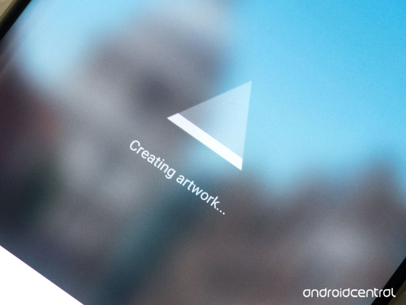
Getting the “Prisma is over capacity” error? Slow performance? Prisma isn’t your average photo-filtering app — and that means it can take a little time to do its thing.
If you’re one of the many people trying out AI-powered artwork app Prisma in recent days, you’ll no doubt have run into the app’s main pain point — speed. Or rather, lack of speed. Prisma’s intelligent, artistic filters are impressive for sure, but they can take a lot of time to apply — particularly at peak times.
Let’s take a look at why Prisma can be so slow, and what you can do about it.
How Prisma works — and why it might be ‘over capacity’
Unlike Instagram, Snapseed or any other photo editing app with filters, Prisma doesn’t process your photos on your phone itself, but instead uploads them to its servers and applies artificial intelligence to them in the cloud. The results are then piped back down to your phone for you to share and enjoy.
In essence, that’s the main reason why you’ll have to wait significantly longer to apply a Prisma filter compared to something like Instagram. Prisma does much more than just apply a uniform filter to your photos, as Instagram does. It uses AI to intelligently interpret your photos and redraw them accordingly — and so way, way more computation needs to happen, which is why this task is offloaded onto Prisma’s servers.
But that comes with its own set of trade-offs. If you’re offline completely, Prisma won’t work. If your data connection is slow, it’ll take longer to upload and download images. And the number of other people using Prisma will also determine how quickly the servers can handle your pics. At the time of writing lots of people are trying Prisma for the first time, which is why it might appear to get stuck on “Creating artwork…”
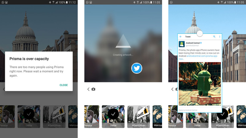
At peak times, you might even see a message telling you that the servers are too busy:
Prisma is over capacityThere are too many people using Prisma right now. Please wait a moment and try again.
Tips, tricks and workarounds to make Prisma faster
The only real solution is for Prisma to build out its infrastructure and add more cloud computing power, meaning everyone’s photos can be processed more quickly. That’s not something regular users like us have any control over, but there are a few things you can do:
Make sure you’ve got a reliable data connection. If you’re on a slow Wi-Fi network or patchy cellular coverage, wait until you’re somewhere with better connectivity before using the app.
Don’t hit the home or app-switching keys while Prisma is processing. If you go to your home screen or switch to another app while the “Creating artwork…” message is displayed, the process will usually freeze, and you’ll have to reselect your filter and try again.
Prisma doesn’t support multi-window — whether it’s Android’s built-in split-screen mode in Nougat or Samsung’s multi-window on Galaxy phones. That means you’re stuck looking at a loading screen while your photo processes — not much fun.
However, Samsung owners can use pop-up view! You can’t open Prisma itself in pop-up view — Samsung’s “floating window” mode that lets you collapse apps down into a scaled view. But you can load up apps like Twitter and Chrome into pop-up windows before using Prisma, and use them in the foreground while Prisma is doing its thing in the background. To put a supported app into pop-up mode, swipe inwards from the top left or right corner, or long-press the app in the Recent apps menu.
If in doubt, wait a little while. At peak times of the day you’re more likely to experience slow processing times, as well as the dreaded “Prisma is over capacity” message. Have a cup of coffee. Make a sandwich. Check out the day’s Android news. Prisma should be back up and running before too long.
Prisma users, how have you been finding the app’s performance? Are you seeing the “over capacity” message a lot? Share your experiences down in the comments!
How to access and use Memories in Snapchat for Android

How do I use Snapchat Memories?
Snapchat has announced yet another feature as they continue to expand their platform that originally was created to simply send and receive temporary pictures.
This new feature is called Memories, and it’s essentially a cumulative archive of all of the snaps you’ve saved to your phone since you downloaded the app.
But how exactly do you navigate Snapchat Memories, and how does this new feature work? Here’s how to use Snapchat Memories to your fullest advantage.
- How to access Memories in Snapchat on Android
- How to access Snaps in Memories on Android
- How to access Stories in Memories on Android
- How to access your Camera Roll in Memories on Android
- How to access My Eyes Only in Memories on Android
- How to post an old Snap to your Snapchat on Android
- How to post part of a saved story to your Snapchat on Android
- How to post a photo from your Camera Roll to your Snapchat on Android
How to access Memories in Snapchat on Android
Launch Snapchat from your home screen.
Tap on the smaller white circle underneath the shutter button to access Memories. You can also swipe up anywhere on the screen.

How to access Snaps in Memories on Android
Launch Snapchat from your home screen.
Tap on the smaller white circle underneath the shutter button to access Memories. You can also swipe up anywhere on the screen.
Tap the Snaps tab at the top of the screen to access your saved snaps.

How to access Stories in Memories on Android
Launch Snapchat from your home screen.
Tap on the smaller white circle underneath the shutter button to access Memories. You can also swipe up anywhere on the screen.
Tap the Stories tab at the top of the screen to access your saved stories.

How to access your Camera Roll in Memories on Android
Launch Snapchat from your home screen.
Tap on the smaller white circle underneath the shutter button to access Memories. You can also swipe up anywhere on the screen.
Tap the Camera Roll tab at the top of the screen to access your Camera Roll.

How to access My Eyes Only in Memories on Android
Launch Snapchat from your home screen.
Tap on the smaller white circle underneath the shutter button to access Memories. You can also swipe up anywhere on the screen.
Tap the My Eyes Only tab at the top of the screen to access your protected, private snaps.

Type in your password to access your My Eyes Only. Keep in mind that if you have to reset your password, all of the snaps saved to My Eyes Only will be erased.
How to post an old Snap to your Snapchat on Android
Launch Snapchat from your home screen.
Tap on the smaller white circle underneath the shutter button to access Memories. You can also swipe up anywhere on the screen.
Tap the Snaps tab at the top of the screen to access your saved snaps.

Tap on the photo or video you would like to post to your Snapchat story or friend.
Tap and hold the photo. A black border will appear around the photo.
Tap the arrow within the blue circle in the lower right corner.

Just like sending a standard snap, select My Story or the contacts you would like to share your photo/video with.
How to post part of a saved story to your Snapchat on Android
Launch Snapchat from your home screen.
Tap on the smaller white circle underneath the shutter button to access Memories. You can also swipe up anywhere on the screen.
Tap the Stories tab at the top of the screen to access your saved stories.

Tap and hold the story bubble you would like to select.
Swipe left or right to pick a specific snap in the story bubble to post.
Tap the arrow within the blue circle in the lower right corner.

Just like sending a standard snap, select My Story or the contacts you would like to share your story photo/video with.
How to post a photo from your Camera Roll to your Snapchat on Android
Launch Snapchat from your home screen.
Tap on the smaller white circle underneath the shutter button to access Memories. You can also swipe up anywhere on the screen.
Tap the Camera Roll tab at the top of the screen to access your Camera Roll.

Tap and hold the photo or video you would like to post from Camera Roll.
Tap the arrow within the blue circle in the lower right corner.

Just like sending a standard snap, select My Story or the contacts you would like to share your story photo/video with.

