


Motorola announces pre-orders for AT&T Moto X, Moto X Pure Edition and more

Motorola on Sunday announced the upcoming pre-orders for a number of its 2014 product line. Effective tomorrow, Tuesday, September 16, customers can place pre-orders for the AT&T version of the Moto X and the Moto X Pure Edition. Pricing is $99 (with a two-year service plan) and $499 (off-contract), respectively. The Pure Edition, as we recently learned, is the unlocked bootloader and carrier-free take on the flagship model.
Also available for pre-order on September 16 are the Moto Hint and the Turbo Charger. The Hint is, wireless earbud that pairs wonderfully with the Moto X and allows for great handsfree interaction and notification, will retail for $149.99. The Turbo Charger ($35) provides a super-quick charge for the Moto X, giving it 50% battery life in a mere 15 minutes.
We're Hiring! Click here to learn more!
The post Motorola announces pre-orders for AT&T Moto X, Moto X Pure Edition and more appeared first on AndroidGuys.
.CPlase_panel display:none;

Motorola’s UK store will now sell you the new Moto G and other devices

Although Motorola has offered phones in the UK for decades, the company has never let you buy direct. Even when it was owned by Google, it chose to point customers in the direction of retailers like Amazon. Now that Motorola is now part of Lenovo, however, the company has decided to take matters into its own hands by opening its first UK-focused store. From today, you’ll be able to order the second-generation Moto G in black or white for £149.99, although they both currently show pre-order availability. While it’ll cost you £5 more to buy it from Motorola over Amazon, the online retail giant does note it could take between 1-3 weeks to reach your doorstep. Sure, only the Moto G is available today, but Motorola’s UK launch does show that it’s ready to handle the upcoming release of the Moto X and Moto 360. For the first time, Brits will be able to customise their Moto X using the company’s Moto Maker tool, which is set to go live later this month.
Filed under: Cellphones, Wireless, Mobile
Source: Motorola Store, Amazon
.CPlase_panel display:none;

Moto X up for pre-order and the 360 returns on September 16th

Eagerly awaiting the brand new Moto X? Well you’ll have your chance to pre-order one on September 16th. Both the AT&T version and the unlocked Pure Edition will hit the web, with the carrier-free version setting you back $499. All the accessories announced alongside Moto’s new flagship will also be available for pre-order on Tuesday, including tiny Moto Hint bluetooth earbud and the Turbo Charger, which cost $150 and $35, respectively. There’s even good news for those of you upset that you missed out on the Moto 360 the first time around. The circular Android Wear smartwatch will go back on sale on the 16th as well. So set your alarm for noon (ET) on Tuesday and keep those credit cards warm.
Filed under: Cellphones, Wearables
Source: Motorola
.CPlase_panel display:none;

Motorola to offer Moto X “Pure Edition” unlocked, without carrier enhancements

Motorola may be about to embrace the Nexus program on an unbranded “pure edition” Moto X device. Whilst the actual Moto X isn’t a hundred miles away from stock Android, it technically isn’t vanilla Android, but the Moto X Pure Edition will be 100% stock Android through-and-through.
It’ll be sold directly through Google Play, be unlocked, and unbranded, and free to enjoy speedy updates that the Nexus devices have always enjoyed.
Motorola say the device will be available later in September, with the website still saying coming soon.
Excited? Comments in the section below.
We're Hiring! Click here to learn more!
The post Motorola to offer Moto X “Pure Edition” unlocked, without carrier enhancements appeared first on AndroidGuys.
.CPlase_panel display:none;

Moto 360 review: It’s the best Android Wear watch, but that isn’t saying much

When it comes to wearables, fashion trumps function. That’s the mantra Motorola went by when it designed and developed the Moto 360, and judging by the enthusiastic response the watch received when it was unveiled earlier this year, plenty of people agree. The Moto 360 is undoubtedly the best-looking of the three inaugural Android Wear watches (the LG G Watch and the Samsung Gear Live are the other two), with its premium leather strap, chamfered glass and circular design. As Motorola designer Jim Wicks said in an interview, “We wanted to hit that ‘Whoa!’ mark.” And so it did. But is that enough? In the past few days, I struggled to like this watch, even though it’s the best Android Wear device available today. Allow me to tell you why.
Hardware

The Moto 360’s claim to fame is that it’s the first Android Wear device with a round face. And that’s a big deal. As I said, when it comes to an item that you wear on your person, it’s crucial that it looks good. Compared to the other two Android Wear watches on the market, the Moto 360 looks the most like an actual timepiece partially due to that round design. Indeed, one of the reasons Motorola went with a circular design is that it believes a round face is simply more watch-like. Of course, there are traditional analog watches with square designs too, but the 360’s round face does make it stand out in a sea of square smartwatches. Motorola made a conscious decision to make the 360 more watch than gadget; more mainstream than early adopter; more SoHo than Silicon Valley.
That thought process included not just the shape of the watch, but also the materials used to make it. The housing is constructed from glass and stainless steel, and the leather strap is sourced from a high-end Chicago tannery. It’s a smartwatch that actually feels comfortable when worn; the leather feels much softer and more flexible than the rubber straps on the G Watch and the Gear Live. What’s more, with the leather strap, the Moto 360 is also quite a bit lighter at 49 grams (the G Watch weighs 63; Gear Live, 59). In other words, the 360 not only looks like a regular watch, but it also feels like one.
If you can’t decide on just what color to get — the initial watchbands come in black, dark gray or light gray — the straps are thankfully interchangeable. However, do note that you’ll need to visit a jeweler to swap them out and Motorola says the 360 is only compatible with straps made specifically for it. Later this year, Motorola plans to release a Moto 360 with metal bands, which is more in-tune with the style of the thick metal housing.

That brings me to one of my problems with the Moto 360. While I don’t deny that the Moto 360 is well-crafted, its 46mm diameter and 11.5mm thickness paired with the leather bands make it much too big for me. I felt a little embarrassed to be wearing such an enormous, attention-grabbing timepiece, and my husband remarked that it looked like I had a hockey puck strapped to my wrist. During a tour of Motorola’s headquarters recently, we were told that the 360 was designed for both men and women — apparently large watches are trendy accessories for some folks these days — but I’m simply not one of them. Of course, this is based entirely on personal preference. And again, even though it’s not to my taste, the Moto 360 is still one of the most striking smartwatches I’ve seen yet.
Display

The primary reason for that is the circular display. It goes practically edge to edge with pixels spread across the entire surface, leaving a sliver of a bezel around it. The result is a watch face that’s nearly all screen, which isn’t something you can say about the Gear Live or the G Watch. That’s a good thing, especially as the Moto 360’s screen is a touch smaller at 1.56 inches across, resulting in a 320 x 290 resolution that translates to 205 pixels per inch. It’s not the sharpest display by any means, but it’s also not bad for such a tiny screen; it seems clear and colorful enough to me.
Unfortunately, there’s a rather noticeable black slice at the bottom that mars the display’s circular perfection. Motorola says that in order to maximize the screen size of a small and round display, it opted to house the watch’s display drivers and ambient light sensor in that little wedge instead of creating a thick circular bezel. If that is indeed the trade-off, I agree that the edge-to-edge chamfered glass is a better option. But if you’re even the slightest bit of a perfectionist, that tiny, little black slice might be difficult to un-see.
Additionally, round displays and Android Wear don’t always get along. Motorola apparently worked closely with Google to ensure that the UI would play nicely with a round screen, and it succeeded — for the most part. Text occasionally gets cut off at the corners, especially when scrolling through messages and long lists. Also, the beveled sides make the circular border look a touch jagged at certain angles, especially against a white background.
Speaking of that ambient light sensor, the Moto 360 is also the first Android Wear watch to even have one. That means that unlike the G Watch and the Gear Live, the 360 supports auto-brightness, which is extremely handy considering the 360 is equipped with a backlit LCD that would otherwise be unreadable in bright sunlight. It’s naturally not quite as crisp as the e-paper display on the Pebble, but it’s legible enough that I could make out the time and read my email notifications. And seeing as turning on maximum brightness would likely put a big dent in the battery life, I’m glad the sensor is there.
It’s important to note here that the ambient light sensor is separate from a Moto 360 watch setting called “ambient screen.” This feature is off by default, and what that means is that the watch will go completely black when it’s idle or not in use — it’ll only light up when you lift the watch to look at it. When ambient screen is turned on, however, the 360 won’t immediately go black when idle. Instead, it dims just enough so that you can still tell the time if you casually glance at it. But if you happen to take the watch off and leave it somewhere, the display will eventually go black, even with ambient screen enabled.

In addition to tapping the screen or lifting the watch, you can also activate the display by pressing on a small protruding crown on the right. If you hold it down, you’ll bring up the watch’s settings menu — a great little shortcut I wish the G Watch and the Gear Live had. Pressing and holding on the screen will bring up a selection of watch faces that have been customized for the 360’s round display. You can adjust the different watch face settings even further with Motorola’s own Connect app. I like the Dials face option the best because it lets me see what time it is in two other cities — a handy thing when you work with a global team.
Now, you might be wondering how you charge this watch; it’s not like there are any ports to plug in a cable. Instead, the Moto 360 charges wirelessly via Qi magnetic induction. Just set it inside the included charging cradle and the watch will get the juice it needs to keep going. When docked, the Moto 360 will display a digital clock along with how much charge it still has. This way, you can use it as a bedside alarm clock if you like. It works as promised, but I do wish Motorola had included a USB-only cable in the box in addition to one that requires a power outlet. Since the 360 charges via the Qi standard, you could theoretically charge it on an existing Qi wireless charger if you happen to have one already.
Features

Phew. That was a lot of words just about the watch’s design. But seeing that most of the watch’s features are the same as the other Android Wear devices — Google isn’t allowing manufacturer-specific skins — the 360’s main differentiator is its design.
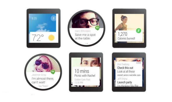
But if you’d like a brief recap, here’s what Android Wear offers. Beyond just telling the time, Android Wear is a platform that transmits what’s on your phone to what’s on your wrist. If you allow it, you’ll see everything from emails to Twitter notifications to Google Now cards popping up on the watch. There’s some notification anxiety as a result — having to scroll through all of those can be a pain, especially as you can’t quite ignore them as easily as you might on a phone. As with the other Android Wear watches, you navigate through the 360’s interface by swiping and tapping on the watch’s touchscreen display. A key component is voice commands, where you can say things like “Navigate” to find directions or “Call a car” to request a Lyft ride. For more details on Android Wear, check out our full review.
Beyond Android Wear, the 360 does have a couple extra features that bear mentioning. Remember that Motorola Connect app I alluded to earlier? That’s also where you can track your steps and heart rate, because the 360 not only has a built-in pedometer, but it also has a heart rate sensor as well (it’s located on the underside of the watch). As with the Gear Live, you do need to hold your wrist relatively still for the sensor to read your beats per minute, but it only takes a few seconds.
Additionally, the Moto 360’s heart rate app also comes with an activity monitor that tracks how active you are in a day. Once you enter in your vital stats (height, weight and so forth), the app will attempt to divvy up your daily heart activity into three categories: “Inactive,” “Active” and “Vigorous.” Motorola’s goal here is for you to get at least 30 minutes of moderate activity a day for five days. As the 360 periodically keeps an eye on your bpm, it’ll know to notify you if you’re almost or at your goal. From my experience with the 360, achieving this 30-minute moderate activity goal is pretty easy — just walking around the house and the local farmer’s market got me to my goal before noon. Still, it’s a noble enough objective and gives us the illusion that we’re trying to be healthy.
Battery life and performance

There’s probably a subset of you that completely disregarded everything I’ve written above and came right down to this section. And I don’t blame you. After all, what’s the point of a watch that runs out of battery in the middle of the day? The problem, of course, is that the Moto 360 isn’t a normal watch. Just like the other Android Wear devices, it comes with a rather dinky battery. The official specs state 320mAh, though a recent teardown reveals that the battery actually has “300mAh” printed on it. Motorola’s official statement is that the battery offers a range of 300 to 320mAh, but opted to print just “300mAh” due to the lack of space.
Regardless of which it is, the battery is still tiny. Under heavy use, the 360 barely lasts the day. With the ambient screen mode on, I had it so that it would notify me of every incoming email, message and notification from apps like Twitter, Facebook and Google Now. I also tried out a couple of different navigation routes and used voice commands several times throughout the day. In about 12 hours, the 360’s battery life dropped to 9 percent. It’s not pretty, to say the least.
However, in the days after the initial thrill of playing with the 360, I found myself hardly ever using the watch in such an active manner. I mostly just relied on it for timekeeping and notifications — I rarely bothered using it for voice commands or navigation, since, well, I could just use the phone for that. With this kind of minimal use, it got to around 23 percent after 12 hours, which is enough to last through a typical day. But if you’re not going to use a smartwatch as a smartwatch, that kind of defeats the purpose of getting one. Plus, even with such skimping, I still had to charge the watch every night.
Under the hood, the Moto 360 has a TI OMAP3630 processor, which is surprisingly old technology — we’re talking the kind of chip used in the Droid 2. Yet, I didn’t encounter too much sluggishness when swiping through the menu or scrolling through messages. I did notice the occasional hiccup when trying to remove notifications — sometimes it took a couple of swipe attempts instead of one — but they were few and far between.
The competition

Android Wear is so new that the Moto 360 only has two other direct competitors, at least for now. When it comes to look and feel, however, both the Samsung Gear Live and LG G Watch pale in comparison to the 360. Unfortunately, better look and feel come at a price — the watch is far more expensive at $250 with a leather strap and $299 with a metal one. Worse, the battery life here is the shortest of the bunch.
Additionally, the 360’s honeymoon period as the only round-faced Android Wear watch will be short-lived as both LG and Samsung are trying their hands at circular designs too. If the 360’s rotund face is the only factor you’re considering in a smartwatch, you might do best to wait to see if you like those. It’s worth noting, for example, that while the 360 has that black slice at the bottom of its circular display, the upcoming LG G Watch R doesn’t. From a brief hands-on we had with it at IFA, however, we can definitively say that the 360 is still the nicer, more premium option.
I’d also be remiss if I didn’t mention the most recent rival to the Moto 360: the Apple Watch. It remains to be seen how intuitive the UI is in real-world use, but in terms of design and style (not to mention app support), it looks like the 360 has some serious competition afoot.
Wrap-up

With its stylish good looks, comfortable feel and overall premium build, the Moto 360 is the Android Wear watch to beat. When it comes to design, at least, it outclasses everything else on the market. Aside from aesthetics, the 360 offers many of the same features as its rivals, including a heart rate sensor and a pedometer, plus some other goodies like wireless charging and an ambient light sensor.
Even with the design, though, Motorola didn’t totally get it right. The 360’s large size is a legitimate concern for narrow-wristed individuals, and the experience is dampened by various imperfections that include cutoff notifications and that “flat tire” at the bottom of the screen. What’s more, the battery life is actually worst in class — and that’s saying a lot considering other Android Wear watches also need to be charged once a day.
All told, the smartwatch landscape is so new that I’d recommend waiting to see if something better comes along. Sure, the Moto 360 is the best option right now, but it might be obsolete in just a few months. That said, if you want to jump on the Android Wear wagon now, the Moto 360 is your best bet.
Filed under: Wearables, Mobile
.CPlase_panel display:none;

Motorola will launch an unlocked bloatware-free Moto X this month

When it comes to Android crapware, AT&T’s light-touch policy means that the new Moto X is already offering a close-to-stock experience. If, however, you want to be doubly sure that you’re only getting what God Motorola intended, then the Pure Edition is likely to be the device for you. According to The Verge, the phone company will offer its homegrown equivalent to a Google Play Edition device on its store towards the second half of this month. Is it true? Probably, but that doesn’t mean that we haven’t reached out to the company for more information, and will update this to let you know what we find out.
Filed under: Cellphones, Mobile
Source: The Verge
.CPlase_panel display:none;

Moto X review (2014): from also-ran to amazing in one year
I’ll be honest with you: When the first Moto X came out last year, some early apprehension soon gave way to unwavering fondness. It wasn’t because of the sheer horsepower (there wasn’t much of it) or a stunner of a screen (it was fine, at best). No, it was because the Moto X smacked of pluck. You could customize it to hell and back. It tried to improve on stock Android with software features that were actually quite useful. And the icing on the cake? It was a pure joy to hold. Motorola — a company that basically jump-started the premium Android phone movement with the Droid before getting lost in an endless loop of modest annual upgrades — seemed to have a pulse again. So here we are, one year later, and the X has finally gotten an upgrade to match the rest of the mobile big boys. Is it enough to make the new X a winner? Is Motorola really back? Read on, dear friends, and we’ll see.
Hardware

I have a tendency to opine at length about industrial design, so here’s the TL;DR if you’d rather move on with your day: The new Moto X feels a thousand times better than last year’s model, and is easily the most comfortable phone current-gen smartphone I’ve picked up yet. As far as I’m concerned, the previous owner of that title was HTC’s One M8, but there are a few factors in play that make the X even more pleasant to grip.
First and foremost, Motorola’s curvaceous design language is back — the Moto X’s backplate swoops a bit more dramatically than its ancestor because of the bigger 5.2-inch, 1080p AMOLED screen up front, and the end result is a phone that feels remarkably natural in the hand despite its size. It’s thinner than you might think, too. Seriously, the thickest part of the hump (near the headphone jack, the 13-megapixel camera/dual-LED flash combo and the trademark Motorola dimple) comes in at just under 10mm thick, but the case tapers down to create some startlingly skinny edges — think 3.8mm. It’s a hair shorter and a hair wider than the M8, which means it fills my admittedly meaty hands better, though your mileage will, of course, vary there.

While we’re talking about hand-feel, Motorola ditched the all-plastic trim from the original X in favor of an aluminum band (which also acts as the antenna) that runs around the edges of the phone. You wouldn’t think that so little metal would have such an impact on what it’s like to hold the phone, but it does — it imparts the X with a denser, more premium feel, and combined with the weight of the screen, it means you’ve got a phone that’s reliably hefty, but not heavy, per se. The sheet of Corning Gorilla Glass 3 protecting the display is curved at the edges too, and while that may seem like a minor design decision, it helps the X feel like it’s been seamlessly put together. There have been times when I’ve had the X in my pocket and I’d find myself absently fingering those smooth edges. It’s the little things that matter, folks.
Our review unit pairs a white face with a bamboo rear cover, and the rest of the phone’s design is an exercise in subtlety — its face is devoid of extra flourishes except for the 2MP front-facing camera and the four IR sensors dotting it (they’re nigh-invisible on the black version). You’ll find the sleep/wake button and volume rocker on the right while the micro-USB port is centered on the phone’s bottom edge. Like a slew of other flagships, the Moto X includes Qualcomm’s QuickCharge 2.0 tech and Motorola says its forthcoming Turbo Charger will get you eight hours of additional battery life on a 15-minute charge. Feeling impatient? There are a handful of chargers that should do the trick right now. The thing to remember is that it’s a Moto X — it’ll only ever be as subtle as you want it to be. Hate white? Think wood sucks? You’re in luck: Moto Maker is just as robust as ever, so you’ve got no shortage of color and finish options (including Chicago-sourced leather, for you exceedingly fancy types) with which you can cobble together a Frankenphone of your very own.

And then there’s the stuff you can’t see at all, namely the Qualcomm Snapdragon 801 chipset tucked away in that curved chassis. We’ll dig into the horsepower a little later — just know that thanks to the quad-core 2.5GHz processor, 2GB of RAM and the Adreno 330 GPU, the new Moto X will easily handle everything you throw at it. You’ll be able to snag either a 16GB or a 32GB model later this month, but you should probably splurge on the latter since there’s still no microSD card slot (sigh). Motorola also saw fit to trick the thing out with a non-removable 2,300mAh battery, which has been enough to get me through at least a full day (more on that later).
Display and sound

After being stuck with a 720p display on last year’s X, I wasn’t too hopeful that Motorola was capable of wowing this time around. I was wrong: The new and improved X’s 5.2-inch AMOLED is one of the nicest smartphone screens I’ve seen in a while. Deep blacks and crisp whites? Check. Vivid colors that don’t skew toward the eye-melting end of the spectrum? Double check. More-than-adequate screen brightness for outdoor use? You know where I’m going with this. Even the viewing angles are excellent — I was able to glean most of what was going on in Paprika with my face nearly perpendicular to the screen. My only real complaint (and it’s a pretty minor one) is that the glass covering the screen refracts light when you hold it at certain angles, so you have to re-orient the phone to avoid that funky rainbow effect.

Most phone makers don’t spend nearly as much time agonizing over speakers as they do screens, but Motorola did surprisingly well here too. The X sports just one speaker that lives up front right under the display, and it’s much crisper and louder than I expected. Who knows? That might be a side effect of being disappointed by phone speakers for so long. And while we’re definitely not reaching BoomSound quality, I also rarely felt I was missing out on anything. Still, it sort of smarts that Motorola snuck not one, but two speakers onto the face of the new (and less expensive) Moto G. Sure, compromises have to be made when you’re trying to figure out how to squeeze lots of components into a tiny, curvy shell, but here’s hoping Motorola cracks the code in time for the next-gen model.
Software

Android purists could really go either way on the Moto X: On one hand, it runs an almost completely stock build of Android 4.4.4 KitKat, which means it’s devoid of any obnoxious overlays or gaudy third-party widgets. It’s very close to Android the way Google intended it. On the other hand, just wait until you see what happens when carriers get ahold of this thing. Our demo model is tied to AT&T and so there’s the usual spate of bloatware apps — 12 to be precise, from the mildly useful (Ready2Go service isn’t bad for first-time smartphone users) to the truly pointless (does anyone really use AT&T Navigator or Yellow Pages?). Thankfully, while you can’t uninstall most of them, you can at least disable them. AT&T is actually known for having a lighter touch when it comes to carrier customizations, so I’m awfully curious (and a little worried) to see what the X looks like if/when carriers like Verizon and Sprint sink their claws into it.
In fairness, those carrier-mandated apps aren’t the only things that have been added to an otherwise pristine Android device. Motorola carried over the contextual smarts (both in the form of apps and a bit of specialized hardware) that made the original Moto X so great in spite of its shortcomings, albeit with a bit of rebranding. The first noteworthy trick — Moto Display — lets you see your notifications at a glance, and jump straight into the related app by swiping an icon on the dark lockscreen. The nifty part is what’s going on with the display itself: Since it’s an AMOLED screen, the X can fire up only the pixels that comprise the time and notification icons so it’s not burning battery life every time you wave at it.

Moto Actions is second, and it involves that small constellation of IR sensors on the X’s face. A quick wave of the hand over the screen (the range seems to top out at about 10 inches) will silence an incoming call, or coax a sleeping screen into telling you what time it is and displaying your notifications. I still wish I could unlock the thing by waving my hand in front of it, Jedi-mind-trick-style, but alas. Constantly gesturing at your phone may seem a little obtuse (not to mention funny looking), but it isn’t long before it becomes second nature.
Let’s be real, though: The star of the show is the X’s ability to quietly listen for your voice commands, even when the screen is off. It used to be that you had to utter, “OK, Google,” to get your phone to pay attention, but now you can define your own command phrase. I’m a fan of keeping things casual, so after a bit of trial and error (you’ll be nagged during the setup process if your magic words don’t have enough syllables). I settled on the jocular “Hey Moto, you there?” From there, you can ask the Moto X to set alarms for you, set up reminders and post inane statuses to Facebook or WhatsApp, in addition to searching Google with your voice.

If you’ve played with Google Now before, you know what sort of accuracy to expect (it’s quite good), but my favorite use for Moto Voice is fairly mundane. You see, in the week that I’ve been testing the X, I’ve used my voice prompt nearly a dozen times just to help me find the phone when it’s nestled deep in a bag, or hiding under a pile of clothes. Lo and behold, the screen almost always sprung to life and an audio cue helped me figure out where it was. There were a handful of occasions when background noise obscured my voice or I wasn’t emphasizing the right words, but the X heeded my commands on the first try about 90 percent of the time. Not a bad hit rate, all things considered.
Each feature on its own is neat enough, but when combined, they help make the Moto X feel like more than just a lump of metal and silicon sitting on your desk. At the risk of anthropomorphizing a gadget, calling out for the Moto X and seeing it tackle my tasks sometimes made it seem like an honest-to-goodness assistant… and not one I have to hold down a button to chat with. Sorry, Siri.
Camera

So far, Motorola has a done a fine job of fixing what it didn’t nail with the original Moto X, but the camera experience on this year’s model still isn’t as consistently good as I’d hoped. The new X hosts a 13-megapixel camera (up from the 10-megapixel ClearPixel sensor we got last year) surrounded by a dual-LED ring flash, and when the sun’s out or you’re in a nicely lit room, your shots’ll feature punchy colors and plenty of detail — especially if you’ve got HDR mode on. Expect to see quite a bit of grain in all but the best-lit conditions, though, and waiting for the camera to focus properly can be an exercise in frustration sometimes. I’ve found it’s best to enable the manual focus and exposure controls so you can just take matters into your own hands. In the event that you need to fire up the flash to throw around some more photons, you’ll notice that the ring around the LEDs smooths out the otherwise harsh light, but it isn’t staggeringly better than other flashes I’ve seen on modern smartphones.
On the plus side, videos shot in 1080p are generally colorful and well-exposed, and the X lets you shoot in 4K (though you’ll have to offload the files onto something with a compatible display to get the full effect). The uber-simple camera interface is still a pleasure to putz around with, too. Instead of giving the camera app a discrete shutter button, you can tap anywhere on the screen to snap a photo (which can be a little odd if you’re used to interfaces where you tap to focus). Holding your finger down on the screen kicks off burst mode, taking photos at a machine gun pace until you release your hold on the screen. You can dig into HDR, flash, Quick Capture, slow-motion video and panorama settings from a menu that slides out from the left side of the screen, but anyone looking for really extensive camera controls might get frustrated by the app’s lack of depth.
Fan as I am of the occasional selfie, the X’s front-facing camera is awfully disappointing. It’s not so much the quality of the photos it captured that bothered me — though they’re generally full of noise and not worth writing home about. What really killed me was the latency between moving the phone to frame a shot and seeing that movement reflected on the screen; the camera always feels like it’s a half-step behind where it should be, and the amount of blur that comes into play while you’re angling the phone around is really obnoxious.
Performance and battery life

Last year’s Moto X might’ve been Motorola’s flagship, but it lacked the sheer oomph many of its rivals did thanks to its curious chipset (a dual-core Snapdragon S4 Pro plus some additional contextual modules, remember?). That isn’t the case this time. In terms of raw performance, there isn’t a great difference between the Moto X and most other top-tier smartphones. That really shouldn’t be a surprise: After all, the Moto X shares the high-end Qualcomm Snapdragon 801 chipset as heavyweights like the Galaxy S5 and the One M8.
You can peep our benchmark tests below if you’re the numerical sort, but what this all boils down to is that the new Moto X simply screams. There’s very little you can do to stymie those formidable guts (though all the silicon in the world might not be enough to make Facebook for Android feel smooth). Swiping through web pages is fluid, as is trying to take those tricky corners in Asphalt 8, and apps launch in a jiffy. The point is, don’t fret: The Moto X won’t leave you wanting for horsepower.
| Moto X (2014) | HTC One (M8) | LG G3 | |
|---|---|---|---|
| Quadrant 2.0 | 22,721 | 25,548 | 25,548 |
| Vellamo 2.0 | 2,093 | 1,804 | 1,405 |
| 3DMark IS Unlimited | 19,568 | 20,612 | 16,662 |
| SunSpider 1.0.2 (ms) | 787 | 782 | 918 |
| GFXBench 3.0 Manhattan Offscreen (fps) | 11.9 | 11.2 | N/A |
| CF-Bench | 39,018 | 40,223 | 24,667 |
| SunSpider: Lower scores are better; results compiled on Chrome. HTC One benchmarked on Android 4.4.2 | |||
Power is peachy, but we’re left with another question: How long can we use it before the X runs dry? In our standard video-rundown test (looping video with WiFi on, but not connected), the next-gen X lasted for a solid 10 hours and 34 minutes before it gave up the ghost. That’s only a few minutes longer than what we squeezed out of the Galaxy S5, but alas — it still falls about an hour short of the number the HTC One M8 put up under the same conditions. Chances are your days will be just a little more involved than that, and Motorola managed to keep its word with regard to an all-day battery — the X stuck with me for just over a day of on-and-off web browsing, texting, Kindle reading, YouTube watching, Rdio streaming and Google Maps navigating. Oh, and here’s another tidbit to keep in mind: Battery performance for some original Moto Xs tanked over time, so we’ll keep our eyes peeled for any long-term changes.
The competition

If you’ve made it this far, you’ve already discovered that the Moto X compares pretty favorably to premium phones like the One M8 and the Galaxy S5. Both of those devices cost $200 on-contract, and the 32GB Moto X probably will too (Motorola hasn’t officially confirmed the price yet). There’s really no wrong choice among the three, but their strengths are scattered. You’re better off with the One M8 if you’re a stickler for metal bodies and music — those BoomSound speakers are the best on the market. Keen on snapping plenty of photos? If you need the best camera of the bunch and don’t mind some gimmicky software, the GS5 is your pal. And if a stunning screen is your overriding concern, there’s always LG’s G3 to consider for the same price. With so much going on at the $199 level, why should you consider the X? Long story short: There’s hardly any cruft to slow it down and it pairs thoughtfully crafted hardware with a few key features that really add to the Android experience. Fan of simplicity? You’ll find plenty to like here.
And hey, if you’ve embraced the cloud and have gigabytes of empty space floating in the digital aether waiting to be filled, you might want to opt for the 16GB model since it’s only $99 on-contract. Oh, you hate service agreements? If all you’re concerned about are off-contract price tags, pay close attention to the OnePlus One. It too packs an awfully similar spec sheet, along with a much larger screen and a much cheaper sticker price — think $299, compared to the base model X’s $500. Good luck getting your hands on one any time soon, though.
Wrap-up

Motorola’s plan with last year’s flagship seemed pretty clear: It set it to build a smarter kind of smartphone. The company mostly succeeded, but the formula just didn’t make sense for people who wanted the most oomph for their buck. One year later and it’s apparent Motorola has learned from its mistakes. This year’s Moto X still isn’t perfect — the camera is occasionally just frustrating, and its battery life is purely average compared to its rivals — but it’s the closest that Motorola has come in a very long time. Moto fanatics might lament the passing of the more compact original, but don’t worry: The new Moto X is the flagship Motorola should have made in the first place, and it’s earned itself a spot in the pantheon of smartphone greats.
Filed under: Mobile
.CPlase_panel display:none;

Early impressions on the Moto 360 vs. Apple Watch

In case you’ve been living under a rock, the wearable space has grown drastically for major companies throughout the world over a few months’ time. With Google’s quicker-than-ever rollout of Android Wear and Apple’s first iteration of Apple Watch, things are bound to get heated over who can make the best device. So many companies already have smartwatches, but who stands out? Who will create the device that will revolutionize the space? Though we need to wait awhile to use one of the contender’s devices, we can help answer a few questions so far: Who is pushing the boundaries of the wearable technology space, and which device is best suited for you?
Preface: There is more that one Android Wear watch available to the public, I know. I chose the Moto 360 for this comparison because of the seemingly superior build quality over the rest of the competition (though fans of the LG G Watch R might disagree).
And I know… the Apple Watch was just announced yesterday. We know much less about this device than we’d like to, but nonetheless, these are my thoughts regarding the future of wearables and how each company is approaching the space.
The Moto 360 and Android Wear
The Moto 360 is the first Android Wear device from Motorola, and is available for purchase today. It offers a circular design, Qi wireless charging, and comes with a Horween Leather strap (or a brushed metal strap if you don’t mind waiting).

Source: talkandroid.com
The watch itself has a brushed metallic outer edge, and offers a 1.56-inch 320×290 round LCD display. One thing that has been getting on peoples’ nerves is the black strip that cuts off the bottom of the display, where the ambient light sensor sits. Like it or hate it, the Moto 360 is the closest thing we have to a fully circular display.
Some other specifications include a TI OMAP 3 processor, 512MB RAM, 4GB of internal storage, pedometer and hear rate sensor, and a 320mAh battery. It measures 46mm in diameter and 11.5mm in width, and weighs 49 grams.
Apple Watch
Apple Watch is Apple’s first attempt at a smartwatch, available for purchase in early 2015. It has a square display, inductive wireless charging, and comes in two sizes and three different iterations: Apple Watch Collection, Watch Edition Collection, and Watch Sport Collection. Each one is different, so let’s break it down a little bit.

Apple Watch Collection: The body is stainless steel or Space Black finish, complete with six different types of straps that buckle into the top and bottom of the watch. This collection is the standard collection, more geared towards the general user.
Watch Edition Collection: This will be essentially the same as the Apple Watch Collection, but will be offered in an 18-karat rose or yellow gold finish and will have design enhancements added to the digital crown.
Watch Sport Collection: The body has an aluminum finish, and comes with only synthetic rubber straps.
Each collection will offer two different sizes: 38mm and 42mm, appropriately made keeping everyone in mind. All collections offer sapphire glass finishes, a custom S1 SiP chip, and a “digital crown” home button (more on that later). Apple’s also offering a new Force Touch technology that can tell whether a touch is normal or forceful. There is no word on battery quite yet, which has some concerned about how long it will last from day-to-day.
Square vs. Circle
The main difference you’ll notice right away is the difference in form factor. The reason the Moto 360 got so many people amped right away was because of it’s circular display. A circular display had never been done on a mainstream device before this, so it really looked like an attractive option for many of us. It looks like a more traditional watch, and absolutely strays away from having a small computer on your wrist. It is a bit bulky compared to the thickness of the watch strap, but that’s about the only design flaw we’ve heard thus far.
On the other hand, the Apple Watch really surprised many of us because of its seemingly underwhelming design. It’s a bit bulky for the overall design, not to mention the square shape of the device. It’s not ugly, but it’s also not anything special. Apple has long had a reputation for creating premium hardware, and I just don’t see that here.
Interface: Voice dictation vs. traditional (touch) navigation
Now this is what really matters. How will you interact with the device? The reason to buy a smartwatch is because of the functionality… and if you don’t like the way it works, why buy it? We’re seeing two very different ways of navigating through the watch, so let’s see which one better fits you.
Android Wear’s approach to navigating the device is to use your hands as little as possible. The main screen is a clock (obviously), with a Google Now card on towards the bottom of the screen. It will give you the most recent one that’s available, including texts, emails, weather, or basically anything else.
The easiest way of navigating through the available actions is to use your voice. Android Wear needs some improvements in this area, especially if you need to use your finger to swipe through different menus. It’s basically a never-ending list to scroll through, which is not user friendly in the slightest. However, Google Now has long had a reputation of getting you information before you need it, so it absolutely helps to see navigation, weather, and other relevant information the moment you need it.

Source: Digital Trends
Apple is taking a different approach when it comes to interaction with your watch. The main screen of the watch is a bulk of circular icons, sporadically laid out throughout the screen. Want to open an app? It’s right there, waiting for you, similar to how the iPhone’s home screen is laid out. Swipe up from the bottom to access Glances: useful information, right when you need it. The Glance feature is basically like Google Now cards that you can swipe through and get as much relevant information as you need.
One other unique feature Apple is using is the new “digital crown” scroll wheel. Not only does it turn the screen on and off, but you can use it to scroll through lists, zoom in to maps, and much more. It’s definitely an interesting concept, but it doesn’t seem like it’s necessarily the most intuitive. Setting a traditional watch’s time is already an awkward hand movement, scrolling a tiny dial with your fingers. Going back to using a dial, even though it isn’t in the traditional sense, just seems backwards. Besides, isn’t this why touch screens were invented?
Both ways of navigating through the respective interfaces aren’t great quite yet, but they aren’t necessarily horrible. They’re both innovative, but we’re going to have to use the Apple Watch before we make any more comparisons.
Price & availability
The pricing information we have so far is as follows: the Moto 360 is on sale now for $249.99 through Motorola.com, Google Play, or BestBuy.com. Motorola’s site and Google Play both have the watch on backorder, and Best Buy only currently has the device available in-store.

All three collections of the Apple Watch will be available at the beginning of 2015. We’re assuming that means sometime in Q1. Unfortunately, that is right after the holiday season is over, and Motorola should already be working on getting the next version of their watch out to the general pubic. We don’t know specifics on the prices, but the Apple Watch’s base price will be $349.99. We don’t know what collection will start at this price, but the other collections will likely start at 50-100 dollars more than that.
So, what’s the draw?
I would, by no means, call myself a fanboy for Motorola. In fact, the Moto 360 is the only piece of Motorola hardware I’ve ever purchased in my life. So why did I pull the trigger and order right away? From the moment I laid eyes on it, it felt different. It felt like the future. A circular (albeit not a perfect one) display paired with the Android Wear interface looks like something out of a crazy concept video that could only be executed in the future.
The Apple Watch doesn’t do that for me.
The Apple Watch reminds me of an LG G Watch/Samsung Gear Live hybrid with a more confusing, cluttered interface, and I can’t just get around that. I can’t pay $100 more for a watch that does the exact same thing as the competition in an uglier package. The software seems too much like a traditional smartphone’s, and that just won’t work on on a screen smaller than 2 inches.

When Apple was showing off the full gallery view of all of their pre-loaded pictures, I laughed at the sheer ridiculousness of the concept. When they were showing off the zooming feature with the digital crown in Apple Maps, I thought that it was a completely pointless feature, yet they were still showing it off to millions of people. Two-inch wide screens aren’t the same as 5-inch screens, and I think Apple needs to understand that. The software seems rushed, and I just can’t get behind it.
Though this is a battle of smartwatches, what it comes down to is this: which complete package offers the best features for you? The competition isn’t just about the best smartphone anymore… it’s about the ecosystem. Both smartwatches, though brand new and partially unreleased, offer incredible leaps in technology that gets me excited, no matter which one I like more. By the looks of it, though, Android Wear and the Moto 360 looks like a more complete, well-thought out package compared to the competition.
But you know what? There are people out there that think Apple just invented the smartwatch. And I would know… just look at my Facebook News Feed. People will still buy the Apple Watch no matter how much catching up it needs to do to other technology out there, no matter how much it costs, simply because it’s Apple we’re talking about. Apple creates great products 99% of the time… I just think they could have done so much better with an entirely new product category.
What are your opinions of the Apple Watch? Am I completely wrong in my thoughts? Let me know in the comments… I’d love to hear from you!
The post Early impressions on the Moto 360 vs. Apple Watch appeared first on AndroidGuys.
.CPlase_panel display:none;

Purported Motorola Nexus X specs found on benchmark
![]()
The Nexus X will be manufactured by Motorola and will feature a 5.2-inch display with 2560 x 1440 display, reports AndroidWorld. According to benchmarks discovered by the blog, the device will pack a 2.7GHz Qualcomm Snapdragon 805 CPU with 3GB RAM, 32GB internal storage, and Android L. Additionally, the handset will feature a 12-megapixel rear camera, 2-megapixel front-facing camera, NFC, and a host of other sensors. Expected to launch in October, the Nexus X is also rumored in a 5.9-inch variant.
The post Purported Motorola Nexus X specs found on benchmark appeared first on AndroidGuys.
.CPlase_panel display:none;

Moto X has me excited for ‘Nexus X’

The new Moto X has been announced, and it has lived up to everything I had hoped it to be. Aluminum metal sides, wooden and leather backs, 5.2 inch 1080p AMOLED screen and the oh-so-speedy Snapdragon 801 chip makes this phone incredibly enticing.

Everything seems great to me about this phone, and I can’t hate on the 2300mAh battery yet until Scott Webster discusses it in his review, because I believe Motorola has a few tricks up it’s sleeve when it comes to battery optimization. Motorola’s own website claims the battery lasts up to 24 hours mixed use, but really that doesn’t say anything concrete. -Motorola.com
It does scare me however that Motorola is selling not just one, but two battery enhancing accessories separately. Their innovative turbo charger will sell for $34.99 which gives the phone 8 hours of battery life in a 15 minute charge, and they will also sell portable chargers like the Power Pack Micro for $39.99 which has a battery capacity of 1500mAh, or a 65% charge for your Moto X. Really cool accessories, but it doesn’t exactly praise the battery inside the phone itself…
While the battery life of this phone had a bit of my attention, my mind was on a bigger picture. The upcoming Nexus phone by Motorola.
This “Nexus X” is not official yet by any means, but multiples leaks and sources tell that Motorola is indeed making the phone, and the launch time of this year’s Moto X is similar to lats year’s LG G2, the phone the Nexus 5 was based off of.
This has me really excited that the “Nexus X” is based off the Moto X because of a few reasons.
First, the return of the AMOLED display to a Nexus phone. I loved the screen on the Nexus S and Galaxy Nexus because there are some really cool things you can do with an AMOLED display, such as active notifications by Motorola.
Second, premium materials on a Nexus phone. My smartphone is something I hold and use everyday, and the way it is built and how it feels is important to consumers. Nexus phones haven’t really had a premium build to them, mainly because of cost, but things might change this time around under the construction of Moto. The Moto X has beautiful metal sides and metal front-facing speakers and is less expensive than the Galaxy S5, HTC One and others, so I can see this coming to the next Nexus. Hopefully.
Finally, customization for the next Nexus. Moto’s new thing is Moto Maker, and it’s a really cool concept to be able to customize the material and colors for parts of your phone. Moto Maker was created under the leadership of Google, so I don’t see why they wouldn’t bring this kind of customization to their popular Nexus phones. It would be a very refreshing thing to see besides the flat black design it’s always had. The Nexus 5 is the first Nexus phone to see some color with the launch of the red model later in its lifespan. Imagining a wooden or leather back on a Nexus phone has me putting $350 aside right now, assuming the traditional price returns.
That’s my thoughts and hopes for the Google flagship next month, what’re you most excited for?
The post Moto X has me excited for ‘Nexus X’ appeared first on AndroidGuys.
.CPlase_panel display:none;
