


Logitech Bluetooth Music Receiver review – CNET
The Good The Logitech Bluetooth Music Receiver streams audio from nearly any mobile device to any stereo or powered speakers with an open input. It’s easy to connect via either 3.5mm or RCA and you can link multiple devices to it at once. The wireless range extends up to 50 feet (15 meters) away and it holds a strong connection within reasonable distance.
The Bad The Chromecast Audio offers better sound quality and multiroom options via Wi-Fi, making it a better option for Android users.
The Bottom Line Forget the aux cord — this Logitech Bluetooth Music Receiver is the easiest way to stream audio from your smartphone or laptop.
Congratulations: you just bought a brand new iPhone 7 or 7 Plus. But it doesn’t have a standard headphone jack, and you already misplaced the dongle.
Yes, wireless speakers and headphones are cheaper and better than ever before. But if you want to retrofit an existing stereo system or old boom box to be wireless compatible, the Logitech Bluetooth Music Receiver is just the ticket. This little box makes anything with an auxiliary line-in — including any old set of PC speakers — Bluetooth compatible, so you can stream audio from pretty much any smartphone, tablet or Mac — any many PCs, too. Best of all it retails for as little as $30 (£30, AU$55).
 View full gallery
The Receiver has a small pairing button on top. Hold down to put it in pairing mode, then select it in your device’s Bluetooth menu to connect.
Sarah Tew/CNET
This model is the second generation of Logitech’s popular wireless streaming accessory. The new one is smaller than the first version so it’s easy to hide behind a receiver or a speaker, since Bluetooth doesn’t need line of sight with the source to operate. Like the original, the device draws power from a wall adapter that plugs into the back.
Related Links
- 11 wireless earbud headphones that aren’t the Apple AirPods
- Best Bluetooth Speakers of 2016
- Best wireless Bluetooth headphones of 2016
- No headphone jack, no problem: 7 ways to output audio from the iPhone 7
The rear also has a 3.5mm port and RCA jacks to output audio, and the box includes a 3.5mm-to-RCA cable so you can run it in whichever direction you want depending on the audio source in use. The convenience of this system is its flexibility — you can hook it up to anything with a free input, including a stereo, AV receiver, TV or PC speakers.

View full gallery
The back of the unit has a power port, an RCA jack and a 3.5mm jack for output.
Sarah Tew/CNET
Once you wire the adapter to an input, all you have to do is link it to your Bluetooth-enabled device via the pairing button on top. Press it once to put it in pairing mode, then simply click on the adapter in your device’s Bluetooth settings menu to connect. Your speakers should emit an audible jingle to let you know the pairing is successful, and that’s it. You can even connect two devices at once so you don’t have to keep switching them on and off, but only one source will play audio at a time.
According to Logitech, the range of the Bluetooth connection is 50 feet (15 meters). I was actually able to walk a little farther than that in my apartment without dropping the connection, but your mileage may vary depending on other devices you have in the same room, the thickness of your walls and so forth. But like nearly any Bluetooth device, you’ll still get occasional wireless hiccups and dropouts.
Alcatel IDOL 4S review: Can it stay king in 2016?
When Alcatel released the IDOL 3 last year, I called it the best budget phone of 2015. This year, Alcatel has come out with its successor that is meant to improve upon the IDOL 3 in every way. Unlike last year, competition has gotten incredibly steep around budget flagships in 2016, and the IDOL 4S has to give everything its got to carry the title of Best Budget Flagship this year. Let’s see if it can claim the crown once again!
Design and Build
 Last year, Alcatel took a more subtle approach to the design of the IDOL 3. It featured a plastic back and sides that felt and looked nice but didn’t create an overall sense of luxury or precision. For its 2016 flagship, Alcatel completely ditched the plastic and opted for a killer metal and glass design. With a glass back and metal sides, the IDOL 4S is a stunner that screams quality straight out of the box. The glass on front and back is slightly curved along the side making the phone comfortable to hold for pretty much anyone.
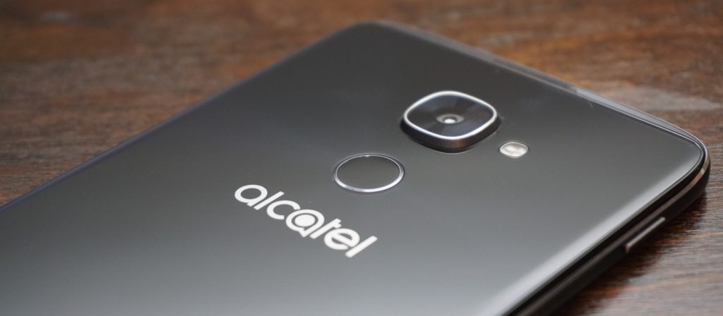
Let’s take a look around the 4S before we dive in. On the front is the 5.5″ display that we will talk more in depth about later along with the dual front-facing speakers and selfie camera. On the left side, you’ll find the power button and SIM card/MicroSD card slot. On the right are your volume controls along with an extra button Alcatel refers to as the Boom Key. On the bottom are the MicroUSB port for charging and a microphone. Finally up top, you have your 3.5mm headphone jack (thankfully) and another microphone. Flip the phone over and you’ll find the main camera along with a fingerprint scanner.

Overall, the IDOL 4S is lightyears ahead of the IDOL 3 in terms of style and design. The glass and metal build feels incredible to hold. However, I have a love-hate relationship with the glass back because it is a fingerprint magnet. It is one of the worst phones I have ever used in terms of how quickly it picks up fingerprints. In fact, I put a case on it almost immediately just because of how often I had to wipe off the back. Also, the glass back means that any accidental drops could end up shattering it along with your screen. And trust me, this phone is slippery. Accidental drops are bound to happen.
As beautiful as the IDOL 4S is, I must recommend that you at least get a skin or a case to keep from dropping it and cracking the glass. Thankfully, Alcatel is one step ahead and includes a case and screen protector in the box.
While the power button is still located annoyingly on the left side of the device, the IDOL 4S kept the double-tap to wake feature from the previous generation. But I doubt you’ll even be using that as the fingerprint scanner on the back with also turn on the phone when you go to scan your finger. In terms of speed and accuracy, the fingerprint scanner impressed me. It is not as fast as the latest from Apple and Samsung, but it is plenty fast for most people.
The only main complaint I have is that it is not set off from the back of the phone at all. This makes it hard to locate blindly and position your finger correctly, but after a while, I found that I got much more accurate.
Display
Alright, it is time for my favorite upgrade from the IDOL 3. This year, Alcatel ditched IPS for AMOLED and cranked the resolution up to 2K. All I can say is, nicely done! The increased resolution is great for gaming, video, and VR (more to come on that) and pairs nicely with the front-facing speakers.
Going for an AMOLED panel was the right choice as colors look clear and vibrant. Like the IDOL 3 before, the 4S has one of the brightest screens I have ever seen. I usually have to keep my screen at above half brightness, but I could easily turn the display on the IDOL 4S down to 30% with the same results. There is no need to worry about outdoor visibility with this display.
I would love to say that the display is perfect, but I found one major annoyance during my time using it. Even as someone who always makes sure to carry my phone is a separate pocket away from loose change and keys, the display on my IDOL 4S still picked up scratches. None are horribly obvious and cannot even be seen with the display on, but I was disappointed that the screen scratched so easily.
Performance
The IDOL 3 was a mid-ranged device that provided competitive performance at an incredible price, but that was in 2015. This year, the IDOL 4S got a price bump while other companies started focusing more on budget-friendly flagships. The 4S definitely has more competition this year so it better come with the performance to keep its high standing.
The IDOL 4S is running on a Qualcomm Snapdragon 652 with 3GB of RAM and an Adreno 510 GPU, and while the processor may not be an 800-series, it still packs quite a punch. For storage, you get 32GB of onboard memory along with a microSD card slot to add extra space when needed. Needless to say, the IDOL 4S is more than powerful enough to handle even your craziest of social media binges. I was impressed with how snappy the Snapdragon 652 was as I was able to fly through most apps without a single frame drop.

Asphalt 8 seems to be the de facto game for testing a phone’s gaming performance so that is the app I used. Ninety percent of the time, the IDOL 4S handled the game like a champ. However, there were a couple of times where I noticed a slight frame drop. I doubt that most would even notice it before it went back to normal, but there were definitely a couple of slow downs. The phone itself never seemed to get hot enough to throttle so I am assuming the hardware just wasn’t fast enough to fully handle the game. Most games will play wonderfully on the IDOL 4S, but graphically intensive games may have a couple of struggles.
Last year, this would not have been a big deal since the IDOL 3 sold for $250 and smoked basically every other phone in that price range. However, the IDOL 4S is priced at $399 which puts it right up there with phones like the OnePlus 3, which is running a Snapdragon 820.
Along with price, Alcatel heavily marketing the IDOL 4S on how well it performed with virtual reality, and while the preinstalled titles do play well, more graphically intense VR games will likely exhibit some stuttering. We will have a post coming out soon fully dedicated to VR on the IDOL 4S so keep your eyes out for that.
So what does this mean for performance on the 4S? Overall, it is incredibly fast and smooth in almost every situation. However at this price point, there are phones that beat it on the performance side.
Software
 The IDOL 4S comes running a slightly skinned version of Android 6.0 Marshmallow (no word yet on a Nougat update). As far as most Android skins go, the one on the 4S is fairly minimal. It’s not as close to stock as something like the Moto G4, but it is nowhere near as intense as Samsung’s TouchWiz.
The IDOL 4S comes with a custom launcher, custom icons for basic apps, and Alcatel’s versions of stock apps like Contacts. There are some preloaded apps, but the majority of them can be uninstalled immediately from the phone.
Even with all the uninstallable apps removed, there are still several apps unique to the IDOL 4S that remain on the phone. These include VR apps and games, an equalizer app, an FM radio app, and some video editing and live streaming apps. While some of them are needed for VR applications, I still wish that they could be removed easily or uninstalled completely.
 The custom launcher comes with a couple of neat tricks up its sleeve. The first is a parallax wallpaper effect that makes it seem like the icons are floating above the wallpaper. I am not a big fan of this effect, and it is easy to turn off from the wallpaper selector. If you are on the homescreen and push the Boom Key, there will be a visualization of the current weather in your location. While it is not particularly useful since the weather is also displayed on the homescreen widget, I cannot deny that it looks super cool, and I find myself pushing the Boom Key to trigger it all the time.
My single favorite feature from the IDOL 3 made a return on the 4S, and that is the Reversible UI. Basically, this allows the screen to rotate a full 360-degrees so that no matter what way you pick up the phone, it is always right side up. Unfortunately, I found this feature less useful now that there is a fingerprint scanner. When I hold the phone upside down and reach for the fingerprint scanner, I immediately realize that I am holding the phone wrong and flip it around.
The feature is still useful for quickly answering calls without having to spin the phone around, but I am sad to see my favorite feature become less useful.
Speakers

One of my favorite features on the IDOL lineup are the dual front-facing speakers, and the IDOL 4S does not disappoint in this area. The JBL-certified speakers pump out a loud sound that is crisp and clean regardless of the volume.
Being phone speakers, the low end does leave some to be desired, but I would challenge you to find a better sounding set of speakers on any smartphone especially in this price range. Whether you are playing a game, watching a video, or just listening to some music, the IDOL 4S speakers will do more for you than basically any other phone speaker out there.
When you lay the phone face down while playing something through the speakers, it will actually route the audio towards the back of the device so that volume and quality are not hindered.

When you are using the speakers, pressing the Boom Key activates one of the special experiences of the IDOL 4S. Alcatel claims that pressing it boosts the bass and volume of the music, and while I did notice a volume increase, an increase in audio quality is questionable. Some of my music sounded fuller when the Boom Key was activated, but other times it sounded too echo-y. It does help with some songs, but it was not something that I enabled every time I listened to music.
The best time to use the Boom Key is while gaming. When I played Asphalt 8, I pressed the Boom Key and the audio became much more immersive. It almost seemed like surround sound at times. While the Boom Key might not improve all the audio you listen to, it definitely increases the immersion while playing games.
Camera

The camera on past IDOL phones has always been pretty good but consistently left me wanting more. The IDOL 4S comes with a 16-megapixel f/2.0 main camera and an 8-megapixel front camera, and I can fully say that these are the best cameras on any IDOL to date.
Throughout my time with the 4S, I found the camera is quick to focus and takes detailed shots with good color reproduction as long as the lighting is good. Unfortunately, it looks like many of the pictures I took with the IDOL 4S suffered from oversharpening like the IDOL 3 before it. While the camera often exposes correctly, I found that it has a tendency to overexpose and highlights easily get blown out.

Thankfully, the IDOL 4S had a pretty solid HDR mode. Unfortunately, there is no option for AutoHDR, which means you need to switch it on and off as needed, which makes taking quick shots more difficult. There are a few Boom Key features within the camera app. You can press it to take a photo, or while taking a video, you can press it to immediately livestream through the preinstalled app TiZR.
If you are looking to record video with the IDOL 4S, you were probably happy to see that it supports 4K at 30fps; however, there is no OIS (optical image stabilization) on the cameras so videos come out looking shaky even with the electronic image stabilization. I think that leaving out OIS was a big mistake on Alcatel’s part.
Overall, the camera is the same story that it was with the IDOL 3. The camera is okay and capable of taking some good shots, but it still has problems that hold it back from being a truly great camera.
Battery
 I was pleased with battery performance on last year’s IDOL 3, but I am full on impressed with what I was able to get out of the IDOL 4S. The phone is powered by a 3000mAh battery and comes equipped with QuickCharge technology for a quick fill up when you don’t have much time.
I am a fairly heavy smartphone user, and I manage to kill most phones before the day is done. My typical day includes streaming music and YouTube videos for about an hour each. I text and check social media consistently throughout the day, and I also have 3 email accounts that are constantly pulling down new emails. Other than that, I do browse the internet over WiFi and LTE along with some light gaming.
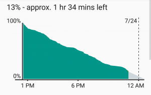
 After putting the IDOL 4S through its paces on a daily basis, I found that I consistently got over five hours of screen-on-time with some days tending closer to five-and-a-half hours. For a phone with a 2K AMOLED display, I am extremely pleased with the battery performance. I still have to charge it every night, but at least I am making it to the end of the day now.
Conclusion
There is no hiding that the IDOL 4S is a wonderful phone and a huge improvement over last year’s IDOL 3. However, the price jump of $150 dollars has put the IDOL 4S against some incredible competition. Phones like the OnePlus 3 and Nexus 6P are available close to that price and each of them comes with a beefier processor, which provides even better performance.
So is it the best budget phone of 2016? Unfortunately, I am going to have to say no, but that is simply because the competition is extremely fierce in the budget arena now. I’d be hard pressed to name any phone as the best budget flagship. That being said, the IDOL 4S is one of the best budget phones of the year. It has great build quality, a stellar screen, loud speakers, and strong battery life. I would definitely recommend the IDOL 4S to any interested, and I doubt it will leave you unimpressed.
One thing that the IDOL 4S has going for it is the inclusion of a case, glass screen protector, and VR goggles when you purchase it. Head on over to Alcatel’s website or Amazon and pick up an IDOL 4S for yourself for only $399!
Lifx White 900 BR30 Wi-Fi LED Smart Bulb review – CNET
The Good The white-light floodlight from Lifx is bright, efficient, easy to use and compatible with Nest, IFTTT and Amazon’s Alexa.
The Bad Lifx bulbs don’t support Apple HomeKit, so you can’t control them with Siri commands. We also experienced occasional hiccups with the Wi-Fi connection.
The Bottom Line These are very good smart bulbs with a lot of tricks up their sleeves, and they cost half as much as Philips Hue’s floodlights. They’re the bulbs you want for smart overhead lighting.
Cloud-connected light bulbs are a terrific starting point for the smart home, but most of your options are A-shaped bulbs meant for use in lamps. That’s all well and good, but it isn’t terribly helpful if you’re living in a home filled with recessed lighting fixtures designed for BR30-shaped floodlights.
The good news is that you’ve got a couple of floodlight-shaped options, too. The best of the bunch? The Lifx White 900, a smart, Wi-Fi-enabled floodlight that lets you control things remotely through the Lifx app on your Android, iOS or Windows device. It won’t change colors like other Lifx bulbs, but it will change color temperatures on the white-light spectrum, which allows you to dial between a warm, golden glow and bright, bluish-white daylight tones. On top of that, it enjoys all of Lifx’ third-party integrations, which include IFTTT, the Nest Learning Thermostat and Amazon’s Alexa. The cost? Thirty bucks a pop (a little less than £25, or about AU$40).
That’s not inexpensive, but it is $20 less than Lifx’ own color-changing floodlight, and $30 less than the Philips Hue floodlight. It’s also just $10 more than bottom-tier smart floodlights from names like GE and TCP that don’t offer white-light spectrum controls or the depth of Lifx’ third-party connections. That, coupled with strong performance, puts the Lifx White 900 right in the smart-floodlight sweet spot.
Smarts aside, a connected light bulb has to start by being a good light bulb, especially if it’s asking you to spend $30 on it. The Lifx White 900 passes this first test with ease. Like the name suggests, it puts out plenty of light, with a claimed 950 lumens at peak settings. That’s a noticeable upgrade from the sort of 65W incandescent floodlight it seeks to replace — bulbs like that typically put out less than 700 lumens.
Here are all of the smart bulbs that work…
See full gallery


1 – 5 of 20
Next
Prev

The Lifx White 900 is noticeably brighter than the 65W incandescent floodlights it seeks to replace.
Tyler Lizenby/CNET
The White 900 has a power draw of just 12 watts, so you’re also getting a nice efficiency upgrade. How nice? In the US (energy rates will vary from region to region), a 12W bulb will add about $1.50 to your power bill each year, on average, which is far better than the $7 or $8 you’ll spend to use that 65W incandescent over the same period. Replace that incandescent with the Lifx White 900, and your new bulb will pay for itself in energy savings in less than five years, then keep on shining for decades to come thanks to a 22.8-year life expectancy.
Philips Hue White LED Starter Kit review – CNET
The Good The plain, vanilla version of Philips Hue’s smart LEDs don’t change colors, but they do enjoy all of the benefits of Hue’s well-connected platform. They’re also bright, good looking bulbs with easy-to-use smarts, and you can add extras to your setup for just $15 each.
The Bad At $70, the two-bulb starter kit still comes with a fair share of sticker shock.
The Bottom Line Philips Hue is one of the best-developed DIY smart-home platforms money can buy, and this white-light starter kit is your most affordable entry point. It’s practically a must-buy if you’re serious about smart lighting.
There’s an awful lot to like about Philips Hue’s smart lighting ecosystem. It’s polished. It’s easy to use. It works with just about everything. The only problem? The price. A starter kit with the essential Philips Hue Bridge and three color-changing bulbs costs $200 — a steep point of entry for connected lighting.
Fortunately, that color-changing kit isn’t your only option. For $70, Philips also sells a starter kit with that same Hue Bridge and a pair of plain, soft white smart bulbs. They won’t change colors at all, but you can still automate them to turn on and off or dim up and down, and they’ll work with all of the same third-party services as the rest of the Hue lineup, including Amazon’s Alexa, Apple HomeKit, IFTTT, the Nest Learning Thermostat and more. Plus, given that the Hue Bridge typically sells for about $60 on its own, you’re basically getting them for $5 each if you buy the kit, which is a heck of a deal.
All of that makes the Philips Hue White LED Starter Kit a near must-have for anyone who’s serious about connected lighting and a very safe purchase given how good Philips has been about keeping its bulbs up to date with the latest platforms and products.
Let’s talk light bulbs
If you take a look at the shape of the bulb itself, you’ll see that it’s nice and wide, extending out beyond the heat sink that makes up the bottom half. That gives it a nice, omnidirectional light output that can shine downward if you’re using it in something like a bedside reading lamp. To me, that’s a slight edge over the Lifx White 800 LED. Though the Lifx is a brighter bulb overall, its flat-topped design that falls flush with the base of the bulb prevents the bulb from casting as much downward light as it should.

The Philips Hue White LED does a great job of casting light out evenly in all directions.
Tyler Lizenby/CNET
The Philips bulb also dims exceptionally well, going all the way down to 0.9 percent brightness at its minimum setting (about 7 lumens). And because it’s using in-bulb dimming smarts as opposed to relying on in-wall dimmer switches, you won’t have to worry about flicker or buzz. Just be sure not to use it with one of those in-wall dimmer switches, as the two dimming mechanisms will clash and cause the bulb to strobe.
Lifx Color 1000 BR30 Wi-Fi LED Smart Bulb review – CNET
The Good The Lifx Color 1000 floodlight LED is an Alexa-compatible smart bulb with full color controls, robust IFTTT support, and a superb design.
The Bad $50 per bulb is still prohibitively expensive, especially since you’ll probably need more than one of them. They also won’t work with Apple HomeKit.
The Bottom Line Prices are still high on these kinds of color-changing LEDs, but this Lifx floodlight is one of the best. It’s worth the splurge if you’re into high-tech novelty lighting.
If money were no object, I’d have Lifx Color 1000 BR30 LEDs all throughout my home. They’re bright, they’re efficient, and they offer better-looking colors than Philips Hue, plus comparable smarts thanks to integrations with the Nest Learning Thermostat, with IFTTT, and with Amazon’s Alexa.
But money is an object, and these LEDs aren’t cheap — 50 bucks each, to be exact, or about £40/AU$65. It’s a lot of money for a light bulb no matter what currency you’re using, and that stops me from recommending them outright (or, you know, filling my house with them). Plus, they don’t work with Apple HomeKit, which might be a deal breaker for the iOS faithful among ye.
Still, these are very good smart bulbs, and a justifiable splurge for owners of the Amazon Echo smart speaker thanks to those Alexa controls. You don’t need these color-changing smart bulbs, but it’s perfectly fine to want them, and fine to buy them, too, if you’re looking for a little more color in your day to day.

The specs are strong with this bulb.
Lifx
As LED floodlights go, the Lifx Color 1000 is flat-out great. With nearly 1,000 lumens at its brightest setting it’s a legitimate upgrade in light output over the kinds of common 65W incandescents you might use it to replace. Bulbs like those typically put out less than 700 lumens.
It’s efficient, too, drawing just 11 watts (oddly even less than the white-light version of this bulb, which doesn’t do colors and isn’t quite as bright). With an 11W power draw, it’ll save you about six or seven dollars per year in energy costs over that 65W bulb, all while putting out significantly more light.
Lifx bulbs are also terrific when it comes to color accuracy, and capable of producing rich, vivid tones at just about every shade. They’re certainly better color-changers than Philips Hue, which struggles to put out true tones of green and cyan due to weak blue diodes.

The “Turn on lights” IFTTT actions for Philips Hue and Lifx LEDs: the Lifx controls go a lot deeper.
Screenshots by Ry Crist/CNET
The smarts are on point, as well. The integration with Amazon’s Alexa is particularly strong (I know because I own a couple of Lifx bulbs along with an Amazon Echo smart speaker, and use Alexa to control my lights each and every day). Sync your Lifx account with the virtual assistant in Amazon’s Alexa app, and you’ll be able to ask her to turn things on and off or turn them up and dim them down.
Apple Watch Series 2 review (as written by a marathoner)
When the Apple Watch first came out last year, Engadget published not one but two reviews. There was the “official” review, which provided an overview of the device’s features and, more important, attempted to explain who, if anyone, should buy it. Then there was a piece I wrote, focusing specifically on the watch’s capabilities (actually, drawbacks) as a running watch. Although we knew that many readers would be interested in that aspect of the device, we were wary of derailing the review by geeking out about marathoning.
This year, we needn’t worry about that. With the new Apple Watch Series 2, the company is explicitly positioning the device as a sports watch. In particular, the second generation brings a built-in GPS radio for more accurate distance tracking on runs, walks, hikes, bike rides and swims. Yes, swims: It’s also waterproof this time, safe for submersion in up to 50 meters of water.
Beyond that, the other changes are performance-related, including a faster chip, longer battery life and a major software update that makes the watch easier to use. Even so, the first-gen version, which will continue to be sold at a lower price, is getting upgraded with the same firmware and dual-core processor. That means, then, that the Series 2’s distinguishing features are mostly about fitness. And if you don’t fancy yourself an athlete, we can think of an even smarter buy.
Design

For all intents and purposes, the Series 2 is identical to the original. Apple says the new models are nine-tenths of a millimeter taller, allowing them to accommodate bigger batteries. This was news to me: When I first saw a tableful of the Series 2 watches at the company’s launch event earlier this month, I was sure the dimensions were unchanged. The screen sizes are otherwise the same — 38mm and 42mm — which means the respective bands will fit either generation of the device. So if you’re one of the few who’s already upgrading to your second Apple Watch, you can keep whatever bands you own.
The watch is available in the same finishes as before too, except that an all-white (and apparently very durable) ceramic model has replaced last year’s 18-karat gold model as Apple’s highest-end “Edition” offering. Most of us are likely to go for the aluminum version, which comes in gold, rose gold, silver and space gray and starts at $369 ($399 for 42mm), or the stainless-steel model, which is offered in two colors and is priced from $549.
If you’re looking for something different, a special-edition Nike+ version of the Apple Watch is coming out next month. It comes in four choices of sporty bands, which are made from the same elastomer as Apple’s own Sport strap, but are lighter-weight and easier to fasten. You’ll also get two exclusive Nike watch faces and support for Siri voice commands — something you won’t otherwise see in Apple Watch apps made by third-party developers. Speaking of the sort, Nike’s run app comes pre-installed, though it’s also available in the App Store for anyone to download on any iOS or watchOS device. It will start at the same price as the Series 2. Which makes sense: It’s basically the Series 2 with a few Nike extras thrown in.
Across the lineup, the Series 2’s screen is more than twice as bright as before, with an option to go up to 1,000 nits. But so long as you have auto-brightness turned on, you’re unlikely to see the panel get that bright on its own — not unless it’s really, really bright outside. Finishing our tour, you still have the rotating “digital crown” on the upper-right edge, with another physical button below that. Those buttons each work slightly differently than they did before, but I’ll get to that in a moment, in the software section.
For now, here’s the last thing I’ll say on the “recap” front before I get to the new stuff: I suggest women and thinner-wristed people opt for the daintier 38mm model. Yes, it still looks like you have a computer strapped to your wrist (you do!), but I find it’s small enough that it blends in with most outfits.
As a sports watch

As I write this, I’m training for my seventh marathon. When the first Apple Watch came out, I was unable to write Engadget’s official review because I was on “vacation,” running the Paris Marathon. I know a thing or two about running.
And, as it happens, I also have strong feelings about sports watches. I don’t actually ask much from them, though. More than anything, I need accurate distance and pace tracking, as well as enough battery power to last through my slow five-hour marathons.
The first Apple Watch wasn’t so good at the whole distance-tracking thing. But I had high hopes for this new model, which has its own GPS and GLONASS radios inside, meaning you no longer need to bring your phone with you to achieve the most accurate results.
Indeed, when I tested the Series 2 alongside my trusty Garmin Forerunner 225, the distance gap was often very narrow. One day, I ran the 3.35-mile interior loop of Brooklyn’s Prospect Park, and the two devices were off by 0.03 miles: 3.39 on the Garmin, and 3.42 on the Apple Watch. At first blush, this doesn’t seem unusual: When I run with my training group, my friends’ devices often show slightly different numbers at the end of a run.
The problem is, even a seemingly minuscule distance gap can translate into a big difference in calculated pace. In the case of that 3.35-mile route, Garmin said I ran a 10:20 mile; Apple claimed my pace was 10:12. Needless to say, because Garmin did a better job estimating my distance around the park, I trust its pace calculation more too.
That pace gap grew whenever I allowed myself to walk. On one workout where I did walk/run intervals, the Series 2 and my trusty Garmin Forerunner 225 were off by 0.11 miles over two hours and 15 minutes, or nine seconds on pace. The discrepancies widened further when I did these walk/run intervals on shorter routes. In one 42-minute workout, the two watches were 0.09 miles off, resulting in a whopping 17-second difference in the average pace. Throughout, Apple consistently told me I ran farther and faster than I actually did.

The Series 2 and Garmin Forerunner 225 frequently disagreed on how fast I ran.
Interestingly, Apple’s calorie-burn estimate was always similar to that of both the Garmin and the treadmill at my gym. The heart-rate readouts during my cross-training classes were also on target (meaning: in the range I expected). I found all of this was true of the original Apple Watch too.
In any case, because the issue here is the pace calculation, and not whether I ran a few hundredths of a mile less than the watch said I did, the Series 2 could still be a good fit for walkers, hikers and casual cyclists. It might even work for sometimes-runners who just want a rough idea of how far and fast they’re going. But I would not recommend it for someone like me who trains for events where speed matters.
Believe me, I’m just as disappointed as you are. Especially since the distance and pace tracking seem to suffer when I switch to walking. Some of the fastest, fittest runners I know slow down or walk sometimes. Any sports watch worth its salt should take that into account.
Speaking of which, I know I sound like a broken record repeating this in every story I write about the Apple Watch, but would it kill the company to add a run/walk mode? Or interval workouts of any kind — even distance? These seem to me like fairly common, in-demand features, and what’s more, you can find a lot of them on cheaper devices. Anyhow, if you want them badly enough, you’ll download a third-party running app, like RunKeeper, which are often more full-featured.
The battery life here is at least decent. Apple says the watch can last through five hours of continuous GPS activity. Having done some testing, though, I believe that’s actually a conservative estimate. After a two-hour-and-fifteen-minute run with auto-pause and no heart-rate monitoring, I was down to 78 percent. That would have been plenty to last me through the rest of the day and into the evening, and then it was easy enough to recharge while I was in the shower. Just as important, the fact that I lost only 22 percent of my charge during such a long run means perhaps I really could finish a five-hour marathon without depleting the battery.
I also like Apple’s slick-looking Activity app for the iPhone. As on other running apps, you can see a map of your route, along with the weather conditions you ran through that day. Here, though, you also get color-coded lines showing where you sped up and slowed down. It’s a nice touch, but can we get some mile markers on the map too, Apple? Oh, and an elevation chart would be nice. Heck, if Apple wanted to study established players like Garmin, it could even throw in things like minimum, maximum and average cadence and steps per minute. Nike, meanwhile, is known for its cool photo feature. Some sort of picture tool seems like a no-brainer here, especially with the iPhone’s cameras being as good as they are.
I’m not saying the average user will demand all these things, but without them, why would a serious (and brand-loyal) runner like me switch? Especially if you could get a more feature-rich sports watch for the same price or less?
Swimming

There’s one thing I can’t argue with: The Series 2 watch really is waterproof. Whereas last year’s model was splash-resistant, the new model can handle immersion in up to 50 meters of water. Engadget’s senior mobile editor Chris Velazco took one for a dip on the Jersey Shore, and he didn’t break it. The watch is still “ticking,” so to speak.
What’s more, Apple added two swim workouts — pool and open-water-swimming — which the company said it tested on 700 swimmers of different abilities, for a total of around 1,500 workouts. Depending on the kind of workout you choose, the Apple Watch uses different techniques to track your distance. In a pool, you can program the length of the pool, at which point Apple can detect when you’ve turned around for another lap. In open-water swimming, the watch’s GPS radio pulls in your location every time your hand is above water to track where and how far you’ve gone. In addition to counting pool laps, the watch can calculate your average pace and even detect the kind of stroke you’re doing. That last part matters because it has a bearing on calorie burn. There’s a reason most of us don’t enjoy the butterfly: It’s hard!
Regardless of the swim workout you choose, the watch will automatically lock the screen to prevent accidental “touches” (water can sometimes register as a tap). When you’re out of the water, rotate the digital crown to unlock the screen and eject water from the speakers. What happens there is that the speakers use their own vibration to push out any remaining water. It’s a neat solution, considering the speakers were the one part of the device that couldn’t be totally sealed. You’ll probably also enjoy the retro arcade-esque beeps that the watch emits while releasing water. On the other hand, you might also be disappointed to find that the water doesn’t burst from the watch’s orifices like an open fire hydrant. You might not even see a trickle.
As a smartwatch

The Series 2 arrived about the same time as watchOS 3, the third and best version of Apple’s smartwatch software. And by the best, I mean this is the operating system the company should have launched on the original Apple Watch.
In addition to being faster, watchOS 3 has a far more intuitive user interface, with a revamped layout that generally requires less swiping and tapping than it used to. Now you can press the side button to open a brand-new “Dock,” where you can swipe horizontally through thumbnails of recent and favorite apps. Just as convenient, these previews refresh in the background. So if it’s my Activity Rings I’m after, I can see them at a glance and get a rough sense of how I’m doing. Depending on how much detail I need in that moment, I might not even need to open the app.
That side button serves a second purpose, by the way: An optional “SOS” feature allows you to hold down that key to call emergency services in whatever country you happen to be in. Unlike some other features in watchOS 3, this is one you actually have to opt into to use. That’s probably a good thing — we wouldn’t want anyone accidentally and unknowingly calling the police.
Another intuitive thing: You can swipe right and left on the home screen to cycle through whatever watch faces you’ve loaded onto the device. Indeed, there are some new faces on offer, and you can find them all in a brand-new face gallery in the Watch app. Adding and removing faces is intuitive, as is reordering them and selecting different accent colors (oh, the options there). My only complaint here is that sometimes when I would swipe left and right on the home screen, my swipes wouldn’t register at first; I’d have to try again before I could get to the watch face I wanted. Also, though I like the watch faces available, I wish I had more options. Why not open this feature up to outside developers?
You may have gathered already that Activity is one of my most-used Watch apps. And it’s not just because I’m a bit of a fitness nut. Even on days when I’m not running, there’s something addictive about completing my three color-coded Activity Rings. On days when I forget to wear my watch, I regret that I don’t get credit for all my New York speed-walking.
All that said, there was apparently room for the app to get better. With watchOS 3, Apple added social sharing, so you can see how far along your friends are in meeting their daily fitness goals. Once you’ve sent a connection request and your pal has accepted, you can check up on them by swiping left to a second screen in the Activity app. You’ll be notified when your buddies finish a workout, earn an achievement or close their rings. You can also send text messages from inside the app, with so-called Smart Replies designed specifically for activity sharing (and smack talk). Lastly, the Activity app is now optimized for wheelchairs, with an option to track wheelchair push counts instead of steps.
In a similar vein as the Activity app, watchOS 3 ushers in a new “Breathe” app that encourages users to stop what they’re doing and breathe deeply. Just take a minute to inhale and exhale as you watch an on-screen graphic contract and expand. Though I was annoyed to find that Breathe notifications can’t be permanently disabled, the app did come in handy on a recent subway commute, where I was otherwise feeling irritated by all the pushy people around me. If meditating is your cup of tea, you can adjust both the target breathing rate and the length of the session. If it isn’t, you can dismiss the notifications — for the day, at least.

Meanwhile, in Apple’s Workouts app you, can now assign names to miscellaneous workouts so that you don’t have to settle for the “Other” label. Think: yoga, belly dancing, et cetera. There’s that auto-pause feature I mentioned earlier, which works for both indoor and outdoor runs. (You’ll feel a “tick” on your wrist when the stopwatch pauses itself.) Additionally, you can mark segments in any workout by double-tapping the display. And you can hit Quick Start for your most common workout types — another example of how watchOS 3 often requires fewer taps than it used to.
A lot of the other new stuff in watchOS 3 matches what you’ll find in iOS 10. In Messages, you can send so-called Tapbacks, which let you respond to a message by adding a thumbs-up, heart or other pictorial reaction by tapping rather than hitting “reply.” That’s particularly useful on a watch, where you can’t type anything and probably want to minimize scrolling through dozens of lines of emoji.
Speaking of replies, you also get a “Scribble” feature, which is exactly what it sounds like: You can draw letters and hearts on the screen with your finger. For now, that feature is available only in English and Traditional and Simplified Chinese, but it wouldn’t surprise me if Apple incrementally added support for more languages. Rounding out the list of Messages features, you get access to those animated full-screen effects that make texting so addictive on iOS 10.
Other features borrowed from iOS (and even macOS): a new Home app, where you can control any smart home devices based on Apple’s HomeKit standard. There’s a new Reminders app and complication. Find My Friends is now on Apple Watch for the first time. And, as I discussed in my macOS Sierra review this week, you can use watchOS 3 to unlock your Sierra Mac. In theory, setting this up simply requires having two-factor authentication enabled and checking off a box in your system settings, but I wasn’t able to get the feature to work until I reset my iCloud password. Hopefully you have better luck there.
Performance and battery life

Throughout, the Series 2 feels fast — gone are the days when you’d have to wait several seconds for an app to load. That’s partly because watchOS 3 itself is faster and more efficient, but it’s also because of the second-gen watch’s new, faster “S2” chip. All told, Apple says the dual-core CPU inside can deliver up to a 50 percent performance gain, while the GPU is up to twice as fast as on last year’s watch.
The Series 2 does indeed feel materially faster than the original. Apps load quickly, it’s easy to swipe left into second screens, and the background updates have been super-helpful. I occasionally notice some lag when scrolling up and down; maybe that’s something Apple can address in next year’s software update. Even so, watchOS 3 and the Series 2 in particular are vast improvements when it comes to sheer speed and efficiency.
Though Apple says the Series 2 watches are slightly taller to accommodate a larger battery, the company lists the battery life as the same for the 38mm and 42mm models: up to 18 hours. In my day-to-day use, I found I could leave the house early in the morning — say, between 7 and 8 — and return some 14 hours later with as much as half a charge left. That’s assuming I used the watch intermittently, checking in occasionally to peek at my Activity Rings and dismiss those incessant “Stand” reminders. You still need to charge the watch once a day, but that never really bothered me. It’s not like I’m going to sleep with that big thing on my wrist, so why not just let it rest on its magnetic charging disc overnight?
The competition

The Garmin Vivosmart HR+
In a sense, the new Apple Watch’s greatest competition is actually … the old Apple Watch. The original model is still being sold under a new name, the Series 1, and at a lower starting price: $269 (make that $299 if you want the larger 42mm version). What’s more, the Series 1 now ships with the same dual-core processor as the Series 2, not to mention watchOS 3. That means the differences between the two models are few: The newer edition has a 1,000-nit screen instead of a 450-nit one; built-in GPS; and waterproofing. There will always be folks who want the latest and greatest (or who want to go for a swim), but I predict that this holiday season, many people will opt for the cheaper model instead.
Beyond that, it’s not helpful to say that the Series 2 competes with every other smartwatch out there; let’s instead focus on devices that are primarily as sports watches but also do typical smartwatch things, like handle notifications. Samsung has the $180 Gear Fit 2, which we called Samsung’s best wearable yet, thanks to its GPS, automatic workout tracking and stylish design. The problem? It’s Android-only for now.
For $250, Garmin’s Vivosmart HR+ has GPS, a waterproof design, support for cycling and a battery rated for eight days total or 13 hours of GPS activity. And, yes, it works with iOS. You might also be considering the Moto 360 Sport (now $200), but as we found in our review, the Android Wear watch doesn’t function nearly as well when paired with an iPhone.
Wrap-up

The Series 2 is a good smartwatch, but not the best sports watch. I always appreciated the availability of apps for the Apple Watch, but I’m particularly fond of the revamped layout in watchOS 3 — everything is easier to find, often with less tapping and swiping than before.
But considering that the Series 2 is being positioned as more of a sports watch, and that the GPS radio is one of the few things distinguishing it from the older Series 1, it’s disappointing that the pace calculation is often off the mark. Apple’s own Activity and Workout apps could benefit from more features too — things like mile markers on running maps, elevation charts and interval settings. In any case, if all you want is distance tracking (meaning pace is irrelevant to you), the Series 2 will make a fine companion on walks, hikes and maybe even casual jogs. But it isn’t precise enough for athletes in training.
Basically, it’s a very stylish, feature-rich fitness tracker. For most people, the less expensive Series 1 is a better bet, since it has the same processor and OS as the Series 2 and works just as well as a smartwatch. Really, I would recommend the newer model only to people who swim. Even then, as with running, it’s probably best for recreational use. Apple might feature serious-looking athletes in its ads, but ultimately, the Series 2 isn’t robust enough for those people to give up their dedicated sports watches just yet.
Photography by Chris Velazco
Alcatel Idol 4S review – CNET
Haven’t considered buying an Alcatel phone before? The unlocked Idol 4S — made of metal, glass and moxie — will work its butt off to change your mind. The phone boasts a large screen and excellent audio quality; a 16-megapixel camera and an 8-megapixel camera with front-facing flash; a convenience key to quickly launch apps; a fingerprint scanner; and a screen layout that orients itself as “up” no matter which way you pick up the phone. With competitive pricing (see below) and a list of impressive specs (full list also below), the Idol 4S is aggressively taking on the excellent OnePlus 3, a CNET editor’s choice phone. (Note that there’s an Idol 4, too. See those specs, you know, below.)
Let’s just make one thing absolutely crystal clear. I’ve been playing around with hardware and software on a prefinal Idol 4S meant for the US, which means there could be slight changes between this model and the completely finished, boxed-up unit. Since this version of the phone isn’t identical to one you’d be able to buy yourself, I’m holding off on a rated review for now and focus on my general impressions here. When I get the final version, the full court press — with my recommendations on whether or not you should buy the phone — is on.
In the US, the Idol 4S goes on sale July 15 for $350 presale or $400 outright. It comes bundled with a case, glass screen protector and Alcatel’s VR headset.
Flagship Alcatels bring the boom key
See full gallery


1 – 4 of 29
Next
Prev
The most important thing you need to know is that the Idol 4S is all about throwing you everything that Alcatel thinks a buyer wants in a phone, plus extras like a case, screen protector and possibly VR headset — for the same price of a midrange flagship phone (that doesn’t come with those extras). You may not want the VR headset that Alcatel will bundle in the box for US buyers, but the tempered glass screen protector and Incipio case do come in handy.
The second most-important thing to know is that it’s an unlocked phone that runs on the GSM network. In the US, that means you’ll have to buy a SIM card that works on AT&T, T-Mobile, Cricket Wireless or MetroPCS.
Using the Idol 4S

These dual speakers can crank out sound.
Josh Miller/CNET
Here’s what I noticed about the phone’s biggest features during this week — remember, this is prefinal-everything, so my impressions are subject to change when I get the real thing.
Boom key (convenience key): You can program this to open apps, like the camera, which is a shortcut. I love this in theory, but in practice, I kept accidentally taking unintended photos. Either it needs some finessing handling it, or I do.
Cameras: Overall, photos looked bright and colorful — so far I’ve mostly taken them of food, friends and flowers. Focus on the 16-megapixel camera seems a little relaxed, but a last-minute software update could very well enhance and sharpen the focus. We’ve seen this happen many times before. The flash on the 8-megapixel front-facing camera can be extremely useful, and harsh at times. Generally, I like having this as an option.
Fingerprint scanner: Located on the back beneath the camera lens, the fingerprint reader is small and not terrifically accurate. It helps to register multiple fingers, so if you don’t have a case on you can kind of drag them along the back. If you do, you’ll have to hit your target, but in a way that the case also helps position your finger. There is NFC, so you can use Android Pay for mobile payments as well as for unlocking your phone.

The fingerprint reader feels smaller than some.
Josh Miller/CNET
Reversible layout design: There’s technically an “up”, and the Reversible OS, which is entirely optional, is meant to help you use the phone right away no matter if you pick it up rightside up or upside down. What I noticed is that if you have the fingerprint reader turned on, it very much matters which way is “up” — you can only unlock the phone from a single orientation. And it’s confusing to think about the location of the Boom key if you want to use it.
Built-in JBL speakers: Audio is loud and rich for a smartphone. This is a great little extra if you play videos and music for others.
Worth watching
So yes, with its hardware and software so far, the Idol 4S is one to keep an eye on when our final review unit comes in. Alcatel’s huge value play is also unignorable for people who are interested in a high-performing midprice phone, one that could be a true contender against the OnePlus 3.
Idol 4S versus Idol 4: What’s the difference?
| Android 6.0.1 Marshmallow | Android 6.0.1 Marshmallow |
| Reversible OS | Reversible OS |
| 5.5-inch 2,560×1,440-pixel AMOLED screen | 5.2-inch, 1,920×1,080-pixel IPS |
| 16-megapixel camera | 13-megapixel camera |
| 8-megapixel camera with flash | 8-megapixel camera with flash |
| 1.8GHz + 1.4GHz octa-core Qualcomm Snapdragon 652 | 1.7GHz + 1.2GHz octa-core Qualcomm Snapdragon 617 |
| 3.6 watt JBL dual speakers for front and back | 3.6 watt JBL dual speakers for front and back |
| 32GB storage, 3GB RAM, up to 512GB Micro-SD card slot | 16GB and 2GB RAM, up to 512GB Micro-SD card slot |
| 3,000mAh battery (quick charge) | 2,610mAh battery with quick charge |
| Standard Micro-USB port | Standard Micro-USB port |
| Yes | Yes |
| $400 (or $350 presale). ~450 euros, converts to £385, AU$780 | ~280 euros, converts to $310, £215, AU$435 |
2016 Roush F-150 SC review – Roadshow
The Good The supercharged 5.0-liter V8 makes the F-150 laugh-out-loud quick. Roush’s performance exhaust produces a thunderous exhaust note. SVT Raptor-inspired visual upgrades look menacing. On-road ride quality is still compliant on Fox suspension.
The Bad The 600 horsepower comes at the expense of lower fuel economy compared to the stock truck. Premium fuel requirement puts a bigger beating on you at the pump. Cost of admission into a Roush F-150 SC gets pricey.
The Bottom Line While not as off-road worthy as the SVT Raptor, the Roush F-150 SC still offers enough capabilities off pavement, while also being an absolute terror on the street.

Tackling sand dunes in the 600-hp Roush F-150 SC
A supercharger, upgraded suspension and styling changes produce a truck that’s a riot, both on- and off-road.
by Jon Wong
Close
Drag
Test Hill is among the tallest piles of sand at West Michigan’s Silver Lake Sand Dunes. For 20 minutes, I sit in my Roush Ford F-150 SC, looking at it and contemplating whether I should attempt a run up the monster hill. While numerous trucks make it to the top as I play spectator, many don’t and have to reverse back down in shame.
Admittedly, I’m a newbie when it comes to driving on sand. Paved racetracks are my comfort zone, but the urge to conquer Test Hill overwhelms any doubts I have, compelling me to jump out of the truck to take a few more pounds of air out of the already deflated tires for more grip. Power isn’t going to be a problem with the Roush’s supercharged 5.0-liter V8, but hitting the hill at high speed doesn’t seem to be the ticket to a successful run.
Instead, beginning the climb with just the right amount of momentum and gradually feeding in more power as you get higher seems to be the best strategy to prevent the truck from digging into the sand and getting stuck. With the truck’s four-wheel-drive system in 4-Low and 10 pounds of pressure in the tires, I stomp on the throttle and shoot towards the base of the hill.

Getting up Test Hill on the first try.
Nick Miotke/Roadshow
My heart threatens to explode out of my chest as I start my ascent. The Roush scampers up halfway without a problem, but I can feel momentum begin to bleed off. I squeeze in more power, and am careful not to mash the gas pedal to tear the tires off and beach the truck. I hold myself together long enough to get the F-150 to the summit, joining a gaggle of other trucks to take in the surrounding sights of other dunes and Lake Michigan.
It’s a relief to not embarrass myself and the truck, which attracts lots of attention from folks at the top with its aggressive visual changes. A blacked-out Roush grille includes clearance lights that follow in the footsteps of Ford’s own Raptor. It also has a new front bumper cover, fender flares with clearance lights and a tasteful slathering of Roush graphics. The entire package rides on dark-finish 20-inch Roush wheels wrapped in Mickey Thompson Baja ATZ tires.
From there, I motor around the rest of the off-road park, climbing other hills, charging through hoops and splashing through puddles of water where the Fox performance suspension works overtime to handle impacts. The SC’s off-road capabilities prove to be plenty for the dunes, which Roush says targets trucks like the Ram 1500 Rebel and Chevrolet Silverado Z71. Power aside, what it definitely is not is a full-blown SVT Raptor fighter.
As capable as it is off-road, I think the F-150 SC is actually more in its element on the street, mainly because of the power it’s packing under the hood. My test truck’s 5.0-liter V8 originally left Ford’s plant with 385 horsepower and 387 pound-feet of torque. After going through Roush’s facility in Plymouth, Michigan, the engine now spits out 600 horsepower and 557 pound-feet of twist thanks to an Eaton supercharger and performance exhaust system.
On the pavement, all that muscle shoots the F-150 SC forward in a brisk manner, but obviously it doesn’t build speed at the same rate as a 600-horsepower sports car. However, it is incredibility quick for a vehicle weighing nearly 4,900 pounds. Roush doesn’t quote performance numbers, so I’m not exactly sure how quick the SC gets to 60 mph or covers the quarter mile, but when you drop the hammer the speedometer needle sweeps upwards pretty darn fast as you get pinned back into the seat.
In a way, I see the SC filling the high-performance street truck void left by OEMs vehicles like the F-150 SVT Lightning, Silverado SS and Ram SRT-10, all of which are a long way back in history’s rearview mirror. Roush admittedly gives the SC more off-road ability, which isn’t something normally found in a thoroughbred street truck’s DNA. It’s there, though, all packed into a pickup that’s also a capable muscle truck with good handling and ride comfort. Consider the SC something of a dual-sport athlete, a slightly different performance truck specimen.
Nintendo Pokemon Go Plus review – CNET
You want to be the very best, like no one ever was. But you don’t want to be nose-deep in your phone instead of interacting with the world.
That’s why Nintendo devised another way to play the uber-popular Pokemon Go: a $35, £35 or AU$50 wearable gadget that can quietly alert you to nearby Pokemon.
The Pokemon Go Plus released on September 16, and so far, it’s exactly what we thought: a dead-simple way of catching Pokemon.
You wear it like a wristband, or pin it to your pocket, purse, lapel or sleeve. It easily pairs with your compatible iPhone or Android phone over a Bluetooth Low Energy connection, and connects to the Pokemon Go app.

The Pokemon Go Plus.
Nintendo
Then, instead of constantly pulling out your phone to scan for Pokemon, you just walk around town like a normal human being. Whenever you’d normally stumble across a Pokemon, the Go Plus lights up and vibrates instead.
Press that green light-up button, and — without needing to pull out your phone — the game will automatically throw a Pokeball to try to catch it for you. (Just so long as you’ve caught a Pokemon of that type before.) Nice, strong, distinct patterns of vibrations let you know whether you’ve caught or missed the Pokemon, even if you’re keeping the Go Plus in a pocket.
Pokemon Go Plus keeps you catching them all…
See full gallery


1 – 4 of 9
Next
Prev
It works for PokeStops, too: if you walk past one, the device lights up blue. Press it, and you can harvest the same items (balls, potions, berries) that would have been waiting for you if you’d activated it from within the game.
The Plus should also keep track of your steps (which count towards hatching eggs), though we haven’t tested that yet.
You can even use the Pokemon Go Plus as a memory aid: if you walk out of range of your smartphone (roughly 30 feet, or 10 meters), it’ll vibrate and light up red to let you know you left your phone behind. Nintendo says the included button battery (a standard CR2032 cell) should last about 100 days on average.
Sound good? Just know that you may have some trouble actually finding one.
Even though Nintendo pushed back the device’s release to September — it was originally supposed to ship in July — there still doesn’t seem to be enough of the devices to satisfy demand. In the United States, Amazon and GameStop sold out of the devices within a few hours of them going on sale on September 16 — though you might still try try your local GameStop to be sure.
A closer look at Nintendo’s Pokemon Go Plus
See full gallery


1 – 4 of 9
Next
Prev
It’s not like you need a Pokemon Go Plus to play the game, though.
Especially when later this year, there’ll be an even more convenient way to catch Pokemon: with an Apple Watch. The developers say a version of Pokemon Go for Android Wear watches is pretty likely as well.
We’ll bring you our full, rated review of the Pokemon Go Plus in the days to come.

Why Pokemon Go is so popular
Why do we love the Pikachu-catching, ball-chucking, Pokedex-filling phenomenon? It’s all down to how little guidance the game gives you, argues CNET’s Luke Westaway.
by Luke Westaway
Close
Drag
Samsung UNKU7000 series review – CNET
The Good The affordable KU7000 series showed accurate color and a good picture in bright rooms. Samsung incorporates unique device and smart-home control features, tied together with a simple remote and interface. The design is sleek and minimalist.
The Bad In overall image quality it lags behind some similarly priced TVs.
The Bottom Line Midrange buyers seeking a stylish, feature-filled 4K TV from a well-known brand will find plenty to like about the Samsung KU7000, but picture-first shoppers should look elsewhere.
Samsung TVs deserve credit for Smart TV innovation and futuristic design, and the KU7000 combines both for an affordable price.
It’s the least expensive TV to feature the company’s cool automatic device control system, which lets you command connected AV equipment using the TV’s simple remote and zero programming. It can operate SmartThings-compatible smart home devices like lights and thermostats, and even simplifies your cable box and streaming-app interfaces. All with style that’s sleek and modern.
So far, so good, and for many buyers, especially those who value Samsung’s brand cachet, that’s plenty. Right about now, however, I’m imagine a typical CNET reader would mutter: “Stop talking about the design and features, Katzmaier, and tell me about the picture.” Soon enough, but first, look at these slides.

22
Samsung UNKU7000 series (pictures)
Back? OK. Remember that Samsung has a premium line of TVs it calls SUHD. But in 2015, the company’s JU7100 — technically a step down from the SUHD line — actually delivered comparable picture quality to its SUHD big brother, the JS8500. But that happy occurrence isn’t being repeated for 2016: Comparing the KU7000 reviewed here directly with the 2016 SUHD step-up, model KS8000, the latter model was the clear winner. It gets brighter and darker, looks better in a dim and in bright rooms, and has better color. (And, of course, it costs a lot more.)
Then there’s Vizio. The 2016 M series costs about as much as the KU7000, and Samsung trounces Vizio in design and ease of use — despite Vizio’s included Android tablet-based remote, it feels less futuristic to use than the KU7000. On the other hand, the Vizio beats the Samsung at the most important thing a TV can do: producing a beautiful picture.
Series information: I performed a hands-on evaluation of the 65-inch Samsung UN65KU7000, but this review also applies to the other screen sizes in the series. All sizes have identical specs and according to the manufacturer should provide very similar picture quality.
 Sarah Tew/CNET
Signature sweet Samsung style
One of the main reasons to pay up for Samsung is for nice design, and even the midrange KU7000 benefits. The dark gray metallic frame is thin, but not razor-thin like on some other sets. The small Samsung logo matches the quiet discretion of the rest of the TV, and the stand is a svelte splayed pedestal in darker black.
 Sarah Tew/CNET
I also like the remote. It’s small enough to fit any hand yet feels substantial. Bumps, depressions and logical placement make finding keys by feel with a thumb as easy as on any clicker I’ve ever used. I’m an especially big fan of the raised flanges for volume and channel. I would have appreciated backlighting, however, as well as a few more keys — in particular dedicated fast-forward, rewind and skip keys.
 Sarah Tew/CNET
Automatic control, smarter TV
Samsung’s novel control system allows the TV’s remote to command a lot of your home theater gear, including a cable box, without any tedious setup. Simply plugging in a device during initial TV setup is often enough to get the TV to recognize it and completely set up control using Samsung’s TV remote. This unique auto setup ability worked for a little over half the ones I tried when I reviewed it with the KS8000 (I didn’t retest it for this review).
You’ll need to plug your stuff directly into the TV, so if your setup incorporates an AV receiver it won’t work. The system mostly relies on infrared commands sent from Samsung’s remote, so you’ll need line-of-sight to control most devices (if your stuff is hidden in a cabinet, it won’t work).
 Sarah Tew/CNET
In the end I’d stick with my Harmony, but people with simpler systems that use supported devices should be fine using just Samsung’s remote to control everything.
Samsung also revamped its Smart TV system with a friendlier design. App coverage isn’t as comprehensive as on Android TV (on Sony sets) or Roku TV, but it’s better than LG. If your streaming tastes go beyond the basic apps, you will probably still need to connect an external device like a Roku or Apple TV.
 Sarah Tew/CNET
Samsung incorporates content more seamlessly than other TVs, though. Click the Home button and you’ll be able to browse content from within apps like Netflix and Hulu while your current video keeps playing in the background. The menu even serves suggestions and, on some apps, lets you resume stuff you were watching previously.
For more details on the control system and Smart TV, check out the KS8000 review.
Key TV features
| LED LCD |
| Edge-lit |
| 4K |
| HDR10 |
| Flat |
| Tizen |
| Standard |
| No |
Features
The KU lacks most of the picture-related extras of its SUHD compatriots, including Quantum Dots, “1,000 nits” of brightness and local dimming. Instead is a relatively standard 4K resolution set.
The “UHD Dimming” feature on this TV isn’t true local dimming, but rather an algorithm Samsung says enhances contrast, color and detail. The KU7000 has an edge-lit LED backlight as opposed to the direct or full-array units found on some other TVs, which helps thin the cabinet but can negatively impact screen uniformity. has a panel with a 60Hz native resolution, not the 120Hz of step-up sets, which has an effect on motion handling. See the picture quality section for more on how these features affect the image.
The set supports HDR (high dynamic range) content in HDR10 format only. It lacks the Dolby Vision HDR support found on Vizio’s and LG’s 2016 HDR TVs. It’s still too early to determine whether one HDR format is “better” than the other, and I definitely don’t consider lack of Dolby Vision a deal breaker on this TV–instead it’s just one more factor to consider.
 Sarah Tew/CNET
Connectivity
- 3x HDMI inputs with HDMI 2.0a, HDCP 2.2
- 1x composite/component video input
- 2x USB ports
- Ethernet (LAN) port
- Optical digital audio output
- RF (antenna) input
No complaints here, and all three of its HDMI are state-of-the-art. Unlike the KS8000 and other more expensive Samsung TVs, the KU7000 actually includes an analog video input.
One of the USB ports, labeled IoT Extend, is designed to accept the company’s SmartThings Extend control dongle. The dongles will allow the TVs to control SmartThings devices via an app on the TV. They were originally expected to ship this September, but now won’t be available until early 2017, according to Samsung. They’re free to owners of this TV who redeem a coupon included in the box. Maybe the integration of the platform into TVs will push Samsung to iron out some of SmartThings’ glitches.
Picture quality

The KU7000’s image was good, but not up to the standards of many TVs I’ve tested this year. Its relatively light black levels and subpar video processing were the biggest issues, and while I appreciated its accurate color and solid HDR image, they aren’t enough to push its picture into “very good” territory.
