


Eight best educational apps for teens

Teenagers and smartphones are an unstoppable force. It would be extremely hard today to find a single high school in the Western world where the hallways aren’t crowded with teenagers texting or taking selfies.
Bu this trend has spiked a wave of worry among adults. Is all that time spent messaging, listening to music and playing gamers really good for kids? Opinions vary, of course. But we can all agree that if used right, technology can become a powerful educational tool.
So rather than trying to enforce strict time limits for phone use, parents might want to consider getting educational apps on their teenagers’ devices. A well-chosen app can boost a child’s learning or even help him/her overcome a specific challenge.
Here are eight great apps that you may want to encourage your teen to use.
The Moron Test
What it is:
Developed by DistinctDev, the Moron Test is a fun app which challenges players to solve seemingly simple yet tricky puzzles and tasks.
Why we like it:

- It has simple but cute, colorful graphics. The background looks like a piece of paper and the numbers and images that appear look like things you’d normally hang on the wall of a classroom.
- Each puzzle comes with its own set of instructions, so learning how to play it’s easy. Some are to the point, while others require you to pause and think a bit before acting.
- The game includes six different sections including Skip Day, Food Fight and Tricky Treat featuring hundreds of puzzles. Want more puzzles? You can install and download The Moron Test 2.
Install The Moron Test
TED
What it is:
TED is a nonprofit organization dedicated to sharing important ideas on a variety of topics. It brings together the world’s most innovative people, including teens to deliver short powerful talks on certain issues. The TED app offers access to all these talks.
Why we like it:

- Provides access to the entire TED Talks video library, with subtitles in over 100 languages.
- Easily lets teens learn something new by letting them browse certain categories (for example: What would it be like to live on another planet or The evolution of music). You can also browse by mood.
- Allows users to download the talk in video or audio format for later offline use.
- Great for fostering curiosity in young minds.
Install TED
Lumosity
What it is:
A compelling brain training app developed by Lumos Labs, which aims to help you develop your memory, attention and more.
Why we like it:

- There’s actual science behind this app. Games are based on common and neuropsychological tasks that challenge core cognitive skills.
- On top of its database of games intended to work your cognitive skills (like information processing or spatial orientation), the app has also a Mindfulness category that includes meditation sessions.
- The app is available in various languages including English, German, Japanese, Portuguese or Korean.
Install TED
Narrate
What it is:
Narrate is an app that can teach teens the benefits of keeping a dairy, as expressive writing is known for being a pathway to psychological healing.
Why we like it:

- Narrate demonstrates journal-keeping is not as overrated as one might think. The app has a beautiful, minimalist interface that’s bound to inspire users to record their thoughts and experiences.
- Gives you the ability to sync your journal across all the devices you own, so you can access your diary everywhere.
- Let’s you save photos and to categorize them using tags.
Install Narrate
Ready4Sat
What it is:
An app developed by Ready4 and aimed at teens who are prepping for their SATs. It gives students access to over 1,000 questions with detailed answer explanations and more.
Why we like it:

- Turns your teen’s smartphone into a personal tutor. Includes intuitive lessons which go through must-know SAT concepts step-by-step.
- Gives access to hundreds of flashcards.
- Includes customizable practice tests.
- Comes with a list of 400+ colleges and universities and also offers additional info on each institution like the average SAT score you need to be accepted.
Install Ready4Sat
SoloLearn: Learn to Code
What it is:
An app designed to help teach kids (but not only) the essential skill of coding. It covers different languages including CSS, PHP, C++ and Java.
Why we like it:

- Coding is becoming the most in-demand skills across industries, so the sooner kids start learning it the better. This app allows teens interested in technology to absorb the basics on their own.
- The app includes a free mobile code editor, so you can write, run and share code right from your smartphone.
- When users eventually get stumped on a concept or lesson, they can turn to the SoloLearn online community to get help and guidance.
Install SoloLearn
Toshl Finance
What it is:
An app developed by Toshl Inc. can be a great tool for parents who want to teach their teens financial literacy.
Why we like it:

- The app looks like a serious digital money manager for adults, but it does pack a lot of handy features which makes it right for the teen crowd. For example, the app focuses on analyzing spending habits and helps you identify potential areas for saving.
- It includes features like bill organizer, receipt database and currency converter.
- Toshl is packed with fun monsters that offer occasional budget tips and tricks.
Install Toshl Finance
Wattpad
What it is:
Wattpad is an app (and a site) where teens and adults alike can publicly share their fiction writing in a blog-like format as well as read and comment on other people’s works.
Why we like it:

- The app encourages teens to read, but also to share their creative efforts.
- Wattpad is also a social app, as it allows you to join the community and connect with authors and readers from across the world.
- The app also has a section dedicated to well-known writers, where you can find works from iconic authors like Dan Brown, Paulo Coelho, Margret Atwood or Kevin J. Anderson.
Have you tried any of these apps before? If not, which would you try first? Let us know what you think in the comment section below.
Web trackers aren’t just spying on you; they’re slowing you down
Chris DeGraw/Digital Trends
(in)Secure is a weekly column that dives into the rapidly escalating topic of cybersecurity.
Trackers are something that most internet users tolerate, though few have much fondness for. At a time when Facebook and other online entities are being called out for their privacy problems, trackers are certainly part of that conversation. But a new study from anti-tracking extension maker, Ghostery, is equally concerned about trackers’ ability to slow down web browsing itself.
Hidden from view behind the pretty front end of modern websites, trackers make up a major portion of the web browsing experience. From managing personalized adverts, to social network integration, they have an important part to play in how the internet works today, but does all of that come at the cost of a fast and efficient internet?
The tracker tax
Ghostery is a tool that is decidedly anti-tracker (it’s not the only one), in that it makes it easy for web users to block any they want, and anonymize the information harvested by ones that they don’t. With its new “Tracker Tax” study though, Ghostery looked into the performance benefit of doing so, as well as the implicit privacy implications of not.
“We were fairly confident that websites perform better and work faster when trackers are blocked,” Ghostery’s director of product management, Jeremy Tillman told Digital Trends. “The purpose of the study was really trying to quantify that impact. Is it a minor thing, is it somewhat rare, or is a major thing that’s widespread?”
Jeremy Tillman, director of product management at Ghostery
The study focused on the top 500 sites as listed by Alexa, which they claim is where the vast majority of traffic in the US spends its time. In addition, Ghostery identified them websites as the websites that implement a lot of third party tracking technologies.
The results were rather stark too. Ghostery found that just under 90 percent of the websites investigated contained some form of third-party web tracker. Those trackers, whether small or many in number, proved to have a significant impact on page load speed too.
The average page load times were around 20 seconds , but when all trackers were blocked, that time dropped to just under nine seconds.
To draw these load times, Ghostery employed a custom-built web crawler that was said to be comparable in usage to a consumer browser like Chrome or Firefox. However, the web crawler didn’t look at websites in the same way a human would. It was focused entirely on a “complete” state of a website’s generation, where there was nothing left to load. In reality, many sites would be functional before then, but that, according to Tillman, is half the problem.
“The truth is that a lot of websites are never that functional, in no small part because the trackers on those pages don’t stop loading,” he explained. “Many sites out there, if you go there without Ghostery, there’s almost like a slow leak because they […] never stop communicating with their servers and for some of these sites the lagginess that results […] is persistent and it never goes away.”
Ghostery’s study suggests that some sites never do quite finish loading. In the case of the slowest sites out there – Ghostery calls out Cracked.com, Si.com and Chron.com as the worst offenders – they could take as long as two minutes to register as “complete.”
“A lot of websites are never that functional, in no small part because the trackers on those pages don’t stop loading.”
Even if those sites become functional for the user before then, Tillman suggests that there is still an unnecessary drain on the website load speed, its responsiveness and on the end user’s system resources.
“New ad placements are being loaded, new trackers are being loaded, information is constantly being sent back and forth, so it’s a constant, persistent drag on the browser’s processing power,” he said.
Living tracker free
Clearly Ghostery’s intent with this study is to highlight not only the impact of trackers, but the effectiveness of its own tracker-blocking tool at remedying the problem. But do we actually want to live in a world that is entirely devoid of trackers? What kind of sites did the study discover that have no trackers at all?
“Craigslist would fall in that category,” Tillman said. “If you’ve ever been to it, it’s almost like a website from the 1990s, just a bunch of hyperlinks.”
No one is suggesting all websites should be like Craigslist, though. Indeed Tillman said that in some cases, trackers can offer benefits to people. Though typically they’re website owners, rather than website visitors.
“It’s hard to say that any one tracker is good or any one tracker is bad,” he said. “There are some that can sort of enhance the functionality of a page. A lot of website owners benefit from this out of the box nature of trackers, so without having to build that feature yourself, within minutes you can have a fully featured video player by using a third party technology.”
“It’s hard to say that any one tracker is good or any one tracker is bad.”
While those widgets may provide a quick ‘upgrade’ for a website’s functionality though, is that worth their cost in privacy and performance impacted by the trackers that go hand in hand with them?
“In those situations where a user is getting a deeper, more meaningful user experience, you could say that those trackers are providing utility to the user,” he said. “[That said,] from a user’s perspective, are any trackers good? It’s a different question.”
Meeting in the middle
Often times the modern web browsing experience can seem like a battle of two camps: The website owners and the users. One side wants to make money from their service, track how its used, and continue to improve upon it. The other wants to use websites with as little intrusion into their personal privacy or finances as possible.
Both sides are entirely justifiable in their goals, but the difficulty comes from how opposed they are. One cannot exist without the other and in some cases, many modern web features require the use of trackers to facilitate much of what we’ve come to rely on as mainstay internet features. How then can we create a web that doesn’t impact the privacy or performance of web users, whilst still giving website owners the necessary tools to run their sites well into the future?
Ghostery’s solution is the “trust” system, that allows users to whitelist sites that they want to support by allowing them to run trackers and adverts.
“The homespun example we give is if your friend has a blog and you want to support it, you can use the trust function in Ghostery to do just that,” Tillman said. If a publisher or website owner does have a very clear sort of value exchange in mind, as long as it makes that easy for the user and the user says yes, then there’s nothing wrong with that.”
Ultimately, Tillman said, Ghostery would like to see more websites be upfront and honest with users about how the content is monetized. After all, if a website is free to access, then the costs of running it must be recouped somewhere, whether through adverts, selling user data, or something a little different like cryptocurrency mining.
“Most of our users […] support publishers finding ways to make money.”
“For the most part, most of our users, more so than the average user, support publishers finding ways to make money,” he said. “The problem is most of them are opposed to the models that are available today. They are opposed to the data collection (especially implied data collection ) practices of website, as well as the forced ad model especially when it’s coupled with poor website performance and really creepy ad targeting technologies.
While a solution to the current tracker climate of web browsing will need cooperation from users and website owners on a grander scale than seems imaginable at the moment, Ghostery does – of course – have recommendations for those wanting to avoid the “tracker tax” in the meantime.
“I recommend they use a browser like Cliqz [developed by Ghostery’s parent company] and a tool like Ghostery and those two things together provide the most complete privacy protection solution,” Tillman said, whilst also highlighting the availability of Ghostery extensions for Chrome, Firefox, and mobile platforms like iOS and Android.
“Fundamentally [people] need to proactive to protect their own privacy,” he said. “Relying on government regulations and self-regulating by companies like Facebook, users will never fully be protected and I think that creates a false sense of security. Using tools to protect your privacy is the best and most direct way to do that.”
Editors’ Recommendations
- Is tech finally killing radio? Don’t let iHeart’s bleeding fool you
- 16 things you might not know Amazon’s Alexa can do for you
- Here’s all the best gear and gadgetry you can snag for $100 or less
- Still using a home phone? Here’s everything you need to know about MagicJack
- RocketBody tracks your metabolism to tell you when to eat and work out
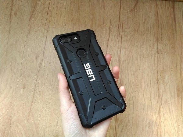
Urban Armor Gear Pathfinder case for OnePlus 5T review
The OnePlus 5T is a great smartphone coming with top specifications and a fair price. Even so, it’s far from being a perfect handset. For example, while the device feels good in hand, it’s extremely slippery.
OnePlus solved this with the Sandstone White version of the flagship. With a matte finish and slight texture, it provides significantly more grip. But if you own the Midnight Black model, it’s highly recommended that you use a protective case with your phone.
There’s no shortage of covers for the OnePlus 5T out there, but if you’re looking for something more rugged you should probably check out what Urban Armor Gear has to offer.
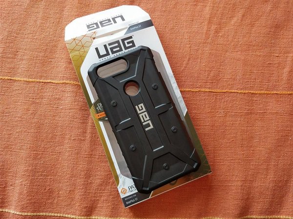
Part of the Pathfinder series, the Urban Armor Gear case for the OnePlus 5T is among the lightest cases ever designed by UAG.
Unfortunately, it does add some bulk. Without a case, the OnePlus 5T is a very sleek device. But snap the UAG case on and the device automatically loses its slimness and becomes more voluminous.
On the bright side of things, the case provides two-layer protection and is military standard MIL-STD 810G-516.6 compliant. Consumers can trust MIL-STD-810G as a primary indicator that the case was designed to, at minimum, survive a four-foot drop and come out unharmed. The case’s armor shell and impact resistant soft core see to that.
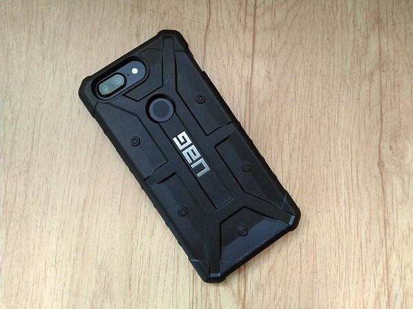
The case features oversized tactile buttons and facilitates easy access to the touchscreen and ports. The protective cover offers full compatibility with the OnePlus 5T’s fingerprint scanner, frontal and rear cameras, including face unlock.
The highlight here is represented by the oversized clicky buttons for power and volume which provide a rewarding user experience.
Most rugged cases are usually too bulky to support wireless compatibility with NFC payment systems. However, this particular case is slim enough so you can still use services such as Google Pay.
Does the case protect against falls as advertised?
Yeah, it does. The bumper is raised around the glass to help protect the display, so even if you drop your phone on the floor or on the sidewalk, the screen will come out unharmed. I’m usually pretty clumsy, which makes me prone to dropping phones a lot. But with the UAG case on, I don’t have to worry about shattering the OnePlus 5T’s beautiful AMOLED display anymore.
So should you invest in a UAG case for your OnePlus 5T? Yes, because the accessory can provide great protection. Mind you, it’s not a versatile case, meaning it does not double as a stand or anything like that. But it gets the job done. It will keep your phone away from harm’s say.


Yet, two things keep me from recommending this case wholeheartedly. First off, it’s pretty bulky. The OnePlus 5T is a sleek, beautiful device. But slapping the UAG case on it will transform it into a sturdy beast. I over exaggerate a bit, but you get the point.
Secondly, the case costs $39.95, which is quite a lot to pay for an additional accessory. Especially when there are more affordable options available. For example, the Anccer Ultra-Slim Hard Case keeps the flagship killer beautiful and only costs $12.
On the other hand, OnePlus’ official cases aren’t exactly cheap either. The OnePlus 5T Bumper Case in Ebony Wood/Rosewood or Carbon will take you back with $29.95.
Behind the wheel with Volvo’s Android infotainment system
Thanks to Google’s Android Auto and Apple’s CarPlay, the vehicle infotainment experience has drastically improved over the past few years. You get quicker and easier access to your tunes, maps, contacts, and more, matching our current digital lifestyle. But these services still require you to plug your phone in to work. Google’s going a step further by working with manufacturers to integrate a custom Android P-based operating system (OS) directly into cars.
Volvo’s senior vice president of research and development, Henrik Green, told Digital Trends that the idea came about quite a few years ago when the company first started integrating Android Auto and Apple CarPlay into the existing vehicle OS.
“You would mirror your phone up on the screen, which is a great system, but then it sort of immediately came to me that this should be an integrated OS, part of the ecosystem by itself, not through a smartphone you’re carrying and a cable,” he said. “And then we met with the Google team, and they have had the same thought for a while, and presented their idea, and we sort of connected around that idea.”
So how does Android look built into a car? We got a close look in a prototype Volvo, which is also the first automaker that announced it will be using Google’s services and Android for its first vehicle next year, and then with more car models after that.
A smarter experience
Like Android on smartphones, carmakers will be able to add their own “skin” or theme to the Android P-based operating system, so the car can feel more like the brand. For example, Android in the Volvo demo car looks very similar to Volvo’s Sensus interface in current vehicles. There’s also a pure Google version of the OS as a reference design, but it’s unclear if any car brand will opt for it.
You can pair several phones to the car, and save them as different users. Each user’s seat position, favorite music app or radio station, and other details are saved as a profile, so when you switch to another user, the car immediately swaps everything to the new user’s preferences. It feels futuristic, especially when the car seat automatically starts to move.
With the new Android P-based operating system, you have access to the Google Play Store, Google Assistant, and Google Maps. Having the Play Store at the ready means you’ll have access to a greater ecosystem of apps, though not the all apps on the Play Store on Android are available. It largely means we can expect developers to create more apps tailored for the car experience.
There’s a notification drawer as well, but Google said it’s still working with manufacturers like Volvo to figure out a safe way to alert drivers. Currently, you can mute conversations from messaging apps in Android Auto.
Google Maps is a little more optimized in this native car experience — there are actually three ways to see your current route information: The main central hub shows traditional-looking Google Maps navigation, then the cluster display in front of the driver shows more streamlined information about the route, and then you can even see turn-by-turn navigation details on the windshield. Google also had to optimize Maps to make use of the large and oddly shaped screen size in the car.
Dan Baker/Digital Trends
The Google Assistant is the main way to interact with the car, and you can access it via a button on the steering wheel. You can ask it to tell you more about certain features in the car, and even to control things like the car temperature. Naturally, you can also ask the Assistant to play music, ask search queries, control smart home products, and more. Voice control in cars has typically been a rubbish experience, so it’s refreshing to see it drastically improve thanks to Assistant.
Just because Volvos and other cars may be powered by Android, doesn’t mean you’ll need an Android phone for it to all work. Even if you have an iPhone, just pair your phone via Bluetooth to receive calls and messages, and you’re good to go.
“The services should be a big improvement for the consumer,” Green said. “They will be always connected — we’re shipping these together with connectivity.”
We’ll likely learn more about development towards the end of the year, as Volvo expects to have Android in its first car by 2019.
Editors’ Recommendations
- Volvo is bringing Google Assistant to your car, even if you don’t use Android
- What is Android? All your questions about the operating system answered
- Android Go: Everything you need to know
- Android P hands-on review
- You can now set Amazon Alexa as the default home assistant on your Android
Lenovo wants to give the convertible PC a flexible, wraparound display
The U.S. Patent & Trademark Office has published a patent application submitted by Lenovo that describes a laptop sporting a flexible screen that wraps around the lid. This screen is divided into two areas: the main window (front) that you typically view on laptops, and the wrap-around area that may or may not stretch across the lid’s surface (back).
Lenovo is seemingly taking notes from Samsung, only on a larger, laptop-class scale. Samsung introduced its first “Edge” phone in 2015 featuring a flexible screen that bends around the sides without spilling onto the back. These two “edges” can provide useful information while the main screen is off such as notifications, news feeds, weather, and more.
Lenovo is targeting a similar idea. In one diagram, Lenovo illustrates a laptop that merely bends the display around to a small area on the rear surface. With this example, the flexible display would only present notifications along the side and across a narrow vertical strip on the rear. Presumably this feature would be useful when the laptop lid is closed, making it actually scrollable while the main screen remains off.
Another diagram shows the design extending the flexible display across the entire backside rather than just around the lip. Additional microphones and cameras are also present on the rear panel “to provide a field of view and audio field directed away from the rear side.” Based on the diagram, Lenovo is trying to support video calls without everyone hovering over the keyboard.
The patent application suggests that Lenovo is looking to improve if not redesign the convertible PC. Although these devices have 360-degree hinges enabling four different form factors, Lenovo argues that they’re problematic given how they’re made and switch between physical form factors.
“Complex interconnection assemblies are utilized to enable the display to rotate, slide, flip, or otherwise turn,” the patent states. “The complex interconnection assembly increases the potential for mechanical and/or electrical failures over an extended period of time.”
To that extent, Lenovo’s patent becomes clearer. Rather than fold the keyboard back under the display to use the PC as a tablet, simply close the laptop’s lid and use the rear display for tablet functionality instead. Laptop mode would utilize the main front screen while theater mode would utilize the secondary rear screen. For notifications, Lenovo’s design determines which display is currently active and renders the message appropriately.
What the patent doesn’t address is content management. A recent patent application filed by Dell addresses digital rights management (DRM), but that laptop design describes two physical screens relying on two DisplayPort connections. Lenovo’s patent may not apply because the laptop consists of a single flexible display divided into two viewable areas.
“The flexible display layer may be elongated and may include a continuous homogeneous two dimensional (2D) rectilinear array of digital pixels arranged in rows and columns that traverse the primary and secondary viewing regions between opposite edges of the flexible display layer,” the patent explains.
Lenovo filed the patent application from its North Carolina headquarters on November 4. 2016.
Editors’ Recommendations
- Dell’s new patent application shows how a two-screen laptop deals with DRM
- A future Microsoft laptop could have a foldable touch screen
- Moto G6 vs. Moto G6 Play: Is the G6 worth the extra cash?
- Here’s how to use split-screen mode on your Android phone
- Lenovo’s Mirage Solo headset and VR camera are available for pre-order
How Porsche Design’s unwavering passion shaped the Mate RS phone
Andy Boxall/Digital Trends
It’s very easy to dismiss the $1,880-plus Porsche Design Huawei Mate RS as an expensive smartphone with flashy branding; but that would do it considerable injustice. To understand why, you’ll need to understand Porsche Design’s philosophy: For it to be anything less than 100 percent involved in a project would be unthinkable. We spent some time at the company’s headquarters in Zell am See, Austria, to find out just how deep Porsche Design’s DNA runs in the Mate RS, a sister device to the Huawei P20 Pro.
Huawei chose to partner with Porsche Design because it understands that while it can design phones itself, there are other companies out there that can do it even better. Huawei chose to work with Porsche Design for the third time in its history. In a conversation with Digital Trends, Porsche Design’s Design Director, Christian Schwamkrug, called this project “the most intense,” as they had discussions on every little detail, right down to the amount of mirroring on the rear panel.
No notch
One thing was very clear from the start. Porsche Design is not a company that does things by half measures, and it isn’t going to put its name to a product without having considerable say in how it looks and performs. That doesn’t mean the partnership was tense. Quite the opposite.
Porsche Design is not a company that does things by half measures.
“From the very beginning onwards, we were on one level, with one design approach, and this is why the end result is so perfect,” Schwamkrug said.
One of the most striking visual differences between the Mate RS and the P20 Pro is the screen design. The P20’s screen notch is missing on the Mate RS, as the latter opted for a 6-inch OLED screen that’s curved at the edges, but conventionally flat along the top and bottom. A major smartphone trend at the moment, the notch didn’t win support at Porsche Design.
Schwamkrug made his feelings very clear.
“When I saw the notch for the first time, I nearly couldn’t believe it. It’s disturbing, from a design philosophy,” he said. “A picture is either rectangular or square, with a border line, and a clear frame format. I like symmetry. We didn’t want to have the notch, we think it’s a compromise.”
Andy Boxall/Digital Trends
Why? It’s an excellent introduction to the company’s entire design aesthetic, which can be summed up by a famous quote from Ferdinand Porsche: “If you analyze the function of an object, its form becomes obvious.”
It’s so much a part of Porsche Design, it’s printed on Schwamkrug’s business card. The notch, in terms of design, goes entirely against this philosophy. The Mate RS has a screen that looks like a screen, and that’s that.
Clean design
Who is Porsche Design?
Andy Boxall/Digital Trends
Founded in 1972 by professor Ferdinand Porsche, Porsche Design is a design and innovation group with its headquarters in Zell am See, Austria. Although it has its own range of products, including watches and clothing, its primary business is designing products for other companies. While it’s not the same company as Porsche cars, it has the same values as the famous automotive brand, and in honor of Ferdinand Porsche, it keeps his office the same as the day he left it.
To better understand Porsche Design’s approach to design, look no further than its P’3310 pencil. The minimalist stainless steel body compresses to extend the lead, in a stunning, eye-catching fashion. It looks great, it operates in a distinctly unique way, it’s a uniform design, and it’s instantly obvious what it does. Look for similar aspects in all Porsche Design’s products.
Porsche Design knows what looks good, and it’s not one for backing down. We were told a story about Porsche Design’s original involvement with LaCie (now a part of Seagate) and the development of a portable hard drive. The edge of the simple rectangular drive was chamfered and had polished edges. LaCie deemed this unnecessary and pushed for it to be removed. Porsche Design said, essentially, it would walk away from the project if it wasn’t. The polished edge stayed. Porsche Design gets what it wants.
Or does it? It may depend on whether usability is impacted by these design choices. For example, there are two fingerprint sensors on the Mate RS — one on the back under the camera lenses, and the other under the display on the front. Arguably, it really only needs one; but Porsche Design prides itself on designing products that are as much about performance as they are style. Having one of the first in-display fingerprint sensors perfectly aligns with this, and its love of clean design. But as Huawei’s senior product marketing manager Peter Gauden explained:
“Being such a new technology, the in-screen fingerprint sensor may not be the technology people feel the most comfortable with. So, as it lends itself to the symmetry on the back of the phone, the inclusion of the rear mounted sensor still makes sense. When we look at it from a usability perspective, it works really well.”
Porsche Design still got its way, but not at the expense of the user experience, which would also clash with the company’s strong ideals.
Technology firsts
Huawei and Porsche Design also pushed the boundaries in other areas of the Mate RS, with three aspects not seen in smartphones before. The in-screen fingerprint sensor is a first for an internationally available phone; there’s a whopping 512GB of storage space inside — the first we’ve seen on a phone; plus the latest temperature-reducing technology used by the aerospace industry to keep the phone cool. That’s before we get to the 8-angle curved body, which although Schwamkrug accepted the comparison with the Samsung Galaxy S9, he said “the Mate 10 RS is more refined.”
Schwamkrug didn’t look favorably on the camera lenses being placed on the side of the phone either, and wanted the visually-natural symmetry of centrally-stacked lenses. Huawei wants the P20 Pro to resemble a camera. To Porsche Design, the camera bumps are also warts on its beautifully-perfect design, and had the technology been there, it would have preferred to hide the camera lenses under the mirrored rear panel so they couldn’t be seen at all. One for a future Porsche Design phone, perhaps.
Porsche Design’s involvement isn’t only seen on the surface either. In fact, the inside of the phone is where the design starts, as it often dictates how the exterior will look. The team additionally gets deeply involved with the software, the size of the icons, and the fonts used for text. This is not a badging exercise, done purely for profit. You’re getting a phone genuinely crafted by the famous design house, and it wants people who understand its philosophy to see and feel that in the end product.
Cash at the ready?
Does that mean you should rush out and buy it over the P20 Pro? Not necessarily. Despite Porsche Design’s sleek styling, more storage, and no notch, it’s not really worth the extra money unless you’re a true Porsche Design devotee, and go weak at the knees for its attention to detail and unerring commitment to a clear and focused design language.
Porsche Design and technology
Porsche Design has a long history of designing products for technology companies. PD has made everything from landline phones for Samsung to vacuum cleaners for Panasonic, along with headphones for Kef, and hard drives for LaCie. It has even made a laptop under its own name.
Huawei isn’t the first smartphone manufacturer it has worked with either. Before this, it produced versions of BlackBerry phones between 2011 and 2014, all aimed at rich business folk who didn’t fancy owning a regular BlackBerry phone. The Bold inspired P’9981 started the line, the P’9982 was similar to the Z10 touchscreen phone, while the P’9983 reworked the Q10. Check out the familiar PD design aspects — the symmetry, the straight lines, and the clean finish.
It has made three phones with Huawei: The Porsche Design Mate 9, the Porsche Design Huawei Mate 10, and the Porsche Design Huawei Mate RS, plus the Porsche Design Huawei Watch 2. Expect more to come too, as the two companies said this is a long-term partnership.
The P20 Pro is far from being an ugly duckling too, with the blue and purple “twilight” color scheme easily matching the red Mate RS for visual punch. The two also share the same excellent triple-lens camera system. The in-display fingerprint sensor may be technically cutting edge, but it is a misstep, at least based on our early experience with the phone. It isn’t as reliable as the rear sensor because it’s a little slower, and requires some effort to “learn” how it likes to be used. We don’t want that from a security system.
The Porsche Design Huawei Mate 10 RS is still a wonderful thing though, and an example of Huawei seeking out high-quality, confident partners that genuinely enhance its products. Schwamkrug called the Mate 10 RS a, “no compromise” device, adding that, “everything you see is Porsche Design DNA,” hammering home the phone’s exceptional pedigree. By not bending to Huawei’s will on the screen, not compromising on the fingerprint technology, and building in its signature styling details, the Porsche Design Mate RS is a true luxury Porsche Design product.
There’s a reason the Mate RS looks the way it does and why aspects differ greatly from the P20 Pro. By understanding what they are, and why Porsche Design is so committed to its vision, parallels can be drawn between how the Porsche 911 car has altered over its lifetime, and the gradual evolution of Porsche Design’s Huawei phones. Both products crucially and rigidly adhere to that famous quote from Ferdinand Porsche, that so obviously continues to shape the company’s products no matter what they are.
Editors’ Recommendations
- Here’s everything you need to know about the Huawei P20
- How do you prune a Porsche? Add carbon and cut carpet (but not the glovebox)
- Can a phone A.I. control a car? We hopped in a Huawei-driven Porsche and found out
- Huawei P20 Pro review
- Huawei P20 Pro vs Google Pixel 2 XL: Can the P20 Pro dethrone Android royalty?
Firefox 60 is the first browser to support password-free internet logins
The latest version of Firefox “Quantum,” version 60.0, is out, and with it arrives support for password-free logins on the internet. This is made possible by the Web Authentication standard and USB-based security keys like Yubico’s YubiKey devices. Chrome 67 will reportedly offer support later this month, followed by Microsoft Edge.
“WebAuthn is a set of anti-phishing rules that uses a sophisticated level of authenticators and cryptography to protect user accounts,” Mozilla explains. “It supports various authenticators, such as physical security keys today, and in the future mobile phones, or biometric mechanisms such as face recognition or fingerprints.”
Yubico offers a variety of standard YubiKeys spanning your typical USB-A and USB-C models that remain plugged into your PC (full-size or nano). Meanwhile, the “Neo” models hook onto your car keys and sport USB-A and NFC connectivity for PCs and Android phones. Yubico’s “FIPS” models are built specifically for government and regulated industries.
With Firefox and a YubiKey in hand, you can create a web-based account using a one-time registration token. The next time you log into that account, you won’t need to enter a password as long as the authenticator is present. Eventually with support for face recognition and fingerprint scanning, all you’ll need is your pretty face or finger.
The benefits of using WebAuthn are tremendous for web surfers. Because it uses encrypted public and private keys, there are no passwords stored in a website’s database. Even more, there’s no password for hackers to scoop on a compromised website, and nothing to intercept as data passes from your PC to the website.
The goal is to authenticate account owners using something that’s physically unique, like their face or fingerprint, and not with letters, numbers, and characters hackers could eventually discover. The standard also wasn’t meant to rely on devices you own for authentication, but they have to suffice for now.
That said, don’t start deleting your passwords just yet. WebAuthn is in its early rollout stages and currently only supports desktop web browsers. But once WebAuthn supports smartphones, switching over from the current two-factor authentication systems is expected to be quick and painless for developers and companies.
Outside new support for WebAuthn, the latest Firefox release provides a wider layout on new tabs, a larger “Top Sites” menu sporting eight icons, and larger “Highlights” icons. The Pocket’s recommendation section now displays an occasional sponsored story as well. Mozilla claims recommendations take place locally on your PC, and thus Mozilla, Pocket, and the associated sponsors aren’t receiving a copy of your browsing history and making recommendations based on that data.
For the enterprise, Firefox 60 now enables IT to customize the browser for the office. Customization can be performed using the Group Policy tool on Windows, or through a JSON file supporting Mac, Linux, and Windows. There’s also a choice of deploying the Rapid Release build that auto-updates roughly every six weeks, or the Extended Support Release that updates once per year. These updates include new features and performance improvements.
Editors’ Recommendations
- Major web browsers will support web-based fingerprint, facial authentication
- Firefox to take another crack at putting ads in new browser tabs
- The best web browsers
- The best password managers for protecting your data online
- Keep on clicking with the 10 best browsers for Android
How to choose a smartphone
Julian Chokkattu / Digital Trends
You need a smartphone, and you need it now. Maybe it’s your first phone, maybe your contract is up for renewal, or maybe you just dropped the last one in the toilet. Fear not. There are a lot of good options out there and we’ve got a quick guide about how to choose a cell phone that’s right for you.
For a more in-depth look at what the smartphone market has to offer, take a look at our guides for the best smartphones, best Android phones, and best cheap smartphones.
Figure out what your needs are
Andy Boxall/Digital Trends
There are a lot of different things to consider when you’re buying a new smartphone. Do you need a phone with a large screen? Maybe you prefer something that you can use one-handed? Are you looking for long battery life or the best camera phone you can find? Do you need a lot of storage for your music collection? Maybe you’re a frequent traveler and a dual-SIM phone would be useful?
Start by drafting a list of the most important features for you and use it to compare devices to ensure your new smartphone ticks all of your boxes.
Choose an operating system
There are really only two smartphone operating systems worth considering today: Android and iOS.
Both are easy to use and support a wide variety of apps and games. While you can change from Android to iOS, or from iPhone to Android, there is a learning curve. You’ll be most instantly at home on whatever platform you’re used to.
Android offers a wider choice of devices at different prices, it offers more customization options, and Google’s excellent suite of services and apps is built in. If you already use things like Google Maps, Gmail, and Google Docs, then Android will be the better choice for you. It also features the best virtual assistant — Google Assistant — which is growing more useful all the time.
Apple’s iOS offers a more uniform, accessible experience, it’s more secure, and the App Store experience and quality of apps is slightly better. If you already have a MacBook or an iPad, then an iPhone is probably going to make the most sense for you. You’ll also find an enormous choice of accessories for iPhones, something that can be limited for lesser-known Android devices.
For a more in-depth breakdown of the top two smartphone platforms check out our guide to Android vs. iOS, where we put them head-to-head in various categories.
Features you’ll want in your phone
Picking the right phone for you can be tough, and you can’t trust most employees at stores to know what they’re talking about or to steer you in the right direction. We recommend that you shop around and get a hands-on with the smartphone you fancy before buying. If you don’t know much about specs, try to bring along a knowledgeable friend if you have one, but if not, here are a few things you’ll want to think about.
Julian Chokkattu/Digital Trends
Design
If you want something you can use one-handed, then pick it up and try it out. A lot of phones nowadays are glass front and back, but that makes them fragile and prone to smudges, so they won’t suit everyone. Check that the fingerprint sensor position suits you as well — they’re generally being moved from the front to the back. The right design for you should look and feel good.
Nice screen
You’re going to spend many hours gazing at it, so make sure that your smartphone screen is a good size for you and that it boasts a high resolution. We recommend a minimum of Full HD, which will be 1920 x 1080 pixels, or perhaps 2160 x 1080 pixels if the phone has a modern 18:9 aspect ratio. Anything that’s 1080p or higher will be sharp enough. In terms of the underlying technology, OLED screens have better contrast, with deeper blacks than LCD screens, and we prefer them overall. Both Samsung’s Galaxy range and Apple’s iPhone X sport OLED screens, but you won’t find them at the budget end of the market.
Good performance
This will mainly be determined by two things: The processor and the RAM. The processor is the most important thing, and newer is generally better in terms of both speed and power efficiency. Apple’s A series chipset tends to outperform the competition. For an Android phone, Qualcomm’s Snapdragon 845 is currently the cream of the crop. It’s debatable how much RAM you need in a smartphone, but we recommend looking for at least 4GB. This doesn’t apply to iPhones, however, because they deal with memory management differently and don’t require as much RAM. If in doubt, read reviews or play with your prospective smartphone in a store to test it.
Up-to-date OS
If you buy a new iPhone, then you’ll get the latest version of iOS on it, but this isn’t always the case with Android phones. Because the manufacturers often apply their own user interfaces on top of Android, it can take a while to get the latest updates, and you may not get future versions of Android upon their release — or maybe not at all, if the manufacturer decides not to update. Only stock Android phones from Google, such as the Pixel 2, are guaranteed to get immediate and consistent Android updates. The current version to look for is Android 8.0 Oreo, but Android P is just around the corner. Always try to get the latest version you can.
A good camera
Smartphone cameras have come on in leaps and bounds over the last few years. The choice can be bewildering, but it’s important to note that good camera performance is about a lot more than just a high megapixel count. If you’re able to test the phone out for yourself, you certainly should, but you’ll also find useful information in reviews, and we do a lot of camera shootouts here at Digital Trends.
Bloatware
Be careful of bloatware or hobbled features, especially if you’re buying Android. Sometimes carriers block specific features or change defaults. Carriers and manufacturers also often add a lot of apps that are superfluous, and you may find that you can’t uninstall them.
Battery life
Removable batteries are rare nowadays, so you want to pick a phone that will be able to keep up with you. Check the consensus on battery life in reviews. The mAh rating will give you some indication, but the capacity is also impacted by the screen size, resolution, and software, so you need to look beyond the number.
Storage
The latest smartphones generally come with enough storage built in. When 16GB phones were common — and they had 10GB used up out of the box — you could run out of space alarmingly quickly. We recommend a minimum of 32GB, but 64GB is better. Much depends on how you use your phone. You’ll obviously need more space if you like to load your MP3 collection on there. Having a MicroSD card slot allows you to expand your storage space relatively cheaply, but Apple never includes MicroSD card slots, so this is something you’ll only find in some Android devices.
Durability
We mentioned the dangers of glass phones briefly, but if you buy a glass phone and you’re prone to dropping it, make sure you get a protective case. You should also get a phone with some water resistance. The top flagships tend to have IP67 or IP68 ratings nowadays, which means they can be submerged in water without damage. Even budget phones often come with some water resistance, but it’s worth checking.
Choose a wireless carrier
It’s important to choose a carrier that offers good coverage in your area so you’ll have a strong signal. We recommend doing a little research at Open Signal where you’ll find comprehensive coverage maps for different areas and carriers. Simply enter your location and pick a carrier to see what the coverage is like where you live and work. If you want to be able to do data intensive things — like stream video or play multiplayer games — without Wi-Fi, then make sure that 4G coverage is good in your area.
The four main choices are Verizon, AT&T, T-Mobile, and Sprint, but there are other carriers such as MetroPCS, Boost, Cricket, and Virgin that may be worth considering. If you plan to buy your smartphone from your carrier, along with your service, then you should also check that they offer a phone you want. We recommend buying an unlocked phone when possible because it will work out cheaper in the long run and give you the freedom to change carrier in future.
Assuming there isn’t much difference in coverage quality for your area, and you can get the phone you want on multiple carriers, you may want to refer to our next section before making a decision.
Pick a service plan
Carriers will always try to sell you expensive plans, so it’s worth considering what you actually need. If you tend to be on Wi-Fi a lot, then you probably don’t need a lot of data. Minutes and texts tend to be very cheap, so it’s usually the amount of data that determines the monthly cost. We have a guide to data usage that will help you figure out how much you use and what you need.
Once you have an idea of the data, minutes, and texts you need, try using a comparison service like Wirefly to find the best deal quickly. It’s worth considering that the more products and services you take from a single carrier, the more of a discount you can expect, though you may have to ask for it.
There are a lot of different service plans out there, but competition is usually good for consumers — you just have to shop around for the best deal. We’ve done some of the legwork for you in trying to identify the best family plans, best unlimited data plans, and best cheap phone plans.
It’s also a good idea to try and negotiate a better deal every once in a while. If you find a better plan for the same money somewhere else, but you don’t really want to leave your current carrier, then call them up and ask them about it. You want to get put through to the retention department, as they often have the power to offer you discounts and other incentives to stay, but it’s important to stick to your guns and be prepared to leave if they won’t match or beat the deal you’ve found.
We hope these tips will help you get the right smartphone for you. Hit the comments if you have a question and we’ll do our best to answer it.
Editors’ Recommendations
- Save data, save money: How to reduce your data usage on Android or iOS
- How to find a lost phone, whether it’s Android, iPhone, or any other kind
- The best cheap phones you can buy
- The best smartphones
- How to photograph lightning: Tips for getting the best shots
Acer Switch 7 Black Edition vs. Microsoft Surface Pro
The Windows detachable tablet is probably the most flexible PC around. You can use it on a desktop like a laptop or like a tablet while lying in bed — just tear off the keyboard and you’re holding real PC power in a (usually) very thin and light machine. Usually, that means that performance is limited to mere productivity levels, but Acer has a trick up its sleeve with its Switch 7 Black Edition tablet — a discrete GPU that offers light gaming capabilities.
Microsoft’s Surface Pro is the standard-bearer for the tablet 2-in-1 market, and so we pitted it against the Switch 7 Black Edition to see if the latter’s more powerful graphics give it the edge.
Design
The Surface Pro sports Microsoft’s iconic Surface aesthetic and build, meaning it’s a flat silver-grey color thanks to a magnesium alloy chassis that’s thin, light, and very robust. Overall, it’s a solid-looking and -feeling tablet that’s modern and elegant. You’ll notice a row of vents along the edges for moving in and out for cooling, which is passive in the lower-end Core i5 versions and fan-based in the faster Core i7 models. Connectivity is at a minimum with the Surface Pro, with just a single USB-A 3.0 port and a mini-DisplayPort to go with the usual Surface Connect port for power and docking.
The Switch 7 Black Edition is a different beast entirely. Its aluminum chassis is all-black (hence the name), with only the stainless-steel kickstand’s chrome accent breaking up the stealthy aesthetic. It’s more rounded than the Surface Pro, making it comfortable to hold (although check out the portability section for the downside here), and it’s completely sealed thanks to a liquid cooling system and zero fans. The Switch 7 enjoys both a USB-A 3.0 port and a USB-C port with full-speed Thunderbolt 3 support that promises excellent display and external GPU support along with the most futuristic connectivity.
While the Surface Pro’s kickstand is a simple yet effective flip-out design, Acer got clever with its engineering and built a spring-loaded version that we found a bit clunky in real-life use. Each tablet’s detachable keyboard provides for a fine typing experience with excellent touchpads, and both pens support 4,096 levels of pressure sensitivity and tilt — but the Surface Pen is full-size compared to the Acer pen that’s diminutive and slips into the tablet’s chassis for storage. Which is better comes down to whether you like a heftier pen or the convenience of easy storage, although we’ll note that the Surface Pen is an optional $100 add-on.
Performance
The Surface Pro is stuck with 7th-generation Intel Core processors, up to the Core i7-7660U with an Intel Iris Pro GPU for slightly faster graphics performance than the usual integrated options. The tablet sports a PCIe solid-state drive (SSD) that coupled with up to 16GB of RAM makes for a fast tablet that’s great for the usual productivity tasks. The 12.5-inch display (2736 x 1824 or 267 PPI) is up to the typical Surface standards, with great sharpness, superior contrast and brightness, and a midrange color gamut with decent accuracy.
The Switch 7 Black Edition is more up-to-date, and in fact is one of the first tablets to ship with Intel’s 8th-generation Intel Core i7-8550U. This is a capable CPU that’s both fast under demanding loads and efficient when it’s not being heavily tasked. Acer’s tablet can be equipped with up to 16GB of RAM, while storage is relegated to a slower SATA SSD that’s a few steps behind the faster PCIe specification. In spite of the slower storage, the Acer is simply a much faster tablet than Microsoft’s option.
But Acer went a step further, building in the Nvidia GeForce MX150, a bona fide if entry-level discrete GPU that’s much faster than the Surface Pro’s Iris Pro graphics. That makes the Switch 7 much better equipped for light gaming and for tasks like video editing that can benefit from a faster GPU. The GPU drives a 13.5-inch display (2,256 x 1,504 or 201 PPI) that’s easily the Surface Pro’s equal — a rarity among Microsoft’s competitors — with similarly excellent contrast and brightness and slightly better color gamut and accuracy.
Portability
The Surface Pro’s 12.5-inch display and relatively small bezels make for a truly portable tablet. It’s incredibly thin at 0.33 inches without the detachable Type Cover (which is an optional accessory at $160) and very light at around 1.7 pounds depending on the CPU. The 45 watt-hour battery capacity provides close to all-day longevity, which is very good for a tablet 2-in-1.
The Switch 7 is a very different animal, with its larger 13.5-inch display that’s surrounded by relatively wide bezels that make for a much larger tablet in width and height. It’s thin enough at 0.39 inches, but it’s also roughly a pound heavier. And, it only packs in 37 watt-hours of juice, making for battery life that’s significantly less and that makes it more likely that you’ll also need to carry along a power brick.
Conclusion
Mark Coppock/Digital Trends
We like the Switch 7 Black Edition’s performance, particularly when entry-level gaming or running demanding creativity apps. But the Surface Pro is so much smaller and lighter and easier to carry around, and it lasts for longer away from a plug.
We think fewer people are looking for gaming tablets but rather want something that’s easy to tote and take notes on, and that makes Microsoft’s Surface Pro the overall winner in this shootout. Just note that you’ll spend $1,700 for the Switch 7, while the similarly equipped Surface Pro with keyboard and pen will run a much heftier $2,460.
Editors’ Recommendations
- Acer Switch 7 Black Edition review
- Microsoft Surface Pro (2017) review
- Laptop kickstands don’t need to be fancy, they just need to work
- The best tablets you can buy
- Acer Switch 7 Black Edition vs. Microsoft Surface Book 2 13
