


Surface Pro 4 makes sleep mode more efficient with latest update
Why it matters to you
Microsoft is keeping the Surface Pro 4 competitive with regular updates, even if they aren’t the most exciting.
Tweaks to hibernation and sleep modes are at the forefront of Microsoft’s latest update for the Surface Pro 4. These changes will improve battery life and stability for a system that will now runs better when you’re not using it. There are also a handful of tweaks to touch up functionality and brightness controls.
With the advent of Windows 10, Microsoft made a big commitment to keep updates for its various hardware and software platforms coming regularly. It’s done a pretty solid job of that, but that does mean that occasionally there are releases which don’t exactly shake the world up. That’s what this latest release for the Surface Pro 4 is like — a nice quality of life improvement, but no big feature updates.
Available via Windows Update, or from the Surface Pro 4 drivers and firmware page (thanks MSPowerUser), the update aggregates a number of updates released recently for Surface Integration and Intel Precise Touch Device drivers. The Surface Embedded Controller Firmware update should improve battery life when the 2-in-1 is in sleep mode and touch support will also be disabled when the cover is closed. It’s said to improve overall system stability, too.
The Surface Integration update tweaks the way hibernation works, while the update to the Surface System Aggregator Firmware resolves problems with screen brightness when bringing the convertible laptop out of sleep mode.
Other improvements in this release include an update to touch functionality, an update to the Surface UEFI which refines the brightness settings, and a Surface Touch update to further optimize its functionality.
All of these improvements might be small, but they help keep the Surface Pro 4 a relevant piece of equipment when it’s being compared to the latest Surface Pro convertible tablet. Picking one or the other isn’t easy, as they’re both great devices. When that new Microsoft 2-in-1 is compared to Apple’s MacBook Pro 13 though, things are a little more clear-cut.
EVGA’s sub-zero Kingpin Edition graphics card could set new GPU clock records
Why it matters to you
When one of the world’s top overclockers lends their name to a graphics card, you know it’s going to be an impressive piece of equipment.
EVGA may be setting itself up to have the world’s most overclockable GTX 1080 Ti graphics card, with a teaser of a Kingpin Edition, built in conjunction with the world-famed overclocker. The as-yet-unannounced card is said to have a new high-efficiency power design, as well as unprecedented overclocking potential.
The GTX 1080 Ti is not only one of the world’s most powerful single-core graphics cards — second only to the Nvidia Titan Xp — but it has proven to be very overclockable, too. Vince Lucido, otherwise known as Kingpin, previously pushed it to break all sorts of records by hitting a frequency as high as 3GHz on the core. This new design could end up being even more capable.
Although no official announcements have been made for the card, EVGA product manager Jacob Freeman has been tweeting out images of a secretive card, said to offer “overclocking perfection.” He claims the card is currently undergoing liquid nitrogen testing at “Kingpin’s lab,” so the connection is certainly there.
Visiting Kingpins lab pic.twitter.com/U17MPjQsub
— Jacob Freeman (@EVGA_JacobF) May 25, 2017
Other images spotted on Lucido’s Facebook page (via Hexus) show a custom Kingpin logo on the PCB of a card, describing it as being highly efficient and indicating that it uses a “next gen KP power design,” which delivers “Pascal OC perfection.” Considering Lucido has had so much success overclocking the Pascal core on the GTX 1080 Ti, it would make sense that whatever custom card he’s working on, it’s based on the same reference design.
The final image on his page tells us that it’s “almost time” too, so whatever card this does turn out to be can’t be too far away from release. Chances are it will be expensive and not a card aimed at the average user, but if you’re a hardware enthusiast who loves pushing your system to the limit, there may only be one card of choice for you when this one rolls around.
Of course though, that discounts AMD’s impending potential disruption of the high-end graphics card market. With Vega just around the corner, it may be a good idea to wait and see what reviewers think of that new line of cards before buying anything new.
Lyft hopes to convince drivers it is better than Uber with scheduled rides
Why it matters to you
Scheduled rides will hopefully make getting to your destination a bit of an easier, more reliable experience.
If ever there were a time for Lyft to strike, this would be it. Between a maelstrom of bad PR around Uber’s CEO and some questionable business practices as they relate to drivers, Lyft has something of a golden opportunity to rise above the din. And it looks like it is grabbing that opportunity with both hands. On Friday, the transportation company made life easier for its drivers, allowing passengers to schedule rides in advance that drivers can accept hours or even days beforehand, essentially helping them set a schedule.
“It gives the drivers to control their schedule and think about what they’re going to do,” Tali Rapaport, Lyft’s VP of Product, told Business Insider. “We can now give certainty.”
This is the first time that a major player in the transportation space has offered such a feature to its workforce. Sure, a flexible schedule has always been heralded as something of a benefit of being a driver, but this new feature also allows for some order and regularity.
That is not the only new thing Lyft is offering. There is also a brand new driver app and “power zones” that promise bonuses on each and every trip. These power zones, as the name implies, are areas that will boost drivers’ earnings, because how many people really want to be driving around in Times Square in midday?
“…It helps us get drivers on the road when passengers really need them,” Rapaport said. “It kind of gives drivers control over what they’re making.”
Ultimately, Rapaport noted, “There isn’t going to be one silver bullet to make the experience better for drivers.” Rather, Lyft is hoping that a confluence of features will help convince drivers to have a preference working for the company.
Of course, these updates are good for the rider, too. Thanks to the new scheduled pickups, you can have drivers book your ride up to seven days in advance. And the power zones ought to send more drivers to areas that you are most eager to leave (or in some cases, get to).
The entirety of the new feature suite is expected to roll out to Lyft drivers over the summer.
Gionee S10, S10B, and S10C: News and release date
Why it matters to you
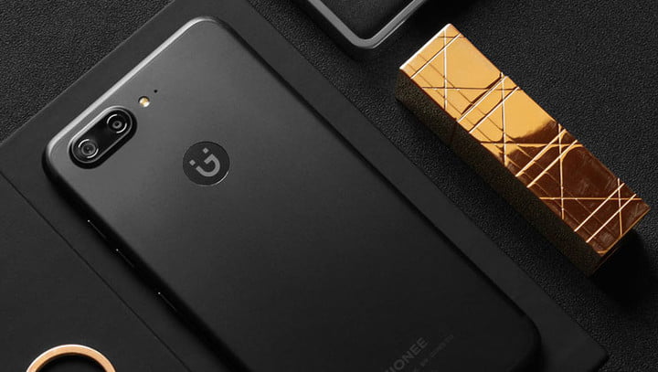
Gionee’s quad-camera S10 sets a new bar for smartphone photography.
Gionee’s no stranger to boundary-breaking smartphone design. Its W2017 features two fast-charging batteries packed into a compact body, and it claims that the M6 and M6 Plus are among the “most secure” phones around. So it’s not exactly surprising that its revamped S Series — the newest to join the company’s growing smartphone portfolio — is no less innovative.
The S10, S10B, and S10C were announced for Chinese markets in May 2017, but could launch in more territories in the coming months. Here’s everything you need to know.
Design
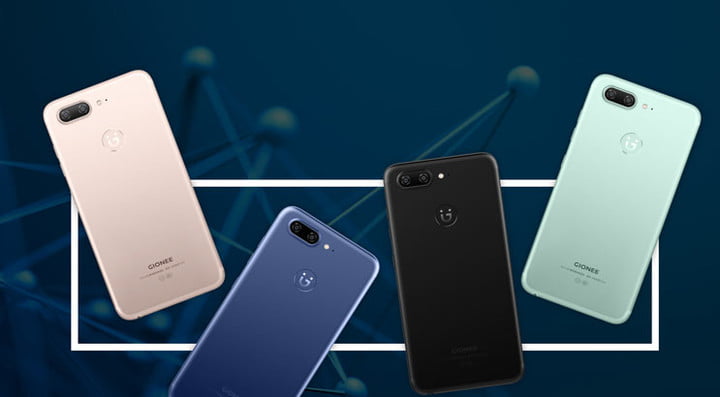
The S10, S10B, S10C may not look especially distinctive — Gioneer’s S-Series aesthetic is something of a cross between an iPhone 7 and HTC’s U11. But there’s more to the phones’ design than meets the eye.
The S10, S10B, S10C have rounded and chamfered edges, and an oval-shaped fingerprint sensor on the front flanked by two touch-sensitive navigation buttons (a back button on the left, and a shortcut to the list of apps running in the background on the right). Gionee has implemented a unique antenna design that has eliminated the need for plastic seams, and has added protective glass on the S-Series with a “2.5D” shape that curves around the phones’ bodies.
All three phones have hybrid slots that allow either Dual SIM or MicroSD storage expansion.
Specs
Gionee S10
The S10, the highest-end offering of the S-Series bunch, boasts the most impressive hardware, unsurprisingly.
On the front’s a 5.5-inch 1080p (1,920 x 1,080 pixels) In-Cell display with a MediaTek Helio P25 processor and 6GB of RAM. There’s 64GB of storage onboard, a 3,450mAh battery that delivers 40 hour of call time and 12 hours of video playback.
But the S10’s four cameras are the highlight. Two on the front (one 20MP sensor and one 8MP sensor), and two on the rear (one 16MP sensor with a f/1.8 aperture and one 8MP sensor), deliver superior shots in low light. Gionee’s “Hardware Engine image processor” powers the four shooters, and an ISP algorithm generates real-time depth of field blur effects.
Gionee S10B
The S10B, the midrange S-Series offering, is a slight step down from the S10.
It has 5.5-inch Full HD display, a MediaTek Helio P10 processor, and 4GB of RAM (as opposed to the S10’s 6GB). There’s 64GB of internal storage, and a 3,700mAh battery.
The cameras are the most obvious compromise. The S10B has lower-quality dual cameras on the rear — one 13MP and one 5MP — and 1 single 6MP selfie cam. And it lacks the S10’s image-processing hardware.
Gionee S10C
The S10C, the most affordable in Gionee’s S-Series lineup, has a smaller, 5.2-inch HD screen and a Qualcomm Snapdragon 427 processor coupled with 4GB of RAM. There’s 32GB of storage under the hood, and a 3,100mAh battery.
A single 13MP front sensor and 16MP rear sensor juggle picture-taking duties.
Software

The S-Series ships with Gionee’s Jinli security suite, which protects against fraudulent phone calls, text messages, and phishing websites, and offers quick access to Allipay and WeChat, China’s most popular payment platforms — double-clicking the home button launches the payment service you’ve specified in the Settings menu.
Gionee’s health app records activities like running and walking, and applies machine intelligence to “show more comprehensive health data” and track sleep. And Grabber uses “semantic intelligence” to highlight locations, times, and phone numbers in text messages and websites, supplying a corresponding “smart card” with related info and sharing shortcuts — sort of like Google’s Now on Tap.
Release date and availability
The G10 starts at CNY 2,599 (roughly $380). The cheaper S10B retails for CNY 2,199 (roughly $320), and the S10C is CNY 1,599 (roughly $233).
Gionee’s S-Series phones will ship in gold, black, blue, and green when they go on sale in China. The S10C is available now, and the Gionee S10 and S10B launch on June 9.
Nvidia claims its MX150 is four times faster than onboard graphics chips
Why it matters to you
Nvidia’s new mobile chip could lead to a new generation of portable devices that offer stronger performance and battery life.
Nvidia released some specifications and made ambitious claims about the performance of its upcoming mobile graphics chip, the MX150. It is said to offer much-improved performance efficiency over the Maxwell-based 940MX from the previous graphics generation, it also claims that the performance can be as much as four times that of integrated Intel graphics.
Although graphics cards and chips are often talked about in the same conversation as high-end gaming, they do have their uses elsewhere. For non-gamers, having a dedicated graphics chip can make a big difference to the time it takes to edit photos, or in remastering video. Those content creators are the ones Nvidia is targeting with its new release, claiming that the MX150 is a must-have for their next upgrade.
In terms of specifications, this chip sports 384 CUDA cores, according to Tech Powerup, which while the same as the 940MX, comes in a 16nm package, a full 12nm smaller than the older generation. It also partnered up exclusively with GDDR5 memory. As reported, clock speeds should also be higher, though the specifics of that will likely depend on the device the chip is used in and how strong its cooling solution is.
 Nvidia
 Nvidia
 Nvidia
 Nvidia
The architectural changes lead to big gains in performance and efficiency, according to Nvidia. The MX150 is said to have three times the performance per watt, when compared with the 940MX and enables photo editing up to 2.5 times as fast as Intel’s HD520 onboard graphics chip.
Video remastering sees a 33 percent improvement over the 940MX too, operating at four times the speed of the HD520. Overall, this is said to give the MX150 four times the performance over that same Intel chip and not far off the same of the HD620.
The added efficiency from the new chip design should give hardware manufacturers many more options when it comes to the power draw and performance they offer. If they so choose, they could utilize the added efficiency to provide stronger battery life and reduced temperature output for smaller, lighter devices, alongside the more powerful alternatives.
Qualcomm’s settlement with BlackBerry has reached a whopping $940 million
Why it matters to you
Qualcomm’s chip monopoly reportedly edged out competition, inflating the prices of smartphones.
BlackBerry just keeps on winning against Qualcomm. While the company was previously awarded $815 million in its case against Qualcomm, the settlement has now reached a hefty $940 million — a sum that Qualcomm has agreed to pay on or before May 31. BlackBerry confirmed the news in a press release.
The specifics of the refund remain unclear — Qualcomm said it is for sales of “subscriber units” — but at the core of the dispute is licensing fees BlackBerry paid in advance to Qualcomm. The smartphone maker argued that an agreed-upon caps on royalties was never applied, and Qualcomm argued that the payments were nonrefundable.
Qualcomm, unsurprisingly, said it disagreed with the court’s ruling. But it acknowledged that it was binding and that it “[had] no impact on agreements with any other licensee,” a Qualcomm spokesperson said.
It’s the latest in a string of legal blows against Qualcomm. In January, the U.S. Federal Trade Commission sued the San Diego, California-based company for anti-competitive practices, accusing it of using its dominant market position to edge out competition. The FTC alleged that Qualcomm gave its partners two choices: Pay pricey royalties for the use of its patents or limit the sale of their devices to smaller markets.
The FTC said that Qualcomm abused standards-essential patents — patents that must be licensed at fair, reasonable, and non-discriminatory rates — by refusing to license them directly to competing suppliers. The FTC characterized Qualcomm’s fees as “disproportionately high” relative to its competitors and said that consumers ultimately paid the inflated prices.
Apple later filed its own $1 billion lawsuit against Qualcomm (and subsequent suits in two other countries) over royalties for basic patents, claiming that Qualcomm forced it to pay excessive fees and withheld nearly $1 billion “as retaliation for responding truthfully to law [South Korean] enforcement agencies investigating them.”
“Despite being just one of over a dozen companies who contributed to basic cellular standards, Qualcomm insists on charging Apple at least five times more in payments than all the other cellular patent licensors we have agreements with combined,” Apple said in a statement.
Qualcomm cut Apple a discount in exchange for agreeing not to source competitors’ wireless modems for five years. That reportedly hampered silicon giants like Intel, which for years have tried to break into the smartphone chip space.
In a statement, Qualcomm general counsel Don Rosenberg said that Apple had “intentionally mischaracterized” Qualcomm’s practices and has been “actively encouraging regulatory attacks on Qualcomm’s business” around the world. “We welcome the opportunity to have these meritless claims heard in court, where we will be entitled to full discovery of Apple’s practices and a robust examination of the merits,” Rosenberg said.
Updated on 05-26-2017 by Christian de Looper: Added news that settlement has reached $940 million.
Computer scientists develop AI that gets curious about its surroundings
Why it matters to you
An AI that’s curious about its environment could help machines learn general skills that can be transferred to other environments.
Artificial intelligence is showing a greater range of abilities and use-cases than ever, but it’s still relatively short on desires and emotions. That could be changing, however, courtesy of research at the University of California, Berkeley, where computer scientists have developed an AI agent that’s naturally (or, well, as naturally as any artificial agent can be) curious.
In tests, they set the AI playing games such as Super Mario and a basic 3D shooting game called VizDoom, and in the games, it displayed a propensity for exploring its environment.
“Recent success in AI, specifically in reinforcement learning (RL), mostly relies on having explicit dense supervision — such as rewards from the environment that can be positive or negative,” Deepak Pathak, a researcher on the project, told Digital Trends. “For example, most RL algorithms need access to the dense score when learning to play computer games. It is easy to construct a dense reward structure in such games, but one cannot assume the availability of an explicit dense reward-based supervision in the real world with similar ease.”
But given that Super Mario is — last time we checked — a game, how does this differ from AI like the DeepMind artificial intelligence that learned to play Atari games? According to Pathak, the answer is in its approach to what it is doing. Rather than simply trying to complete a game, it sets out to find novel things to do.
“The major contribution of this work is showing that curiosity-driven intrinsic motivation allows the agent to learn even when rewards are absent,” he said.
This, he notes, is similar to the way we show curiosity as humans. “Babies entertain themselves by picking up random objects and playing with toys,” Pathak continued. “In doing so, they are driven by their innate curiosity, and not by external rewards or the desire to achieve a goal. Their intrinsic motivation to explore new, interesting spaces and objects not only helps them learn more about their immediate surroundings, but also learn more generalizable skills. Hence, reducing the dependence on dense supervision from the environment with an intrinsic motivation to drive progress is a fundamental problem.”
Although it’s still relatively early in the project, the team now wants to build on its research by applying the ideas to real robots.
“Curiosity signal would help the robots explore their environment efficiently by visiting novel states, and develop skills that could be transferred to different environments,” Pathak said. “For example, the VizDoom agent learns to navigate hallways, and avoid collisions or bumping into walls on its own, only by curiosity, and these skills generalize to different maps and textures.”
Nova Launcher Beta adds Android O style notification dots, but Dynamic Badges are better
Badges? We don’t need no stinkin’ badges.

Notification badges have made huge strides on Nova Launcher in the last few months. We got Dynamic Badges to replace the hum-drum numeric badges back in March, and now, Nova is letting us downsize our badges and try out the more simplistic Android O-style dots in its latest beta update. And while I’m all for bringing the latest Android goodies to older versions, this is one bit of O-ey goodness I will be skipping.

Android O dots are, well… they’re boring. They’re uninformative. If you’re using a white or black icon pack, they’re also these ugly, bland gray dots. I understand everyone wanting to try out something from Android O, I really do, and I commend the Nova Launcher team on getting this cranked out so quickly, but… Dynamic Badges are just better. They can add pops of color from the notification images they pull in, and if they can’t get one of those, at least they use the app’s colors instead of pulling a color to match your icon pack, thus making the dots blend in with your app icons, especially in the app drawer.
Of course, in Android O, notification dots are more than just badges, but shortcuts to actioning notifications from the icon itself with a long press. This won’t be possible in Nova Launcher until Android O is released later this summer, but it’s a nice preview of what’s to come.
If you’re excited to try the dots in Nova Launcher beta,
feel free to opt-in and try them out. After you do, I only ask that you try Dynamic and see if the Nova way is better for your home screen. It’s most certainly better for mine.
Gifting on Google Play: What you need to know
I just want to send someone a gift card…and on Google Play, that just got a lot harder.
We’ve talked about how Google was missing the ability to gift content before, and there’s a little good news on that front: you can now gift books through Google Play. Now there’s a bit of bad news, too: you can’t buy Google Play gift cards on the Google Play app anymore. If you want to add credit to your Google Play balance, you’ll need to go hunt one down at a brick and mortar store or answer some Google Opinion Rewards.

The ability to buy gift cards on Google Play’s app and website has vanished recently, followed shortly by an update of Google Play Support to show that you can’t buy the gift cards digitally anymore, you have to buy a physical card, and that you can gift Google Play Books and Google Play Music All Access. We’re not sure what prompted the change, but for parents who top off their kids’ Google Play accounts through gift cards or those who found Google Play credit to be an easy last-minute gift, you’re going to want to head to a retailer that stocks them and grab a few.
So now, you now have to use three different methods to gift three different kinds of Google Play content:
- To give Google Play credit, you have to go to a store that sells the physical gift cards.
- To give a Google Play Book, you have to find the book on the Google Play site or app and tap Gift.
- To give a Google Play Music All Access subscription, you have to open the Google Play Music app, open Settings and tap Send gift.
And here is what we now cannot gift through Google Play:
- Movies and TV shows
- Music albums and individual songs
- Magazine and newspaper subscriptions
- Apps and games
We can only hope that gifting books is the test balloon before being rolled out to the rest of the content in the Google Play Store, but that’s anyone’s guess, at this rate. What isn’t a guess is how much of a pain removing digital gift cards is going to be.
Aviate Launcher review: Smart, but not better
How’s Aviate Launcher these days? Let’s take a look!
Updated May 2017: Review updated to reflect the stability of the launcher and how it’s aged over the last two years.

Aviate Launcher has garnered hype since it first debuted on Android, and after being acquired by Yahoo has actually seen steady improvement through updates. It’s been awhile since we last examined it, and now it’s time to take a fresh look and see how it works today.
Aviate aims to analyze how you use your phone to better surface information and apps that are relevant based on a variety of factors, taking the burden of customization away from you. But does it work? We’re going to find out.
The basics of Aviate

Aviate falls into the category of “predictive” launchers, as it aims to change and adapt with your usage, location, and the information you provide it. There’s less focus on your personal customization — you can choose a wallpaper and icon packs, but that’s about it — and more on just letting Aviate do its thing.
There’s a set design of four main home screens, and you’re stuck with them. Your main home screen — as in the one you get when you hit the home button — is left of center, and has a standard five-across quick launch bar at the bottom that you can put any apps you want in it, with additional rows available if you want more than five apps. You also have a search bar at the top of the screen.
The entire rest of the screen is blank, letting you add standard Android widgets from your installed apps, but only at full width — you can’t have side-by-side vertical widgets or a variety of small widgets. A simple swipe up on the screen gives you quick access to calls or messages, as well as frequently-used contacts, eliminating the need for dialer or contacts app icons.


To the left of the main screen, you get a very Google Now-like experience in the “Smart Screen” — a vertically-scrolling list of cards with various information that Aviate thinks is relevant at the time. You’ll see directions to work in the morning, directions home when you’re out of the house, events and places near you, news, weather and upcoming events on your calendar. The entire list adjusts throughout the day based on the time and where you are, and you can specifically call up “Today,” “Places” and “Entertainment” sections if you want more to look at.
You can’t dismiss timely cards like you do on Google Now, though — you have to either leave them there and let them be updated, or remove them until you call them back again from the settings.
It’s like 70% of Google Now … but with Yahoo.
Right of the main screen is where your apps live. Rather than having standard icons and folders, your apps are organized into “collections” based on their function. You’ll tell Aviate during setup what apps and categories you use most on your phone, and it’ll set up at least five collections for you. Off the bat I had Transit, Utilities, Productivity, Social, and Entertainment — encompassing pretty much everything I do on the phone. Collections are basically just folders, with five apps listed above the fold for quick launching, with the rest of the apps in the collection available with an additional tap. You can choose the positioning of the collections manually, but they’ll also automatically move based on how often you use each one.
Another swipe over and you get every app installed on your phone, sorted alphabetically and easily findable thanks to big letters showing you where you’re at and a nice scroll bar on the side. The persistent search bar at the top of every page works for searching installed apps as well, if you prefer that method.
What it’s like to use

Predictive features, especially ones that move elements around on your launcher, can seem intrusive and annoying, but in Aviate they’re subtle and for the most part useful. Having my apps categorized automatically (but still tweakable manually when needed) is great, and really shows you the difference between how you think your phone should be set up to be most efficient and how it actually should be laid out based on usage.
Predictive Collections and apps are nice to have, but the Smart Screen isn’t so great.
The so-called Smart Screen isn’t quite as useful, though. It offers pretty basic and mundane information that I can really get anywhere, particularly from Google Now, no matter what launcher I use. Some of the predictive things like having a music selector when I plug in headphones is neat — though useless if you use Bluetooth — as is the predictive adjustment of information based on location, but it’s not quite good enough in itself to make me want to use Aviate.
Perhaps the biggest thing hurting Aviate is that it’s tied to Yahoo, which owns and operates the app. The search bar at the top of the launcher sends you to Yahoo Search rather than Google, and lots of the predictions and information in the Smart Screen is just pushing you out to the web rather than pulling it in and displaying it nicely inside the launcher or sending you to an installed app.
And my life just isn’t tied into Yahoo — it’s in Google. Although Aviate can read my calendar app to see my upcoming events, it isn’t scanning my email for information on travel and appointments, intelligently learning about what sports teams I like, offering public transit information, or any of Google Now’s data-driven predictive features.
Taking the questionable draw of Smart Screen out of the equation, Aviate actually works quite nicely as a standard launcher. Focusing on a handful of frequent apps and one or two widgets on the main home screen will make sense for a lot of people, and having the rest of your apps categorized by type and sorted by use will be the best way to keep the phone clean and usable. As someone who usually keeps their launcher super simple I can see why Aviate has so many downloads in Google Play.
The bottom line

For a lot of people who have stuck with the stock launcher on their Android phone, Aviate may actually be one of the front-runners for a potential launcher replacement. It offers some useful features, a clean and attractive interface, and overall good performance in everything that it does. Aviate clearly has its loyal users and will continue to gain them, but it’s absolutely not for everyone. And while I like the idea of the predictive app collections and simple main home screen, I just don’t see enough value in those items to also deal with less-than-stellar predictive information in the Smart Screen.
