


Sky Q review: The live TV box you don’t use for live TV
It’s more than a decade old, but Sky+HD remains one of the leading set-top boxes available to subscribers in the UK. YouView, TiVo and others all have their merits, but in terms of longevity, speed and ease of use, Sky’s had it all sewn up for years. But while internet-connected boxes like Now TV are Sky’s future, it needed a new piece of subscriber gear to get it through the next decade. The result is Sky Q, a family of devices that ensure you’ll never think about cancelling Sky and going to Netflix ever again. But here’s the gag: after years of development and a glitzy launch, Sky Q is a TV box that actively discourages you from watching TV. No, that’s a good thing.
Ecosystem

Sky Q isn’t a single set-top box, but a collection of products that, together, form an ecosystem of gear with gratingly similar names. Replacing the Sky+HD box under your TV is the Sky Q, which comes in either Black or Silver models. Silver is the premium option, offering 4K support (and channels), a 2TB HDD, five tuners and the ability to stream content to up to two mobile devices at once. The Black, meanwhile, tops out at 1080p, comes with 1TB storage, four tuners and streaming to just one mobile device.
If you previously wanted to watch Sky in more than one room of your home, you’d need a second set-top box wired directly to the same dish as the primary box. Q ditches this archaic system in favour of the Sky Q Mini, which piggybacks on the main Q box to stream live channels or recorded shows to a second TV. You can buy up to four Mini boxes with your subscription (first free, £99 each thereafter) if you’ve added the £12 per month multiscreen bundle, but be aware that you can only sustain two of them at a time, or just one if you have the Black box. You’ll also need the multiscreen add-on to stream to mobile devices using the Sky Q app.
Rounding out the lineup is the Q Hub, a revamped wireless router that’ll sit next to your phone line. This is only available to Sky Broadband customers, and choosing one gets you vastly improved WiFi performance. That’s because all of the Sky Q-branded devices in your home will form a mesh network that should banish any black spots without the use of additional boosters. Although, privately, Sky will supply extra boosters if your home is somehow incapable of sustaining a blanket WiFi network. Unfortunately, your humble reviewer lives in a Virgin area, and the Hub was unavailable for review.
Hardware
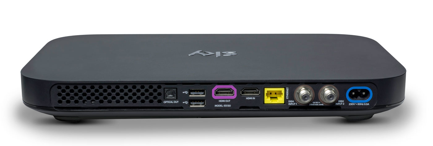
Do you remember how massive the original PlayStation 3 looked, and how tiny the PlayStation 4 was by comparison? The Sky Q boxes are similarly eeny-weeny, to the point where it’s almost shocking to see them side-by-side with the older model. The hardware measures just 330 x 210 x 43mm, down from the 364 x 255 x 73mm of the Sky+HD. In order not to break the sleek, elegant lines of the front, the viewing card slot is now hidden on the right-hand side. Up front, you’ll find a WPS button, the Q logo (which, when pressed, will cause your remote to bleep to make itself known) and an IR sensor. Round back, you’ll find the usual coterie of ports, including power, HDMI (x2), USB (x2), Ethernet, two dish connectors and an optical audio-out.
The Mini, meanwhile, measures in at 232 x 155 x 35mm and looks like a version of the main Q that’s been shrunk in the wash. Round back you’ll find slots for Ethernet, HDMI, 3.5mm audio-out, optical out and USB. If there’s one negative thing I could say about the Q Mini, is that I expected it to be smaller. Sky is an investor in Roku and the latest Now TV box (with a Freeview tuner) is a lot more diminutive than its wider and thicker cousin.
Remote

Here’s the bad news: your existing Sky remotes (even the branded ones) will not work with Sky Q. Except for the Sky Accessible remote, that is, which is designed for people with reduced dexterity and/or poor vision. For the rest of us, the company actually makes two controllers for the new gear: the futuristic Touch Remote, and a more traditional button remote that comes with the Mini.
For the purposes of this review, Sky let me borrow both a Touch Remote and a spare Mini remote that was paired with the Silver. This has turned out to be a Very Good Thing, because the former handset, for all of its bells and whistles, is going to be very divisive. Even Sky employees, off the record, have admitted that they struggle to use the newer handset and sometimes find themselves reaching for the simpler alternative.
The top third of the Touch Remote is dominated by a black, circular clickpad that you’ll use to gently scroll through the Q’s vast menus. The clicks are satisfying and the swipes have a real weight to them, and the further you pull south, the faster you scroll. That’s fine, and it’s really the only way to get around the significantly more dense UI that Sky Q is offering.
The issue comes with the capacitive playback controls that are housed in a half-ring above the clickpad. The bar offers a Play/Pause button and two arcs that end in a Rewind or Fast Forward command. Rather than a hard press, a dainty tap is all you need to get things moving, and you can actually slide across the arc to dictate the speed of play. Those with long memories will be reminded of the jog dial wheel that you’d find on super-expensive VHS players, updated for the 21st century.
Written down, it sounds fantastic, and futuristic, but in reality there are problems with how subtle the remote requires you to be. Linger too long, or press too heavy on the buttons, and you’ll find yourself picking the wrong option. Or you’ll press play, and follow through and put it back on pause again because the sensitivity is far too high. I’ve also had the remote on the sofa beside me, and my upper thigh brushing the controls is enough to jerk the picture into a frenzy of rewinding.
The Mini remote ditches the clickpad and capacitive controls for hard buttons, and I’ve asked plenty of visitors to try the both on for size. While I find the Touch Remote to be problematic, others have struggled to use it altogether, and express a liking for the simpler, nicer Mini remote. It’s less elegant for pawing through all of the Q’s menus, but it’s certainly easier to use in general.
I’ve always had a soft spot for the Sky+HD remote, with its easy-to-memorise control scheme and clear separation of sections. The Q remotes are a challenge to that muscle memory, not to mention that the “Back Up” button, an easy way to dismiss menus and overlays, is now a thing of the past. Instead, you have the “Home” button (which takes you to the Q Menu) and “Exit,” which lets you walk backwards one step, like a browser’s back button.
The other button below the clickpad is the apps menu, which lets you access apps for Sky News, Sky Sports News, Photos, Weather and Sky Help. I’m not sure that the menu deserves such a prominent button placement, especially given the limited utility of those features. It’s my hope that, down the line, Sky will let you add and remove other apps to the panel at your whim. For instance, it makes perfect sense to add YouTube to that list, given that’s where so many videos people look for are now housed.
Another annoyance is the loss of a dedicated subtitles button, great for when you need to translate a mumbled line of dialogue in a TV show. Previously, you could simply rewind a moment, hit subtitles and finally understand what the actors are saying when they move away from the microphone. Now, you have to come out of the show you’re watching, dive into the overall settings menu, find the accessibility panel and activate subtitles for all programs, forever. Suffice to say, it’s too involved to bother with, so I just live a life of ignorance.
Software

Shortly after the launch of Sky Q, BSkyB allegedly received a complaint from the BBC saying that Sky was deliberately burying public service channels. I can see why the BBC would feel this way, and there may be some legitimacy to its complaint, but the whole point of Sky Q is to bury all TV channels. Enter the home screen and you’ll be first presented with the Top Picks section rather than the channel menu. Hit the silver Sky logo at the top of the remote, and you’ll be dropped straight into your recordings.
It’s here that Q really earns its keep, simply by using My Q and Top Picks as a way of serving up content straight to your eyeballs. The latter is curated by flesh-and-blood humans at Sky HQ, while the My Q menu looks at what you’ve already watched and will make suggestions based on that. Every time I’m bored and begin to think about channel flipping, I never have to bother, because some new tidbit is being offered to me. If there’s one complaint, it’s that the content is skewed towards commercial stations and Sky’s own output. For instance, I’m currently being offered shows from the likes of ITV, Channel 4, Sky Atlantic, Nickelodeon and Disney XD. Part of that, I hope, is because it’s not yet learned that, as an adult, I’m not Nickelodeon’s typical audience.
There’s also an on-demand layer which will give you access to the catch-up TV platforms from all the main channels, including BBC iPlayer. But, while I’m not going to assume malice here, it does seem strange that BBC shows aren’t seen inside any of the curated pages. Unless there’s some technical or legal boundary that’s preventing proper integration, it’s enough to propel a half-decent conspiracy theory.
Sky’s previous channel menu was already vastly superior to pretty much everything else on the market. As such, the firm has taken the “if it ain’t broke” approach to the Q’s navigation menu, which has had a minor polish. The video preview has been moved from the top right corner to the left rail, leaving more vertical room for the channel list itself. It also uses smaller, clearer fonts that allow Sky to fit several more entries on the screen without scrolling.

Whoever’s in charge of channel ordering at Sky really does need to have a long think about user experience. It’s 2016, and I’d wager that HD is dominant enough now to end the days when HD channels are ghettoized in the channel order. It’s insane to think that channels 101 and 103 — BBC One and ITV One — are broadcast in SD. Their high definition counterparts, meanwhile, languish as channels 115 and 178. Clearly, there are contractual, technical and legal wrangles that probably prevent this being changed on Sky’s part, although I wish there weren’t. Perhaps the company should offer a setting that lets us re-order the list to end such a user-hostile move.
What has changed, and for the better, is the in-channel selection, for those moments when you don’t wanna stop watching your current show but are curious what’s about. Pressing up or down lets you sift through the channels in chronological order, but brilliantly, each one now comes with a video preview of what’s going on. I foresee this being a great way to avoid commercial breaks during your favorite shows, by switching to something else and using the preview as a second screen.
There are plenty of neat little touches, like being able to download a HD film in full if you catch it part-way through on a Sky Cinema channel. Similarly, hitting record on a show now presumes you want a series link, rather than just to catch that one individual instalment. Similarly, watching the first episode of a TV series on-demand will prompt the Q to download the second, ensuring you can bingewatch as if you were engrossed in your favourite Netflix show. Pushing shows to your tablet is relatively easy, although it’s an annoyance that the Sky Q app can’t be used on smartphones as well. After all, I do most of my remote TV watching on my 5.5-inch smartphone rather than on a 9.7-inch tablet.
Pricing
Sky Q, with all of its whizzes and bangs, now occupies the rarified space on top of the firm’s product line. But, as much as +HD is now the norm, Q is already getting cheap enough that people will begin to upgrade as a matter of course.
A Black Q (aka the 1TB box) will currently cost you £32 a month, but that doesn’t include any other channel bundles such as HD, box sets, movie or sport packs, and you can’t use the multiscreen feature either (an extra £12 per month). Silver (aka the 2TB box) is no costlier, but the one-off setup cost jumps from £49 to £99.
To give you an example of a fully featured package, a 2TB box with all the HD, movie, sports channels and multiscreen (with a free Mini thrown in) costs £86 per month with a £10 setup fee. Depending on what options you select, though, this or that will be discounted, like the £10 one-off charge (as opposed to £49 or £99) if multiscreen is included in your package. The pricing structure is an absolute mess right now. The fact 4K channels are included with the most basic of Silver subscriptions, yet you have to pay extra for HD channels, is a testament to that.
I know plenty of people for whom a Sky subscription with all the trimmings is a sacred part of the family budget. A sum like that, however, may be on the fringes of many people’s purchasing power — though a £74 per month Sky+HD subscription is equivalent to an £86 Sky Q package, albeit without the Q’s fancy value-added features. If you can afford it and you want the best, then go knock yourself out. If you can’t, then I wouldn’t suggest worrying over it, as I’m sure patience will ensure you’ll get cheaper access to it soon enough.
Wrap-up
I like watching TV, and my home setup can access Virgin Media, Netflix and Amazon Prime, which I have on almost constantly. Since I’ve been testing Sky Q, I can count the amount of times I’ve felt compelled to open Netflix and Amazon Prime on a single hand. And most of those were to watch the latest episodes of (AMC’s new Amazon Prime exclusive) Preacher. I already had access to a compelling list of movies and TV shows, and Sky’s content library isn’t so much better that I’m being swayed unnecessarily.
In fact, it’s more that the Q hardware is very specifically designed to serve up fresh, relevant stuff that I’ve not yet come across. Every time I go back to the home screen, it’s pulled up some new treat to dangle in front of my eyes, knowing that I’ll bite. Aside from watching the coverage of the European Championships, I’ve barely scrolled through the TV guide at all. Why would I need to? After all, why spend hours looking for something to watch when my set-top box can do the work for me?
This is the killer feature of Sky Q, and the hardware’s bells and whistles are secondary to simple editorial and algorithmic curation. By keeping you constantly hooked on a drip feed of stuff that the box thinks you’ll like, you very quickly forget all about the chore of scrolling through channels. With Sky Q, on-demand video really is king.
Fitbit’s new Charge and Flex track every type of workout
It’s no surprise that Fitbit’s been planning a major update to its fitness trackers. And about time, too. The two-year-old Charge and three-year-old Flex are in dire need of a tune-up to help the company maintain (or grow) its narrow lead in the industry, after it lost a significant amount of market share to newer rivals. As a result, the new Charge 2 and Flex 2 boast a decent set of aesthetic and functional upgrades that could help take on the competition, including specific workout tracking (finally) and guided breathing exercises.
Despite the improvements, the Charge 2 and Flex 2 will cost the same as their predecessors when they arrive this fall: $150/£130 and $100/£80 respectively. I’ve been wearing preview versions of both new trackers for a few days and while I’m impressed by the improved functionality, I still wish they didn’t look so… Fitbit.
Cosmetically, the biggest change to the Charge is its screen size. The Charge 2’s display is four times larger than the original. Instead of one thin horizontal strip near the top of the band, you now get a much more useful oblong that takes up nearly all of the device’s front. It looks like a more blocky Gear Fit 2.
This extra screen space allows for a selection of watchfaces that can display more useful information at a glance than before. I picked one that showed the time, steps taken and current heart rate whenever I lifted my wrist — which more than satisfied my endless desire to know how my ticker was doing.
That heart rate sensor is one of the biggest appeals of the Charge 2 and its predecessor. Fitbit’s “PurePulse” optical HR sensor and app combo can tell you how much time you have spent in specific cardio zones. In the past few days, the app said I spent most of my activity in Fat Burn, and some time in the Cardio and Peak zones.
Cardio zone information is useful for those who are serious about their fitness, but not so much for the average sidewalk slogger. To make the feature more meaningful for the rest of us, Fitbit’s added a Cardio Fitness Score component that lets you gauge your heart health against people of your age range and gender. Luckily for my ego, it turns out my resting heart rate is considered average to fair for women my age. Sorry to those of you who fall below average on this curve.
Steps are forgettable, but seeing my hear’s performance right there actually spurs me to do something about my health. It’s this type of personal info that will ultimately keep me wearing the Charge 2. But the new tracker isn’t just there for your workout. It’ll help you recover after. Fitbit implemented a new Guided Breathing mode that, like other stress-fighting wearables, will coach you through breathing exercises to help you wind down.
It’s a well-intentioned feature that’s quite poorly executed. You get the option of two- or five-minute sessions that you launch from your wrist. During these session, you’ll have to look at the screen, inhaling when a circle expands, exhaling when it contracts. Throughout this, the Charge is measuring your pulse to tell how quickly and deeply you should be breathing.

Maybe I should be more fit than I am right now, but holding up my arm for two (not to mention five) whole minutes while trying to breathe in sync with the Charge was more strenuous than it should be. I couldn’t comfortably see the circle unless I held the my wrist up in front of me, and the device had to be on me to detect my pulse. Fitbit could easily put this tool in the app to let audio guide you and still have the tracker send heart rate information to your phone.
Other Charge improvements include auto exercise recognition and multi-sport tracking to record more meaningful data for specific workouts such as running, biking and weights. The wearable can now tap your phone’s GPS to show stats such as pace and distance in real time, as well as save a map of your route to the app. The Charge 2’s battery lasted about three days on a half charge, which is similar to the Charge HR’s touted five-day endurance. The new-gen tracker also maintains its sweat and rain resistance. A lot of the abovementioned features already exist in other trackers, however, so Fitbit isn’t doing anything really groundbreaking.
Many of these tools — such as auto exercise recognition and auto sleep tracking — are also available in the Flex 2, which got quite a major redesign. Instead of looking like a smaller, thinner Charge with a horizontal row of LED lights at the top, the new Flex looks more like a Jawbone Up or Misfit Ray, with a more rounded, cylindrical tracker housed in a narrower band.
I really don’t have much to complain about the Flex 2. It’s now swim-proof so you can use it to record laps at the pool or keep it on in the shower if you wish. During my time with it, the Flex 2 was comfortable and accurately measured my activity and sleep, which is all its target audience would really care about anyway. The most interesting change for the Flex 2 is the set of attractive, interchangeable metal and leather accessories that it will launch with.
Although the new trackers still adhere pretty much to the brand’s familiar “Fitbit” shape, I applaud the company for at least knowing the importance of a wearable’s design. It has partnered with fashion houses such as Tory Burch, Public School and Vera Wang to make better-looking accessories to up its sartorial appeal. I also love the upcoming new finishes and bands for the Alta and Blaze, which definitely earn the company some style points.
Unfortunately, Fitbit has failed to impress me aesthetically. Even though its new bangle and necklace cases for the Flex 2 are prettier than Misfit’s similar accessories, Fitbit is simply playing “Who Wore It Better” with its competitors. As an industry leader, Fitbit could easily be setting trends, but it seems to be lagging.
Beyond aesthetics, the Charge 2 and Flex 2 are decent, well-rounded fitness trackers that seem to do what they promised. But there are plenty of other companies out there that do the same, or maybe even better. Fitbit doesn’t only have to contend with the likes of other fitness brands such as Jawbone, Misfit, Nike or Garmin, but also powerhouses such as Samsung, Microsoft and Apple. Even the upcoming series of Pebble smartwatches for 2016 focus on fitness, promising to do what the Charge 2 can and more. Fitbit needs to prove it can do better than its rivals if it hopes to recoup its lead in the game, and the new Charge and Flex just don’t seem to be enough.
T-Mobile tweaks its One plan to address your complaints
T-Mobile’s One plan rubbed a lot of people the wrong way: sure, you got unlimited on-device data, but anything better than 480p video or 2G hotspot tethering was going to cost you an arm and a leg. The (un) carrier isn’t deaf to your complaints, though. It’s modifying its strategy to not only tackle key gripes with the One plan, but add a second plan that covers what gaps are left. The base One plan (still $70 per month for the first line) now includes 512Kbps unlimited hotspot data instead of 128Kbps — still pokey, but you can at least do more than check your email. Also, you’ll have the option of daily HD passes that, at $3 per day, are decidedly more affordable when you only want high-quality video for a weekend trip.
As for that second plan? It’s called T-Mobile One Plus, and it really amounts to bundling all the previous add-ons into one more reasonable package. The $25 extra per line that you would have paid just for HD video now gets you unlimited HD passes (you have to turn it to always-on yourself, oddly enough), LTE hotspot data and twice-as-fast data roaming in over 140 countries.
Both the modified One plan and the new One Plus tier will launch on September 1st, or 5 days earlier than originally planned. Clearly, T-Mobile is feeling the heat from rivals who’ve stepped up their game — all four major networks now have at least ‘overage-free’ plans, and Sprint’s unlimited HD video plan is still less expensive than One Plus at $80 per month (albeit capped at 8Mbps for video and game streams). Not that we’re about to object to T-Mobile changing its tune. The One Plus plan doesn’t cap anything beyond the potential for throttling after 26GB, and those who stick to the base One plan are getting a much better deal before it’s even available.
Source: T-Mobile
Amazon and Pandora Nearly Ready to Launch Apple Music Rivals
Amazon and Pandora are closing in on licensing agreements with the world’s largest record labels to launch their own streaming music services later this year, reports Financial Times.
Both subscription-based services are expected to cost $9.99 per month, a price that has become the industry standard, and compete with heavyweights like Apple Music and Spotify.
Amazon’s offering could launch as early as September, according to the report, while Pandora is said to be making progress towards debuting its service later this year.
Reuters first reported Amazon’s plans to launch a standalone streaming music service in June, followed by a Recode report last week claiming the online retailer is also working on a $5-a-month subscription music service that will be exclusive to owners of the company’s internet-connected Echo speaker.
Amazon currently sells individual songs or albums through Amazon Music, while Amazon Prime subscribers can stream Amazon music, playlists, and radio stations for free, but the selection is limited compared to Apple Music and Spotify.
Pandora’s ambitions to launch its own subscription music service, likely based on its acquisition of “key assets” from Rdio in 2015, were first reported by The Wall Street Journal earlier this month. The company plans to offer two price tiers by also slightly tweaking its existing $5 per month ad-free option with select new perks like skipping songs and offline listening, the report said.
Pandora currently offers customers in the U.S., Australia, and New Zealand the ability to listen to free, ad-supported radio stations centered around particular artists or songs, rather than offering on-demand listening like Apple Music. By offering only randomized, radio-like stations that prevent users from playing specific songs, it has been able to bypass licensing agreements with major record labels.
Tags: Amazon, Pandora, Apple Music
Discuss this article in our forums
How to take better photos with a Galaxy phone

How do I take amazing photos with my Galaxy phone?
Shooting phenomenal photographs with your DSLR can be relatively easy, but getting the same stunning quality and clarity with your smartphone is a bit more of a challenge.
Luckily there are some surefire ways to get high-quality photographs with your Galaxy phone. Here are a couple of things to try the next time you’re lining up a shot to capture that picture-perfect moment!
- Use the rule of thirds
- Shoot with a tripod
- Get creative with external lenses
- Get familiar with your modes
- Forget the flash – use external lighting
Use the rule of thirds

In order to make your phone photography stand out a bit more, break away from lining up your shot dead-on. Try using the rule of thirds, a trick used by artists, photographers, and filmmakers for years.
The rule of thirds essentially means that an image should be imagined as being divided into nine equal squares, and that nothing should really be smack-dab in the middle. Why? Because by doing this, it draws your eye around a photograph or painting, making you look at all corners and take in the scene rather than focus on the obvious subject in the center of the piece (plus, having a single subject sitting in the center of the photo can be pretty boring more often times than not).
By enabling the 3×3 grid on your Galaxy device, you’ll be able to clearly line up and take shots using the rule of thirds. Be sure to experiment with placement of items and how far they are from your phone in order to capture different creative shots and angles.
Shoot with a tripod

Sometimes the lighting it perfect, the people around you are still, and the shot is clear as day. Other times there’s too much movement, not enough sunlight, and you just can’t seem to capture a clear shot.
A tripod is a great tool to have in your phone photography arsenal for a number of reasons, regardless if you’re serious at taking photos with your Galaxy phone or not.
Using a tripod almost always guarantees that your shots are going to be steady and clear, regardless of the lighting. Some people have said they’ve even captured beautiful shots of the night sky with just their phone and a secure tripod.
You don’t need to use your tripod for serious photography — in fact, if you pick the right tripod, it can double as a selfie stick or even a decent time-lapse stabilizer for video like the CliquefieMax does. Tripods are for all skill levels and phone photographers.
Go small or go home, which essentially means you don’t need to spend a ton of money on a larger, higher-quality tripod to shoot your photos or video. You can even pick up a decent tripod for under $15.
Get creative with external lenses

External lenses can be pretty polarizing: some people love to shoot with them, others think they’re trinkety and get in the way of capturing a beautiful photo. Regardless of your stance on external lenses, there are dozens of different types that are available to shoot with, some which are a bit more creative and unique than others.
Most external lens kits come with three types of lenses – a macro lens, a fisheye lens, and a wide-angle lens. These lenses themselves can be used in dozens of different ways and take your phone photography perspective to new heights. The fisheye is great for modern party shots and selfies, while the wide-angle is fantastic for capturing large crowds, and the macro is great for up-close-and-personal nature shots. Samsung’s own lens cases for the latest Galaxy phones are the best choice for a first-party experience that you know will integrate perfectly.
There are some other strangers types of lenses available, too. Urban Outfitter’s has a Fly Eye lens that gives a psychedelic, kaleidoscope-like perspective to your phone photography. Lensbaby’s LM-10 allows users to get super artsy and creative with their close-up shots and focusing. The popular magnetic Smartphone Spy Lens from Photojojo lets you explore different angles as you shoot your phone photography.
At the end of the day, playing around with different external lenses is a great thing to consider if you’re trying to get creative with your shots!
Get familiar with your modes

In order to really get comfortable shooting photos with your Galaxy phone, you have to get familiar and play around with the different settings and modes available in your Camera app.
With your Galaxy phone, you get options like Auto, Pro, Selective focus, Panorama, Video Collage, Live broadcast, Slow motion, Virtual shot, Food, and Hyperlapse. While not all of these have to do with taking photos specifically, settings like Pro allow users a lot more creative control and professional editing power while shooting.
Pro mode lets you adjust white balance, ISO, auto or manual focus, contrast, and so much more, just like a DSLR camera would. With these freedoms, users can even choose to save their photos as RAW files, something professional photographers would do if they were shooting with a DSLR camera.
Getting familiar with the modes on your phone will help you take better photos and will make you more confident in your shots, so take the time to fool around and fiddle with your settings.
Forget the flash – use external lighting

Using a flash can be a good thing in some low lighting situations, but overall it’s hard to control, difficult to edit with, and can wash out photos, making them look low-quality and unprofessional. By using an external lighting source, it’s a lot easier to get the proper wash of light in your photos without going flash-crazy or having your photos look like big dark blobs.
The Galaxy’s flash is powerful, but sometimes it’s too powerful. By using an external light that has a dimmable feature like a Mini LED light or even a clip-on Ring light for selfies, you can get full creative control over the amount of light that gets let into your photos.
There are plenty of different types of external light sources to choose from depending on your photography style and what you’re shooting, including those that are good for action photography, those that work well with selfies, those that work well for social situations/parties, and so much more!
Now it’s your turn
Do you have any tips or tricks for shooting professional looking photos with your Galaxy phone? Let us know!
Samsung Galaxy S7 and S7 edge
- Galaxy S7 review
- Galaxy S7 edge review
- U.S. unlocked Galaxy S7
- Should you upgrade to the Galaxy S7?
- Best SD cards for Galaxy S7
- Join our Galaxy S7 forums
Unlocked
AT&T
Sprint
T-Mobile
Verizon
Philips’ Hue motion sensor automatically turns on the lights for you
You can control Philips Hue lights with your phone, but if you’re feeling especially lazy, you’ll want to take a look at the latest addition to the Hue ecosystem. The Philips Hue motion sensor automatically switches on the lights in a room, with the ability to configure a specific scene to a sensor.

The motion sensor is powered by two AAA batteries, allowing it to be placed anywhere in your house or garage. The back of the device is magnetic, and it has a 100-degree detection angle and a range up to 16 feet. As with all devices in the Hue ecosystem, the motion sensor is highly configurable through the Hue app, letting you select different scenes for daytime and nighttime, and various levels of motion sensitivity.
There’s even the option of having the sensor switch off lights in a room when it doesn’t detect motion for a specified amount of time. You can connect up to 12 motion sensors on a single Hue bridge. While Philips isn’t the first brand to launch a smart motion sensor, high configurability and integration with Hue bulbs make all the difference for those that have already invested in the brand’s smart lighting ecosystem.

In addition to the motion sensor, Philips announced a new generation of White Ambiance and Color lights that bring richer green and cyan hues.
The $39.95 motion sensor will make its debut by the end of October. Who’s in the market for one?
New York’s smarter face recognition catches more ID thieves
Sometimes, behind-the-scenes tech upgrades can make a big difference. New York’s Governor Cuomo reports that an overhaul of the state DMV’s face recognition software in January has led to more than 100 arrests and 900 open investigations so far. The trick? The new system checks 128 points on a face instead of 64, dramatically increasing the chances that it’ll match a photo against the DMV’s database. Combine that with new comparison modes (like black-and-white and overlays) and it’s easier to catch identity thieves and fraudsters, such as one man who tried to get a license with a stolen identity in order to evade a suspension.
New York isn’t alone in using face recognition in the US, let alone the world. As Ars Technica notes, there are 39-plus states relying on it in some capacity. And to no one’s surprise, it’s unclear how many people might be slipping through the cracks. However, the data hints that weak points in the technology are going away — it may be that much harder to hijack someone’s ID going forward.
Via: Ars Technica
Source: New York State
There may be water on Mars, but not much
Remember those weird dark streaks that NASA’s Mars Reconnaissance Orbiter found last September? These recurring slope lineae (RSL), as they’re called, were originally thought to contain liquid water. On Mars, liquid water would obviously be a huge deal because it means both potential source of life and potential resource. Well, it turns out that there isn’t nearly as much water in those RSLs as astronomers had hoped and certainly none that’s potable. What’s more, new analysis has estimated that the amount of liquid surface water on Mars cannot exceed that of Earth’s driest deserts.
To determine this estimate, NASA scientists used the Mars Odyssey’s Thermal Emission Imaging System (THEMIS) to remotely measure the planet’s surface temperature from orbit. When water is present in the spaces between grains of soil and sand, it affects how quickly the ground’s temperature will heat up during the day and cool off at night. The deeper the water seeps, the more insulated the ground becomes. After analyzing multiple years worth of THEMIS data, NASA researchers concluded that the upper limit of water that a given area of soil could contain was just 3 percent by weight. That’s roughly the same level of dryness that you’d see in the Atacama Desert, one of the single driest places on the face of the Earth.
“Our findings are consistent with the presence of hydrated salts, because you can have hydrated salt without having enough for the water to start filling pore spaces between particles,” Christopher Edwards, a faculty member in the Department of Physics and Astronomy at Northern Arizona University, told Space. “Salts can become hydrated by pulling water vapor from the atmosphere, with no need for an underground source of the water.” So not only is there a very small amount of liquid water, it’s so briny that we’d be unable to drink it. When we do send people to Mars, they’re going to need to bring canteens.
Source: Space
Opera Browser Users Urged to Reset Passwords After Sync Server is Hacked
Opera has warned users of the browser that an unknown hacker has managed to gain access to its sync system, potentially compromising the data of around 1.7 million users.
The Norwegian company said in a blog post that “some of our sync users’ passwords and account information, such as login names, may have been compromised” following the hack, and encouraged users to reset passwords for third-party sites.
Although we only store encrypted (for synchronized passwords) or hashed and salted (for authentication) passwords in this system, we have reset all the Opera sync account passwords as a precaution.
We have also sent emails to all Opera sync users to inform them about the incident and ask them to change the password for their Opera sync accounts. In an abundance of caution, we have encouraged users to also reset any passwords to third party sites they may have synchronized with the service.
Opera’s web sync feature lets uses synchronize their browser data and settings across multiple devices. Opera notes that the total active number of users of the feature in the last month is less than 0.5 percent of the web browser’s user base of 350 million people, and that the password reset is a precaution.
Security scares have been a recurring theme for online services recently. Last week, Dropbox told its users that the firm was resetting passwords for anyone who had not changed theirs since mid-2012. The preventative measure was enacted after the company learned about an old set of user credentials that was stolen in a hacking incident nearly four years ago.
Tag: Opera browser
Discuss this article in our forums
Winner of ‘Celebration’ Apple-1 Auction Was Prepared to Pay $2 Million for ‘Holy Grail of Computers’
After placing the winning $815,000 bid on the rare “Celebration” Apple-1 computer last week, Glenn Dellimore spoke with Business Insider about his reasons for purchasing the computer. Dellimore made the decision with his wife, Shannnon, and the two were not only prepared to pay up to $2 million for the piece of Apple history, but both see it only increasing in value over the years.
The Dellimores — who founded the Hollywood skin care brand Glamglow, now owned by Estée Lauder — think that in around 10 to 15 years, the Apple-1 sold by CharityBuzz “could be worth as much as a Monet or Picasso.” The rarity of this particular Apple-1 is doubled by the fact that it started as a “blank original-run board,” that was never meant to be sold to the public and was not from a production run, potentially making it one of the first Apple-1 computers ever made.
Shannon and Glenn Dellimore
“When the auction was taking place, I realized we’d actually be in the air when it ended. Just as our wheels touched down, there were 30 seconds left in the auction and I was actually outbidded with 37 seconds left,” Dellimore said. “I think the bid was $270,000 when I looked, and then it went up again, and I kept going bidding with someone else until it was $515,000. I said, ‘you know what, I’m just going to put in a large number.’”
He said he might have bidded up to $2 million if he had been outbid again.
“Typically with things that are so valuable and so rare, there will be buyers in the world that are willing to pay whatever it takes,” he said.
The current plan for the Apple-1 is for it to be displayed in a museum, and Glenn Dellimore hopes that the computer, which he refers to both as a “piece of history” and the “holy grail of computers,” will be used to help educate younger people. Ultimately, Dellimore said that “the possibility of it being the number one, the very first prototype that Steve worked on, and with the way over time Apple has changed the world, this computer is the holy grail of computers, it is the most important computer on the planet, I think.”
Tags: Apple-1, CharityBuzz
Discuss this article in our forums
