


Knocki Release Date, Price and Specs – CNET

Knocki
Houston, Texas-based startup Knocki wants to simplify your smart home. Rather than switching feverishly among apps, voice control devices and assorted multifunction buttons to keep your connected home in check, the team of two instead came up with Knocki, available for preorder now on Kickstarter starting at $69/£45/AU$95.
A puck-shaped Wi-Fi gizmo with built-in vibration-sensing tech, Knocki is designed to go pretty much anywhere inside your home. Use the included adhesive tape to stick one under a table, attach one to a wall, hide one inside a cabinet — or behind a door. I’m a little skeptical about the staying power of an adhesive-mounted product that looks slightly larger than palm-size, but the team also provides mounting hardware for a more permanent installation.
In other smart home news:
- Coolest new tech: A $34 Flic smart button
- Google Home vs. Amazon Echo: Why Home could win
- Throwing open the doors to the CNET Smart Home
Knocki promises an easy configuration that’s as simple as downloading the companion app on your Android or iPhone and entering your Wi-Fi credentials. From there, you’re supposed to be able to assign up to 10 custom “gestures” to a single Knocki.
Since the team claims upcoming support with the likes of IFTTT, Nest, Belkin WeMo, SmartThings, Philips Hue and other smart-home brands at launch, one Knocki can seemingly control a whole lot of stuff.
A double tap, for instance, could turn on your LEDs, two taps followed by a triple tap could unlock your integrated deadbolt, and a triple tap could dim your LEDs and turn on your TV. And that’s only 3 of the 10 possible gestures you can create per Knocki device.
This quirky gizmo is also supposed to be able to know the difference between a tap or a knock (I can’t wait to test this out), so there’s a bit more leeway in terms of the gestures you assign to certain functions. And even if you don’t have smart products at home, Knocki should be able to control music or find your phone, too.

Drag
Close

Our five favorite uses for the Flic smart button
We find out just how flexible Shortcut Labs’ new device really is
by David Priest
February 23, 2016
We haven’t seen anything quite like Knocki before. Sure, Shortcut Labs’ $34 Flic button is similar, but Knocki is using vibrations to determine which device or devices to control rather than Flic’s button presses.
The campaign ends on July 2, so there’s time to get an early production version of Knocki. The $59 price tier is already sold out, but you can still snag one for $69/£45/AU$95 (the price will jump up to $129 when it officially hits retail). Knocki units will ship worldwide and are slated for delivery this December.
Canon EOS 80D review – CNET
The Good The Canon EOS 80D is fast, and if you play with the settings can produce excellent photo and video quality.
The Bad The automatic white balance isn’t very good, and it doesn’t have a terribly broad set of features.
The Bottom Line With better performance and photo quality than the 70D, the Canon EOS 80D is worth the upgrade, but it’s got a lot of competition for the money.
Canon delivers a decent update to its popular prosumer action-capable camera, the EOS 70D. The 80D gets a new version of the company’s Dual Pixel CMOS sensor with a faster on-sensor autofocus system, plus some minor additions. It has some notable improvements over the 70D, including much better Live View performance; it’s not as fast as a mirrorless interchangeable-lens camera, but it’s finally usable for subjects in motion. And the generally improved performance will resonate with the typical action-shooting enthusiast who buys this class of dSLR. But if you’re persnickety about color, you’ll have to do some tweaking.
It costs $1,200 (£1,030, AU$1,880) for the body and $1,600 (£1,380, AU$2,400) for a kit with the updated EF-S 18-135mm f3.5-5.6 USM lens that supports new the power zoom adapter.
Good photos, but change the defaults
The 80D is capable of producing excellent photos — as long as you either shoot raw or change many of the default JPEG settings. The camera’s automatic white balance isn’t very good. Under our lab lights, the only way I could get anything I could compare to other cameras was by using manual white balance; I’ve had similar issues with the Nikon D7200 and other Canons, but the 80D’s is pretty bad. In real daylight it’s better, but still has problems — among other things, it turns blue flowers purple. I couldn’t find a white-balance preset that produced accurate colors. On the flip side, though, the cast keeps its low-light photos from shifting too far to yellow.
Canon EOS 80D full-resolution photo samples
See full gallery


1 – 5 of 8
Next
Prev
Complicating the issue is Canon’s Auto Picture Style, which pushes the saturation and contrast way too much, plus overprocesses edges, making them look too heavy. The new Fine Detail option is much better at edge processing, delivering results comparable to using raw up to about ISO 1600, and delivers sharpness on thin lines comparable to other APS-C-sensor cameras. It should really be the default. You can get pretty good results processing raw through ISO 6400, though beyond ISO 1600 there isn’t a lot of dynamic range available to recover.
The slightly higher-resolution sensor plus Fine Detail mode allows the 80D to produce noticeably better JPEGs than the 70D, though the latter’s auto-white balance is more accurate. The 80D also has a far cleaner noise profile in general across ISO sensitivities.
The video still looks good, not much different than the 70D’s, though with the same caveats about the color and image settings. Now it also supports 1080/60p, though.
Apple TV (2015) review – CNET
The Good Apple TV delivers the most polished video experience today, with speedy reactions and a familiar yet attractive interface. It has the best remote on the market. Siri voice search is excellent, and useful voice commands add unique capabilities. The selection of apps is excellent, and AirPlay can be used for unsupported apps.
The Bad Apple TV costs more than similar devices like the Roku, Amazon Fire TV and Chromecast for basically the same core functions. There’s no dedicated app for Amazon or any other a la carte video service beyond iTunes.
The Bottom Line Apple TV’s awesome remote and voice control make it one of the best entertainment devices, especially for anyone who already owns plenty of Apple gadgets.
When the updated Apple TV box was first introduced in October 2015, it immediately distinguished itself as the most luxurious streamer available. From its extraslick touchpad remote to its polished interface to, yes, its higher price, it made the Rokus and Amazon Fire TVs of the world seem a bit clunkier. These devices all do pretty much the same thing — let you watch apps like Netflix, Hulu and WatchESPN — but the Apple TV makes everything smoother.
Since then Apple has added a bunch more apps, rolled out some minor tweaks to ease pain points, and doubled down on voice commands and tricks, another feature that helps Apple stand out. The Apple TV has improved in small steps, but they add up to a more refined streaming experience overall.
Apple TV 2015 (hands-on pictures)
See full gallery


1 – 5 of 51
Next
Prev
The most obvious change is overnight explosion of Apple TV apps. In half a year the store has expanded to more than 5,000 apps and games, outpacing Roku and Amazon Fire TV despite their years-long head starts. Of course many of those apps were originally designed for iPhones and iPads, recast with more or less extensive changes onto the big screen.
Apple TV has most TV-centric streaming apps like Netflix and FXNow, although the selection on Roku and Amazon is better, especially if you’re not heavily invested in Apple content. iTunes is still the only service on the box that allows you to buy first-run TV shows and movies — competitors like Amazon Video (including Prime), Vudu and Google Play Movies and TV are shut out.
Siri’s search has expanded to cover more services like PBS, and the list of tricks is growing. And performing text searches, sign-ins and other menial tasks are helped by voice, and made easier with no-brainer additions found on competing devices, like using your phone for text entry.
A bit past its half-year birthday, Apple TV is still one of our favorite streamers. We like the Roku Streaming Stick better overall, however, because it costs one-third as much, has better app access, and nails the basics. The Apple TV has yet to offer anything irresistible to convince those who aren’t “Apple people” to pay up and make it their primary streamer.
Maybe that will change with announcements made at WWDC in June, when Apple promises to address tvOS, the box’s operating system, with app developers. But the big killer feature, a rumored Apple TV service along the lines of Sling TV and PlayStation Vue, seems pretty far off.
In the meantime the Apple TV remains a great choice for devotees of Cupertino, while most everyday users of streaming services, especially Amazon Prime Video, will want to investigate alternatives.
 View full gallery
Sarah Tew/CNET
Pricing information: The 2015 Apple TV comes in in two versions: $149 for the 32GB model, and $199 for the 64GB model. The previous Apple TV , first released in 2012, remains on sale at $69, £59 and AU$109. In the UK, the new model costs £129 for the 32GB and £169 for 64GB, while in Australia they cost AU$269 and AU$349. For most people I recommend the 32GB version. See “A choice of sizes: 32GB vs. 64GB” below for details.
Editors’ notes: This review has been updated to account for changes in the competitive landscape since it was first published in October 2015. Major changes include features added as part of tvOS version 9.2, new apps and comparisons to other products.
Also, please note that this review refers to the US version. Some details, in particular available video-streaming apps, will vary in different territories. Check out our separate review of the UK version for more details.

View full gallery
Sarah Tew/CNET
So what’s new?
If you’re familiar with Apple TV, you might want a simple list of the improvements and changes made since launch. Here ya go.
- More apps, “more than 5,000” as of May 2016 according to Apple
- Siri voice search enabled across more movie and TV apps, including PBS, Disney channels and Starz
- Siri voice support for Apple Music and App Store
- Live tune-in, to ask Siri to go directly to a live channel inside supported live TV apps like Watch ESPN and CBS All Access
- Dictation to use voice to enter text on screen
- Support for Bluetooth keyboards
- Folder support for apps
- Podcast app
- iCloud Photo Library and Live Photos
- Conference Room Display, to lock Apple TV in business and education environments
- Additional Siri language support: Siri now understands Spanish in the US and French in Canada. If English is the language that you use for Siri and you live in Australia, Canada, the UK or the US, you can choose Australian English, UK English or US English.
One of the biggest gripes at launch was the difficulty of entering information into text boxes like Search on the app store, the search app itself, and worst of all, the usernames and passwords required to authenticate accounts on apps like Netflix, Hulu, Watch ESPN and the rest.
At first, the only option was to use the on-screen keyboard. I actually find it faster than most others, thanks to the swipe-friendly horizontal layout and snappy remote, and it often only requires a couple of letters before surfacing relevant results, but it does take some getting used to.
Apple TV OS 9.2 gets folders and voice dictation…
See full gallery


1 – 5 of 7
Next
Prev
With a March 2016 software update Apple has introduced some alternatives. My favorite for entering password info is to use the Remote app for iOS devices, which allows you to use your Apple phone or tablet’s onscreen keyboard (Pro tip: copy and paste complex passwords from a locker like LastPass, or another source, to Remote). You can also connect a Bluetooth keyboard.
There’s also the ability to dictate individual letters, numbers and even symbols into the mic. This feature sounds cool, but didn’t really work well in my experience. No matter how clearly I spoke, the results always seemed to miss a letter or two, or it would otherwise misinterpret my dictation. I recommend sticking with the Remote app.
I go through and test many of the other improvements in the review below.
Same black brick, different feel altogether
Compared to the old device, Apple didn’t break the physical mold. Glossy edges, rounded corners, a matte top with the requisite logo — the two small black boxes look basically identical. The new one is 0.4 inch taller, weighs 5.4 ounces more, and felt like a solid brick when I pulled it out of the box.

View full gallery
Sarah Tew/CNET
In every important way however, the 2015 Apple TV feels better than the original to use. It starts with the remote. It has a touchpad, a few more buttons and a familiar mic icon to evoke Siri, the name for Apple’s disembodied female voice assistant (DFVA). Unlike Siri on a phone (or Alexa, the DFVA on Amazon’s Echo and Fire TV ) Siri has no actual voice on Apple TV. Her replies are limited to words and visuals that appear on the screen, but she usually responds accurately and can perform some useful tricks.

View full gallery
Sarah Tew/CNET
The remote’s touchpad is sensitive and fast, with just the right amount of friction, and the perfect size for one-thumb operation. It took a second to realize I had to click it to select anything, rather than just tap, but immediately afterward I was blowing through menus, zooming across thumbnails, and navigating quicker than with any plodding, click-based control. The menus let you choose a tracking speed. As someone who loves living dangerously, I chose “fast.”

View full gallery
Screenshot by David Katzmaier/CNET
And those menus are great. A clean, white canvas to fill with the app icons you know from your phone, the Apple TV home page allows nearly full customization. One of the first things I did after installing everything I wanted was to move Netflix, Hulu and HBO to the top row, along with Disney Junior for the kids, and move iTunes down a few rows since I don’t buy many TV shows and movies from Apple. The top-row app you select expands above to show content within (as chosen by the app itself).
You can also group different apps into folders and name them anything you want. The process is quick and painless, especially if you use voice to name them. Just tap the mic button and speak.

View full gallery
Screenshot by David Katzmaier/CNET
The old Apple TV came with numerous screen savers which appear after a period of inactivity. On the new one, for now, you just have a choice of your own photos or something called Aerial (above). Trust me, you should go with Aerial. It’s a stunning collection of cityscapes, landscapes and landmarks shot in slow motion, and looks so good you might feel reluctant to ever turn your TV off.
Exploring the app store on a 65-inch screen
To fill Apple TV’s white canvas you’ll head to the app store, which feels a lot like the store on an iPhone or iPad, with bigger icons. One issue with Apple’s app stores is wrestling with the sheer number of apps, and the problem rears its head on the Apple TV too.

View full gallery
Screenshot by David Katzmaier/CNET
Apple has improved organization of the store since launch, adding the ability to search by voice for example, and it’s relatively well-organized given how many apps are available. At the top is where you’ll find the main tabs for browsing new apps.
TV-centric apps predominate in the Featured tab, but other categories are appearing all the time. Some are devoted to games, apps for kids, sports and news, and some get Apple’s further approval in categories like “New Apps We Love” and “Games with Intuitive Controls.”
The Top Charts tab is next, with the most popular Paid, Free and Grossing apps (the latter, sadly, refers to money made, not fart and burp apps). The Categories tab, similar to “Explore” on the mobile app store, breaks apps down into “Games,” “Education” and “Entertainment.”

View full gallery
Screenshot by David Katzmaier/CNET
The Purchased tab lists all of the apps you’ve installed on other devices that are also compatible with Apple TV. You download and install them individually, picking and choosing which ones you like (although I did wish for a big “Install all” button). In most cases, if you’ve already paid for the app or game, it will be available for free on the Apple TV too — but the decision to grandfather earlier purchases or charge you again is left up to each app’s publisher.
Finally, the Search tab shows trending apps and allows you to find more via keyword, whether typed in or via voice.

View full gallery
Sarah Tew/CNET
One-thumb gaming
The first thing to know about gaming on the Apple TV is that you can always use the included remote; you don’t need to buy a separate controller. The second thing is that with many games, a controller simply works better.
Most of the titles I played worked fine with the included touchpad remote, and there’s something to be said about gaming with one thumb. I easily could hold my infant son while I played Crossy Road, for example.

View full gallery
Screenshot by David Katzmaier/CNET
That addictive chicken-smasher, with its simple controls and graphics, played beautifully and looked great on the big screen. So did JetPack Joyride and Bandland, both of which mainly consist of timed jumping. Slightly more complex controls worked well at times, for example steering on Does Not Commute (tapping either side of the pad) or swinging a bat with Beat Sports (swiping to move a bit, and swinging the controller like a Nintendo Wii). Where the touchpad controller failed for me was with quick movements requiring precise directions, like flying the ship in Geometry Wars, or directing the character to move across the map or attack something in Oceanhorn and Transistor.

View full gallery
Screenshot by David Katzmaier/CNET
One of the titles with the most complex controls at launch is Galaxy on Fire: Manticore Rising (above). A space-based arcade shooter, it incorporates the remote’s position as well as swipes and clicks on the touchpad. It played surprisingly well considering all that, and again, required just one hand.

View full gallery
Sarah Tew/CNET
Two of the driving games, Asphalt 8 and Beach Buggy Racing, required me to put down my kid and hold the controller horizontally, like a steering wheel. Both were pretty forgiving and fun, but I definitely missed the precision of the controller.
I tried most of those games with a compatible controller, the Steel Series Stratus XL, and in most cases I found it more precise and responsive. But for casual games and quick one-off entertainment jaunts, it’s pretty great to just pick up the remote and click.
Best games for Apple TV
See full gallery


1 – 5 of 11
Next
Prev
Graphics, for what these games are, looked very impressive across the board. Even simple games like Crossy Road have been tuned up for the big screen, and higher-end titles like Galaxy on Fire and Transistor looked particularly good.
Cane Wireless Cliki review – CNET
The Good Cliki’s app groups commands into helpful sets, making feature selection easier than with other smart buttons.
The Bad Cliki doesn’t have nearly enough flexibility to appeal to most users. It’s Android-exclusive, and it doesn’t work with IFTTT or other integration platforms.
The Bottom Line For Cliki’s price, you can buy a much better smart button. But when Cane Wireless adds IFTTT integration and iOS compatibility, its product might start to gain on the competition.
Visit manufacturer site for details.
Smart buttons are hard explain, partly because they look so different depending on who’s using them. You can control the music on your phone, toggle the smart lights in your house, order a pizza, and more — all with the press of a button. At it’s best, using smart buttons can feel magical.
But when it comes to reviewing any particular smart button, the process is strictly scientific: How flexible is it? How many functions can it perform? How many platforms does it work with? These are the simple building blocks that construct the user experience.
Cliki, a new smart button by Florida-based Cane Wireless, is Android-exclusive and can perform thirteen distinct functions. It sends commands to your phone — to take a picture or toggle tethering — and it does so reliably. The problem is, for a $39 product, Cliki should do so much more.
This smart button could live on your keychain…
See full gallery


1 – 5 of 9
Next
Prev
Cliki does a few things well. First off, you can attach Cliki to your keychain and use it as a fob. To me, that feels much more useful than the adhesive strips that other smart buttons have used. The Cliki app is also efficient. Rather than programming the button one command at a time, the commands are grouped into sets. That way, when you select the music icon, your button will automatically be able to play/pause your music with one press, and skip to the next song with a double press. Grouping commands in this way makes transitioning between button uses really easy.
Get Android N wallpapers on your phone right now
The third developer preview of Android N is now available, and buried inside the software are four new wallpapers.
Anticipation is high for Android N and in an uncharacteristic move, Google released a developer build of Android N into the wild much earlier than expected. We’ve been playing with the future version of Android to see what’s changing, what’s new, and what we can expect come launch day. You can read all about our findings from here. Preview 3 of Android N is the latest version of Google’s mobile operating system due this autumn.
Apart from introducing new wallpapers, this developer preview tweaks existing features, adds new ones, improves stability, and more. Google said it considers this build to be “beta” quality. Android N Developer Preview 3 can be installed on select Android devices. We’ve detailed how to get it running straightaway. Keep in mind Google plans to release two more previews in the coming months ahead of the final release later this year.
Google typically releases the first preview of the latest Android during its Google I/O developer conference held annually in May. But this year for the first time it made the first preview available in March as an over-the-air update for those enrolled in the Android Beta Program. If you don’t want to take chances by testing unfinished software on your device, you’ll be glad to know you can still get ahold those new Android N wallpapers.
We’ve included them in the gallery above. You’ll see classic aerial shots of coasts and water bodies.
Pepper the robot is opening up to Android
SoftBank’s Pepper robot is about to get a lot more developer-friendly. The Japanese firm announced today that it’ll be opening up Pepper’s tablet to Google’s mobile OS, in the hopes of spurring on its capabilities with new apps, Bloomberg reports. SoftBank CEO Masayoshi Son initially wanted to keep Pepper’s entire platform closed, and it took a loss on every $1,800 robot it sold to drive its cost down. Unfortunately, despite selling around 10,000 units, developers have been slow to bite.
SoftBank will still use its Naoqi operating system to control Pepper’s hardware — Android will only run on its chest-strapped tablet. The company isn’t saying what sort of business deal it’s struck, but Google typically takes a 30 percent cut from Android app revenues. We also don’t know how much the robot will be able to take advantage of Android’s features. The recently announced Google Assistant AI could actually be useful in a humanoid robot that can move on its own.
SoftBank is still trying to figure out a purpose for Pepper, hence the need for more developer interest. As an experiment, it staffed an entire phone store with several Pepper units earlier this year, but that was only temporary.

Source: Bloomberg
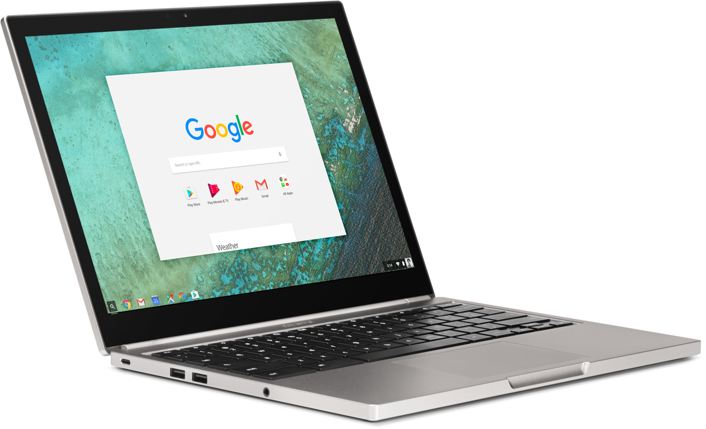
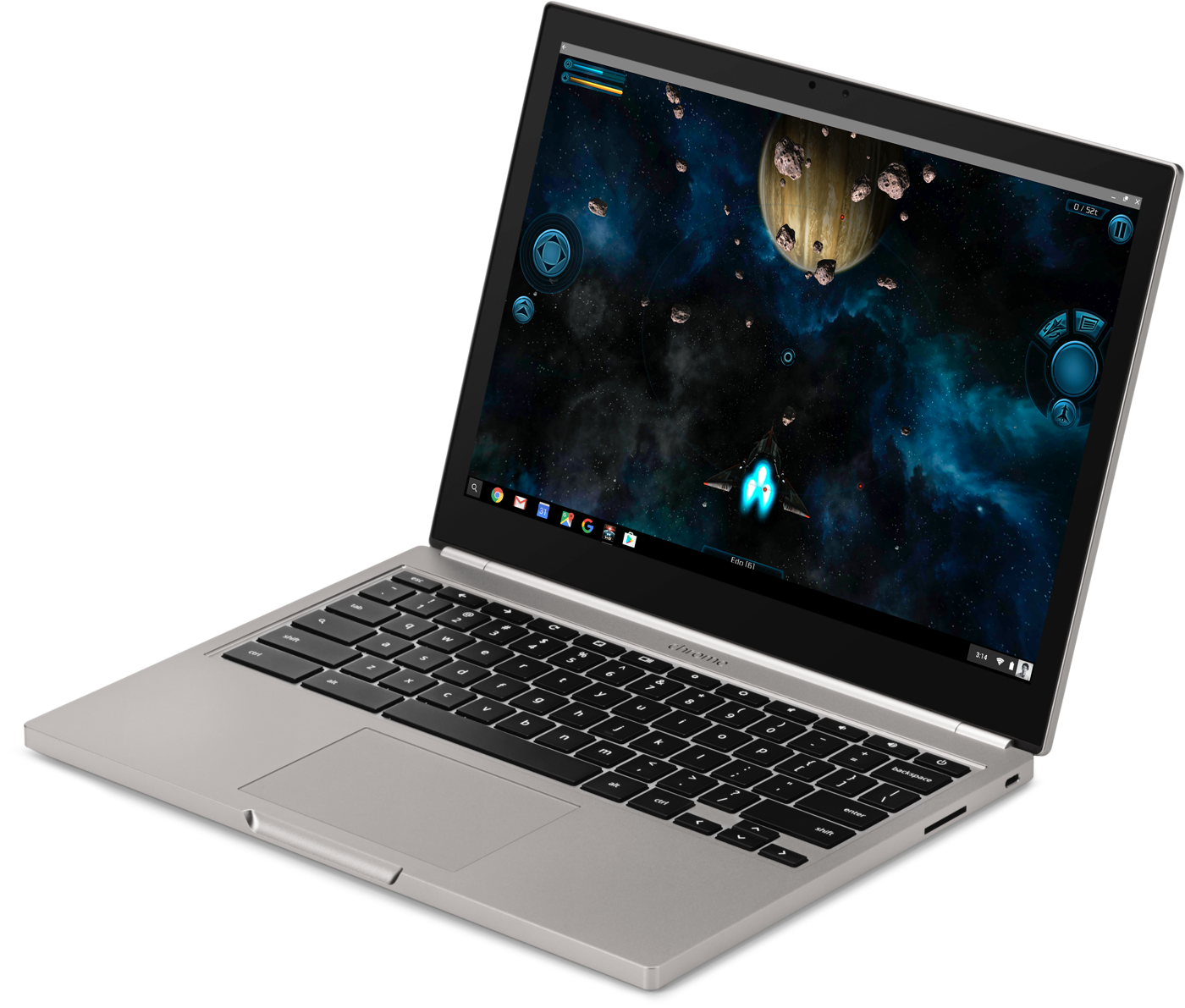
Android Apps and the Play Store are coming to Chrome OS this year
Google CEO Sundar Pichai was handed the reins of Android in early 2013, putting him in charge of both Chrome and the company’s mobile OS. Ever since then, rumors have swirled that Google would look to merge its two distinct operating systems into a unified whole. Those picked up steam this past fall, and indeed Google is finally unveiling some closer ties between Chrome OS and Android. But that doesn’t mean Chrome OS is going away. Quite the opposite, in fact: This year, Google’s browser-based operating system will become compatible with the million-plus Android apps available in the Google Play Store. The company accidentally revealed its plans yesterday, but a session this morning at Google I/O makes it official.
When the update rolls out later this year, Google will simultaneously tackle two of the biggest problems facing Chrome OS. “A lot of users wanted more apps and better offline capabilities,” says Google’s Kan Liu, a senior product director for Chrome. “We’ve been thinking about what is the right way to bring that to end users — and it turns out we have a great app ecosystem in the Play Store.” These apps will enable much more robust offline capabilities, something that could significantly transform how people work with Chromebooks.
“We’ve spent a lot of time and made good progress at enabling offline for Chromebooks based on the web,” Liu explains, “but the web wasn’t fundamentally designed for offline.” Even though our smartphones are online most of the time, the vast majority of apps are designed to work offline as well, in a way that web apps just can’t replicate. “When you design for Android, you have to think about offline,” Liu adds. Things like music, video, photos, games and documents all benefit from more-robust offline modes. Some worked offline before but not to the extent they will when the Play Store arrives. “We’ve been trying to get developers to prioritize it [for Chrome] because users are asking for it, but developers weren’t thinking about it,” Liu says.
Google is doing as much as it can to make these feel like native desktop applications. It’s not quite there yet, but eventually you’ll be able to grab an Android app from the corner, stretch and resize it any way you like, with the content adjusting to fit that space. At the moment, though, you can only run them in their portrait “phone” or larger landscape “tablet” modes. Still, most of what I saw felt perfectly native: Notifications are filtered into the standard Chrome notification area, and the common design language across Google means most Android apps fit right in.
The obvious question is, why bother running Android apps on Chrome when you can just run them on native Android devices? But traditional notebooks still have a lot of productivity advantages over tablets. “The big difference between a tablet and a Chromebook is the trackpad, doing things with precision, it’s a lot easier to use a mouse editing a document,” Liu says. “And because it’s a Chromebook, we have a full desktop-class browser.” Split-screen multitasking in Android N will certainly help, but the multitasking experience still falls short of what a laptop can offer. That, combined with the stability of Chrome itself, will continue to give Chromebooks an advantage over tablets when it comes to sheer productivity.
As with most things Google, it’ll be a while yet before users get to enjoy the benefits of the Play Store on their Chromebooks. Google is announcing the initiative today so it can start getting developers to take its desktop OS into account when updating their apps. It’ll be available in the next developer channel release and will only work on a limited set of devices: last year’s Chromebook Pixel, the ASUS Chromebook Flip and a few others. A touchscreen will be a requirement at first — but that restriction will be lifted by the time the Play Store rolls out. That should happen before the end of the year.
If you’re a Chrome OS fan, it’s hard not to be excited about what Google is doing here — but it’s also worth remembering that the success of Google Play on Chrome will depend on developers. The big knock against Android tablets has been less about hardware and more about the quality of apps. Developers haven’t focused on building apps for larger screens with the same gusto that iOS developers have — Android tablets have always felt like an afterthought.
For that not to happen with Chrome OS, devs will need to think about building for the form factor. History says that won’t happen at the level you’d hope for. Still, my fingers are crossed that things will go differently this time. The growing number of Chromebook users means there’s a big new market for Play apps. Hopefully developers will embrace the form factor. More users are always a good thing, and more apps are definitely good for Chromebook fans.
For all the latest news and updates from Google I/O 2016, follow along here.
Google will sell its own Daydream VR headset
When Google developed its popular line of Nexus phones and tablets, it didn’t just give the reference designs to third parties and hope for the best: It built and sold its own hardware to showcase just what those designs could achieve. The company announced on Thursday that it will take the same tack with its newly unveiled Daydream VR hardware. That’s right, Google is going to build its own line of Daydream headsets and controllers to show third-party developers how it’s done.
Since the Daydream is an evolution of the Cardboard headset — albeit a heck of a lot easier to wear — it’s not going to have any onboard processing power, instead relying on the user’s phone. To that end, Google’s already in the process of certifying handsets from LG, Samsung, HTC, Xiaomi, Alcatel and others. And you can bet the Nexus line will be among them.
For all the latest news and updates from Google I/O 2016, follow along here.
Source: Google (Twitter)
Why Google can’t stop making messaging apps
Google has announced three new communication apps this week: Spaces, Allo and Duo. That’s in addition to the three it already has. To understand why it’s doing this, and why it’ll do it again, we only need to look to its past.
Twelve years ago, Google began its shift from being “just” the world’s most popular search engine to something much more: It released Gmail. Soon, the company was offering several options for communication. By 2009 Google users had a pretty robust set of tools at their disposal. Gmail for email, Talk for real-time text and voice chats, Voice for VoIP calling, and Android to facilitate everything else. Unfortunately, this simple delineation would quickly disappear as the company launched more and more services.
Google Wave was the first addition. Announced in mid-2009, it mashed together elements of bulletin boards, instant messaging and collaborative editing to pretty awesome effect. It grew a small but fervent community — I was a big fan — until Google halted development.

Then came Buzz. Launched in 2010, it was Google’s first attempt at a bona fide social network. It failed miserably, not least due to complaints about the way Google forced it upon users and some valid privacy concerns. Although neither Wave nor Buzz really competed with what the company was already offering, that would change when Google launched its next attempt at a social network, Google+.
In addition to standard social networking, Google+ also had two features that facilitated direct communication with individuals and groups: Hangouts and Huddles. Not to be mistaken with the current app, Hangouts at the time offered multiuser video chat for people in the same Circle. Huddle, on the other hand, was an instant messaging app for talking with other Google+ users.
Huddle would soon become Google+ Messenger, offering the same functionality as Google Talk, while Hangouts would expand to seriously encroach on Google Voice. Within a year, Google had added the ability to make “audio-only” calls by inviting users to join Hangouts over a regular phone line.
Google now had two apps for everything, coupled with the problem that many users — even on its Android platform — were still using SMS to communicate on the go. It began work to rectify this and unify its disparate platforms. In 2013 we got an all-new Hangouts, available cross-platform and on the web. It merged the functionality of Hangouts and Messenger, and it also replaced Talk within Gmail if you opted to upgrade. Voice was still out in the cold and SMS wasn’t integrated, but the company was moving in the right direction.
In late 2013, Google added SMS to Hangouts, and in Android 4.4 it replaced Messaging as the OS default for texting. By Oct. 2014 Google had integrated VoIP into Hangouts as well. It finally had one app for everything.
You could assert that Hangouts was a better app because of the confusing mess that preceded it. Google tried lots of things and put the best elements from all of its offerings into a single app.
That arguably should have been the end of the story, but it’s not. For whatever reason — probably because it figured out that a lot of Android users didn’t use Hangouts — Google released another app in Nov. 2014 called Messenger. This Messenger had nothing to do with Google+ but instead was a simple app focused on SMS and MMS. Hangouts could and can still handle your texts, but Messenger is now standard on Nexus phones and can be installed on any Android phone from the Play Store. This confusing muddle means that if you have, say, a new flagship Samsung phone, you’ll have two apps capable of handling your SMS (Samsung’s app and Hangouts), with the possibility of adding a third with Messenger.
Hangouts, for the most part, has been doing a fine job.
Still, SMS isn’t exactly a burning priority for most people, and Hangouts, for the most part, has been doing a fine job. I can’t say I use it that often — my conversations are mostly through Facebook Messenger and WhatsApp, because that’s where my friends are — but when I do, it’s a pleasant-enough experience. The same can be said for Google+: It’s actually a great social network now, aside from the fact that barely anyone uses it.
That’s the issue that Google faces today and the reason why these new apps exist. More people are using Facebook Messenger than Hangouts. More people are using WhatsApp than Hangouts. More people are using Snapchat than Hangouts. And everyone uses everything other than Google+.
So we now have three new apps from Google, each performing pretty different tasks. The first is Spaces. Think of it as Google+ redux redux redux. It takes the service’s fresh focus on communities and collections and puts it into an app that exists outside the social network. The end result is a mashup of Slack, Pinterest, Facebook Groups and Trello. It’s promising, but, as of writing, it’s very much a work in progress.
Next up is Allo, a reaction to Facebook Messenger and Microsoft’s efforts in the chatbot space. It uses machine learning to streamline conversations with auto replies and also offers a virtual assistant that’ll book restaurants for you, answer questions and do other chatbotty things. Just like Spaces exists outside Google+, Allo exists outside Hangouts. You don’t even need a Google account to sign up, just a phone number — much like how WhatsApp doesn’t require a Facebook account.
Finally we have Duo, which is by far the most focused of the three. It basically duplicates Hangouts’ original function: video calling. According to the PR, it makes mobile video calls “fast” and “simple,” and it’s only going to be available on Android and iOS. Both Duo and Allo also have the distinction of offering end-to-end encryption — although Allo doesn’t do so by default — the absence of which has been something privacy advocates have hated about Hangouts.
This summer, when Duo and Allo become available, Google users will be at another confusing impasse. Want to send a message to a friend? Pick from Hangouts, Allo or Messenger. Want to make a video call? Hangouts or Duo. Group chat? Hangouts, Allo or Spaces. It’s not user-friendly, and it’s not sustainable.
Sure, Facebook sustains two chat services (WhatsApp and its own Messenger) just fine, but it bought WhatsApp as a fully independent, hugely popular app and has barely changed a thing. Google doesn’t have that luxury. Instead, it’ll borrow another Facebook play: Test new features on a small audience and integrate. Over the past couple of years Facebook has released Slingshot, Rooms, Paper, Riff, Strobe, Shout, Selfied and Moments. I’m probably missing a few.
All of these apps were essentially built around a single feature: private chats, ephemeral messaging, a prettier news feed, selfies, etc. The vast majority won’t get traction on their own, but their features might prove useful enough to fold into the main Facebook and Messenger apps. And if one of them takes off, no problem, you’ve got another successful app.
This has to be Google’s strategy for Allo, Duo and Spaces. We don’t know what Google’s communication offerings will look like at the end of this year, let alone 2017. But chances are that Google will continue to float new ideas before eventually merging the best of them into a single, coherent application, as it did with Hangouts. And then it’ll start the process again. In the meantime, Google will spend money developing x number of duplicate apps, and users will have to deal with a confusing mess of applications on their home screens.
‘GunJack Next’ coming to Google’s Daydream VR platform
Google yesterday revealed a brand new VR platform for Android called “Daydream,” and now we know of at least one game for it. CCP, which developed Eve Online and Gunjack for the Oculus Rift, HTC Vive and Samsung Gear VR, will make a sequel tentatively named Gunjack Next exclusively for Daydream. The original title was a VR shooter set in the space world of Eve Online, where you defend your ship by blasting enemies from a gun turret, arcade-style.
Google’s Daydream is a software and hardware virtual reality platform for Android N that includes a Gear VR-like headset and handheld controller. The search giant is partnering with smartphone manufacturers including Samsung, Xiaomi and HTC, along with content providers like Netflix and HBO. It calls Daydream a “high-quality VR platform” and will certify partner handsets to make sure that’s so. The best way to do virtual reality on mobile at the moment is with Samsung’s Gear VR, which is powered by Oculus software.
CCP shouldn’t have much trouble creating a game for the Daydream Android platform, because it originally built Gunjack for the Gear VR, then later adapted it for the Rift and Vive. The company also released Eve Valkyrie, a dogfighting game set in the Eve Online universe, to the Oculus Rift and plans to release it on the HTC Vive and Sony Playstation VR headsets later this year.
