


Which is the best password manager on Android?

When it comes to passwords, we all have a lot of them. I even have one to allow me to log in to AndroidGuys and talk to you about passwords. The most secure thing that you can do with all of those passwords is have every single one of them be different. If I’m honest, I’m pretty bad about that because I have never been willing to write my passwords down somewhere. At this point, my entire digital life would be taken to my grave with me.
However, as more and more services take security more seriously, they are asking me for more complicated passwords and at a certain point I’m going to start forgetting them (that certain point has already happened). The best way to do this would be to literally write down each password onto a page in a binder and put that binder into a safe that you have secured to the floor of your bank vault. If you don’t have a bank vault handy, password managers are a pretty good alternative.
What is a password manager? Are they safe?
Password managers are exactly what they sound like. They’re applications that securely store all of your passwords in a database so that you only have to remember one password; that of the password manager. All you have to do is have the app installed on whatever machine you plan on signing into apps/websites with and it will do all of the work for you!
There is deserved concern over whether password managers are safe because it seems ill-advised to keep all of your digital world in one place and it’s not unreasonable to think that way. Just last year LastPass was subject to a security breach that resulted in hackers getting away with user email addresses, password reminders, server per user salts, and authentication hashes, according to LastPass.
That having been said, the hackers weren’t able to secure any users’ password vaults, which are the silos/databases that contain all of the encrypted password information. Additionally, one security expert told Ars Technica that he’s so confident in LastPass’ hashing that he doesn’t even feel compelled to change his master password.
Still, it could have been much worse and given the rate of failure it’s still much better than using the same password for everything or using the still most popular password on earth, 123456.
So where does all of this leave us? Well, there are many options when it comes to password managing services and I want to quickly give a rundown of my favorites and what I like about them. I’m not going to pretend to have any knowledge as to whether each service has a secure algorithm, so we’re going to assume that they’re all equal in that regard and judge them based on ease of use, features, and overall value pertaining to cost.
1. LastPass

LastPass, by coincidence was the last password manager that I tried of the five here. Admittedly, I was a little turned off by the fact that they have been hacked twice and had a major security flaw discovered at one point and purely on a cost aspect, I really liked that you could buy everything you needed from 1Password in one shot and be done. The subscription model is taking over everything these days and one less yearly cost is one tick of sanity that I get to keep.
 However, at only $12/year LastPass is the cheapest yearly subscription on this list (apart from KeePass, of course) and the overall usabliity of their app just blew me away. Using the accessability super powers that you grant it, it can recognize whenever you’re about to type into a password field, scans the screen to see if it has information with a corresponding account, and presents you with the option to click a single button and fill in the password. Of course you’ll need to authenticate first, but since LastPass will authenticate using your fingerprint, it’s a snap and you never need to type a single letter.
As overall usability to cost is concerned, LastPass is absolutely the password manager that I would recoommend to my mom or anyone else who isn’t as technologically savvy as I am. It makes the entire process dead simple, which makes it a better experience for anyone.
Download: LastPass
2. KeePass

KeePass was my favorite app to use, but it isn’t necessarily going to be for everyone. The reason that I like it so much is because it’s Open Source and because it lets you store the database on your own terms. I, being an IT professional, am increasingly paranoid when it comes to the storage and security of personal information. KeePass being open source means that anyone can scrutinize the code and be sure that it’s not falling into the wrong hands. Perhaps more importantly, from my perspective, is that I can store and sync the database file however I want – that means it can be stored on Dropbox or I can use any open transfer protocol (FTP, SFTP/SSH, Webdav, etc) to sync it between my phone and PC.
The major downside is that without money backing the project, there isn’t an official Android app. Since it’s an open source project, there are plenty of options in the Play Store, though, and I chose to go with KeePass2Android. It’s a fairly attractive implementation and allowed me to use the syncing option that I wanted. It doesn’t allow for fingerprint authentication and while it’s a little less convenient, that’s probably a good thing. Much like all of the paid services, KeePass offers the option to generate complex passwords for you and rates their effectiveness on a scale of bits rather than a subjective percentage scale. KeePass differs from all of the other password managers in that it doesn’t store your credit card or bank information like the others do. I don’t really want/need this feature, but maybe some people would.
Download: KeePass2Android
3. 1Password

First things first: I think that their pricing model is utterly ridiculous and poorly marketed. You can subscribe for a family plan for $5 per month, which includes up to 5 people and all of the apps, which is not bad. However, if you’re a single user you’ll probably not want to do this because you’ll end up spending about $60/year when the competition is generally about half that.
Well, what if you want this just for yourself? You can opt for the the “One-Time Purchase” and pay $64.99 for a lifetime license of the desktop apps (not the mobile apps), so you’ll then have an app for both Windows and Mac and nothing for your phone without dishing out another $10 (per platform). Of course, you can just buy this for your phone but it’s not going to be nearly as useful that way.
Right about now you may be starting to swing back to idea of just buying the subscription. After all, you’ve already spent $75 on something that you don’t know very much about and for some reason even though most of us only have one PC OS, you have a license for both Windows and OS X.
Once you have 1Password on your phone, though, things become a lot less stressful. As features go, it is pretty much lines up with what its competition offers. You can store nearly any kind of sensitive information: bank accounts, credit cards, drivers licenses, software licenses, secure notes, and, of course, logins (and a lot more). You can also set the application to be unlocked using your fingerprint, which is majorly convenient. There’s a little more of a learning curve for this one, which is why it fell to number three on my list.
What I really liked (before I started digging) about 1Password is that it allows you to choose to keep the database in a variety of locations. Currently the options are local storage (on your phone), WiFi Sync (sync between your PC and phone over WiFi), Dropbox, and iCloud (iOS/OS X only). For some inexplicable reason, though, when you buy the family plan you lose the option to store your database on your own terms and have to store the database in their cloud server.
Download: 1Password
4. Keeper

At first glance, Keeper looked like it was going to be one of my favorites because of one killer feature: the ability to share entries with one click. If your family has shared accounts (eg – cable, internet, Netflix) or you’re in a situation with your job where you would need to share login credentials with coworkers, this is an excellent feature so that you never need to write down/email password information. I also really liked that after I set my account up on my phone, it offered to set up two-factor authentication whenever I signed in on a new device in the “DNA” section of the app.
What I found to be curious/concerning was how long it took for the vault to automatically  relock when you left the app (and unlike other apps, didn’t give a persistent notification to remind you that it was unlocked). I also didn’t like how agressive they are with trying to upsell you to the subscription service. There is a free version of the service, but within the first few minutes of signing up for the service, they essentially prompt you to pay for it, making it look like a pay wall, and send a pop-up notification to remind me to pay for the service before my trial of the premium version ends in 30 days!
Keeper seemed to be one of the apps that was better at using its powers of accessibility to make filling in a password more streamlined. It has a small overlay that displays whenever you’re on the web that you can tap and it will try to find a place to put password information. This seemed to be a marked improvement over what other apps preferred, which is to have a special keyboard with magical password filling-in features (though it has one of those too). For $30/year Keeper is not a bad deal, especially if you need to share entries with someone, but if you’re on your own you might want to look elsewhere.
Download: Keeper
5. Dashlane

 One thing that I really liked about Dashlane was that the first thing it does after you install it (besides essentially forcing you to install it on your PC) is give you suggestions of which other services you might be interested in storing in it. Among the options are Google, Twitter, Facebook, and a few popular banks. Curiously, one of those options is LastPass – I wasn’t able to find a connection between the two companies, but if you know anything tell us about it in the comments section.
As value goes, I can’t really tell you what Dashlane offers that the other guys don’t and would explain the $10/month price increase over what Keeper charges. That having been said, they have a very intuitive and easy to use app (both on the phone and the desktop).
What I didn’t like and honestly can’t explain about the service is that it somehow synced login information that I definitely didn’t give it. I don’t even remember typing some of them on my PC. Whether or not I can trust Dashlane is immaterial, it’s an invasion of privacy for them to automatically store my Facebook or Android login information. That said, considering I have no idea where they got the information from, I have to wonder what other applications are just sitting in the background watching me type…
Download: Dashlane
At the end of the day I chose KeePass for myself because I like the idea of it being open-source and I really prefer to have more control over the storage of such sensitive data. 1Password had similar features, but it wasn’t nearly as easy to use as some of the other options.
LastPass is the best paid password manager that I used in that it was able to recognize when I was looking at a login field and would automatically give me a dialogue with an option to log in using existing credentials or create a new entry to work with the app/site that I was on. Like I mentioned before, LastPass is definitely the one that I would recommend for my mom and therefore anyone else who isn’t as big of a nerd as I am.
Google Spaces hopes to offer a better group sharing experience
Google has introduced Spaces, a new tool that makes it easier to share links, videos, and more with groups of people with similar interests. Spaces lets you create groups, like “Comic book buddies,” and easily share with them from the web, YouTube, and more.

From Google:
With Spaces, it’s simple to find and share articles, videos and images without leaving the app, since Google Search, YouTube, and Chrome come built in. When someone shares something new to a space, the conversational view lets you see what the group is talking about without missing a beat. And if you ever want to find something that was shared earlier—articles, videos, comments or even images—a quick search lets you pull it up in a snap.
Spaces isn’t quite live as of this writing, though it will roll out later today on Android, iOS, and the web for all Gmail accounts.
HTC 10 — a second opinion
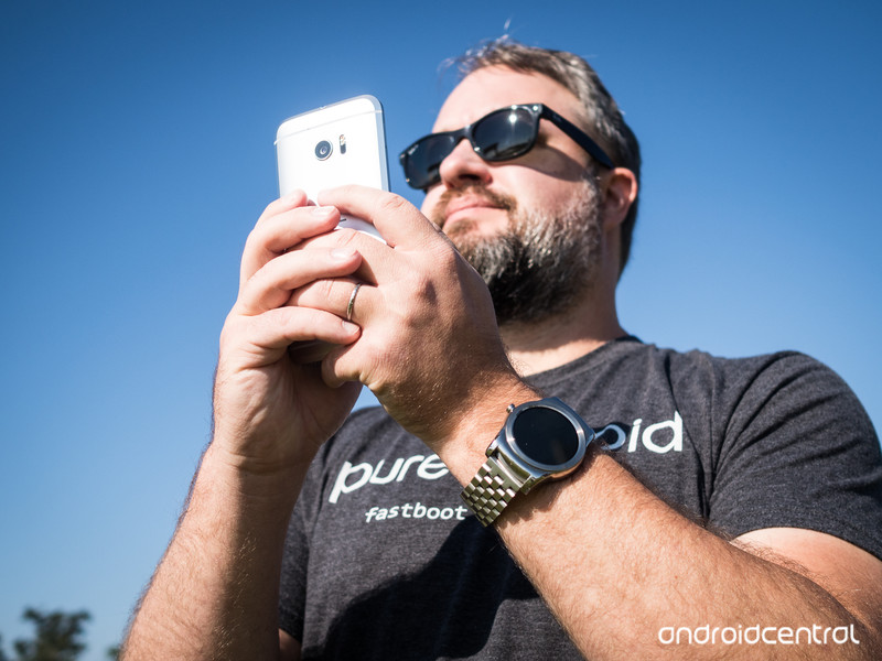
One of the best phones you can buy in 2016 is now my favorite phone of the year.
Anyone can make a phone out of metal. That’s not to say it’s easy. But at this point there’s nothing particularly special about being a metal phone. Or being a metal unibody phone. Or whatever other marketing language we want to throw at it.
What isn’t easy is making a good metal phone. Or a compelling one, actually. You’ve got metal so thin it feels like plastic. Metal covered in so much paint it feels like plastic. Or a metal phone that looks like every other metal phone out there.
Nobody makes metal phones like HTC, though. Of the company’s sins the past few years — and there have been sins — unoriginality isn’t one of them. Attention to detail in design isn’t, either.
And that brings us to the HTC 10, which quickly was considered by many to be the Taiwanese manufacturer’s best smartphone to date, including in our own official review.
I’m inclined to agree. It’s not perfect, though, and clad in a bit of marketing wizardry.
This is our second-opinion review of the HTC 10.
About this review
I’ve been using the HTC 10 for more than a month. Mostly in Pensacola, Fla., but also in New York City, and a little bit on the road in Canada. I’ve been using an unlocked North America model (with T-Mobile) supplied as a review unit by HTC. It’s running Android 6.0.1, software version 1.53.617.5. (Yes, that’s the one with the most recent camera update.)
I had the HTC 10 — which I’m going to refer to as the M10 from time to time — connected to an LG G Watch or Huawei Watch for the entirety of my time using it.

Yasssssssss
HTC 10 hardware
Few companies do industrial design like HTC. From the days of the Touch Diamond (I’m showing my age here) to the first Android phone (the G1) to the early start of the HTC One era. That continues with the HTC 10.
This is a substantial phone. There are metal phones that keep the weight down in any number of ways, and that keep things pretty slim. The HTC 10 has none of that. It’s smaller and lighter than, say, the Nexus 6P and LG V10 — two of the biggest available right now. It’s smaller and lighter than the Galaxy Note 5. But there’s still something that’s just beefy about this phone. Being 9mm thick (at the thickest part, that is) and weighing 162 grams will do that.
It’s a blunt instrument, almost. Metal. Glass. Solid. But it’s beautifully crafted. With the curves we’ve come to know and love from HTC’s “M” line. The M7, M8 and M9 each have distinctive but unique slopes to their backs. That continues with the M10, of course, only with large, chamfered edges. That major change makes this phone the easiest to hold since the much smaller M7. The matte finish on the metal is still a little too smooth to not be a little slippery, but that chamfered edge makes all the difference.
There are metal phones, and then there are metal phones made by HTC.
That, and it just looks beautiful, particularly on the silver models.
Also worth a mention is the way HTC has burned its logo into the back. You can’t feel it at all. And unlike past phones, it’s not going to fall out. (Does it get any more embarrassing than that?)
The change from front-facing stereo speakers is a big one, but necessary. You can’t (and shouldn’t) put out a phone these days without it having a fingerprint sensor. And HTC using the combination scanner/home button on the bottom of the front of the phone means something had to give. But instead of just opting for a forgettable single speaker like so many others, we’ve got treble (higher) sounds coming out the earpiece, and bass (lower sound) firing out the bottom of the phone. It’s not really like a true subwoofer — the mids are mixed way too much for that — but it works, and it works pretty well. What you get is a way-above-average mono smartphone speaker. It’s great for folks speaking — podcasts and news and the like. It’s pretty good for music.
Actually, maybe there are times in which it works too well. There are times when I’ve been on a call (that’s the feature wherein you use your smartphone to actually talk to someone, using 10-digit numbers to determine with whom you want to communicate) and the earpiece is just too damn loud. (The HTC 10 also occasionally gets on my lawn, but that’s another story.) The speakerphone feature, however, has been a little quiet for my taste. Go figure.
I’m not all that concerned about having 24-bit sound — HTC including it is better than not, certainly. But I have been very much enjoying the “High-res Audio Earphones” that won’t be included with the phone in the U.S. (Elsewhere in the world, it’s time to get excited.) They sound great. They feel pretty good. They’d probably be the best in-box earphones I’ve ever used, if they were actually in the box in my little corner of the world. (HTC has yet to set a price for them, so I can’t weigh in on whether they’re worth a splurge after you buy the phone.)
There’s some serious old school/new school going on in the HTC 10.
Elsewhere on design: I’m digging the look of that bass speaker on the bottom. I’m fine with the slight extension of the camera housing (also known as the z-stack, because it extends on the z axis). I’m loving the look and feel of the power button. That’s a small but important thing for making sure you can find it quickly and easily without fumbling — not always something easily done on HTC’s phones of the past.
The HTC 10 display is a little disappointing, especially in sunlight. And Florida gets a lot of sun.
The display on the HTC 10 is good. Maybe even great. But I’m not in love with it. I’ve been spoiled by AMOLED panels in Samsung’s phone. And not just because of their ridiculously black blacks (none more blacks) or that I think they just look better than backlit screens at this point. No, the problem is I’m on a polarization kick of late. LCD screens need polarizers to work. That means color shifts — and it means that too often my polarized sunglasses mean I can’t actually see the screen as well as I’d like. (And occasionally not at all.) Somehow Huawei managed to avoid all this with the LCD panel on the P9.
If that’s not a problem for you, awesome. Me? I like sun. I see a lot of it in Florida. For me that’s a thing.
The HTC 10 is the third phone I’ve used with Snapdragon 820. Heat hasn’t been an issue in any of them, and it’s not in the HTC 10. Occasionally it’ll get warm, but not hot. Raw performance has been fine, too. I don’t play games on my phones, though. So, yes, I hope the latest processor can push a UI without issue.
This is a solid one-day phone. Most of the time. And that’s enough for me.
Battery life has been the big question with Snapdragon 820, if only because of all the promises Qualcomm has made about “2x” gains in power consumption. Add to that HTC’s claim that you can get two days of use out of the M10, and we’ve got some pretty lofty expectations set.
My take on the battery life has changed a little bit. I’ve gone from “Two days? Where did HTC get that idea?” to something I think is more realistic. This is the first “all-day” phone I’ve seen from this current generation of devices. Better for my use than the Galaxy S7. Better than the LG G5. From the time I wake up and unplug, to the time I go to bed. We need to have realistic expectations of a 3,000 mAh capacity — two days is pretty generous, and does it really count if the phone is all but shut down while you’re sleeping? And if I’m on the run and not on Wi-Fi, I can burn through the HTC 10 battery a good bit faster and need to top up at some point.
But if I’m on Wi-Fi most of the day, and get a little bit of charge back on the commute home, I’m easily getting 15 hours of actual use, with 30 percent or 40 percent of a charge remaining.
And that doesn’t even take into consideration what I still think is the differentiator in phones today — quick charge. Whether it’s Qualcomm’s branded version or a manufacturer’s implementation of faster USB charging (and I don’t really care which, so long as it works), being able to get 30 percentage points back in 20 minutes or so is huge. Two-day battery life is moot at this point and is a superfluous marketing message.
The more I think about it the more I’m OK with Quick Charge balancing out not-quite all day battery life in phones.
— Phil Nickinson ✘ (@philnickinson) April 14, 2016
Just 20 minutes on a QC3.0 charger in the car on the way home from the office can get me about 30 percentage points back. A good half-hour or so can get damned near double that.
These phones are doing more and more every day. These processors do more and more behind the scenes. We tend to forget that, and we tend to have unrealistic (and, let’s face it, uneducated) expectations. Toss in the fact that HTC has already switched to the reversible USB-C standard, and I’m OK with how long the phone is lasting, and how quick and easy it is to charge.
I don’t need “two days.” I need one day — or at least most of the day, with a 20-minute top-off.
Best of both worlds
HTC 10 software
When I called for a Sense revamp, this wasn’t what I expected. But it works.
Another big change for HTC here in the software department. It’s scaled back Sense a good bit — to the point where Sense no longer even gets a version number. (But if it did, it’d be Sense 8.) That’s not to say you won’t find changes. The default launcher still has HTC-style folders and a custom app drawer. But it’s all completely usable, and it’s no longer trying too hard. (The ability to put folders within the app drawer is still great.)
 I used HTC’s UI for more than a week. It’s just fine. I’m no longer using it though because I prefer a different launcher. In any event, the single most important thing you can do to do your phone is make it yours. Rearrange icons. Change things up. Don’t just use what they give you. What HTC has is fine, but it’s HTC’s. (And Google’s, I guess.) Make it yours.
The biggest improvement, I think, is in the notifications. HTC has gone full Google on that front, which gives the most room for notifications without taking up room with quick settings. If you’ve yet to experience this particular bliss, a single pull down shows your waiting notifications. Keep pulling and you get quick settings. Or just pull with two fingers to get straight to the quick settings.
That’s the only scheme that works. Anyone who does anything different is wrong.
HTC still has a bunch of software gimmicks this year, though — which is odd considering if you do a Google search for “HTC 10 gimmicks” you’ll find a number of entries from folks about how the HTC 10 doesn’t have gimmicks.
If a company tells you its product has no gimmicks — guess what. There are gimmicks.
Sure, it’s got HTC “BoomSound” with Dolby Audio. And it’s got a whole (excellent) themes ecosystem. And new “freestyle” themes that break free of the home screen grid. (The kids are gonna love it.) And this ridiculous “Boost+” app that promises to manage your memory and storage and stuff better than Android does. Or the “Lock apps” feature inside Boost+, which will password protect any app of your choosing, which is a great idea. (But is still an additional gimmick.) Or the fact that HTC pushes a “simple” four-digit PIN for security instead of something longer and more secure for security. Or the useful HTC Connect feature that makes it easy to stream music to other sources — and now including Apple’s AirPlay. And there’s the BlinkFeed news reader that’s still in the launcher. And then there’s Sense itself.
Oh, and “PowerBotics.”
So you can’t say the HTC 10 doesn’t have gimmicks — even if more than a few of them are genuinely useful features. (I guess you can say it — but I want to know why.) Where the line really comes from, I think, is that HTC and Google worked together to cut back on the number of duplicated apps, which is great. There’s no separate Gallery app anymore (though it will be made available in Google Play if you want to use it). Instead, Google Photos is integrated into the camera application. Some folks are fine with that. Some aren’t. So in some instances you get HTC apps. In others you get Google apps. It’s not a bad mix at all.
And, finally, a big (yet niche) reason why the HTC 10 is staying in my pocket for the foreseeable future — it works great with Android Auto. (Somehow Samsung screwed that up with Marshmallow.)
Better than before
HTC 10 camera
The camera app (and the camera itself) is the area that’s gotten the most attention with the HTC 10. This is a completely new camera app for HTC. And for the most part I’m digging it. There’s nothing specifically difficult about it or anything. It’s got all the modes you’d expect, and they’re easy to flip though. (Though I’ve found that the “auto” mode — just called “Photo” is sort of annoyingly far away when I want to switch back to it from another mode.) Having the HDR option on top of the UI instead of buried behind a menu or two is a big improvement. I’d probably like to have the ability to swipe the screen to flip between the front and rear cameras, like other apps do, but that’s not a huge deal.
The bigger change is in how the HTC 10 focuses and sets the exposure level. Most phones let you top on the screen to do both at once. The HTC 10, however, takes into account what’s in the entire frame when setting exposure. That can be difficult when subjects are backlit. And the focus (laser-powered as it may be) is a little hit and miss. Sometimes it nails it. Sometimes it takes a few tries to get things right. (HTC’s addressing that, it’s told us, and also will tone down the annoying “there’s something in front of the laser” message, which was extremely sensitive at first.)


I’m mostly getting some pretty good pictures from the HTC 10. (I’m keeping a running album of them here.) Not all of them are perfect. The phone is pretty aggressive on ratcheting up the ISO in low light, which leads to noisier pictures. But if I’m really worried about that I can hop into manual mode.
All in all I think HTC has a really good camera here. It doesn’t saturate as much or sharpen as far as Samsung’s camera does. I think the LG G5 is better about handling low light. But the HTC 10 certainly is a vast improvement over the M9. It doesn’t make me want to carry a second phone. And the camera app itself is greatly improved. It’s maybe not quite the best camera app we’ve used, but it’s definitely among the top, and a vast improvement from HTC’s past efforts. I do take a little issue with that DXOMark thing rating the HTC 10’s camera the same as the Galaxy S7. I don’t think the end result is as good, nor is the camera app quite as easy to use (it’s not far behind, though) or as full-featured. The two swipes down to launch the app is clever, but not as quick as I’d like it to be. (It’s definitely not as fast as Samsung’s home button method, or LG’s volume rocker.)
The HTC 10 has a really good camera. Maybe No. 3 in my list, behind the GS7 and the LG G5 — and that’s a really good position to be in these days.

My favorite phone for now
The bottom line
HTC is back. Period. This is a very good smartphone, and worthy of your attention, and your money. But also true is the refrain we’ve sung year after year. Having a really good device is one thing. Selling it is another. (With the added complication of its flagship phone not always being HTC’s revenue driver.)
I don’t think the HTC 10 is as good a complete product as the Samsung Galaxy S7. (Water resistance and Samsung Pay are a big reason for that thought, in addition to the camera.) But the best phone doesn’t always have to be your favorite. And as far as Samsung phones come in my mind the past year or so (I’ve been very happy with the Note 5 and GS7), it’s good to have an HTC phone in my pocket again.
A couple other considerations: HTC’s done pretty well with its Android updates. That it’s available unlocked is another plus — and is something Samsung doesn’t do in the U.S. And unlike the GS7 (and Samsung’s other Marshmallow-running offerings) it works with Android Auto. That’s a small but important factor for me.
So there’s a whole lot done right here. And I hope HTC is able to build and then ride that wave.
I’d buy it
Where to buy the HTC 10
The HTC 10 will be available direct from HTC, and from independent retailers in the United States, Canada and the UK. In the U.S., it’s available on T-Mobile, Verizon and Sprint, in Canada it’ll only be offered on Bell, and in the UK it’s been picked up by EE and Three, as well Carphone Warehouse as the usual unlocked sellers.
Where to buy the HTC 10 in the United States Where to buy the HTC 10 in Canada Where to buy the HTC 10 in the UK
Devil in the details: Nova Settings and what you do (and don’t) need to know

Nova Launcher is a fairly easy launcher to pick up.
In fact, Nova was the very first third-party launcher I tried, and it’s held a special place in my heart ever since. But Nova Launcher can get overwhelming at times, and most of those times have to do with Nova Settings. Because Nova Launcher has such an amazing amount of customization, it also has a lot of settings that those customizations rely on. So how do you find what you need among the rest? Never fear! We’re here to help you through Nova Settings and help you find what you were looking for — plus a few cool features you probably didn’t even know were there.
Let’s customize!
Main menu
Nova Settings, like most settings menus, begins with the main menu. While this list looks pretty straightforward, here’s what each of them hold and some of the settings we’ll be approaching in them:
- Desktop: This holds home screen settings such as number of screen, size of each home screen, and margins around those screens. The best theming gems hiding in here are subgrid positioning, widget overlap, and lock desktop.
 App & widget drawers: This is where you’ll organize your app drawer. The hidden gems here are Drawer groups and their method for populating tabs and folders.
- Dock: You can define how many items appear on your dock and how many pages your dock has. It’s oft overlooked, but re-organizing your dock can completely change the way you use your home screens.
- Folders: These settings relate to how a default folder looks. The Background color and transparency can be quite an asset when dealing with particular themes and icon packs.
- Look & feel: This is where you can change your icons as well as the animation speeds. You can also tweak the notification bar here, including darkening the icons on the notification bar so that they show up better against a light-colored wallpaper.
 Night mode: You can let Nova change certain functions to a darker theme based on the time of day or you own time-based preferences.
- Gestures & inputs (Prime only): Dictate what certain button and gestures do in the launcher, such as launching an app or executing a Tasker task shortcut. Even if you don’t use gestures, using the Home button to open a often-used app when you’re on the default home screen is very convenient.
- Unread count badges (Prime only): You can configure the unread badges and the plugins used for them. If you’re into that kind of thing.
- Backup & import settings: You should always back up your launcher layout and theme once you’re happy with it. If you’re new to Nova, this is where you should begin by importing your layout from your old launcher.
 Labs (Prime only): this is where experimental and troubleshooting settings lie. While there may be a few things in here useful to a small portion of users, most will not need to venture into these.
- Select Default Home: if the setting for selecting your launcher are hiding in Settings, you can get a shortcut to it here in Nova Settings
- Advanced > Error & usage reporting: Help make Nova better by sending back data about your usage and any crashes you might run into. Nothing identifiable is sent, so leave this on please.
- Advanced > Restart Nova Launcher: Sometimes things can get a little glitchy, so before you go begging support for help, restart Nova Launcher to see if that clears anything up.
- Advanced > Aggressive desktop: if your device gets a little kill-happy with its memory management, you can use this option to keep your desktop from have to be re-rendered every single time you come back out to the home screen.
Desktop
Desktop holds most of the settings for how your home screen pages look and behave.
- Desktop grid dictates the size of the grid on which you place widgets and apps on your home screen. Whereas most launchers are 4×4 (4 rows by 4 colulms), Nova Launcher can down to 2×2 or up to 12×12. Nova’s ace in the hole is hiding in here, too:
 Subgrid positioning allows you to place items in between the rows and columns of your grid. This can effectively double the positions you have available to you when trying to place apps or resize widgets.
- Icon layout allows you to resize the app icons on your home screen as well as customize or remove app labels, should you not want app names cluttering the home screen.
- Width padding and Height padding adjust the space around the outside of the icon grid. Increasing the padding will push icons in from the sides of the screen; this can be useful if you use a thick case that may obstruct the edges of your screen.
 Persistent search bar adds a Google Search bar to the top of your home screen (or to the left side of the home screen in landscape), similar to the Quickbar in Action Launcher.
- Search bar style allows you to select a logo and search bar style for your persistent bar. Note: styles do not include colors. Night Mode can turn the search bar from white to dark grey, but other than that, white and transparent are your only color options.
- Scroll effects are the animation that you’ll see when swiping between home screens. You have several styles to choose from, some more flashy like the Zoom Fade and Throw, and others more more subtle like Simple and Tablet.
- Wallpaper scroll dictates whether your wallpaper remains in one place or scrolls with your home screens. If you’re using a wide wallpaper with a lot of detail, scrolling allows you to see more of the image.
 Infinite scroll will scroll from the last home screen back to the first when turned on. Otherwise, you’ll see an overscroll animation and stay on the last home screen.
- Page indicator sets the style of the page indicator that sits between your home screen and dock. You can choose between dots, a solid line, or no indicator at all.
- Page indicator color sets the color of your selected page indicator.
+Add icon to Home screen adds every newly installed app to your home screen. Just turn it off. You don’t want every app you install on your home screen. And Because Nova knows you don’t really want it, either, they even note that you need to turn it off in Google Play, too, while you’re at it. - Advanced > Widget overlap allows you to place widgets and shortcuts on top of each other, either overlapping or completely on top of each other.
 Advanced > Overlap when placing allows you to overlap when placing widgets and shortcuts on your home screen. This can sometimes lead to placing apps on top of folders rather than in them, but it does prevent Nova from pushing widgets out of the way if you try to place a widget in the same area.
- Advanced > Lock Desktop prevents you from making any changes to the home screen. If you need to prevent someone from messing up your home screen after you get everything in its proper place (like kids, or technically-challenged users who long-press everything), locking your desktop can keep things from being accidentally changed.
- Gradual shadow add a soft shadows to the top and bottom edges of the screen. This can add extra contrast and allow the notification and navigation bars to show up better.
App & widget drawers
You can corral and control your app drawer and widget drawer with the following settings:
- Grid sizes dictate how many apps will show on each page of your app drawer (or if you have a vertically scrolling app drawer, how many apps will appear on screen at a time). Like the home screen grid size, it’ll go from 2×2 to 12×12. Unlike the home screen grid size, you can set different grid sizes between portrait and landscape, should you use your app drawer a lot in landscape.
 Icon layout allows you to resize the app icons in your app drawer as well as customize or remove app labels. While removing labels is more common on the home screen, we recommend leaving them on in the app drawer.
- Frequently-used apps adds a bar to the top of the app drawer with your most-used apps, should you not want to hunt for them over and over in your app drawer. Its effectiveness can be offset by how many of the most frequently used apps are on your dock and thus are easy to find without even opening the app drawer. All apps outside the most frequently used apps will be sorted alphabetically.
- App drawer style allows you to select one of three styles for your app drawer: horizontally paged screens, a vertically scrolling grid, or a vertically scrolling list. The list lists far fewer apps on screen at one time, so if you have a lot of apps installed, be prepared for a lot of scrolling.
- Widget drawer style allows you to select one of three styles for the widget drawer: horizontally pages screens sorted by widget size, a vertically scrolling gird of widgets sorted by size, or a vertically scrolling list of widgets grouped by app, witch widgets being sorted alphabetically by app rather than by widget size.
- Card background will set your app drawer background to a white card rather than your wallpaper.
- Background will allow you to select a color/opacity to overlay on your desktop wallpaper in the app drawer. These tints can help make apps more visible against particularly noisy or colorful wallpapers.
 Fast scrollbar turns on or off the ability to quickly flip multiple app drawer pages with either a series of dots at the dot of the screen or by tabs if you’re using app drawer groups.
 - Scroll accent color sets the color of the dots used for fast scroll when enabled. If using custom colors for drawer tabs, those custom colors will override Scroll accent color.
- Transition animation sets the animation that you will see each and every time you open the app drawer.
- Scroll effects are the animation that you’ll see when swiping between pages of the app drawer. If using horizontal pages, you have several styles to choose from, some more flashy like the Zoom Fade and Throw, and others more more subtle like Simple and Tablet.
- Infinite scroll will scroll from the last app drawer screen back to the first when turned on. Otherwise, you’ll see an overscroll animation and stay at the end of the list.
- Search bar will enable a permanent Google search bar at the top of the app drawer, should you prefer to voice search and app rather than hunt through pages and pages of icons.
- Pull to search will add a gesture to the app drawer, summoning the search bar with a swipe down on the screen.
Tabs and drawer groups in the app drawer are vastly under-used, which means most of you can skip this section entirely. For those who love the organization tabs give you, here’s where you can tweak a few things:
- Tab bar turns on the tabs bar, and adds a menu button to the app drawer so you can quickly access Nova settings and other settings from the app drawer.
 Tab style lets you select the style of your tabs, from the more subtle Material to Classic to the birght Colorblock.
- Menu lets you replace the menu button added to the tab bar with a shortcut to search or to the Google Play Store.
- Isolate tabs stops you from swiping from one tab to the next while swiping between app drawer pages.
- Hide apps lets you keep apps from being seen on the launcher, or you can come here to unhide them if you accidentally hid them which trying to sort apps into tabs/folders. Note: hiding an app is not the same as disabling it, and disabling an app will automatically hide it from Nova Launcher (and keep it from running in the background or taking up resources).

Drawer groups allow Nova to go beyond its simplistic A-Z sorting and offer users a bit more control over how their apps are organized through app drawer tabs and folders. It makes populating folders easier than just about any app drawer system I’ve ever tried.
- Create a new tab by tapping the + in the top right corner. You can title it as you wish.
- Edit a tab/folder by tapping the pencil icon next to a tab or folder. Once you’ve opened a tab/folder, you can:
- Keep apps in main app tab duplicates apps when they appear in this tab, keeping one in the Apps tab and another in your designated tab.
- Tab color can be changed by tapping on the colored circle next to the tab’s title. This color will override the scroll accent color.
- Delete tab/folder can be found under the three dot menu icon in the edit tab. When you delete a tab/folder, the apps within it will go back to the Apps tab. You can also long-press on a folder in the folder list to delete it and long-press and drag a tab up to a trashcan at the top of the menu to delete it.
-
Select apps for a tab/folder brings up a list of all the apps in the Apps tab, as well as any apps currently in the tab/folder. Tabs can also see any folders in the Apps tab and add them.
-
Folders first puts any folders in a tab at the beginning of a tab instead of where they would naturally fall in alphabetical order with the rest of the apps.
- Advanced > Automatically close the app drawer once you open an app with this setting enabled. If you click back after opening an app you’ll be taken to the home screen instead of the app drawer you were just in.
- Advanced > Remember position will let you hop out of the app drawer and then when you re-enter it, it will be on the same page. This can be useful to some, but annoying to others, so toggle it as you see fit.
Dock

The dock is an under-appreciated part of the home screen, both by users and by launcher developers, who often have few or no options at all for their dock. Nova appreciates the dock, and lets you customize to your heart’s content.
- Dock background but a colored shape under your dock, like a shelf to hold it up. You can choose from several shapes and colors for the dock, or you can leave it off and let your wallpaper shine through.
- Dock pages dictates how many scrolling pages of dock items you have. You can have up to 5 pages, but after 3 things can get a bit difficult.
- Dock icons dictates how many icons appear on one page of your dock. You can have as many as 7 items on your dock, be it 7 apps, 6 apps and an app drawer shortcut, or even a few 1×1 widgets.
- Icon layout allows you to resize the app icons on your dock as well as enable and customize app labels, which are turned off by default on the dock.
- Width padding and Height padding adjust the space around the outside of the dock. Increasing the padding will push icons in from the sides of the screen and away from your nav bar and home screen, which can help avoid fat-fingering a app on the dock when you meant to hit Recent apps.
- Infinite scroll will scroll from the last page of your dock back to the first if enabled. Otherwise, you’ll get an overflow animation and stay on the last page of your dock.
- Dock as overlay moves your dock on top of your desktop grid, allowing you to hide it through gestures to hide/show the dock and give more real estate to items on your desktop like widgets or that awesome wallpaper.
- Automatically close the dock after an app is opened while this is enabled. When you go into an app and then back to the home screen, the dock will be hidden.
- Remember position will stay on the dock page you were last on when you return to the home page when enabled. Otherwise you’ll be taken back to the first page every time you return to the home screen.
Folders

Not to be confused with the folders in your app drawer, these settings concern home screen folders.
- Folder preview is the default icon for a folder, showing the first few apps in the drawer in one of four arrangements, from Stack to Fan to Grid. Keep in mind that you can always replace these previews with icons for a single app or a custom image when editing the folder on the home screen.
- Folder background is a solid shape that you can have appear behind the folder preview, such as a circle or square.
- Transition animation is the animation shown every time you open a folder on your home screen.
- Background for the window of your folder is the square behind the open folder, which can be set to any color or transparency your heart desires. Transparent folder backgrounds can prevent a folder from taking you out of a theme, or they can help accent a theme without overshadowing it.
- Icon layout allows you to resize the app icons in your folder as well as customize or remove app labels.
For more ways to make folders awesome, read this!
Look & feel

This section of Nova deals with animations, icons and other visual aspects of Nova Launcher that effect multiple sections of the launcher. While there’s not a lot in here you’ll mess with on a regular basis, the first item in here is reason enough:
- Icon theme is where you apply all those lovely icon packs you download. There’s a slightly hidden feature in the Icon theme menu you should know about:
- Reset custom icons will wipe all the custom icons you’ve set in your app drawer. If you’ve individually set an icon, it will not be effected by setting another icon pack later, so having this option to nuke all the custom icons in your app drawer — but not on your home screen, this option will not purge custom icons on your home screen — can be quite helpful when trying to wipe the slate clean between themes.
- Screen orientation allows you to limit Nova to portrait, landscape, or, in most cases, allows it to auto-rotate with your device. Due to how skewed some elements can look when rotating a portrait-based home screen setup sideways, locking Nova in portrait can make some sense to themers with a very particular setup.
- Scroll and animation speeds deal with how quickly Nova goes through the animations you’ve set in the other menus. While you may think that you want your animations as fast and short as possible, there does come a point where it goes from quick to just abrupt.
- App animation is the the transition you’ll see between Nova launcher and any app you open, and back to the home screen.
 Show notification bar can take away the notification bar when disabled, if you don’t need the time, status symbols, and notifications cluttering the top of your screen.
- Transparent notification bar will replace the boring red or black bar at the top of the home screen with a transparent bar, allowing more of your lovely wallpaper to shine from edge to edge on your screen.
- Dark icons will turn the white icons on your notification bar black in an effort to make them more visible against on white/light wallpaper. If this isn’t enough to make you notification bar really visible with your theme, you might instead try turning on Gradual shadow in the Desktop settings menu.
- Search as overlay has searches by the search bar or other Nova actions executed in a pop-up rather than leaving Nova and opening the full Google search app.
Night mode
Night mode in Nova is pretty great and we think more apps should act like this. Here’s how you can customize it:
 Night mode schedule can follow one of four schedules: Always, Auto, Follow System (which outside of Android N acts like Auto), and Custom, which you can set to whatever time frame you want. If you don’t want Night mode at all, just set Night mode for a five minute stretch at 3 AM, like Windows Update.
Night mode always applies to Nova Settings, but you can choose whether it applies to four other sections of the launcher:- Search bar will turn the persistent search bar on the home screen and app drawer from white to dark grey.
- Drawer will turn the white card background for the app drawer dark grey. If you don’t have the card background enabled, it will change your background tint to a solid dark grey, blocking out your wallpaper. If you were using a transparent tint over your wallpaper for the app drawer background, you may be better off leaving this off.
- Folders This will change the folder window from its previous color/transparency to a solid grey card. Again, if you have transparencies on your folder window, you may be better leaving this off.
- Drawer icon will replace your app drawer icon with a darkened version of the default app drawer icon. If you’re using an icon pack or custom icon, this will replace that icon while night mode is active. You’ve been warned.
Gestures & inputs

Gestures and inputs let you add some invisible magic to your home screen. For each of the Gestures and Button Actions available to your particular device, you can either launch and app or execute a Nova Action or App Shortcut. All of these actions are set in the same way, you tap the gesture you wish to set then select the desired action from the menu.
Note: While there are an ungodly number of option listed in the submenu for Activities for Nova Launcher shortcuts, most of these activities are not things you can actually use as shortcuts. Before setting one as a shortcut, make sure you know what it does.
- Home button will re-purpose the home button while you’re on the home screen, letting the home button pull double duty.
- Only on default page will limit the home button shortcut to on the default screen in your home screen, with the button still functioning as a home button while on secondary home screens.
- Long-press Menu is not an available option for all devices, but it nevertheless gives you an extra gesture option if it appears on your device.
- “Ok Google” hotword taps into the voice recognition in Google Now to let you do hands-free searches in Nova, even if your haven’t allowed Google to listen on every screen.
- Confirm Google Settings will take you into the appropriate Google Now menu to ensure that voice detection is turned on and the app has a recent vocal model to compare to.
You have nine swipe gestures you can use on the home screen in Nova, and while they aren’t as intuitive or diverse as Action Launcher, they can still prove quite useful, especially the easy gestures like Double tap and Swipe up/down.
Unread count badges

If you aim for Inbox Zero and try to see and reply to every little thing that comes to your phone, you might want Unread count badges for apps on your home screen. Even if your stock launcher doesn’t support it, Nova Launcher Prime does thanks to a few downloadable plugins like TeslaUnread.
- Unread count badges can be turned on or off using the toggle at the top right corner of the screen, though you will be prompted to download TeslaUnred if you don’t have an unread plugin installed already.
- Position and size: You can chose which corner the unread badge appears in and how big or small it is, depending on how much of an intrusion you want the badges to make.
- Presets offer you a few starting points from which to configure the color and shape of your unread badges. Material is a slightly rounded white square, Holo is the sharp grey square with a sharp blue border, and Classic is a round red dot with a white border. Preset will switch to Custom once you make any changes to one of the standard presets.
- Colors: You have three colors you can set, the border, the badge itself, and the test atop that badge. These colors can be selected from any shade and any transparency, so feel free to play around with badge colors to match or accent your Nova theme.
- Corner radius dictates whether your unread badge is a square, an oval, or something in between.
- Provider lets you pick between the unread plugins you have installed, TeslaUnread or MissedIt!
- Provider settings will take you into the badge provider’s app so that you can set which apps have badges and which do not. Some apps are better supported by the plugins than others, depending on how popular and how easy it is for the plugin to pick up on unread messages/emails/etc.
Backup & import settings

As mentioned at the beginning of this article, this is where most new users should actually begin their Nova journey. You can import your old launcher’s layout rather than build one from scratch. You can also create and restore your backups from this menu, and you should really, REALLY be backing up your launcher.
A word about widgets and imports/backups: widgets are handled rather oddly in Android, especially in regards to launcher data. From some launchers, Nova will pull the widgets no problem. From some, Nova will pull placeholders but you’ll have to set the widget back up the way it was. And from some launchers Nova can’t pull widgets at all. The Android team needs to sort that out in a future version of Android, but that’s a low priority for people who don’t theme their phones or transfer phones on a regular basis.
- Import will begin by warning you that importing a layout into Nova erases the home screen layout you’ve already made. You’ll then be given your choice of installed launchers to import. Once you select one, a list of the elements from that home screen layout will be listed for you. You can import the layout or cancel if it doesn’t sound right.

- Backup creates a new backup of your current home screen layout. Once you enter the backup menu, you can rename the backup and specify where the backup is going: Document storage, Device storage, or you can directly share it to any service you like through Android’s sharing intent (like Google Drive).
- Restore or manage backups will list any backups on your device, and let you go searching backups that are sitting in cloud services accessible through the Documents browser. once you select the backup you want, you’re asked if you want to erase the current layout and replace it with this backup, just in case you tapped on the wrong backup.
What you need to know about backing up your launcher
Labs
This section features experimental features, which are not to be confused with Beta features found in the Beta version of the app, and debug features if Nova is misbehaving and you need to send data about it to the developers so they can fix it. You shouldn’t need to mess with many of these, but the developers have offered them up for the few Nova Launcher Prime users that do.
- Long-home for Now instead of On Tap: Should you prefer Google Now to the On Tap pop-up, but don’t want to completely turn off on-tap, you can at least get back the old functionality on Nova Launcher with this setting.
 Restart widgets on resume: Restarting the widgets can force them to update, which is useful if some widgets don’t update like they should.
- Big Grid Size Options: Nova Launcher already supports a 12×12 grid for the home screen and app drawer, but if you need more, this will let the gird options go all the way up to 16×16. Can be useful on extra-large devices.
- Upside down screen: Flips the screen for Nova Launcher and locks it in portrait. While this is here for some admittedly weird scenarios, this is a great feature to prank someone else’s phone with. Not that you would ever advocate messing with another person’s launcher without their express consent….
- Bad intent-filters: Some apps can do bad things to a launcher. Nova helps you weed these rotten apples out if you have one messing with Nova.
 Gmail Unread Count: This is an experimental feature and doesn’t actually seem to work right now. If you need an unread count for Gmail, use the Unread count badges plugins.
- Reset first run help: Another feature that doesn’t seem to work quite yet, but once it does it should be a useful feature for users returning to Nova after spending a while on another launcher. This should give a rundown of the launcher as we saw it when we first installed it.
- Permissions: you can turn off/on certain permissions for Nova Launcher here in the settings, should you not want to do it from the system menu for whatever reason. Keep in mind that turning off permissions means some things might not work, especially with the Storage feature disabled.
The debug settings here are, again, not something most people will need, but there are a few things that can come in handy for themers and theme developers.
- Debug > Show Component in Edit dialog lets you see which activity or section of an app is called when you tap on an app or shortcut, which can be helpful to themers who are trying to open specific parts of an app when they tap or swipe on a shortcut.
 Debug > Show Export PNG adds a new option to your home screen icons when you long-press them, allowing you to export fully transparent icons and widgets for editing and mock-ups. It’s another useful tool for themers and theme developers, but not something the everyday user will often need unless you just have to fix that one flaw in that one icon.
- Debug > Show device info brings up the technical information about your device’s hardware and software. It even has an option to add it to an email so you can send it off to the developers to use in finding and fixing issues with the app… which is probably the only reason you’d ever use this.
- Debug > Export Icons for theme dev will push all of the app shortcuts on your device to a compressed file. Icon pack developers can take the ZIP and use it as a base for their icon pack, or they can use it to figure out which activities they need to tie their icons to in a finished pack.
- Debug > Clear icon cache can help clear up the occasional bug when an app icon update doesn’t take.
- Dump icon size debug pngs to /sdcard: this is a debug tool for theme developers relating to icon packs and the sizes of their icons.
What this all means for you as a Nova user

At the end of the day, Nova does have a lot of settings and customization, but there are a few settings to keep an eye on as a regular user:
- Desktop grid and subgrid positioning: Adjusting your desktop grid can help you not only fit more on your screen but it can help what’s already there fit better. And subgrid positioning helps you resize your widgets and place shortcuts in more ways to ensure that things look perfect to you.
- Widget overlap can also help with getting things places the way you want them.
- Use Drawer groups to quickly corral your apps into useful categories or section if you don’t like scrolling through your entire list of apps. Or turn on the search bar in the app drawer and let the phone find it for you with a voice search.
- Hide apps you don’t use and don’t like. Disabling an app will hide it from the launcher, too, but that’s not always an option.
- Don’t be afraid to add more icons to your dock. Going from 5 spaces to 7 really can make a difference.
- Even adding a few simple gestures can take icons off your screen and get you into apps quicker.
- Lock your desktop when you’re done setting it so you or your mother don’t mess it up. You should also back it up while you’re at it!

And here’s a few more settings as a themer to get just a little more awesome in your work:
- Change your Page indicator color, App drawer background, and Folder window background (not to be confused with Folder background) to match the main colors of your theme. Or even better, set them to an accent color that will help your icons pop when displayed with it. Don’t forget that you can also use transparency.
- If you’ve set a lot of custom icon in your drawer you want to purge for a new app, Reset custom icons before you set the new pack. You’ll still have to manually change over the ones on the home screen, but at least your app drawer will be taken care of.
- If you have a light wallpaper, you can darken the icons on your notification bar so they’ll still show up in Look & feel.
- Night mode is awesome, but if you’re using custom icons or transparent colors, you may be better off without it.
Any other tricks in Nova Settings you use for your theme? Any features you wish Nova Settings would add or re-organize? I wish all the color settings were together like Quicktheme in Action Launcher. Share your Nova tips in the comments and we’ll see you soon with more themes!
The Washington Post’s Gear S2 watch face keeps you up-to-date on the presidential election
The Washington Post has released its own watch face for the Samsung Gear S2. The face displays the current general election polling, along with a countdown to election day, letting political junkies get a quick glance at the state of the race.

From The Washington Post:
The candidate matchups automatically rotate every 10 secs or the user can tap the screen for the next pairing. The data is based on averages of polling from open source data that is analyzed by The Washington Post.
You can grab the watch face by heading to the Samsung Gear App store and performing a search for Washington Post.
Samsung Gear S2
- In-depth Samsung Gear S2 review
- Full Gear S2 specs
- Here are the phones that work with Gear S2
- Gear S2 vs. Apple Watch
- Join the discussion in our forums!
Samsung
Amazon
AT&T
Verizon
Best Buy
Waze kicks of carpooling pilot program in San Francisco

If you live and work in the San Francisco Bay Area, you may get a chance to test a new carpooling feature in Waze. The Google-owned navigation app has officially begun testing the new carpooling service in the Bay Area, aiming to take a stab at making the process of setting up rides with others easier while also helping to cut down on road congestion.
According to SFGate, Waze’s pilot will cover some 25,000 employees at select companies with which Waze has partnered. To use the feature, those looking for a ride can use the Waze Rider app to find someone already headed in their direction. Drivers can simply use the Waze app to accept additional riders. Riders and drivers will share the cost of gas, with Waze handling payments automatically.
This follows an initial carpooling pilot launched by Waze in its home country of Israel in 2015. For now, the pilot is limited to the companies with which Waze has partnered. However, if you’re interested in learning more, you can head to Waze’s website to read more abut the test and sign up and register for updates when the program expands.
The Intercept is opening up access to the Snowden archive
Nearly three years after Edward Snowden first exposed the NSA’s PRISM electronic data mining program, and his trusted journalist partners are finally ready to bring even more of those documents out into the open. Today, The Intercept announced two initiatives to further that goal: First, the site is releasing a cache of internal NSA documents that it believes will point other journalists towards noteworthy stories. And second, The Intercept will partner with other national and international media outlets to allow access to the sensitive documents in its possession.
For the first initiative, the site is publishing 166 documents from SIDtoday, the NSA’s internal newsletter that covered everything from “serious, detailed reports on top secret NSA surveillance programs to breezy, trivial meanderings of analysts’ trips and vacations,” according to The Intercept’s Glenn Greenwald. Although they can occasionally seem trivial, Greenwald notes that the newsletters have been the source of “significant revelations in the past.” Moving forward, the site will periodically release new batches of SIDtoday newsletters with summaries of the content found in each, as they did with this story on the NSA’s involvement in Guantánamo interrogations.
While the second part of The Intercept’s announcement is less visible, the site says they have now navigated the tricky legal and security issues involved in allowing additional access to a wider range of publications of journalists. “We now feel comfortable that we can do so consistent with the responsibility demanded by these materials and our agreement with our source,” Greenwald writes.
Apple’s New Flagship Union Square Store in San Francisco Opens Saturday
Apple has announced that its downtown San Francisco store at 1 Stockton Street is closing on Friday, May 20 at 9:00 p.m. Pacific, ahead of the grand opening of its new flagship Union Square location on Saturday, May 21 at 10:00 a.m. Pacific.
Apple’s new Union Square store in San Francisco under construction (Image: Curbed SF)
The new Union Square store at 300 Post Street, just three blocks down Stockton Street from the existing store, has been planned since 2013 and under construction for over two years. The store will feature Apple’s next-generation store design adopted at its new and renovated retail stores since 2015.
Union Square is the focal point of San Francisco’s high-end shopping district, located above the city’s work-in-progress Central Subway project.
Related Roundup: Apple Stores
Tags: San Francisco, Union Square
Discuss this article in our forums
