


Fitbit Charge HR review
Buy now from Amazon
Fitbit is pretty much the company that comes to mind when talking about activity tracking wearables, and many would say the Charge HR helped give the company the household name it has today. The Fitbit Charge HR has been on the market since January 2015, and still serves as one of the company’s flagship activity trackers. This device offers continuous heart rate monitoring, detailed activity tracking, sleep tracking and information on your resting heart rate, making this somewhat of an all-in-one wearable that aims to satisfy everyone’s needs.
The Charge HR was one of the highest-selling wearables of 2015. But that was 2015. Now that a new year is upon us and many other fitness trackers have become available to the masses, is the Fitbit Charge HR still worth it? And how has it held up overtime? Today we’re going to find that out, and much more, in our full Fitbit Charge HR review.
Review notes: I’ve been using the Fitbit Charge HR as my main fitness tracker for something close to ten months now. For most of that time I was using a Nexus 6 as my smartphone companion-of-choice, up until just recently when I switched to the Nexus 6P.
| Display | OLED |
| Heart rate monitor | Yes |
| Sleep tracking | Yes |
| Splash proof | Yes |
| GPS | No |
| Battery life | Up to 5 days |
| Sensors and components | Optical heart rate monitor 3-axis accelerometer Altimeter Vibration motor |
| Compatibility | Windows, Mac, Android, iOS, Web |
| Colors | Black, Blue, Plum, Tangerine, Teal |
| Dimensions | Small: 137mm – 157.5mm (21mm wide) Large: 157.5mm – 193mm (21mm wide) |
Design
One of the things we liked most about the Charge HR is its simple design. It’s pretty sleek and doesn’t really stand out all that much, which we understand can be both a positive and a negative for some folks. The black version is particularly more nondescript than the other colors being offered by Fitbit, so if you’d like people to notice the tracker on your wrist, we’d suggest going with any of the other color options (Blue, Plum, Tangerine, Teal).

The display is very easy to read both indoors and out
It’s made mostly of a soft rubber material, save for the small OLED display that shows you time, steps, calories burned, flights climbed, distance traveled and heart rate. The screen color also matches the color of your band, which helps the fitness tracker not stand out too much. The display is quite easy to read both indoors and out. It’s always off by default, but with the handy Quick View feature turned on, your Fitbit will show you the time when you raise your wrist or when you tap the screen. This feature does impact battery life a bit, but not so much so that I needed to turn it off for any reason.

There’s only one button on this activity tracker, and it’s found on the left side of the OLED display. Pressing it cycles through time, steps, and other information, while holding it down for a second or two starts a stopwatch. On the bottom of the device you’ll find the heart rate sensor. While it looks like it’s a bit too bulky for comfort, it’s actually very tough to notice that the heart rate sensor is there. A problem with many heart rate-tracking wearables out there is that the sensors stick out too much, but luckily this isn’t the case here.

The Charge HR attaches like a standard watch with a buckle. This makes for a very secure and comfortable fit, and I never once thought the band was going to fall off when performing any activities. This again is a big problem with other activity trackers on the market, so we’re happy to see the Charge HR excel in this area.

If you need to charge it – and you won’t have to that often – you’ll need to do so by using the included proprietary USB charging cable. It’s not very long and needs to be plugged into a computer in order to charge. Try not to lose it, either. Replacement chargers from Fitbit can cost around $20, while third-party charging cables from Amazon can be yours for just under $10.
Features

Like most other fitness trackers out there, the Fitbit Charge HR covers the essentials… and then some. Step tracking, calories burned, flights climbed and distance traveled are all present here, as well as the added benefit of heart rate monitoring and sleep tracking. Perhaps the nicest part about the sleep monitoring system is that it will track your sleep all on its own — there’s no need to put it into a “sleep mode” before you try drifting off for the night. We’ll talk more on that later.
The Charge HR isn’t waterproof, and that will be a deal breaker for many
The Charge HR is 1ATM water-resistant, which means it’s rain and splash-proof. You shouldn’t wear it in the pool or shower, though. It can withstand an accidental drop in the water, but shouldn’t be submerged for more than a few seconds. This is definitely a potential deal breaker for some fitness-minded folks out there, as there are many other activity bands on the market that can be submerged in water and worn in the shower.

Aside from tracking your daily activities, the Charge HR can give you call notifications as well. You’ll need to turn on an extra setting in the Fitbit app in order to get call notifications sent to your wrist. Your wrist will buzz when you get a call, and the name of the caller will scroll across the display. The vibration motor is much more powerful in the Charge HR compared to an Android Wear or Pebble smartwatch, and it took me a pretty long time to get used to the jarring vibration on my wrist when someone would ring. Unfortunately there are no other notification options here.
 Related: Best Android Wear watches (February 2016)60
Performance

Activity tracking
Like other activity trackers, the Fitbit Charge HR can track your steps taken, calories burned, distance moved and floors climbed.
The Charge HR really excels when it comes to step tracking
The Charge HR really excels when it comes to step tracking. It’s incredibly accurate and is very good at differentiating actual steps from random arm movements. As a test I counted a certain number of steps (500 to be exact) and looked at the Charge HR before and after. I started with 3,478 steps, and after I took 500 equally big steps, the tracker read 3,981. It was only 3 off, which isn’t bad at all. Additionally, the Charge HR seems to be in line with the Garmin vivosmart HR and the Jawbone UP3 in this case.
A recent update to the Charge HR makes it so you don’t have to remember to start the stopwatch at the beginning of your workout. It will automatically track when it thinks you’re starting your exercise, and it’s pretty much spot on every time. Whether you’re going for an intense run, light jog or simple walk, all of your data will be there inside the app when you’re done. This, paired with the automatic sleep tracking detection, makes it one of the most convenient activity trackers out there.
Heart rate tracking

The biggest difference between the Fitbit Charge HR and Fitbit’s $100 Charge wristband is the inclusion of a heart rate monitor. The heart rate monitor sits on the underside of the Charge HR and slightly pokes into the top of your wrist when you’re wearing it. The heart rate monitor doesn’t make it too uncomfortable to wear, but it’s still slightly noticeable compared to the standard Charge.
Right off the bat, it should be noted that a heart rate tracker on your wrist isn’t going to be as accurate as one that you can wear around your chest. Even though they’re pretty annoying and can get in the way, chest straps are the way to go if you need the most accurate data. There’s also a growing number of earbuds that can track your heart rate, which are also plenty accurate and don’t get in the way as often.
In the Fitbit app, you can set your device’s HRM to be always on or always off, but you should just keep it in Auto mode. Auto mode means the tracker will be active when you’re wearing it and inactive when you’re not. If your device is struggling to find your heart rate at key times of the day, you can always turn it to always on in the settings. Alternatively, if you’d like to maximize battery life or aren’t too fond of HR tracking, switching it off will definitely be beneficial.

Since this is a wrist-mounted HRM, you sometimes won’t get an accurate reading if you’re engaged in an activity that requires lots of arm and hand movement. Heart rate monitoring will cut out at some points during activities like boxing, but Fitbit claims this shouldn’t be a problem. If, or more appropriately, when the heart rate monitor cuts out, the company says it won’t disrupt your overall data. The Charge HR will instead take good HRM data from other points throughout the day, which will give you an average HR reading for that period where the data was lost. This certainly isn’t the best way to go about things, especially if you’re someone who needs an accurate reading every couple of hours. Then again, you probably shouldn’t be using a wrist-mounted heart rate monitor in the first place if you’re in this scenario.
Sleep tracking
The Fitbit Charge HR makes sleep tracking easier than ever
One of my favorite features on the Charge HR is its ability to track sleep. This is by no means a groundbreaking feature, but it’s something the Charge HR does right. Most fitness trackers require you to press a “sleep now” button inside the companion app right before you try to catch some Z’s, which can be quite annoying. The Charge HR automatically enters sleep tracking mode when it thinks you’re sleeping, and most of the time it’s spot on with its assumptions.
Not only does it measure the amount of sleep you get, but also the number of times you become restless during your slumber. Of course, this isn’t the only information it gives you about your habits, either. In the companion app, you can also view your average sleep amount, history, and much more.
Software

I’m a big fan of the Fitbit app. It’s simple, pretty, and gives you all of your most important information on the main screen – right where you need it. The home screen of the Fitbit app shows you which device is currently connected, number of steps, bpm, distance, calories, floors, active minutes, as well as some personal goal information. Tapping on your device will bring up a settings menu, where you can change notification settings and a few other display options.
There’s a slide-out menu on the left side where you can view your Challenges, Friends, Account and manage alarms. The Fitbit app is pretty good at giving you daily, weekly, monthly and yearly challenges, and will let you know when each challenge is met. You can also connect with friends who are in the Fitbit community. Finding new friends with which to connect is as easy as tapping the FAB at the bottom of the screen, and selecting which people in your contact list have Fitbit accounts.

The app runs on Android, iOS, Windows, and you can sync your tracker with a Windows or Mac computer. The Charge HR comes with a small USB dongle that lets you sync your data with your computer wirelessly. If you don’t want to to that, simply connect your tracker to your phone via Bluetooth and it will sync whenever you want it to.
One of the nicest parts of the Fitbit app is that it connects with an enormous amount of third-party services. So whatever fitness app you’re currently using – whether that be Lose It!, RunKeeper or MyFitnessPal – the Fitbit app will make sure all of your most important workout and health data is recorded.
 Related: 15 best Android fitness apps and workout apps37
The thing I like about Fitbit’s app so much is that it takes on most of the settings that you don’t absolutely need on the fitness tracker itself. You can’t turn anything off from the tracker. So if you need to turn off heart rate, adjust Quick View settings or basically anything else, you’ll need to open the app. One of my major gripes with the Garmin vivosmart HR, which you’ll learn more about in our upcoming review, is that the vivosmart HR’s UI is a cluttered mess and doesn’t need to be that way. The Fitbit Charge HR is much more easy to use, and that’s because the app does the brunt of the work.


Battery

Fitbit says the Charge HR can last up to 5 days on a single charge, and that’s mostly true. I’ve been able to consistently get a solid 5 days of use when the heart rate monitor is turned off. But when the HRM is turned on, it’s more like 4 days of battery life. This is to be expected, as the constant flashing green lights take up more power.
Battery life is good. And it’s not often that a company tells you the proper battery life estimate. But I do have one gripe with the Charge HR, and it’s that you can’t find an exact battery percentage anywhere within the app or the tracker itself. The Fitbit app will show you whether your battery level is high, medium or low, and that’s it. You’ll also get a notification on your tracker when your battery is about to die, but there’s no exact percentage to be found. I don’t know if I’m just being nitpicky, but you’d think it wouldn’t be too difficult to display this information in the app.
Gallery

Conclusion

Buy now from Amazon
So, should you buy the Fitbit Charge HR? That depends. The Charge HR does a lot right, and it’s not so good at a few things. If you’re looking for an accurate step tracker that’s easy to use, simple, durable and doesn’t cost an arm and a leg, this might be the one for you. But if you’re looking for something that’s waterproof or something that will take an accurate heart rate reading, you might want to look elsewhere.
The Charge HR is good. And it might just be one of the best all-around fitness trackers on the market. But you should know that this isn’t a device for hardcore athletic monitoring, nor is it simply a pedometer. The Charge HR is good enough for most fitness-minded folks out there who are looking to get a better handle on their exercise routines. The app provides enough information to help you improve your workouts, and the fact that it can tell when you’re sleeping or exercising is just fantastic.
Right now, the Charge HR is available on Amazon for about $130. The Fitbit Charge can be yours for $20 less on Amazon as well, and the only thing you’re missing out on is heart rate tracking. Is it worth the $20? First you need to ask yourself — do you want to take a closer look at what your heart rate is doing during your exercises? If so, then the Charge HR is the one for you.
How did you like our review? Do you have any questions or comments? If so, be sure to leave your thoughts below in the comment section.
BLU Vivo 5 review
Over the last year or so we’ve really seen a number of smartphone companies step up their game when it comes to the entry-level and mid-range markets, and BLU, the Florida-based device manufacturer, is no exception to this. Last year BLU really raised the bar across the board, and we expect 2016 to continue this trend.
The latest member of the BLU family sets to bring high-end build quality, great specs to the mid-range, but amid a sea of competitors, does their latest handset manage to stand out from the pack? That’s what we aim to find out, in this comprehensive BLU Vivo 5 review!
Buy now on Amazon
Design
It wasn’t too long ago that the idea of a mid-range phone with a premium metallic build would have been absolutely unheard of, but that’s exactly what you get with the BLU Vivo 5. Unlike its big brother, the BLU Vivo XL, the entire back and side of the Vivo 5 is made from metal, with nice chamfered edges. The end result is an excellent feel in the hand, and the metal here will certainly provide the kind of feel and style you’d expect out of a flagship smartphone. The design also looks pretty durable and doesn’t feel like it’s going to get scratched as easily as other aluminium phones.

It can’t be stressed enough beautiful this phone is, especially considering the fact that this is an affordably priced device. The Chic Gold color is certainly my personal favorite, and the one I have in this review, though you can also choose a Liquid Silver version if you prefer.

Like past BLU Vivo phones, these devices remain very thin at a respectable 6.9mm. Combined with its light 141 gram weight, this phone really does feel good in the hands, especially considering this is a big screen device. Part of what helps this great feel in the hand is the ever so slightly slightly rounded back which helps with your grip.
Display

While many phones in the entry and mid-range stick to LCD displays, BLU raises the bar by offering a 5.5-inch Super AMOLED display. As you’d expect, colors are very saturated here, and the display’s black color looks great. Of course, whites do appear a bit pinkish, but that’s normal for a lot of Amoled Panels. Overall, the color profiles and features of the Amoled screen should make for a solid viewing experience, though the Vivo 5’s display does have one big weakness: a very low display resolution.
We are only talking 720p here, and for a screen of this size, you will definitely notice some pixelation going on, even when holding the phone a good distance away. A 5.5 inch display at 720p comes to a pixel density of only 267 ppi. Text can be very fuzzy at times depending on it’s size, which is sure to be a turn-off for some folks.
Looking past the low resolution, the mix of this Amoled screen with punched up colors can still make for great video watching, but when it comes to reading text, you may have some trouble. Bottom-line, the display isn’t bad, but we can’t help but be a little disappointed that BLU didn’t spring for a 1080p resolution here.
Performance and hardware

Under the hood, the Vivo XL comes with an octa-core MediaTek MT6753 processor, clocked at 1.3GHz and backed by the Mali-T720 GPU and 3GB of RAM. While this is the same package used by the Vivo XL, the addition of 1 extra gig of RAM makes a big difference here. When it comes to day-to-day use, the Vivo 5 runs very smoothly, with animation stutters a rarity. Jumping in and out of apps is also a breeze, though there are occasional short pauses when switching things around in the recent apps screen.
For Benchmark nuts, the phone scored just 2,850 on GeekBench, with Antutu giving it a score of 38,009. This numbers certainly won’t blow anyone away, but for most users, the BLU Vivo 5 is more than capable of providing a solid Android experience. Gamers will also find that the phone holds up pretty well here, with a few dropped frames here and there in more graphically intensive games, but really I was pretty impressed with how the phone’s performance here.


Battery life is also pretty great, helped by the phone’s 3,150 mAh non-removable battery. Thanks to the low resolution AMOLED display and a fairly energy efficient processor, I was able to easily make the phone last a full day, and could even go without charging overnight, to find the phone still had some juice left in the morning. Of course, part of this is due to its intelligent standby power saving mode which is on by default. My screen on time for the BLU Vivo 5 averaged about 6 hours of screen which for me is excellent.

Charging the phone is great thanks to the USB Type C connector found on the bottom. Yes, you’ll have to use different cables, but due to USB Type C being reversible, they’ll be a lot less fumbling around, especially in the dark as you charge it up for the night. Type C also results in fairly fast charging times, though not the kind of quick charging speeds you might expect from flagship devices.

The Vivo 5 might be lacking a few extras like fingerprint scanners, or even NFC, but honestly, you can only expect so much out of a mid-range phone and so we certainly won’t hold it against BLU for excluding this things. What the Vivo 5 does have is a dual SIM card tray, with one of these trays capable of serving as a microSD expansion slot. In addition to microSD, you’ll also find 32GB onboard storage here, which is a pretty generous amount for a mid-ranger.
For those wondering about the sound quality here, the speaker is found at the bottom right of the Vivo 5 and actually sounds really good. It gets pretty loud and even at max volume, there seems to be no problem with sound being muffled or even distorted. It lacks a lot of bass, but the mids and highs seem to be mixed perfectly.
Camera

While mid-range phones have nearly caught up with many flagships in terms of build qualities and even special features, camera performance is often a weakness. Thankfully, the 13MP camera on the BLU Vivo 5 performs admirably, especially for a phone in this price range. Sure it doesn’t have optical image stabilization, but overall you’ll find that you can get some pretty good shots with this camera, especially in good lighting.
Of course, the camera isn’t without its struggles. The colors aren’t too saturated, and it can be prone to over exposing. It can also struggle with dynamic range in the shadows. HDR can certainly help out, but often times the images it create really aren’t that much more appealing. All this being said, photos still look very good. Like most cameras in this segment, you’ll have some issues with grain indoors, and in some shots the camera’s slower shutter speed can cause moving objects to blur a bit. Finally, as you’d expect, performance in dark areas will be hit and miss at best. It all has to do with how steady you can keep your hand as the camera’s shutter speed becomes very slow to compensate for lots of light. Most of the time, you’re shot will become blurry, but every once in awhile, you’ll capture something perfectly.

Speaking on video quality, you’ll find that the Vivo 5 is decent but certainly not exceptional. You will experience lots of overexposing with constant exposure changes, and it can also be pretty shaky.
On the front, you’ll find LED Flash along with a 5 MP wide angle selfie camera. The front camera performs about how you’d expect and should more than satisfy today’s selfie-loving smartphone owners. Just keep in mind that when you’re not in direct sunlight you will start to notice some grain.
At the end of the day, for the price you spend, the camera package here is more than good enough, and I was actually pretty impressed when I think about its performance versus similarly priced devices.
Software

Depending on the model, BLU’s skins can range from “near stock” to something very different. With the BLU Vivo 5, you’ll find a heavily skinned version of Android 5.1 Lollipop with plenty of extra features and visual changes. Some will appreciate this change, while others won’t.
As you’ll find with many Chinese phones out there, the app drawer is gone with this particular UI, and so all your icons will reside in a single homescreen. That means folders will quickly become your best friend if you’re looking to keep everything clean and organized. The notification menu is very simple and looks very clean, although there is no setting button here. In fact, there’s no quick settings for anything, just a notification panel. If you want to access your quick settings, you’ll have to pull up from the bottom, which is certainly very different from most other skins out there. Honestly, it takes some getting used to and I did find myself accidentally pulling it up accidentally from time to time, or found myself struggling to make it appear.

It’s also important to note that sometimes the phone would refuse to chime when new notifications arrived, making me miss a lot of notifications and even texts. I’m not sure why this would happen but, a simple restart usually fixed the problem. It’s certainly possible that this issue could be with my particular review unit, or it could be something that BLU resolves later with a simple app update.
Turning to the recent apps screen, you’ll find a far more familiar design with little skinning present, which is nice. It’s worth noting that the recent apps button is capacitive, along with the home and back button, although the back button and recent app button have been flipped which can take some time getting use to.
As for the homescreen, you might have all your apps in one place, but widgets are still very much part of the package here, and customizing your homescreen is very simple, with BLU making it easy to allow widgets and transition effects to be chosen. In the theme app you can even change how your wallpaper and apps look with a lot of dark options that really suits this amoled panel.
Overall, not all the reskin is bad, and you’ll find the UI still performs pretty well when it comes to speed. Still, for those in the US, it will take many users some time to get used to some of the changes made with the lack of an app drawer and the unique pull-up method for quick settings, though a 3rd party launcher can resolve at least the former of these issues.


Specifications
| Display | 5.5-inch Super AMOLED display with 1280 x 720 resolution |
| Processor | 1.3GHz octa-core Mediatek MT6753 |
| GPU | Mali-T720 |
| RAM | 3GB |
| Storage | 32GB, microSD expansion |
| Camera | 13MP rear camera 5MP front camera |
| Connectivity | Wi-Fi a/b/g/n, GPS, Bluetooth v4.0, Hotspot, Type C-USB, FM Radio, VoLTE |
| Battery | 3,150mAh, non-removable |
| Software | Android 5.1 Lollipop |
| Dimensions | 151.9 x 74.6 x 6.9mm |
| Colors | White-Silver, Solid Gold |
Gallery

Pricing and final thoughts
The BLU Vivo 5 is available now through Amazon, priced at just $200, which is pretty impressive when you factor in the specs, performance, and the design.

So there you have it for this in-depth look at the BLU Vivo 5! At the end of the day, this is a $200 smartphone that feels like a flagship that costs triple it’s price. The build quality on this thing is incredible, with it’s metal build, thin body and lightweight. For a phone of this price, you’ll be more than happy with it’s camera, it’s USB Type C support, and great battery life. Sure, it’s software might not be for everyone and the low display resolution is a minor turn off, but BLU checked so many boxes with the Vivo 5 that it’s not hard to be at least a little impressed.
If you have a tight budget but consider premium design to be at the very top of your wish list, you won’t find a more premium designed phone for $200 and for that price, you can’t go wrong with the BLU Vivo 5.
Buy now on Amazon
LG G5 – UX Feature Focus
Last year we saw Samsung make some pretty bold moves starting with the Galaxy S6, not only when it came to its design language, but also in terms of software. Long criticized for being one of the more bloated OEM skins on the market, TouchWiz received a much needed slimdown in 2015. A year later, it seems to be LG’s turn. Alongside its own massive design language overall, the LG UI is making some pretty bold changes, all in the name of creating one the leanest and most simplistic versions of LG UI to date.
The very first thing you will notice before even diving into the UI is that, when in standby, the LG G5’s display is never off. Officially dubbed as “always on display” mode, you’ll find that the time and a few notification icons will be ever present, making it easy to see the time and other relevant information at a glance. From within the settings, you’ll also find an option for adding a custom signature to the always on display, though only a limited number of characters are allowed. According to LG, the always on display is very power frugal, but for those who’d rather not use it, it’s worth noting that you can easily turn it off.

Moving on, once you unlock your phone your eyes will likely be drawn immediately to what is the biggest and probably most controversial change found within the LG G5’s software. Yes, LG has ditched the app drawer. The official reasoning is that LG wants to create the “simplest kind of interface, and make it as intuitive as possible”, though whether removing the app drawer really helps that goal is certainly a matter of debate. For one thing, that means that all the apps will now reside on the homescreen, making users reliant on folders to keep things organized.
As you might already know, we recently released an article reporting that Google itself is preparing to ditch the app drawer starting with Android N, at least according to two independent sources, and so it’s very possible that LG is just trying to get ahead of the curve. Regardless, the lack of an app drawer will be the most polarizing aspect when it comes to LG’s UI. Of course a 3rd party launcher will resolve much of the issue, but that doesn’t change the fact that the out of the box experience with the LG G5 is very different from stock Android in its current form.

It’s not just the app drawer that’s getting the axe here. There are plenty of features from previous LG phones that are absent with the G5 including Q Slide applications. First introduced with the LG G2, Q Slides were small utility apps that could be launched quickly from the notification shade, designed to make your multitasking experience more pleasant. Speaking of multi-tasking, LG is also ditching dual-window support. You can still pin apps in the recent apps screens so they don’t get cleared out, but that’s about it when it comes to features designed with improved multi-tasking in mind.
There are plenty of other minor tweaks and changes to be found here too, including reorganized settings, cleaner and more minimalist settings icons, and less bloatware overall. LG didn’t remove all its extras however, as well received features like Knock On and Knock Code are still present, as are tools like Smart Bulletin and LG’s Smart Cleaning, which identifies apps and other files that you don’t use in order to help you free up more space on your device.


At the end of the day, the lack of the app drawer might be a deal breaker for some, though LG says that after a lot of market research they believe this is a more simplistic user interface a lot of people really want. Are you one of those people, or do you feel that LG misteped with the changes introduced in LG G5’s UX? Let us know your thoughts in the comments, and be sure to stay tuned for more great LG G5 coverage and all the latest from MWC 2016.
Lenovo Vibe K5 and Vibe K5 Plus hands on
At MWC 2016 we had the opportunity to go hands on with the Vibe K5 and Vibe K5 Plus, two new entry-level handsets from Lenovo, which were formally announced by Lenovo over the weekend. Priced under $200, what do Lenovo’s latest budget-friendly handsets bring to the tablet? Let’s take a quick look.
Aesthetically, these two phones essentially offer the exact same design, which is built of aluminum, though you’ll find a lot faux metals coverings and parts here too, which isn’t too shocking given the pricing. Regardless, the Lenovo Vibe K5 and K5 Plus actually feel pretty good in the hand and the slight curve around the back sides help make an otherwise pretty ordinary phone stand out a bit more.
Unlike typical metallic phones, the Vibe K5 and K5 Plus have a removable back which provides access to a user-replaceable 2750 mAh battery. There’s also a microSD expansion slot, which also you to add an additional 32GB storage on top of the 16GB that’s built in.

In addition to offering the same battery sizes and storage configurations, the K5 and K5 Plus also both offer 2GB RAM, 13MP rear cams, 5MP front cams, dual SIM slots, 4G LTE, dual rear-facing speakers, and 5-inch displays. Where they differ is in the processor and display resolution. The Lenovo Vibe K5 is powered by a Snapdragon 415 and has a 720p resolution, while the Vibe K5 Plus takes things a step forward with its Snapdragon 616 processor and full HD (1080p) display.

Software wise, the phones are running on Android 5.1 Lollipop, skinned with LG’s typical customizations on top. And yes, that means no app drawer. There’s also a number of special pre-loaded apps like SHAREit, SNAPit, and Guvera Music. Even though the Vibe K5 family are entry-level products, the lack of Marshmallow in 2016 is a bit disappointing, but not a deal breaker.
So that’s it for our quick hands on with the Lenovo Vibe K5 and K5 Plus. You can expect the Lenovo Vibe K5 and K5 Plus to make their way to select markets starting in March for $129 and $149, respectively. At least at this time however, Lenovo has no plans to bring the Vibe brand to the US market.
Next – Check out more MWC 2016 coverage!
Samsung Galaxy S7 vs iPhone 6s hands on comparison
Samsung and Apple are undeniably the two dominant forces in the smartphone world, and every time one of them launches their latest and greatest, there’s naturally a lot of curiosity with regards to how it stacks up against its biggest competition. Well, Samsung just took the wraps off their latest Galaxy S series flagship at MWC 2016, and so we pit it against the current best from Apple, in this quick look at the Samsung Galaxy S7 vs iPhone 6s!
- Samsung Galaxy S7 hands on
- iPhone 6s vs Samsung Galaxy S6
Design
Both smartphones share a lot of the design language found on their respective predecessors. This is of course, not unexpected, given that this is an “s” iteration in the case of the Apple smartphone, and with Samsung having introduced a much appreciated and major overhaul to the design only last year. However, there are subtle improvements with both that help further enhance aspects like build quality and handling experience, but those looking for dramatic changes with either device will be left disappointed.

In the case of the Galaxy S7, the metal and glass unibody construction returns from last year, but the sides and corners are more rounded off this time around. The backing also comes with curves along the sides, similar to what was seen with the Galaxy Note 5, and even though the Galaxy S7 is quite compact already, this design change makes for a much improved handling experience, with the device sitting far more comfortably in the palm of your hand. The camera protrusion on the back with last year’s devices is still to be seen, but is a lot more flush with the body this time around, which a lot more aesthetically pleasing. Compared to its predecessor, and the iPhone 6s, the Galaxy S7 also sees its advantages in the form of the return of expandable storage, and resistance to dust and water.

The changes are far less noticeable with the iPhone 6s, and while the design language remains largely the same, the latest iteration sees a difference in build quality, with the full metal device being built with a stronger 7000 series aluminium, likely done in order to avoid the “bendgate” issues its predecessor faced. This change resulted in the iPhone 6s also being marginally thicker, wider, taller, and heavier, than the iPhone 6, but certainly not enough for it to be noticeable. With a small 4.7-inch display, the iPhone 6s is noticeably smaller than almost all of its Android competition, but the very comfortable one-handed usability certainly has its positives.
Design has always come down to personal preference, but as we started to see last year, things continue to be closer than ever. The Galaxy S7 does make enough refinements to the design to avoid being confused with its predecessor, which is something that cannot be said for the iPhone 6s.
Display

Things start to diverge quite significantly between these two smartphones as we continue through this comparison, starting with the display. While Galaxy S7 comes with a 5.1-inch Super AMOLED display with a Quad HD resolution, resulting in a pixel density of 577 ppi, the iPhone 6s features a 4.7-inch IPS LCD screen with a 1334 x 750 resolution, resulting in a pixel density of 326 ppi.
Despite significantly differing in size, resolution, and pixel densities, it has to be said that there isn’t a lot of difference in terms of clarity. The Quad HD screen does allow for more sharpness, but the iPhone’s display still manages to do a great job. However, the dissimilar underlying technologies do make a difference, with the Super AMOLED screen of the Galaxy S resulting in the vibrant and saturated colors, deep, inky blacks, and good viewing angles that we’re all used to. Granted, the display of the iPhone 6s is quite bright and vivid as well, and you will get an almost equally good display experience with it as well.

An interesting addition with the Galaxy S7 is the availability of an Always On display, letting you see the time, your notifications, the calendar, the weather information, and more, with a glance, and without needing to wake the phone.
Performance and hardware

The Galaxy S7 comes with an octa-core Qualcomm Snapdragon 820, backed by the Adreno 530 GPU and 4 GB of RAM, while some versions of the device will also be powered by the Exynos 8890. Meanwhile, the iPhone 6s Plus features a dual-core Apple A9 processor, clocked at 1.84 GHz, and backed by the PowerVR GT7600 GPU and 2 GB RAM. As always, a by the numbers comparison isn’t particularly fair, given the two very different ecosystems they cater to, and the fact that Apple’s control over both hardware and software allow levels of optimization that simply can’t be achieved by Android OEMs. This means that despite looking weak on-paper, the performance disparity between the two isn’t as significant as you’d expect.
We haven’t got to spend a lot of time with the Galaxy S7, but from what we’ve seen so far, things have been as smooth and snappy as expected, helped along by the even more streamlined software experience underneath. Performance on the iPhone 6s is really good as well, and while there have been some complaints of lag and stutter occasionally, things remain smooth for the most part. Both processing packages should be able to handle just about anything you throw at them, including intensive gaming.

In hardware, both devices come with fingerprint sensors embedded into the tactile home buttons up front. The functionality is the same with both, and both scanners are fast, accurate, and reliable, but we will have to test the scanner of the Galaxy S7 further to see if there’s been any improvements compared to the already impressive implementation from last year.

In terms of battery, the Galaxy S7 comes with a large 3,000 mAh battery, while the iPhone 6s packs a comparatively paltry 1,715 mAh unit. The iPhone 6s battery life certainly isn’t the best, and while it you may be able to squeeze out a full day of use with this device, you’ll certainly be running very low by the end of the day. The larger capacity of the Galaxy S7 should help improve battery life compared to the also average life of its predecessor, but more testing will be required before we can draw any conclusions. Wireless charging and fast charging capabilities also return with the Galaxy S7.

In additional hardware, the Galaxy S7 comes with a heart rate monitor, but also sees the triumphant return of expandable storage, up to an additional 200 GB via microSD card. Also coming back is resistance to dust and water, with an IP 68 rating, which means that the device can be submerged in up to 1.5 m of water for as long as 30 minutes, without any negative effects.
Additional hardware with the iPhone 6s comes in the form of 3D Touch, which uses a pressure-sensitive layer below the display, that allows for hidden menus to be shown when pressing on something like an app icon with a bit more force. This helps keep the menus and homescreens looking clean, while adding a lot of functionality, such as Peak and Pop, which allows for a preview of something like an email or an image, and using a little more force will then take you into the full image.
Camera

When it comes to the camera, the main story here is Apple’s enhancement to the camera package with the iPhone 6s, with the device now featuring a 12 MP rear camera, with a f/2.2 aperture and 5 MP front-facing unit. On the other hand, the Galaxy S7 also comes with a 12 MP rear camera with an f/1.7 aperture lens, and the sensor also sports a larger 1.4µm pixels, which should allow the camera to take in much more light, and make for far better performance in low light conditions.

We weren’t able to spend enough time with the Galaxy S7 camera to get a good idea of what it is capable of, but if previous generations are any indication, the camera should be great. Apple is also known for their camera prowess, and it’ll be interesting to pit these cameras against each other in a more in-depth comparison a bit further down the road.
Software

Finally, on the software side of things, you get the latest iteration of TouchWiz on top of Android Marshmallow with the Galaxy S7, in an even more streamlined iteration. Perhaps the biggest change in the software is a new experimental feature, found in the Galaxy Labs section of the Settings menu, that allows you to turn off the app drawer altogether. The end result is an experience that looks a bit more akin to the iPhone’s UI, and could be indicative of what the future of Android looks like as well. Of course this remains an optional feature on the Galaxy S7 — the same can’t be said for the iPhone, where app drawers aren’t possible thanks to the locked down nature of the UI.

The software experience with the iPhone has been largely unchanged from generation to generation. The home screens remain grid of icons, with the only way to keep things somewhat free from getting too cluttered being folders. There have been a few additions over the last couple of years that have made a difference, such as the notification dropdown, with a secondary screen can bring up a few extra shortcuts and glances at some contextual information, and a swipe up from the bottom opens the Control Center, where a number of controls and toggles are easily accessible. Of course, there is also 3D Touch now, which brings in an extra layer of functionality where applicable, while maintaining the aesthetically simplicity overall.
Gallery

Conclusion at a glance

So there you have it for this quick look at the Samsung Galaxy S7 vs iPhone 6s! Things were a lot closer between the two last year in terms of design, build quality, and hardware features, but with key elements like expandable storage and water and dust resistance making a return, there is actually more separation this time around. 3D Touch is a useful addition with the iPhone that can prove to be game changer over time, so it really comes down to what features are more important to you.
Stay tuned with Android Authority for more great coverage from MWC 2016!
HTC Desire 530 hands on
HTC might not have had a flagship level product to show off at MWC 2016, but that didn’t stop them from unveiling a trio of new Desire products this week. While hanging out with HTC we had the opportunity to get our hands on the HTC Desire 530, a mid-range budget smartphone aimed at casual users and those who want a phone that “just works”.
What does the Desire 530 have to offer? Let’s take a quick look.
See also: HTC announces the fashion-focused Desire 530, Desire 630 and Desire 825 at MWC 201612
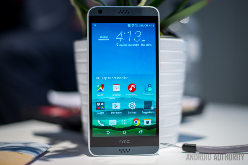
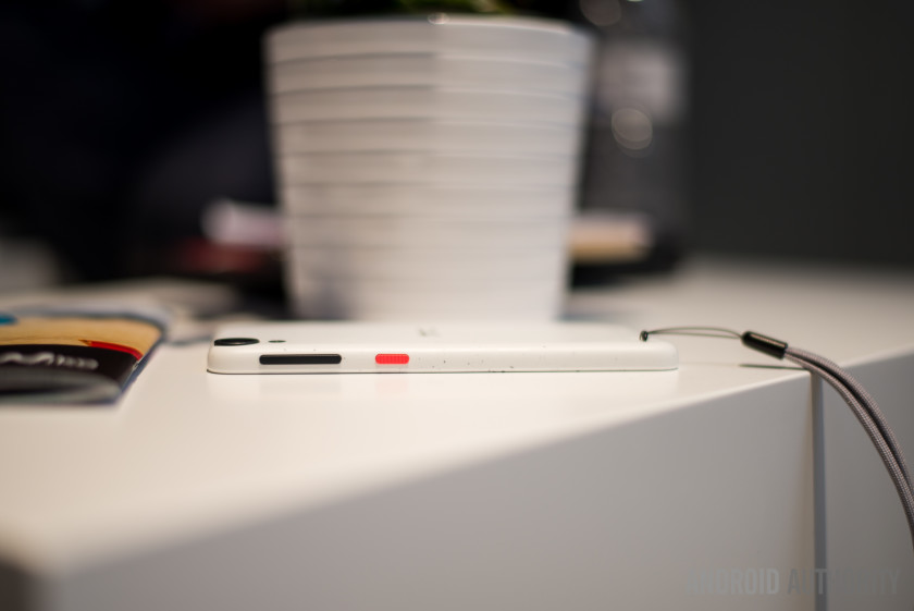
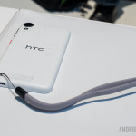
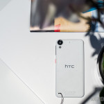
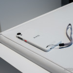
The first thing you’ll notice is that the Desire 530, and all its new Desire brethren, stick to the same signature design phone in previous Desire phones, complete with slightly rounded corners, sides, and a dual-speaker grill on the top and bottom. One design aspect that is different however is the presence of a bunch of paint speckles on the back, in what HTC is calling ‘microsplash’. The cool thing here is this isn’t a preset pattern, so each and every Desire model with this backing will look at least a little bit different. You can even customize things further with colorful lanyard loops and cases that have microsplash patterning as well.
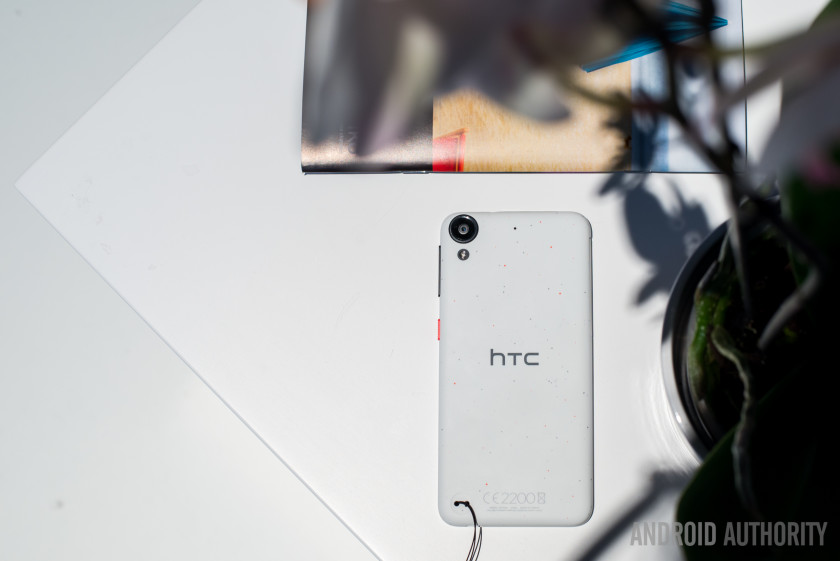
As for what’s under the hood? You’ll see pretty typical entry-level specs here including a 5-inch 720p LCD display, a 1.1GHz quad-core Qualcomm Snapdragon 210, 1.5GB RAM, 16GB storage with microSD, an 8MP rear cam, 5MP front cam, and a non-removable 2200 mAh battery.
If you like the design of the Desire 530 but are looking for something with a bit more meat, the Desire 630 offers the same aesthetics but upgrades things a bit thanks to its 1.6GHz quad-core Qualcomm Snapdragon 400 with 2GB RAM. The phone also offers a better 13MP main cam, and its dual-speakers support hi-res audio.
Obviously neither of these phones are the most powerful in the world, but they are designed for people that aren’t overly concerned with specs, and just need a phone that handles the basics with ease, while bringing a unique style that reflects their own.
Both the Desire 530 and the Desire 630 run on Android 6.0 marshmallow with Sense UI on top, which offers a familiar experience for anyone who has used an HTC device in recent history. All the HTC features you’d expect are here including a vertical scrolling app drawer, HTC’s Blink feed, and the overall typically clean experience Sense brings to the table.


That’s it for this quick hands on look! The Desire 530 is expected to arrive this March, though exact pricing or even launch markets have yet to be announced. Given the specs, we imagine this should be highly affordable and competitively priced with other devices in the budget-friendly space, though we’ll be sure to update you when we know more.
More MWC Coverage here!
AT&T seeks to delay Google Fiber in Louisville, Kentucky with lawsuit

Louisville, Kentucky, which is one of the cities that is currently under consideration to get the Google Fiber 1Gbps Internet service, is now facing a lawsuit from a competitor, AT&T. The company claims that Louisville’s city government exceeded its authority in changing laws that could make it easier for Google Fiber to be deployed.
The Louisville Metro Council passed an ordinance earlier in February that cut down the process of a competitive Internet service wanting access to the city’s utility poles from six months to just 30 days. It also gave those competitors the right to move the equipment operated by other carriers, but made the moving party libel for any damages.
40 percent of Louisville’s utility poles are actually owned by AT&T, and in their lawsuit that was filed on Thursday, the company said the city didn’t have the rights to make decisions on who can use their poles. Louisville Business First received a statement from an AT&T spokesperson:
“Louisville Metro Council’s recently passed ‘One Touch Make Ready’ Ordinance is invalid, as the city has no jurisdiction under federal or state law to regulate pole attachments. We have filed an action to challenge the ordinance as unlawful. Google can attach to AT&T’s poles once it enters into AT&T’s standard Commercial Licensing Agreement, as it has in other cities. This lawsuit is not about Google. It’s about the Louisville Metro Council exceeding its authority.”
This move will more than likely delay, or perhaps even cancel, any plans Google might have had for deploying Google Fiber in Louisville.
Source: Louisville Business First; Via: DSLReports

Samsung wins appeal in $120 million patent dispute with Apple

The $120 million ruling in Apple’s favor has been overturned by the U.S. appeals court, as Samsung was found to have not infringed upon the patents. Samsung was accused of infringing on Apple’s “quick links” patent and two other patents, and the initial ruling went in Apple’s favor. Reuters reports:
The U.S. Court of Appeals for the Federal Circuit in Washington, D.C., said Samsung Electronics Co Ltd did not infringe Apple’s “quick links” patent, and that two other patents covering the iPhone’s slide-to-unlock and auto-correct features were invalid.
The court also noted that Apple actually was liable for infringing upon one of Samsung’s patents, though no specifics are known on that at this time.

Samsung Galaxy S7 preview: Premium for the traditionalists
When Samsung introduced a second device to its annual flagship Galaxy S refresh, in the form of the Galaxy S6 edge, we wondered why anybody would choose the more traditional Galaxy S6 over the swanky, newly designed edition.
However, plenty of people did. After all, bar the curved screen there were few differences between the two phones.
This year, things are more distinct. The Samsung Galaxy S7 is similar to its direct predecessor in that it has a 5.1-inch, flat Quad HD display, while the S7 edge has adopted a bigger, 5.5-inch screen. It makes the two devices look and feel very different in the hand, and therefore the decision on which to buy will be easier.
Sadly, we feel that fewer will be opting for the Samsung Galaxy S7. That’s not to say it isn’t a well-spec’ed phone in its own right – more than capable when pitched against direct competitors.
Indeed, bar size and form factor, much of the same technology and feature set found on the Galaxy S7 edge can be found here too.
READ: Samsung Galaxy S7 edge preview: The best smartphone Samsung has ever made?
Samsung Galaxy S7 design
The Galaxy S7 has water and dust proofing to a high standard. It is IP68 rated so can be submerged down to a depth of 1.5 metres for up to 30 minutes. It also has a SIM tray that also doubles as a microSD slot for up to 128GB cards. The tray has spaces for both a SIM and microSD card.
The return of microSD expansion will be well received by fans, giving more choices when it comes to storage. Sadly, it looks like Samsung isn’t using Android Marshmallow’s flex/adoptable storage, because it believes that people will want to hot swap cards and use it to add and remove content, rather than being able to use it for added app and data storage: of course, that also means that Samsung can push you towards buying a device with higher capacity storage.
Pocket-lint
It also has the always-on screen function also found on the larger sibling. This means that you can set the phone to permanently display certain data or details, such as the time, date, a calendar or personalise it with a funky pattern or picture.
Those worried about battery drain will be pleased to note that this feature only uses at maximum 1 per cent of battery power per hour, so in an average day you’ll barely notice the effect. It can also be turned off completely though, if it’s not your cup of tea.
Samsung Galaxy S7 camera
The camera has been improved over last year’s model, even though the amount of megapixels on the sensor have actually dropped. It is now a 12-megapixel sensor, but that’s because the pixels themselves are now larger (1.4um over 1.2um) and can therefore capture more light, even in low light conditions. A larger aperture of f1.7 also helps.
Pocket-lint
That’s Samsung’s main selling point this year – better low light performance – and from the demo we saw at the London prebrief ahead of the MWC unveiling in Barcelona, it works very well in comparison to the SGS6.
When taking a picture or video in very low light, the SGS6 could only capture a fuzzy, noisy image while the SGS7 was much sharper and less murky. Samsung has also added the sort of dual pixel technology that is found on DSLR camera sensors, so autofocus is much quicker too.
What’s more, while the camera lens this year still protrudes from the rear, the lump is less distinct.
Samsung Galaxy S7 specs: Qualcomm and Exynos
Samsung has, as in some previous models, mixed its hardware in the SGS7. It will be using both Exynos and Qualcomm chipsets. Some regions will get the new Qualcomm Snapdragon 820 chipset and others will get the Exynos 8 Octo.
Qualcomm has seen a lot of support for its powerful Snapdragon 820, which is a 64-bit quad-core processor, with a boosted GPU, making it a lot more powerful than the last generation of chipset, along with a faster X12 modem for LTE speeds up to 600Mbps. We believe that the US will be getting the Qualcomm powered device.
The Exynos version of the SGS7 has an octo-core processor. Again it offers those fast LTE speeds and boasts about being faster and more power efficient than before. Unfortunately we don’t know which handset will be the more powerful – or if you’ll ever get a choice of which hardware you’ll get – we believe that most of Europe will be getting the Exynos version.
Samsung confirmed that as well as better power management, the CPU is 30 per cent faster than the one in the SGS6 and the GPU is 64 per cent faster, although at the time this information was given to us, it wasn’t clear which version was being referred to. The latter is certainly important for one of the major elements Samsung dwelled on in our demo: gaming. The manufacturer is clearly targeting gamers this year, more than any other. To begin with, it has a dedicated hub in the new, less cluttered user experience.
Pocket-lint
Game Launcher not only serves as a home for your Android games, but you can change plenty of the options for how you’d like your gaming sessions to progress. You can change the frame rate of any game from 30fps to 60fps and vice versa depending on how much stress you want to put on your battery charge.
There are also tools you can use in game, that appear as an overlay. These allow you to record gameplay with your own face and audio appearing as picture in picture, take screengrabs simply, and other in-game tweaks.
The last aspect of the Galaxy S7 series this year is that both phones come with a tiny water cooler built-in to ensure overheating doesn’t become an issue during the more graphically intensive gaming bouts.
We’d need to test the phone for more than 15 minutes to find out what effect this really has, but it’s an interesting inclusion.
Samsung Galaxy S7 battery
Because of the smaller screen size, the standard Galaxy S7 has a smaller battery than the edge model – at 3,000mAh. Again, we’d have to give the phone a thorough work out to see what that equates to in the real world.
Samsung Knox security comes as standard on the phone, as will Samsung Pay when it launches in the UK later this year.
First Impressions
There’s no doubting that the Samsung Galaxy S7 is a very good phone. It is super fast in operation, has an excellent, vibrant Super AMOLED screen, and plenty of other bells and whistles to make it a distinct improvement over last year’s model even though it’s not a complete overhaul.
However, when directly compared to the Galaxy S7 edge we found ourselves wondering who exactly would prefer the smaller, almost retro of the two?
It is roughly the same in thickness but feels a lot chunkier in the hand even with a similarly styled rear casing. Dare we say it, it even feels more like a mid-range handset when faced with the more modern, sexier S7 edge. The edge just felt more premium, even though much of the spec and abilities of the two phones are identical.
We suspect it will come down to price. If there is a distinct difference between the two handsets in affordability, like there is between the iPhone 6s and iPhone 6s Plus, there will be a market for the Galaxy S7 for sure.
Once we’ve had one in the Pocket-lint test labs for an in-depth review, we’ll be better placed to make a final judgement.
Panasonic Lumix TZ100 review: Imaging liberation meet lens limitation
The Panasonic Lumix TZ100 (known as ZS100 in the US) joins an increasing raft of cameras built around a 1-inch sensor size, promising upgraded image quality over what you would normally expect from a standard compact.
Most prominent camera companies are playing the pocketable 1-inch sensor camera game right now: we’ve seen the likes of Sony with its RX100 series, Canon with its PowerShot G5 X, and new to the stable is Nikon with its trio of DL models. But the TZ100 takes a different angle thanks to its 10x optical zoom lens – it’s more the casual consumer snapper; a TZ80 on sensor steroids, if you will.
Indeed, the TZ100 keeps very much within that “travel compact” camp in terms of physical size, avoiding enlarging both its scale and price by using a lens that, while fast at the wide-angle, doesn’t maintain that fast aperture throughout its extended zoom range. As such it should be seen as the evolution of technology trickling into more accessible products, not a ultra-high-end compact as per some of its peers.
We’ve been using the TZ100 for a week to see whether that lens decision compromises what is otherwise a quality premium travel compact. Is it the 1-inch wonder to pocket?
Panasonic Lumix ZS100 review: A new breed
In its simple black finish the TZ100 doesn’t look particularly different or distinguished compared to many compact cameras. But we don’t have the simple black finish; nope, we have the gunmetal grey with flash red cut-out line surrounding the up-top on-body controls. It’s kind of kitsch, kind of cool, and certainly stand-out. Not that we suspect many will buy this flashier looking trim model.
Pocket-lint
Anyway, we digress. The point really being that Panasonic has maintained discretion: the TZ100 remains pocketable – it’s 44.3mm thick – despite its 10x optical zoom and large sensor size. That ensures it’s still very much a compact, not a chunkier wedge like, say, the Canon G5 X. However, the Panasonic is larger than any Sony RX100 model, thus sitting it somewhere in the middle of its main competition.
That’s an interesting position to be in as a new breed, but a slightly confusing one because most 1-inch sensor cameras pair the highest ability with the sensor. Although it’s got the “TZ” name, we feel as though the TZ100 ought to be the current TZ80 model in a sense, rather than its bigger-sensor brother. Without the lens ability to keep up with its near competitors, there’s an immediate lacking in this Panasonic’s ability, which is the same issue we found with the also slender but all-touchscreen Canon PowerShot G9 X.
Panasonic Lumix TZ100 review: Lens limitations
The lens is a critical part of the TZ100’s make-up. With a 25-250mm f/2.8-5.9 (equivalent) on offer in this Lumix, the extended zoom isn’t particularly well designed for a number of scenarios. As the maximum available aperture dips as the zoom extends, so therefore does the ability to allow lots of light in, which has a knock-on effect to maximum shutter speed availability, ISO sensitivity required to expose and, therefore, overall image quality as a result.
Pocket-lint
If you’re interested in the maximum aperture at standard focal lengths then here’s what you’ll get: f/4.1 at 50mm; f/4.6 at 75mm; f/5.2 at 100mm; f/5.8 at 150mm; and f/5.9 at anything beyond 157mm.
Indeed we’ve found the camera will often plump for higher ISO settings than you might otherwise want to use. Even when shooting outside in daylight at the full 250mm (equivalent) extension auto-selecting ISO 640 isn’t unusual; indoors in daylight and ISO 1600 has frequently been the choice – which is the soft default ceiling to Auto ISO, and often not paired with a sufficient shutter speed to match. The ISO sensitivity can be pushed higher manually, but in ISO Auto the camera is fairly reluctant – a 1/4 second exposure considered ISO 1600 to be sufficient, for example, when that shutter speed is clearly too slow.
On the upside this lens does incorporate optical image stabilisation to help keep things steady, which goes some way to negating that limited maximum aperture. When the camera thinks the shutter speed is a little too low you’ll be presented with a red “shaky camera” symbol in the display. It’s decent stabilisation that you’ll feel and see in action, given the way it smoothes out movements.
So that’s the compromise with the TZ100: you’ll get more zoom than any other pocketable 1-inch model, but it’s not an especially proficient zoom. It feels akin to the first-generation Sony RX100 in a way, which over its successive releases has cut back on the zoom in favour of a wider aperture lens and pop-up electronic viewfinder – but that also escalated its cost (to over £800), which is one way the £529 TZ100 claws back some points.
Pocket-lint
Panasonic Lumix ZS100 review: Autofocus ace
In use the TZ100 performs well, though, much like the TZ80 with some added in that respect. So while shooting in low-light conditions might prove tricky to get a steady hand-held shot – and the screen preview does stutter somewhat due to lower frame-rate on account of light limitations (it can’t always achieve its maximum 60fps) – it doesn’t cause major issues with the TZ100’s rather accomplished autofocus system. The camera seems adept at locking onto subjects and confirming focus in a variety of situations, as it’s functional to -4EV, which makes it particularly snappy at the widest-angle settings.
We’ve stuck with the 1-area autofocus option for the majority of this test, as is typical of our Panasonic camera setup, with the ability to reposition it across the touchscreen via a quick tap is great. The top thumbwheel can be used to the resize this point through eight different sizes from small to large too.
Pocket-lint
Panasonic Lumix TZ100 review – sample image at ISO 640 – 100 per cent crop
In the TZ100 there’s also the inclusion of Pinpoint autofocus, a setting that’s typically reserved for the interchangeable lens Lumix line-up. We’re especially fond of this AF option, which only Panasonic offers: it displays a cross-hair target, which then magnifies the in-focus area to 100 per cent scale in a small on-screen window to confirm precision focus. It’s not as immediate as the 1-point AF option, but it’s great for assuring, well, pinpoint accuracy – we see where the name came from.
There is also a 49-area auto mode, which is fine, but this decides the subject and area of interest for you – which you may or may not want as the focal point. Choose Custom Multi instead and a 13-point diamond arrangement can be positioned across the 49-point grid, which is a nice touch. Face detection and Tracking options are also fine enough, but the tracking mode isn’t especially speedy at keeping up with moving subjects (single/continuous autofocus is actually a separate option, but tracking will always work on a continuous principle).
Close-up focus needs to be manually engaged (when in a manual shooting mode) by hitting the left d-pad direction and toggling between standard AF and AF Macro, the latter allowing for 0.05cm close-up focus at the 25mm equivalent. That drops to 20cm at the 100mm equivalent, 50cm by the 150mm equivalent, at 70cm from 188mm and beyond. Still not bad, though, and we’ve been able to shoot some shallow depth of field “macro” shots with the zoom fully extended.
Pocket-lint
Panasonic Lumix TZ100 review: Feature rich
In terms of features the TZ100 (ZS100) is typical of Panasonic’s current TZ line-up. That trim body incorporates a built-in electronic viewfinder, tucked to the top left corner. It’s a subtle incorporation, and while the panel isn’t super-high resolution – it’s the same 0.2-inch 1,166k-dot panel as found in the TZ80 – it’s a useful addition. Even if you don’t use it often, it’s tucked out of the way sufficiently and can even be deactivated using the Fn4/LVF button next to it if you want to prevent auto eye-level disruptions.
The main LCD screen on the back of the camera is fixed to the body, rather than mounted on a vari-angle bracket, which is a feature we’ve got so used to in other cameras that we rather missed it in the TZ100. Its inclusion would bulk-out the camera, we suppose, so can see why it’s absent. But it’s still on our wish list.
Other features include a lens control ring to the front, which glides smoothly upon rotation – no click-stop motion available here (and such dual functionality would have been great, alas) – for quick adjustment of priority controls, such as aperture value. There’s a second rotational dial to the rear top that can also do the job.
Pocket-lint
Panasonic Lumix ZS100 review: Function, 4K & Post Focus
There are four function (Fn) buttons arranged across the rear of the TZ100, although they’re pre-defined for this camera: Fn4 looks after finder/LCD activation; Fn3 brings up the Quick Menu (which can be touch-controlled and even customised with available settings); while Fn 2 and Fn1 handle what’s known as Post Focus and 4K Photo.
Those last two are Panasonic’s attempt to further stand out from the crowd. The 4K Photo modes – available on a quick access function button – allow for a rapid burst of shots (extracted from a movie file, essentially), the best of which can be selected as an individual 8-megapixel frame after shooting. It’s even possible to shoot a single second’s worth of footage before even firing the shutter to help catch that perfect moment. It’s very clever, but we’re unconvinced by the 4K Photo namesake and whether people will immediately get this mode. One additional take-away, of course, is that the TZ100 can capture 4K video too.
The newer mode of the two, Post Focus, does what it says on the tin: you can focus the shot after taking it. However, if you’re hoping to shoot hand-held like you would with a Lytro, then you’ll be disappointed; the Panasonic mode needs a tripod for steadying the frame while it grabs a movie file at multiple focal depths. It’s a nice idea though, even if it’s not immediately apparent how it functions after clicking the dedicated Fn2 button – it’s as though there needs to be more education there rather than just being thrown into the deep end and thinking “what does this do?”.
Panasonic Lumix TZ100 review: Image quality
As with any camera worth its salt, a significant reason to buy a compact rather than just using a smartphone comes down to the resulting image quality. The TZ100 certainly steps up beyond a standard compact camera in this department, but as we touched upon the ISO sensitivity is frequently pushed high as a result of that lens.
Pocket-lint
Panasonic Lumix TZ100 review – sample image at ISO 1600
However, even through to ISO 1600 that’s not a massive issue. A shot of a statue, painted in mid-grey, reveals only slight colour noise in the deeper areas, but the image processing otherwise smoothes everything out without entirely losing detail – sure, there could be some more precision in the eyelashes in this example, but they’ve not been entirely muted.
Given the sensor’s 1-inch scale, the 20-megapixels arranged over its surface are each roughly two and a half times larger than the TZ80 model. So even at this high resolution the light gathering properties are sufficient for a solid signal and decent results. The same ISO 1600 shot on the TZ80 would be nowhere nearly as clean, which is what you’re paying for in the TZ100.
And if there’s enough light to keep the sensitivity low then the results are decent. At ISO 125, shots of brightly coloured flowers taken in the Portuguese sun show crisp detail. However there is some “mottling” to larger areas, while edges could be more defined – something that even more apparent in, say, an ISO 640 shot of an olive hanging from a branch.
Pocket-lint
Panasonic Lumix TZ100 review – sample image at ISO 125
The other obvious benefit of a 1-inch sensor is the associated depth of field, meaning a more shallow, softly blurred background than a smaller sensor would be able to produce (at the same equivalent settings). Want that melty backdrop? The TZ100 should do a much better job than a smaller compact – and even f/5.9 at the full zoom extension gives a good lick of background softness. It’s a good look.
It’s hard not to come full circle to the comment about the lens though: with the maximum aperture dipping to just f/5.9 at the 250mm equivalent focal length there’s a lot less light available to use, which pushes the ISO sensitivity up. And while manual shots of a stuffed toy lion taken at ISO 6400 are fine, this sensitivity shows a lack of biting sharpness, while image noise is more apparent throughout. It’s not to the point of oblivion, though, again the sensor size showing its strengths.
Verdict
In a sense the TZ100’s maximum aperture lens limitations are, in part, counteracted by its 1-inch sensor quality – finding a happy medium somewhere in the middle. And yet that leaves this camera feeling like a “TZ80 Plus” in a sense (minus the 30x zoom, of course), less the kind of high-end high-flier associated with most 1-inch sensor compact cameras.
That’s the TZ100 in a nutshell really: it’s no Sony RX100 IV, but then it is more affordable than that and has a more significant maximum zoom to reflect its different market position; it’s a new breed with some commendable new ideas. We certainly can’t call it out on autofocus ability or overall feature set, but that lens is going to divide whether it’s the pocketable model for you or not.
Overall the Lumix TZ100 reflects where compact cameras are headed: it’s all about larger sensors and more touch-based controls, which will become the norm in the near future – we said the very same of the Canon G9 X (although the Panasonic would be our preference if faced with the choice of buying between those two models) – but, right now, the lens is as much a limitation as the sensor is a liberation.
